First Full Image Of New Star Trek USS Enterprise | TrekMovie.com
jump to navigation

First Full Image Of New Star Trek USS Enterprise November 11, 2008

by TrekMovie.com Staff , Filed under: Star Trek (2009 film) , trackback

The moment everyone has been waiting for is here. In anticipation of the upcoming Star Trek trailer premiering this weekend, Paramount has released the first full image of the new USS Enterprise (NCC-1701, no bloody A, B, C or D).  EW’s Popwatch blog got the exclusive first look at this beauty.


And here she is


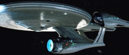
Click to see larger version at EW

EW also talked to director JJ Abrams, who had this to say about his new E

If you’re going to do Star Trek there are many things you cannot change. The Enterprise is a visual touchstone for so many people. So if you’re going to do the Enterprise, it better look like the Enterprise, because otherwise, what are you doing?s

Comments

1. charliebob - November 11, 2008

OMG This is fantastic

2. OneBuckFilms - November 11, 2008

Oh my ….

Erm, it kind of looks like a cross between the TMP Enterprise and a Jet Fighter.

This is a little weird, and may take some getting used to.

3. Mike Tomaras - November 11, 2008

Ok-Ok this is wild!!!

4. Enterprise - November 11, 2008

Looks cool. I don’t like the neck, though. One blast and that sucker falls apart.

5. Shane S - November 11, 2008

WoW! Finally we get a look and I am happy, First?

6. SPB - November 11, 2008

Um, I’ve been a glass-half-full guy in terms of STAR TREK XI…

…but yikes. I’m gonna need A LOT of time to get used to THAT.

7. Daniel Broadway - November 11, 2008

Wow, that is one ugly ship.

8. charliebob - November 11, 2008

Wow I even got first?!
Couple criticisms…
Not sure about the nacelles and theres something about the connection between the saucer and the secondary hull that I don’t quite like.

9. The Wild Man of Borneo - November 11, 2008

Fantastic?? are you kidding me?? This is F*******ing horrible. It looks so out of proportion. Is this supposed to be a TOS ship?? This ship belongs in the TNG era, or even beyond that.

10. Boulderdash - November 11, 2008

Come ON! This is gorgeous!!!!

11. archangel jim - November 11, 2008

I’m not sure how I feel about this design. I’m hoping it’ll be like the title Quantum of Solace, that it’ll grow on me over time. First!

12. Sputnik - November 11, 2008

Looks to TMP-ish for my taste. And the deflector dish is just … wrong. If it at least would be golden.

Other than that it seems “ok”. Perhaps it will look better in moving pictures.

13. Enterprise - November 11, 2008

So, it’s the Akiraprise?

14. 1701 over Gotham City - November 11, 2008

SHRIEEEEEEEK!!!

Well, I’m not overwhelmed, but I don’t mind it either… But I understand the AICN reports now.
The secondary hull does look a little odd, and somehow overall it’s not as dynamic in proportions as the classic 1701, but I give it a thumbs up.

But it’s STILL damn prettuer than the D or the Excelsior ever were!

15. Devon - November 11, 2008

Eeek, I’m not too sure about that. The secondary hull is way too forward on that. The rest I’m okay with, even the Nacelles look okay I think. I just would have done some work with the “Neck” and “secondary hull” is all. But I don’t know.

16. Andrew - November 11, 2008

I feel like a kid again when Star Trek: The Next Generation was first starting up. This is so exciting. What a great looking “modernized” looking version of the Enterprise. Now if the tricoders look like the iPhone… :-)

17. 750 Mang - November 11, 2008

Looks good. Wish it had the old deflector dish but hey “young minds fresh ideas.”

18. Valar1 - November 11, 2008

Wow, I really like the nacelles and the saucer, but that deflector area is sticking out a little farther than past ships. Not ugly, just unnerving.

19. Leroy the Starship Engineer - November 11, 2008

hmmm … J.J. may have lost me. I hope it grows on me… I want it to so bad. The main hull is too small, the saucer too big. It seems very disproportionate to me.

20. Enterprise - November 11, 2008

So the nacelles have windows this time?

21. TrekMadeMeWonder - November 11, 2008

“if you’re going to do the Enterprise, it better look like the Enterprise, because otherwise, what are you doing?”

BWWAAA HAHHAHAHAHHAH hAHAH h HAH HAH hAaHHAHAHAAAA!

22. dalek - November 11, 2008

I dont know whether i like it or not. I’d like to see a bigger image and different views.

But im not blown away impressed.

23. Capt Mike from the Terran Empire - November 11, 2008

Well. It looks great. I like the design and i think in time it will grow on everyone. I can’t wait to see the Big E on action and see her firing Photon Torpedoes and phasers. it’s a little different but i think it will work and Yes. Im a Tos Purest but Believe The new Enterprise will work just fine.

24. Vorus - November 11, 2008

Well, there went my confidence in this movie . . .

By Kahless’ blade, could they have ruined the design any more? It not only looks ugly by its own standards, it looks FAR too much like the TMP version in the details. They’ve completely let down the loyal fanbase on this one.

Total letdown, JJ.

25. Gorn Captain - November 11, 2008

Well…I like it a lot, but I’ve been open to change. It just makes you go “wow”, and imagine it on the big screen!

26. That One Guy - November 11, 2008

Sexy.

27. Alex Rosenzweig - November 11, 2008

Eh… I’m not blown away by it, but I’m not hating it at first sight, either.

Primary hull looks nice. Engines look so-so. The secondary hull and pylons look really ungainly.

To be fair, I’d like to see some more angles of it. This one looks awkward, without much of the grace I’d expect from the Enterprise, but it might be the angle of the shot.

28. charliebob - November 11, 2008

this is certainly going to be one of the most controversial changes in the entire movie. This and the bridge design (as seen in previous photo’s). This may take it a step too far for most people’s liking.
Oh and @9, by Fantastic I was referring to the fact that there was a picture at long last…my later post was when I’d seen it.

The biggest problem I have is the neck positioning. It’s too far back. And with it looking so much ‘better’ than the original 1701, how can you ‘Upgrade’ to what we’re used too? Surely going to TMP era ship design is a downgrade almost?

29. Remco (Netherlands) - November 11, 2008

Bunch of bitches. It’s just funny to hear them go on and on and on!

This ship simply kicks ass!!!

30. mark - November 11, 2008

i choose to take some of the comments here not seriously

31. OneBuckFilms - November 11, 2008

20 – Those are downward facing lights, not windows on the nacelles.

This is different to say the least. We’ll see if it grows on me.

As a test, I showed this to a workmate who was not a Trek fan, and he thought it was cool. He loved it.

That’s a good thing, but it kinda looks like a hodgepodge mix of the TMP Enterprise, a Blackbird jet and a modern art sculpture.

32. Jeffries Tuber - November 11, 2008

Don’t these people know that we have to make a living? I have my own business and can’t blame things on The Man. This is beautiful!

33. rehabilitated hitch1969© - November 11, 2008

cat’s out of the bag, as they say…

it was…. fun.

oh my.

THE WOMEN!!

=h=

34. Mark S. - November 11, 2008

How do you get from this to the old, reliable Constitution-class clunker from the original series, now beautifully remastered on DVD? I agree. This looks like something out of TNG. I’ll get used to it, but apparently continuity does not matter. Than again, maybe it doesn’t. Galactica got “reimagined.” Maybe we will need to look at this the same way. Question: Is there going to be any nod to the storyline that Chris Pike was the first captain?

35. Closettrekker - November 11, 2008

I love it. I think they did a great job bringing the NCC-1701 to the present.

It looks terrific….no complaints here.

This looks like something I could imagine being a starship about 237 years into our future.

:) :) :) :)

I give it 4 smiley faces.

36. damn and hell - November 11, 2008

Uargh, for the first look I thing enginiering is much to ugly, but perhapse it looks much better then it is in motion, maybe …

37. Enterprise - November 11, 2008

Does it Transform?

38. cagmar - November 11, 2008

It is too squished… Star Trek taking on another of the design flaws of Star Wars — space ships don’t need to be aerodynamic, people! That was the beauty of Star Trek, its ships were big, hulking clunky things. This one looks like its being squished for aerodynamic purposes… to look slick. sigh.

Not ugly, but definitely not my favorite.

That, and phasers with broken beams — what are they doing to the scientific sensibilities of Star Trek!!

39. Vorus - November 11, 2008

Y’know, thinking about it, I’m wondering if this image is even real. It looks rather different than the image in the teaser trailer. For one thing, the nacelles are too low. In the teaser, you can see the nacelle bussard collectors over the saucer. In this new image, there’s no way you could get that angle.

Is it possible this is a fake?

40. freezejeans - November 11, 2008

o_O Holy cow. I…actually like that design, speaking as a TOS-era guy who always preferred the TMP version. Can’t wait to see the big E in motion :D

41. charliebob - November 11, 2008

I dunno…I keep looking at it and seeing the odd thing I like.
It’s growing on me, and by all accounts it’s not a bad design. If this is what they’d started with I think we’d all love it instantly (by they I mean TOS ship designers).
It’ll look great on the screen, and this is a reboot so I suppose I can live with the change.

42. Nobody - November 11, 2008

It never ceases to amaze me how so many fans pass judgment based off of one picture of the ship — as if it is indicative of how the entire movie will play out. Like it? The movie is oscar worthy! Hate it? My childhood is ruined — ruined, I say!

Who cares? Trek is in the story, the heart and soul of human adventure. That said, I think the ship looks good and a nice updated — but still recognizable — version of the TOS Enterprise.

43. Mark T. - November 11, 2008

If the whole secondary hull/nacelles part below the neck was shoved back a bit, I’d really like this a lot more. It looks like the whole thing braked hard and everything slid forward…

Kinda crowded looking.

44. That One Guy - November 11, 2008

My roommates like it. None of them like Trek a ton, but they definitely think it looks cool.

“It looks very technologically advanced. It looks like it actually belongs in the future.” One of them said when compared between this and a picture of the original.

“Kickass.”

“Streamlined.”

It’ll take some time to grow on me, but I think it’ll go fast. Plus we have yet to see it moving, other aspects of it, or a full 360×360 of it.

45. Zardoz - November 11, 2008

…the HELL??!!!??!!!

46. charliebob - November 11, 2008

@39 you have a point. In the teaser the Nacelles were round and … normal…is this a fake?

47. TrekMadeMeWonder - November 11, 2008

DAMNED ROMULANS!

48. Capt Mike from the Terran Empire - November 11, 2008

I thinkonce we get some more looks it will be better looking as well. Yes this is an update of sorts and i do like it and as i now have it on my screen saver and as i study it it is kinda growing on me. So for the haters out there give it a chance and it may grow on you.

49. mikey_pikey - November 11, 2008

Oh it looks great and you know it lol, i like what they’ve done with the deflector dish, stick’s out like the old but lights up like the new(er).

50. kevin - November 11, 2008

it looks like the enterprise the same way a minivan looks like a shuttlecreft; almost, but absolutely not.

this has to be a joke, but i guess not.

damn, i HATE abrams now.

51. mark - November 11, 2008

“Is it possible this is a fake?”

No it’s not possible. That you are stupid, on the other hand, is very likely.

52. Dr. Horrible - November 11, 2008

Gorgeous! I cant wait for the trailer! Seeing it friday :D

53. barrydancer - November 11, 2008

That’s, uh…that’s um…I mean…that’s…What the hell is THAT, exactly?

54. sean - November 11, 2008

I LOVE it. Nacelles are great, perfect compromise between TOS & the TOS films. I also love that they retained the external deflector, but made it blue like the film Enterprise. Secondary hull is the right size for the TOS E, and there’s some nice reinforcements on the neck (my only complaint about the TOS E was that connection the secondary hull always looked pretty darn flimsy). The level of detail on the outer hull is also a nice compromise – not quite as detail-heavy as the film E, but not as plain as the TOS E.

I’m very happy with this.

55. lesser ajax - November 11, 2008

It looks like the iShip… that said, I like it.

56. Jamie - November 11, 2008

I think it looks great.

The main thing to me is not the shape, it’s the fact that it looks REAL. It doesn’t look like plastic CGI, there is a ton of detail and I like the materials. It looks like a big solid real thing in space.

As for the style, it kinda looks like an “expensive car”, compared to TOS’s “cheap car” Enterprise. I’m not saying I agree with changing it, but I am utterly relieved that it actually does look like the Enterprise. I had feared it would look nothing like it at all.

Then again, I’m primarily a TNG fan, so I am probably more accustomed to seeing this kind of design.

For me, this is the final piece of the puzzle and I am now pretty much happy about all the pieces, with the possible exception of the ship interior sets which, to me, look too much like a “workplace” and not quite “cosy” enough.

57. The Starfleet Conservative - November 11, 2008

Looks like Gabe Korner’s design

58. Brian - November 11, 2008

It’s basically the TMP Enterprise with some kind of new sensibilty….interesting. Be curious to see how she looks when she’s moving.

59. darendoc - November 11, 2008

And this is the point where I realize I’ve been in the mirror universe for a while now…

:)

60. Adam Cohen - November 11, 2008

I’m still trying to absorb it. I like some parts, I dislike others. But it *is* the Enterprise. And it’s exciting to see a new design of an old friend. That being said, if they stayed close to the original design, I may have been happier.

61. New Horizon - November 11, 2008

I really hate it. Wow…I honestly expected so much better than this. :( It looks hideous…please, someone say this is a joke. That just isn’t the enterprise.

62. Benjamin - November 11, 2008

It isn’t bad, but they’d better have a good “in-universe” explanation ready why it doesn’t look anything like the TOS-era ship we’re used to.

63. charliebob - November 11, 2008

@51 Yes because the news services ALWAYS get it right. It’s just speculation because as noted, the Ent in the teaser looks different. OK they don’t need to stick to that design, and we didn’t get a good look at it but still…

64. That One Guy - November 11, 2008

Wow… it’s been out for 5 minutes and people are already bitching about it and saying they hate the entire franchise and Abrams.

Simply amazing…

65. TrekMadeMeWonder - November 11, 2008

Is this the kind of “Change” we can expect troughout 2009?

66. Pragmaticus - November 11, 2008

It looks fantastic. Everybody needs to calm down and quit freaking out.

67. utterlee - November 11, 2008

It’s quite a nice looking ship, but it’s not the Enterprise.

Guess I’ll have to view it as a reboot and get over it.

68. GregW - November 11, 2008

James Doohan is rolling in his grave, “Tha’ canna be my Enterprise!”

My first reaction is what is so bloody wrong with the original Matt Jeffery’s design? Have the production team even bothered to watch TOS and the movies? The movie Enterprise is a refit and upgrade of the TOS ship. This version seems to do away with all of that canon and mixes the two eras into an out of proportion amalgamation.

I still have hope but this is really taxing it.

69. SPB - November 11, 2008

And I thought the Enterprise-B and -C were ugly little bastards…

Sorry. Just not feelin’ it. Maybe it’ll look better in action and from different angles, but from a lifelong fan, my first reaction SHOULDN’T be “Uhhhhhh…”

The TMP Enterprise is still the one to beat, in my book. That one wowed be the SECOND I saw it. This thing is some sort of TOS/TMP/TNG mutant.

70. Tiberius - November 11, 2008

I’m gonna need a lot of time to get used.

71. Bodge Of England! - November 11, 2008

All I can say is “Awesome!!!!”

Looks like they have done a great job on bringing the Original Enterprise to modern day cinema. Can’t wait to see what it is like when she is doing her thing!!

Roll on Friday so we may see a bit more of it!!

72. Vulcan has no moons - November 11, 2008

I kind of like it… It’s like a giant Cadillac in space… ;)

I’m going to wait for the sound effects to bring life to that chubby girl!

:p

73. Stanky McFibberich - November 11, 2008

Man……that is bad.

Wow.

74. Third Remata'Klan - November 11, 2008

#64 – Totally agreed. Sheesh.

I totally DID NOT want to see the Enterprise–even in the trailer–until I got to see her in the theater, but that was too much to ask.

As of this photo, I think she looks nice; but the trailer will be the true test.

75. Beck - November 11, 2008

A few people have complained about the proportion, but this pic seems to be taken at an angle – difficult to judge that aspect.

76. Buddykarl - November 11, 2008

I just threw up in my mouth and swallowed it…ugh…looks like it was rear-ended in a horrible accident and the Talosians put it back together again.

77. TrekMadeMeWonder - November 11, 2008

64. That One Guy

Just what did you expect?

I bet you… oh, what’s the use.

Real apathy is starting to set in for this movie.

78. Antni - November 11, 2008

first look is wow i love it, i just think the secondary hull looks a little weird but i’m sure it’ll grow on me and i’m not letting it ruin my excitment for this film i soooo excited i wish i could time travel to May 8th 2009 this film is going to be amazing.

79. Shatterhand - November 11, 2008

I think it looks great. I will say that it seems like a pastiche of other Starfleet vessels from different eras mixed together, but overall, I think the original Enterprise’s look was honored quite nicely here. It’s not identical to the Enterprise of old, but let’s face it: we were never going to get that in the first place, and anyone who expected that was fooling themselves.

I’m sorry, but I’ve just about had my fill of people like Vorus, who are willing to completely dismiss the movie based on pictures they see on the internet. I’m convinced they are incapable of satisfaction. Folks, there was virtually NO WAY that this movie was going to look and feel exactly like the original series, or even your idea of what the time period before TOS should’ve been. We were never going to have a bridge that looked even remotely like the bridge on TOS’s Enterprise. You can’t go from what we saw on Enterprise (which, as much as some don’t want to believe it, was canon, so get over it) to the look and feel of TOS and still make any kind of sense.

I’m quite happy with what I see, and I’ll save my nitpicking for when I’ve actually seen the entire movie in its full context, when it seems a lot more appropriate to pass such strong judgment.

80. New Horizon - November 11, 2008

Perhaps I’ll get used to it…I’ve been open minded about the film so far…but this is a big stretch.

81. LoyalStarTrekFan - November 11, 2008

My thoughts: saucer section looks perfect, warp nacelles look great, the stardrive section looks wierd. It would have looked better if they tried to utilize the stardrive look of the TMP Enterprise more. As a result, the movie era Enterprise looks much better than this one but I’m sure I’ll get used to this design.

I also think the ship looks a lot better in the fan speculative design that you can see on Ex-Astris-Scientia.org on the Star Trek XI ships page.

Overall: the ship looks good and it flows well together but is a bit different from what we’re used to. Then again, according to all accounts, that will sum up the new film. I look forward to seeing this ship on the big screen.

82. Devon - November 11, 2008

#57 – Do a comparison of the two:

Here is Gabe’s from somewhat of the same angle.

http://img.photobucket.com/albums/v469/Lizoid/Prise.jpg

Actually looks almost nothing a like other than a few similar asthetics.

83. spock - November 11, 2008

The horror

84. Allen - November 11, 2008

I have to agree with a couple other people it looks like the neck is to far back and the star drive section is too small. Other than that i think it looks pretty good. I always love the TMP deflector the best. Persionally i thought the Ent-D’s deflector looked dumb. Im not sure how I feel about the warp engines, they kinda remind me of the nabuu fighters in starwars episode 1. But the nice thing is the match the look and feel of the new bridge.

I think this design works, but only if you ignore the TOS version and say that this is what the ship looked like in TOS and it was upgraded to the TMP version from this in the movies.

85. That One Guy - November 11, 2008

People! CALM DOWN.

I thought that us Trek people were supposed to have more common sense than this! And here we are yelling and screaming about how much we hate one little ship.

Do realize:

Trek was created in the 60’s. It was ugly. It was VERY ugly. My generation, 18-20’s, couldn’t care LESS about Trek. The original E looks like something out of a REALLY bad sci-fi. Which was what TOS was much of the time, minus the notable exceptions such as Amok Time, Managerie, etc.

Seriously, quite whining. Give Trek over to a new generation and let them deal with it.

I’m sorry that we’re playing in your ballpark now, but…. Trek is old. It needs a new coat of paint. It needs….

a refit.

86. @34 - November 11, 2008

Pike will be the first Captain, yes.

87. bdrcarter - November 11, 2008

There she eez!!!!! THERE she eez!

And what a beauty!

88. Frank - November 11, 2008

I can only hope that it blows up in the movie…..

89. barrydancer - November 11, 2008

76: You made me spit out my gum in laughter.

90. Scott - November 11, 2008

Other than the oddly “aquatic” look to the nacells, I’m pretty impressed with the new 1701. I always felt that the original design was a bit too fragile looking and this definitely gives it a much more sturdy look and feel.

I really like how they took what was great about the 1701-A and put it in the 1701. The blue glow on the deflector, the torpedo launches actually being prominent, the swept back design of the nacell fins. Very nice.

91. table10 - November 11, 2008

Your ship, was imagined 40 years ago for a small TV show with little budget. It was never meant to be fleshed out.

This ship, 40 years worth of technology enhancements later, 150 million in budget, and a bunch of guys who’s main goal was to make every inch of it make sense, have a purpose all the while looking majestic on the big screen…

Your ship, in this movie, would have been laughed off the screen

In my opinion, for what the filmakers wanted to achieve with it, its absolutely stunning and perfect

92. Sebi - November 11, 2008

Can we have a Vreenak on this?

I’m with #39, I’m not sure this is the real thing. Maybe this is a different-timeline-Enterprise (just like the D in “All good things”) which, like I said is in an alternate timeline in the movie? We don’t know the whole plot yet…

Anyway, if that’s the real thing I am not sure whether I like it or not. It just seems………weird…

93. sean - November 11, 2008

Anyone saying this looks like a TNG era ship never watched TNG.

94. Thascales - November 11, 2008

I kind of like it, kind of don’t… it’s like an exotic new flavour that I’ll need time to grow to like. Immediate thoughts are that all the struts attached to the engineering hull would look better moved forward a bit, more like the old style, but I’ll see how I feel after a few days, and the trailer…

95. Norm! - November 11, 2008

Did anyone else make the stupid visual mistake of thinking the shuttle craft was part of the engineering hull?

I can see what Abrams & co. were trying to do with the TOS/TMP hybrid, but the nacelle pylons look cartoonish to me. I’ll probably get used to the new look, but they should have stuck closer to the TMP design or done something more original. Hybrids of two different designs are often fugly and silly — like the Enterprise-C in TNG.

96. Captain Scokirk - November 11, 2008

You can’t go home again, you just can’t, I appreciate the bar being set at TMP’s Enterprise flyby, and this is a handsome enough amalgamation, but it remains just that. Which is fine, it is no more updated than the sets or the actors for that matter which are equally streamlined and jarring when compared to the originals. So it is what it is, as inspiring as a new Challenger, new Beetle, new T-Bird, new Mustang is next to the original, it’s pretty and an improvement over your run of the mill car but it just doesnt match the original. SO here we have the ipoding of Star Trek, the King is dead, long live the king!

97. Sean4000 - November 11, 2008

No thank you. Oh my……

98. pink - November 11, 2008

Because of the debacle that was Transformers,

I am very concerned about special effects not being allowed to fit into the frame of the camera. When those Transformers transformed, I was lost and confused and I just wanted to see what they looked like!!

All I wanted from JJ Abrams was that he keep the camera back enough to let us see the entire ship. So I’m hurting now because the one frame he chooses to release as a picture of the new ship is cutting off the front end of the saucer, snipping the nacelle at the back, and nearly shaving the top of the saucer off as well.

Why? Why do you do this to us?

99. ShawnP - November 11, 2008

Loves it.

100. I am not Herbert - November 11, 2008

Whoa!!! Pretty “stylized”…

…gonna have to stare at this one a while…

…kind of in shock…

101. Skippy2k - November 11, 2008

Its not quite what I had hoped for but maybe it will grow on me…I think its mainly the proportion/shape of the eng hull. While I like it more overall than gabe’s I like the shape/size of his eng hull better…

Look forward to seeing it in motion.

102. Frank - November 11, 2008

Well, the saucer looks good…at least it’s round and looks like TMP. The rest I’m not so sure about.

103. Vorus - November 11, 2008

@79

No one is saying that we wanted the movie to look EXACTLY like the old show. Perhaps you should not try to read people’s minds through the internet.

What we are saying is that we have been assured by various sources that this film will HONOR the original series, which some of us take seriously. (And if you don’t like that we take it seriously, tough. Do I make fun of your hobby?)

And yes, this ship has a saucer, and a hull, and two nacelles, but that’s really the ONLY thing it has in common with the ship we all know and love. I could give you a long list right now about the things that are too modern, or simply impossible to reconcile with the original design, but I doubt you care, because Trek isn’t your hobby.

Well, it IS my hobby, and I’ll take it seriously if I want to. Go hump a targ.

104. Enterprise - November 11, 2008

I see the shuttlecraft in the shot in front of the Enterprise.

105. Bubba2008 - November 11, 2008

Fan-friggin-tastic! WOOHOO!!!

106. Luke Montgomery - November 11, 2008

PERFECT!
COOL!
AMAZING!

Really do love it. I like the way it looks tough and sleek at the same time. Looks really solid.

I’m loving the look of this film from the retro-updated costumes, the bridge (the window/viewscreen rocks!), the bridge graphic displays, the overall colour and style choices… and now this! I lov ehow it’s shown with 3 shuttles buzzing about it to give it a sense of scale and importance.

Beam me up!

107. Captain Jas - November 11, 2008

In space, no one can hear you as you shake your communicator in your fist and scream:

“JayJAAAAAAAAAAAAAAAAAAAAAAAAAAAAAAAAAAAAAY! JayJAAAAAAAAAAAAAAAAAAAAAAAAAAAAAAAAAAAAAY!”

108. DarthLowBudget - November 11, 2008

That actually looks REALLY cool.

109. Stanky McFibberich - November 11, 2008

re:85 That One Guy
“Seriously, quite whining. Give Trek over to a new generation and let them deal with it.”

Ok…you can have it….whatever IT is.

That thing is not only worse than I imagined, it is worse than I COULD have imagined.

110. rehabilitated hitch1969© - November 11, 2008

earth final conflict season one, meet earth final conflict season 5.

whats new at the sto’or???

=h=

111. Pah Wraith - November 11, 2008

How did it went

“IT’S A DISASTER !!!”

;) lol

No, seriously – the very first thing about ST11 I truly dislike. They tried to do it more streamlined, kinda like modern sports cars, but… well I don’t think they got the idea right… :(

112. Kelvington - November 11, 2008

OK, I don’t hate it, it’s not offending my eyes. I think this is one of those things where they felt they had to change stuff for the sake of change. It’s not a terrible design, but it will take a while to get used to it.

In particular, the idea of a HUGE shuttlecraft just sort of stuck on the side like that doesn’t do it for me. ;)

113. TuVokSpock - November 11, 2008

I give it two pointy ears up.

114. Joker - November 11, 2008

Why so serious?

115. cd - November 11, 2008

uh…reboot

116. Kirk's Revenge - November 11, 2008

Looks a lot like the Enterprise-C to me… for some reason.
Having said that, I just don’t like the design. It’s modern and clunky at the same time. However, I do like the detail. Actually looks like an old school model and not some CGI monster.

Oh well.

117. Just another German trekker - November 11, 2008

Uhmmm… well… gotta get used to it, I guess…

118. Bob, the Evil Klingon Frontline Leader - November 11, 2008

I imagine, had there been an internet way back in 1979 when ST:TMP came out, that the discussion around how ugly the movie Enterprise is v. the real tv series Enterprise would have sounded much like today’s discussion.

119. Rick Sternbach - November 11, 2008

*Sigh*

Rick

120. Sputnik - November 11, 2008

We definitely need a vote on this topic on trekmovie.com. :-)

121. Barney - November 11, 2008

Hmmm…my first reaction isn’t a ‘wow’, which is a shame, and the first time in the run-up to the movie that I’ve been a little disappointed. It does look, to me, like a chop shop stuck the front of the TMP Enterprise on to the back of a TNG-era ship to create a kinda Enterprise-C lookalike. Doesn’t ring my TOS bells as much as the other photos I’ve seen so far of interior shots, uniforms and characters.

That said, I’m not going to go daft about it, I’ll wait and see more stills and hopefully some trailer action.

I’m sure I’ll still love it come May 2009!

122. Luke Montgomery - November 11, 2008

Hey Rick Sternbach…
was that a good sigh or a bad sigh?

123. Capt Mike from the Terran Empire - November 11, 2008

I think it’s great desgin and i think for most non Trek fans it will work wonderfully. I think some of us so called true trek fans have almost killed trek in general. some of us are so criticle of the shows. Like Enterprise and Voyager and such. You Tune away because you don’t like certen things. Well I say you are not true trek Fans. The reason I say that is because you are part of the reason trek has almost died. I have watched every trek series and all 10 movies since i was a kid. I was born In 68 and i and others like me will give this movie a real chance and not critisise this movie and diss it badly. So the haters. Please stop. as you are the ones who have about killed Star Trek.I am so glad that J.J Abrams is Keeping Trek Going and to Bob and the rest you have a very gratefull Thank you form a true Star Trek Fan who has benn watching Trek for over 30 years.

124. DeafPoet - November 11, 2008

Looks okay to me. I’m not blown away by it and I was looking at it trying to put my finger on why.

Then it dawned on me: how COULD I be blown away by it? At its core it’s gotta be a saucer, drive section and two nacelles and how many variations on THAT have we seen over the years? All they had to do was not screw those basic elements up and just make it look kinda cool.

I think they succeeded. Anybody expecting something revolutionary was kidding themselves.

125. Drew - November 11, 2008

It is quirky looking.. of course so was TOS Enterprise.. It has a very futuristic look and looks kind of muscular..

126. Vorus - November 11, 2008

@ 118

You’re probably right. But at least then, it was supposed to be a FUTURE version of the 1701, which cannot save this iteration. We’re supposed to believe this is how it looked BEFORE the TOS series?

127. Mark - November 11, 2008

I really want to like the new film’s designs (ship / bridge etc) but I just can’t reconcile them as part of the ST universe I know and love; it just feels like one reboot too far…

I have always been fine with recasting to push the story forwards and I would have enjoyed subtle restyling (love the new viewscreen) but how can you change sets and scenery so completely and still pretend it’s part of the same timeline you know and love?

If we’re ignoring what’s gone before and starting again, it looks fabulous … but I don’t want to ignore what’s gone before and start again. Sorry.

128. Joker - November 11, 2008

109,
“It” is the U.S.S. Enterprise, NCC-1701.

“It” is Star Trek.

129. Captain Jas - November 11, 2008

I’m all for variance in design, but because this is not a reboot (although it is a revitalisation), she could have been designed a little better to suggest an eventual evolution/refit into the 60s TOS version of the design. This girl could just as well be the Enterprise F. I’d have preferred it if he’d ditched the naff 60’s uniforms and sexist miniskirts in favour of a look which foretold and eventual TWOKhan look, and kept the ship close to her original specs a little. It doesn’t matter if the bridge or interior decoration changes, all Enterprises saw several internal shifts i design but the outside was so iconic… I hope the script is excellent and that the casting works as well as it looks but I think Admiral JJ may have scored a bit of an own goal here.

Shields up.

130. Sarah - November 11, 2008

I’m trying to keep an open mind about this…. I’d like to see it in motion and see different angles of it.

#76 LMAO

131. Enterprise - November 11, 2008

Rich passed out,

132. Dom - November 11, 2008

I absolutely love it. It’s still definitely the Enterprise but done for our era, rather than the 1960s. After we saw her fiery death in Star Trek III, it’s wonderful seeing our old friend back looking better than ever.

Wow! Very very happy!

133. Kirk's Revenge - November 11, 2008

“The Enterprise is a visual touchstone for so many people. So if you’re going to do the Enterprise, it better look like the Enterprise, because otherwise, what are you doing?”

Mr. Abrams, there are some touchstones you shouldn’t touch.
What are you doing?

134. Brian - November 11, 2008

I agree….can’t bring the TOS Enterprise onto the big screen now…it would look ridiculous. It would’ve looked ridiculous in 1979. Gene had said when TMP was being made that the refit Enterprise(far and away the best version of the ship, in my opinion) was more in line with what he would’ve done in the 60’s if he had more money and time. TOS Enterprise is a product of it’s time….I’ll always love it, but you couldn’t expect them to stick with it.

This new ship looks pretty decent….already looks better than Enterprises B-D.

135. Ralph F - November 11, 2008

What 103 said.

But, I guess; It’s there, it’s done. I mentioned since the first inklinks of a reboot/remake/whatever were in the works that they could change everything except two things; change the fanfare and change the 1701.

Ah, well.

136. Vorus - November 11, 2008

@ 127

I’m thinking EXACTLY the same thing.

And if that really was THE Rick Sternbach, I’m thinking it was a bad sigh.

137. FJP - November 11, 2008

I think my Dad bought one of these in 1957. It had real big tail fins.

138. Gb - November 11, 2008

agree : 89 and 76 : what an ugly duckling !

139. elyoh - November 11, 2008

I’m not so keen on the look… not as graceful as perhaps the Enterprise should be. Have to wait and see her in action

140. ngl;sdb;ga - November 11, 2008

better than the D

I think its a bit of a shitty angle (have any of the ships really looked good from this angle?), though I do sort of have qualms with the connecting bit between the saucer and engineering sections. slopes too far back

141. Ed G. - November 11, 2008

wow. just wow.

I cannot believe all the crybabies. When you mommy calls you up from the basement for dinner in a few miuntes, do us all a favor and turn your computer off. Good Christ, this site is becoming unreadable with all the whining about cannon and now this. Nerd war indeed.

142. The TOS Purist aka The Purolator - November 11, 2008

I think the negative comments are being deleted…there’s no way so many people could be seriously happy with that design.

I’m not going to bitch, and just ask a simple question…

WTF?!?

143. Julio - November 11, 2008

I’m diggin’ it… looks close enough to the original, but a little more modern. Thanks for hookin us up, AP!

144. Smike van Dyke - November 11, 2008

Okay, an hour ago I was defening every tidbit of info about those scenes from the new movie but I just can’t get into this design of the Enterprise.

If you accuse B&B of having served us the Akiraprise back in 2001 than this ship looks a lot like the Enterprise-C depicted in “Yesterday’s Enterprise”…

It just looks awkward. There seems to be something wrong with it. The dimensions are way off and that back is ugly…

The only thing I like is the blue stuff but only because I support a German soccer team that plays in white and blue…

I guess I*ll have to sleep over it…it worked with the bridge design…maybe I’m gonna embrace the ship tomorrow morning…

145. Stanky McFibberich - November 11, 2008

118
The Motion Picture Enterprise was fine because it made sense. We saw that it was a refit. According to things I have read, this is supposedly the Enterprise of Captain Pike. We know what it looks like…and this ain’t it.

Maybe there is some alternate timeline BS that will explain it, but in the meantime, I am dismayed.

Fake Enterprise for the fake actors. Fitting, I guess.

146. CMX54 - November 11, 2008

Ugly as sin.

147. Ruger - November 11, 2008

Fugly. Just fugly. Looks like an odd hybrid of the 1701 and 1701-D. Why? Change for the sake of change. Thanks for ruining an icon, JJ.

148. mikey_pikey - November 11, 2008

looks really “real” ’bout time.

149. Al - November 11, 2008

Horrible. Needs liposuction

150. Skippy2k - November 11, 2008

This is what I had hoped for orginally before the first trailer pics…

http://img.trekmovie.com/images/wip_006.jpg

http://img.trekmovie.com/images/wip_002.jpg

151. KHAAAAAAAN! - November 11, 2008

This new design is splitting the page in half, every other person likes it and all the others hate it. It’s different though don’t get me wrong, i think it’s a design that will grow on me but at the moment i don’t know wat to feel

152. Gavvo - November 11, 2008

she is no galaxy class starship

153. Luke Montgomery - November 11, 2008

Have to say again…

Love it!
Love it!
Love it!

It looks real. Like it could really do what it does. I love all the detail. The description of it being “muscular” was right. It looks like a female bodybuilder – but not in the creepy way. Strong, bulging, female. I really like the metal look to it. The parts seem like the blend well together and that they are all connected by some internal structure that would allow it to withstand all sorts of stresses. the engines look “fast” while not moving. They have proportions that seem like the hold the power to really haul butt.

My favourite ship design yet.

154. Rick Sternbach - November 11, 2008

#122 – an ever so slightly disappointed sigh, I’m afraid. I can’t say that the shapes speak to me much at all.

155. Desertrat - November 11, 2008

Message to all f you who hate it:

DON’T GO TO THE DAMN MOVIE-JUST STAY AWAY AND LET US WHO LIKE IT GO.

WE DON’T WANT YOU AROUND!

156. Desertrat - November 11, 2008

Message to all of you who hate it:

DON’T GO TO THE DAMN MOVIE-JUST STAY AWAY AND LET US WHO LIKE IT GO.

WE DON’T WANT YOU AROUND!

157. cugel the clever - November 11, 2008

Excellent. Great job upgrading the look of the cheesy 1960’s plastic model to modern standards without losing the essential look and feel of the design. This is going to be a great ST film and the start of a new and successful film franchise.

I’m glad that the canon freaks in this forum are howling with outrage and I hope that they don’t even bother to attend the new movie. They aren’t needed or relevant anymore because this film will be a monster hit with most ST fans and with a huge number of non-fans. The trailer info, the casting, the story, the look and feel of the movie are all proof that JJ did the right thing and will bring in a whole new generation of fans.

158. Captain J - November 11, 2008

It’s looks like a great reboot ship…I dig it…

159. Lancelot Narayan - November 11, 2008

#85

I appreciate your sentiments, but to call TOS Enterprise ugly is missing the point.

The USS Enterprise is a prop in a TV show, and it is designed as such. No matter where you stick a camera around the hull, the model still looks terrific. Matt Jefferies designed with his mind and his eyes. Same goes for the Enterprise A. It represents strength and power…and beauty.

Looking at this photo, I don’t know if the same can be said for this new E.

I will probably be proved wrong. I hope I am.

160. AP - November 11, 2008

#85 and #91 nailed it.

I’m in my 20s and I can’t watch TOS without noticing how ugly that ship was. It looked like some people took some toilet paper rolls and some glue and threw something together. That, plus is always looked like it was flying downhill.

If they had reproduced that exact design on the big screen, hardcore purists might have been happy. But it would have been ridiculed and laughed off the screen and lambasted in the ultimate kitsch.

People have problems that it looks more advanced than the TOS ship. Well, what did you want them to do? Make it look WORSE than the TOS ship? Yikes.

Don’t you think that Roddenberry himself would have made the Enterprise look exactly like that if he had 150 million dollars instead of 150 dollars?

This is Star Trek’s chance to become relevant again. Everything we’ve seen and heard in the past few weeks sounds extremely exciting. now is not the time for hardcore purists to drive Trek into the ground again by clinging to their demand for kitschy design.

161. Alex - November 11, 2008

Right now, I love being a Trek fan. When was the last time we had this much fun? I spent the last years watching my DVDs and wasting my time nitpicking on some boards or discussing technical details or whatever, but somehow, it felt tired. That’s why my interest slowly faded. Don’t get me wrong, I was still Trekker and will ever be, but it was just not like the old times, back in the 90s, when I grew up and became a fan.

But this here is *exactly* what I needed. I’m back on track, we’re making life-and.death discussions out of this, my interest is rising as I feel something truly big is headed this way, and I’m having more fun than I had in a long time.

To hell with the design flaws. I spent the last 20 minutes comparing the photo to the old Constitution-class ship, and guess what? It looks different. But somehow, it *feels* right. I can’t describe it, but from the reactions here, I assume many of you get the same vibe. She doesn’t have to look like the Enterprise to be the Enterprise.

162. Jeffries Tuber - November 11, 2008

It sure would have been boring to see this ship look exactly like TMP.

I’m kind of surprised, not unhappy though, that the nacelles look so much like the 1701-E’s nacelles.

For comparison, it would make sense to compare a
WWI Battleship: http://www.naval-history.net/Photo01bbAnson45.JPG
with a
concept of the next generation battleship: http://www.defenseindustrydaily.com/images/SHIP_LCS-GD_cutaway.png

Basically, basic design hasn’t changed at all for 80 years, and only now are we seeing concepts that look noticeably different than WWII.

My point is that the 1701 shouldn’t have an entirely different design vocabulary than the 1701-D or E. The differences should be in size, function and instrumentation. Basically, this design works within the computer-aided design vocabulary that started with TNG.

163. cd - November 11, 2008

The Gabe Koerner Enterprise is much better than this.
Much.

To quote J.J.’s favorite space related franchise: “I’ve got a bad feeling about this.”

>|>{

164. Magnolia Fan - November 11, 2008

It’s so ugly, I can’t stop crying.

And yes #37, it transforms into a yellow Volkswagen Beetle….go fig huh?

165. Captain Presley - November 11, 2008

A ship is a ship.

166. sean - November 11, 2008

This looks fine, kinda awesome in spots, and I’m greatly enjoying how irate some people are getting.

167. Tesh_Karde - November 11, 2008

go hump a targ?

that’s pretty terrible really.

I’m happy with it. Does it look like the tv show Enterprise? No.

Does it look like a ship that fits well between the NX-01 and the Enterprise B? Certainly.

I think Abrams and the crew are doing a hell of a job and will be delivering a Star Trek that will save the franchise and ensure that my grandkids get to see new and relevant Star Trek. I can’t wait for ten years down the road when we see a rebooted TNG. w00t~!

168. Jason - November 11, 2008

I remember seeing some old concept art for ST:Phase II that reminds me a lot of this ship. I love the original design but there were some silly points in it that this version tries to fix.
The ridiculously thin connection between the primary and secondary hulls and the warp engines looked nice but hard to believe they could carry any of the dynamic forces a ship would see while make any turn (even in space objects see inertial loads).
Also a more compact length makes more design sense since it makes the rotational moment of inertia more even about 3 axis of rotation. That property is critical for control of real spacecraft.
The smooth lines may be aerodynamic to a point (the ship was built in atmosphere and in TOS eps it did go into the atmosphere) but also blended surfaces reduce stress concentrations.
It’s not the old enterprise but at least the changes make some sense.

169. Van Banoovong - November 11, 2008

It looks like they’re combining both TOS and movie Enterprise from the first 6 films. I hope this is the Enterprise under Captain Pike’s command because I want the ship to be the one we know from TOS when Kirk takes command. Not too bad overall.

170. Seattle Trek Fan - November 11, 2008

Um, no. Just no.

171. John from Cincinnati - November 11, 2008

So now the NCC-1701 looks more advanced than the 1701-D or 1701-E

172. SB - November 11, 2008

Sigh. Please stop bitching…

You people give me a pain on both ends.

173. VOODOO - November 11, 2008

I like it.

It’s pretty similar to the TMP version of the Enterprise.

174. John from Cincinnati - November 11, 2008

I’d like to see what this version looks like after it’s refit in TMP.

175. Captain Jas - November 11, 2008

I’m bored of this shit now. When is the trailer coming out in the UK? That will be far more telling.

I’ll be on the bridge.

176. Jordan - November 11, 2008

Kick ass. The more I look at it, the more I like it.

177. McCoy - November 11, 2008

LOL. Ugly.

After this, and all the weird character back stories and breast grabs, I now know this movie is not for me. So, thanks for the reveal. Good luck with the film. I’m waiting for the $2.99 rental.

178. Brett Campbell - November 11, 2008

To my dad in heaven (? — I hope): This is not our Enterprise from NBC 1966. It won’t be our “Star Trek” either. But it’s not 1966 anymore…

May it give many fans, new and old, many new, exciting and wondrous voyages.

Trek lives on. Let’s all live on with it!!

179. SexyAsianGurl - November 11, 2008

Whats that big patch of missing panel right by the deflector dish? I sure hope thats temporary?

180. cd - November 11, 2008

Compare this to the picture on page 70 of “The Art of Star Trek.”

181. Professor Askew - November 11, 2008

#123

I pretty much agree with everything you said.

People need to close whatever volume of Star Trek they’re still reading and get ready to open the next book. This ship design is gorgeous and a great start to the revamped franchise. Great casting (hopefully), great design, and hopefully a story that revitalizes Gene Roddenberry’s original vision.

I’m as much a freak about canon as the next guy but I don’t need it spoon fed to me. Nothing about this movie could ruin what came before. It’s impossible. This movie is not an eraser but an addition to canon. It’s filling in back story…and while they’re at it, updating lots of things for a contemporary audience, and re-rooting it in a reality and a future we can imagine actually taking place.

Sometimes I read these negative posts and I think the canon-ites somehow convinced themselves that J.J. was literally going to remake ToS. And if that’s not what you thought…..then what were you thinking?

I have yet to see a misstep yet in this production. I’m excited and very much looking forward to seeing this on the big screen. I’ll probably wait a week and then I’ll slip out of work and see an afternoon showing. My only fear about this movie is that I’ll be surrounded by the above naysayers in the theater.

Signed,
Another Trek vet of 30+ years

182. Captain Jas - November 11, 2008

It looks much betteron repeat viewing especially if you save it to your desk top and expand the image across your screen.

Not that I’m nerdy enought to have done such a thing. Ahem.

183. John from Cincinnati - November 11, 2008

JJ said “So if you’re going to do the Enterprise, it better look like the Enterprise, because otherwise, what are you doing?”

Good question JJ, so what are you doing?

184. Gavvo - November 11, 2008

I like everything except the warp nacelles…they look…just…weird…

185. richpit - November 11, 2008

I think it looks good. I haven’t gone over it with a fine tooth comb yet (and I probably won’t) but it looks like the Enterprise.

I think we all need to get over the designations “TNG”, “TMP”, etc…this is NEW Star Trek…none of those things exist in this universe. This is the NEW Enterprise and it’s nice.

My 2 cents, as always…

186. Ed - November 11, 2008

I’m starting to like it the more I look at it, looks like it can kick some serious ass.

187. Chris Dawson - November 11, 2008

Some things you can’t just change????

It is interesting all on it’s own to me, but it is simply too GOLD KEY Comics-looking . . . . or something done by a non-licensed company making little
Space Trinkets modelled after Star Trek.

It is a nice rendering (as far as can be judged by a little image)

It may grow on me, but are we to think REBOOT for sure now, or pre-TOS (in fact, pre-The Cage, or just alt reality)

188. ngl;sdb;ga - November 11, 2008

It just takes a little used to, the engineering section looks less “too far forward” every time I look at it.

In a few weeks, this will probably be my favorite design behind the TMP refit

Oh how I wish they had the internet back then, so we could see all those nerds bitching about how “shitty” the refit looked.

189. table10 - November 11, 2008

Can’t wait to play with the toy version of that!

190. Captain Jas - November 11, 2008

I guess JJ’s just establishing his own part of the canon – that this was the pre-TOS series Enterprise and that it underwent a refit before Pike flew by Talos with Spock.

191. McCoy - November 11, 2008

I am not a total purist. It’s about design and what looks real and futuristic. This ship has more style than realism. I don’t see how this is more real than any other Enterprise—and it certainly is not more attractive.

If they had chosen to go with the E from STTMP (except for some fancy rounded narcels), I could have lived with that.

192. Classic Trek RULES!!!!! - November 11, 2008

deleted by admin

193. steve623 - November 11, 2008

Ummmm …. well … at least the saucer is round …

194. Craig - November 11, 2008

crap

195. sean - November 11, 2008

I’m glad it didn’t look like the Gabe K E – no offense to him, but that really DID look like BSG Trek. This is a much better compromise, IMO.

196. General Order 24 - November 11, 2008

I’ve got the same sick feeling I got back when I first saw the Enterprise D. God, what piss poor bastard child of a starship design. They should call this movie Star Trek: Ugly Enterprise.

197. Yehuda - November 11, 2008

Yes…….yes…..I think that will do just fine.

198. Mitja Iskrić - November 11, 2008

It’s horible. The nacels looks way too big. The saucer is TMP. I love the 1071-A, but this is ugly. I even liket the original 1701 better. Still , the best one is 1701-D.

199. Ensign Ricky - November 11, 2008

Yikes! It’s cool but it isn’t the Enterprise I know & love.

200. Ran - November 11, 2008

Hello old friend, it’s been a long time since I saw you. You look damn good if I may say.

Be good.

201. elecromatic500 - November 11, 2008

The exterior realy matches the interior images of the bridge
considering how often the Enterprise is damaged, crashes and explodes what are the chances of the Enterprise getting a re fit? its still early days for the Enterprise

202. Dom - November 11, 2008

192! Bye Bye! We won’t miss you! Good riddance!

203. ucdom - November 11, 2008

Amazing…in the space of five minutes I’ve gone from hating it so much I wanted to throw my laptop out the window (screaming KHAAAAAAAAN!! – with a T on the end) to…. I don’t know, not bad.

I think the join to the engineering hull is too far back. The line (between the neck and the deflector) must be drawn HERE!

I reckon it’ll look fine from other angles and flying about.

Jesus, I’m almost turning into Canonista

By the way, whoever said “Set phasers to STUNNING!” is a genius. Was it Jon Stewart doing his diva impression??

204. Spocks BRAIN - November 11, 2008

not.. EEEeeeeekkkk but YyyUUUUUuuuuucccckkkkkk!!!!

the nacelles stink…

Heck the whole design is horrible…

Who was put in charge of the redesign for me send him hate mail?

Or I could send him a leather glove with instructions on how to slap his face with it.

205. Capt Mike from the Terran Empire - November 11, 2008

#181. You are right. The haters and nay sayers can just stay at home and us True fans can go and see it with the rest of the new trek fans. It is up to us true fans and the new ones to help keep the franchise going. I mean it almost died because of the haters and nay sayers and here they are trying to kill it again. well Not going to happen. Star trek will go on weather the haters and nay sayers like it or not. I like the new desgin and i think it’s a great look for the Big E and I sure can’t wait to see it in action. It will be so Kool.

206. jared wynn - November 11, 2008

IT LOOKS LIKE A GODDAMN KID DESIGNED THIS!

207. Ashley - November 11, 2008

I like it, except for the secondary hull being too far forward… but, it may grow on me when I see it in flight. It DOES seem to match what we’ve seen of the interior though. …hmm, actually, I think I see why they did that…the neck seems to cover a larger portion of the secondary hull, making it more sturdy-looking… I suppose that could be a good thing, just will take some getting used to.

208. Gd846c3 - November 11, 2008

Stunning. Different, but stunning.

209. ScreenRant.com - November 11, 2008

My knee-jerk, no thinking about it reaction:

That thing is fugly.

Vic

210. WicketSC - November 11, 2008

I would like to say I rarely post comments, I rather enjoy reading what others have to say and it is pretty scary sometimes. Two things:

1. I think the Enterprise looks great, it is refreshing to see a new take on Star Trek and the Enterprise. It is the 21st century and it is time for a refresh on a 40 year plus franchise that has clearly been to the well too many times.

2. To all of these CANON people, if you are crying, pouting, or otherwise wringing your hands over the photograph of a starship from a science FICTION franchise, it would be wise to go somewhere and sit quietly and reevaluate your priorities and your life.

211. DevlinC - November 11, 2008

Oh hell yeah – been itching to see the trailer all week, got a bit despondent that it won’t be released online until Monday… and now this.

It’s not a great surprise that a lot of you are pretty down on it. I wasn’t sure on my first glance but as I keep looking at it I’m starting to see how majestic it’s going to look on screen.

First of all, I like the way the nacelles are attached to a base of the engineering section rather than welded to the top, looks stronger (as anyone who’s tried to build a model of the 1701 & 1701-A will attest to, it was always getting the nacelles to stand straight that was the hard part). Secondly, the dish being blue fits it into the movie ship pretty easily (although I think they should have dispensed with a dish entirely, little bit outdated surely). Thirdly, the tapered nacelles are just stylish.

I love it – I don’t think it’s quite as iconic as the 1701-A or D for me just yet, but they definitely nailed a look. Congrats to all involved.

212. Kirk's Revenge - November 11, 2008

What’s the point in making it more aerodynamic? It’s a SPACEship!
It’s kind of hard to believe a film production that would hire an expert on space would make this obvious mistake. Look at the Lunar Module. It was a clunky spider with aluminum foil walls. No streamlining needed.

Same goes for Jeffries’ original Enterprise. It was simple and functional while at the same time being aesthetically pleasing.

213. theARE - November 11, 2008

Judging by the slant of the secondary hull and the placement of the pylons – the shuttle bay must be virtually non existent. Cant see how ther could possibly room for it

214. SB - November 11, 2008

183:

Okay, John, now you’re just running amok.

Saucer-shaped primary hull: check.

Roughly cylindrical, tapered secondary hull: check.

Twin nacelles cantilevered outward from the secondary hull by tapered struts: check.

In other words, it looks every bit as much like the Enterprise as — well — practically every major Starfleet vessel ever designed for any of the series or films.

What you *mean* is, it doesn’t look the way you wanted it to, and therefore it’s terrible. Which, when you come right down to it, is what every single complaint about this film I have read on this site so far boils down to.

Do us a favor, folks… just make up your minds to boycott the movie and give the rest of us a little peace and quiet… whaddya say?

215. Cranston - November 11, 2008

Huh.

Actually, if I cover up the secondary hull and just look at the saucer, the nacelles, and the “neck,” I like it quite a bit. The proportions of the seconary hull are just…weird. Small, squished, and pushed too far forward.

I may get used to it, though.

216. Captain Jas - November 11, 2008

You know what, ***k it, I’m just gonna enjoy it for what it is.

The Deflector Dish does look a little too “forward” on first inspection but when you take a look at 1701 here it’s not that much more forward, really…

http://forums.filefront.com/attachments/starbase-42/37126d1122495327-uss-enterprise-vs-uss-voyager-ships02.jpg

I bet I like the way she moves… I imagine she’ll be very slick.

I’m laughing at the superior intellect.

217. Jeyl - November 11, 2008

It ain’t no E, but it’s sure better than D!

And if I may be so bold (Spock Line), this little lady looks 100x better than Voyager.

- J

218. Thorny - November 11, 2008

Well, I’m glad they got rid of the silly radar dish, but otherwise, the secondary hull and nacelles are hideous. Who designed this thing, Picasso?

219. Chris - November 11, 2008

ugh, just not feeling this.

Looks like a huge underbite.

The saucer is set too far back on the neck, and the neck is far too back on the secondary hull. Hell, I wonder if she loses the aft 3/4 beauty view that both the 1701 and refit/A shared that made them so distinctively so.

I could get over everything else if those proportions were set. Overall, had the proportions looked right, it could still have been a precursor to the connie-refit (although even more detailed, considering nearly 30 years later in movie production, and adjusted for our ever changing view of future technology).

Outside the placement, some of it looks so alien, and less like what we’d expect from humanity.

I’m keeping an open mind on this movie, but this is half-dissapointing.

220. M-BETA - November 11, 2008

Looks like the Enterprise to me.

Well done.

221. Timncc1701 - November 11, 2008

Secondary hull and nacelles look cartoonish. Thumbs down.

222. Maximus - November 11, 2008

The nacelles look like they came off the Enterprise-E. I don’t mind them really, but they do look out of place. And the way the bottom of the ship tails off as you get farther to its end looks a bit silly. I would have liked it better if they had gone with the original design.

At this point, I think its best not to think of the movie as a prequel, but in fact a full fledged reboot.

223. Classic Trek RULES!!!!! - November 11, 2008

“If you’re going to do Star Trek there are many things you cannot change. The Enterprise is a visual touchstone for so many people. So if you’re going to do the Enterprise, it better look like the Enterprise, because otherwise, what are you doing?s”

Sorry you FAILED!!!!!

224. Bob - November 11, 2008

MY childhood is ruined…..

Stop whinning this design is awesome

225. Tox Uthat - November 11, 2008

I look at it and I see……The Enterprise. Just cut a little differently.

I’m very ok with it.

226. Captain Joe (formerly Joseph Brown) - November 11, 2008

The ship looks awesome for an Enterprise of an altered timeline. I’m just glad the timeline was altered. Otherwise I would be very unhappy because of the change to continuity. Even then I would still think the design in and of itself is awesome.

227. Spectre_7 - November 11, 2008

Absolutely gorgeous!

I can finally begin to appreciate this new TOS

228. Capt Mike from the Terran Empire - November 11, 2008

#202. I agree wholehartadly. True fans will stay and enjoy the franchase and the fake ones like that are gone!!.

229. LostonNCC1701 - November 11, 2008

I freaking love it. It’s different, but it is still easily recognizable as the Enterprise. The Nacelle size appears to be a function of the angle, BTW.

230. Fred - November 11, 2008

I really try not to get too wrapped up in all this, but when I was a kid, I loved the Enterprise. 40 years later, the original Enterprise is still the classiest sci fi ship design I’ve seen. When I saw the picture of the new bridge, I was instantly turneed off to this project. The original may have looked a little cheesy, but it also looked functional and like someone actually spent a few minutes thinking out functionality. The new one looks like a disco by way of Apple’s stylists. I’ve been sort of dreading this reveal because all signs pointed to them screwing this up, and sure enough, there it is. They kept the saucer looking about the same, I guess that’s a good thing. But the giant hairdryers just look ludicrous. Only so many people in the world will ever get a chance to actually design a ship for Star Trek, is it asking to much to let someone do it who actually likes the show?

231. SexyAsianGurl - November 11, 2008

they need to release a better pic without that shuttle craft I seriously thought its part of the design and was about to puke..now I feel better about it

232. DarthLowBudget - November 11, 2008

Of interest to me is that it does actually look like a physical model, though I’m sure it isn’t.

233. barrydancer - November 11, 2008

I’ve been trying to figure out those nacelles. They look a cross between a Naboo Starfighter and the Doomsday Machine.

Would someone on the film please just tell us if this Enterprise is meant to be the same ship in the same configuration as TOS, or are we getting an alternate universe? Like Transformers. I love G1, and it’s my favorite. Armada, and many of the other series, are totally unrelated, though they use the same names and have the same basic premise.

234. msr - November 11, 2008

If the ‘neck’ and the nacelle pylons were shifted forward, I’d absolutely love it.

As it stands, I love the details and the massive, metallic feel of it… but the proportions seem a little bit jarring to me. That said, I think it’s really a worthy and excellent re-imagination of the original Enterprise I grew up with.

235. Aragorn189 - November 11, 2008

Good Hybrid. I actually shed a tear when I saw it. The E looks awesome. I can’t wait to see it in action.

236. Spocks BRAIN - November 11, 2008

if scotty was to see this monstrosity he would be freaked out..

UP YOUR SHAFT!!!!

237. captain_neill - November 11, 2008

JJ has now rubbed Salt in the wound

Further confirmation that he is screwing everything up. What is up with the nacelles and why the movie era colour. I thought the exterior was not going to be changed in anyway.

Another lie JJ.

How can he change everything so much yet everyone thinks its ok for him to do it. Lose the old fans to get new ones.

I am a huge Star Trek fan and I really want to love this film but these changes are drawing me away and not pulling me in. Why? Because this is not the show I fell in love with. It is being chopped and changed to fit in with a mainstream audience who will never get what Star Trek means to us.

He has taken a classic iconic design and made it ugly.

What will he change next? I dread to think

Maybe a pink tribble

I will try and give the film a chance but it looks like there is no respect of canon

My only hope is for the Roddenberry philosophy to be in the film

238. The Angry Klingon - November 11, 2008

Interesting looking ship but not how I want to see the Enterprise.

239. BlackBirdCD - November 11, 2008

I think this is perfectly fine. I rather like that the saucer is close to the TMP version. It looks like they struggled a bit with the secondary hull, but then we’re only seeing it from this one angle.

I’d love to hear from the folks who worked out the final design and hear how this evolved.

Looking forward to the movie.

240. Captain Jas - November 11, 2008

Of course you know what Shatner would say…

GET A LIFE! YOU, THERE, I BET YOU NEVER HAD A GIRLFRIEND. GET A LIFE!

241. lostrod - November 11, 2008

#95

Yep. I made the same mistak. :)

242. lostrod - November 11, 2008

#95

Yep. I made the same mistak.e :)

243. Dave - November 11, 2008

J.J. where is the shuttle pod bay? I don’t like the way the back of the ship just stops.

244. Newman - November 11, 2008

not sure how I feel about the Enterprise looking like this…

I guess it will just have to grow on me.

245. Horatio - November 11, 2008

OMG, the bitching and moaning is pathetic….

246. steve623 - November 11, 2008

I’m with Daren and Rick on this one.

247. captain_neill - November 11, 2008

As fans how can you like this?

Its awful. That is not the Enterprise!

This is the final straw JJ!

248. Pah Wraith - November 11, 2008

DEAR ANTHONY

please – delete the 192. – “Classic Trek RULES!!!!!”. As much as I dont feel comfortable with the new design I think we should all stick to the canon… of good manners…

249. fanboy B - November 11, 2008

fantastic… utterly fantastic :)

250. Sarah - November 11, 2008

Having looked at it more, I’m really starting to like it. The only issue I have is that the deflector dish area is sticking way too far out in front, but maybe this angle is just really bad. I’m anxious to see more pics:)

251. Brett Campbell - November 11, 2008

Folks, maybe we should all just take a step back for a minute and breathe.

For me, the amazing thing is that a television oddity from the 1960’s that was always was threatened with cancellation at the end of each season, survived for three — AND inspired all this forty years later.

I hope the kids who become new fans will be able to now watch TOS (even if only in remastered versions) and appreciate how far this show was ahead of its time and that it has survived for 42 years because of great writing, storytelling and acting.

Trek has survived to a new future, and the future is now …

252. Maltz - November 11, 2008

So, I see a bunch of shuttlecraft flying around, but I can’t see any evidence of a shuttle bay. It’s like the secondary hull narrows to a point at the aft end.

I wonder if this is a Vreenak….they’ve offered way too much info in one week, and the release is still six months away!

253. Dr. Image - November 11, 2008

Just goes to show– just because one CAN change something, doesn’t mean one SHOULD.

The thing- no, abomination- looks like something out of Galaxy Quest!!
And JJ’s trying to make Trek “real?” Via what, bad design??

#59 Daren- Yes- a very evil mirror universe…

254. Decker's Stubble - November 11, 2008

Interesting design. Definitely a heavy TMP influence. It certainly makes the refit changes much more feasible.

The style of the saucer clashes a bit with the secondary hull and the nacelles. It’s like they kitbashed a TMP Enterprise saucer with odds and ends from other AMT models. I’m not saying it’s bad, it just gives me a stripes-with-solids kind of feel.

But never mind. I’m just happy to see the Big-E ready for commissioning. I’ve missed the dear girl.

255. montreal paul - November 11, 2008

Wow! Absolutely beautiful! A great update for 2009. I am a true fan of TOS and TMP Enterprises.. but this one is definitely up there! This ship looks like it can kick some serious ass in a fight! Can’t wait to see it in action!

Oh… for those of you that hate it and say you are done with Trek.. SEE YA!! Thank God we won’t hear from you on here anymore… was getting tired of the whining!

256. Pat Payne - November 11, 2008

Gorgeous. Other than the awkward nacelles, I think Matt Jeffries and Andrew Probert would approve. It looks enough like the original USS Enterprise without being a ’60s Ertl model on a movie screen of 2009. I love the old TOS design, but it’s 44 years old. Lyndon B. Johnson was President when the ship was first designed, and Patrick Troughtoin had just taken over as the second Doctor Who. The TMP design still looks fresh and new (even though it’s now 30-31 years old), but this is a good melding of the two, and brought up to today’s standards without looking like a total redesign. I can see the lineage there, and it is recognizably the Big E, and that’s what’s important.

I don’t like the nacelles though — they look too ungainly and large.

And for all the BMWs out there, please note — no turrets. TWOK-style phaser emitters. On that at least, kwityerbitchin.

257. Billy Baloney - November 11, 2008

I’m iffy too, but you know what helps? Saving the picture and stretching it out so that it fills up your monitor. Then you get a better idea of how it’ll look in theaters, and the scale of it. Unfortunately, the shuttlecraft are too close to the camera here, making the ship seem smaller than it actually is.

258. rehabilitated hitch1969© - November 11, 2008

we need some side by sides, please.

at first glance when i went to the link, obv. it was the enterprise.

it was only in looking closer that i began to…. well, it’s about 75% the real deal, innit?

the nacelles look starloggy…

THE WOMEN!!

=h=

259. DavidJ - November 11, 2008

The proportions are definitely a little different than I’m USED to, but I can see it growing on me.

The only thing that seems odd is that the saucer looks very plain and basic next to the sexier and modernized rest of the ship….

260. HMS Enterprise - November 11, 2008

facinating…

Its certainly not ugly, but it is different and for those of us who are so familar with the old design it will take a bit of getting used to.

I love that its design is obviously influenced by the refit version – that is the version I love. Upon reading JJ comments about seeing the Enterprise in drydock in TMP I couldn’t agree more, I felt exactly the same when I first saw it.

Roll on Monday when I can see the trailer online!

261. Donn - November 11, 2008

Rats, the hits of a million Trekkers on this site ate my original reaction post. To sum up:

You had to be crazy to have expected something that looked like the TOS Enterprise. You also have to be crazy to actually ask the question, “So, how does this evolve into the TOS Enterprise or the TMP Enterprise?” Answer: IT DOESN’T. This is a re imagined portrayal of Star Trek, with a new (as was so eloquently put above) design vocabulary. You can quibble about the Kirk knowing Pike or the Romulan problem vis a vis canon and continuity, but make no mistake: visually, this film is a reboot.

Needed to happen. There was never a doubt that TPTB would put their own stamp on the Big E. I can’t believe they kept as much as they did.

I love that they used the move-era saucer. Which it is, right down to the pattern of the damn windows! The neck looks more substantial than TOS to me, and I dig the deflector dish. It’s a nice compromise between the copper dish and the internal blue one. I’m with the other guy that posted that he didn’t really like the Galaxy-class one.

I think the proportions are fine. We are seeing a slight fish-eye effect on the edge of the saucer near us, so it looks a lot bigger compared to the secondary hull. If you trim the neck from the way it slopes to the back of the secondary hull to come almost straight down like TOS, then I think you’ll find everything is where it should be, apart from the way the deflector dish section protrudes further forward from the neck. It’s like they took the movie-era deflector housing, which already stuck out, and stuck the dish out in front of that. We’ll get a better sense of things when we see her in profile.

I dig it, overall. The Enterprise is dead, long live the Enterprise!

262. Smike van Dyke - November 11, 2008

#237: It isn’t ugly! It is just a different Enterprise from an altered timeline.

“Movie era colour”? Are you even listening to yourself? What have you been expecting? I’m not the biggest fan of that design yet and it has to grow on me but remember this movie is not a pilot episode for a 43 year old low-budget TV show!!! It’s a new take on everything and the only link between this version and the old one is Nimoy-Spock! New timeline, new luck! Get used to the thought…

And BTW: Pink Tribbles ARE CANON!! Just look at TAS!

#192: And I’m done with ppl like you…get a life!

263. John Cooley - November 11, 2008

There’s something that’s either being forgotten or has never been thought of by those who are in the “Star Trek is about the people and the stories, I could care less what the ship looks like” camp. And that is, that Gene wanted the audience watching the original Enterprise, to feel that she was a character in the story. As important a character as the Captain and first officer. When she was destroyed in The Search for Spock, it was effective because of the relationship between that fictional ship and it’s very real audience.

To the thought that the original Enterprise is ugly, you’re welcome to your opinion, but I’ll tell you something as someone who works in and around new cutting edge aircraft and knows more than his fair share of aeronautical engineers…Matt Jeffries original design has inspired more modern technology and the designs that contain that technology, that you can imagine. Any number of designers will tell you how graceful the lines of the original ship were, and how the TMP Enterprise was a pleasing take on that design.

As for the new ship pictured above…it’s really, I don’t know, disheartening. I’ve been optimistic about this whole thing, considering Nimoy’s participation in the film, but this is just so…I don’t know, jarring. I had always thought that Gabe’s Enterprise was too far from Mr. Jeffries design but now, after seeing THAT? It makes me long for something as close as Gabe’s ship. I just…it just really makes me realize how far removed from STAR TREK this new film is going to be, and that sadly my generation has not even been considered as a demographic that matters to this production. RIP STAR TREK…1964-1991. Thanks for the good times.

John Cooley
Born in 1971
Star Trek fan since 1975

264. LostonNCC1701 - November 11, 2008

I now want to see the Romulan Cthulhu ship!

265. Willardcanada - November 11, 2008

I think everyone should just be counting their lucky stars that they did not SEVERELY alter it’s design. It could have been MUCH worse. I am really going to hold off my judgment until I see more pictures.

266. JROD - November 11, 2008

It’s Star Trek and I’m happy to see it back.
That’s all.

267. Captain Jas - November 11, 2008

“I will try and give the film a chance but it looks like there is no respect of canon”

If it hasn’t yet been seen on screen, then it isn’t canon yet. Chillax, dude.

“It’s a new ship, but she’s got the right name. Now you remember that. You treat her right, and she’ll always bring you home.”

268. art diaz - November 11, 2008

i am sorry, i just don’t like it…i had loved everything i’d seen until now…not the end of the world still will see the movie…

i wish i didn’t feel so, so….violated :(

269. Dave - November 11, 2008

A P R I L F O O L S……C’mon J.J. please tells us this is an april fools joke in November

270. That One Guy - November 11, 2008

The only thing I don’t like is the pylons to the nacelles look a bit too…. strange. I’m cautiously optimistic.

256,
Agreed. Kwityerbitchin.

271. captain_neill - November 11, 2008

My expectations get lower with each pic

272. Brett Campbell - November 11, 2008

Hey, anybody know who is credited for the design, by the way? I haven’t found that information anywhere…

273. caz316 - November 11, 2008

I was not shure about Kirk black uniforme
not shure about Chekov curly hair
not shure about the bridge
and defenely not shure about this supposely constitusion class
and from the scene they describe,the one with Kirk and Pike in the bar,well,Kirk said that he met Pike at one time,and he never served with him.
for me,it’s going a good action scfie movie,but does not respect the essense of the look or the storie of TOS.
I want it to see a modern version of the Enterprise,not a version inspire of all the recent one.

274. JoeR - November 11, 2008

Well that is it.. I have see all the movies, and series.. JJ will not get my $10 -$12 to see this movie.

Not respect to the TOS Enterprise, just because it has the same shape, dose not mean that it shows any respect to TOS Ship. I have been very open to wait and hoped that the ship will make up for some of things that I have seen and read.

And for all the fans who loves the ship and want to jump on me. I have shown the respect to everyone who went on and on about this movie. I said that I will wait, I did.

I was open to a TOS my only thing was to respect TOS and the Fans of the show. I am sorry, but I don’t see it. If this was the case, why do a TOS Movie. Why not make a Scifi Movie and call is Star Trek?

275. mikey_pikey - November 11, 2008

Well I’m still very happy, and relieved :) . Anyway for all the haters out there, vent your anger out on this guy http://www.ryanchurch.com/, i think he designed the updated E anyway, my bad if I’m wrong, so you guys go get the pitchforks and torches out, the rest of us will go watch the movie :=))

276. eastwhite - November 11, 2008

This does not look like the same ship shown in the trailer released earlier this year. The nacelles for one look totally different!

277. Darrell Kaiser - November 11, 2008

I liked this one better.
http://www.youtube.com/watch?v=3tlXCaKkEo0&feature=related

278. Jimbo - November 11, 2008

I hated it at first glance (I don’t like change), but the more I look at it the more I like it.

279. Jovan - November 11, 2008

I like it. If they made the deflector dish gold then it would be perfect.

As to the comparisons to the teaser… it was a teaser. Not indicative of final product. They even said as much.

280. Jeff Bond - November 11, 2008

Interesting because it’s a pretty radical reinterpretation but it looks at least 50/50 in terms of the reaction here. I’m impressed.

I’ve seen the ship in action and it looks very real on screen. The dorsal is split into three “necks,” sort of two flying buttresses on either side of the main pylon. And I agree it has something of the Phase II feel to it plus you know what else? John Berkey’s teaser poster for Star Trek TMP that was on the back of all those comic books in 1979. It does have the right feel but it’s also kind of a wild caricature. But I got used to it very quickly from watching footage.

281. captain_neill - November 11, 2008

I should have said purple tribbles

TAS is canon and JJ has screwed that.

As a Star Trek fan I feel sick and angry at this.

The E would not be touched- he lied!

Star Trek fans never got this screwed before

282. G - November 11, 2008

Hey. Whatever happened to the (very) early rumors about the time travel plot line, hinting how we ‘might’ see up to 3 different versions of the Enterprise/alternate timelines?? I vaguely remember reading an article that hinted there might be a ‘battle ship’ Enterprise and maybe 1 or 2 other versions.

Does anyone else remember what I’m talking about? Were those rumors ever debunked? If not, who knows, we may see yet another version of the Enterprise exterior and bridge by the time the movie ends (i.e. restoring the time line? a bridge and an exterior closer to the originals?)

If all these people (Kevin Smith, Paramount execs, etc) who claim to have seen the movie and who all insist that the movie is amazing, I find it hard to believe they’d alienate the existing fan base too much. Maybe there are still some major surprises in store by the movies end?

Time travel.. too many possibilities. I won’t knock the ship designs and pictures it until I see the entire movie.

283. Hesht - November 11, 2008

On first glance I’m not mad on the design, the deflector sticks out a bit too much at the front for my liking and the necelles look a bit awkward. However, I do think this is a very good addition to the long list of Enterprise ships. It’s prettier than Galaxy class and Excelsior class, in any case

284. THX-1138 - November 11, 2008

I’ve gotta go with my first gut reaction, which was:

Yuck.

I was willing to accept a lot, but that is too much for me. Believe me, I really have tried to give it a chance. I took the time to follow the link and get a better view of it. I just don’t think the design makes any sense. Why have the engineering section at all? It looks like an afterthought. The Bussard collectors look WAY too big. Nah, I don’t like it.

I can’t believe it makes me actually wish that they would have chosen Gabe Koerner’s design. Nothing against Gabe and his fine work, but I didn’t see that as the TOS Enterprise. But it is preferable.

OK, JJ, the story better kick my ass, because this leaves me cold.

285. 250harris - November 11, 2008

What a day….my head hurts!!…maybe I’m just to old (47) time to move aside for a new generation…It was fun while it lasted….

286. Xai - November 11, 2008

145. Stanky McFibberich – November 11, 2008

I promised I’d say “when” and I am.

I am not thrilled with it Stanky. I can say it fits with the bridge design and maybe I’ll like it when I see more, but for now….

Not happening for me.

287. Spocks BRAIN - November 11, 2008

the mere fact that so many people absoluley hate it, means that there is something wrong with it.

I have been a designer for 15+ years, and trained myself to learn classic drawing in order do do modern stuff and animation. I wanted to have a solid base and thousands of drawing time .. and this experience shows now when I design anything with a computer.

My eye is trained to see when something follows the rules of beauty, This design is not even interesting.. its horrid.

The TOS and Motion Picture ship was very well designed and reflected their era… all they needed to do was to modernize those designes a bit…. but those designs were done by the same man, a genius designer Matt Jefferies. http://memory-alpha.org/en/wiki/Matt_Jefferies When they told him to redesign the big E for phase 2 and the motion picture, he was smart enough to not alter the basic concepts that went into the original design.. some wanted something different but he didnt want to stray too much from the original concept.

I could design a better ship than this, while BLINDFOLDED, DRUNK, and STABBED IN THE BACK!

This also shows that whoever did the design does NOT have a technical mind.

Designing such things needs to use the Leonardo way of thinking, that combines beauty and usability and using both parts of the brain, right and left thinking. Its not an easy task to have this balance.

Also if I had a better picture of this ship I could point out all the basic RULES in design that its breaking…

This design seems too overworked, distracting one from the main shapes, too many curves that are not needed in a star ship at least in this manner…..

I dont know I have seen some designs from startrek FANS that are 100% better than this

288. Killamarsh Trekker - November 11, 2008

I like the detail of it,
I like the styling of it,
I can even live with those ‘fat’ fronted nacelles!
But somebody PLEASE tell me that secondary hull slides backwards,
it’s WAAAAYYY too far forward!

289. meni - November 11, 2008

Congrats to John Eaves and the rest of the concept team.

John, you finally got your reversed nacelle arms! Unlike Mr Berman, I don’t think they looked like turkey legs on that E sketch.

Beautiful design. I love how Abrams finally let you play with the proportions to come up with something exciting.

Job well done!

290. Mark T. - November 11, 2008

I couldn’t resist taking this into Photoshop to see the whole ship. I removed the shuttles and filled in what was cut off on the photo as best as I could.

http://marktedin.com/enterprise579_REV.jpg

291. Kevin Rubio - November 11, 2008

“All I ask, is a tall ship and a star to steer her by…”

292. Paulaner - November 11, 2008

Sweat, sexy and faithful to the original. Well done!

293. rehabilitated hitch1969© - November 11, 2008

re- the enterprise

if some of you are disappointed, wait until you see what sir JJ WANTED to do….

THE WOMEN!!

294. Sam Belil - November 11, 2008

WOW — I am now MORE CONVINCED than EVER and I feel JUSTIFIED in all my prior posts (for those of you who read them) — this is a REBOOT, in AN ALTERED TIMELINE!!! It has to be, this not the Constitution Class Starship that was commanded by Captains Kirk/Pike as we have known it! NOT EVEN CLOSE. The more I look it at the more disappointed I am, this design almost appears to be (pardon the pun) a “next generation” class of Starships that immediately follows the movie versions of the USS Enterprise/Enterprise-A. I also resent “purists” like myself and other being called “haters”. All we wanted was some kind of continuity from the overall Trek universe that we have come to know and love — that is not going to happen in this movie. Because it is again a REBOOT. I am predicting again Captain Pike in this movie will meet his fate, other than one that was established in “The Menagerie”. An alternate timeline clearly explains how Chekov and Uhura can serve under Captain Pike, NO Gary Mitchell, No Number One, No Doctor Boyce, No Tyler, etc. etc. etc. Having said that — I will give this movie a chance, I WANT THIS MOVIE TO ROCK!!!! I hope it will!!!

295. KJTrek - November 11, 2008

Ok – I’ve been sick all day, and this DEFINITELY doesn’t help. My God Bones, what have they done? My excitement over the new movie will not be affected overall, but I think overall this is close to atrocity. I think it might grow on me though.

296. karanadon - November 11, 2008

Quite like it, but the secondary hull juts out a bit at the front and looks a bit ungainly, and I worry the nacelles aren’t long enough….hopefully it’ll grow on me. Saucer section’s awesome…maybe because they changed that the least. Hm, anyway…

Otherwise, nice!

297. ngl;sdb;ga - November 11, 2008

“not shure about Chekov curly hair”

are you kidding me? an actor’s hair is too curly?

298. 4 8 15 16 23 42 - November 11, 2008

It’s like I’ve been saying since the teaser trailer. The nacelle caps are not enormous, they just looked that way due to perspectival issues. The saucer is sitting very close to the nacelle caps.

299. Steven JB - November 11, 2008

Looks ridiculous. But I’m still excited for the movie. I’ll like it if it has good acting and a good script, even though I’ve hated every single picture of the set so far.

300. DGill - November 11, 2008

Yes. Wow. These guys did not disappoint.

301. a.h.stuff - November 11, 2008

this is superman in the black suit.no cape.
i am very dissapointed.

it is not ugly by any means, but it is not the Enterprise either.

302. Peter - November 11, 2008

Oh man the hyberbole of the wounded reactions here is hilarious. I wish they’d changed the Enterprise design far more, just to increase the outraged bleatings of “fans”.

You guys do realize that the original series still exists, on DVD and HD-DVD and VHS, right? The original Enterprise is still there.

This new one is more a blasphemy than all of the awful spinoff “Trek” shows and movies were.

303. G - November 11, 2008

Re: 282. G – November 11, 2008

[Hey. Whatever happened to the (very) early rumors about the time travel plot line, hinting how we ‘might’ see up to 3 different versions of the Enterprise/alternate timelines?? I vaguely remember reading an article that hinted there might be a ‘battle ship’ Enterprise and maybe 1 or 2 other versions.

Does anyone else remember what I’m talking about? Were those rumors ever debunked? If not, who knows, we may see yet another version of the Enterprise exterior and bridge by the time the movie ends (i.e. restoring the time line? a bridge and an exterior closer to the originals?)

If all these people (Kevin Smith, Paramount execs, etc) who claim to have seen the movie and who all insist that the movie is amazing, I find it hard to believe they’d alienate the existing fan base too much. Maybe there are still some major surprises in store by the movies end?

Time travel.. too many possibilities. I won’t knock the ship designs and pictures it until I see the entire movie.]
—————————————————————————————————
Yeah, I just found the old spoiler article. Unless anyone knows if these rumors were debunked, we may be seeing more than one Enterprise in this movie. And, if so.. ’save the best for last’???

http://trekweb.com/articles/2008/02/02/Enterprise-Warship-in-New-Star-Trek-Movie-Rumor-Mill-Spinning-Fast-Spoilers.shtml

304. Joseph Coatar - November 11, 2008

FAIL!

305. captain_neill - November 11, 2008

It should not have been changed

Next the Andorians will be lilac instead of blue

306. Jon - November 11, 2008

WONDERFUL

307. Thelin - November 11, 2008

Looks awesome to me! Also surprisingly close enough to the TOS Enterprise to satisfy me at first glance. It looks like they were indeed able to mix retro with new. I guess it is hard to make everyone happy, but I think this is as close as you can get to satisfying all.

308. Devon - November 11, 2008

If Roberto and Co. really are taking into consideration what people say, maybe they should reconsider a different art department for the next movie… just saying ;)

309. montreal paul - November 11, 2008

ummm… excuse me… I’ma 41 year old fan of Trek.. I don’t feel slighted in the least.. JJ did not alienate me at all. I guess I am just more open to change and not stuck on the look of a 60’s TV show. I personally think this will be a great movie.. if you don’t like what you see.. if you feel that it will suck… then stop bitching about it.. just don’t go see it then.

310. Alec - November 11, 2008

Gorgeous! They’ve respected the original ship and brought it into the 23rd century. Before having seen this, I was worried about the nacelles, in particular. The team has done a great job, though. I hope we great a real sense of the ship’s size: as we did, for example, in the motion picture.

311. Lousy_Canadian - November 11, 2008

Finally! What I’ve been waiting to see. It’s worth the wait and it’s quite traditional to us fans, as it is breathtaking for new ones to come. Great work by the effects team! :D

Mr. Abrams, Orci, Kurtzman, Cast and Crew: My best wishes to you guys next May and…

Thank You! Thank You! ThanksYou! Thank You! Thank You! Thank You! Thank You! ThanksYou! Thank You! Thank You! Thank You! Thank You! ThanksYou! Thank You! Thank You! Thank You! Thank You! ThanksYou! Thank You! Thank You! Thank You! Thank You! ThanksYou! Thank You! Thank You! Thank You! Thank You! ThanksYou! Thank You! Thank You! Thank You! Thank You! ThanksYou! Thank You! Thank You! Thank You! Thank You! ThanksYou! Thank You! Thank You! Thank You! Thank You! ThanksYou! Thank You! Thank You! Thank You! Thank You! ThanksYou! Thank You! Thank You! Thank You! Thank You! ThanksYou! Thank You! Thank You! Thank You! Thank You! ThanksYou! Thank You! Thank You! Thank You! Thank You! ThanksYou! Thank You! Thank You! Thank You! Thank You! ThanksYou! Thank You! Thank You! Thank You! Thank You! ThanksYou! Thank You! Thank You! Thank You! Thank You! ThanksYou! Thank You! Thank You! Thank You! Thank You! ThanksYou! Thank You! Thank You! Thank You! Thank You! ThanksYou! Thank You! Thank You!

312. Regula One - November 11, 2008

That’s one fine lookin’ ship!

I approve.

313. haissemguy - November 11, 2008

Ok my first thoughts were a bit undecided.

So I looked at it again while playing the Enterprise reveal music from The Motion Picture.

Result = Goose bumps & a tightening in my chest.

Which is all I need to confirm that this is the U.S.S. Enterprise. It feels like the Enterprise.

Welcome back young lady.

314. ScreenRant.com - November 11, 2008

When I look at the secondary hull and nacelles, “taffy” comes to mind. My thoughts on the new design:

http://screenrant.com/new-star-trek-movie-uss-enterprise-vic-4205/

Vic

315. Devon - November 11, 2008

“but those designs were done by the same man, a genius designer Matt Jefferies.”

So much of a genius that it would take almost nothing to blow the plyons or the neck of the ship away? You know, I respect Matt for what he was, but he was nothing of a “messiah” when it came to design. COME ON NOW.

316. Bill - November 11, 2008

Eek!

Anthony, would it be possible to put up an icon on this article that isn’t the new Enterprise for those of us waiting until Friday to see it? I averted my eyes just in time.

I haven’t read any of these comments either, I hope the ship is a beauty.

317. mikey_pikey - November 11, 2008

So did Ryan Church design this? or a team of people or what, someone go find out please :-)) just so i can say thank you!

318. Regula One - November 11, 2008

This is now my new wallpaper.

319. Thelin - November 11, 2008

Where’s Spockanella? I want to here her go “Can’t breathe, heart pounding, feel faint!”

Maybe she passed out from all of the excitement?

320. JeffA - November 11, 2008

Oh. My. God. This movie…. I don’t care if its OSCAR material… is NOT going to make up for THAT! At the tender age of 42, I have finally learned the meaning of the word blasphemy. unbelievable. Honest to God, the words fail me.

321. DJ Neelix - November 11, 2008

Finally will we stop hearing the continuous nagging over “the big E”.

See, it looks just like it always has but with some changes. Are you happy now?? Was it really worth all the nagging? I doubt it.

I haven’t bothered to read a single post on this board btw, I mean over 300 posts!!

322. Mr. Bob Dobalina - November 11, 2008

First impression. I like it. I am a lifelong fan of TOS and love the original ship design so much I dropped $1500 on a master replicas lit model. The original desgn is NOT dated, never was and never will be. It’s simple and practical,looks “real” and the 11 foot model withstands close ups very well, thank you.

Having said that, these guys need to put their stamp on it and given this is an alternate timeline, I can live with it. In fact, I can’t wait to see this ship in action. It looks very cool, like a motion picture saucer and retro, art deco engines. The whole retro/art deco look is very cool, very stylized and I like how it distances itself from the dirty Star Wars look. This ship is sleek, it’s smooth, it’s sexy and retro cool. It’s fresh, yet very faniliar.

I’m a lifelong TOS fan since the 70’s and I’m VERY happy with it.

Well done Bob Orci and company! Damn it I hate to have to wait till May!

323. Mazzer - November 11, 2008

I love it. The TMP ship was always my favorite. The TOS ship was classic, but never looked like something from the future with that old dish on the front. JJ’s ship is both beautiful and kick-ass with those jet-engine nacelle fronts!

324. Chris Doohan - November 11, 2008

My dad would be quite pleased with the look of her.

325. elmachocombo - November 11, 2008

Ew!

326. captain_neill - November 11, 2008

I will give the movie a chance but its not boding well

327. Grag - November 11, 2008

I too have to get used to it–not that I think it’s bad, but the differences still seem odd and, in a way, arbitrary. It seems like if you’re going to keep the saucer section almost completely unchanged, why change other aspects? ‘Course, it’s hard to tell if I’m reacting this way just because it’s different from the various versions of the original 1701 (TV and movie) that I’ve imprinted on over the years. If I’d never seen any version of the ship before in my life, would I have these reservations or not? If only I could go back in time and find out….

328. Paulaner - November 11, 2008

I am not afraid of the word “reboot”. All I want is Star Trek to live again because, until now, it was to be considered dead. Classic Trek is in dvd and old movies. We love it and it’s still there. Now, let’s move on and Trek again. Fans should rejoice.

329. Joe - November 11, 2008

Why’s secondary hull smaller than original?
Shure, it’s a nice design… despite ankward proportions… but only for a ship set between TOS and TMP era, not for TOS Enterprise.

This redesign is better:
http://www.filmwad.com/fw_images/2008/01/17/uss_01.jpg

330. Captain Hackett - November 11, 2008

Friggin’ Wowz!

It is an early birthday gift for me! I cannot wait to watch the movie trailer this Friday night!

331. weeharry - November 11, 2008

looks good

332. Irish Trekki - November 11, 2008

The nacells are too far back……. Just me?

333. montreal paul - November 11, 2008

324. Chris Doohan – November 11, 2008
My dad would be quite pleased with the look of her.

It’s nice to hear that, Chris! Always nice when you pop in with your input.. and saying things like this. Your Dad is missed.

334. Phaser...where are youuu? - November 11, 2008

We are all different and all have our different tastes, so I think those folks who are bashing each other over differing opinions should think twice. For goodness sakes…it’s the Enterprise. Sure, it’s an iconic vessel, sure, for many of us, the original 1701 was something sacred, but sheesh, this is not something to abuse your fellow man about.

Personally, I think this new Enterprise looks cool. Like a couple of other people, I also initially mistook that shuttle for part of the secondary hull. But for all the folks complaining about it being such a departure, we can’t expect someone like J.J. Abrams to sit there and give us the old Enterprise design from the 1960’s or the TMP-flavored ‘E’…that would make this movie kind of ’stale’. Now, if it had three nacelles or two saucer sections, that might be kinda weird…but I think they pulled this off nicely.

I almost think we will see at least a couple of different Enterprise designs in this movie, and this might be only one of them…which might explain why some people who already saw the trailer are questioning this design.

Anyway, I’m still very much looking forward to seeing the movie. There’s no doubt things are going to be quite a bit different than what we’re used to (like I mentioned before, the bridge is extremely light-bulb heavy and reminds me of a Beverly Hills beauty salon), but I think many of us fell in love with Star Trek because of the relationships and interaction between the lead characters, and if this movie has that, the ship design and overall style of this movie may not be that difficult to get used to…after a while.

335. The TOS Purist aka The Purolator - November 11, 2008

Why is the bottom of the saucer flat, and not concave?

Why are the port/starboard running lights white instead of red and green like real ships?

Why are the nacelles so small, and the disc so big?

Why aren’t there any windows?

Why doesn’t it have any registry numbers on the bottom of the saucer?

Why is the deflector disc glowing?

Why is the neck so big, and why is the engineering hull so tiny? How can they fit a shuttlebay in the pencil-thin end of that thing?

Why is the outer plating smooth as a dolphin’s skin? I thought they didn’t like the “smooth” look because they liked the “realistic” look of plates bolted together.

Why does it have all of those blue highlights? Was this Enterprise bought from an Apple store? Is it the “iEnterprise?”

Why do the nacelles have those huge cowls underneath them?

Why don’t the nacelles glow in the front?

Why did they go with the “torpedo launcher on the neck” thing from TMP?

How can they possibly reconcile ANY of this with established canon?

This is WAAAY beyond “a few tweaks” or “spirit of the law,” people. This is a total joke – quit kidding yourselves. Abrams and Co. have obviously just been feeding us bullsh*t about “it’s like Star Trek” or “it fits with what came before,” because there is NO way this works with established Trek. This “Enterprise” screams either “ALTERNATE REALITY” or “TOTAL RETCON.”

336. Spoctor McKirk - November 11, 2008

It’s close enough to the original to make you wonder why they made such odd, subtle changes that make it look…well, odd. Of course, I thought the same thing about the TMP re-design first time I saw it.

Of course, anything’s better than the Enterprise-D…what a bloated cow that was.

337. NDP - November 11, 2008

This sums it up——> What a piece of S—!

338. Darkowski - November 11, 2008

Wow… cannot explain the uglyness of the E on that specific pic…. it’s not even that similar to the original E IMO… hope it’s only a bad pic…

339. IcebreakerX - November 11, 2008

They made the mistake of showing off a non-glamour shot.

340. Scott Gammans - November 11, 2008

Yuck.

341. kirk's corvette - November 11, 2008

that’s a sexy bird.
that’s why we call her “she”.

my heart goes out to anyone who is disappointed, but my arse goes out to folk who are “insulted” or “outraged” by every aspect of this film. stop owning trek, please.

i see a nice continuity between kirk’s corvette and this vehicle as well. what i nice tribute to 60’s aesthetics!

i really love it. if i had my druthers though, i agree with the post who suggested a copperish deflector. that would have melted my heart.

342. Irish Trekki - November 11, 2008

Apart from that though I actually kind of like it. Fits in with the reboot thing quite nicely.

343. SPOCKBOY - November 11, 2008

I love the texture and skin of it.
The nacelles look like 2 doomsday machines though.
The saucer is great!
The secondary hull looks all warped and messed up though.
Overall it appears very awkward from a design perspective. The lines remind me of what Salvador Dali would have made the Enterprise look like.
I might get used to it.
My main problem is the secondary hull and struts.
I can definitely live with the rest of it. :)
I think if it was more like THIS…
http://img.photobucket.com/albums/v617/spockboy/ENTERPRISE-new.jpg

344. Jason - November 11, 2008

Simple question, is that a shuttle approaching the ship, if not it looks like a bad gash to the side there. But, looks almost perfect, have a few issues with the engines on the top there, don’t know exactly what, but doesn’t look 100% right, but I’ll get used to it.

345. ialfan - November 11, 2008

I HATE the secondary hull. They should have just used Matt Jefferies original design. I daresay Star Trek remastered and “In A Mirror, Darkly” have shown that the design still looks viable and futuristic even today. There was no need to butcher it like this. Same goes for the bridge.

The only things about this film so far I like are the updated uniforms, Quinto as young-Spock, Jennifer Morrison as Kirk’s mother, Nimoy as old-Spock, and the new deflector dish.

This ship, the redone bridge, and little details like the 0 on the Kelvin show me that the creative team behind this team don’t care to get the “little” details right. It’s a shame really.

That said I likely will watch the film in theaters at least once to give it a fair chance.

346. Anthony Pascale - November 11, 2008

OK people, I know this is a hot topic, but please find ways of making your points without getting rude and personal and with attacking people, etc.

347. Jeffries Tuber - November 11, 2008

Having read a lot of hysterical nonsense and sentimental claptrap above, I just have to ask:

DOES THIS MEAN YOU’LL STOP POSTING YOUR SELF-IMPORTANT SCREEDS ON THIS SITE? please?

As someone said a few weeks ago, SOMEBODY CALL THE WAAAAAAMBULANCE!

348. MyPetTribble - November 11, 2008

There’s a real problem here. Unless this ship is a result of the rumored altered timeline, this design is not gonna cut it if they intend to make this into an Oscar-winning movie. Showing respect to a classic means preserving everything that people remember about it. The redesign of the uniforms was enough of a compromise but for the designers of the Enterprise in this movie, I honestly have to say, What were they thinking? To borrow a quote from Captain Kirk in “The Ultimate Computer”, I’m tired of hearing about the M5’s new approach. Well I’m tired of their new approach to Star Trek. Haven’t the dunderheads figured out that if you try to redesign the TOS Enterprise in your own image without keeping the look of the original, it will be a distraction to the fans that remember watching TOS? At first I had high hopes for the movie but now I’m not so sure anymore. If the production team is smart they will issue an ultimatum to the idiot that designed the ship by telling him. Either make the ship look like TOS or pack your bags and leave!

349. Donn - November 11, 2008

Wow, really interesting. That is, to see this divide between the hard core Trekkers who think this is an offense and a desecration of everything that Star Trek is, and the hard core Trekkers who are open to the new design and ready to give a re imagined Star Trek a chance.

Let’s be clear: nobody is posting on these threads unless they consider themselves some kind of serious fan. You must accept that there are Trekkers as serious a fan as you who like where this movie is headed.

You think I wasn’t inspired by TOS and the movies that came after? I’m 33. TNG didn’t come out until I was in middle school. My early interest in science and computers came from shows like Star Trek and old school Doctor Who. I went to Space Camp, for crying out loud, and not because of the stupid movie! Nothing that any filmmaker does can take anything away from the visionary work of Gene Roddenberry, Matt Jeffries, Ralph McQuarrie, and others. I don’t think anybody means to “knock” the design of the TOS Enterprise.

But if you put that flat gray model on the big screen, with its cylindrical nacelles and copper radar dish, and ask kids to be inspired by it… it’s not going to happen. The ability to do really highly detailed production right on your desktop these days mean that you have to keep up with the times. What, do you put the TMP skin on the TOS Enterprise, and call it good? I think that would look terrible.

You’ve GOT to modernize it. To refer to Doctor Who again, the Tardis still looks like (mostly) the same old police box, because that’s just what it IS on the outside, but they’ve completely re imagined the interior. You can’t stick the original ’60s console in there, with its giant knobs and oscilloscope screens! To depict the future, you have to at last keep up with the present.

I think it’s in great deference to the original Enterprise design that the general configuration is intact, indeed the general proportions and ideas like the deflector dish, the Bussard collectors, the bridge on the top, and other design cues that come right from that original model that sits in the Smithsonian.

I only care because I hate to see folks who clearly care so much about Star Trek, and what it means, abandon its future and not be there to provide context for all the little Trekkers who might be inspired by this in the future. They’re not going to go back and watch the good ol’ stuff if we aren’t there to point them in that direction.

350. DavidJ - November 11, 2008

Hey guys, one thing you might want to try is drawing out the profile of the ship. I did and the design actually works a lot better than you think.

351. PK - November 11, 2008

There is nothing wrong with this image. We have not seen any other shots which may show the ship looking different. It is close enough to the original to work well in the movie.

What is important is that Star Trek is back. We have a movie from JJ (the man behind Lost, MI3, Alias and Cloverfield.) The guy is a genius.

Don’t go off the movie because of photo’s. This is a fresh approach to a show and movies that we all love.

Reading the press screening info there seems to be a lot that I wasn’t expecting (particulary how Kirk gets to be on the Enterprise) but it’s okay. I want to see a Star Trek movie and will remain open minded.

This movie will be awesome, great chemistry between the characters, great action sequences, humour and a great story. What more could any Trek fan want.

Can’t wait…. Keep it coming… Look forward to the trailer.

352. Rastaman - November 11, 2008

Personally, I kind of like how they centered and lengthened the neck on top of the primary hull. If you’ve ever built a model of the Enterprise, you’ll realize how lopsided the weight distribution is. Those models were always tumbling over saucer section first. This design looks a bit more evenly distributed. I also like that they swept the nacelles back to a point, and kept the protruding deflector dish in keeping with the original. Overall, the ship looks speedier and more agile.

Think positive folks. It’s not THAT huge of a modification. I’ll always have a soft spot for The Motion Picture’s Enterprise, but this is hardly a departure. At least, I for one am excited not to see any gun turrets!

353. Larry - November 11, 2008

fantastic!

354. SPOCKBOY - November 11, 2008

Yeah it’s the secondary hull. VERY Next-Gen.
The way the struts swoop look very awkward, and the struts are all crammed together. It doesn’t flow in any direction.
I might get used to it though.

355. 4 8 15 16 23 42 - November 11, 2008

Overall, I like it.

First, the somewhat objectionable;

1. The nacelles taper back. I was kind of hoping for more of the original cylindrical shape to the nacelles, with the little balls on the end.

2. The primary hull saucer section & neck sit a little too far back for my taste.

3. I would have preferred the secondary hull to extend out in the back a little more for the shuttle bay to get more room.

And now, what I like:

1. The saucer section is spot on… well, maybe a little more refit-like than I expected, with more rounded edges, but a nice, familiar shape nonetheless.

2. The nacelle pylons are not swept back. That is a TOS hallmark.

3. The nacelle caps are round, like metallic bubbles. That looks right to me — a nice amalgam of the old with a modern look. It almost makes up for the lack of little balls at the end of the nacelles (but I’m still a little sad that the ends of the nacelles come more to a point).

4. The deflector dish is pretty and functional looking. I don’t mind that the color is blue.

356. SChaos1701 - November 11, 2008

As a real Star Trek fan, I have to say that the Big E looks BEAUTIFUL!!!!

357. Buttman - November 11, 2008

In my humble opinion, this looks like absolute dog sh*t; I don’t like it at all…

358. Carlos Frederico - November 11, 2008

Looks like consistent with the ships seen froom The Motion Picture to undiscovery country.

It appears they want to make it visually canon with at least the old movies, but keeping things very much like the TOS era. It’s clear that you can’t consider the visuals from the 60’s consistent with JJ version.

It’s not the same ship of the old series, but it could be the ship that they refited to become the enterprise for the original movie.

I think the canon of the 60’s is being considered only through the script and story events. Visually, is a homage to TOS but still a canon if put close to filmes I to VI.

I aprove this aproach.

359. DavidJ - November 11, 2008

335

Agreed. If the Ent-D could grow on me, then I have no doubts this new ship will.

360. Nemesis4909 - November 11, 2008

Ok JJ that was funny, now show us the real Enterprise.

Surely this isn’t what we’re getting?

It’s an abomination.

361. 24th Century Rockstar - November 11, 2008

Check my posts – I’ve been a total optimist, but seriously (without getting into too much of a hissy or being a prude)

“ouch”

:\

362. Anthony Lewis - November 11, 2008

The thing that gets me about the haters of the new design (not all) wanted to see Trek back on TV or on the big screen. Who wouldn’t right?

I would also assume them smart enough to realize under what circumstances this would happen under. Trek fans love Trek but the networks and studios don’t go near it because of failures of the films and recent shows (all of which I have enjoyed).

With that knowledge in mind it seems pretty obvious that if Trek were to ever return it would be under the helm of a new team, and under the control of what the studios want. To them if the tickets sales are down, the ratings are down then changes need to be made.

I am sure the original Trek IS honored. It is likely honored in the story, and in the characters, but changes in the look of the film or show had to be expected. Executives don’t care about Trek cannon, they care about making money. Trying not to come off as cynical hear but the Trek you know and love is still there on DVD, but it’s not coming back. Maybe if a trek fan someday buys the rights to the franchise and makes a film independent of the system in Hollywood then you will see that.

Until then I am just happy that enough people liked Trek enough to get the studio to make something new. It’s nice to know that there are people with their hearts in the right place.

363. John from Cincinnati - November 11, 2008

I’m still waiting to find out why old Spock doesn’t remember it differently.

364. Stanky McFibberich - November 11, 2008

re: 286. Xai – November 11, 2008
“145. Stanky McFibberich – November 11, 2008
I promised I’d say “when” and I am.
I am not thrilled with it Stanky. I can say it fits with the bridge design and maybe I’ll like it when I see more, but for now….
Not happening for me.”

You’re a man of your word :)

After my initial reaction I went back and looked again. Even worse.

Oh, well. Whatever.

365. MyPetTribble - November 11, 2008

“Oh BTW Matt Jeffries, thanks for your original Enterprise design. We know how much work you put into it and how important your design was for this franchise. But guess what? We found something better to use so we’re not gonna need it any more. Thank you.”

366. S. John Ross - November 11, 2008

The primary and secondary hulls look like they’re from two entirely unrelated schools of design, like they weren’t meant to go together. The secondary design has an almost creepy, Dr Suess vibe going on.

Here’s hoping she’s shot mostly from above.

Except by disruptors. Aim those low, please.

367. John - November 11, 2008

@150

that’s what i thought it would look like as well since this new thing? well to TNG looking to me i was expecting classic trek not new trek

368. Timyj - November 11, 2008

“If you’re going to do Star Trek there are many things you cannot change. The Enterprise is a visual touchstone for so many people. So if you’re going to do the Enterprise, it better look like the Enterprise, because otherwise, what are you doing?”- J.J Abrams

Well JJ Abrams that isn’t the Enterprise. Alot of hard core Trekkies/Trekkers already disliked the idea of this man messing with Trek. Now tha the has gone and done this….he has taken something we hold so dear and turned into Galaxy Guest 2. For those of us die hard fans who had faith in JJ. He just lost us.
Please Mr. Abrams stay away from anything related to Trek in the future!

369. ZENO - November 11, 2008

Awful piece of crap!

370. Negotiator - November 11, 2008

Spoiler Alert

Relax trekkies, this is obviously the prototype Enterprise that blows up when young Kirk accidentally presses the “DO NOT PRESS” self destruct button ( thank god for teletransportation technology ) clearing the way for the real Enterprise that looks more like the original and will be used and loved by all.

Right JJ?

Needless to say, the button was removed from all the ships after this unfortunate incident.

371. SPB - November 11, 2008

GABE K. HAD THE RIGHT IDEA.

Sorry, but his design wipes the floor with that monstrosity.

372. Imrahil - November 11, 2008

Hope they get the guy who rear-ended the enterprise. That’s some serious body damage.

Hate it. Not elegant, not swooping. It’s like a metallic turd.

373. Bill - November 11, 2008

Not bad, I am impressed, since I love me some 1701-a, it looks ok. I would say B-. Probably moves to an A when it moves on the IMAX screen!

374. Michael Delaney - November 11, 2008

Do you people realize this version is supposedly built on the ground in Iowa and then LAUNCHED into space? Jeez! People were SO much smarter 40 years ago than today!

375. John from Cincinnati - November 11, 2008

I can’t wait to see the new re-booted Star Wars sequels helmed by Rick Berman. I heard they are changing Han Solo to a female character and she is now a lesbian married to Princess Leia. (To hell with “canon” , the execs are trying to appeal to our “current” culture).

Also, Yoda is now a Vulcan.

The Death Star was never destroyed and the interior will look like Klingon ships. (what’s a few details amongst friends)

Luke Skywalker is of African descent.

Obi wan Kenobi never have aged..he’ll be around 45 in the new sequels. (who’s keeping track right?)

376. Christopher Lee - November 11, 2008

It’s no NX-01, but I love it. Looks like a cross between the Enterprise-A & D. Looks amazing. Looks extremely futuristic compared to the original. But considering the original was designed in the 60’s it’s bound to.

377. caz316 - November 11, 2008

wep,and if my grand-mother had whels,she’ll be a wagun

378. Shatner's Girdle - November 11, 2008

deleted by admin

379. caz316 - November 11, 2008

wep,and if my grand-mother had whels,she’ll be a wagun

380. RedShirtWalking - November 11, 2008

I kind of like it, but I do have one criticism:

It looks like they chopped the saucer section off the model from ST:TMP and put it on a brand new secondary hull.

381. John from Cincinnati - November 11, 2008

372. The dumbing of America my friend.

382. Eric Holloway - November 11, 2008

#303 I hope that link you provided is right and hopefully this is an alternate timeline E cause I’m just not feeling it. I like the saucer section and can even get used to the nacelles but the rest is just too outta proportion for me. I mean, why did she need a big makeover? The Big E doesn’t age, she’s a timeless beauty! Leave us something from the past, it’s because of the fans that we are even here today!! There’s nothing like the original E, there’s nothing like the original E, there’s nothing like the original E except maybe the E from TMP.

383. Star Trackie - November 11, 2008

First off- its not the design of the TOS ship that looks dated, it’s how it was filmed. The Remasterd TOS Ship flybys are beautiful and great scale CAN be achieved and no, no one would walk out laughing at the “Ship on strings”. That’s just silly. But this is JJ’s movie. It needs it’s own identity and I think they have good reason to be proud. I’m as hard core a TOS fan as you can get but I like this design. It’s not too “busy” like the Star Wars ships, it isn’t a carbon copy of the ship of TMP and it looks nothing like the busy designs of the Bermanverse era. It;s a fresh hybrid of TOS and TMP with completely new designs thrown into the mix. I like it. Bring it on!

384. MORN SPEAKS - November 11, 2008

I’m gone for just a second and the Enterprise shows UP!!!!!

385. werewindle - November 11, 2008

as far as I can see, it’s still got the radar dish, it just glows blue from the center instead of being unlighted. Fugly, though.

J.J. lied (like I haven’t ranted about him helming this thing from the beginning), and he has killed the “real” Star Trek. You “new” fans just continue on… most of us will just sit sobbing at the graveside with our DVD’s insisting that, just because this is a professional production with things seen on screen, NOT ONE FRAME OF IT IS CANON!

386. helenofpeel - November 11, 2008

“A ship is a ship.” – James T. Kirk

387. mikey_pikey - November 11, 2008

@375, now now, don’t be silly, we all know Mr.Berman would never intoduce a gay character into star trek wars. Crazy talk man!

388. Realtrekfan - November 11, 2008

You guys are such A-holes.

“this parts wrong.”
“this part is too close to this…”
“the blah, blah isn’t blah blah enough.”

You’re all like the kid on Christmas who cannot be appeased with any gift.

“But, this isn’t the action figure i wanted.”

389. senwod - November 11, 2008

While I admit that it didn’t sit well with me at first, I must say that it is already starting to grow on me. What matters though is how it looks when its moving. I hated in New Voyages that although they had the original design they made it do loops and act like a freakin’ X-wing. If they can make this design look good in action, then I’m willing over look the fact that the neck is a bit too far back.

390. 4 8 15 16 23 42 - November 11, 2008

A couple more things I like:

5. I much prefer the way the neck is more a part of the secondary (engineering) hull than just another, only larger, pylon.

6. I am glad they kept the refit style torpedo turret. Watching TOS, it is bothersome that torpedoes don’t have a dedicated turret.

391. John from Cincinnati - November 11, 2008

Star Wars was for people to have a feast for the senses, with no knowledge of anything, people can just stroll into the theater and experience the sights and sounds.

Star Trek always required the audience to have SOME knowledge of history, the human condition, social issues to more fully enjoy the shows. Required some intelligence one might say.

Now, with the new Star Trek movie, we’ll be welcoming all the Star Wars fans into our fold.

392. tholianhata - November 11, 2008

It’s already grown on me. I was initially bothered (and somewhat still am) by the influence of the ’50s/early ’60s aesthetic — seems like Roddenberry and co. deliberately sought to avoid that — but I can also appreciate it as an homage to the era. What we have here does look more futuristic to modern eyes than the original Enterprise, and that’s important, I think. Love the new deflector, and I even like the muscular nacelles. My biggest hesitations now are how far back the neck sits on the secondary hull, and how the saucer looks like a TMP saucer grafted onto another body. Hopefully, other angles will make the saucer look a little more integrated.

393. Dennis Bailey - November 11, 2008

I like the looks of it.

It’s not my favorite version of the ship, for sure. But I expect that it will look great in action if all the praise that we’re hearing about the effects work for the film is true.

394. Dom - November 11, 2008

The main complaints, I reckon, are coming from disgruntled ‘canon-freak’ TNG fans and their cohorts because the new design undermines bits of 15-year-old episodes of the Trek spin-off shows, whose makers slavishly replicated the 1960s designs so they could have a jolly good laugh at the expense of the original show over which they felt so superior.

Indeed the very existence of this film has probably eradicated TNG and its companion shows from the timeline, which is sensible, given this version of Trek needs to be the ‘current’ version rather than an historical period locked in by 25 years worth of spin-off show future history. It doesn’t mean the spinoffs won;t happen, but maybe not in the same way this time. After all, there are tons of Bajoran prophecies which still have to happen!

It’s funny that a character ordering a Cardassian drink is taken as some sort of heresy, though, when in fact it is the writers giving a nice nod to the other shows. Who knows, maybe there’ll be a TNG-era reinvigoration one day (good luck!) that actually has a decent handover from the Kirk crew.

I think the ship’s design is very sleek. I presume the shuttle bay is now part of the ship’s neck merging with the back of the secondary hull.. More than anything, the ship looks solid and has a sense of weight about it.

My friends, we’ve come home! :)

395. Greg2600 - November 11, 2008

This “Enterprise” stinks. I could go for the retooling, but this thing looks absurd. It looks like something out of the Lost in Space or Galaxy Quest movies. Why is the neck of the ship in the middle of the hull? I won’t even get into the fact that it’s completely out of line with canon. The same film makers who used canon as the reason for leaving out Shatner seem to feel free to throw canon out the window when it fits them.

396. Agent69 - November 11, 2008

I love it.

397. David P - November 11, 2008

i love the ship, only one thing would make it perfect……i wonder what it is?………oh yeah….the one thing missing is

THE APPEARANCE OF SHAT IN THE MOVIE!!!

KHHHHHAAAAAAAAAAAAAAAAAAAAAAAAAAAAAAANNNNNNN!!!!!!!!!!!

398. Gus - November 11, 2008

How does this ship in any way show continuity to the TOS telivsion show. It is totally screwing up the lineage of the ship’s design. What, they have an advanced style of starship in this move and then go back to a more basic simple design? Gene is rolling in his grave with this monstrosity. This ship has no resemblance to the TV Enterprise and shows no regard to the evolution of the starship and as if the TV series Enterprise did not screw that up enough.

399. banned - November 11, 2008

deleted by admin

400. Lord Garth, Formerly of Izar - November 11, 2008

Boy I HATE the secondary hull

like alot of aspects but that secondary hull , not a fan

401. 4 8 15 16 23 42 - November 11, 2008

I’m liking this more and more as I look at it. I can live with the nacelles coming to a point, I guess. It kind of fits with the tapering of the secondary hull.

I’m starting to wonder if perhaps the shuttle bay is now more part of the back of the neck?

402. T2 - November 11, 2008

No comment…..ok 1 comment…or a series of comments….it looks like it’s ready to tip forward, but until i see much more of the ship, especially in flight, I’ll keep other structure-related comments to myself…aside from that, it is the enterprise. I’ve seen Enterprises that have been beautiful, powerful, big, small, timless, nice, and this one is the first Enterprise that I think deserves the word “cool” in every sense…that’s cool

403. G - November 11, 2008

#382..
Agreed. Nobody is saying the new design isn’t ‘cool’ in it’s own right. And, we’re not saying that it isn’t necessary to ‘update’ TOS version. We’re just saying that there are plenty of nice ‘tweaks’ that could have been done to the original, without having to change the actual lines and contours. I mean, just google the Christie’s Star Trek auction and look at those old model ships of the Enterprise. Out of date? Hardly. Those old models had GREAT lines and contours. An absolute stellar design, the original. There’s updating and tweaking (a nip here, a tuck there), and then there’s amputation.

404. blake powers - November 11, 2008

I would love to see Orci and Kurtman bring this into tranformers 3. And have this version of the Enterprise turn into a Flesh and Blood woman.. If this were a human you know you would ask her out. I think this is a super sexy looking ship and fits the mold that they are looking to fill. But I think I can speak for everyone in saying that I will not be 100% happy until I have a version of the Enterprise that I can view from every angle in 100% 3d.

405. CardassiaPrimera - November 11, 2008

Excelent. Is very good.

406. Jeffries Tuber - November 11, 2008

349 Donn: Right there with you, buddy. I’m 35 and went to Space Camp, Huntsville in ‘87, only to learn that astronauts have to be under 6 feet tall. I’m 6′5″, so I had to find another career path.

407. Constitution-refit FTW - November 11, 2008

Nothing beats the classic and tasteful lines of the Constitution-refit Enterprise. NOTHING! In fact it’s my desktop wallpaper. Beautiful forward 3/4 shot of the refit-E cruising past the Moon. Not even ANY ship from the TNG-era shows and films moves me like the TMP Enterprise…and then Abrams gives us this??

I don’t know. I may feel different when if I see the movie but I’m not impressed. I had some doubts about this “reboot” when I saw the first pics on the bridge but after seeing this awful Trek/Buck Rogers/Captain Proton mashup the Red Alert klaxons in my head started wailing! I never expected anything like this monstrosity. I waited all this time since news about this new Trek started trickling out to see what our ship would look like. They’ve had all this time to make this ship RIGHT and this is what we’ve been given? People complain that TOS is cheesy. FOLKS, THIS IS WHAT CHEESY TRULY IS!!!

This better be one kick ass movie…

408. Enterprise - November 11, 2008

That is one sexy stripper pole on the Enterprise.

409. John from Cincinnati - November 11, 2008

I would’ve liked this design and the design of the bridge if this movie were taking place AFTER Nemesis and with NEW characters.

Game. Set. Match.

410. SPB - November 11, 2008

SOMEONE HAS TO SAY IT:

Ladies & gentlemen: The U.S.S. Edsel-prise.

411. Chingatchkook - November 11, 2008

This all reminds me of reading the newspaper in 1979 and seeing the redesigned enterprise for the first time. I thought for sure they screwed it up…ok, I was wrong then.
Just based on a few still pictures, I have to admit that I like Gabe Koerner’s design better. But as I’ve learned, it isn’t wise to base one’s opinion on one single picture. The new ship is different, and it does actually look pretty good. I suspect that it will look a LOT better once we actually see it on the big screen.
Was it Abrams or Orci mentioning something about people screaming ‘heresy’? Wow, they weren’t kidding.

412. Tommy Servo - November 11, 2008

As others have said, the story better be damn good. Between the Apple Store bridge set and this, I’m starting to lose confidence.

413. Lord Garth, Formerly of Izar - November 11, 2008

Still loath the secondary hull, and flip the warp engine pylons upside down please

414. valdore1982 - November 11, 2008

I second that amen peggy brown.

415. Peter N - November 11, 2008

Has anyone attempted to assemble a side-by-side-by side image/comparison of the TOS Enterprise, the ST Enterprise, and the TMP Enterprise? It would be interesting to compare the proportions of these three vessels (or is it wessels)….

416. Shatterhand - November 11, 2008

@103

Please, let’s not waste time going into a debate about who takes Star Trek more seriously and how that should affect what we think about the things we hear and see about this movie.

I love Star Trek; I have ever since I was 6 years old, and I’m 34 now. But, I don’t want to take it THAT seriously. I want to enjoy its evolution over time. I want to see what new frontiers it can take me and the rest of its fans to. I I want some new blood taking on the franchise and seeing what they can do with it. If they succeed, great. If they fail, nice try, and let’s see what the next guy can do.

I’m going to go to this movie and savor every moment of my excitement over it. If I walk out with less excitement, oh well, I’ll live with it. If I walk out practically leaping out of my shoes with joy, then it was worth the wait and the worry.

So, by all means, continue to take Star Trek seriously. I’ll be over here, having fun.

417. CMX54 - November 11, 2008

JJ should be thinking: “WE’LL FIX IT IN POST!” :-P

418. spiked canon - November 11, 2008

you people crack me up. you know what? stay away. It will make it easier for the rest of humanity to get into this next hollywood blockbuster. wow….”oh no the nacelles have windows…ewwwww”

419. Alex - November 11, 2008

I like the fact that its sleek and not so bumpy. My major complaint with Gabe’s version. The E has to be smooth, without any exposed panels and stuff like that. The more I look at her, the more I like her. The design aesthetic of the 1950s, transported to 2250, just as TOS brought 60s design to the 2260s.

420. Sid - November 11, 2008

Holy Christ, it looks like a parody of the Constitution class.

At least now the NX-01 looks totally believable and conservative.

421. AJ - November 11, 2008

Nice to see the old girl.

Treat her like a lady, and she’ll always bring you home.

422. Peter N - November 11, 2008

By ST I of course mean the new movie….

423. Ben - November 11, 2008

I’ll admit: it is very different, certainly not what I had expected. However, I’m not boycotting the movie based on the design of a ship. ‘Star Trek’ isn’t – at its core – about ship designs, but about our endeavor as a species to venture beyond Earth. Yes, it is different, and many of us have our own vision of sacred Trek lore, but doesn’t Roddenberry’s vision teach us to accept that which is different? JJ’s movie does not erase TOS; it will (hopefully) be a colorful chapter in Roddenberry’s broader vision for a bold and peaceful future, which goes beyond nacelle design and phaser placements.

424. Rick Sternbach - November 11, 2008

While I don’t believe that a whole lot of people will scroll this far down, I’ll still offer the weirdly radical idea that *this* particular Enterprise appears because of some screwup with the timeline (this is a time travel movie, is it not?), and that when the timeline has been “fixed,” everyone is back on the good old light gray TOS Enterprise and on the good old black and gray and red bridge. Now wouldn’t that be a cool trick for JJ to pull? And get the trufans back on board. If it turns out to be something like this, I’m going to buy myself a bottle of champagne. :)

425. John from Cincinnati - November 11, 2008

I would love to hear what William Shatner’s take is on the new bridge and ship designs.

426. magnumpc - November 11, 2008

Wow! Guys, why all the hate?

Initially, I was taken aback by the nacelles looking shiny(?) and the deflector dish being lit up but the architectural changes are starting to grow on me. Specifically, the studier struts for the nacelles and the neck. (I always thought it looked a little too flimsy, but that’s because I tried building the AMT model kits when I was a kid and had problems with the primary hull and nacelles falling off. :) Don’t you hate it when that happens?)

Relax guys… She’ll do warp 8 and .5 past light speed! :)

427. valdore1982 - November 11, 2008

get a grip people its a freaking movie.Goddam

428. G - November 11, 2008

Elegance.. sophistication.. sleek.. sexy.. fast.. The new one just doesn’t say those things to me. Again, I don’t mind ‘updates’ and tweaks and additions, etc.. just don’t mess with with my baby. She had a great body LOL

http://www.startrekdesktopwallpaper.com/wallpapers/Star_Trek_wallpaper_USS_Enterprise_in_Earth_orbit_computerdestkop_s.jpg

http://www.startrekdesktopwallpaper.com/new_wallpaper/StarTrekEnterprise1701A_freedesktopwallpaper_p.jpg

http://farm1.static.flickr.com/104/270840350_b358dda70d.jpg?v=0

429. That One Guy - November 11, 2008

424,
I’ll go with that if it makes this all stop.

430. Scott Gammans - November 11, 2008

From your lips to JJ’s ear, Rick.

431. ben the rocket scientist who doubled in architecture - November 11, 2008

I like the new nacelles, like the new dish, like the new saucer, like the new interconnecting dorsal – it’s just the way they’re all put together that makes me start cussing in ways I usually don’t. Oh yeah, and the pylons look like Andorian antennae.

Let’s hope the saucer/secondary hull proportions are skewed because of some fish-eye effect or the relative proximity of the camera to the ship (judging by the variable thickness of the saucer rim, I’d say it’s a chance.)

Movie enterprise was gorgeous, well proportioned, but this is not. Too front heavy. JJ may love the reveal sequence, as I do, from TMP, but it won’t work with an ugly ship. And this is one m***** f****** ugly ship. Shoot, I was introducing Star Trek to a friend and all I showed him from TMP was the kirk/scotty tour Ent./reveal.

So JJ (hey, how are you) keep everything just the way it is, but please push the entire secondary hull back about half the distance from the front of the torpedo launcher to the top edge of the dish. Oh yeah, and what was up with the maître d’ console on the bridge?

432. WannaBeatle - November 11, 2008

as many of you, I’m not sure if I like it all that much. but, it took me a little while to get used to Enterprise D–and I had extremely early views on that one (Andy Probert drew me a sketch of it while Farpoint was being shot still)

433. Dab - November 11, 2008

Love it! Lot’s of whiners here though…

434. Enterprise - November 11, 2008

Somebody scrunched up the Excelsior!

435. John from Cincinnati - November 11, 2008

427.

Then don’t visit this site and don’t read the posts if they irritate you so much.

436. Lord Garth, Formerly of Izar - November 11, 2008

Rework the secondary hull, flip the warp pylons upside down and we have a winner

Where the hell is Spockboy???????????????!!!!!!!!!!!!!!!!!!!!!!!!

Photoshop please!!!!!!!!!!!!!!!!!

437. Greg2600 - November 11, 2008

“The U.S.S. Edsel-prise.” Yes, yes, yes, a perfect analogy! Ha ha ha ha. When I said Galaxy Quest btw, I meant Saris’s ugly ship, not the Protector.

438. Odkin - November 11, 2008

Oh it’s not bad, ya whiny babies, get over it. Any average moviegoer will find it a perfectly reasonably modern facsimile of the TV Enterprise.

My only AESTHETIC observation (not based on prior incarnations or Trek nostalgia) is that it looks a little top-heavy. Too much taper on the bottom of the Engineering hull.

Just be grateful there aren’t any flames painted on it. Or fins. Or an air-scoop. Or a big fugly spoiler on the trunk.

439. Dab - November 11, 2008

424 – Nice idea there.

440. Greg2600 - November 11, 2008

Woah, Rick Sternbach is here! Your work was fantastic on Trek!

441. Angry but i'll get over it - November 11, 2008

its starting to get a little ridiculous…all this hype and excitement about this movie for over a hundred weeks and now people are looking for ways to bash it when they haven’t seen footage yet. this is a nice ship and it can’t replace the original…nothing can. My personal favorite Enterprise is the Ent-A, but the Original Constitution, that’s in the Smithsonian, will always be THE Enterprise. This is a nice piece of ship, and she is the Enterprise, but not the original, and that’s ok for this kind of movie. It could have been A LOT worse and you know that.

442. Lord Garth, Formerly of Izar - November 11, 2008

Spockboy

Danny Broadway

Dirty Daren

WHERE THE HELL ARE YOU GUYS????????

This sucker needs photoshop enhancements stat

443. ben the rocket scientist who doubled in architecture - November 11, 2008

437 yes it does look more like Sari’s ship, you are so right!
hey, maybe this is why they moved it to next May, to give JJ time to hire a real artist to redo the Enterprise so it looks good.

444. Xplodin' Nacelle - November 11, 2008

The saucer looks ok. I dont see hull (NCC-1701) markings though.

The dorsal (neck) looks like the ENT-E.

The secondary (enginering hull) looks waaaayy too elongated, or squished iin the back, & the deflector end looks waaaayy too elongated.

The pylons look like upside down TMP versions

The nacelles look also look like they came off of the ENT-E

Overall it looks passable, but it will take alot of getting used to. I’m curious to see what the Phase II (Cawley’s people) come up with. My favorite is still the original TOS version, & TMP/ENT-A version, in that order.

445. RTC - November 11, 2008

Wow. An amazing design in its own right. But I’ll need a little time to get used to such a radical change.

Still … I think our Trek remains in good hands.

446. That One Guy - November 11, 2008

I dunno, I’ve always like the B. The Excelsior class was always so… regal.

It has 1701 on it.

447. Closettrekker - November 11, 2008

I wanted it to look like a 21st Century interpretation of the NCC-1701, a starship that made me believe it is from the 23rd Century. I wanted it to look as good to my kids as it did to me in the 1970’s (when I first started watching TOS reruns).

I think they got it… It’s beautiful.

448. Chris Doohan - November 11, 2008

399

That’s not me. Imposter alert!!!

449. McCoy - November 11, 2008

#438 “Oh it’s not bad, ya whiny babies, get over it. Any average moviegoer will find it a perfectly reasonably modern facsimile of the TV Enterprise.”

—Like, dude, then those same moviegoers would have been fine with a design that was better, and even closer to the original.

This thing DOES look like a mutant rather than a “good” design. TMP Enterprise is the BEST.

450. Devon - November 11, 2008

#424 – Nice to hear from ya Rick. Believe me, a lot are reading this far probably!

451. Robert April - November 11, 2008

I understand that this WAS going to be new Enterprise design but that JJ was unhappy with the protruding secondary hull and bloated nacelles. He then asked that the FX be re-shot and that is why the movie was moved from it’s original December release date. Everything has been fixed in the new version.

Really.

Honest.

Well, that is what I choose to believe anyway. That, and a surprise cameo at the end.

452. Gene Roddenberry's Ghost - November 11, 2008

Remember, it’s an alternate timeline.

Idiots!

453. EM - November 11, 2008

I was hoping that they wouldn’t release a photo until after the movie was in theatres. Oh, well. Looks great!

454. Enterprise - November 11, 2008

In all honestly, it’s just not that well designed. There is something off about the proportions. I’m not just saying this–I’m not a purist. It’s just.. UGLY. The saucer doesn’t fit with the rest of the design. They look like they belong to two different ships.

Sorry, JJ. Your ship stinks.

455. werewindle - November 11, 2008

People… we are not “haters” and “canon freaks”. Some of us just hate everything Abrams/Orci/Kurtzman have done and don’t like the idea of their touching our beloved Star Trek because — YES, we have a pre-conceived notion — of what they will do to it.

And, Rick S… wonderful idea, but it doesn’t do any good when half of the audience has walked out and demanded their money back an hour-and-a-half before we get to the “real” Trek in the movie.

456. anti-matter - November 11, 2008

Well it was unexpected, but I’m really excited about this movie now!

457. 4 8 15 16 23 42 - November 11, 2008

The way the secondary hull sweeps back to a point is a bit like the Enterprise-D. Thank god the nacelles are more attractive than the hideous Galaxy class nacelles. These nacelles combine the Sovereign class tapering with the bubble-cap quality of the pre-refit TOS nacelle shape. I would still prefer a more cylindrical shape, but it’s too late now — either we accept what’s good about it, or we suck our thumbs and confine ourselves to the original shows — as some here already do. I for one believe in moving forward AND honoring the past, not just one or the other.

458. werewindle - November 11, 2008

Chris Doohan… I thought so. Besides, I’m from the midwest and I’m not familiar with the term “smokes pole” — and I’m not sure I want to know.

459. 24th Century Rockstar - November 11, 2008

“C-Word” purists kinda annoy me, but I’ve gotta say – all that C*nnon talk aside…

It IS kinda hard to swallow – In fact, I was just commenting on another forum about getting behind Star Trek to bring it back….

So here’s to hoping something is done with this storyline that at least makes it all CLOSE to the source material it’s suppose to be going back to….

Really…I’m really hoping here.

And it’s not that we’re all – every last one of us – kids that didn’t get what they wanted for Christmas…

It’s that what we ARE going back to – no matter the optimism – is starting to look less and less like what we were TOLD we were going back to – and there’s bound to be some fallout from that. Plain and simple.

I think I’m not alone in saying, “Please guys, pleeeeeeeaaase take it easy on the clever, yeah-we’re-totally-super-post-modern, post-digital, post-23rd Century Ikea ‘aesthetic surprises’

…..and just tell the bestest Star Trek story you can tell…..

…..please?

I’ll be waiting on baited breath – and promise to pack a flask of scotch when this whole thing premiers!

- 24th Centruy R.S.

(still loves the 23rd!!!)

460. Jared Butcher - November 11, 2008

Showed the picture of the new Enterprise to a non Star Trek fan, but who likes Sci Fi and here’s what she said:

“I instantly recognize it as the Enterprise, and isn’t that the point?”

Smartest thing anyone has said about this ship yet :)

461. Kirk, James T. - November 11, 2008

oh, hmm, it’s a bit of a disappointment actually. Its OK but i wanted to be blown away and instead I’m left feeling a little cold, like i was with so many iconic ships and cars such as the Batmoblie from Batman Begins or the Enterprise – E from Star Trek: First Contact.

The thing is, if this is meant to be something that fits in with canon and doesn’t break canon completely then why go to the extreme of doing this to the Enterprise? sure it has the saucer, the nacelles and the secondary hull in all the right places and if this was a TOAL re-invention of Star Trek from scratch then sure why not this design, it’s pretty radical but it doesn’t exactly make me think that this film is going to honor what Abrams said it’s honoring – ie. the Original series – i mean are we meant to believe this film paves the way for the original series HAHA because it doesn’t.

462. Nomad - November 11, 2008

I think it’s very nice, but is there room for a shuttle bay at the back there? It looks a little flat. I’m going to lie awake now worrying that those cadets are going to scrape the roof of the suttlecraft off as they fly in, and all get killed off in the first 20 minutes.
Seriously though – this whole production has a fine line to tread between respectful and innovative. If you can’t change a hair for fear of mortifying an army of geeks, why make the darn film at all? The best thing about this film already is that it paves the way for more fresh interpretations in the future. Give ‘em room to breathe!

463. Edwin - November 11, 2008

Yuck!

This ship is uglier than Enterprise D and is definitely NOT the original 1701.

JJ has “updated” Trek so much it is not recognizable.

If you want to update a franchise and keep it very loyal to the original then he should have taken advice from the new team that has put Dr. Who together. The Daleks have been slightly modified from the original design (i.e. bulkier) but they still remain recognizable, sinister, and definitely not cheesy.

I am so disappointed with the images I have seen from this movie so far. Thank God I have the 79 episodes on DVD and can enjoy my Trek anytime!

464. jiat2001 - November 11, 2008

Wow, I’m sorry but I actually hate it. That’s the worst design since STAR TREK ENTERPRISE. JJ has just ended his career. I was actually looking forward to this movie but now, I’m not gonna waste my money on this pile of garbage. I’m sure some people will agreed with me. If not, that’s your choice.

465. Quarksbartender - November 11, 2008

I will hold out hope to see it in action, so far i think it will grow on me.

466. rob. a. - November 11, 2008

“29) Remco (Netherlands) – November 11, 2008
Bunch of bitches. It’s just funny to hear them go on and on and on!

This ship simply kicks ass!!!”

Amen Remco, Amen.

467. Clinton - November 11, 2008

I’m not having any real problem with this image — especially since it is just one still. I think this ship is much closer to the ST:TMP Enterprise than most people could have hoped for. I give it a cautious thumbs up.

468. A.A.P. - November 11, 2008

What the #!@$ing $#!@ is that? Canon no longer exists, I mean that just destroyed any good thoughts I had about this movie. J.J., WHAT WERE YOU THINKING?
Number 454, you took the words right out of my mouth!

469. AJ - November 11, 2008

424/Rick Sternbach:

Rather far-fetched, and a fanboy’s dream, no? ‘Twould be mine for sure.

I certainly hope that all the extra external doo-dads and doohickeys have a purpose.

470. Nathan - November 11, 2008

The new Enterprise looks fine… but I just have to say: Matt Jeffries’ original Enterprise design is so, so, so much better.

It’ll work, though.

471. Greg2600 - November 11, 2008

Well I guess if the movie starts an alternate timeline, thereby eliminating all future issues with canon from the TOS and onwards, I guess I won’t complain. Would be the last Trek movie I’d see.

472. 4 8 15 16 23 42 - November 11, 2008

Not a single hater has been able to provide an insightful, reasonable analysis of what is supposed to be “wrong” with this design. If all you can do is spew vitriolic logorrhea, then don’t post.

473. ScottA1 - November 11, 2008

Okay, I’m one of those, in quotes, “hard core old timer Trekkers” who has a great many reservations and has since the beginning of all of this and I’ll say that I’m willing to give the ship a while to sink in. I’m not against some streamlining of the design of the original. I can accept the butt-tuck of her rear-end, the front end “enlargement” of the nacelles that really scream of some designer issue related to a fixation of some kind that I’ll politely pass on. The enlarged intake vents really make some sense as on the original design it actually was always something we talked about in the 70’s and the 80’s believe it or not of the geeks we were back then we actually did talk about that stuff. I’m even willing to accept that in the re-visioning of all of these designs, detail is something that in todays age is a must to the beauty and the screen. John Dykstra taught film-making buffs like us this when he designed his version of the 70’s Galactica. It was his rule that as much detail as possible should always be practiced and in today’s age, I expected the detail rule from Mr. Abrams design. If I place the 60’s original next to this version and give myself some time and I’m willing to give my hard-core mentality a kick in the pants and say, what the hell. It does look nice. Where the hell the shuttle bay ends up I’d like to know, but who’s nit-picking.

I will say this much. If the computer ends up sounding like Kylie Minogue and there is pink velvet carpeting beneath the bridge seats, then I’ll start to take a personal exception with this Directors creative license and go back to my DVD collection for good.

I just pray Mr. Nimoy doesn’t come onto the bridge wearing a straw hat singing “take me home again Irene” during the film! No offense Mr. Nimoy, I remember you being so gracious when you shook my hand in Boston so many years ago. That was just a joke!

God I hope this film comes out okay…………………………….*crossed fingers*

474. Michael Delaney - November 11, 2008

DOESN’T ANYONE CARE THAT THIS VERSION OF ENTERPRISE IS BUILT ON THE GROUND AND BLASTS OFF?

475. InSaint - November 11, 2008

I hate it. It’s the ugliest Trek ship, ever. And we’ve seen quite a few ugly ducklings. It’s all wrong. How is this keeping up with the canon. WTF is it? First the bridge, now this. They could have updated the ship to look more modern and yet to keep true to the original, but NOOOOO. They had to do it all over again THEIR WAY? Damn it! I want to like this movie, but more we see, more skeptic I become.

476. TonyD - November 11, 2008

It’s not my favorite design but I like it overall. Some things are a bit jarring – especially the size of the neck connecting the primary hull to the secondary hull. By makingit larger, pushing it back, tapering the secondary hull and making the nacelles larger in front the eye tends to focus on the center of the ship since that’s where most of its mass seems to be.

I didn’t expect (nor did I want) an exact recreation of the TOS design. That would have been pointless to me and, canon be damned, I would have been disappointed if TPTB went with designs that were over 40 years old.

The new Enterprise isn’t an instant classic but it already looks better than anything from the prequel show or the TNG era and I’ll be curious to see how it looks from different angles.

The ST:TMP refit is still my favorite design, but this isn’t ruinous to the film by any means.

477. Jon - November 11, 2008

I laugh my ass off at the people who have no problem accepting a starship which can travel faster than the speed of light but throw a hissy fit at the thought of it defying the gravity of earth to launch from being built on the ground. This place is mad, I hope all you bitter fans clinging to the 1960s sod off and watch your TOS VHS so those with a bit of imagination can enjoy this reinvigoration.

478. JB - November 11, 2008

Meh. I thought they’d do better than this. This looks like a half-assed compromise between TMP and trying to do something original.

479. werewindle - November 11, 2008

#460… It’s good to hear that, but if you were to show a pic of Excelsior (or the E-B) to a non-fan, they’d probably think it looks like the Big E (of course, in the case of the latter, it WOULD be the Big E). It’s an iconic image — a pie plate connected to a toilet paper roll by a rickety triangle and even more rickety straight pylons holding up two paper towel cores.

This thing looks like a drawing I did of the ship when I was four years old (and I hadn’t quite developed my artistic talents by that time)

480. SeePea - November 11, 2008

Is it possible the forward part of the neck with the torp bay moves forward? It kinda looks like there’s a hole in front of the neck, and it looks like it might be seperate from the main part of the neck. Don’t know why it would need to move, but it would help the design a lot to me if the neck didn’t sit back to far.

Other than that I don’t hate it. It looks more like something that would have been refitted into TMP Ent.

481. werewindle - November 11, 2008

#474 — yes, we do. I always felt these things were built in spacedock, but there seems to be alot of — oh, God, CANON evidence — that sometimes they were built on the ground.

482. Joe Diaz - November 11, 2008

I can’t believe even after this that somehow the old TOS 1701 is going to show up….

That said I don’t like the secondary hull…it looks stunted…

483. ShipHunter - November 11, 2008

For me I can say…I hate it…

But it seems to work the right way it should…I just showed it a Friend he said

“Oh this is the new Enterprise in the new Movie? Damn! Looks really realistic!”

So it seems Mr. Abrams and Star Trek reaches the goal…for new and some old fans.

For me…they failed. But I still hope the new Movie will work…we have to see.

But…from day to day we get more information and pictures of the movie…I don’t believe it will work for old Trek Fans – for the real die hards I mean.

I’m only 21 years old and I can tell you that I love TOS – the best of all Trek Series in my opinion…so may be this is why I’m pissed off. I know that many Trek Fans out there love TNG and other series much more then TOS this is maybe why you “like” the Design a bit more. I always loved nostalgic things and in my point of view…things which are good – have not to be changed. The original TOS and TMP Design where very good…still today. Okay maybe not on the big screen…and I never had in mind to see the TOS Enterprise on the screen (even if I hoped for) but THIS is one step too far!

Star Trek seems to look a bit more like Star Wars now….ok folks….we can hate it, we can love it…we can discuss about it but we have to accept that this is STAR TREK!

484. Dr. Image - November 11, 2008

Rebooting, I’m ok with. And I’m a purist!
Bad design, I’m not. And I know I’m not alone.
But obviously it’s written in stone now, so …sigh…

485. Xai - November 11, 2008

237. captain_neill – November 11, 2008

“Another lie JJ.”

I am not thrilled with this, but I can handle it. However NO one said there would be changes. NO one lied and you always seem to be eager to saddle someone’s name with a term such as Liar.

Get over it.

486. SeePea - November 11, 2008

SO far, I mean.

Also, they got that TMP shine on the hull just right.

487. Xai - November 11, 2008

237. captain_neill – November 11, 2008

“Another lie JJ.”

I am not thrilled with this, but I can handle it. However NO one said there would be no changes. NO one lied and you always seem to be eager to saddle someone’s name with a term such as Liar.

Get over it.

488. Mark T. - November 11, 2008

I forgot about those fins on the back of the nacelles seen in the trailer:

http://marktedin.com/enterprise579_REVb.jpg

489. Jesustrek - November 11, 2008

is a joke ????????????????? this the class contitucion or axperimental pre-tos enterprise.

490. Joel1245 - November 11, 2008

“Looks like Gabe Korner’s design”

Only, I think I liked Gabe Korner’s design better. I’m going to have to get used to this a bit. To me, the ship looks a bit more “cartoony”. I’m going to have to wait to see the ship at a couple more angles before come to a final decision of what I think. I’m not sure if I like how the saucer section and the neck have been pushed back but we’ll see.

491. Scott S. - November 11, 2008

Looks like the Enterprise. I like it. A lot of similarities to the original and the TMP ship. Good job JJ. Looking forward to a fun, exciting movie. Remember everyone, it doesn’t really fly. This is all science FICTION. Have fun with it!!

492. I left my heart on Rigel 7 - November 11, 2008

Wow! That is awful!
This is, by far, the worst looking ship in Trek history!
The saucer is fine, but the secondary hull & nacelles are shockingly bad! CAN WE PLEASE DITCH THE BLUE NEON ALREADY?!!
It was fine to have in TNG, but feels so out of place in ENTERPRISE & now this abomination!. Am I the only person in this fading republic who understood that when they added the glowing dish & nacelles in TMP, it was to imply that starfleet had made some technical advances in warp design?
The nacelles are connected at the wrong part of the ship, the secondary hull is way too short and the whole thing is way off! It looks like the Enterprise C.
Nice quote from JJ, maybe if he’d actually made it look like the Enterprise at all, he could get away with a quote like that. What a jackass!
Exactly JJ; “what ARE you doing?”

493. 24th Century Rockstar - November 11, 2008

#489 – Dood, I’m totally hoping! (in fact i’ll drink to that right now!)

494. Michael Delaney - November 11, 2008

#478- Jon, you must be a shining example of the English school system, with your obviously vast scientific knowledge. I’ll bet you didn’t see anything wrong with that chrome space-going SR-77 Blackbird and Imperial Star Destroyers that could suddenly land and take off like airplanes in The Clone Wars either, did you? You probably think people have already landed on Mars, too. What an idiot!

495. StarTrekkie - November 11, 2008

All this fuss over technical details. What drives star trek is the heart and story behind it. Not the design of the spaceship.

George Lucas went nuts on these sort of details with Episodes 1-3, did it help the movie at all? No, the movies had not heart and no soul. No humanity.

The shape of the Enterprise really doesn’t matter at all if the story is solid.

496. StarTrekkie - November 11, 2008

#488 – Great work! I thought of doing that myself, you beat me to it =)

497. Kuvagh - November 11, 2008

More of a departure than was required to speak to the audience, I think.

Perhaps I’m overestimating people, though. They may have difficulty in differentiating avant garde consumer style from technological sophistication.

I’m 29. I know I’m not exactly a kid anymore, but I want to stick up for some of the people who aren’t pleased by the design and are being called old sticks in the mud.

It’s not a matter of calcified purists versus the open minded. As with the bridge, I’m absolutely certain that there is an approach which would’ve satisfied both consistency and contemporary taste. Not just a compromise, but a design which would excel at meeting both groups’ expectations.

498. The Underpants Monster - November 11, 2008

I rather like it. It’s got a ’60’s design vibe. It looks cool, and that’s all it needs to do.

499. Joe Diaz - November 11, 2008

Actually I like it…I never liked the TOS 1701…this is an awesome new design…and it looks like it can be refit into the refit from the motion picture….I love it…very nice.

500. Tosk - November 11, 2008

Guess what, everybody? It’s not the 60’s any longer – they can make it look different from the “original” version!

The original Enterprise is a classic, but this is beautiful too. It pays homage to the TOS movie era refit, TNG era, as well as the original design while also bringing something new and fresh to the table.

501. StarTrekkie - November 11, 2008

#488 – I was thinking though, that black strip on the part of the nacelle you pasted in might only be on the inside part of the nacelle, not the outer side. You might just color that part in?

502. TrekMadeMeWonder - November 11, 2008

447. Closettrekker

When are you going to wake up?

The Starship Edsel it is.

503. Greg2600 - November 11, 2008

StarTrekkie, George Lucas made a number of changes which at the end of the day, made you wonder if you were watching the same Star Wars you expected, and at the end, wanted to see. If they left the saucer to main hull section in the SAME place as it has been throughout Trek, I would be okay with the other stuff. Even though the blue deflector and nacelles don’t match IMO with any of Trek canon. I would have given them that. Someone asked for a reason for the “hate”? The placement of the midsection. The long profile of the Enterprise is what sets it apart from any other Science Fiction ship. It’s beautiful. They’ve taken that vital element in the artistic essence of the design and ruined it. Shame, shame on them.

504. Nathan - November 11, 2008

It’s not that it looks bad, but the original design is just better to begin with. I have no problem with them detailing and/or slightly redesigning the original…which is what a lot of what this new Enterprise is. But the nacelles, and the other big changes to the design just take away from it, in my opinion, and are really rather unnecessary. But, again, it’s not enough to kill the film. The new design looks fine.

Oh, and– is anyone else getting an Ambassador class vibe from this design? The nacelles and slight flattening of the hull appear reminiscent of it to me…

505. Dr. Image - November 11, 2008

#424 Rick- You and me both!! I’m praying.
But… do you really give them that much credit?
(You don’t have to answer that;)

506. AJ - November 11, 2008

Now to nitpick:

How about a good photo? Full saucer and nacelles?

507. Al Hartman - November 11, 2008

“if you’re going to do the Enterprise, it better look like the Enterprise, because otherwise, what are you doing?”

It doesn’t look like the Enterprise. It sucks.

I know now for sure I’m going to hate this movie.

508. werewindle - November 11, 2008

#497 — this old “stick in the mud” thanks you.

509. John N - November 11, 2008

No I remember why I post so rarely on this site.

Some people need to relax. The design is fine.

Take a deep breath and calm down. You’ll live longer, and like be happier.

510. John N - November 11, 2008

Sorry… “likely be happier”. Sprained hand makes it difficult to type… lol

511. StarTrekkie - November 11, 2008

@503, the more I look at Mark T’s version, the less odd the saucer connection to the main hull feels. I think it’ll all be good.

http://marktedin.com/enterprise579_REVb.jpg

512. Stanky McFibberich - November 11, 2008

re: 403 “Nobody is saying the new design isn’t ‘cool’ in it’s own right.”

I am.

513. Michael Delaney - November 11, 2008

#482- Werewindle, read “The Making of Star Trek” by Gene Rodenberry and Steve Whitfield. I’ve owned a copy since 1971. It includes the entire Star Trek Bible, which clearly states that the Enterprise was assembled in space from parts manufactured in the San Francisco Navy Yards, and that Constitution class starships can neither ever land on a planet, or operate for verylong in a planet’s atmosphere. It is this type attention to detail that made Star Trek science fiction rather than fantasy, a distinction which so few today seem to recognize or care about. These are not Hobbits here, you know!

514. Greg2600 - November 11, 2008

500. Tosk – My issue is that J.J. has been stern in repeating this isn’t a reboot or remake, that this will be “canon.” If this were a straight reboot, then yes, an homage to various Trek’s could be relevant. Its just one photo, but there’s no way that design will do a tenth to my senses that the TMP intro did. Beyond canon, it’s just not a powerful design. Visually it looks like a mish mosh. It’s a lost opportunity, like failing to include Shatner. That’s my take.

515. 24th Century Rockstar - November 11, 2008

# 497 “More of a departure than was required to speak to the audience, I think.

Precisely mate – check out #459

#495 – The shape of the Enterprise really doesn’t matter at all of the story is solid

I’m hoping it’s reeeeeeaaaally sold there bud.

It’s going to HAVE to be if what’s we’re reading ends up being an accurate sample of fan reaction.

I don’t think ANY of us want to see another ‘Lost in Space’ or ‘Wing Commander’ happen to good ol’ Star Trek

Now THERE’S something everyone can agree on! XD

- 24th Century R.S. baby!

516. Closettrekker - November 11, 2008

#502—I don’t need to “wake up”. Since when is it a requirement to ind something to bitch about?

I think it looks good. I don’t care about your opinion of it. Why should it bother you that mine differs from yours?

517. Pete - November 11, 2008

Well, it certainly wasn’t what I expected. At first I found every flaw I could find but on second (or was that third) glance, I find I can get used to the design. I do think the proportions are all wacky but there’s little bits and pieces I kind of like.

For instance, the deflector dish is not integrated into the body of the ship as it is in the films, but extended out from the ship like in the TV show. It does look like it’s glowing however. I hope the nacelle caps glow and shimmer like on the original show.

If I had to change one thing, I would move the struts that hold the engines forward. They look like they are flush with shuttlebay, which gives the ship a strange, elongated quality. Perhaps this was done to give the ship a “fast” look but it still doesn’t quite sit well with me.

I bet after a couple more ganders, I’ll be totally sold…

518. ben the rocket scientist who doubled in architecture - November 11, 2008

474:
If the enterprise’s warp engines can get it out of a black hole, what’s the problem with lifting off from Earth?

only problem seems to be that it’s being built in Iowa, not San Francisco.
not that I’m partial to SF. Actually, getting trek away from SF may be a good thing…

519. Space Ghost Joey - November 11, 2008

Your joking right it looks like a piece of crap. it looks like a ship put together from parts of other ships from other movies.they should have used the original and painted it a different color sleeked it up a bit. The bridge looks stupid too.the actors look good considering that they are playing younger versions. This looks nothing like star trek except the saucer section. no wonder they put this off til May 09. Hate to say it but this movie looks bad just from some of the pictures I’ve seen.Parts of the story don’t sound right either.Guess I’ll wait till the DVD comes out.

520. sherlockfreak - November 11, 2008

I love it!

Question: is this a model or CG?? It may be a stupid question, but they said this in the EW post,

“His ambition was a ship that felt very realistic, that could “stand up” to today’s f/x standards—and beyond. ”

And so that confused me. I would assume it’s CG, but now I’m not sure. Anyone know?

521. Will - November 11, 2008

Well, for some reason my comment got zapped.

I think I can grow to like it. The warp engines are a little weird, but not too bad. Overall, I’m reminded of the concept art and unfinished model from Star Trek: Phase II.

522. EnsignJulka - November 11, 2008

I must say I like this new Enterprise, but it still doesn’t compare to the TMP refit version, that will always be my first love…

523. Chris J - November 11, 2008

Put it this way, the original TOS Enterprise will be immortalised for all time . Even forty years on, we are comparing the old to the new, and finding that the original is still a better piece of design.

I doubt we will remember the design of this ship in five years, let alone forty.

p.s Something which has been bugging me is that the Enterprise is supposedly built in Iowa… coincidently where Kirk lives. That just feels ‘wrong’, for some reason.

524. Trekkie88 - November 11, 2008

Come on people! Think! We already knew what the Enterprise looked like from the first trailer! And the Enterprise wasn’t exactly new in TOS, before Kirk it had 2 captains: Robert April & Christopher Pike; so it is very conceivable that it may have gone through at least one refit since its commissioning. We saw 3 refits in TOS: in the original pilot with Pike, in the first few episodes they had those mini-screens on arms, then after that it stayed the same throughout the rest of the series. Then in TMP, the hull, nacelles, & inside went through a complete refit, everything was different, the layout, the corridors, the bridge, etc. No one made a fuss when they put new nacelles & saucer on the Enterprise in TMP. It is consistent with canon that ships go through refits! Who are you people to say that the Enterprise we saw in “The Cage” was what the ship looked like when it was commissioned, we never saw the original bedfore commissioning like we did with the D. So think before you judge!

525. Greg2600 - November 11, 2008

Wait a minute, it’s supposed to be built in Iowa???? Not San Francisco? What?

526. Marvin the Martian - November 11, 2008

I was hoping for flames on the side, along with a scantily-clad pin-up Vulcan with the phrase “infinite diversity in infinite positions.”

But other than that, I like it.

527. Cosmo Kid - November 11, 2008

Sleek and sexy just like the crew! Jokes aside, Its better than I thought It would be. Never liked the design of the Next Gen Enterprise, or related federation ships from that era. The new nacelles are kind of wonky, but so is the idea of Pike playing father to Kirk. Who’s your Daddy?

528. ben - November 11, 2008

Tweak the design a bit and it (almost) looks beautiful, check it out:
http://www.benspratling.com/newenterprise.jpg

529. Clinton - November 11, 2008

#520
A good question. I hope we get an answer.

And yes, it is a nice design.

530. SteveinSF - November 11, 2008

Well, it’s, well, kinda of chopped off in the back, like he took the Enterprise A-E and made a hot rod out of it
I think it looks a little heavy in the front. But I’m sure the movie will be..hmmm

We’ll see

531. Michael Delaney - November 11, 2008

#519- read my post in #514- Rodenberry SAID it was not designed to take off or land on a planet! The energies employed by the Enterprise in escaping a black hole or entering warp drive would devastate a planet! they can only be used in space; as a matter of fact, the original series said they could only safely go into warp drive outside a solar system.

532. Jon - November 11, 2008

525- The Titanic was built in Ireland but commissioned in Liverpool, and carried Liverpool’s name.

533. fred - November 11, 2008

Well, folks, it seems the best we will ever see the original Big E is on the ST Remasted shots. Cause this doesn’t beat those.

He said “If you’re going to do Star Trek there are many things you cannot change. The Enterprise is a visual touchstone for so many people. So if you’re going to do the Enterprise, it better look like the Enterprise, because otherwise, what are you doing?”

So, JJ, what ARE you doing? Sigh…

534. Pete - November 11, 2008

Hey Ben,

It’s interesting how just a little nudge makes the whole thing look more like the Enterprise we all know and love. Good work! Unfortunately, that’s not what’s going to be in the movie.

535. kronos490 - November 11, 2008

Looks UGLY : (

536. Jon - November 11, 2008

531- yet it was more than capable of escaping the atmosphere in TOS, remember? Who cares anyway, RETCON.

537. Chris J - November 11, 2008

Basically, the TOS Enterprise was memorable.

This one isn’t.

538. XI's Target Audience - November 11, 2008

Sharp. I need one more angle from the back to be sold on it. I’m not sure if I’ll get used to the neck sitting in the middle of the lower half of the ship, but it sort of looks like a naval destroyer that way (like a mast or something)

Come on.. just one more angle!

539. vanedge - November 11, 2008

it’s ok i guess.
i’m not feeling the nacelle pylons and i really don’t care for the tiny secondary hull.

540. Dom - November 11, 2008

If people don’t like the design, then fine. But there are people dismissing the film as a ’stinker’ and saying they won’t say it based on the ship design!!!! WTF!!!!

This is what frustrates me about the obsessives. Ignore storyline, characters, concepts, philosophy . . . freak out over the positioning of the sticker on the right turbolift door.

Star Trek is about great stories and adventure, not ephemeral bits of set design. I think too many people are getting distracted by minutiae.

Daft thing is, this is clearly recognisable as the original USS Enterprise designed by a 21st century FX team. Step back from the world of fanwank and look at it from the point of view of Joe Public (there will be far more regular filmgoers watching this than fanboys!)

The mainstream audience will see the original ship given a modern makeover. They’ll see the film as a remake, even if Leonard Nimoy appears.

This is a modern Enterprise designed for a modern-day cinema-going audience, people! Trek isn’t yours! It’s a studio property aimed at getting in a mainstream audience!

Live with it!

541. Husher315 - November 11, 2008

Ya I hate to break it to all the haters…but it looks like the freakin Enterprise! It’s fantastic! If TOS had come out in our era, this is what I would hope the Enterprise looked like, so… to each their own, but I think it is amazing!

542. Greg2600 - November 11, 2008

Ben – yes you’re photo shop looks about 200 times better than what they did. I would freely accept that one and commend it. The placement of the saucer neck is the big problem for me. Theirs is simply wrong. It’s wrong.

And now the Iowa thing is really getting to me. Jesus, couldn’t they read? The plaque said San Francisco.

543. Rick Sternbach - November 11, 2008

I get the distinct impression that to do the nacelles and secondary hull, someone stared at the USS Pasteur for a while. Just a thought. But even the Pasteur’s Bussard collectors had line of sight to open space, which the nacelles on this new ship don’t seem to have. Perhaps the designers didn’t know exactly how the different hardware bits worked (I violated this rule a little here and there, but I knew when I was doing it). Now I’m not being a whiner, just an informed critic. There’s room in this Trek world for healthy design criticism, as well as simply sitting back and enjoying a well made SF film. I -hope- the film is well written and clever and has good proportions of action, humor, tech, etc. but I’m also prepared to analyze the design work to see, perhaps, how far the shapes and colors and functions stray from 40 years of evolved gear.

544. 24th Century Rockstar - November 11, 2008

#533 – Wait man – there’s still a chance we’ll all wake up tomorrow and they’ll have posted that this was all an elaborate joke!

- 24th Century!

545. ben - November 11, 2008

495:
I was inspired to go into aerospace engineering to design space ships because of how beautiful the Enterprise was.
I know the physics of why the Enterprise design would never work, but I think the new design risks erasing that inspiration altogether.

Come on JJ, just take a look:
http://www.benspratling.com/newenterprise.jpg

546. DJT - November 11, 2008

Budweiser Classic.

:::sigh::

I’m cool with the redesign. This is a new branch of the old Trek universe. So, it makes sense things are not going to be the same. That said, I still prefer the original TOS/TMP designs. But who knows, maybe this new design will grow on me after I see it in action. However, I don’t think the layman knows the difference between all the different incarnations of trek ships. To some a nerdy star trek ship equals a nerdy star trek ship. So the only people who really care about the redesign are fans who actually paid attention to that kind of stuff. The layman just wants to see ‘exploshuns plus some T&A.

547. Lumenary - November 11, 2008

My nit-pick list consists of the following:

1 – The lower flank-lines of the secondary hull start too far forward; i.e., the stern “undercut” is too long and too “smooth”.

2 – The secondary hull itself is not tall enough, top-to-bottom. There’s supposed to be quite a large shuttle bay and cargo hold down there. Where does it all fit?

3 – The warp nacelles look either like an Olympic torch laying on its side, or a grape-flavored “slushie” cone (I can’t decide which). And the Bussard ramscoops seem to have been turned into actual “scoops”, which makes sense (given the scientific principle behind the term), but it’s just not quite “right”.

Most of the primary haul (saucer section) looks terrific, although I don’t see any hint of an impulse engine assembly at the top of the interconnecting dorsal.

As for the interconnecting dorsal itself, I both like it and don’t like it… The foreward angles seem to be about right. The rear angle, however, is too shallow, and extends a bit too far back.

Guess I’ll have to wait and see how it moves on the Silver Screen…

548. werewindle - November 11, 2008

#513 Michael Delany– had that book a long time ago… had them all, but forty-plus years of moving and such takes a toll on one’s library. In a post in an earlier thread someone mentioned that in the novel for ST:TMP, Will Decker flew the Enterprise saucer section up to the spacedock, but I don’t remember that (I do remember something about Kirk’s genitals reacting to some female hologram, though)

549. New Horizon - November 11, 2008

I see many next generation influences here. This ship looks more like the Enterprise D than the original 1701. I really didn’t believe they would go this far. It’s not a bad looking ship, but it’s still not the Enterprise. They could have done much to simply enhance and improve the original, rather than this nearly complete redesign. It’s just not THE Enterprise…it’s a different ship completely.

Gabe’s enterprise was on the bulky side, and too militaristic, but at least he manged to still make it look like the Enterprise.

This ship was designed for the average move viewer who says, “Hey, it has a saucer and two nacelle’s, must be the enterprise.

I’ve been very open minded about this movie. I wasn’t bothered by the look of the bridge, the uniforms, or whether the actors look like the original actors…that stuff has much more latitude…but the exterior of the ship was the deal breaker for me. I’ve been looking at it and trying to warm up to it, but it’s not happening. I’m truly disappointed in this design. I truly feel let down after all the hype of how it was going to remain true.

Just slapping a saucer and two nacelles onto a ship doesn’t make it the Enterprise. I draw the line there. Not that anyone should care what I think, but whatever.

550. LostonNCC1701 - November 11, 2008

Listen, the Enterprise will be fine. History won’t forget it’s name, no matter what it looks like.

551. Xplodin' Nacelle - November 11, 2008

# 528 Ben

I like what you’ve done w/ the ship alot. It would be alot easier to accept in your configuration.

I also like Gabe Koerner’s too. I had really hoped the fake teasers on YouTube were true. Oh well.

552. John Trumbull - November 11, 2008

…Doesn’t really work for me.

I wouldn’t have minded if they fiddled with the surface details a bit, but they screwed up the whole silhouette of Matt Jefferies’ classic design. The neck is set too far back on the base, and the angle contrasts badly with the nacelle supports. The nacelles also look way too bulky to my eye.

The TOS & TMP Enterprises both had a grace to them that is missing in this chunky design.

I’ll reserve final judgement til I see it in motion, though.

553. LoyalStarTrekFan - November 11, 2008

85, you are correct that most people in our age range (I’m in my 20s) are not “Trekkies” and that the ship needed an upgrade. You are wrong when you say that the TOS ship looks like crap. It could use more detailing but I think you could make it realistic. I would also point out that there are more Star Wars fans than Trek fans in our age group and the ships in Star Wars do look like crap. With all that said, I have mixed feelings about this ship (as described in post 81.) You should also realize that many people grew up watching Star Trek and love the classic design and too much of a deviation will bother them. You can’t please everyone. If you don’t want to “hear” the “whining” then don’t read the posts. It is not required. Everyone is entitled to their own opinions.

One thing I will add to the my comments from post 81 is that I like how the new Enterprise looks like a precursor to the TMP Enterprise and that it looks like it belongs in the 23rd century and is more primitive than TNG era (24th century) ships

One final note, TOS was a great show. Yes there were many 1960’s crappy, cheesy episodes (Miri, The Apple, And the Children Shall Lead, etc.) but they also had many great episodes that would stand up against even the best of today’s dramas (Amok Time, The Cage, Menagerie, Balance of Terror, Errand of Mercy, The Enterprise Incident, etc.) Remember, there would be no Star Trek of any kind without The Original Series.

554. Dave - November 11, 2008

Looks fine enough to me. I think people need to just forget about this being “TOS.” It’s not. It’s the JJ-verse. I think Bob and Alex and JJ made a mistake in talking too much about this being “within canon” or “just filling in gaps,” as though this was a “lost adventure of Kirk and Spock.”

It’s not. This is brand new. This is as radical a reinvention as TNG. It’s not TOS at all…but it is Star Trek and I can’t wait to see it.

555. fred - November 11, 2008

I… don’t think I’ll have that model proudly sitting on my shelf….

I can truly say that out of all the designs for the E in all of the TV shows and movies, this is the worst one. It might fly, but unless it looks better from other angles it ain’t gonna be a pretty sight.

556. Kobayashi_Maru - November 11, 2008

I was so excited about this film. love everything i’ve read about the scene descriptions, everything, but this ship looks HORRIBLE.

557. Pr011 - November 11, 2008

I hope it’s just at a bad angle… the secondary hull…

I’m sorry, I hate to admit it, but this is the first time my rock solid faith of the new team has been shaken. I hope I’m wrong but you can’t ignore that gut feeling.

558. Lord Garth, Formerly of Izar - November 11, 2008

#528 BEN

MUCH MUCH BETTER!!! EVERYONE TAKE A LOOK AT HIS PHOTOSHOP.

Ben if you can add a little more meat to the bottom of the secondary hull, please

Not too late to tweak some changes stil have 5 months.

559. Enterprise - November 11, 2008

Come on. It’s looks better than the Enterprise one in the Bakula TV series.

560. Michael Delaney - November 11, 2008

#537- That episode was “Today is Yesterday”, and the Enterprise was nearly burned up because it flew low into the stratosphere to rescue a military jet pilot whose plane was being torn apart by the Enterprise’s tractor beam. This proves that the Enterprise is not meant to be in an atmosphere.

561. AJ - November 11, 2008

Anthony:

Who designed/adapted the ship(s) for the new film?

562. New Horizon - November 11, 2008

528. ben

Now that I could definitely like.

563. Paul - November 11, 2008

Oh well. It looks nice, except for the nacelle pylons, those are just plain strange. Might be the angle though.

However…

IT DOES NOT MATTER… because… what can stop us from making OUR OWN sfx sequences and cut them into the movie?

Star Wars fans actually managed to turn SWII into a decent movie. Why couldn’t we do the same?

Mark my words. In a year after the release, two years tops, there will be a new version available all over the internet. A new version where the Enterprise will be retro-fitted for her *proper* look. And it will fraking rock.

564. Dave - November 11, 2008

Ugh, not a good design. Saucer is great, and I like the ideas behind the engines and secondary hull, but it just doesn’t work. Nothing looks refined, it all looks overly exaggerated. Kinda like if you made a literal CGI rendering of a Manga sketch.

565. Doug - November 11, 2008

The Saucer section looks very nice as expected. However I am not so certain about the secondary hull. The hull is too far back on the neck and it seems to short. The pylons are not supposed to be so close to the end of the secondary hull.

566. Dr. Image - November 11, 2008

I’d just like to acknowledge Doug Trumbull and his team for JJ’s inspiration.
The TMP Enterprise (uh, unlike this thing) was genius from concept to detailing to lighting to photography.
(Ahh, the days of 65mm effects….)

Still, maybe when seen in action it’ll look totally different! ;)

567. Jeffries Tuber - November 11, 2008

520 – They built and photographed a physical model of the ship.

Ben, your photoshopped ‘tweak’ amounts to nothing more than a resistance to change. And it looks clunky. The new design looks far more agile than TOS and TNG designs–classics that they are.

568. Franbro - November 11, 2008

Sorry, I don’t mind change. LOVED the TMP Enterprise but this is just hideous for the “E”. Looks like a battle cruiser. A muscle car. Not sleek or elegant at ALL. ugh

569. Greg2600 - November 11, 2008

Hey, not for nothing, but if J.J. is going to allow the costumers, set designers, prop masters, etc. go in a mostly different look from TOS, isn’t it only fair to do the same with the digital artists? I think that’s what happened here. Plus I really sincerely feel this jives with how much the Shatner backlash caught them off guard. They might have watched Star Trek, but haven’t lived it like some of us. Maybe that’s a good thing for them? I don’t know.

570. 24th Century Rockstar - November 11, 2008

#528 – Hey that photoshop IS pretty good – it does a great job of being way more faithful to the source material while still looking updated. Big Kudos.

I dunno man, I’m still holding out for that big post tomorrow that says “New Enterprise = J\K LOLZ!”

Or something comparable of course!

571. Eclectrek - November 11, 2008

If all you have to do is quibble over the looks of the latest Trek incarnation, then no one can say it better than The Shat himself on SNL.

You know, before I answer any more questions there’s something I wanted to say. Having received all your letters over the years, and I’ve spoken to many of you, and some of you have traveled… y’know… hundreds of miles to be here, I’d just like to say… GET A LIFE, will you people? I mean, for crying out loud, it’s just a TV show! I mean, look at you, look at the way you’re dressed! You’ve turned an enjoyable little job, that I did as a lark for a few years, into a COLOSSAL WASTE OF TIME!

[ a crowd of shocked and dismayed Trekkies.... ]

I mean, how old are you people? What have you done with yourselves?

[ to "Ears" ] You, you must be almost 30… have you ever kissed a girl?

[ "Ears" hangs his head ]

I didn’t think so! There’s a whole world out there! When I was your age, I didn’t watch television! I LIVED! So… move out of your parent’s basements! And get your own apartments and GROW THE HELL UP! I mean, it’s just a TV show dammit, IT’S JUST A TV SHOW!

Charlie: Are- are you saying then that we should pay more attention to the movies?

William Shatner: NO!!! THAT’S NOT WHAT I’M SAYING AT ALL!!! HEY, YOU GUYS ARE… THE LAMEST BUNCH… I’VE NEVER SEEN… [ walks away from podium ] I can’t believe these people… I mean, I really can’t understand what’s…

So there!!

572. Space Ghost Joey - November 11, 2008

JJ stands for JUST JOKING right. Guess somebody was tripping when they came up with this wreck.

573. Enterprise - November 11, 2008

The episode was “Tomorrow Is Yesterday”. You people are Trek fans, right?

574. Space Ghost Joey - November 11, 2008

Oh I just figured it out. This Enterprise is a rental from enterprise while the real Enterprise is in the shop. Dam Pike

575. Charles Trotter - November 11, 2008

#561. AJ — This Enterprise was designed by concept artist Ryan Church.

http://memory-alpha.org/en/wiki/Ryan_Church

576. ben - November 11, 2008

567
yes resistance to change.
that’s why I kept the new dish, nacelles, interconnecting dorsal, oddly-long undercut on the secondary hull, etc…
I just don’t want anything to change.
never never never

gees…

or maybe I’m concerned with the Enterprise being beautiful…

577. Greg2600 - November 11, 2008

571. Eclectrek – If you read, much of the criticism is not simply about change or the adherence to canon. People don’t like the look of it period. Aesthetics. Two “awesome” moments for me, seeing the TMP Enterprise intro, and the first moments of First Contact. Those ships got it right. They had a sense of size, artistry, power. This one looks like a bad fan film creation.

578. Michael Delaney - November 11, 2008

#549-Werewindle, I actually have TWO copies of it now- let me know if you want one! LOL Actually, it is possible that the saucer was flown through the atmosphere; Although it was never shown in the eries due to costs, Rodenberry says in T.M.of S.T that the saucer was meant to be able to detach from the rest of the hull and land on a planet in an emergency. That is why the saucer was aerodynamic. I believe this was actually shown in one of the Next Generation Movies- maybe First Contact? I don’t remember.

579. Capt.Ulyesses - November 11, 2008

NOT CANNON!!!!!!!!!!!!!!!!!!!!!!! Its improbable a 23rd century technician came up with this design, the arching substructure of the nacelle clearly would not withstand a rouge warp bubble implosion, therefore it cannot ever be real. I hearby declare my crew and I have forthwith boycotted this movie.

Thank you

580. fred - November 11, 2008

Well, I’d rather see it now and get used to it by movie day, rather than have it be such a shock on the screen the first time.

We’ll all probably be over it by then… hopefully…

581. Greg2600 - November 11, 2008

Michael, Generations had the Enterprise-D saucer detach and crash landed. Also, the Voyager took off from a planet in “The 37’s” but used maneuvering thrusters, not the impulse or warp engines. It contradicts all logical science to build a ship of that size on the Earth. The lack of gravity makes assembly in space or on Mars or the Moon a much better alternative. The Enterprise was built in space, not Iowa, and the writers should not have compromised on such a point.

582. Josh - November 11, 2008

I don’t know if I like it. Its different, more different than I thought it would be. Change is good….right?

583. LoyalStarTrekFan - November 11, 2008

517, you realize that this is a Trek forum where people can discuss their ideas and thoughts about the Trek story, right? I agree some people take it too seriously but, as I said to someone else in a previous post, if you don’t want to hear the nitpicking, then do not read the forum. It is not required. Also, perhaps you should consider not insulting people with whom you disagree. You will find that your comments are better received and you don’t turn a forum debate into a schoolyard spat.

584. John from Cincinnati - November 11, 2008

A question:

What happens after all the marketing for this movie is done and merchandise starts coming out. Eventually there’ll be a ‘Ships of the Line’ book.

What picture will they show for the entry NCC-1701? The original or this new thing?

585. The Angry Klingon - November 11, 2008

#228
Who l are you to say who is a true fan and who isnt? Youre like these people that say fi you didnt like one candidate in the election you arent an American.
Your lack of tolerance for differing opinion is remarkably UN Trek like. Not only am I TRUE fan from 66 forward but I have WORKED on this franchise and I dont like the look of this ship regardless of whether it is supposed to be the Enterprise or some other ship. It is disproportionate and ugly. Rick Sternbach, who has also posted here and has designed a lot of Trek ALSO doesnt like this design. Should he go away too? Heres an idea, how about YOU and the less then tolerant blowhards who think that only THEIR opinions qualify them as Trek fans go away and allow the rest of us to agree to disagree on a franchise that we are ALL passionate about. If you were a TRUE fan you would be a lot more tolerant of differing opinions. Why dont you muil that over for a bit?
This design looks like someone gave an 8 year old a model kit of teh TMP Enterprise but forgot to give them instructions to go with it. It is ungainly, disproportionate and ungainly looking. That being said I will STILL see the movie because I am a TREK fan from day one and my love of the franchise is deeper then one design element. This is a NEW timeline and I accept that there will be changes. I expected that. What I didnt expect was that the E would be this malformed version of the original. Whether I end up enjoying the new iteration of Trek or not doesnt matter because, as a TRUE fan, I always have teh ORIGINAL.

586. ben - November 11, 2008

579
yes, because clearly curved structures don’t work with warp fields…

587. Jamesb3 - November 11, 2008

It reminds me of the Ambassador class.

588. Prologic9 - November 11, 2008

That is not the enterprise.

589. AJ - November 11, 2008

We all must admit that re-designing the Enterprise is most likely the most thankless job in Hollywood today.

Whoever made it, he didn’t create it, it’s iconic, and it has to resonate with 9 year olds in 2009 and not shatter the fanboy expectations of the us crazy Trekkers.

Also, having Rick Sternbach and John Trumbull come out so quickly with luke-warm reviews has to hurt.

The Matt Jeffries Enterprise design is so classic and iconic that there is nothing that can be done short of an absolute duplicate, that won’t cause an uproar. Why the designer fiddled with little details has to be absolutely justified, detail by detail.

590. John from Cincinnati - November 11, 2008

JJ said everything that looks different will have a canon explanation.

Alternate universe here we come.

591. ster julie - November 11, 2008

At least this is recognizable as the Enterprise. Did anyone see what they did to the Jupiter 2 in the Lost In Space movie?

Yeah, I don’t like the “neck” either, and since when did the nacelles need air intakes? But you know what? This is so far down the list on my expectations for this movie. TOS was about “peace on Earth” and ‘the future is possible if we could all just get along.” It was the message and the characters that made Trek great. The rest was just gee-whiz eye candy.

Let;s just give it a chance, people.

592. Fuabmushu - November 11, 2008

No!

Wrong!

Fail!

Ugly!

Wrong!

No!

593. KMKProd - November 11, 2008

I think Gabe Koerner’s would have been better. This is just a bit too radical IMO. However, I remember reading that at some point in the movie, aren’t we in an alternate realty brought on by the antagonist Romulans? Perhaps this is that Alternate Enterprise?

We can only hope it is not permanent.

594. werewindle - November 11, 2008

#549 — I remember the (non-canon) Franz Joseph blueprints. They have the saucer section separated and the “cargo doors” (at least that’s what I always called them) open to reveal three extendable legs that the saucer section would land on. I always regretted not seeing that onscreen.

595. Michael Delaney - November 11, 2008

Here’s one last post…I predict THIS version of the USS Enterprise will never be hanging from the ceiling of the Smithsonian National Air & Space Museum in Washington D.C.

596. Charles Trotter - November 11, 2008

#579. Capt. Ulyesses — If that makes sense to you (it shouldn’t, since it doesn’t actually make sense), then by all means, keep on believing it. :-P

To no one in general: I’m not sure I like this design. Then again, this is only one angle; I’ll wait until I’ve seen the whole ship before I pass judgment. I will say that I am currently not that thrilled about it; it essentially looks like the TMP/Enterprise-A saucer on top of… I don’t know, something weird. It’s like the saucer and engineering sections don’t belong together. I need to see it from other angles, though.

597. Capt.Ulyesses - November 11, 2008

586: I detect your sense of sarcasm and must respond, I had my engineer go over this design and from his esteemed experience (over 20 years in starfleet) he concluded that it is not conducive to a stable warp field due to the poor angle of attack of the pylons nor their relative placement along the vessels secondary hull would indeed cause the warp bubble to malform causing a catastrophic loss of control of the vessel at warp speeds. Not a good idea.

598. Devon - November 11, 2008

“#561. AJ — This Enterprise was designed by concept artist Ryan Church.

http://memory-alpha.org/en/wiki/Ryan_Church

Thanks! I feel like that group of people in the film “Young Frankenstein” who were traveling in a large group to hunt him down in the middle of the night saying “Get him!” Well, that’s kinda how I feel here!

To Rick S., just wondering, as a Trek vet did you have an objection to the notion of there being a redesign/update to the original Enterprise for the new movie? There surprisingly seems to be some people who think that the Matt Jefferies design model in the Smithsonian could be used (no I’m not talking about people here.) I don’t think so personally.

I know an update would be warranted, but with respect to Ryan Church, some of this (especially with the secondary hull) is a bit too goofy looking for my tastes personally. Also surprisingly, I actually like the nacelles! They aren’t as big as I thought they might be.

599. James R. Kirk - November 11, 2008

Are you serious?

600. KMKProd - November 11, 2008

Besides, at first glance this look alot like Enterprise-C!

601. Schtobes - November 11, 2008

Anyone notice that when you zoom in, the deflector dish is actually a satellite-style dish that protrudes from the engineering hull? Very cool.

602. kirk's corvette - November 11, 2008

uh…

“Capt.Ulyesses – November 11, 2008
NOT CANNON!!!!!!!!!!!!!!!!!!!!!!! Its improbable a 23rd century technician came up with this design, the arching substructure of the nacelle clearly would not withstand a rouge warp bubble implosion, therefore it cannot ever be real. I hearby declare my crew and I have forthwith boycotted this movie.

Thank you”

yr kidding, right? a ROUGE (like, red?) BUBBLE IMPLOSION?

603. Elrond L - November 11, 2008

Oh my God, she’s fantastic. I grew up with the TMP version, and this is everything I hoped for … all the nagging flaws of the TV series E are fixed, but her core design is intact. She is indeed a beauty. Don’t listen to the closed-minded crowd above.

Thanks for the capper to a terrific day!!

604. Plum - November 11, 2008

It’s great! Love it. :)

The nacelles are the most daring part here, if the lower ‘engineering section’ getting flattened, pushed forward and smoothed toward the stern isn’t. The nacelles give a huge new feel to the ship, rather like most other new designs for starships always seemed to not want to mess with the saucer.

Do I like it? It’s great and seems to fit the design styles the film seems to be going for… futuristic and retro but not a campy retro. It follows some of the most modern designs we see in vehicle design, architecture (especially the silver, shiny, skin), and so on. It might not appeal to the fanboy set but personally I find this design to be wonderfully contemporary, sophisticated and appealing to todays eyes. Well done I say!

605. POESRAVEN - November 11, 2008

I am open to re-imagined and reboots. However I was lead to believe this was a Prequel to the orignal series. Dispite that the original Enterpirse was designed in the 1960’s, it still to me seems to be the most realistic of a “Space Faring” starship taking humans to the final frontier. I must say that while I respect the intention of “updating” the star trek mythology for the 21st century, I am disappointed in the new look for the Enterprise. Streamlining, changing and supercharging just for the sake of redesign seems absurd. I would have much more accepted the new cast in the original roles if the original Enterrpise had been used. Again, I have looked forward to this project but the “New” original Enterprise is a big disappointment for me.

606. Kirk, James T. - November 11, 2008

well i’ve had another good look at it, being the geek i am i can imagine flying a 16 inch toy version if it from playmates around my room.

There’s no getting round it, this new Star Trek is going to smack the fans in the face if we don’t just accept change. This is about as radical a change to the Star Trek universe… ever.

However, from a design point of view, it reminds me of so many things that have gone wrong – the Olympic 2012 logo for example, and the Star Wars prequel ships – most notably that big shiny sliver ship Padme used in the Phantom Menace. That was a nice ship but it’s place was in the Star WARS universe and thats just it. I kinda like this ship but can’t help feel that it belongs in the Star Wars universe and not the Star TREK universe.

If this is to be a taster of what’s to come in looks, then i fear that the Star Trek universe in this movie might come dangerously close to looking like the Star Wars universe – and for what ever reason Abrams chose this design look for Star Trek – i hope it wasn’t to emulate the look and scale of Star Wars. Trek needs its own style and own vision – and whilst it might get the vision, the look might damage the film with the mainstream, mocking it for “copying” the Star Wars prequels – only done better (one would hope).

The other two things it reminds me of, and something Abrams i thought wanted to get away from is the Galaxy Quest ship :-S i dunno i think it’s just the colours and shapes, how it kind of flows into pointy shapes at the end – the only difference being is, this ship has a saucer.

the other thing was the Cloverfield monster – dunno why i saw it in this ship, i think it’s the Nacelles.

but definitely looks like a Star Trek, Ipod, Star Wars, Galaxy Quest, Pimp My Ride hybrid. However, after all that, it is growing on me and i should really learn to judge it when i see it in all it’s glory.

definitely something to get used to.

607. TOG - November 11, 2008

Extreme close-up the ship looks modular, as if pieces could be replace or additional parts were added on while in space. Looking at the deflector dish, think modern fighter jets – just pull the engine out insert a new one.

Long time fan and I like it!!!!

608. LordCheeseCakeBreath - November 11, 2008

I don’t see the reason for the change. Making the nacelles and rear look silly seems strange to me. Keeping the original design with more details would have more appropiate. I doubt the new comers would have demanded over sized nacelles and a weird back section. It seems like they merged TOS, Movie TOS, and TNG just to merge them all. Why is all I ask? What’s the logic for it?

I will be seeing the movie and giving money to Paramount for sure. Just a disappointed fan.

Sort of sad to see this be a true reboot. And of course the story is the most important thing. I’m just confused by it’s new goofy look. Gabe’s design was much much better. Thamk God we still have the folks at Phase II for real Star Trek Fans.

609. lt1701e - November 11, 2008

so much for cannon, this movie will look good on my dvd shelf, but it will not be part of my star trek collection. oh well, i guess star trek really is dead.

610. Enterprise - November 11, 2008

I bet James Crowley’s head exploded when he saw this.

611. Barry - November 11, 2008

I either like things or I don’t– I DON’T like this…in fact it’s pretty horrible.

Things hsouldn’t have to ‘grow’ on me. Pewww.

612. MidgeLover - November 11, 2008

Yikes. I have loved everything I’ve seen from the new movie until now. I simply do not like the shapes and the proportions of this re-envisioned Enterprise. I think I would feel that way even if I had never before seen any Star Trek. My dislike of it has nothing to do with nitpicking.

613. Kirk, James T. - November 11, 2008

btw, i just showed it to my mum, a Star Trek fan – the first thing she could think of was the NSC Protector – The main ship in Galaxy Quest! lol uh oh!

614. TOG - November 11, 2008

Shuttle to right at the bottom of the pic!

615. Mark - November 11, 2008

First, I’m none of the Marks above. I may be the “original” Mark, if there is such a thing, as I’ve posted here off and on for quite some time. Anyway, I’ve only read 100 of the comments so far, so someone may have said this already, but to me it looks like a cross between Star Trek and The War of the Worlds. The TOS version was fine (until the movies came along), then we got the TMP version of the E and, of course the A, which has never been topped – inside the Trek world or out. There was nothing wrong with the movie version of the E, and no one would have complained if externally it was identical to what we have seen (internally is another story.)

#76 was hilarious, and I still have about 480 messages to read, but while typing here, I can see #579, and you are right – it’s not a cannon, it’s a star ship.

616. garen - November 11, 2008

i’ve read some talk about fins on the nacelles. and i saw someone make a comment…..”be glad it doesnt have any fins”

Guys…there ARE fins right on the hull. There are two of them. Both of them forming in either side of the “neck” about a half an inch (on this picture) back from the main dish and tapering down just as they reach the pylons.

i tend to like the fins. At first look i thought the hull stuck out way too far towards the dish. but when you train your eyes to see the fins instead of awkward hull….it somehow makes a bit more sense.

…to me anyway/

617. Q - November 11, 2008

A little strange, but not bad…kinda sexy, actually. lol.

618. Kirk, James T. - November 11, 2008

lets face it, i’m a bit bummed because i grew my hopes in seeing a Gabriel Kroener type of ship – but i get the NSC Protector instead – i mean sure it’s the Enterprise but it seems to me that it’s the Enterprise taking inspiration from Galaxy Quest who took inspiration and made a joke out of Star Trek in the first place, so what does this mean for this movie lol :P

619. AJ - November 11, 2008

598:

Devon: Thanks for the link.

Ryan Church has cred, for sure.

It’d be nice to get him out here for a quick talk once the dust settles.

It would also be great to hear from Andrew Probert, who had to do the same for P2/TMP.

620. werewindle - November 11, 2008

If I my re-iterate a post from a previous thread:

I have always maintained three things:

1. A “prequel” is a bad idea.

2. Re-casting original — classic — trek roles is a bad idea.

3. Putting JJ Abrams in charge of Star Trek is a bad idea.

I’m absolutly cerain I’ll be back here honestly saying, on day +1 “Right on all counts”.

621. dyaleleon - November 11, 2008

Sweet….

622. Husher315 - November 11, 2008

Kirk: My friends, the great experiment: The Excelsior. Ready for trial runs.
Sulu: She’s supposed to have transwarp drive.
Scotty: Aye, and if my grandmother had wheels, she’d be a wagon!
Kirk: Come, come, Mr. Scott. Young minds, fresh ideas. Be tolerant!

My words exactly!….without the transwarp drive…and the excelsior bit…

623. James R. Kirk - November 11, 2008

My girlfriend said I can print it out and look at it when we make love, just like a Klingon aphrodisiac.

Riiiiiiight.

624. DesiluTrek - November 11, 2008

Absolutely ungainly as hell. Yuck. Who thought this would draw in general audiences with only a casual knowledge of Trek? Who thought that this ship could do that and not put off the fan base?

The more I see, the less I like of this movie. It’s looking like Trek made over by the people who did the Lost in Space reboot with Matt LeBlanc. Hideous. For the first time, I fear a disaster in the making. I’m still trying to keep an open mind, but they’re making it harder and harder to overlook their designs in hopes the story and “feel” will be good.

Note to the designers: Automakers who revived the Ford Mustang, Dodge Challenger, Austin Mini and even the New Beetle did a better job of paying homage to their originals.

Maybe it’s just as well this Trek will exist in an alternate universe, which will make it easier to ignore should it really be as bad as this looks. Thank goodness we have James Cawley Trek and other fan films to look forward to.

625. THERE SHE IS! The new Enterprise… | Blog of Much Holding - November 11, 2008

[...] 2: Wow. I posted the Nerd Fight! entry earlier today, but it appears I was premature – this is the true nerd fight… Share and [...]

626. Rudy M Alapag Jr - November 11, 2008

kirk’s 1st enterprise? Looks awesome!!! from the outside but the inside is better. no, both look cool. Great job!

627. Devon - November 11, 2008

” 620. werewindle – November 11, 2008

If I my re-iterate a post from a previous thread:”

Then it will be just as irrelevant in this thread. Bye.

628. Devon - November 11, 2008

“Thank goodness we have James Cawley Trek and other fan films to look forward to.”

HAHAHA!

629. garen - November 11, 2008

please see my previous post….#616

630. The UNnatural log - November 11, 2008

It disgusts me.

631. Brad Mckenzie - November 11, 2008

It is a remake so some changes are expected. As a trek fan of many years to see the 1701 go from what it was to this is kind of big thing for me as well as many others. I don’t know i’m still positive that this may turn out to be a good movie it does’nt look that bad, its just to go from tos Enterprise to this is a big step in design and shape. The reality of this movie is that there completely rebooting the franchise so alot of the things were used to seeing in the past are going to look very different like the big e, and sets etc.
After 40 plus years for any franchise hell there are bound to be changes right?

632. Thelin - November 11, 2008

Anyone notice the shuttlecraft has nacelles, (one thumbs up to TAS) and apparently the ship was constructed on the ground (San Francisco navy yards?) (two thumbs up to TAS)

633. Captain april - November 11, 2008

Not what I expected, but not bad, I hated the the 1071-D, had to grow on me, I like this one better than that one. It’s a larger ship too, check out the docking port on the engineering section, she’s as big as the Enterprise D!! Big ship for the big screen!!

634. Ensign Ruiter - November 11, 2008

This is Pike’s Enterprise, and at the end of the film we will see a more familiar “retro-fit” Enterprise that looks like the one we are used to. There will be a dry-dock Enterprise with new nacelles being attached as little shuttles drift by and the camera scopes…

I hope I am right because this is a f*cking ugly design and there is no way to convince me otherwise.

But I have faith my prediction is correct–it is an opportunity to show the passing of the old Pike vessel to the Kirk age; it is also a way for Abrams’ team to shock the shit out of everyone prior to the release to drive away the crazies and take Trek more into the mainstream of sci-fi.

Relax everyone, this could just be an earlier Enterprise or an alternate time-line Enterprise. (An alternate timeline where Matt Jeffries DIDN’T EXIST.

635. 4 8 15 16 23 42 - November 11, 2008

#528 ben — that is more like it. Now just make the nacelles more cylindrical and it’s exactly what I was hoping for.

636. Quatlo - November 11, 2008

Top 5 reasons not to like this Enterprise

1: If the guy who designed the `56 Chevy has any living relatives who see this, they should sue JJ’s ass off.

2: The five month delay was because the bad E design won out and there was a mutiny at ILM.

3: Designer of the Edsel angrily denies involvement.

4: Two words: Bumper Bullets.

5: Actually looks BETTER upside down.

637. kirk's corvette - November 11, 2008

why aren’t there like a thousand posts just discussing the nacelle caps? (i dig them, btw.)

638. Enterprise - November 11, 2008

Who the hell works on the Enterprise? The American Choppers?

639. DmsDyMach - November 11, 2008

“Captain…I am detecting poor design aesthetics ahead!”

“Oh my…!”

640. Mark - November 11, 2008

I know why so many things have hit the net today. It is all part of a grand plan on the part of JJ and Paramount to induce heart attacks in all the canonists out there. Once they are gone, only the people who really love the idea of Star Trek will be left to enjoy the new movie for what it is– a continuation of the spirit of Trek.

641. 16309A - November 11, 2008

Hmmm, I keep staring at it, hoping and hoping, but it just isn’t doing it for me. Bummer!

642. Scott - November 11, 2008

This design makes as much sense as the so-called ‘refit’ of the1701 in TMP. That design was totally different from TOS, and yet we suspended disbelief and accepted that this was supposed to be the same ship as seen in the t.v series.

So keeping that in mind, I’m open to this ‘early’ version of the original 1701, and can assume that at some later point it will be refit into the design of TOS Enterprise. And then of course, if this is an atlernate timeline of some sort, then none of this affects canon anyway.

The design is pretty sleek and has some retro feel to it, while keeping it inline with TMP detailing. Let’s see how this thing looks moving around in space…

643. TrekMadeMeWonder - November 11, 2008

624. DesiluTrek

“Note to the designers: Automakers who revived the Ford Mustang, Dodge Challenger, Austin Mini and even the New Beetle did a better job of paying homage to their originals.”

Great comment!

By the way, Perhaps the Edselprise second hull and engines were brought back with Spock on his Timeship so the new kids on the block could have an even chance fighting along side himself against Romulan-Space Pirates from the future.

Just like the old days.

Seriously. Only a geriatrically crazed and partially senile Spock would show up with this mutated ship.

644. Greg2600 - November 11, 2008

Mark – Now that you’ve said that, I’m going on a diet and exercise regiment so I’m sure to be alive and kicking next May.

645. Enterprise - November 11, 2008

I can totally hear Peter Cullen as the voice of the Enterprise.

646. SPB - November 11, 2008

#637-

You mean those over-sized “Uni*Ball Vision Elite” ballpoint pens…?

647. tevardarth - November 11, 2008

oh my dear god!!!
is awesome the new enterprise

648. Dom - November 11, 2008

This film will probably play big with mainstream audiences and most casual Star Trek fans. Actually a fair few die-hards are likely to enjoy it too!

If the producers lose a few anoraks along the way, well, it’s more than worth it!

Does anyone really think their tirades make a tiny bit of difference here? We’re small potatoes, folks! We’re a tiny interest group and actually a bit embarrassing, truth be told.

We all love some version of what came from Roddenberry’s spark of an idea. Some people are going to love the new Star trek more than any other incarnation.

The pottiness of many of the posts here only serves to emphasise that many people here either have their heads on another planet or up their own backsides!

Soon there will be comicbooks and novels using the designs and character likenesses from the new films. There will be ‘making of’ books and ‘art of’ books.

And in a very real way this will all now be Star Trek and the other spin-off materials will fade into the background. And there will still be lots of Star Trek fans still out there, some long-timers and many newbies brought in by the new movie.

Star Trek has been revamped. It’s happened and it’s here. I’m sticking around. Many of you won’t because you’re very much yesterday’s news. Welcome to the future folks!!

649. Eduardo Augusto Cordeiro - November 11, 2008

Well, I was 7 when I first saw the Big E travelling on the stars for the first time. Today I´m 25, and I consider myself as a Trekkie.
I usually have a open mind about changing some things (even screwing with the Star Trek timeline like JJ and his gang are doing), but MESSING with the old lady is simple not right in my small opinion.

The TOS Enterprise is THE most recognizable ship in the history of television and movies.

To me, it´s like someone repainting the Monalisa to make it look more like Amy Winehouse. It´s simply not right.

I can be a reacionary guy of just 25 years old, but this seems like a message to everyone that keeped Star Trek and it´s encarnations alive for more than forty years : Your time is over, just let it go.

Here in Brasil, when you ask someone what Star Trek is, they will answer : Kirk, Spock and the ENTERPRISE.(no bloody A, B , C, D or E)

I´m not bashing the movie in any way, I hope with all my powers this to be a great film and for sure I´m going to the theater on the opening day, first on the line. But every time this ship apears on the screen it will remind me that it seems my time with Trek is over.
Perhaps tomorrow I can see this ship and pretend it´s the ONE I loved, but not today.

Ps : sorry folks for my bad english.

650. JT - November 11, 2008

This is gross!

651. SPB - November 11, 2008

http://www.uniball-na.com/main.taf?p=2,3,1,4&prod=visionelite

(Do I lie?)

652. OR Coast Trekkie - November 11, 2008

I like this. I’m excited.

653. NoRez - November 11, 2008

It’s gorgeous. It’s not ‘my’ Enterprise, that one being the NON-digitally-remastered-looks-like-a-plastic-model-but-it’s-mine-and-it’s-REAL Enterprise, but it’s gorgeous, and I’m willing to accept that this Enterprise is the new vision of THAT Enterprise. My quibbles are irrelevant, I just look at that saucer and I know I’m home.

654. Robert Saint John - November 11, 2008

I think it’s really, really beautiful. Can’t wait to see it from all angles. Can’t wait to see it in *motion*!

655. agentm31 - November 11, 2008

I need to see another angle of this thing. I’m sure it looks better from a different perspective.

This kind of reminds me of the batmobile from the Chris Nolan films. Everyone hated that at first, including me, but now it’s my favorite.

656. NoRez - November 11, 2008

(cut off: ‘…looks-like-a-plastic-model-but-it’s-REAL Enterprise….’)

657. Greg2600 - November 11, 2008

Dom, I think we deserve the right to say if something stinks. The last “remake” or “reboot” that was better than the original was The Brady Bunch movie.

658. JT - November 11, 2008

^ 650 You know this is bad! Star trek ended for me in 1979!

659. Bill Hunt - November 11, 2008

Well… not sure what I think. I’d like it a helluva lot more if they pushed the heck forward. It feels a little stunted as it is.

660. HSIV - November 11, 2008

OMFG JJ RIPPED OFF GABE KOERNERS DESIGN!!! SLIGHT MODIFICATIONS BUT ITS BASICALLY THE SAME THING…

AND WTF? that deflector dish is wrong in way too many ways to count… they should’a gone with the 1979-1991 film design for the deflector…

661. Mugz - November 11, 2008

You know what? The BIGGEST problem I have with this new Star Trek is…. the fans! Honestly – Gene Roddenberry’s show was about optimism and looking forward – NOT backward. Do any of you whiners REALLY GET that?!? What IS important is the spirit of the film, and we won’t know about that until May.

At the end of the day, this is JUST a film!!! It’s ENTERTAINMENT!!!

IT’S NOT REAL KIDS!!!!!!!!!!!!!!!

Like it or not, the original Star Trek was about mixing in current world issues into a palatable sci-fi suger-coated pill, as well as a healthy dose of optimism. The 60s show BROKE IT’S OWN FREAKING ‘CANON’ MANY TIMES OVER, and it’s STILL regarded as a classic. Why?!? The characters and – overall – quality of the writing.

Stop whining, embrace the IDIC of Star Trek, and EMBRACE this new creation. We may just have got our favourite crew back again for many films to come – does it get much better than that?!?

Agreed the Enterprise does look a tad ‘unbalanced’, but this is ONE PHOTO, and we have yet to see the old girl in action. Again, give it a damned chance!

I fear for our world if so many people get so wound up over a damned TV show/Movie – there are FAR more important events in the world that DEMAND the kind of energy you people are throwing into moaning about this film.

Get over yourselves!!!

662. Gigastazio - November 11, 2008

You know, I used to come to this site instead of AICN because the folks here are generally patient and accepting of new ideas, in the true spirit of embracing the Trek ideal of IDIC. They avoided snap judgements, obscene generalizations and the temptation to sound like they know more about the film (and film-making) than they actually do.

I see that’s not actually the case.

I fell in love with Trek because it helped expand my mind, to make me more accepting and to show tolerance. It also demonstrated to me how desctuctive it is to be divisive and judgemental, and that patient wisdom and cool confidence win over hasty action and seething hatred every time. And so here we see people who purport to embrace the same ideals waxing apoplectic over somehting as mind-numbingly petty as design aesthetics.

Not that I expect my rant to change anyone’s mind, but when you cling stubbornly to only that which you have known in the past, and descend into this level of small-mind quibbling when new ideas don’t match up with your preconceptions, Star Trek doesn’t suddenly become unworthy of you – you become unworthy of Star Trek.

On opening night, feel perfectly free to skip the movie and stay home with your VHS copies of the Orignal Series and 1970’s action figures. You’ll be much happier, and trust me – no one will wonder where you are.

663. harris250 - November 11, 2008

my god! Church worked for ILM unitl 2005. Thats why the thing looks like a Star Wars sports car. I wonder what the studio thinks about the negative feedback on this and other sites….

664. Jeffrey S. Nelson - November 11, 2008

Why?? Design looks like it came from Jules Verne…

665. Norman - November 11, 2008

Enter’sur’prise…

666. Norman - November 11, 2008

bad robot!

667. HSIV - November 11, 2008

#39…in the trailer, the saucer and engines were being assembled on the ground and thus were not yet attached to the main hull so no, i doubt its a fake…sadly…

668. Bill Hunt - November 11, 2008

Gabriel’s was better if you ask me. This looks like a case of form over function. One image isn’t enough to judge, but my main problem with it is that the neck connecting the two hulls is pushed too far back. It ruins the graceful, foward sweep of the classic design. But it’s not awful. I hope it grows on me.

669. Annoyed ANimator - November 11, 2008

Maybe they should have actually paid an auto designer to do this, instead of some snotty little self proclaimed ‘fotoshop’ master artiste or whoever did this monstrosity. Its not about giving us something new, Im OK with that, but at least hire someone with godammn talent to do it?!?! Surely there is some left in Hollywood?? Even a 1st year design student would have probably been thrown out of class for handing this over!

GOOD GRIEF! The only thing I like is the SAUCER, and thats because it looks so much like TMP version which has stood the test of time so far!!

670. Dom - November 11, 2008

657. Greg2600

Greg, you and your loony buddies have looked at one angle of a 2D still and decided that an entire movie stinks! The word ‘losers’ springs to mind!

Now you’ve made your point that you don’t like this. If you don’t like it and hate the new Star Trek on principle, pack your bags and leave. Because the new Star Trek will carry on quite happily without you!

When I see a show or film series go in a different direction from one I like, I leave, as I have with Doctor Who!

Walking away is quiet and shows a little class. because right now, I see very little discussion: just a lot of kneejerk(off) frothing at the mouth!

671. Annoyed ANimator - November 11, 2008

Its the back that really sucks..too thin at the aft and the nacelles..?!? What happened there?

672. I'm not an effect! - November 11, 2008

Wow, so much anger over what are ultimately really modest changes.

You must learn to govern your passions, or they will be your undoing.

I can’t wait to see her in action myself.

673. Grand Lunar - November 11, 2008

As others have said already, this will take some getting used to.

I can imagine this as being a vessel of the product of many years of spacecraft design.
She does look practical, with some asthetics as well.

Now we have to see the Big E in action!

674. Bonnie Allen - November 11, 2008

THIS ONE IS WAY BETTER THAN THE ORIGINAL!!

675. D - November 11, 2008

Wow…it is a Star Trek ship…

A Star Trek ship combined with the body posture of Steve Erkel…

676. LostonNCC1701 - November 11, 2008

657: “The last “remake” or “reboot” that was better than the original was The Brady Bunch movie.”

Ocean’s Eleven. Chris Nolan’s Batman. The Incredible Hulk (not great, but a better movie than the first attempt at a Hulk movie).

Maybe Casino Royale, but that’s trudging into very controversial waters (although it cannot be denied that Casino Royale with Craig was better than the David Niven Casino Royale).

677. Annoyed ANimator - November 11, 2008

672: modest? it doesn’t take much to throw a design out of whack, its why they spend millions on those details for car manufacturing and design. Sure this isn’t a car by any means, but they seem to have lost the subtle and just warped (no pun) the shapes just to make it different..without any thought? That much IS clear.

678. Opcode - November 11, 2008

Ok, I shown the new Enterprise to my wife, an absolute non fan, and she loved it. In fact I shown her both the new E and the TMP E, both from the almost same angle, and she preferred the new E. She said the new E looks more modern, has better proportions and a more cohesive design. Again, she is a non fan (and an architect). I thought some of you would be interested…
As for me, I liked the new E. But of course it has been 30 years watching the TMP E, so I probably still need to get a little bit more used to it….

679. Buddykarl - November 11, 2008

#452 If it’s an alternate timeline, where’s the goatee?

680. Jeffery Wright - November 11, 2008

i think they should have just paid gabe koerner for his model, this thing is a mutant.

whats all that junk on the forward secondary hull?

how does this become the refit 1701-a?

those nacelles are reall pieces of work…

the saucer section looks like someone kitbashed a 1701-a and stuck it on an upscale lighting sconce from a pretentious european interior design boutique…

do the nacelles and struts flap? like a bird? or what?

the redesign of the galactica was brilliant… but this?

it looks like fanart from sci-fi meshes dot com.

i suppose i could deal with it, as long as they didnt mess up the shuttlebay too terribly (d’oh!)

681. Annoyed ANimator - November 11, 2008

I like my IPOD too..but this?? Urgh..

682. Greg2600 - November 11, 2008

Mugz/Gigastazio, almost everyone is commenting intellectually on the form and artistic measure of the design, some like, some do not. There’s a difference between refusing change and saying something looks ugly. What’s wrong with that? Look, the visual is just as important in film making as sound or dialog. Sometimes more so.

683. MEO - November 11, 2008

So they say in the trailer there is a girl taking her top off… Guess now we know why they have to resort to that…

684. Red-Shirted Monkey - November 11, 2008

Ok, I get it. The bridge was redesigned because we know so much more about computers and human interface design now than in the 1960’s and modern audiences wouldn’t accept an outdated presentation of them.

Similarly, the nacelles have had their shape significantly altered because of the tremendous advances in warp propulsion technology that have been achieved since the 60’s and modern audiences wouldn’t… oh, ah, um, ah… Wait… Come to think of it… I don’t think we know any more about how to design and construct a warp drive system than we did 40 years ago! We haven’t made much progress at all have we?!?!

Why would the fundamental profile of the most iconic miniature prop in the history of miniature props be rendered so differently? Answer: Hubris. Thanks Supreme Court! Great call!

685. Darth Quixote - November 11, 2008

I agree with you, Mr. Hunt. I’d rather have the the Foolerprise. That being said, I don’t hate this. The only thing I don’t like is how stubby the ass-end looks. Everything looks fine and then it’s just kind of scrunched up in the back. I actually love the front end of the engineering hull.

686. Green-Blooded-Bastard - November 11, 2008

I’m having a really hard time reconciling the notion that this is not only the best Abram’s design department could come up with, but that he approved it. Shame on him for simply not caring.

I can’t say I’m going to see this movie anymore. I’m not being “sour grapes”, just trying to curtail my huge level of disappointment right now. The first shots of the bridge that were released looked a little too friendly and sterile to convince me it was part of a ship that carried armaments. The pics of the actors in uniform helped a bit, but not entirely.

This is just ridiculous. It literally looks like the took some green-screen shots of a toy. Even if this wasn’t Star Trek, it is STILL a ridiculous looking ship, and I’m terribly disappointed in JJ Abrams at the moment. He lost my $10, and I’ll just download it to watch it. I can’t consciously pay for this, I can’t support this. And to think of all the shameless pandering he did to the fans of TOS, even including Leonard Nimoy in the film in an effort to get us hyped about his “new” Trek. There is absolutely nothing Star Trek about this other than the name of the movie and a remotely vague similarity to the original ship.

They could have used the Gabe Koerner design. It is MUCH better than this sillyness.

It looks like the Love Boat.

687. Gigastazio - November 11, 2008

Greg (#682), either you’re not reading the same posts I am, or you and I have vastly different ideas of intellectual commentary.

688. JTK - November 11, 2008

My God Bones, what…have…they…done?

689. Scott - November 11, 2008

This design really does seem like a thumb in the eye of fans of the original design. I don’t care for it at all. I hear the kewl crowd talking here… but it doesn’t make this design right.

I hope Rick Sternbach is correct, and Spock will click his heels together at the end of the movie, making everything go back to normal. I’ll buy every man jack among you a drink if it does, though.

Scott B. out.

690. Tony Whitehead - November 11, 2008

Regarding the pic of the Big E…

We all knew this was going to happen. Some will love it and some will hate it. One thing is certain. It ain’t a gonna change. Get used to it, or live your life to complain. It’s taking a bit of time for me to get used to it myself, but the design sense follows what we’ve seen of the bridge elements released to date and it’s starting to grow on me.

691. Rath - November 11, 2008

The design has good elements, but reading some of the comments on TrekMovie and EW, there are people out there who have finally taken a break from bashing the very concept of a re-imagined Battlestar Galactica (Pfft, as if the new show isn’t the best television ever produced) and are now using one hand to point at the original Matt Jeffries design and the other to slap the sides of their heads, Dustin Hoffman in Rain Man style, while screaming “Not canon!”

692. Michael Delaney - November 11, 2008

Here’s a serious question: if Star Trek Deep Space Nine is considered canon, then we know that in their century, the original Jeffries-designed Enterprise was still the original Enterprise from Kirk’s command, because we SAW it in “Trials and Tribellations”! Also, we saw its bridge in the Next Generation episode where Scotty was brought back! So, where does THIS version fit in???

693. I'm not an effect! - November 11, 2008

Oh my god! It looks like it has a center of gravity! And wouldn’t tip over if one too many redshirts stood on the edge of the bow!

ITS A DISASTR

694. Mark - November 11, 2008

What I think is so funny is how quickly all the folks who have said they will never support this Trek or will wait for the DVD will be in the theaters if the movie gets rave reviews and Star Trek becomes cool again. Look for them– they will be the ones with the fake mustaches on!

695. Gary - November 11, 2008

New enterprise, I want some schematics to see it better…

for better judgement….

HEY THERE IS A POLL!!!!!!!!!!!!!!!

696. Chris_Moderato - November 11, 2008

That ship looks awesome, get your heads out of your asses and relax. This movie is gonna be sweet, that ship is sweet.

697. ShawnP - November 11, 2008

I’ve read through a good number of the posts, but I haven’t seen too much opining from engineers and the like.

I’m curious: From an engineering standpoint, does this ship make more sense than the original one in terms of being more pragmatic, like with the support structures being sound and making sure that the ship doesn’t snap apart?

698. Greg2600 - November 11, 2008

Michael, the bigger canon issue is with the first pilot, “The Cage,” which took place during Pike’s command, and featured an Enterprise looking exactly as it did in TOS. Obviously we know why, they used the same model. This film it seems will take place not much earlier than The Cage, making any kind of redesign, essentially against canon. Unlike Dom suggests, I’m not going to flip out over that. Like many, I think the ship looks ugly. I’m sure the general audience won’t care either way, but many of us I think had expected more.

699. Enterprise - November 11, 2008

I wonder if the Enterprise will have a boy or a girl?

700. TrekMadeMeWonder - November 11, 2008

Good concept Rick.
Perhaps this new voyage will correct everything by the end.

Perhaps the Edselprise is a metaphor for all that is wrong with Star Trek.
Unfortunately it appears to be too deep an idea to possibly ever happen.

701. josepepper - November 11, 2008

No one has been more dedicated to trek than I have, it’s the nacelles they are frieking weird. I hate it

the very best ship of all was the refit in TMP. They should have started there and simplified her a bit. They went TOO FAR with this design

702. JT - November 11, 2008

Gab”s Enterprise would have been much better!

703. Drew M - November 11, 2008

I mostly like the design. I know that in motion she’s gonna look like the 1701-A. The location of the neck, and the nacelle pylons just seems off. And the size of the nacelles is weird

704. The Rusted Robot - November 11, 2008

yay…i’m #700

705. LostonNCC1701 - November 11, 2008

It is perfectly possible that, like how different people interpret poetry, the shape, size and look of the Enterprise and it’s innards can be interpreted in different ways. This is just the latest interpretation.

I for one like it right now (as I said earlier), although I can see (somewhat) where the antis are coming from. But remember that this is basically the only shot we have of it, although we also have the Teaser Trailer and what MAY be the reflection of the ship in one of the screencaps from earlier. We have yet to see it in motion, to see it from the side, to see it in battle or in orbit around a planet. One shot should not make anything more than an initial opinion.

706. I want to beleive - November 11, 2008

THAT ‘E” WILL LOOK AWESOME ON THE BIG SCREEN

707. RamblnJack - November 11, 2008

I’ve been trying not to be a purist about this movie. I’m not too bothered with an attempt in making the Enterprise more believable for a 2009 movie audience. It does look damn sweet. But one of the things I loved about the original design, and something i hoped would be preserved by Abrams, was a sense of utility over style.

It was fine to sleek up the ships in TNG and after. I recall reading something about the design of the Enterprise D when TNG was about to premier… it was described as being reminiscent of the original Enterprise, but sleeker and more stylish because by the Next Generation era, technology had been “unleashed,” allowing things to not only advance in capability, but also in style and aesthetic expression. That seemed cool, 100 years after Kirk.

Canon-wise, I’m not so concerned about the specific “look” of Kirk’s ship, but the “feel” of it. To me, Canon would still be preserved more completely if the new look still had that sense of utility and industrial power, rather than of sleekness and artistry. For me, this ship feels too stylized for Trek’s “wagon train to the stars” era, even in an updated vision. To me, it’s like tricking out a 21st century aircraft carrier to look like a luxury cruise liner… one is meant to be utilitarian, while the other is meant to be elegant. By the TNG era, this would make sense, since that was Roddenberry’s vision. If Canon events are to be preserved, it makes me wonder how the design of Abrams’ Enterprise would evolve into its TMP refit?

But as others have said, maybe it will grow on me. AND, in the context of the movie itself, I’m hoping it makes perfect sense. As I say, it does look fantastic. But without that original feel of military utility, I must admit to some disappointment.

708. simonkey - November 11, 2008

i wonder what you could say if they designed it without nacelles…..

so this is why people call star trek fans as nerds……..

comeon it is like the original…..!

709. Michael Delaney - November 11, 2008

#699-Greg 2600-The point I’m making, is that even after the Star Trek Movie series had been ongoing for several years, Star Trek canon did not simply ignore the Jeffries design the way it did smooth-foreheaded Klingons. It didn’t try to pretend that the Original series Enterprise had never existed or looked the way it did in TOS. The only time Pike’s Enterprise was ever seen was in “The Cage”, so I suppose the post-movie Trek universe could ignore it if it wanted to, but not the look of TOS Enterprise, because its look was “confirmed” in Trials & Tribbelations.

710. FSL - November 11, 2008

It is… wierd. The ship looks much smaller, especially the Engineering section. and with the neck moved backed. The saucer was almost touching the collectors. It seems so… cramped…

And the nacelles… What kind of look are they going for? It looks very… organic, like some Delta quadrant people grew something from it.

I know I don’t like it as much as the original. But I guess under the curcumstances, they have tried to restrain themselves with making changes.

Reminds me of McCoy’s comment in TMP, “You know engineers..”

In that sense, I actually like the nacelle pylons ending at the shuttle bay doors.

711. Al - November 11, 2008

Im suspecting she gets her classic bottom half by the end of the movie, or she receves alot of damage and thus a refit or modification to her hull to put her more in line with that of the TOS enterprise.

Remember, acording to the art of star trek, the sauser section does seperate and ill bet ya that this happens in the film. Maby the reason she looks the way she does in TOS is because scotty (from what we’re told from the 20 minunt screenings) is brought aboard and modifies the damaged enterprise or They just attach her sauser to a newer hull? Idk. Seems plausable.

Eather way i dont hate the design. Just not what i would have gone with if i were directing, but its cool. i dont see how it would ruin the movie for me. Also, you guys have to remember, the shot is from an angle, so maby some features of her hull are skewed. idk. But, im not appalued with the design. And to be honest, i never was a big fan of the ENTERPRISE D’s hull eather. That ship looked extremley top heavy to me, but i still fell in love with her after a few episodes of TNG

712. Regula One - November 11, 2008

To all the haters: get over yourselves. It doesn’t matter what you guys say, it won’t change or hinder anything.

To all the “True Believers” nothing said will ever change the minds of the haters.

The ONLY way to change a cynic’s mind is personal experience.

*Though all the cynics have already stated “It look different, me hate, me not watch” basically. And like most cynics; they’ll try avoid or ignore anything that throws off their perspection of the world. Thankful cynics only make up a VERY small portion of society.

I leave guys tonight with this quote from Star Trek VI:

It’s about the future, Madame Chancellor.
Some people think the future means the end of history.
Well…We haven’t run out of history quite yet.
Your father called the future…the Undiscovered Country.
People can be very frightened of change. ~James T. Kirk

713. Itch - November 11, 2008

Wow, what is that thing? it’s certainly not the Enterprise. So much for this movie not being a re-boot. Shame on JJ and paramount for thinking that the way to revitalize the franchise is to throw away the past 40 years and start all over again. Would have been nice if they had been honest with us from the start and told us they were throwing trek out the window and starting over, because there is no way that this will fit in with the rest of trek with all the changes they’ve made; there’s just to much to try and “explain away”. And too everyone that’s gonna say “it’s just a tv show”, well, yes, it is, and i personally prefer my escapism to make sense within it’s self. kinda helps with the whole ’suspension of disbelief’ thing.

We were better off with Berman (shudder)

714. Victor Hugo - November 11, 2008

Ouch, looks like her neck was punched and dragged to it´s back. :P

Just move it back a little bit to the front and we´re ok.

715. Jeffery Wright - November 11, 2008

the first time i saw the 1701-a i was instantly floored, she was a beaut…

after years a several 1701 model kits and delighting over matts brilliant original design, the re-fit was just super.

the 1701d took a little getting used to, but it did look heroic on the small screen.

the b and c are of course sweet starfleet vessels, too.

the 1701-e? i recognise a lot of homage to jefferies original 1701 in that design, oddly enough, and would like it better if it had a taller profile, but its a pretty cool looking ship.

they should have used gabe’s design, or the 1701-a with cylindrical nacelles and modernized the hull finish with a few greeblies and aztec plating, etc…

this looks like an alien swan that caught a frisbee in its beak…

not a deal breaker of course, but there seem to be design disconnects with this movie that are just odd… like the fleet uniforms in contrast to the uber-chic bridge set, for instance.

716. Len Krieger "Purist" - November 11, 2008

Let’s face some facts here everyone.
(I cannot be silent anymore…Delete my post if you want to! But I state the true facts)

If the movie fails at the Box Office there will not be one single soul left at Paramount who will ever want to hear the words “Star Trek” spoke aloud again! Because their gums will still be bleeding because of a whopping 140 Million Dollar price tag that turned in to a huge turkey. It will be many years to come before we Star Trek in ANY form again!

If it is a success, then the CORE, Purists out there will be treated for many years to come with something they hardly recognize. Or something that is merely a Ghost of what was once called “Star Trek”

It boils down to the Core Fans. If the Core Fans get really fired up about this movie then they will see it, tell others to see and influence other Sci-Fi Non Star Trek fans to see it. A buzz is created. A Buzz that will spread from both Core fans and Non Trekkers alike and this film can be a success. Alienate your Core and this movie will be a bust.

In My Humble Opinion: From the various images I have seen and descriptions of scenes I have read; this movie is nothing more than a Re-imagined load of crap! Compounded by repeated statements in the press that “We will honor canon.” Can only be judged as lip service to the core fans.

Millions upon Millions of people have seen TOS. And those same people know what the Ship and the Bridge look like. There will be people who say “That is not what Star Trek looked like why should I go and see this?” You cannot take 40 years of Star Trek imagery and memories of what the show looked like and flush it strait down the toilet!!!

The images from Star Trek containing Kirk, Spock and McCoy are engraved in the world’s visual conscience. This movie will present a contradiction to those established perceptions. From what I have seen this incarnation is utterly revolting. And no amount of “Time Travel/Alternate Reality/Altered Reality Scenarios” can excuse or explain why on May of 2009 the average person should pay $8.75 to see this movie. The Result is THEY WON’T and this Movie is DOOMED to FAIL!

I know that I will see replies that state, “But you haven’t seen the movie and your passing judgement on it!” Wait and see, you might be surprised! To that I reply here and now, “Take a look around the internet and you will find that my voice and opinion is Not Alone!” There are those who have already criticized the “New Look Bridge” as “the I-Phone Store meets CSI.”

So I will wait, as I return to my silence, until the Box Office receipts of May 2009 will either agree with my assessment or prove me wrong.

If I am right, then we will be without Star Trek for many years to come. If my opinion is wrong then I know that the Paramount Money Machine will continue to crank out more Celluloid Bastard Abominations. They will be something I can hardly reconcile as what I loved called, “Star Trek.”

717. John from Cincinnati - November 11, 2008

I predict the legacy of this new movie will be it is to Star Trek as ‘Never Say Never Again’ was to the Bond franchise. It will have an original actor, but everything else past that will be Star Trek in name alone. One side of my dvd collection will be all my TOS, TNG and movies and on the other side, like an ugly step child, will be the new Star Trek movie by itself, it’s own enigma.

718. Krik Semaj - November 11, 2008

697 From an engineering standpoint? Are you crazy? Nope just another goofy Trek fan. There is no engineering. It’s a Hollywood movie.
Engineering. Right.

719. Jeyl - November 11, 2008

Hmm. I don’t see any “Star Trek: Enterprise” elements on her. Can’t complain about that either.

720. c0mBaTkArL - November 11, 2008

This. Ship. Looks. FAST! I try to imagine it ripping past me, nose down, as in the TOS opening credits, and it totally works for me. If I look around the shipyard, I know THAT ship will leave all else behind. I get it. WELL done laddie!

721. SciFiMetalGirl - November 11, 2008

Might as well jump into the fray…

This is pretty much what I expected. The same basic design, with a few items added in. There seems to be aspects from many different ship designs blended in that we have seen in the past, so no real surprises here to me.

All of this bickering really reminds me of what happened way back when we were first anticipating the new Enterprise in ST:TMP. Sure enough, we had a whole bunch of people that said that if things weren’t exactly the same, they wouldn’t like it. Now we have people that say that the TMP ship is their favorite! Go figure!

I really liked #216’s attitude when he said “I’m just gonna enjoy it for what it is.”

And #290: good job there! Nice work! I’ll be using that one as my new wallpaper!

To me, change is inevitable. This is simply another ship in a long line of ships that we have been given to enjoy; to explore all the little nuances, to build models of, and to take us on new adventures!

722. Tim Lade - November 11, 2008

And this is EXACTLY why we all look insane! If you don’t like it…don’t go see the movie.

723. lieud vejgrint - November 11, 2008

# 706 I Do believe you are right! And on the small screen, too, for that matter! I cannot agree as quickly with the shots we have seen of what we believe may be the interior of the enterprise, though. I used to bartend at a “neo-style” restaurant in Philly a decade ago when it first opened called “POD” and I think JJ and crew must have eaten there too (not that there’s anything wrong with that) because this ain’t Star Trek so that’s alright.
You know, perhaps I should take back all ive said on previous posts. This “Star Trek” is probably just a spoof, or parody, like an updated version of “Galaxy Quest”. Maybe this is Star Quest (ion mark?) Lots of actors go on to Parody their earlier roles (Brando “the freshman”) (Shatner-Airplane 2) so Nimoy is likely doing the same, right? I mean, we didn’t think Hot Shots w/Charlie Sheen was a reboot of Rambo, right? So why should we think this is a reboot of “Star Trek”? I mean, Kevin Smith saw it and liked it and he is the king of sarcastic comedy (BTW you can find me on Clerks X DVD Q&A as “Magnolia Fan” but I didn’t use my real name).
So let’s not think that JJ and co. are just limited to Sci-Fi. Da Vinci wasn’t just limited to “Mona Lisa”, right? He showed his humorous side and parodied himself in “The Da Vinci Code”. George Lucas poked fun at himself with “Star Wars 1-3″.
I think this is a great Enterprise. I know Sulu prefers the “Excelsior” but hey, if my gramma had wings she’d fly too. So now, now, young minds, fresh ideas. that’s what youth is about, disrespecting your elders, doing it your way, then as you get older BECOMING JUST LIKE YOUR ELDERS then complaining about the next generation.
As for me, just give me a tall ship and a big screen to watch her on. When this comes out, I’m goin’ to the first theater on my right and watching it non-stop till morning!

724. McCoy - November 11, 2008

#669

I agree!

This looks like a first try at a Enterprise redesign….I can’t believe this design would be accepted.

Those of you who like this design, or still say “give it a chance”, really don’t have any preconceived ideas upstairs. You are too open. Really. You belong to the group of people who don’t care what the thing looks like. It just wouldn’t matter what they came up with, you would still be open to it.

But to call it ‘Star Trek’ and the “Enterprise” has meaning that should define their industrial designs. I’m not talking using the exact classic Enterprise either. There are other solutions that would have worked much better for fans—and all the open minded people who really don’t have an opinion about the design would never have known the difference.

725. charlie - November 11, 2008

Ummmm… huh. Well, didn’t anyone do any research on PAST designs? The reason the nacelle struts weren’t swept forward on ENTERPRISE-E was because it reminded someone of a Thanksgiving turkey!

But I will be open-minded and non-judgemental… for now.

I hope Matt Jefferies, may he rest in peace, isn’t spinnin’ in his box!

726. Greg2600 - November 11, 2008

Michael, yes you are right. Somethings just shouldn’t be touched. The Dukes of Hazzard remake, as bad as that thing was, did keep the General Lee unchanged. As did Starsky and Hutch. My preference would have been very little if any design changes to the ship and costumes. In addition to mostly sticking to canon. I actually DO like nearly all of the actor choices. Zoe Saldana on her own will make me watch this movie. Chris Pine is eerily striking in his appearance to Shatner’s. Besides being upset at the lack of Shatner, I really don’t think they had to change the look of the franchise for this movie. But its progress, I understand that, but the ship should have been largely left alone.

727. Mike T. - November 11, 2008

The design is alright, be dissapointing. I just hope the front of the warp engines glow red when at warp speeds

728. Daren Doc - November 11, 2008

I think if any credit is deserved for this, it rests squarely on the shoulders of JJ Abrams and his production designer Scott Chambliss. From what I understand, Ryan Church was following orders on this one.

For the record, the drawing that I saw last year of the ship looked worse than this…

729. ShawnP - November 11, 2008

718. Krik Semaj

Seriously, though. I find it difficult to believe that the people who were in charge of this redesign were completely unaware of the gravity of their task and that they just sat down and reinterpreted on a whim how the Enterprise should look like in this new movie. I mean, c’mon, they got a woman from NASA as a consultant on how planets should look when traveling in space. My guess is that the designers sat down and re-evaluated the ship’s design from a true engineering standpoint, although this is, of course, just conjecture on my part.

Roberto Orci: If you’re still keeping up with these 700 posts in, I wonder if there will be something on the DVD about production design, especially in regard to how the production designers arrived at this version of the Enterprise. It will be interesting to hear the logic and flow of ideas that led you all to finally adopt this version as the final version for the movie.

730. PDX Trek - November 11, 2008

I like it! I want to see more…

731. Victor Hugo - November 11, 2008

370:

Excellent idea hahaha this way, they won´t have to redo the CGI in the
re-re-remastered Star Trek TOS.

732. Gary - November 11, 2008

I hope so too

733. John from Cincinnati - November 11, 2008

The new cast – love them all

The uniforms – (slight tweak) like them.

The bridge – (completely overhauled) hate it.

The Enterprise exterior -(major differences) don’t like it.

The plot points – (the ones revealed) sounds exciting

…still going to see the new movie.

734. The Last Maquis - November 11, 2008

OH………..Ouch!!!

Rioting in the Streets will occur I believe, I mean ……….Yikes!!

Enterprise? I don’t Know about All that.

735. Dennis Bailey - November 11, 2008

#716: “If I am right, then we will be without Star Trek for many years to come.”

If so, is it too much to ask that we’ll be without overblown, self-righteous fannish hystrionics as well?

736. McCoy - November 11, 2008

I’d like to toast #716….

well said

737. Fizzbin - November 11, 2008

Looks fantastic. Great job J.J.! Now at least the NX-01 Enterprise seems appropriately designed. This looks similar to Andy Proberts redesign of the Enterprise that impressed Gene Roddenberry to let him design the 1701-D. Although I always thought the “D” looked too fat.

738. Spock of Ages - November 11, 2008

roolz

739. Brian from OR - November 11, 2008

Im taking a wait an see attitude. I remember when the Tumbler came out for Batman Begins and how I hated that design. But after seeing it in action I love that thing and sad that it was destoryed in Dark Knight. So im going to wait and see what the reason why the Enterprise designed to look this way. Im sure they have her looking this way for a reason.

740. Promoboy - November 11, 2008

So THAT’S the Enterprise, huh?
They managed to take a graceful, perfectly proportioned ship…
and re-design the crap out of it.
The saucer looks fine– but those oversized engines! (I was first worried when I saw how big they looked in the teaser trailer)
And what’s with that engineering hull?
Look, I’m a big fan– but not a purist. I’m willing to give these new actors the benefit of a doubt– even the new bridge and interior designs. But if you’re gonna mess with the ship (like they first did in ST:TMP), keep it proportioned- and graceful.
This looks wrong.
“Treat her like a lady and she’ll always bring you home”….?
Better start walking… this lady’s a no show.

741. captain shroom - November 11, 2008

Wow, 710 posts and counting.

Okay, here’s the thing, think of paint color. At first it looks all wrong. Then it dries and it looks better, the next day even better.

Apply the same logic here, look at the image…freak out partially…look at it again…go on Facebook for a while…come back look at it again.

I actually works.

Breath, trekkers, breath

742. Chris Basken - November 11, 2008

I LIKE IT!

743. Will H. - November 11, 2008

I think its ugly, honestly, the nacelle pylons are way too far back, and the nacelles them selves are fugly. The drive section, yuck, thats the worst part, way too flat and not round enough. I thought at first they were going to keep the outside design the same, and I honestly would have liked that better than this.

744. munk - November 11, 2008

Where the hell is the shuttlebay?

745. garen - November 11, 2008

FINS
FINS
FINS

why is no one talking about the FINS on the HULL?

See my post #616

i like em. i like the new Enterprise. I just want to hear some specific conversation about the HUGE FINS on the hull!

746. DaiMonRon - November 11, 2008

OMG!! Over 700 posts!! Those that say they don’t like it sure are typing alot!!! Longest comment list (especially given the time since artical was posted) I’ve seen here yet – much excitement!!!!!

Double check your opinions people. This is our new Enterprise. And, IMO, it looks AWESOME!!!!

“To these and their posterities sake we devote our future”

Come on calander, move faster……..

747. charlie - November 11, 2008

To # 51, YES, this is the real design. If you blow up the pic, you can see 1701 at the base of the main deflector.

All you clowns had best get used to it!!!

748. DarthLowBudget - November 11, 2008

It’s. A. Different. Timeline. Who knows what the technological impact of Romulan incursion on the future were? I mean, come on. You all know you’re going to see the movie anyways.

749. Xai - November 11, 2008

716. Len Krieger “Purist” – November 11, 2008

You don’t like it. Others don’t like it.

No grand predictions there, can’t please them all…

Since you have already decided… deny Paramount your $$.. don’t go.

You get your rant. So do I.

Don’t go. I don’t want to sit next to you in the dark theater nitpicking and scoffing at every frame. I paid to get in because I wanted to hear and see and experience what these people worked on. I am going to see Star Trek and if it’s not up to snuff, then I will say so, but not in the theater. Some others in the audience feel the need to vent their beliefs right then and there. If that’s you, please don’t go. You already formed an opinion based on… something.
I am sorry this doesn’t follow your personal vision of Trek, but “c’est la vie”.

750. Scrimpy - November 11, 2008

Please!!! To think that engineers 200+ years from now would build something that looks as dull and spartan as the original series Enterprise is absurd. Progress is good! I think it’ll rock our world when you add motion and a rumble that will shake your boots as it passes by. You just wait!

751. Critic 101 - November 11, 2008

If the secondary hull were beafier and not so far forward it would have better proportions and look kick ass. I have to say I’m disappointed. Please say they will redo the effects. I’m still going to see the movie. I love the characters too much. I even liked Star Trek V on some level but this leaves me feeling I’m in a abusive relationship.

752. Skippy2k - November 11, 2008

#343 Spockboy,

Yes I think that looks much better, too bad. Guess we’ll get used to it…maybe.

753. Greg2600 - November 11, 2008

716 – Len I think a big selling point for this movie is the name J.J. Abrams.

754. Oktoberfest - November 11, 2008

1. I’ll make no judgment about the film or the Reboot E until the final pixel darkens.

2. Note to J.J.: Robert April was captain of the Enterprise during her first 5-year mission. In all sincerity, there is a legion of future historians eager to help with consistency issues; please take advantage of this resource. Most of us are a walking encyclopedia of episode titles and details, whether we want to be or not. You have a built-in audience ready to embrace the reboot and shower you with adoration and money, but all the little inconsistencies are annoying. Remember, Only You can prevent fanunrest fires.

3. A ray of hope to all pessimists and naysayers: There are no midi-chlorians, as in that other lesser, more childish franchise.

755. Victor Hugo - November 11, 2008

Well, this could be the ENTERPRISE…G

Really, all those fine actors could portrait a post Nemesis time frame.

Spock´s son with Saavick, Kirk´s nephew, things like that,

There was no need to try to remake TOS. :(

756. Denny - November 11, 2008

#747 — You can also see “NCC” on the port nacelle.

I think this E finally looks like a realistic predecessor to the “refit” that we see in movies 1-6. The difference between the original 1701 as depicted in TOS and the “refit” is just too great. You have to suspend a ton of disbelief to accept that the two ships have a single weld or rivet in common.

I would’ve preserved the barrel shape of the secondar hull to a little greater extent, but otherwise I think this is HAWT.

757. Thomas - November 11, 2008

290. Mark T.
I like what you did there. Seeing the Enterprise with the saucer fully rounded out and the shuttlecraft removed really shows off the design well. I like it more now than when I first saw it.

758. Thomas - November 11, 2008

290. Mark T.
I like what you did there. Seeing the Enterprise with the saucer fully rounded out and the shuttlecraft removed really shows off the design well. I like it more now than when I first saw it.

759. Dr. Image - November 11, 2008

#543 THANK YOU RICK!! Well stated.
(Now everyone go and read.)
I’d love to hear what Andy Probert thinks too.

760. Denny - November 11, 2008

Obviously there are a lot of people on here who’ve never known anyone who was actually raped or in an abusive relationship, otherwise they wouldn’t be so callous and throw those words around so cavalierly.

Get a life people, it’s a smurfin’ movie. If you don’t like it, say so, but don’t be a jerk about it.

761. M33 - November 11, 2008

The engines and engineering areas look BLOODY AWFUL!! What were they thinking!? Looks like a kid’s toy!

762. AjaxLou - November 11, 2008

I like it!

Kudos!

….and the adventure continues….

763. Skippy2k - November 11, 2008

Gotta say though, even with as much as the overall design changed why they couldn’t have kept some of the smaller things from the tos ship… A nitpick yeah but its like skipping between this to the refit, the saucer looks like the refit down to the placement of windows and all…why not move them like the tos one, very small nit but still.

764. Dennis Bailey - November 11, 2008

#749: “Don’t go. I don’t want to sit next to you in the dark theater nitpicking and scoffing at every frame. I paid to get in because I wanted to hear and see and experience what these people worked on.”

You know, at the first public showing of ST:TMP – MacArthur Theater in Washington, DC, December 7th 1979 – I sat next to a geek who was so tightly wound about the movie that I thought he’d have a seizure.

Every time someone laughed at a joke, or cheered or applauded (and we did, quite a bit, all being starving fanatics) this guy would hiss “Shut up! Shut up!” as if he were terrified of missing some word or even a passing sound effect.

So you’re right – since I *am* going to spend money to see this, I certainly hope that the critics will either stay home or keep their disapproval to themselves for two hours.

Or accustom themselves to a lap full of ice cold Coke, maybe. LOL:

765. Elrond L - November 11, 2008

To the guy who said the movie will live and die based on the hard-core fans… they didn’t save ‘Nemesis,’ did they? The movie-going world has moved on, and no one gives a frak what an obsolete fanbase thinks.

Dennis was right — I would love to enjoy the movie without the hysterics of self-righteous fans. Just don’t go, then. We’ll have lots of fun without you.

766. captain shroom - November 11, 2008

On another note, take a look at the schematics of TOS Enterprise. Note how far forward the secondary hull protrudes under the saucer section. Also note how far back the supports for the nacelles are placed.

The proportions of the design is not as far off as we might think.

767. fred - November 11, 2008

It looks like what a fifth-grader who had seen Trek in passing might draw when asked to sketch the Enterprise. The major components are there but all wrong in the connections.

768. Enterprise - November 11, 2008

I can never understand why every starship has to have rudders. Rudders in space?

769. The Realist - November 11, 2008

I liket he saucer, the rest, look um bad.

770. M33 - November 11, 2008

Better to have NOTHING then something as TERRIBLE as THIS! I had such high hopes…. Oh well!

771. JimJ - November 11, 2008

#661 & 662-I started watching Star Trek in 1970, as a 4 year old. I have watched it ever since and, to this day, the original series is my favorite, as is the original Enterprise, followed closely by TMP Enterprise. What gets me is, I kinda like this design. It’s design fits with the movie, from what I have read. Yes, for some people, they don’t like where this movie is gonna go…but you know what? It HAS to go there. We have proven that we (the hardcore fans) cannot support a Trek movie anymore. If we want Star Trek, we gotta bring in new and younger fans. I have been hyping this movie to my HS students (yes, I’m a teacher) for quite a while. JJ Abrams and “Lost” had a few of them intrigued enough to maybe check out this movie. All the others scoff at Star Trek because of their preconceived notions about it. However, after showing them pictures of the movie that have been released and showing a few kids this ship, they are geniunely getting interested and are talking about possibly going to see it. THIS IS WHAT WE NEED TO HAVE HAPPEN. If they had just left everything “as is”, the young people would just scoff at it like they always do. Frankly, some of you are proving that modern Star Trek fans are spoiled brats beyond belief. My guess is that most of you (no, not all, I am sure) don’t even remember or didn’t live during the days when we used to gobble up every magazine or book that had ANYTHING about Star Trek in it. There just wasn’t much out there. I still remember practically being orgasmic about the “photonovels” when they came out for the original series. If you have no idea what I am talking about when I say photonovels, then I’m sure you wouldn’t understand why I am defending this newest version of the original crew and ship.

Correct me if I am wrong, but I thought a while back that I read there would be more than one version of the Enterprise for this movie. Was I dreaming? Perhaps this is only one design out of 2-3? Who knows. People just need to chill out! I’m frankly waiting for the first news report of someone jumping off a building because the Enterprise is wrong. GAWDS, relax people……no wonder people think Star Trek fans need to grow up and move out of their parents’ basements!

772. Movie Enterprise Musings - November 11, 2008

There’s a lot to absorb here. On the one hand the new E looks like the TMP E. 30 years later, we’ve got CGI rendered ships as opposed to modeling but the thing is they don’t seem to move as gracefully as the traditional models. Then again, most of us haven’t seen the final finished visual effects so maybe there is a WOW factor like there was when Kirk & Scotty took the shuttle pot to the Enterprise.

The description of the “new” warp drive jump doesn’t sound very dramatic. Why couldn’t ILM improve on the original warp jump since they’ve obviously redone the original TMP Enterprise? I never liked ILM’s depiction of warp jumps since ST2 and the sound effect, which sound like they just lifted it off one of the Flintstone cartoons..with the car whoooshing sound.

Maybe seeing the actual trailer and the ship on the big screen will change my mind. We’ll see. :)

773. Motorhead - November 11, 2008

-Neck is to long
-Secondary hull protrudes too far

Another view would be nice, I don’t think this one shows her finest qualities…

774. Wes - November 11, 2008

I am sorry, but that looks crummy, here are the problems:

The Saucer is to big for the secondary hull and ‘weighs’ it down.

The neck does not look like it could support anything let alone the oversized saucer

The secondary hull looks like a mix between excelsior, the D, the C and 1701- Ugly, not graceful or aerodynamic

The warp engines are bulky and that design would never work, especially after what we saw 100 years before in Enterprise- circular engines, why would they make ones bigger?

Bottom line, it looks like a ripoff toy that I bought in the early 1990’s at a gas station in Forsythe Montana that was attempting to rip off the TNG ‘D’ design (they also had a reliant looking one in the bag too, along with space aliens! LOL!)

775. JR - November 11, 2008

Maybe it’s just one of many version of the E as this movie skips about in time.

776. Windsor Bear - November 11, 2008

Well…. looks like someone resurrected the designer of the AMC Gremlin to redesign the Enterprise. Sorry guys… as with the merchandising for the “Lost In Space” movie, where model kits of the original Jupiter II far outsold kits of the new one, I’m pretty sure the model kits for the original Enterprise will far outsell the model kits for this thing.

Or to put it another way, it’s “Coke II” all over again!

777. Fwise3 - November 11, 2008

seeexxxyyyy!!!!

778. M33 - November 11, 2008

“Trek-formers”, the new Mattel Toy!

779. Spocko - November 11, 2008

“Do me a favor Spock, and don’t say it’s fascinating.”
“No. But it is…interesting.”

780. JR - November 11, 2008

Mabey it’s Pike’s E.

781. SPB - November 11, 2008

The pylons and nacelles are growing out of the Enterprise’s ASS.

That’s reason enough for anyone to throw their hands up in disgust.

782. Chain of Command - November 11, 2008

Hmm…. that’s an interesting take on the E. Cool looking, kinda weird, but I’m sure it will grow on me.

They probably should have just made this new flick a complete reboot instead of a retcon, but oh well. It’s just a movie.

The story and the actors interpretations of the characters are what’s important. But, again, it’s just a movie!

783. Chris Basken - November 11, 2008

I’m sorry, but this ship blows the TOS E out of the sky. It might even replace the TMP E as my favorite variant.

784. Lord Garth, Formerly of Izar - November 11, 2008

Our very own beloved Spockboy also did a photoshop similar to Ben’s

Here’s the link from Screenrant

http://img.photobucket.com/albums/v617/spockboy/ENTERPRISE-new.jpg

Much better, now add Ben’s flipped warp pylons and you have something quite extraordinary

BIG THANKS TO BEN AND SPOCKBOY!!!!!

785. Leela - November 11, 2008

Final. Nail. In. The. Coffin.

What a turd.

786. Chris Basken - November 11, 2008

#784, ugh. That’s horrid.

I wish people would cultivate some courage and move on.

787. Enterprise - November 11, 2008

Oh you photoshoppers are never happy.

788. Wes - November 11, 2008

My question is, how do they go from this to what we see in TOS? Or at the end of the movie when the 5 year mission supposidly starts? What about the Cage and Capt. Pike, we saw the Enterprise and it DID NOT look like this. This is a violation of one of the largest parts of the Canon, the Enterprise! People complained for years about how many decks are on the ship……Well, What about this? I think now would be a good time to say something.

789. SPB - November 11, 2008

I was hoping STAR TREK XI would be more along the lines of great re-boots such as BATMAN BEGINS, CASINO ROYALE and the new “Battlestar Galactica.”

My sinking feeling is that we’re going to get GODZILLA 1998.

790. Chris Basken - November 11, 2008

I mean, no offense to Spockboy, he did a fine retouching job. I just mean the mashing of the two designs together.

791. Fizzbin - November 11, 2008

I’ve always heard opinions are like a__holes. Everybody has one. To everyone hate’n on the new big E. Sit down and redesign it your way, then let the rest of us pick to pieces. No matter what design they would have come up with, there’s no way it would please everyone. I’m sorry I just can’t stand a bunch of whiners wanting everything their way. Sit back and take it for what it is. An update of a glorious concept that was Star Trek. There will NEVER be another original. There NEVER can be. 40 years from now they may be updating it again and that generation will be crying foul. I cherish the original Star Trek and continue to watch every episode when it airs but I cannot believe this movie is going to nullify 40 years of my Star Trek. Everything I’ve seen so far looks fantastic. And I couldn’t dissagree with #216’s post more! I can’t wait to hear the excuses all the naysayers will have if this movie breaks all records. May 8,2009 is well marked on my new calendar and I will be in a very long line on opening day to see the most anticipated Star Trek movie since Star Trek VI. And yes I have an a__hole too.

792. TL - November 11, 2008

WHAT A PIECE OF CRAP!!!!!!!!!!!!!!!!!!!!!!!!!!!!!!!!!!!!!!!!!!!!!!!!!!!!!!!!!!!!!!!!!!!!!!

793. LOUIS G. - November 11, 2008

#716

TRUER WORDS HAVE NEVER BEEN SPOKEN! EITHER YOU DO THINGS RIGHT TO REVITALIZE THE FRANCHISE PROPERLY OR YOU LEAVE IT ALONE & MOVE ON TO RUIN SOME OTHER CLASSIC TV SHOW (LIKE THEY DID MOST RECENTLY WITH GET SMART, THE HONEYMOONERS & THE DUKES OF HAZZARD). I DO NOT LIKE WHAT I SEE SO FAR FROM THE STORY & THE PHOTOS, ESPECIALLY THIS POOR EXCUSE FOR A CG ENTERPRISE PICTURED ABOVE. THIS COMPUTERIZED ENTERPRISE MAKES PICARD’S ENTERPRISE D LOOK AS GOOD AS THE RELIANT, AND THAT IS SAYING ALOT!! NOT INCLUDING WILLIAM SHATNER IN THIS FILM WILL PROBABLY BE THE BIGGEST MISTAKE JJ ABRHAMS EVER MADE AS SHATNER IS STAR TREK NO MATTER WHAT OTHER PEOPLE SAY AND EVERYONE ELSE (TAKEI ESPECIALLY) RIDES ON THIS MAN’S COAT TAILS OF SUCCESS. WITHOUT HIM THERE WOULD HAVE BEEN NO NEXT GENERATION CRAP OR ANY OF THE OTHER BLAND CREWS THAT FOLLOWED THEM ON TV. BEING A HARDCORE FAN WHO HAS PUMPED LOT’S OF MONEY INTO HIS SCIENCE FICTION SHOW WE LOVE SO MUCH AND IM REFERRING TO THE ORIGINAL SERIES, I JUST MAY PUMP ANOTHER 20 BUCKS TO BUY THE DVD OF THIS MOVIE NEXT YEAR JUST TO HEAR THE DIRECTORS COMMENTARY, LIKE IN THE STAR TREK GENERATIONS DVD TO POINT OUT ALL THE MISTAKES THEY ADMITTED MADE IN MAKING THIS MOVIE. WE SHALL SEE!

794. sherlockfreak - November 11, 2008

#567
Thank you very much! That makes me SO HAPPY!!! Everyone is far too CGI happy today, and they seem to have forgotten how good real effects can be. That was my biggest thing about the remastered TOS–I missed the real, tangible feel of the ship (from using a model). So it’s good to see that they went back to that. It just looks so much better.

795. Fizzbin - November 11, 2008

I meant # 716

796. Trekwebmaster - November 11, 2008

J.J. Abrams has a new vision for the course set for “Star Trek,” than what the usual “Trek” fan or anyone familiar with the series, which began in the late 1960’s, would assume. J.J., does indeed “boldly go” where no director has gone before, to foretell of a “fascinating” and successful “reboot” of this still great franchise.

“Don’t grieve, Admiral, it is only logical,” seems to be the message behind the message, at first look of a new U.S.S. Enterprise; a stunning example of “fresh minds,” looking at a franchise, which had suffered from “branding of an era,” from a new perspective.

A “new look” for this famous starship features very modern stylistics, which are more canon than one would think. Just think back to the “Phase II” study model, and suddenly the details jump out at you, it is very “fresh,” and a much needed change, indeed.

Trekwebmaster
http://www.myspace.com/trekwebmaster

797. Woulfe - November 11, 2008

Wuhdufuh ?

Okay, I think I can live with it, it’s going to take some time to get used to it.

Then again it took some time to get used to the TMP ship.

Just goes to show that the more things change, the more they stay the same, when it comes to brand new Star Trek that is.

798. Rick Sternbach - November 11, 2008

#598 – I don’t really object to the idea of the production company reinventing the Enterprise or Star Trek in general. Like everyone else in this long string of posts, I can make judgments about how well (or not) the current designers have done in pulling it together. As a “legacy” designer, I think I’ve got a bit more chops in analyzing and critiquing the publicity photo, but also like everyone else I’m going to have to wait and see if the movie works as a complete work. I’ll be honest in saying that I’m not really excited by the design. That’s okay. I’m not 100% happy with some of my own Trek creations, and a lot of folks have expressed their opinions about my designs, both good and bad. That’s also okay. But the designs I did that I think worked best came from a long understanding of both the style and how to evolve it, mixed with the invented science and technology and “understanding” how that all worked and evolved. Not an easy task to get both together. A TV or movie spaceship doesn’t absolutely require those things, but IMHO the *best* ones emerge from that combination.

799. Diggin' up Bones - November 11, 2008

Oh well…so much for J.J. Abrams Star Trek. That is the butt-ugliest thing I have ever seen. Like when a beautiful woman gets plastic surgery that ruins her looks forever. I think its the engineering hull that ruins it.

800. thebiggfrogg - November 11, 2008

Yuk! Why mess with success. The original was lovely. This looks like it got tugged backwards through a blackhole. Sorry to be negative, but yuk!

801. Ryan - November 11, 2008

Wow, there are so many comments here! If anything this ship is creating a lot of buzz.

I’m a huge TMP Enterprise fan, so naturally I’d be inclined to like this.

But does anyone see that there are no markings on the ship? No NCC-1701 on the bottom or the ship’s insignia on the engineering hull…

Hmmm, could this be a transitional design? What if we see multiple refits of the Enterprise during the movie?

Just some thoughts…

802. Diggin' up Bones - November 11, 2008

And what are those bulges where the nacelles meet the pylons? Warp tumors?

803. BONES - November 11, 2008

… ..it’s different…not bad….but the term “SQUATTY” comes to mind.. …kind of ..streamlined and smushed..all at the same time.

804. Maltz - November 11, 2008

Wow, 777 posts and growing…

I first saw this photo 6 hours ago. I still haven’t come around to it. And I wondered if it is just me.

So, I perfomed a test. I told my wife (Mrs. Maltz, I guess) that I wanted to show her something, didn’t even tell her what she was going to see/ Then I showed her the picture on the computer screen.

I kid you not, the first sound out of her mouth was “meh.” Which is surprising, because she has never read Trekmovie.com.

805. Chad N. - November 11, 2008

Hmm. I’ll wait to see it in motion, but this image of the “Enterprise” looks like butt. I like the Motion Picture stylings, but the proportions look all over the place. The saucer and warp nacelles look ridiculously huge attached to that secondary hull. The ship looks like it’s missing some much needed length. The thing about the Enterprise is that it’s so recognizable, you don’t need to reinvent the wheel so to speak. I know J.J. Abrams is going for a more “real” palate for his film, but this ship doesn’t look any more real than any other starship. This looks like a kit-bashed model, or a cheap knock-off toy. It could have been designed a lot better.

806. TL - November 11, 2008

Stupid design, fails on so many levels. Doesn’t pay homage to the original. JJ Abrams is a complete idiot, he has destroyed the look of the original. Any Paramount execs reading this? Fire that idiot now. Hopefully its not to late, redo the special effects shots with a ship that looks like the original not this piece of SHIT!!!!!!

807. Reign1701A - November 11, 2008

Why is the saucer so close to the refit TMP design, going as far as to have the same mustard colored thrusters in the exact same spots, but then radically change the rest of the ship? If they just slide the neck and saucer forward I think it’d like it a whole lot more…but the proportions are awful. I like the detailing, but…they just didn’t get the proportions right, it’s too smooshed. I don’t get it, why the almost slavish recreation of the uniforms (arguably the corniest part of TOS) but not the Enterprise? Of course the original design would be ridiculous, but argh. Hopefully I’ll get used to it.

808. Matt - November 11, 2008

This is the first Star Trek ship I have ever, ever hated. It’s completely disproportional. I am SO disappointed.

809. C.S. Lewis - November 11, 2008

Eh.

If one considers the design evolution of Dr Prof Porsche’s coup concepts from the early Volkswagen (ca 1925) to the present 911, there is a startling consistency from begining to end. If you did a flip-book animation, it would be a smooth, organic maturation.

And that’s why very sophisticated and wealthy men are happy to pay in excess of $100,000 to own a Porsche production car.

This is not a Porsche. It’s not even a Volkswagen (they too have exquisite designs in the German “Form follows Function” school).

Just another rip-off for the masses that don’t understand the classy, inspired original.

810. Dennis Bailey - November 11, 2008

Well heck, maybe they’d have done better to just throw the old concept out the window altogether and design something totally new and unexpected to use for the Enterprise.

It wouldn’t have met with much more complaining, after all.

811. Captain Crawford - November 11, 2008

Wow. It looks absolutely nothing I like I thought it would, but nonetheless it is amazing!

812. Peter N - November 11, 2008

#528

Right on! New design aesthetic + respect of original dimensions and interrelationships between saucer, secondary hull and nacelles = success. That is completely believable in a (potential) lineage toward the TMP Enterprise. I did not dislike the “new” Enterprise, but your improvements knock it out of the park.

813. Kirk's Girdle - November 11, 2008

It looks like the Cloverfield monster

814. David - November 11, 2008

From stem to stern, I completely love it.

815. DrNebuloso - November 11, 2008

Looks awesome, but I like Gabe’s better.

816. sean - November 11, 2008

I wrote this earlier but it was swallowed by the site overload.

I performed what I believe will be the true litmus test for this movie earlier today. I sent this pic to my mother (who is a real TOS fan). I said ‘Here’s the new Enterprise. What do you think of the changes?’. She said ‘What changes?’.

That honestly says it all. Most moviegoers and even casual Trek fans will be perfectly happy with this new design. In fact, they won’t even realize it *is* a new design.

817. Matt - November 11, 2008

Okay, move the neck forward so that the main deflector dish area doesn’t protrude so much and the ship is decent. Its like IKEA meets Starfleet.

818. Chadwick - November 11, 2008

Don’t hate on the new ship too much, the more you look at it the more it will grow on you.

As a 25 year old who is a 21 year Trek fan and a strict observer of Trek cannon, everything I have seen so far excites me. Cannon does not matter if it is going to inhibit my enjoyment of this movie. As long as this movie, is fun, exciting, and the meaning of Trek is alive then Cannon can be changed. Yea its fun to fallow the Trek cannon, “when did the ships start looking like that, when did Starfleet come into existence, or when did they eliminate the use of separate insignia each ship,” but the Trek cannon is not history, it’s a future we aspire to, something we want but is yet unwritten.

With the descriptions of the visual details and special effect in this movie, I am salivating to see this.

The funny thing is, is that this ship has a 70’s retro feel much like 1701A. I mean this ship really screams 1970’s! Seems a little like the Phase II Enterprise and ever so slightly like one or two of the concept scetches for the Enterprise D in The Continuing Mission book. I know that most of you are like me and wish Star Trek made some movies or a TV series *cough* Phase II *cough, cough* in the 70’s when Sci-fi hit that golden age. I love 70’s sci fi and I wish Star Trek were more a part of it. We did have a taste of that “70’s” style with the motion picture and some residue of the 70’s in the wrath of khan. Again the look of the ship, the bridge, and the mentions of these “white corridors” it seems like this 70’s retro feel with a modern twist. I am happy with everything I have seen. The crew, the uniforms, the bridge, the ship, its all fantastic!

I don’t have a problem with the deflector dish, to me the nacelles were the first things that hit me, and I didn’t really like them. The deflector sticks out no farther then the original 1701 its just that fact that it is blue it seems like it should be sitting flush with the hull like Enterprise A, I think it looks fine. I like that they light it up blue rather then the gold dish. Back to the nacelles it was just that bottom looping of the structure (which are more then likely the burssard collectors) that I didn’t like. But it has grown on me the more I look at this new old ship. Also the ship does not look like it belongs in a future past the Enterprise D’s existence, it’s the same old ship but it is now 2008 not 1966. The magic we can make with today’s technology, I say we need a new TV series or movie that takes place far in the future like the late 2400’s or 2500’s.

Ill agree with many of you that Enterprise A design is still my favorite. Granted most people say oh Enterprise E because it is the most advance and it is sleek looking but the Enterprise A has remained timeless and I have never seen a ship that visually looks so proud, powerful, and solid.

819. thebiggfrogg - November 11, 2008

Can it be April Fool’s Day? I’ll even take Robert April Fool’s Day if this will go away.

I can deal with the nacelles and the saucer (which looks about the same), but the primary hull and the pylons–gag me with a warp core.

820. THOR - November 11, 2008

Hey, it looks a little weird. /me checks blood pressure. Yep, still okay.

821. Greg2600 - November 11, 2008

Maltz – Like the Shatner fiasco, I’m sure J.J. and company are probably just as surprised over the reaction as your wife. On the one hand I feel for them, because they can neither live in a vacuum or on a website like this. Damned if you do, damned if you don’t. They’ve unfairly been saddled with a ton of Rick Berman’s garbage coming in, such as the Shatner thing. I think they’ve hit on 75% of everything they’ve done so far well. But this is an example where they missed it badly. Nobody’s perfect I guess.

822. eric the redshirt - November 11, 2008

This reminds me of when Daniel Craig took over the role of James Bond. I never thought he looked the part, but he gave one of, if not the best, performance as the character. Even after I was floored by Casino Royale and how great that movie was and after I got used to Craig as the character, I still don’t think of Craig when I think of bond.

This new Star Trek “may” just be the best Trek film yet, but even after this new Enterprise design “grows” on me I’ll still always love the TMP Refit in the same way that I do the original Bond films. That being said lets get on with the show!

823. Jordan - November 11, 2008

Ok, so fellow fans, what do you think? I love it, but I guess this means that the original Enterprise underwent two major refits before it was destroyed in Star Trek 3 (the Enterprise was redesigned for the original series and was redesigned for The Motion Picture.) I guess this doesn’t cause continuity problems, right?

824. The Vulcanista - November 11, 2008

WTF??? No flame decals down the sides of the naecelles? No “NCC-1701″ in flashing bright purple neon lettering???

Damn.

Peace. Live long and prosper.
The Vulcanista }:- |

825. Peter N - November 11, 2008

Just showed both versions (the n”EW” Enterprise and the Ben “refit” Enterprise) to a friend and compared them to the TMP Enterprise. What we will likely see in the movie got an “oh, ish” (not good) and Ben’s version was highly preferred. TPTB, are you enjoying reading all of these comments?

826. spooky - November 11, 2008

It look top heavy, the secondary hull and nacelles are all wrong and the deflector juts out too much. It looks awkward but I know that this is only one view of the ship. A side note; the Gabe Koener model was more beautiful than this. I also liked Dennis Bailey’s model which balanced the old school look with better detailing. I hope more perspectives and actual footage of the ship in movement will change my mind.

827. Crewman Darnell - November 11, 2008

@ 230. Fred

I hear ya.’

I’m thinking maybe “the Giant hair dryers” look was fashioned to compliment the glittery salon-like decor of the new “iBridge.” In any case, I’m sure it will all make sense due to the time-line disruption.

“Mr Sulu, ready the photon torpedoes and energize the foot spa!”

828. SPB - November 11, 2008

This new Enterprise was dropped on its head as a baby.

829. Dennis Bailey - November 11, 2008

That’s to enhance fan identification with it.

830. CJ - November 11, 2008

ok I’m sorry but that is one ugly ship. it just dose not look right to me

I think I was just hopping for to much I guss
but maybe it will look better in action.

831. Greg2600 - November 11, 2008

Hey J.J., no one will mind if you have the CGI edited before May……..

832. Skippy2k - November 11, 2008

Its growing on me a bit… I did a comparison as if everyone doesn’t know what the original looks like but still…

http://img223.imageshack.us/my.php?image=comparisonva7.jpg

833. Wes - November 11, 2008

I met both Matt Jeffries and Harold Michelson (TMP prod. designer) and both told me why they liked the Enterprise and Jeffries explained why he designed each thing the way he did, and it all made sense. When I met him, he had the mockups of the sets with him from TOS (the fiberboard ones). TMP Enterprise respected the design and it had logical upgrades but this makes no sense. Why would you go from NX-01 to this? and then this to TOS 1701?

834. Silvereyes - November 11, 2008

Come on, all you whiners. What did you expect? The Original Enterprise from TOS was designed in the 60’s, with their vision of the future and with a minuscule budget. This is 2008, of course the look and feel of the ship will be updated. She looks exactly like she should.

I’m curious… Anthony, what do you think, if I may ask?

835. Greg2600 - November 11, 2008

Good comparison Skippy. Like most, I feel if they had just moved the saucer and neck of it forward, the ship wold have looked perfect. It’s not horrible, it’s not as ghastly as when I saw Michael Bay’s Transformers and collapsed in horror.

836. tiako - November 11, 2008

JJ AWESOME JOB!!! and balls of steal for taking on this franchise. And to my fellow fans BE THANKFUL WE’RE GETTING STAR TREK BACK!!!!! Who’s cares if the ship just isnt right, or the informs are different. WHO CARES!!! This film and this franchise are being redesigned for everyone not just purist. JJ thank you for giving TREK a home again on the big screen! Keep up the GREAT work and ignore the HATERS!

837. M33 - November 11, 2008

This is in no way a decent blending between Enterprise era and TOS era. What the hell were they thinking?? Gabe’s Enterprise was more true to the spirit, not looking to make a bloody racecar out of the thing!

838. Greg2600 - November 11, 2008

Wes that’s also what Rick Sternbach said in this page. Jeffries designed the nacelles and made them away from the saucer and hull, due to perceived radiation or whatnot from the warp engines. It’s been a major part of every Trek Starship design since, well, until now.

839. SPOCKBOY - November 11, 2008

#436
http://img.photobucket.com/albums/v617/spockboy/ENTERPRISE-new.jpg

840. jrivest - November 11, 2008

To be sure, it isn’t a Sovereign-class fanboy-wet-dream, but the proportions aren’t any more radical than the Enterprise D’s.

I think that many negative posters would have only been pleased with a ‘fast’ looking (vroom vroom) diagonal sland to the netire design, which typically conveys sleekness (a key criterion for the fanboy cromagnon).

Even fanboys must admit, however, that it looks much better than Voyager, for instance, which resembled a flying uterus.

841. 4 8 15 16 23 42 - November 11, 2008

#832 — good job, confirms that the nacelles are not particularly large, and also shows that the parts are all much closer together.

842. Gary Seven of Nine - November 11, 2008

I’ve got to see it from a couple angles. From this shot, it looks pretty cool, but the neck looks further back than it should be. However, when you look at the original E, the neck is back a bit, but nicely balanced-out by the proportions of the deflector dish. This may sit with me like the Enterprise D does: from some angles, it looks great, but from others, it looks kinda awkward. All in all, I like it…the CG doesn’t even look plasticy.

843. P Technobabble - November 11, 2008

I don’t think there’s anything wrong with this design. Of course, I didn’t already have my mind set on what I had to see… which is quite a liberating feeling.
I think we really must come to accept the fact that Star Trek is the kind of product that is inevitably going to change, if it is to have longevity. For the gazillionth time, look at the franchises of classics like Sherlock Holmes and James Bond. Are there people out there still pissing and moaning that Basil Rathbone is the one and only Sherlock Holmes? Do people rant and rave that Jeremy Brett isn’t smoking the same pipe Rathbone did? This is the kind of silliness that a certain faction of Trek fans have fallen to, but they seem to be taking it quite seriously.
Star Trek will always go through changes — we know it already has. I truly hope that Leonard Nimoy will address the issue of trying to bring Star Trek to a new, wider audience. The fact is, Star Trek cannot (and did not) survive merely on its own audience — especially today, it could not happen, it will not happen. Star Trek needs a new, bigger, enthusiastic audience… so, critics, how do you go about doing that by presenting them with a vision from a time that had barely started watching color tv?
These are young, sharp film-makers behind the wheel of ST2009, and I think they are doing the right thing. I also think they deserve a bit more civility… If, when I see the movie, I don’t like the STORY, then I will have something to criticize. Whether the Enterprise is painted the proper shade of gray, or the nacelles aren’t exact, or Pine’s hair is too long, or Spock’s ears are too pointy… it’s all inconsequential. STORY. Period. No matter what it looks like, NO ONE will like this film if the STORY sucks! But we’ve only gotten tidbits about the story, eh?, so I’m reserving judgment until I actually see the movie flashing before my very eyes.

844. Norbert - November 11, 2008

To say it with the Jokers words:
Waaaahahahahahahahahaaaaaaaaaaaaaaa!!!!!!!!!!

It looks funny. And that is what it shouldn’t do! Bad design! Very bad!

845. T Negative - November 11, 2008

It’s OK.

I didn’t like the Enterprise D when I first saw it and I still don’t. I think this one will grow on me though. It seems like they changed it simply for the sake of change, without putting much thought into it.

Kind of a letdown if you ask me.

846. Norbert - November 11, 2008

Spockboys version is way better!!!

847. Buckaroohawk - November 11, 2008

I am very surprised at some of the comments here about the big reveal of the new Enterprise. Everyone is entitled to voice his/her opinion of course, but some of the remarks are positively scathing. I expected a bit more decorum, though in hindsight perhaps I should have known better. Is it too much to ask that you voice displeasure without being crass?

Me? I like the new design. It remains in keeping with the classic profile of the beloved original TOS Enterprise while still giving it a modern, current effect. It also solves (or at least attempts to solve) certain design conundrums that plagued the original design. The connecting dorsal has been widened, lengthened, and set further back along the secondary hull, providing better support for the saucer. The warp engine struts have been given additional support as well so they’re better able to hold the mass of the warp engines. Lastly, they did away with the dreaded cut-in area on the underside of the saucer section, which adds a lot of interior space.

The only fault I can find is with the noticable lack of markings from the angle shown in the picture. I’ve always liked those bold red stripes adding some color to the hull.

From a CGI standpoint, this image is just astounding. The level of detail is just so impressive and the lighting in that shot is gorgeous. At first glance, it looks much more like an actual physical model than a CGI render. I am impressed, and I’m looking forward to seeing bigger, more detailed images soon.

And a quick aside to Mr. Rick Sternbach (#798):
I’m not sure how many people saw your post here and know who you are, but I noticed and I’m honored to see yet another person so closely assocaiated with Star Trek here. Your work with the franchise has been exemplary and has long been a great inspiration to me. It’s great to see you here.

848. Capt. Quinn - November 11, 2008

The more I study the new Big E the more I love it! Way to go JJ!

849. Bob Bastard - November 11, 2008

I would have preferred a simple, high detail update of the TOS Enterprise, but I’m happy with this one.

850. Fansince9 - November 11, 2008

It brings to mind what Jean-Luc Picard’s words were about the Enterprise in TNG: “Sleek, narrow, and fine-lined”.

She’s a thing o’ beauty!

851. Schultz - November 11, 2008

Wow! I love it. She’s absolutely beautiful. I don’t care about the Star Trek gramps and their microcanonical issues. It’s an amazing iteration, with slight but noticeable variations (at least it’s noticeable for fans like me)… there’s more density, a little organic touch, it’s tight and powerful, awe-inspiring but still inviting, almost cozy. (I don’t know how else to put it at such short notice!) It warms my heart! :) I love the deflector and especially the nacelle design. A huge tip of my hat! Styleeeee!!!!!

PS: I want to hear at least one cue from the Star Trek score as a free online release.

852. Son of Sarek - November 11, 2008

My instinctive reaction was to inwardly wince. The effort to redesign is commendable yet ill-advised, being a TOS prequel film. I tend to agree with Rick Sternbach way back in post #424. Perhaps this design is a product of a warped timeline?

The comments in this thread will not be indicative of the mainstream audience’s perception but should be of considerable interest to TPTB as we approach opening night.

As many have stated upthread, Star Trek at the core is about ideals with ships and space travel as a means to convey those ideals in an engaging fashion. Let us hope they are maintained in this film.

BTW, I anticipate reading thoughts of this Enterprise revamp from Bob Orci and James Cawley in this section over the next few hours. #818 – Chadwick, a fellow 25 year old here who agrees with your perceptions of the 1701-A as being the pinnacle of Trek starship design.

853. Chadwick - November 11, 2008

@ # 833. Wes – November 11, 2008
“I met both Matt Jeffries and Harold Michelson (TMP prod. designer) and both told me why they liked the Enterprise and Jeffries explained why he designed each thing the way he did, and it all made sense.”

So why did Jeffries design it the way he did? Give us some details, unless its something published in the Star Trek Sketchbook regarding TOS.

854. ben - November 11, 2008

” 597. Capt.Ulyesses – November 11, 2008
586: I detect your sense of sarcasm and must respond, I had my engineer go over this design and from his esteemed experience (over 20 years in starfleet) he concluded that it is not conducive to a stable warp field due to the poor angle of attack of the pylons nor their relative placement along the vessels secondary hull would indeed cause the warp bubble to malform causing a catastrophic loss of control of the vessel at warp speeds. Not a good idea. ”

Ok, clearly the angle of attack to the pylons can’t be a factor since TOS Enterprise had 90º, End D had forward angled pylons, Ent-A, E had reverse angled, and Voyager had side-facing which then folded.

Second, the Ent-D’s pylons were the back of the secondary hull, and the TOS Ent had them far from the back, so if you’re going to try to make canon arguments, pick something reasonable…

lol, reasonable.

Gees, if you people are going to criticize the design of the Enterprise, don’t make up stupid arguments from your “engineer.” The Enterprise is and always will be, ahem, always should be, a piece of artwork: so make it beautiful.

Oh right, the much loved Ent-D started its life as a painting…. I had a mouse pad with that image for years. You really don’t have to do much to make this one sort-of beautiful. check it out:
http://www.benspratling.com/newenterprise.jpg

855. M33 - November 11, 2008

You know, at least when they rebooted Doctor Who, they didn’t change the TARDIS for the “21st century” audience. Take a hint!!!

856. Reign1701A - November 11, 2008

I agree with a lot of the points above:

1. the details are awesome

2. the lighting in the shot is beautiful

3. it looks like a real object, not cgi.

However, the “Ben” revision is way, way better and closer resembles the silhoutte we all know and love. It’s amazing what a slight repositioning does for the new design.

http://www.benspratling.com/newenterprise.jpg

JJ, PLEASE change it as per Ben’s photoshop, there’s still time! Who else with me? Campaign!

857. Mike - November 11, 2008

I have no complaints whatsoever with this design. Good work, this is exactly how I would have done it myself!

858. Greg2600 - November 11, 2008

852 – I would disagree on the perceptions of the masses. Because if websites like Yahoo for instance takes the image of the ship, and has a headline which is derogatory, I would think that doesn’t help? If the perception is that Star Trek fans aren’t happy, then doesn’t the movie goer get second thoughts? You know the press loves to make bad press.

859. matt - November 11, 2008

It’s strange that they went to so much trouble to keep many original details (from the movie Enterprise) on the saucer, like the window pattern along the rim for example, but then the rest of it is so different.

Maybe it’s just the angle, but the proportions of everything seem really off.

860. Alex Rosenzweig - November 11, 2008

#228 – “#202. I agree wholehartadly. True fans will stay and enjoy the franchase and the fake ones like that are gone!!.”

Actually, I think it’s the fake fans who are so quick to embrace a reboot, while the true fans would be more committed to something that helps the existing Trekverse to grow and expand.

On topic, though, it isn’t so much continuity that makes me uncomfortable with the new design. It’s just aesthetics. It actually passes one of my mental acid-tests. If we take Trek as just a movie franchise for a moment, I could imagine the new 1701 being refitted into the ship from TMP. In that sense, the design works for me. It just doesn’t feel (based on the limited sample of views we have…like, one ;) ) like it has the grace of either the original or the TMP-TUC version. It does, though, remind me in some ways of the E-D, and in others of the McQuarrie-prise.

Still and all, I shall reserve judgment until I see so me other angles. Looking at anything from just one viewpoint can sometimes be misleading.

861. sean - November 11, 2008

Everyone complaining needs to look at #832’s link. This isn’t THAT much of a deviation.

862. M33 - November 11, 2008

And Doctor Who is as popular now as it ever was! To reboot something, one does not need to DRASTICALLY CHANGE IT to make it better. Just tweak it.

863. Will - November 11, 2008

http://www.scifi-meshes.com/forums/3d-wips/37615-conjectural-trek-xi-enterprise.html

That one is better and my personal favorite of all the Trek fan update designs. Same guy who did the hand drawn April fools E with phaser turrets. Just enough updating to keep the design fully “awesome” but faithful enough that it fits with canon without any stretch of the imagination.

If memory serves, he also had the idea to do TOS Remastered before TPTB did and had his test footage turned down because a project(now TOS-R) was already in progress.

JJ Abrams – Please please PLEASE contact Vektor and have him erase your aborted fetus of an Enterprise!!!!!!!!!!!!!!!!!

864. Greg2600 - November 11, 2008

Perhaps they intend of nearly blowing the ship to pieces, and then we see a repaired ship more in line with the TOS at the end of the film?

865. M33 - November 11, 2008

Oh, well. I give up. I think many other will, too. It will be what it will be. Nothing any of us can do now…

866. Skippy2k - November 11, 2008

As I said its growing on me but to me it looks like they gave the designer the wrong ship to look at, the refit rather than the original. Not the shape but the details, if you were to watch the movies skipping tos then it seems like it would be easier to accept but its just odd that the little things change and then change back…

“Everything works…but they had never seen the enterprise before, they had no guide for putting it back together.” ;-)

867. sean - November 11, 2008

I’m sorry, but there’s a significant leap of faith involved in truly swallowing the movie-E as being a ‘realistic’ refit from the TOS-E. Sure, we accept it because it’s all we’ve got, but the reality was that even back in 1979, Rodenberry & Co knew it was absurd to think moviegoers were going to accept the TOS-E on the silver screen. Why on earth do you think JJ Abrams would stick it up there 30 years later??

868. Hungerfellow - November 11, 2008

Yeah… it’s pretty ugly…. Oh well….

869. Will - November 11, 2008

^ ^ ^ ^ ^ ^ ^ ^Bad^ ^ ^ ^ ^ ^ ^ ^

Good:

http://www.vektorvisual.com/projects/TrekXIEnt/gallery/Desktop01.jpg
http://www.vektorvisual.com/projects/TrekXIEnt/gallery/Desktop02.jpg
http://www.vektorvisual.com/projects/TrekXIEnt/gallery/Desktop04.jpg

Anyone agree?

870. The Last Maquis - November 11, 2008

Here…………….http://the-last-maquis.deviantart.com/art/MODDED-NEW-ENTERPRISE-103355943

871. Tim - November 11, 2008

I was hoping for something great but this is crap. I got a bad feeling about this.

872. Thomas Jensen - November 11, 2008

This ship is not a problem in the reboot universe. I like it. I also like the original Enterprise. So, where does this one fit in? Can we just start over with the ship updating? I mean, not over completely, but again?

Ok, that’s the new/old Enterprise, so is that related to the original? Or does it replace it? Is that in our universe? Or another’s?

Don’t answer, it’s just a post here. And don’t read this, either. It won’t change anything.

It’s a new ship, not the same, anymore.

873. Chris Basken - November 11, 2008

#832: It’ll grow on most everyone. The majority of negative reactions really have little to do with the aesthetic of the new ship and more to do with the simple fact that it’s different. Once the shock wears off, people will begin to love it.

874. Anthony Pascale - November 11, 2008

In January it took 14 hours to break 850 posts
http://trekmovie.com/2008/01/17/first-official-picture-of-the-uss-enterprise/

this time it was done in less than seven!

875. The Last Maquis - November 11, 2008

We were duped back then…..

876. Chris Basken - November 11, 2008

#867: Roddenberry wasn’t so hung up on it. He was ready to recast everyone, but nerd rage fanmail stopped him. From what I’ve read by those around him at the time, in his heart, TMP was a reboot/reimagining. He didn’t care that the refit ship didn’t match up right with the TOS version. He didn’t try to explain the gray and beige uniforms in the context of the 60s primary color ones. He just knew what looked good and went with it. Which is all Abrams is doing.

877. Rich P - November 11, 2008

Step1.. recreate a symbolic icon the way YOU want to. Step 2…. throw out everything ever cherished by fans and actors alike. Step 3….. dig up Gene Roddenberry and turn him upside down. Step 4… Have J.J urinate on grave and desecrate genes vision. If this takes off into a different direction i might just lock up all my origional star trek stuff and worship a childs movie series like star wars. at least they keep continuity. Thanks JJ. Thanks for killing it when it’s down. At least we know whats on your mind….$$$$$$$$$$$$$$$$$$$$$$$$$$$…………………………

878. Kirky - November 11, 2008

Well that looks like the Enterprise! :D

879. Imrahil - November 11, 2008

It just looks clunky. Every time I come back and look at it, it immediately just sets off “wrong” in my brain.

880. Schultz - November 11, 2008

#877 (Rich P): You suck. Big time. You don’t know anything about “symbols” and “icons”.

881. Tim - November 11, 2008

# 877 I agree 100%

882. Federali Aundy - November 11, 2008

It’s simply quite horrible.. but I hope it grows on me. Let me go dry heave now…

883. LordEdzo - November 11, 2008

Dear God in Heaven … what the FRAK is THAT??? Holy cripe, I can’t believe how abominable this thing looks. Jeeziz, what an unforgettable (unforgiveable?) letdown! Abrams, what the frell have you done? I’ll tell you: You just elevated that bulky Excelsior model from dead-last as the clunkiest-looking Federation starship in ST history. Ugh … I’m hoping this is just a really bad viewing angle of the ship, but just to be safe … I need to go hurl.

884. Leonel - November 11, 2008

OK – so the link back in #832 helped me feel a little better. At first I didn’t like the new E. The side by side comparison convinced me it was just the camera angle.

Now that I look at both ships side by side, if I may be so bold, the only thing really turning me off is the big NCC-1701 painted at the bottom of the engineering section. I know I’m nitpicking. Overall, maybe she’s not too bad after all.

885. LordEdzo - November 11, 2008

“I know engineers … they love to change things.”

886. Dave - November 11, 2008

“She’s a beautiful lady and we love her.”

JJ just turned a grand lady into a harlot… I hate it.

I really hope this is an “Alternate” Enterprise

887. The Last Maquis - November 11, 2008

You know what would really help?, a Sombrero.

888. ME - November 11, 2008

It wouldnt be THAT bad if the nacells didnt look like the doomsday machine. Its a little too Gabe Koerner for my taste

889. MattTheTrekkie - November 11, 2008

Well, I personally think it looks nothing like the original, but it also looks like it would actually function if it were real. My feelings are deeply mixed. But hey. It isn’t my movie. It’s J.J.’s, and from that standpoint I love it.

Good to go J.J. ;) diggin the new look.

890. Alex Rosenzweig - November 11, 2008

#349 – “You’ve GOT to modernize it. To refer to Doctor Who again, the Tardis still looks like (mostly) the same old police box, because that’s just what it IS on the outside, but they’ve completely re imagined the interior. You can’t stick the original ’60s console in there, with its giant knobs and oscilloscope screens! To depict the future, you have to at last keep up with the present.”

If they had done that with the Enterprise, I would have been perfectly fine with it. ;)

Like I said, I’m not hating it ’cause it’s different. I’m not liking the proportions, though. I think Spockboy’s tweaks actually make it look a lot better, without losing the essence of what the new design holds.

891. JB - November 11, 2008

What would be so wrong about adding better textures to the existing shape. The same goes for the bridge.

I’ll still go to the movie & I am still optimistic about it, who knows maybe this new design will even grow on me.

Hopefully its not a fake. Hopefully its a test to see our reaction to it.

Give us the Enterprise, JJ, with better textures!

892. Reign1701A - November 11, 2008

Anthony could you throw up a poll about the new Enterprise?

893. Schultz - November 11, 2008

There’s already a poll.

894. Newman - November 11, 2008

Did John Eaves do this? I’ll admit, since I first saw it earlier today it has grown on me.

It looks hot rod-ish. I like it. I think it will grow on others as well.

895. sean - November 11, 2008

#876

And that was my point exactly. JJ is only doing what any sensible filmaker would (and what Rodenberry DID do). I give him major points for having the balls to defy the rabid fanbase.

896. Ken - November 11, 2008

I am reminded of how brilliant the makers of Star Trek TMP were with the first big screen Enterprise. That redesign was immediately lovable and modern, yet totally believable as a “refit” of the original Enterprise.

This new team has some more leeway, since this is a “reboot” and not a continuation. This new design is not so immediately acceptable. However, I just downloaded the image to my computer and stretched it across my screen. While a bit blurry, it looks much better seen bigger. I imagine it will look quite amazing on a mega-size movie screen. Even on my relative small computer screen, the more I look at it, the more I like it and accept it as the Enterprise.

897. Kirky - November 11, 2008

You know what people it’s another Enterprise, it could of been shaped like the Millennium Falcon and it’s not it has the saucer and two naucels, bravo!!!

898. ben - November 11, 2008

874:
yeah those posts were mostly positive

todays are mostly negative

899. Anthony Pascale - November 11, 2008

894. we have previously reported that Ryan Church designed the E
http://www.ryanchurch.com/

I believe (but am not certain) that Eaves designed the shuttlecraft (which you can also see in the above image.

We are looking to have some more behind the scenes ‘get to know the team’ articles with this kind of stuff coming up

900. sean - November 11, 2008

Well, according to the poll at least 60% of us are fine with it (and presumably most people visiting TrekMovie.com are pretty hardcore Trek fans). I’d say JJ is more than safe with most moviegoers.

901. Hat Rick - November 11, 2008

The ship is beautiful. I must admit that I was taken aback by how the aft tapered away, and yet the Enterprise-D has a similar aft section.

You can easily see how the TMP Enterprise (with a larger engineering hull and rectangular, rather than cylindrical, nacelles) is an evolution from this movie’s Enterprise, and perhaps the idea of a “back-formation” from the TMP ship is what helped guide the designers of this version.

902. Yspano - November 11, 2008

It’s not so bad. It takes a bit of getting used to. If you think about it, it’s no more unusual than, say, the Enterprise-J. It’s the swishy lines that bother me the most. When Abrams said he wanted to make Trek realistic, I thought he meant “utilitarian” which made me picture a more angular starship with a lot of protruding objects. But I suppose a twenty-third century human civilization would have enough resources to spare, to give their interstellar vessels a sense of flair.

I really like the way the model was rendered, though. This is CG? The texture resembles that of a physical model’s.

903. Quarksbartender - November 11, 2008

Hey as far as the design goes it can be explained simply, here goes. First Contact they go back in time with borg, the borg crash the crew of the Enterprise meets Cochran. They change the whole future that why we had an Enterprise before Kirk the NX-01 so history happens differenty the meet the Borg earlier than they should have so some of there technology goes into designing new ships hence the new look. Alex and Bob you owe me for explaining that one, just kidding. I like the new look and am a big fan having worked at Star Trek the Experience for 9 years.

904. WallDoctor - November 11, 2008

I like everything except for the nacelles. I actually despise those. Everything else I think is awesome but those nacelles suck.

905. MDSHiPMN - November 11, 2008

For me The Enterprise Has always been one of the characters.

I always appreciated how such a ship design created in the 60’s could be so ahead of it’s time and give birth to TMP Big E, a ship I thought PERFECTED what they wanted to do, update the look and honor the original. So stunning…

This new thing for the time being will NOT be accepted as a good sign for what’s to come me.

I now believe this movie will be one big mixed bag of half-assed canon explainations, fan-boy pleasing sound bites and referances, and a bunch of new *stuff* to please the newbies.

I could be wrong though.

906. thomoz - November 11, 2008

Sorry, this is gonna have to “grow on me”.

Never thought I’d be the luddite on this. I even liked the bridge interior.
This exterior looks comical.

907. Kirky - November 11, 2008

Looky looky!
http://img139.imageshack.us/img139/5567/trekenterprisescp6.jpg

908. By The Book - November 11, 2008

I can’t believe you people argued over nacelle caps for months and now you are into this design.

I’m disappointed. I want the Enterprise back.

909. jim - November 11, 2008

turn upside down and you have your uss kelvin.

910. Kirky - November 11, 2008

You know there are alot of things I don’t like about it, but I’m not gonna waste my time complaining about it!

911. Aggi - November 11, 2008

Hm, Gabe Koerner’s Enterprise looks much better than this. But this Enterprise has some elements from Koerner’s Enterprise. I like Gabe’s E from the first second, but it was to big. The size of his ship has something like the E-D (I think about 650m – according to the windows), the E for 2009 has the right size but has also a part of an alternate design from TMP.

I have to go familiar to this completly new ship over the next months.

912. Reign1701A - November 11, 2008

I hate to be whiny and all trolly, but isn’t this much better guys?

http://www.benspratling.com/newenterprise.jpg

913. Kirky - November 11, 2008

#921 Holy shiss kabibble it does look so much better!!!

914. Devon - November 11, 2008

#912 – Getting there! Enlarge the secondary hull a little.

915. Yspano - November 11, 2008

@912

Oh, haha, now that actually looks a lot more odd. I kinda like JJ’s better now.

916. Schultz - November 11, 2008

912/914 Who cares?

917. Enc - November 11, 2008

916
i care

918. Reign1701A - November 11, 2008

914-The photoshop was done by “ben”, it was posted earlier, somewhere in this gigantic thread.

919. Schultz - November 11, 2008

917 Why? It’s useless.

920. tholianhata - November 11, 2008

907: Thanks for the comparison. As much as I love the original, I must admit, I think I like the new neck better. It looks less fragile. I don’t care for the new pylons as much, but I can see what they were going for — something that looked a little less Popsicle stick. I’m really digging the new deflector dish area. And I just realized that the bottom of the saucer still lights up. With the bright white lighting, I had missed it.

If the nacelle caps illuminate like the original, I’ll be a pretty happy camper. We knew the E was going to look different, but it’s not so different as to not be the E.

921. Adam E - November 11, 2008

#917
That does look better
Not saying the real one looks bad, but it will take some getting used to

922. Adam E - November 11, 2008

oops – I mean #912

923. Praetor Tal - November 11, 2008

It’s all right. By itself it’s a lot to swallow, but I hope it’ll all come together as a package. What I really want to know is the canonical explanation. Time-line pollution? Alternate dimension? I would be happy with a line from the elder Spock, something to the effect of, “Curious, it’s not exactly as a remember it.”

924. Red Spar - November 11, 2008

The previous posters nailed it when they were talking about bad 50’s design elements.

So, I took a good hard look at it and was astonished this monstrosity has 50s excess written all over it. My love of car design is nearly as great as my love of starship design so it was really easy to notice where all the design elements came from.

Here is my design breakdown and critique:

http://www.redspar.com/pics/edselprise.jpg

Honestly, IMO this (star wars security guard voice) __*thing*__ looks like they took a standard fairly decent looking federation saucer and welded it to some freaky alien stardrive hull from the planet of DeSoto

I’m sorry to all you guys who like this, but this is just an abomination to me. It has no design integration, aesthetic balance, no logical engineering style, it just an Enterprise hit with a Transformers stick.

JJ Abrams, how could you! The Enterprise is the first and foremost star of Star Trek even above Capt Kirk. She is literally the main drive for the plot. This was the most important part of Trek not to screw up and IMO you did.

Ugh, I’m feeling sick now, I think I have to throw up.

925. SPOCKBOY - November 11, 2008

Thanks to Anthony’s link I went to Ryan Church’s website (the guy who designed this Enterprise) and I have to say some of his paintings are quite beautiful.

926. Notes to My Children » Blog Archive » My brain hurts - November 11, 2008

[...] If you are following the news of the upcoming 2009 Star Trek movie, you probably ran across this picture of the new Enterprise design. I think it’s an interesting mix of old and new, and can’t wait to see it, and all of [...]

927. SPOCKBOY - November 11, 2008

#924
Nicely done!
LOL

928. Tony Whitehead - November 11, 2008

899. Anthony Pascale.

Congratulations on the growth of Trekmovie dot com. As the movie draws nearer and more feedback from the producers continues to develop, I was wondering if your plans of upgrading the site to added features like chatrooms and so forth are still progressing?

Also, welcome to Rick S, Daren Doc, the real Chris Doohan and all who have worked so hard to bring us wonderful Star Trek programming throughout the years.

929. Schultz - November 11, 2008

The filmmakers worked weeks, if not months on the design, and they’re pros, and this fan redesign by “Ben” is really bad, lacking any artistic aptitude, besides being utterly useless. The original nacelle area design (protruding) is necessary for the right balance. The retracted fan design of the nacelle area gives the ship a feeling as if it is rushing from A to B, not flying fast and elegantly, which is even enhanced by the extended stern. The reversed pylons detach the nacelles from the rest of the ship, so the designed flow from neck to pylons gets totally lost.

930. redbellpeppers - November 11, 2008

Well, that’s that:

Star Trek is a Re-boot. Now, taking this design at face value- on its own merits- I neither love it, or hate it. On the overall, non-scrutinizing glance it looks o.k.. However, certain details upon a more focused look seem… absurd. It’s a perfect blend of crazy cool and utterly ridiculous.

As far as the comments and reactions from others in the places I’ve been visiting, the most scornfull words come, not from the critics of new designs, but from the LIKERS of new designs.

Think about it.

931. Deebo Shanks - November 11, 2008

Canon aside, this is one monstrously ugly ship. It has all of the same design problems the Cloverfield monster had. It doesn’t at all look natural, it doesn’t at all flow. The only thing I like about it is the 50’s future styling of the nacelles. The neck is atrocious, but not so much as the secondary hull that, to me, looks akin to some sort of malformed, under-nourished limb that you can’t stop staring at because of it’s awkward appearance.

Canon? No need to even speak of it anymore. It’s clear they’re erasing it based on everything we’ve heard and read. Honoring should never be mistaken for adhering.

932. Elrond L - November 11, 2008

#912: Sorry, it just looks like the same old, same old . . . safe and comfortable, like most of these whining fans want. Y’know, I hated the new Batmobile/Tumbler when the first pics appeared, and then I saw it in action and ate crow. I heard non-stop moaning when Daniel Craig and Heath Ledger were cast, but now not a peep. I love the new E, but for those of you that don’t why not see her in the trailer first before making a snap judgement about the ENTIRE MOVIE?

933. Phil Bailey - November 11, 2008

That is not the Enterprise NCC 1701!!! its the wrong shape!

934. silencer - November 11, 2008

FU Abrams, and the upside down phaser design you road in on.
You just lost my money.

935. Ralph - November 11, 2008

Looks like the USS IPECAC!

936. aries127 - November 11, 2008

As soon as I saw it, I kinda lost my breath a bit.

It’s gorgeous. Just gorgeous.

I could point out all the little things about it that are different, but when I just sit back and look at it, it feels like home. Thank god.

Here we go…

937. MI-6 - November 11, 2008

Looking at it more and more it is beginning to become the “E” to me.

Tip for those who are not convinced- Look at #907 for a minute. Then take a break…….get something to eat………polish your Vulcan ears…….then go back and look at again……

Now take another break………..come back again. I think you’ll see that it looks better every time. Now imagine it on the Big Screen with all the action we can’t wait to see and before you know it- it’ll have grown on you..

The first time I saw the 1701-D… I was repulsed. Then after a while I loved it. First time I saw the 1701-E…I was not really crazy about it- it had no neck!!!! But after watching “First Contact” I liked it (still don’t care for the front of the nacelles).

Bottom line is change is always a little upsetting. But after a while you get used to it.

938. kev - November 11, 2008

Eh it isn’t that bad. Atleast its not a redressed nx 01 or enterprise e and it looks like it could have been refited into the tmp enterprise we all know and love. I always found it abit hard to swallow the change from tos to tmp enterprise with the original, it looked like there was a 70 year difference between the two for christ sake.

939. El Robbo - November 11, 2008

Nope, don’t like it. It looks seriously front-heavy, unbalanced. It looks like they moved stuff around — like connecting the neck so far back on the secondary hull — just to show they could.

Other things: I want to see more of the rear of the secondary hull. Is there actually a shuttle bay? Do the nacelle struts scoop “under” the secondary hull? The nacelles themselves look stupid, like the backs of external side-view mirrors from a ’30s sedan, or too much like a jet intake.
I do like the whiteness of it, the battleship grey of all the ships after TNG seemed needlessly drab to me.

And this has nothing to do with the design, but did they have to crop the image that clumsily? Maybe that’s all they could fit in print, but online you can show the whole darn image!

And damn, J.J., why do you have to do the stupid Hollywood thing of bragging how you never were a fan of the property you’ve been hired to direct?

940. Schultz - November 11, 2008

924 (Red Spar): I’m sorry, but your comparison (although quite interesting) is totally superficial… and there are only vague similarities. And your comparison is—as you yourself say—based on your bias (love for car design). You’re only seeing what you already know. Standard human behavior. It’s the edge of the plate for you, not the final frontier. But let’s for a moment assume that you’re correct and the 1701 designers actually copied from 50s car designs, then it’s still only about minor design elements, and it would not justify you’re rant against the filmmakers. You could as well say it’s a Colani-take on the Enterprise. We should wait for the actual filmmakers to say how exactly they planned and developed the new design.

941. Yspano - November 11, 2008

@ 924

I like your reading of the Enterprise design! I guess it would have taken an automobile enthusiast to notice the influences. I also like your observation about how the saucer looks “welded” onto some “freaky alien stardrive hull” resulting in a lack of “design integration” and “aesthetic balance.” Hopefully, though, the overall intention of the designer will become apparent in the movie, and hopefully, his intentions will make sense.

942. Brad Mckenzie - November 11, 2008

771 is right on the money i agree

943. Gary - November 11, 2008

Excuse me if this has already been said (I’m NOT reading all 915 posts)

Here’s what I just learned – put your thumb over the deflector dish area and my problems are solved ! :D

944. Ian - November 11, 2008

Why isn’t the registry on the underside of the saucer section? I can see it on the nacelle.

945. ben - November 11, 2008

942, check out
http://www.benspratling.com/newenterprise.jpg
see if that helps a bit

946. Reign1701A - November 11, 2008

931-Dude, chill out, of course I’m still seeing the movie! I just think sliding the saucer/neck forward makes it so much better. Sure, I’m not thrilled with the new design (hopefully it’ll grow on me), but I’m absolutely thrilled to see the trailer this Thursday night when I see Quantum of Solace and ecstatic to see the movie!

947. redbellpeppers - November 11, 2008

“Bottom line is change is always a little upsetting. But after a while you get used to it.”

It’s called “conditioning”.

948. Buzz - November 11, 2008

.
Weird… I don’t like it… If is was from a “parallel universe”… maybe… But to the SAME time line that the OLD Spock, and to make us believe that it is ‘the same” Enterprise… no way…

Strictly about the design, if it was done to be the “lost years” Enterprise it would be just PERFECT… But being the ship to supposedly be OUR known and loved (TOS) Enterprise… I don’t buy it…

I wish it would be a faaaaaaaakeeeeeeeeeee…
But if it isn’t, I’m just… sorry…

Pitty…

Buzz
.

949. ben - November 11, 2008

928
I did that in five minutes with no shop and no budget
so, where’s your photoshop?

950. Jim Nightshade - November 12, 2008

Almost a 1000 posts! I knew this was gonna be controversial….I have to agree at first glance….not that great….but it grows on ya…and it does look sexier and more muscle like….stronger—and The necaells remind me of Speed Racer and the Mach 5 for some reason oh well..

It is the Enterprise….and blending the movie and tos enterprises is the obvious connection….cant say that is a bad idea either….GO JJ! I also liked all the series and supported watched them all. I also love the Star Trek Experience attraction —Too many of you are too picky..DONT kill off the franchise cuz you dont like the shape of the Enterprise…

The newest Futurama DVD has Sulu shooting down Scott Bakula as he says WAY TO KILL THE FRANCHISE BAKULA…HAHA>…

You guys are doing the same thing if you dont support the movie! I dont blame some after all the original, best exemplified by the tos MOVIE design…was sleek and elegant and magical….this one does seem klunkier….but also true it looks more real, more heavy….stronger….At the Experience in Vegas I would stare at those beautiful huge models for many minutes…Voyager was the least beautiful, the Movie Enterprise probably the best and the TNG ship 2nd best…..I can see this Enterprise up there with them…and looking almost as good……hell better than the voyager ship….Also a lifelong trek fan who has enjoyed all the series….This movie sounds Fantastic and Looks fantastic! Prediction: this will be the best and most popular star trek movie ever made! Period!
There was no way the Enterprise could look the same….As long as the story is great and acting great everything else is window dressing…If you are not going to see a star trek movie because you dont like the look of the enterprise you probably are not really a star trek fan and you are missing the point of Roddenberrys Universe…..I also loved the original design of the Enterprise but this version is also the enterprise….Its even mostly the same….

951. Andy S - November 12, 2008

I think it’s pretty cool. The deflector dish is a little odd and the nacelle caps are a bit much, but the rest looks incredible!

952. Chris Basken - November 12, 2008

#924: Comparing it to old cars like that makes me like it even more.

And where are the fins people are complaining about? The nacelle struts? Every Enterprise has had nacelle struts. Are there invisible fins I’m not seeing in that pic?

953. Val Jean - November 12, 2008

Its not too bad…has grown on me i have to say, but when you see something new replacing something you’ve known for so long…you have to give i time to sink in.

having said that i think it goes well, especially with the interior bridge aesthetic.

954. Devon - November 12, 2008

“916. Schultz – November 11, 2008

912/914 Who cares?”

Ermm, I do? For one. Hence my interest and my suggestion to them.

955. Chris Basken - November 12, 2008

And about the deflector dish, go back and take a closer look at the TOS Enterprise. The deflector dish on that stuck way out in front, too.

Look at Kirky’s posted pic.

http://img139.imageshack.us/img139/5567/trekenterprisescp6.jpg

956. will - November 12, 2008

The more central positioning of the “neck” allows for the elevators (er, turbolifts) to go straight up and down between the saucer and the other part, which makes sense.

957. MyPetTribble - November 12, 2008

Actually to be honest, it does look like something out of 1950’s car design. And to whomever came up with that theory may be correct. Baby Boomer Trek? Could work, but only if it is Pike’s ship (or April’s ship) and another refit takes place that brings the 60’s design that we all know and love with Kirk taking over the center seat. Like I said, I’m not too thrilled with this design but I’m still looking forward to the movie. I’m just worried about how this movie will be received by the fans that already exist. All I can say is if this movie doesn’t achieve “Star Wars” or “Jurassic Park” status, we’ll know why. To quote Captain Kirk, “The Enterprise is a beautiful lady and we love her.” And if this turns out to be the same beautiful lady that we all love, then we will all love this movie. I’m not happy with this design, but I do agree that we should all “See what she’s got” and find out for ourselves. Star Trek is not dead but it does seem that it’s being used as a guinea pig right now. We’ll see.

And to all the naysayers that hate the design of this Enterprise, keep saying it and don’t let any so-called embracers of change that called the 60’s design ugly discourage you. Anybody that would put down Matt Jefferies original design truly does not know TOS and are probably the same dumbbells that suggested that Shatner not be in the movie They may be fans but clearly they don’t know what they are fans of.

958. the king in shreds and tatters - November 12, 2008

Could’ve used a bit more badunkadunk in the trunk.

959. kev - November 12, 2008

http://www.ex-astris-scientia.org/articles/constitution-refit.htm
look for the compairison of the original and refit and the real life example of it. It could be refited into the tmp enterprise and lets face facts, the non fans that are also part of the target audience have probably only seen the wrath of khan and not the original series so it won’t be too much of a shock for them (I myself have only started watching the remastered original series recently, I’m more of a tng fan, its what I grew up with, mind you I still think it was a bad idea to kill the “D” four shots from a flimsy bird of prey killed it?! but thats going off topic, and now that I think of it if this film doesn’t work out trek is offically dead, so for god sakes give it a chance!

960. Dan - November 12, 2008

It looks like the neck is to far back, and the front of the naucels are silver! Oh well!!!

961. kev - November 12, 2008

O ye, of little faith

962. Peter N - November 12, 2008

#907

Thank you! I don’t suppose that you could re-do the pic of the three Enterprises using the n”EW” Enterprise as redesigned in the URL below?

http://www.benspratling.com/newenterprise.jpg

963. Cobalt 1365 - November 12, 2008

It’s not exactly what I expected but…

I like it! As I keep looking back at our new Enterprise I’m reminded of the time I saw the original 11 foot filming model at the Smithsonian. From far away it looks quite good, but the closer you get the more you realize that it’s pretty featureless and lacks much in detail. Don’t get me wrong I LOVE the TOS Enterprise and wouldn’t change one iota of it. But this is a big movie with a large budget and high definition, and the new perspective demands an updated look. Let’s face it, the original Enterprise wouldn’t hold up very well to the scrutiny of the big screen with all it’s angular lines and simplistic design.

I’m not knocking Matt Jefferies’ original design by any means, any casual moviegoer who has ever seen the starship Enterprise can immediately recognize it, and one can only wonder what the Enterprise would look like had Jefferies had access to the money and resources of this new movie…

964. ME - November 12, 2008

YOU KNOW!!! I figured it out. Cover the saucer with your hand.

The saucer not only has a different texture, but also doesnt match any of the rest of the ship. Its like movie era saucer got slapped on to a 26 century ship. Maybe if they would have matched the saucer with the rest….I just dont know.. I really am trying to like it but its just off. Especially the top of the secondary hull. It doesnt match. Then again, maybe we see a bad angle…I just dont know

965. Red Spar - November 12, 2008

Why do I have the sinking feeling those little pods below the bussards have some sort of phaser or photon torp launcher in them?!? Also, doesn’t it look like the warp pylons are at a much steeper angle like around 60° instead of the old E’s 45° ? Makes it even look more weird.

966. Daniel Broadway - November 12, 2008

798. Rick Sternbach

I’ve always been a fan of your designs and the thought process you put into them. I think you would have made a MUCH better Enterprise than this. I wish they had hired you instead.

In fact, you should whip up a design as a “what if” had you been hired. I’m sure people would enjoy that.

I’ve stared at this new Enterprise all day, trying to like it. I want to like it. I’m not a purist, and I was all for a redesign, but this is just absolutely horrible and ugly design.

967. Khan Singh - November 12, 2008

Would have liked the Secondary hull to be more fluidly connected with the Saucer. It looks like they built the two sections separately and then welded them together in the wrong place. Much too far forward. One of the graceful aspects of the TMP Refit enterprise was its sense of balance. It looked strong, well constructed, and photographed beautifully from every angle because of it. admittedly, this isn’t a “good” angel shot to take of any of the enterprises really.. I think that from the front it will look almost exactly like the TMP with a TOS looking nassel structure which I think will be beautiful. From the back it will be like looking at a foreign, yet acceptable looking enterprise.. something of a mash up of the ‘E’ by adding the neck to make it a little like the ‘A’. I have to say, I was expecting waayyyy worse of a design to hit the screen, and I had been dreading this day. Not saying I love it, but considering how much of Trek they’re re-doing, this seems a very logical design choice.

I hated the “enterprise” series, but if we take that ship into consideration as true trek history, I think this is a good way of bridging the styles of the two eras. My hope is that there aren’t large moving sections of the hull that take place before warp or something.. like in Voyager with the moving pylons..

968. Wes - November 12, 2008

“853. Chadwick – November 11, 2008

@ # 833. Wes – November 11, 2008
“I met both Matt Jeffries and Harold Michelson (TMP prod. designer) and both told me why they liked the Enterprise and Jeffries explained why he designed each thing the way he did, and it all made sense.”

So why did Jeffries design it the way he did? Give us some details, unless its something published in the Star Trek Sketchbook regarding TOS.”

Well, it was at a Creation Convention about a year or so (maybe sooner) before he died, and it was in Pasadena,CA, and he had the mockups for some interview (which they were not doing when I walked up) anyway, I was walking around and this older gentleman was standing over the mockups of the TOS sets, anyway, I asked him what they were, and some other questions and he said ‘well I designed them so, I should know’ anyway, he told me who he was (I had never seen him before, except in the 60’s stills, and I verified who he was in the Star Trek Magazine a few months later when he died (before I had internet!)) and we started talking about the design of the Enterprise and he was saying how he was a pilot in WWII and how he based the Enterprise design on various planes and put them all together. Then he went into the story about the various versions and how the producers came in. But, anyway, he wanted the Enterprise to reflect a posibility of aviation in the future. Then we talked about the mockups and he was telling me how and why they were set up in his mockup and why he put certain sets in a certain order have an ease of filming. Then he told me that he had wished that he had kept that ‘plastic junk’ and ‘the set pieces we threw away’ that he had designed for the show on a ‘thin budget’ and now that he would be a millionare. I asked him what he thought about the other Enterprises and he said that he liked the newest one (the E) because it reflected alot of what he was trying to convey with the 1701 and he of course liked the movie Enterprise and how it was a logical upgrade. He was a very interesting person, and it was an interesting surprise to meet him, I was ecstatic afterwords! See, no one recognized him and it was great to talk to someone that had been there and behind the scenes since day 1. I also met Harold Michelson at a screening of STTMP at the egyptian theater in Hollywood about 4 years ago, and he did a big talk about the movie (he was frail but, enjoyed talking about his movie) and I asked him some question (forgot what now) and then he died a couple of years after that. But, seeing STTMP on the big screen with Harold Michelson in the audience was an interesting experience.

969. Elrond L - November 12, 2008

>931 – Dude, chill out, of course I’m still seeing the movie!<

#945: Actually I meant that last part for all the shrieking fans who are saying they will boycott the movie,. Sorry, didn’t mean to lump you into that bunch. :-)

970. Commodore Redshirt - November 12, 2008

Hmmmm.

I think I like it.
I’m not “Wow’d”, but I sure ain’t pissed off either.
Over all I say B+. It has room to move up to an A if it looks good from every angle.

971. Khan Singh - November 12, 2008

#801 Ryan

I think I see 1701 printed on the bottom section near the front of the engineering hull, close to the deflector dish. But, yes.. good observation. Not sure I like the emptiness of the logo on the underside of the saucer. Makes it bare. Wonder if this is only an incomplete digital rendering of the ship. I kinda hope so.. I’m so happy that the turrets that we saw on the Kelvin aren’t present so far in this design.

972. G-Boss - November 12, 2008

Look at this.
Almost 1000 comments about a CGI Spaceship from a movie.
Like any of your complaints will be heard anyways.

973. david - November 12, 2008

That has the look of a John Eaves design! Very similar to an early desgn for the 1701-E!

Nice to see it for real at last. Looking forward to this film

974. Wes - November 12, 2008

967-

I forgot to mention that I talked to him about his WWII stuff, he spoke of his bombing missions (I am a History major!) WWII pilot guys have to be the most interesting and brave people around.

975. chris u - November 12, 2008

you all need to chill, the ship look amazing

976. Harrydog - November 12, 2008

Uhura – Would you look at that!……

Kirk – Young minds – fresh ideas, be tolerant

977. Steven - November 12, 2008

Wow. I have to say that I’m impressed with the design. Different, yet familiar. But I know that my Mom, who’s a “purist” in the strictest sense of the word, is gonna go nuts after seeing this. But I absolutely love it. God bless!

978. Red Spar - November 12, 2008

Maybe the Klingons would be right in calling THIS Enterprise a garbage scowl. ;)

“It shouldn’t be hauling garbage, it should be hauled away AS garbage” – Klingon barfly

979. Nostromo - November 12, 2008

It looks fine. I don’t love it, and I’d have preferred something a bit more familiar, but I don’t hate it. Still taking it in!

980. LoyalStarTrekFan - November 12, 2008

Wow, another story that got us Trekkies really talking! There certainly seems to be a lot of interest in this new film.

The more I look at the ship, the more it grows on me. We’ll all see what it looks like in the film. Only a little over half a year to go!

981. Gary Seven of Nine - November 12, 2008

877: Of course it’s about money. Paramount is owned by a corporation, after all.

I still like it, but I want the neck and saucer further forward.

982. ShawnP - November 12, 2008

934. LOL! Clever way of expressing your dislike.

983. Heywood Jablomee - November 12, 2008

Holy Crap. Of all the designs for the Enterprise I’ve sen in thirty years of watching Star Trek, I have to say that this is the WORST design yet. Clunky, awkward and difficult to look at. So much for most of the excitement i was feeling for this movie. Why couldn’t they do a better job re-designing the most famous spaceship in entertainment? Looks like it was slapped together with little regard for aesthetic appeal. Let’s hope the rest of the film isn’t the same…

984. Mark Lynch - November 12, 2008

Hate. It. No interest in seeing the movie what so ever now.

985. Adam E - November 12, 2008

Here is an interesting comparison:

http://aqua.mysfdb.com/wp-content/gallery/fan-art/neck_and_pylon_arrangements.jpg

Posted by Aqua at the official Star Trek Movie forum

986. V - November 12, 2008

Here’s my 2 cents:

Looks pretty much like an Enterprise should, but I thing the back half of the secondary hull (the one with the deflector dish) is too thin. Liked it better as re-designed by Gabe Koerner.

Now, as for some of the other changes (like the fact that it is a little bit more elongated and reduced in height) I would wager that the reason is the same one that was involved in introducing the Enterprise E instead of the D for the TNG movies: the Ent E had a design that was better suited to the widescreen format used for cinemas while the D was better suited to the 4:3 format used for TV.

In the TOS movies they worked around this with interesting camera movement around the model, but it would NOT be something that today’s audience would appreciate. I don’t mean Star Trek fans, but the regular audience.

Also, here’s something else.

Kirk is supposed to be seen driving a classic Corvette in the STXI, right?

Well this enterprise design has certain lines (like the nacelles and the secondary hull) that make me think of the Corvette C1 (first generation Corvette) http://en.wikipedia.org/wiki/Chevrolet_Corvette

Maybe this was intentional.

Also, ignoring some of the design changes, there is a clear connection between the design of the STXI Enterprise and the TMP Enterprise.

Please keep in mind that the TMP Enterprise was a redesign caused by their jump to the big screen, that the TOS series of movies has re-designed the Ent so many times just to keep up with what audiences of those times considered “cool” and that the Ent D was replaced by the E when TNG jumped to the big screen for the same reason the TOS Ent was replaced by the TMP Ent.

The ship’s design was always influenced by what the producers thought audiences would like.

So, relax fans. It’s all been done before.

987. Chris Pike - November 12, 2008

JJ mentions the impact of the new E in TMP in space dock, the new version has nowhere near the elegance and beauty of TMP version. Its just too ugly. If the general public still identify it clearly as the E, why alter her to that extent at all? I just don’t see what’s been gained by the change for the worst in aesthetics. Don’t get it.

988. Iowagirl - November 12, 2008

The NCC-Church-Abrams looks alright. Thank God I didn’t expect The NCC-1701.

989. Remington Steele - November 12, 2008

Its just a friggin’ ship.

People are going to pieces over it and it’s ridiculous.

Certain people not going to see the movie because of the design???

Seriously, what kind of an opinion is that?

990. jr - November 12, 2008

NO !!!!!!!!!!!!!!!!!!!! My God, are there really trying to bring trek down!! Guys I am so disappointed with that ship it is not even funny. I have seen on youtube of an updated version that looks way better and they are going to put that crappy ship. I love star trek too much for that, we all know how a Constitutional starship looks like during the time of Kirk, what is this !!!!!!!

jr

991. Val Jean - November 12, 2008

by the way, it really reminds me of the Ambassador Class Enterprise-C

http://memory-alpha.org/en/wiki/Ambassador_class

well..without the secondary hull sticking out past the neck, but the end “skinny part” definitely has a resemblance.

992. Mark Lynch - November 12, 2008

Hey Stanky, looks like you were right all along. Which is a real shame in my mind.

993. Adam E - November 12, 2008

#991
I think the aft end of the new NCC-1701 looks more like the aft end of the Enterprise E
See the link I posted in # 985

994. Chris J - November 12, 2008

TOS Enterprise = ‘Constitution Class’

STXI Enterprise = ‘Constipation Class’.

Any takers?

995. Gary - November 12, 2008

Here a little ‘oh yeah!’ moment:

http://trekmovie.com/2007/11/13/james-cawley-on-the-new-enterprise/

996. Adam E - November 12, 2008

I think someone allredy mentioned this either here or on the official forum.

Does it look like the nacelles are lower on this model then on the E featured in the first teaser trailer?

997. Of Bajor - November 12, 2008

Stunning, Awesome, totally believable, I love it.

To all the haters..get over yourselves. You were never gonna like it unless it looked the same as the TOS ship, which incidentally, it never was.

998. mikko - November 12, 2008

This obviously says something along the lines that this isn’t my father’s – or my older brother’s – Star Trek any more. Qualitative remarks can be made, but this seems to be the fact of the situation.

To me, it offers reminders of some of my favorite 1701 designs: the 1701-refit/A; the 1701-E; the 1701-Koerner. Some influence, perhaps, can be seen from early 21st century muscle cars, and other ‘modern’ things I can envision but can’t quite grasp enough to name.

The original series in the 1960’s has an innocent and unassuming quality that’s very much appealing. The characters and relationships reflect that; the plotlines reflect that; and the designs (interior and exterior) do, too. The 1701-Jeffries, with its pure colors and pure lines does just that. The simplicity of the design gives it its elegance.

We live in an era where a lot of things get oversimplified, but design seems not to. So, there are far more facets to the design here, giving what we know and love a new and distinctly early-21st-century revamping.

These don’t feel like very innocent times, and so we have a muscle car version of the old Enterprise. It doesn’t feel so much like a ’she’ as the other ships — but like a ‘he.’

Do I like the design? A resounding NO. I just prefer the simpler designs — the 1701-refit/A in particular. Complain as one may about ST:TMP, the film did an outstanding job of making the viewer attached to the ship.

Is the design credible? Absolutely! It can’t be anything other than our Enterprise — just through a 21st century lens. Even if I don’t like it, I find it to be ‘real’ and convincing — and the folks working on this deserve enormous credit for it.

The film may turn out not to reconcile with canon; if that’s the case, then those who care about such things will likely split into three splinter groups:
(a) the ‘alternate timeline’ bunch, who decide that the whole film is some sort of altered timeline caused by the initial Nero incursion;
(b) the group that accepts this as in the same timeline as the rest of Trek, and who must pick and choose which elements will stand as ‘canon,’ in case of any conflicts with whatever has already been established;
(c) those who decide to accept Roddenberry and Berman Trek to be one ‘canon’ and that this film establishes a whole NEW canon to build on.

Consider (c) as a possibility if one can’t deal with the other two. I, for one, will probably be thus inclined — and is anything REALLY wrong with that?

Anyway, Star Trek is being given a 21st century sensibility. I may not wind up caring for that approach, but it’s an honest and commendable effort to make Trek something for the contemporary audience. In the worst case, this could alienate the older-school fan base — but with 700+ hours of material, I think they’d manage. A whole new fan base may emerge from this, in any case — and that would be wonderful for anyone who loves Star Trek.

999. Red Spar - November 12, 2008

Wow 1000 posts. What does this say about the fans passion for the Enterprise?!?!? She is sacred ground.

1000. Marcus S - November 12, 2008

Why all the negative remarks?!? Do you seriously think that the Enterprise would look like the one in TOS if man was to build one in the future?

No, this new version makes it feel more realistic. I love the Vette-inspired nacelles and the dish, which really connects to Enterprise-A and beyond. The original Enterprise was equipped with a sattelite dish. How modern would that be?

This is a great design and it makes the Enterprise look like a razor sharp Bat’leth!!

1001. Gary Seven of Nine - November 12, 2008

Anthony –

Any chance you you getting other views of the new E?

1000th?

1002. TomBot99/4A - November 12, 2008

IF…you squint, it looks like any old Enterprise, but if you look at it with an experienced(perhaps jaded) eye, it reeks of WRONGNESS! I’ll admit, I got a barely passing C grade in Design, but I just don’t think this is an A effort either!!! If you’re going to fudge it up, fudge it up good, dammit! Show us a new damn intperpetation that’s revolutionary yet honestly inpired by the iconic TOS-Enterprise!
Ugh was my first honest impression, and it still remains, only slightly mollified by the fact it could have been even worse.
Still, this IS the Enterprise we are getting anyway…
I’ve loved LOST so far, and even though, really, JJ’s only been too a degree a smaller part of its success. It’s LOST’s characters that keep me watching, not the friggen Island mystery. So, I still have some hope for the new Trek.

And not to beat a dead horse too much, but some people seem to confuse classic TOS with the classic SNL spoof of TOS with John Belushi as Kirk… Cardboard sets, plastic models on string and laughable! The original Enterprise model was not just slapped together toilet rolls and a hair dryer! It was designed and expensively(for the time) crafted! Read the Making of Star Trek and you’d see a lot of thought and effort went into it.

1003. I left my heart on Rigel 7 - November 12, 2008

I cringed when we saw a picture of this moron having lunch with George Lucas. It was foreshadowing for this travesty!

This is what I’d expect from a monkey-tard like Abrams; his tv shows are low brow crap & now he’s got his talentless hands on OUR show & has given it a celebrity make over!!

Who asked you to, JJ? And get a first name you Hollywood douchebag!!

Why didn’t you just put a giant laser cannon sticking out of the secondary hull or make Spock green?

Thanks for ruining the smart people’s franchise!! Couldn’t you have done a Pigs in Space movie, instead?

1004. Adam E - November 12, 2008

Is this picture from the new trailer?

1005. Toddk - November 12, 2008

Lame..absolutly lame. Once again paramount seems to be “enterprising” things, This ship flies in the face of starship continuity. I finally gave in on the updated bridge…i figured why not? but this takes the cake. In the next episode, why not have the DS9 crew go to K-7 and explain how the ship evolved from this to the TOS ship..and will worf start to explain that “its a long story” ? I’ll still see the movie.. I dont for one second believe that the old TOS design looks dated.

Fan from early 70’s re-runs to the present.

1006. RuFFeD_UP - November 12, 2008

Thats horrible.

They say Enterprise screwed with consistancy well this is screwing with it twice as much as Enterprise ever did. I think at the very least this film will silence the Star Trek Enterprise haters.

1007. Alec - November 12, 2008

The more I look at it, the more I like it.

Can’t wait for the movie! :)

1008. ham sandwich - November 12, 2008

I like it.

1009. Flake - November 12, 2008

I don’t like it, but I will get used to it!

It might look better in motion and from different angles.

1010. Sxottlan - November 12, 2008

I like the new design.

A much sturdier-looking neck by connecting it to the center of the secondary hull. Alas, it makes it look like the secondary hull is shorter. If they added a bit more to the back, it’d be perfect.

I don’t know how anyone couldn’t look at it and not think, “Enterprise.”

1011. Will Doe - November 12, 2008

NO! Maybe it’s one of the designs it will have in the film. Hopefully by the closing credits it will look more……………correct.
But if this is what I had to wait till next year for. NO!
And I’m not even that hardcore fan.

1012. TrekMadeMeWonder - November 12, 2008

This guess this IS perfect for Star Trek Alternates. I’m signing on now.

I like it!

LOVE IT!

Got it!

But could someone “official” please, again, promise that in the next movie we will see EVERYTHING returned TOS style.

I hope Star Trek will return to “normal” in the next one. There is so much more material to be covered for the original crew and 5 year assignment. But I’d still like to see a more straight-forward TOS movie.

Heck, the crew will be starting to look thier ages too!

I wonder.

1013. Jas in Perth - November 12, 2008

Sweet!, Very nice indeed, a fresh futuristic take on the design elements basic to starfleet ships. It does reference the shape of both TMP and STNG Enterprises and that is probably intentional for appealing to the various divisions, schisms, factions, err, communities that enjoy the many incarnations of the starfleet universe. The join between the secondary hull and the deflector dish / saucer hull looks like two sections, with the deflector dish half slotting into the other half. Does this mean that this Enterprise seperates like the 1701-D? Or that different secondary hulls can be slotted onto the main saucer section …?

1014. Thascales - November 12, 2008

Ok I’ve slept on it, and for some insane reason I really like it now. :D

1015. Brendan - November 12, 2008

Hideous. Did I say ‘hideous”?

I mean LAZY and hideous!

The saucer is a carbon copy of TMP and all the early movies.

The rest, I simply can’t take to. It reminds me of the slightly plastic toyish look of the Thunderbirds from the movie.

They have messed with the wrong thing. Don’t get me wrong – I expected and was looking forward to a ‘freshen up’ of the design – but this thing looks like it should be sitting on a purfume counter full of cheap smelling stuff.

If this is the final product, then Abrams had better have an AMAZING script and story line backed up with incredible performances.

1016. captain_neill - November 12, 2008

I believee the Neterprise would be the one thing that was only tweaked not changed.

This does not have the beauty of the original, proper Enterprise.

1017. commander K, USS Sovereign - November 12, 2008

haters..You are only seeing this ship from one angle, you aren’t even seeing it in MOTION. So will you reserve you nonsensical gibberish until we see more?

Haters really need to take a look at themselves in the mirror. It’s a movie..be THANKFUL that a franchise that DIED after nemesis/ENT has been resurrected and not only that..resurrected with a MASSIVE budget..what were the chances of that?

Exactly. Be thankful for what you’ve got!

1018. LETHLSS - November 12, 2008

made a little vid out of the photoshopped version seen on the trek forums, added in the audio/music from the teaser trailer, and has a surprise ending =P

follow my homepage link….

:::Peace, LETHLSS:::

1019. El Chup - November 12, 2008

What we are witnessing here people is the removal of Star Trek from the loyal and intelligent fan base. It’s big audience time. This Enterprise is designed for the casual cinemagoer to look at the screen and go “wow dude, that’s neat”.

To my mind they never needed to mess with canon at all. A far more detailed version of the orginal enterprise could have been designed, but the basic ship could have stayed the same. We are in a era of reto and minimalist design. For those who say the look of the original 1701 is now outdated, I couldn’t disagree more. To have kept a more detailed version of the old design would have been the boldest move of all. Instead we have a kop out that there just for the wow factor. How very dissapointing.

What JJ, Borb Orci & co don’t seem to understand is that in order to bring in all of the supposed powerful story telling thats planned they really didn’t need to mess with canon much at all. Thats what baffles me most about this and the other many changes.

If this is liked by critics and non-fans on scale then JJ would have done his job and Paramount will be laughing all the way to the bank. I just feel though that there are thousands upon thousands of us who care very deeply about canon and the 40 year legacy of Star Trek, something that has been a fabric running through the whole of our lives, and something that helped make Star Trek the global phenomenom it is. I feel very strongly that this movie is appearing more and more to have been made at out expense and for that reason I feel totally cheated. There had better be some damn good reason why Nimoy is giving this the thumbs up because he, of anyone, is best placed to understand how the older fans feel about this sort of thing.

The last movie I got in any really excited about was Generations because I was going to see Shatner’s Captain Kirk one more time (even if the movie was ultimately a bit dissapointing). Now that I am going to see Nimoy’s Spock for one last time, why do I feel bitter about the whole experience.

People like Bob Orci will read this kind of post and scoff. We’ll hear dross about how bending canon is necssary and in the back of their minds will be the assumption that I am one of these basement dwelling nerds who have too much time to worry about these things and that this is an over the top rant, but that couldn’t be further from the truth. I am a successful lawyer and a businessman. I have new, growing family and enjoy the fruits of a lot of hardf work. I don’t have time to sit down and watch Trek every day anymore. I have watched about 5 hours of it in the past 3 months. But, it is in the fabric of my life. I just wish JJ & Co could understand how people like me fe