Super High Resolution Images For ‘Star Trek’ 2009 | TrekMovie.com
jump to navigation

Super High Resolution Images For ‘Star Trek’ 2009 December 30, 2008

by Anthony Pascale , Filed under: Star Trek (2009 film) , trackback

This morning Paramount Pictures released their ‘2009 Press Preview Kit.’ It includes brief overviews and some images for each of their 16 feature films slated for 2009. For Star Trek none of info was new and the four images were all previously released, however they were in super high resolution (including the image of the new USS Enterprise). Check them out below


HIGH resolution images from Star Trek
All of these images had been shown before, but since the press kit is for all media (including print media), the images are very high resolution so they can be used in magazines. Usually online sites resize image, but TrekMovie is the first to present the following in their full (up to 5484 x 2332 bandwidth hogging) size. These new images allow you to really get up close and personal and see new details, especially with the Enterprise exterior and bridge.

Images presented below with the ‘official’ captions provided by Paramount. Click the images to see in full size and download.


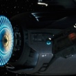
The Starship Enterprise in "Star Trek."


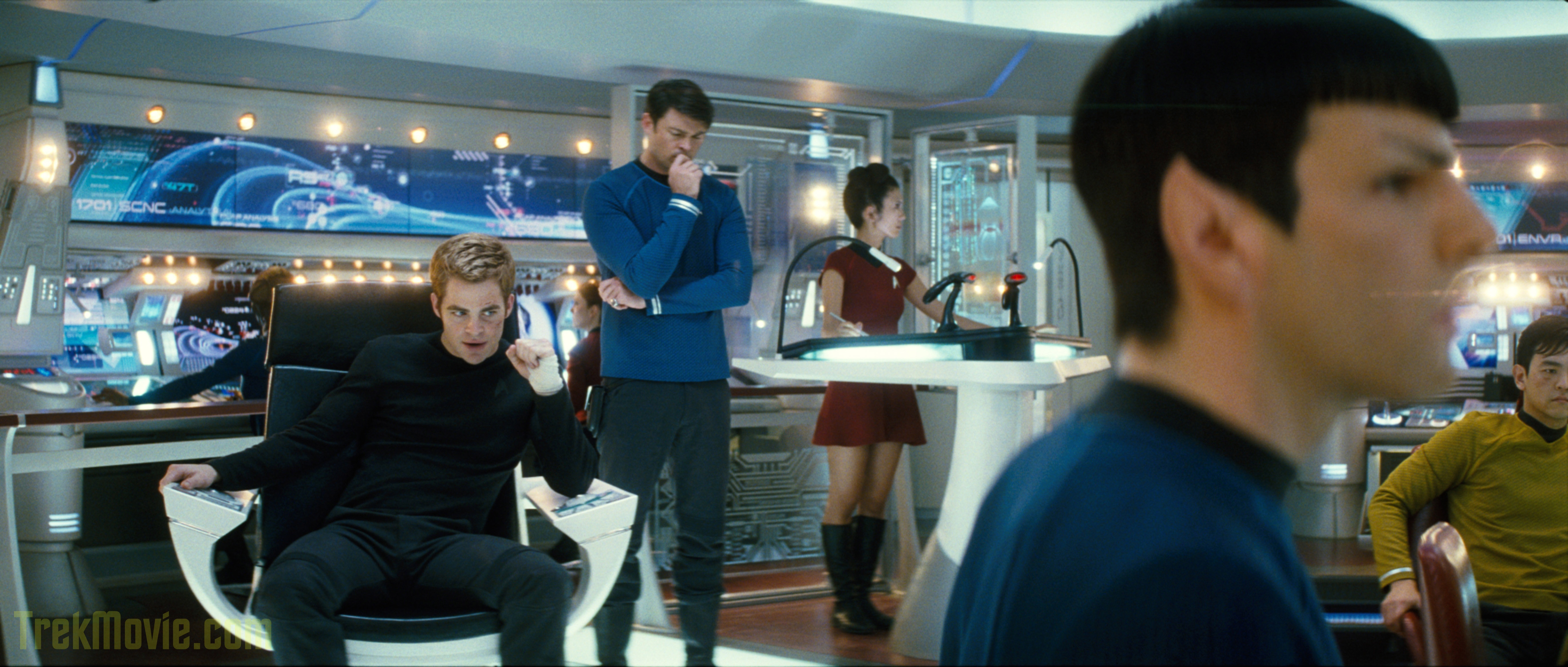
(Left to right) The crew members of the Starship Enterprise include Captain Kirk (Chris Pine), Dr. Leonard "Bones" McCoy (Karl Urban), an unidentified crew member, Spock (Zachary Quinto) and Sulu (John Cho) in "Star Trek.


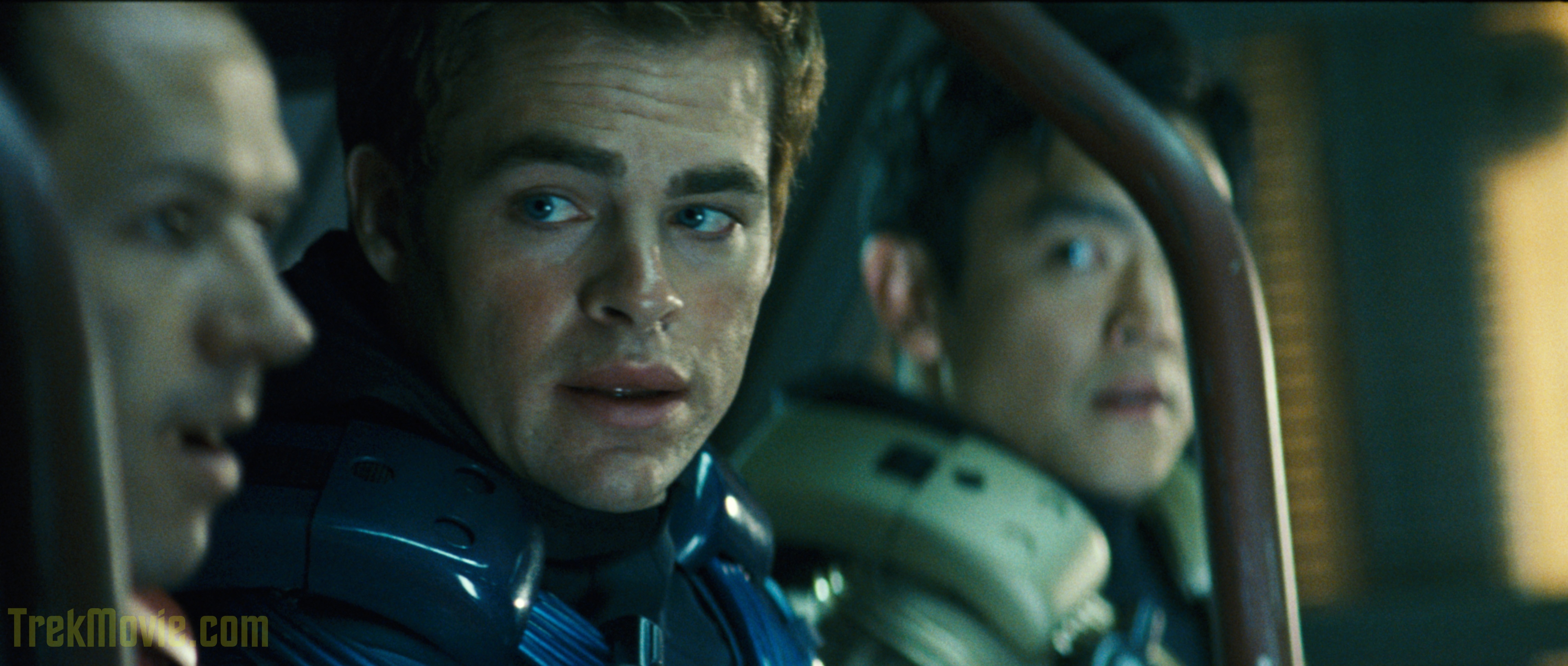
Chris Pine (center) stars as Captain Kirk and John Cho (right) stars as Sulu in "Star Trek."


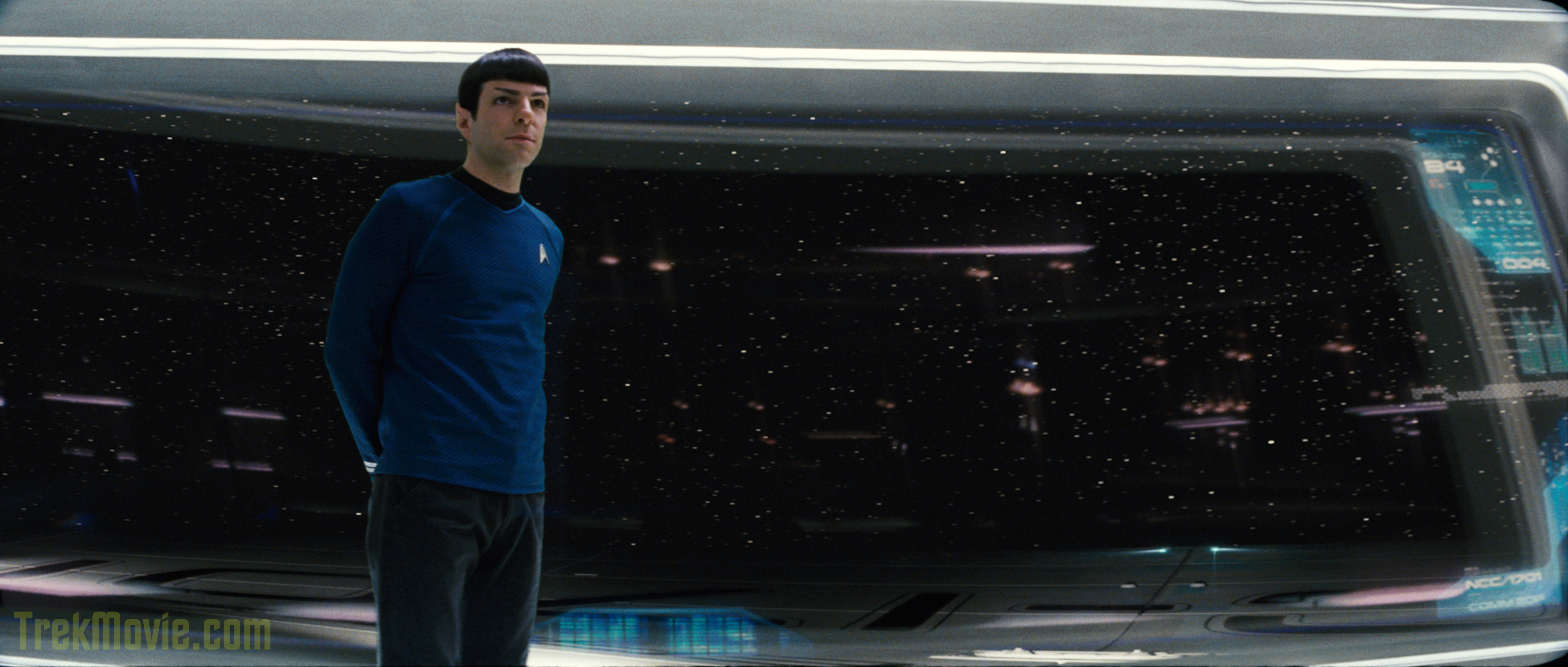
Zachary Quinto stars as Spock in "Star Trek."

Official Paramount ‘one pager’ and synopsis
The Press kit also includes ‘one pagers’ or single page breakdowns of each of the films. The one for "Star Trek" is actually almost identical as the one from the 2008 Press Preview (see Dec. 2007 TrekMovie article). But here it is all the same:

"STAR TREK"
Paramount Pictures and Spyglass Entertainment Present
A Bad Robot Production
"Star Trek"
Executive Producers Bryan Burk Jeffrey Chernov Roberto Orci Alex Kurtzman
Produced by J.J. Abrams Damon Lindelof
Based upon "Star Trek" Created by Gene Roddenberry
Written by Roberto Orci & Alex Kurtzman
Directed by J.J. Abrams

Cast:
John Cho, Ben Cross, Bruce Greenwood, Simon Pegg, Chris Pine, Zachary Quinto, Winona Ryder, Zoe Saldana, Karl Urban, Anton Yelchin, with Eric Bana and Leonard Nimoy

Synopsis:
From director J.J. Abrams ("Mission: Impossible III," "Lost" and "Alias"), producers Damon Lindelof and Bryan Burk and screenwriters Roberto Orci & Alex Kurtzman ("TRANSFORMERS," "MI: III") comes a new vision of the greatest space adventure of all time, "Star Trek," featuring a young, new crew venturing boldly where no one has gone before.

Release:
May 8, 2009

This film has not yet been rated.

CREDITS ARE NOT FINAL AND SUBJECT TO CHANGE

"Star Trek" is a Paramount Pictures Release


Note for credits junkies
The only real change we see here is with regards to the production partner. Sometime during 2008 Paramount switched its Star Trek production partner from Level 1 Entertainment to Spyglass Entertainment. This is very ‘inside baseball’ stuff and has no real impact on the film itself. It is common for studios to bring in financial partners on big budget films to share in the costs (and profits), and for some reason they changed partners in 2008.


Comments»

1. Chain of Command - December 30, 2008

Cool! Very cool

2. Jonny Bombastic - December 30, 2008

This movie looks great… I can’t wait for it to come out!

(first)

3. Mirror Jordan - December 30, 2008

Awesome! I was just looking for a big pic of the new Enterprise this morning. Thanks!

4. Author of "The Vulcan Neck Pinch for Fathers" - December 30, 2008

Wish the shot of the Enterprise didnt have that shuttle in front of the lower hull…

And I noticed that a backside shot of the E from the latest trailer doesn’t, to me, seem to match exactly with the shape of this ship…..hmmm..

5. Jon - December 30, 2008

Wonderful… the new Enterprise is simply gorgeous.

6. Steve T. From NY - December 30, 2008

Are there two E’s? I’m starting to think there might be. Especially with this whole Time thing. I think the movie is an alternate reality due to Nero’s screwing around, and then when all is put right, the “normal” reality we know will be revealed.

I think the last reveal will be an Enterprise that looks far more familliar than this thing we keep seeing. Well, I hope it’s not just wishful thinking..

7. AvonJunkybone - December 30, 2008

Wow you can see 1701 under the dish in that pic, talk about Hi-res

8. Holger - December 30, 2008

Still shocked by this new Enterprise. It just strikes me as wrong.

9. Driver - December 30, 2008

John Cho, aka Sulu, gets first credit?

10. Ensign Ro- (Short for Roland) - December 30, 2008

Wow…you’re not kidding, Anthony, when you say these are super hi-res pics. lol They are HUGE! It’s fun to try and check out the detail. I do like the exterior of the Enterprise (think I’m in the minority on that one). However, I’ll have to see the bridge on the big screen in its entirety to form an opinion on that one. It just seems soooooo white, but then again, I thought the same thing of the TMP bridge when that movie first came out. In any event, seeing this new version of Trek is my big movie experience of 2009…bar none.

Thanks for sharing these pics, Anthony…its always “one stop shopping” here. :-)

11. YARN - December 30, 2008

Yes…

Less quantum legerdemain and more pics!

I am glad they are releasing info slow, but it would be nice ot get a few more angles on the E.

12. Jon - December 30, 2008

At least this ship is recognisably the Enterprise, recognisably, INSTANTLY to even the most hardcore of fans, as a constitution class configuration. Not only did they stick to that- they stuck close as hell to it. They could have gone for a whole new shape. I still think this is not the best shot they could have released, with the wide lens distorting the shape, but eh, it’ll make it all the more beautiful when we see her on the big screen.

13. Anthony Pascale - December 30, 2008

10
yes they are very very high res. as noted, sites like this almost always resize images so that even ‘high’ res would be smaller, but I thought that Trek fans would want to see it all…but bandwidth isn’t cheap so feel free to click a few ads while you are clicking those bandwidth hogs above.

9.
you are joking right?

14. Reign1701A - December 30, 2008

Why is the Enterprise so much darker in this shot? Interesting. Amazing quality though, woohoo!

15. Just askin... - December 30, 2008

Enterprise is fine, just a little jazzed up. Hardly a big deal.

16. T'Cal - December 30, 2008

I should’ve seen it 5 times already! I wish they hadn’t put it off until May, but I understand why they did.

17. Mirror Jordan - December 30, 2008

When I saved the pic of the big E, the thumbnail on my PC shows Spock in front of the viewscreen. But when I click on it, the pic is of the Enterprise. Odd…

18. Nemesis was a good movie - December 30, 2008

I don’t care what anyone thinks of my opinion but personally I think the new Enterprise is a thing of beauty inside and out.
Cant wait for release day :D

19. T'Cal - December 30, 2008

9. Driver – December 30, 2008
John Cho, aka Sulu, gets first credit?

The actors are listed alphabetically with the exception of the big names, Bana and Nimoy.

20. Jon - December 30, 2008

9, heard of alphabetical ordering?

21. Sam Belil - December 30, 2008

I so want to love the “new” Enterprise.
I so want to love the new bridge — but with all those bar-code scanner, looks more like how WalMart will look in the 24th century.
Maybe, just maybe this new look will grow on me …..

OF COURSE this is “reboot”
“comes a new vision of the greatest space adventure of all …..”

22. MikeJones - December 30, 2008

Is Star Trek being shot digitally? If not, why not? I thought its supposed to give higher resolution detail than normal film stock. Whats the score

23. MikeJones - December 30, 2008

These dont seem very hires to me, more like blown up low res jpegs..very grainy..

24. desertrat - December 30, 2008

“CREDITS ARE NOT FINAL AND SUBJECT TO CHANGE”

So we “might” see Shatner in this movie???

Just wantin’ to stir the pot a bit!

/Gotta run!

25. Uhura (Mirror) - December 30, 2008

9 & 22

I was wondering how long it would take for people to start complaining. For some fans, it seems like they just want to hate everything and constantly moan…it is kind of sad

26. John Whorfin - December 30, 2008

Please forgive my possible impertinence, but since these are official Paramount publicity photos, is it really (at all) appropriate to tag them with obtrusive TrekMovie.com watermarks?

These images don’t belong to you, so you shouldn’t really be treating them as proprietary, plus I think most of us would greatly appreciate having them “clean” — just as the studio intended and released them. Thanks.

(And yes, I’m not unsympathetic to your bandwidth expenses, but isn’t that what your site’s ads are for?)

27. Paulaner - December 30, 2008

Talking about time travel and parallel universes, in my opinion there will be a brief cameo of the original TOS Enterprise. I feel it.

28. MikeJones - December 30, 2008

25. Chill. Im loving the shots, loving the trailer and trying to stay spoiler free so I can have a blast come May. I just was questioning if they shot it digitally or why they didn’t, I thought its become cheaper to do it that way than on film and at the same time yield higher res pictures. The ones from Paramount are great but not what I would call HiRes thats all…doesn’t mean Im ‘hating’ it because I called that into question? Im a huggggggggggge fan of this new movie.

thanks

29. Mirror Jordan - December 30, 2008

@ 27

It would be cool if they at least sneak it in the background. Like the Millennium Falcon in First Contact.

30. Daniel Broadway - December 30, 2008

These high resolution images are very nice Anthony, but a waste of bandwidth. You see, movies are usually mastered at 2K, in other words, all film is scanned and edited into a size of about 2048×870, being anamorphic in this case.

So seeing these images at high resolution is nice, but at anything larger than 2048 in width, you are not seeing any extra detail, because it wasn’t there to begin with. Star Trek might be mastered at 4K, but I doubt it, as the effects would become quite expensive at that size.

As to the new Enterprise, at first I hated it, but now I can tolerate it. As a matter of fact, looking at the various components, I think they did an awesome job on the saucer, nacelles, and neck. I’ve come to realize the only thing that bothers me is the odd shape of the secondary hull. If the secondary hull where a mix between what it is now, and the TMP hull, man, they would have knocked this new Enterprise design out of the park.

31. Sam Belil - December 30, 2008

#27 …..I WISH it were TRUE!!! I hate to break this to you, it ain’t happening. There’s a greater chance of Bugs Bunny making a cameo than the original Enterprise. I have said many times before (being an “old-schooler myself). In spite of the changes, looks, etc. etc. — We have to assume that Abrams and company know what they’re doing OR at least know what they’r trying to do.

Fancy sets, images, scenery, trailers will not translate into critical or box-office success!!! Yes many of us have had many grievances and disagreements about this project. ONE THING we can ALL AGREE ON — is that we’re Star Trek fans (be it avid, casual or light), and for that reason alone we should ALL WANT this movie to be a blazing success!!!!!!

32. CmdrR - December 30, 2008

Quinto has a condom in his pocket! Wow, now that’s hi-res!!

33. CmdrR - December 30, 2008

More to the point… how do I maintain the correct aspect ratio when I flagrantly steal the pic of the new E for my wallpaper?

34. That One Guy - December 30, 2008

CmdrR, depending if you have Vista or XP, most likely XP, when you go to the Desktop settings, there should be something that says “Center.”

Or if you really want to edit it down, you can go into Paint and edit the image by moving it around. Or, I can do it for you.

35. hitch1969©, producer of "If I Did It, Jr"- a musical for children, starring children. - December 30, 2008

re 26. John Whorfin – December 30, 2008

AP pays for this site. If you want them without the trekmovie logo, find them elsewhere. It’s that simple, and I dont appreciate people attacking AP for the great site that he provides here. When you attack AP, you are attacking me. I was appalled by that statement, sir. A nice “thank you, AP” would have been much better.

THE WOMEN!!

=h=

36. CmdrR - December 30, 2008

Thanks, TOG. I’ll try your suggestions. I’d have you do it, but then I’d never learn computers. My wife is getting tired of coming in here every time I need her to turn it on.

And whilst I’m being pathetic… I JUST NOW am seeing that the reflection in the nacelle cap is Earth. I mean, DUH, of course, but I can see continents now. WOW!

37. Babel Girl - December 30, 2008

Maybe the shuttle is hiding something?

38. Driver - December 30, 2008

#25 you can’t be serious. How does my faux pas and #22’s post translate to hate? Incredible.

39. Evan - December 30, 2008

21 – I just noticed them and was checking to see if anyone else had.

40. John Whorfin - December 30, 2008

35. hitch1969 – That was totally uncalled for. I wasn’t attacking Anthony in any way — I was making a fair, reasoned and valid query. Chill the frak out. (And btw, we help pay for the site through the advertising, thank you very much.)

41. Butters - December 30, 2008

Looking at those high-res pictures, I just noticed that Karl Urban’s McCoy is wearing a ring on his pinky finger like DeForest Kelley did. That’s a nice little touch that I think fans will appreciate.

42. MORN SPEAKS - December 30, 2008

When they show Earth in the movie I hope they show Florida, like they do in every Sci-Fi movie, especially Trek! Call it selfishness!!!!

43. hitch1969©, producer of "If I Did It, Jr"- a musical for children, starring children. - December 30, 2008

re 40. John Whorfin – December 30, 2008

You know what, you’re right. I am sorry. I just get a little sensitive about people being critical of AP. I guess I defend him in that way. Would you not admit, that in the very least, your comments come across as a bit off-putting and… non-appreciative?

Theres a word for this. Cant think of it … like, if you were AP. And it was you putting this whole thing together, bringing the news, sharing the stories. How would you have taken those comments?

I’m not AP, I am just a good internet friend of AP and I was insulted. I was insulted for AP. And I think that responses like yours would cause me to pull the hi-res images were I him. And then it’s all ruined because of one bad apple, now innit?

Are you capable of seeing this point of view? Sir?

THE WOMEN!!

=h=

44. Robert J. Sawyer - December 30, 2008

And you can see that Kirk’s black shirt does, in fact, have a (darker) black Starfleet delta shield symbol on it in the usual position. Cool!

45. hitch1969©, producer of "If I Did It, Jr"- a musical for children, starring children. - December 30, 2008

addendum – prefacing something with “Please forgive my possible impertinence” IS NOT the same as “With all due respect”; which is basically a license to say anything you want.

And I do say that with all due respect, sir.

=h=

46. jeffery wright - December 30, 2008

that viewscreen could use a reflection suppressor…

i like the idea of the main viewer being an actual window that can display data and communications, but pocketed, zippered trousers are so two centuries ago.

paramount couldnt have released a better angle of the 1701? maybe thats the best angle of the old girl?

i still say that saucer section on that stardrive looks like the head of a pit-bull on the body of a poodle.

47. James Heaney - Wowbagger - December 30, 2008

Vegeta, what does the scouter say about the resolution on those photographs?

It’s over NINE THOUSAAANNNNND!

What?! Nine thousand?!

48. NCC-73515 - December 30, 2008

I don’t see any differences. They may have been rescaled, but there is no more information in them. This is nothing new, I think.

49. James Tiberius "my cabin in the Nexus hasn't depreciated" Kirk - December 30, 2008

WOW –

The CGI E almost looks like a model. NICE!

I like the design lineage from the Kelvin to the Enterprise, too.

50. James Tiberius "my cabin in the Nexus hasn't depreciated" Kirk - December 30, 2008

Holy cow…

You can tell the Simon Pegg is involved with this because, with the high-res photos, Kirk looks like he’s “got wood” in the captains chair.

LOL

51. screaming satellite - December 30, 2008

i wonder if there will be opening credits?

in this age of movies where they start immediatly i doubt it (even Nemesis did away with them)..However if they do I hope theu are listed thus (instead of the alphabetical order):

Pine, Quinto, Urban, Pegg, Saldana, Cho, Yelchin, (as that seems to be the order of importance of Uhura, Sulu and Pavel in this one)…Cross, Ryder, Greenwood, with Bana and Nimoy……….

and William Shatner

52. thorsten - December 30, 2008

There is a NCC 1701 slung around the bottom of the engineering section…
fascinating.

53. John Whorfin - December 30, 2008

43. & 45. hitch1969 — I’m happy to see your point of view just as soon as you’re happy to see mine. ;-) As you noted, I preemptively (and sincerely) asked Anthony’s forgiveness for any possible impertinence on my part in posing my question, for the very reason that I do greatly appreciate this site and all his (and his team’s) hard work on it.

And as for your other question — “How would you have taken those comments?” — well, I never would’ve engendered them in the first place. It simply would never occur to me to take someone else’s intellectual property (i.e. a studio’s copyrighted publicity photos) and put my own watermark on them, hence denoting them as my property.

Hence, my question still stands.

54. Adam Cherry - December 30, 2008

im curious.

did paramount give jpegs highres images or did trekmovie convert them to jpeg?

also my observations with star trek nemesis lead me to believe it was too mission impossible’lite (the buggy scene!?!wtf!?23rdcentury?!wtf!?) or maybe the polar magnetic fields in the planet caused hover technology to fail?

anywhoo now they even have a mission impossible screenwriter :))

funny that.

55. NCC-73515 - December 30, 2008

They should release the department insignia wallpapers… it’s been that long…

56. Ashley - December 30, 2008

baww I was hoping for some new pics lol… still, nice to have the big E, bridge, and the delicious Zachary Quinto and Chris Pine in larger resolution :D

57. Enterprisingguy - December 30, 2008

#43 Hitch:

There’s no need to get worked up. I didn’t think John’s point was either a criticism or being unappreciated. To be honest I thought the same thing when I saw the TrekMovie logo on those pictures.

I appreciate all that Anthony does as well. But I don’t think I would have marked those pictures if I were him. But that’s his choice.

John is entitled to his opinion certainly.

58. Zibri - December 30, 2008

Well.. higher resolution.. they seems rescaled.
Anyhow I spotted 2 shuttles near the ncc 1701.
A very fain one in front and slightly behing the main deflector.

59. NCC-73515 - December 30, 2008

larger resolution… yeah you could blow them up even more without adding more details… I expected more from the title.

60. K Greene - December 30, 2008

Digging that Enterprise more and more.. my biggest complaint was the secondary hull and the deflector dish area. I thought it jutted out too far from the neck. But when I looked at pics of the Enterprise from TOS I realized that the dish area does stick out very far; my thinking and memory was skewed by the Enterprise refit. Ryan Church did a great job in making this a TOS re-design, not a movie Enterprise re-design. I understand that now.. and I really dig it.

61. hitch1969©, producer of "If I Did It, Jr"- a musical for children, starring children. - December 30, 2008

Maybe this is just me. Maybe I’m the freako of the bunch here. Or it could be that I just have a great attitude, respect for others, and display gratitude when I am given something.

All these comments – not hi res enough, “nothing new to see”, the trekmovie logo shouldnt be on them, etc.

Now I am going to say this again, with all due respect. A simple “thank you” would have sufficed. The nitpicking is very unthoughtful and inconsiderate, infact it is inappropriate. AP pays for this site out his pocket and does it for you, for free. He’s like JC™ in that way. Shout out to Phase II.

You folks just aren’t getting it. It’s not in how you are asking, it’s the fact that you are asking at all. Enjoy what has been given you, you spoiled brats. Merry effing Christmas and Ba Humbug to y’all Scrooges. (with all due respect)

=h=

62. Adam E - December 30, 2008

What I really want to know is what the barcode scanners are supposed to be.

63. Jon - December 30, 2008

@61… right with you, and I hate to be disrepsectful myself, but I’ve come to expect no less of many Star Trek ‘fans’ who visit this website.

64. Captain Roy Mustang - December 30, 2008

This is goin to be interesting but cant wait for 2009 Hell ya

65. hitch1969©, producer of "If I Did It, Jr"- a musical for children, starring children. - December 30, 2008

addendum – might i say that it is quite a contradiction to say that you love the trekmovies site and then say that the trekmovie logo shouldnt be on these pictures. because if you love the site, and you love who is giving these to you, you would love the trekmovie logo on the pics just as I do.

its not an intellectual property issue. what AP did is commonplace and it is unfair for you ask him to pay for the bandwidth so that you can have them but then tell him that he can’t take credit for paying for that bandwidth.

i’m a webmaster, too. I know these things. I defend AP not only as a friend but also as a brotherhood of webmasters sort of thing. Only we know the pains and the struggles. Its a shared history that others might not understand.

=h=

66. Devon - December 30, 2008

I want to point out something interesting regarding the Spock/Viewscreen shot.

At first glance this shot appears to be from the Empire Magazine cover.

Here is the Empire shot:
http://www.empireonline.com/images/image_index/hw800/30307.jpg

Now look at the Enterprise Hull and stars in both of these shots.

It seems to be the exact same shot but with a slightly background outside of the view screen. Regardless, notice the sideways “streak” of the stars and the different angles of the top of Enterprise hull. This could suggest one of two things.

1.) It IS indeed a viewscreen (and not a window as had been speculated) and it displays what appears to be a rotating camera image from the bridge POV.

2.) It’s a window and the bridge rotates.

Which one is more feasible?

67. Devon - December 30, 2008

I didn’t mean to say “Empire Magazine Cover” but the “Empire Magazine Article.”

68. Gary Reynolds - December 30, 2008

I never noticed that McCoy is wearing the pinky ring…..just like canon!

69. M-5 COMPUTER - December 30, 2008

Hmmm. A bridge with what appears to be a partially hardwood and/or laminate floor and a viewscreen that is definitely a window (you can see the the writing on the outer hull through it). As Spock might say…Fascinating.

70. Devon - December 30, 2008

#69 – Please refer to my post at #66.

71. 1701 over Gotham City - December 30, 2008

Still hate the hospital/apple store bridge, but now I can hate it with clarity! :)

Interesting to note… Look at McCoy’s ranking stripes (no longer classic military braid…feh)
Rather than a solid strip and a broken strip, it is now a wide band and a thin band. And hats off to classic fan Urban, he is even wearing McCoy’s pinky ring!
He’s also wearing his small medical pack on his hip. Probably just treated Kirk and Sulu for those shiners.

72. Dr. Image - December 30, 2008

Ugh. Film grain. I remember that.
Yes, I wonder why they didn’t shoot digitally?
Film is DEAD- or should be.

I really don’t like diffusion in space shots. It makes no sense.
Digital Domain used a lot of it in Nemesis and it looked very wrong.
Suprising since Apollo 13 looked so great.
Oh well.

73. thorsten - December 30, 2008

@71…

If this is after Chekov beamed Kirk and Spock up from destroying Neros drill, and Pike is on the Narada, then Spock is acting Captain and Kirk First Officer… so Spock should sit in the big chair.

This must be later…

74. konar - December 30, 2008

#16 — interesting theory regarding the possibility of a rotating bridge…

I think we should also consider that the earlier image (for Empire) might have had the effects “rushed” or not quite final — the relections are real and are coming from the set, whereas the Enterprise hull is probably added, which could account for the differences between the two images.

My theory is that the window is fixed, and can become a viewscreen when necessary, just as today’s technology is capable of producing LCD-screens variable opacity. It would be cool if the bridge rotated, but it doesn’t seem too practical.

What I love about the idea of a large, clear “window” is the sheer drama of it — standing where Spock is standing would be an extremely vertiginous experience! And you defintely get a sense of the scale!

As for the Enterprise — I “liked” it before, but these images prompted me to take a closer look, and I have to say I am loving it!

75. JusticeBoy - December 30, 2008

I hadn’t noticed those ridges above the knees in the pants before. That’s interesting.

Oh… and, Thanks, Anthony!

76. Jon - December 30, 2008

66… noticed that too… weird, because it is exactly the same scene, unless that’s an unchanging statue of spock. Did one of the effects guys throw the alignment out of whack in this version?

77. spaceghostjoey - December 30, 2008

that enterprise looks like a bad pimped out ship. Looks like crap

78. Dr. Image - December 30, 2008

Does anyone know if the designer of the Kelvin was mentioned anywhere?
I don’t think it was Church, though I could be wrong.

And yes, the hi-res Enterprise looks great, but it’s just not THE Enterprise.

Kirk: “I assure you, we… WILL… be scanning… ALL…of your barcodes…”

79. thorsten - December 30, 2008

@66…

Devon, the images are identical, the EMPIRE version is edited, it is darker, has a higher contrast and saturation…

it is a window, but the stars are not moving, what you described are reflections of the bridge lights…

80. Jon - December 30, 2008

79 you are incorrect, you can very clearly see the different orientation of the NCC 1701 on the empire image and the new large one.

81. Devon - December 30, 2008

#79 – No, look closer. I know what I am talking about. Look at the hull, namely the hull registry. The center of the registry/hull is more “centered” in the Empire photo, now look at the new one. The center of the upper hull is now to the far right and it is seen at a different angle, along with ALL the stars streaking suddenly.

I can tell the difference between stars and reflections.

Thanks.

82. Devon - December 30, 2008

#76 – I am just speculating, but it could possibly have been an earlier effects shot?

83. OM - December 30, 2008

…Notice that you can actually see McCoy’s medical kit strapped to his hip in the second pic. Good move on getting these onlne, Anthony. Makes up a bit for being a censor :-) :-)

84. NCC-73515 - December 30, 2008

check out the latest TOS version of the trailer (fanmade and excellent):
http://www.youtube.com/watch?v=CqYzV0napYs

all the things like the pinky ring and the medkit are nothing new…

85. thorsten - December 30, 2008

@81…

good for you. I made a gif animation for you anyway,
to point out the changes in the shots.

http://thorstenwulff.com/Spock.gif

86. Doomsponge - December 30, 2008

Bloody hell, CGI’s looking good these days, isn’t it? Must be Transformers’ fault (they crashed ILM trying to render it, so ILM decided to increase their computing power by 50% or so to handle it)

Okay, so thoughts.
1: The Enterprise is a detailed beastie, isn’t she? Not so much in terms of texture, but sort of more in terms of you sort of get an idea of what stuff does with it. I hated it, i’m swinging somewhat swiftly up to loving it, it’s probably only the slightly anorexic secondary hull that’s a little tiny thing, but (unlike some… tut tut. The world’s a wonderful place, stop complaining about little details and go outside and enjoy it!) it’s not really something that bothers me much. If you don’t like it, go look at Ralph McQuarrie’s scetches. There’s ‘raped my childood!!1!!’ for you.

2: Ooh! You can see the upper surfaces of the primary hull in the viewscreen! I like that! (Also, in ‘The Cage’ and ‘Where no man has gone before’ look at the front of the bridge dome. Black rectangle which looks suspiciously like… A WINDOW!)

3: Spock is Vulcan. He can stay exactly as still as he damn well pleases!

4: I don’t think they’ll get rid of pockets. Show me somewhere else that’s convenient to put your wallet. Genetically engineering storage spaces in to the body itself is probably banned after Khan’s silliness. Even so, one of the things I disliked in early TNG was how things were often futuristic for futuristic’s sake. A sort of ‘if it ain’t broke, assume something better will arrive’. If it isn’t broken, don’t fix it.

5: The bridge is growing on me. Those sticky-overy-lampy-thingies, the bauhaus-looking ones illuminating the consoles, are yet another little Cage hint. What IS fun is how the continuity seems to be nadhering surprisingly well in terms of visual nods and hints to the two pilots- the rank stripes being solid bands instead of braid, the desk lamps… I wonder if there are two little black stripes on the extreme port and starboard sides of the dorsal primary hull?

87. Todd Vaziri - December 30, 2008

#74, Konar wrote:
I think we should also consider that the earlier image (for Empire) might have had the effects “rushed” or not quite final.

“Not quite final” is correct, but in reverse. The Empire shot is actually the final shot. I think.

-todd

88. thorsten - December 30, 2008

@87…

Yep, I think so, too.
About the Empire shot.

89. Devon - December 30, 2008

#87 – I am not saying you are wrong, and you could be right, just curious what your line of thinking is that the Empire Shot being the “final shot?”

90. thorsten - December 30, 2008

@89…

It looks more polished.

91. Odkin - December 30, 2008

“…venturing boldly where no one has gone before.”
Are they really that tone-deaf in marketing? They have one of the most recognizable tag lines in history at their disposal and they tinker with it?

92. Mark Rademaker - December 30, 2008

#89: probably because it’s aligned right, and the entire hull is cut nicely into the window/viewscreen thingy. (the other one is washing trough)

God I hate analyzing, but I have nothing better to do while waiting for a render. :)

93. deekay - December 30, 2008

these are no highres, just blown up to high size. it´s all blurred…where are the details? :)

people who say, that these are highres, never saw highres pics before.

94. thorsten - December 30, 2008

@93…

but the detail is all there, deekay.
Reduce the filesize to 2500 pixel and unsharp mask the images,
the quality is amazing.

95. Katarian Eggs - December 30, 2008

#6 – Steve T from NY

I hope so too, but I have a bad feeling that it won’t happen.
That shot of Kirk in the gold uniform saying “buckle up” in the trailer is clearly an ending shot; my guess is it’s the last line before they warp out at the end & the Walmart checkout bridge is still the same. :(
Since when did the bridge have a gift shop?

I actually like some of the redesign like Kirk’s chair looks good, makes sense as an updated version of the original. The Kelvin fits in with an updated look for TOS era vessels perfectly, so why does the Enterprise look like it was designed by George Clinton on an acid trip?!

It would be great if everything snapped back to normal at the end, with a certain amount of modernization, of course. But I think Orci’s weak & scientifically questionable, quantum mechanics excuse makes it clear that this reboot takes place through the looking glass!
This was probably done so they can make a new Khan movie for the sequel, which is guaranteed to be a screwed up version of Space Seed.
Maybe they can getb Lorenzo Lamas to play Khan!!
:)

96. Pimp My Mego! - December 30, 2008

Nothing new!

97. Sam Belil - December 30, 2008

#95, you’re so right!!!
This is the Enterprise we’re stuck with for (if there are any) future movies.
When I first saw the trailer and saw the part where Kirk says buckle up, I told my son that’s the final scene (it was obvious to me).
Yes — it’s the WalMart bridge not the iBridge
Gift shop — hey Starfleet has the right to make some extra bucks!
I keep looking, looking and looking at the new “E”, and still I can only sense disappointment, I’m NOT digging it!
No way everything “snaps back to normal” (other posts have suggested that), to borrow a phrase, “it is what it is”.
I do not expect to see any surprises (I could be wrong) at the end of this film.
Lets face it, the film is a DONE DEAL — I look forward to “Judgement Day” on May 9, 2009.

98. Magic_Al - December 30, 2008

The resolution definitely exceeds what is there. Better too much than too little I guess!

Looking at the ship up close I’d say Andrew Probert deserves just as much credit as Matt Jeffries for “prior art” in this design. The detailing, compared to the TOS Enterprise, is almost identical to what Probert added the first time the ship had to be dressed up for the big screen. The “JJ” Enterprise looks like what Probert might have come up with if Probert had started from the TOS design instead of from Jeffries’ Phase II design.

99. Will H. - December 30, 2008

Any complaints I have about those pics has already been said, so I’ll just mention a couple things I never noticed before. The bottom of the nav dome looks more like the TOS enterprise now being that I can see that its partly clear and shiny instead of just solid like the TMP. I actually like the dish better now that I have a better look at it. The torpedo launcher, just looks strange, like its a cheap knockoff of the TMP launchers, but Im only seeing one tube, maybe explaining why its smaller. Im wondering, since the neck of the ship seems a tiny bit thicker, weather we’ll be seeing a vert core or something more out of ENT in the engine room. Also, in the bridge pic, I just noticed that it looks like an alien sitting behind kirk. At first I thought it was a woman with poofy hair, but its wearing long sleeves, so Im thinking alien with a big dome.

100. Magic_Al - December 30, 2008

One more Andrew Probert comment: When Probert designed the Enterprise-D, Probert recycled his OWN ideas much, much less than the new ship does!

101. everyday_ponn_far - December 30, 2008

Larger images, but not much more detail.

Like most of you, the new Enterprise’s design is starting to grow on me too, except for the anorexic hull. Some of you are saying that there could be MORE THAN ONE Enterprise – That’s something i would really like to see. maybe the E with the original design before Nero decided to screw around with the timeline.

If you remember, Abrams said something about the ways things look is because of the timetravel bit.

102. Devon - December 30, 2008

“#89: probably because it’s aligned right, ”

Aligned right as in aligned correctly, or aligned to the right (that this one is?)

If it’s the latter, I see no reason, given the streaking stars, that it could be a viewer camera panning around saucer.

103. MikeJones - December 30, 2008

93: thats what I said about 80 posts ago

104. McCoy's Gall Bladder - December 30, 2008

Too Weird MAN

What’s next, spinner rims, fuzzy dice and leopard print seat covers?

105. konar - December 30, 2008

I took a closer look after an opinion was ventured that perhaps the Empire version was the later version — and while I believe it’s relatively impossible to judge which is later unless we were looking at everything on the same monitor, I DID notice something that supports the camera vs. actual window theory — look carefully at the upper rim of the “screen” and you’ll see stars where between the glass and the thickness of the hull — which would seem to support a semi-transparent projection onto glass. It’s visible in both versions.

Also, I’m looking and looking, and I can’t for the life of me see any streaking stars. What am I missing?

#78 — LOLZ! — “Kirk: “I assure you, we… WILL… be scanning… ALL…of your barcodes…””

106. Clawhammer - December 30, 2008

@102:
Well I guess they did not render the extra exterior image because they only want to use the correctly aligned image. So a panning camera is pretty much an option.

*sleeps

107. Karen Tow - December 30, 2008

Can’t wait! That looks sooo cool!

108. Robert H. - December 30, 2008

I get the funny feeling the Enterprise shot is the one where McCoy is looking at the Enterprise, from another still floating around the internet.

109. 750 Mang - December 30, 2008

Thanks for the big pics.

Karl Urban is McCoy in that bridge shot – very cool.

Remember the Farragut!

110. Nathan - December 30, 2008

I still don’t really like the New Enterprise… and I still think it would have been really, really cool to see the actual old Enterprise design, spiffed up and slightly modernized, shooting around the screen in all the CGI glory ILM could muster. Ditto for the New Bridge.

Ah, well…it’s really only a minor issue, in the scheme of things. In the long run, I doubt it’ll have much to do with my liking/disliking of this film. It’ll be the plot and/or characterizations that will determine that…

111. MikeJones - December 30, 2008

Can we have a shot of the Enterprise without that damn shuttle in the way its driving me NUTS..PLEASE?!!!!!!!!!!!!!!!!!!!!!!!!!!!!!!!!!!!!!!!!!!!

Can we have a shot of the Enterprise without that damn shuttle in the way its driving me NUTS..PLEASE?!!!!!!!!!!!!!!!!!!!!!!!!!!!!!!!!!!!!!!!!!!!

Can we have a shot of the Enterprise without that damn shuttle in the way its driving me NUTS..PLEASE?!!!!!!!!!!!!!!!!!!!!!!!!!!!!!!!!!!!!!!!!!!!

Can we have a shot of the Enterprise without that damn shuttle in the way its driving me NUTS..PLEASE?!!!!!!!!!!!!!!!!!!!!!!!!!!!!!!!!!!!!!!!!!!!

112. Babel Girl - December 30, 2008

One thing I see is that from the outside of the ship, it looks like the warp core is vertical, like in TMP and not horizontal like in ENT or TOS.

113. Nathan - December 30, 2008

Addendum: Oh, and props to ILM: the CGI effects are excellent. The Enterprise could be a real studio model, sitting in Image G waiting to be rigged, for all I can tell. Bravo…

And I should add that, while I vastly prefer the original, I really don’t actually dislike the New Enterprise design much…it’ll work.

Here’s to seeing it on the big screen!

114. patrick - December 30, 2008

Enterprise looks great… I sent my wife (not a Trek fan) the composite shot of TOS, TMP & “new” ship, and her response was “aren’t they all the same ship.” I think that’s EXACTLY what JJ is going for. Updated, familiar, but with that shiny, new feeling. I do think there are surprises in store for the “timeline” scenario before the end of the movie… Canon rules!

115. harris250 - December 30, 2008

Just thinking….if the time line changed after Nero destroyed the Kelvin, it makes sense that the new Enterprise would not look like what we think it should. The Kelvin design has a lot in common with TOS Enterprise. What I’m saying is that the new E in these pics are of the next generation ship but “slightly different” to account for the change in time line. If Nero never made an appearance the Constitution class would have followed more closely the Kelvin….

116. Balok - December 30, 2008

Thanks for the pics. Intersting to see a few more details on the E, still not liking it, a big step down form TOS E.

Also liking the high res photo of the red skirt, nice zoom action!

117. Devon - December 30, 2008

#105 – View the image at 100 Percent. You will see a slightly horizontal blur to the stars.

118. konar - December 30, 2008

I just went back and watched the trailer again. I don’t know what it is, but I guess the saturation with images lately led me to somehow pay more attention to other details — namely, the VO:

(of Spock) “You will always be a child of two worlds. The question is, which path will you choose.”

Wow — think about the double meaning there — referring to both his heritage — and some kind of monumental choice he will have to make regarding which “future” — WOW — I mean it might be “duh” to others, but that really put the potential depth of the Spock story in this movie into perspective for me.

119. Elrond L - December 30, 2008

As a photographer, I am loving these. Thanks, Anthony.

Still love the new E (and now I see the “NCC-1701″ below the dish).

120. Captain Archer - December 30, 2008

So there are TWO turbolifts on the bridge. You can see its doors behind the woman in the red shirt.

121. sean - December 30, 2008

#26

It is commonplace for sites to watermark pictures provided courtesy of their own bandwidth (especially when a photo is ‘exclusive’). This is far from unusual. If Paramount objected, they’d surely speak up as it’s clear they monitor this site often. Ads help pay for bandwidth, but only if someone is clicking on them.

I’d say Anthony actually exercised considerable restraint, as the watermarks are far from intrusive. Most sites would plaster them across the content of the photo itself (across the Enterprise, for instance).

122. MikeJones - December 30, 2008

121: which could also be caused by the camera panning/moving in the shot. Duh.

123. sean - December 30, 2008

#121

I’m going to go out on a limb and guess you responded to the wrong comment.

124. spaceghostjoey - December 30, 2008

your alllllll gay

125. Buddykarl - December 30, 2008

Thanks for the HR pics, Anthony. I clicked on all of the ads on this page and will click on a few on the other pages too. I know all to well the need for viewers to help out with clicks to help generate revenue…now if only I could generate readers for my webcomic, regular visiting, ad clicking readers….lol

Thanks again for the pics to explore up close and personal!

126. P Technobabble - December 30, 2008

114 – Patrick
I agree with you and your wife’s honest appraisal. Since the first time I saw the new pic, I said, “It’s the Enterprise.” No matter how much you wanna pick at it, criticize it, analyze it, when you look at it you see the Enterprise. Beyond that, I have no idea what all the fuss is about.

Oh, wait… the nacelles aren’t pitched at the right angle… the deflector dish isn’t clean enough to eat off of… the hull should have .5% more gray in its coloring… one of the docking hatches on the secondary hull is 1/4″ to the left of where it should be… there’s a white light where a red one should be, and a red one where a white one should be, and…. oh my god, I’m going to implode!!!!!!!!!!!!!!

127. Admiral_BlackCat - December 30, 2008

Love it! The new E is perfect, the bridge is ultra high tech, hope we get to see sparks and flames when this new shiny, glossy bridge gets battle damage! Anthony trekmovie rocks!
And a windshield on top of the saucer section looking out at that long flat surface, nice imagery.
I’m sold. ;)

128. spaceghostjoey - December 30, 2008

how can anyone think that this enterprise is better than the TMP enterprise or any of the other ones. This thing is the dumbest looking ship in all the Sci-fi movies ever made.This alone will keep me away from the theater.

129. Dr. Image - December 30, 2008

#124- Except for me, who can’t get enough of the bridge hostess in the red miniskirt;)

130. Kev - December 30, 2008

to me this ship (the new enterprise) is like the new ferrari 599, good looking, modern, and a hell of a lot better looking than a scion xb, which would be in star trek terms the akira prise, but not beautiful like the ferrari daytona which to me in star trek terms is the enterprise tmp refit.

131. Fubamushu - December 30, 2008

For me, the new design of the Enterprise clearly is a Federation design. When or where in the timeline I could not tell you. More importantly while it is a great looking Federation starship, it is not the Enterprise.

132. McCoy's Gall Bladder - December 30, 2008

All of this reminds me of hte old warner bros cartoon featuring a black cat attempting to seduce a white cat which is really a puppet on the hand of a brown cat, who is trying to kill the black cat.

The Black cat, seduces, smooches and feels up the puppet, caressing her back, down the brown cat’s arm, finally his hand touches the brown cat’s nose, honks it twice and breaks the fourth wall by declaring to the audience:

“Well, wouldn’t you know? SOMETHING NEW has been added!”

The joke is funny to those who know what female anatomy is supposed to feel like.

This isnt the Enterprise I know.

133. Fubamushu - December 30, 2008

OH, and speaking of HD:

And now to answer your last question, “What is the resolution of the movies shown in theaters?” This one isn’t as easy to answer because well, there is no fixed answer. Film stock isn’t bound by the same rules that make up the pixels in a frame of video. Most of the data I’ll cite from here on out comes from a great study done by the International Telecommunications Union, specifically sub-group 6 which deals with large screen digital imagery. Their study titled ‘Image resolution of 35mm film used in theatrical presentation’ is as close to the definitive word as I’ve found on the subject.

One thing to keep in mind is that analog film has no ‘lines of resolution’ as we know them in the video world, but it is possible to arrive at a comparative resolution by using a resolution-chart in the frame that equates to fixed video resolutions.

The study indicated a 35mm negative has a resolution in excess of 2400 lines by picture height but obviously we don’t watch negatives, the film has to be processed into a stock reel. Those tested stock reels were found to have a maximum comparative line resolution of 1400 lines P/H, still considerably more resolution than 1080p’s vertical integer. (Note: the P/H formula is used because film has the same vertical and horizontal resolution, where video does not.)

Luckily the study also included real-world data collected at a sampling of movie houses. I say luckily because no matter how good the film stock, the theater’s equipment plays just as much into how the projected image looks as the film itself.

This part of the study only reinforces my anticipation for high definition DVD as the numbers indicated what we’re seeing at the theater in many cases falls short of 1080p. The study indicated a comparative, average line resolution of between 685 lines and 875 lines P/H. But again don’t let these numbers alarm you as the film stock itself is more than capable of bettering HDTV, it seems it’s the movie houses that have been letting us down.

http://www.hometheaterblog.com/hometheater/2006/04/mailbag-hd-movies-and-the-resolution-of-film/

(And that is why film is not dead.)

134. Enterprise - December 30, 2008

Wow, way to over think everything.

135. Jefferies Tuber - December 30, 2008

RE: 84. NCC-73515 – December 30, 2008
check out the latest TOS version of the trailer (fanmade and excellent):
http://www.youtube.com/watch?v=CqYzV0napYs

That TOS trailer is totally bad ass.

Has anyone figured out how a female officer denotes rank when she’s wearing the short sleeved miniskirt?

136. SteveinSF - December 30, 2008

You know, the Enterprise is just not right. I just can’t get used to it.

137. S. John Ross - December 30, 2008

I wonder if it’s intentional symbolism that the E’s secondary hull looks unusually waspy while James T. Kirk looks unusually WASPy.

138. S. John Ross - December 30, 2008

#135: Olfactory insignia — Special rank-indicative perfume placed just behind the ear, at the elbows, and at the hemline. Rrrrrowl.

139. McCoy's Gall Bladder - December 30, 2008

ooo er

I wish they had that in the Air Force…

140. McCoy's Gall Bladder - December 30, 2008

She’s just a redshirt,

when the viewscreen/window cracks, she’s the one that gets sucked out…

poor yeoman whatzername

141. McCoy's Gall Bladder - December 30, 2008

I like the TOS trailer, it’s exciting!

Och, poor Scotty, I knew him Horatio…

142. sean - December 30, 2008

#84

Hilarious! And likely the only way anyone could ever force me to watch any part of A Piece of the Action again. :)

143. sean - December 30, 2008

As for the new Enterprise, I quite like it. Don’t know why anyone else wouldn’t, but to each their own.

144. hitch1969© speaks with wise tongue™. - December 30, 2008

Thorsten Howell The 3rd,

Thanks for the gif – that demonstrates the differences perfectly.

Notice that the star field to the left of spock is basically unchanged, but to the right of him it is different.

and the ncc-1701 is definitely at a different angle. lol – does the saucer spin? or the bridge rotate on the saucer?

i’ve been analyzing like the zapruder film. thank god that you guys went back and compared it to the empire mag one. I just assumed it was the exact same shot.

=h=

145. Dude - December 30, 2008

@72

Film will be dead when digital reaches the same white to black range as film. As of right now, the average 35mm disposable camera has a higher resolution than ALL consumer level digital photographic devices, video or otherwise. Professional film equipment holds the same advantage.

If you want all your films to look like collateral and Miami Vice, enjoy.

Next topic.

146. OneBuckFilms - December 30, 2008

144 – I think it is, but they must have redone it.

Things get tweaked in post often.

147. thorsten - December 30, 2008

@145…
well, Dude, you can use one of these…

http://www.red.com/cameras/

148. Pah Wraith - December 31, 2008

145
and
147

This company promised to release Scarlet 3000P (sic!) and it’s supposed to be available 2009 at a much more affordable <$4000.
http://forum.indymogul.com/showpost.php?s=c10b53d36030db9ca5cf93604b6596b2&p=109764&postcount=7

149. Binker - December 31, 2008

Holy Sh!t
I just realized something (please dont post me as stupid). For a long time, I’ve been poiting out that there seemed to be something off around the dish/secondary haul. Thanks to these new images, we can actualyl see that ITS A SMALL SHIP COVERING THAT PART OF THE ENTERPRISE. You can tell because the window is cut off, and for a long time it seemed this was something “new” that made no sense, nor looked no sense.

Now Paramount, could you release a version of the ship from that image with NO OTHER SHIPS, and speaking of which could you start releasing new images of the Enterprise now?

In the meantime, is there anyone here that could edit that image by taking out that ship, using what the E looks like from the trailer?

150. thorsten - December 31, 2008

@150–

Binker, you want the shuttle edited out from the foreground?

151. thorsten - December 31, 2008

haha,
sorry,
referenced myself
;))

@149!

152. thorsten - December 31, 2008

@149…

here you go, Binker…

quick and dirty Phptoshop job ;))

http://thorstenwulff.com/1701X.jpg

153. captain_neill - December 31, 2008

Why is John Cho gettingtop billing and not Pine and Quinto, just as Shatner and Nimoy gott op billing?

Captain always gets top billing. Pics look great although I am still not liking the bridge.

When the movie hits sure I will love it.

154. captain_neill - December 31, 2008

why is the registry not on the bottom of the sauucer section?

155. Mark Lynch - December 31, 2008

Until it says ‘NCC-1701′ on the underside of the primary hull, it ain’t the enterprise.

156. Remco (Netherlands) - December 31, 2008

Very nice photos indeed. But please remove the TrekMovie.com logo. It has nothing to do with Paramount.

157. hitch1969© speaks with wise tongue™. - December 31, 2008

I’m sorry but the trekmovies dot com logo is not negotiable, as previously discussed.

However, you will not be charged for your initial 8mb download allocation.

How’s that for a nice tradeoff?

hitch1969 (USA)

158. Sean - December 31, 2008

That Enterprise still looks horrible! The whole movie has a Transformers/EP1 look to it. Very sad!

159. thorsten - December 31, 2008

@92…

so, Mark, you were just rendering the Aventine, hmm?

160. AdamTrek - December 31, 2008

#153

The cast are in alphabetical order, not preferential billing order, for a lack of a better term.

161. CmdrR - December 31, 2008

Are those velco strips on the guys’ left knees? Um… why? Kinda miss the Jupiter rings on the pants, too. I suppose that’s dated, but it’s cool sci-fi.

162. CmdrR - December 31, 2008

d’oh… Saturn rings…

163. Nozzer - December 31, 2008

Has anyone else noticed that the blue deflector dish seems to be made of ‘pure energy’ – ie it does not have an underlying structure of metal and seems to be ‘projected’ from the the central hub at the front of the engineering section. The high res images make this easy to see – I expect that there will be some sort of cool deflector activation effect in the movie when the dish it activated. I quite like this idea if it is true – I thought the jutting deflector dish looked fragile compared with the recessed dish of the Motion Picture, but if the dish is made of energy this wouldn’t matter.

I was reading an inteview with the designer of the new ship and he dropped some hints about the nacelles which got me thinking. Those shiny structure at the tip of the nacelle seem to be glass or crystal (or transparent aluminium!) and his hints led me to think that they will pop out and light up (presumably orange) before the ship goes into warp, which is another nice idea that will look cool on screen.

164. hitch1969© speaks with wise tongue™. - December 31, 2008

i heard those flaps on the nacelles flip out hence the comment last year about the enterprise having wings

you know what, its good.

just looking at the hi res shots of the bridge, spock by the window, and the enterprise – definitely gives you the feel that the ship is as massive as chris pine is in his underoos.

the women!!

=h=

165. Tanner waterbury - December 31, 2008

THEY FINALLY HAVE POCKETS! Look at Sylar Spocks pants, and it seems they have zippers too. About time they added those!

166. Doug in Kabul, Afghanistan - December 31, 2008

#53: the watermarked logo is no more, no less, a sign of the times.

I mean tell me one TV show, one news program, one entertainment TV program that does not insert its identifying logo. I know if Entertinment Tonight has shown any TREK spoilers, it has the ET logo somewhere on the screen.

You may not like it, but it’s just the way it is.

AND

Happy New Years from Afghanistan, everyone (where as I write this it is 7:10 p.m., nine and a half hours ahead of you folks on the east coast)!

167. earthclanbootstrap - December 31, 2008

At the end of the day I still just think this ship is FUGLY. I expected the Big E to be redesigned (although a beautifully rendered classic Jeffries design would have sent me over the moon). I just didn’t think it would look like the USS Frankenstein. And before the gushers complain about me being a hate filled atavistic canonista, this is strictly an aesthetic reaction. I’m not proposing that Mr. Church set out to intentionally design a ship that rapes my childhood or anything. It. just. looks. ugly. to. me.

168. John Gill - December 31, 2008

Thanks so much for these larger pics! Although, I can now see that they did not keep with Gene’s vision and mandate that Starfleet Pants Uniforms would never have pockets…

169. Babel Girl - December 31, 2008

Here’s an image from Trekcore.
http://movies.trekcore.com/gallery/albums/xi/screencaps/trailer/trailer042.jpg

170. earthclanbootstrap - December 31, 2008

#167 – Don’t forget that he also outlawed buttons and zippers. That always kind of made me chuckle…

171. thorsten - December 31, 2008

@165…

Hi Doug, from freezin germany… 4:30 PM
how is the weather in Kabul?

172. NCC-73515 - December 31, 2008

Screen says NCC/1701 instead of NCC-1701 … :S

173. Star TRackie - December 31, 2008

#164 “THEY FINALLY HAVE POCKETS! ”

Actually they always had pockets, they just never used them onscreen. Check out Scotty as he is working on the controls of the Shuttlecraft in Galileo 7. You can clearly see the opening and white cloth interior of his pocket.

Love the pics, and it’s great to finally see the detail of the ship. I like it, but I really miss the red pin striping on the engines and secondary hull. A little splash of color would have really gone a long way to connecting the ship to the original.

174. sean - December 31, 2008

#162

I’m not sure what you’re seeing, but there’s definitely a physical connection between the dish and the ship. And the dish itself is clearly a physical part, this can be seen in the images of the ship’s construction in the trailer.

175. pafan - December 31, 2008

I would give the “new” 1701 a grade of C. I like the fact that they incorporated features of the refitted Enterprise from TMP because that is my favorite Enterprise. However, the secondary hull/deflector dish area projects too far out in front of the ship. It spoils her good looks. That is my biggest gripe.

pafan

176. Chadwick - December 31, 2008

That’s what I want to know, what the hell are those black handles with the red lights on them? At the helm and the consoles to the left and right of the captains chair. Some kind of internal ship communications? Take a break play some video games?

31. Sam Belil could not have said it better myself.

110. Nathan I agree but I am still not opposed to this new ship, she looks great.

The images are not really high res but still nice to have these large shots. As to the new Enterprise, never really hated it, hate is too strong, too negative. At first I was shocked neither good nor bad, just shocked at how different it was, not like the TOS at all. I thought for sure we would get the TOS with some ILM tweaks to make it look incredible. Then I looked closer, “ah the blue dish and the saucer were TMP.” I don’t know why the neck and placement of the nacelle pylons bother people so much, to me it looks much more tight and battle ready. I don’t know how the placement of the neck could bother people when the nacelles are more most odd looking, something about that swoop on the bottom which I assume are the bussards. Its not that the neck is THAT much further back but the deflector protrudes much more give the illusion the neck is further back. Movies, it’s all about tricking you. For me those nacelles were the most unusual change, not the bloody neck, but the nacelles have grown on me. Even though the Enterprise was not TOS I wasn’t hostile or hateful to it, my first thought was “my god what is going on here, these guys are going to butcher Star Trek.” My first thought was “wow if the Enterprise looks so different there must be parallel universes and time travel involved in this movie,” and I let it go, and I was right. I didn’t really want to see the same thing AGAIN, I like change. I am not going to burst blood vessels because it is not the TOS enterprise and everything is different, this is Star Trek and I am a Trek fan, and that’s it.

People enough with the Apple store analogies, sorry but looks nothing like it. Just because everything is smooth and white its kind of pathetic to make an Apple analogy. I only hope the computers on the Enterprise are some future incarnation of Apple computers lol, teach you generic PC and Windows lovers a thing or two.

P.S. computers on the U.S. space shuttle are Apple. There is no comparison to Apple.

177. Paulaner - December 31, 2008

#175 “People enough with the Apple store analogies, sorry but looks nothing like it”

Yes, that’s a strange comparison to me. And what about all the strange references to “barcode scanners” ?? I don’t see any barcode scanner. The barcode scanners I know are _way_ different ;)

178. thorsten - December 31, 2008

@175…

The movie was made on macs, Chadwick…
JJ lugs around MacBooks all the time, and Bob Orci writes on one

Think Different!

;))

179. Balok - December 31, 2008

#135, this is great!!!

180. John Whorfin - December 31, 2008

157. hitch1969 – It’s delusional for you to presume to decree that the TrekMovie.com watermark is “not negotiable”. By your own previous admission, you have no authority to speak on this site’s behalf. As for your bandwidth argument, there are plenty of free file hosting options available that make that an entirely moot point.

Look, if these photos were _exclusive_ to TrekMovie – like how the original batch of pics were exclusively distributed to individual sites when initially released – then obviously it’d be entirely appropriate for TrekMovie to put a proprietary watermark on them. But as Anthony made clear in the very first sentence of this article, these are publicity photos that Paramount’s just released to all media outlets. Therefore I think it is questionable at best and highly inappropriate at worst for anyone other than the copyright owner (the studio) to put any sort of proprietary watermark on them. Just because TrekMovie is redistributing them on their server (and, again, they could use a free service if bandwidth is a concern) does not change that.

#165 Doug – That’s an irrelevant, inapplicable comparison. A TV show’s bottom corner watermark is at best comparable to a website’s logo on the website itself. Show me an example of a TV show redistributing highest-resolution-available files of someone else’s publicity photos (or a trailer) that the viewer can save to their computer, but embedded with the show’s watermark, and then we’ll talk.

At this point I’ve already managed to get ahold of the watermark-free versions of the files, but I still think there’s a matter of principle here. I’d be very interested to hear Anthony address it, and articulate TrekMovie’s official editorial policy regarding it.

181. Elise - December 31, 2008

Can any one point how you can tell the rank of the female crew members? They don’t seem to have any braids.

182. Lord Garth, Formerly Of Izar - December 31, 2008

Bigger Clearer and even more Blah. Look at those caps for God’s sake they look like jeweled motorcycle tail lights!!! I know I had similar lights on my Harley!! God I want to like it. But this bigger clearer pic makes me like it even less.

Thank the lord for refits because it’s not just a bad angle folks even though the apologist Nazi’s would claim that it is. THis ship does not look good. Maybe from the front or rear it will but it does not look good from a very key angle. Sorry , don’t want to offend anyone who really likes it. But when our top in house CGI artists are every bit agast as me then there is a problem.

183. RD - December 31, 2008

Paramount’s evil plan is working. The more I see it, the more I accept it. It’s starting to look like it always has been part of canon.

184. Lord Garth, Formerly Of Izar - December 31, 2008

And another thing; The cordless powerdrill and mounting arm things with red lenses sitting awkardly on the bridge consoles look really really dumb and out of place. I’d like the bridge if not for these odd looking and terribly distracting cordless powerdrill thingies drawing my eye and sticking out as much of a sore thumb as a velvet dogs playing poker painting in a Frank Lloyd Wright house. Please paint them out they look quite stupid. If they are important they should go in a drawer

185. earthclanbootstrap - December 31, 2008

#183. “velvet dogs playing poker painting in a Frank Lloyd Wright house.”

Priceless!!! (But stomach churning at the same time…)

186. Dr. Image - December 31, 2008

#145- Dude qquote:
@72

“Film will be dead when digital reaches the same white to black range as film. As of right now, the average 35mm disposable camera has a higher resolution than ALL consumer level digital photographic devices, video or otherwise. Professional film equipment holds the same advantage.

If you want all your films to look like collateral and Miami Vice, enjoy.

Next topic.”

BWAAHAHAHAAA!!!!
You are talking to someone who has worked as a professional photographer for thirty YEARS.
So… I tend to disagree.

And no, I’d expect it to look at least as good as Superman Returns or Episode III.

Next topic, “Dude.”

187. hitch1969© speaks with wise tongue™. - December 31, 2008

re: 179. John Whorfin – December 31, 2008

Whorfin Mighty Morphin Endorphin™, my old friend. Ahhh yes. I’ve done far worse than watermark your precious hi res photographs. And I wish to go on, watermarking your precious high resolution non-proprietary. I shall leave you, as you left me… as you left AP… trekmovies dot com…. trekmovies dot com… trek movies dot com…..

THE WOMEN!!

=h=

188. earthclanbootstrap - December 31, 2008

re: #186. hitch1969© speaks with wise tongue™. – December 31, 2008
re: 179. John Whorfin – December 31, 2008

HHHHHHHHIIIIIIIIIIIIIIIIIIIIIITTTTTTTTTTTCCCCCCCCHHHHHHHHH!!!!!!!!!!!!

189. classictrek - December 31, 2008

this is just what i feared.

whats all this ‘where no ONE has gone before nonsense’?

this is the original series. Its ‘where no MAN has gone before’. My first real dissapointment about this film. its wrong. this is not TNG.

theres no one been more hyped about this film than me – just ask my work colleagues! but this issue was important to me. dissapointed.

Greg
UK

190. Gregory Limardi - December 31, 2008

Pine looks like a little kid sitting in dads chair

191. Xplodin' Nacelle - December 31, 2008

I noticed that the secondary hull has 1701 wriiten on it below the deflector, & there is a second shuttle near the stern. It’s amazing what this looks like in HD. I can’t wait to see this movie in IMAX!!!

192. Xplodin' Nacelle - December 31, 2008

Cool – I just found a third shuttle in front of the deflector.

193. Xplodin' Nacelle - December 31, 2008

Just found an NCC on the port nacelle!

There are THREE Shuttles – LMAO (Picard in the Cardassian prison camp)

194. Xplodin' Nacelle - December 31, 2008

The deflector dish is a seperate item like in TOS, not integrated into the hull like in TMP.

The nacelle caps have a divider lie the flux tuners of the TMP Ent.

195. Gorandius1256 - December 31, 2008

Not really related to this, but On the Price is Right thismorning, I was a prize pack which included a TV, and a Nintendo Wii, as well as several games, and one of those games happened to be Star Trek Conquests, I think it needs at least a formal mention by the admin or something in an article, like all of the Trek references in other TV shows.

196. Gorandius1256 - December 31, 2008

sorry for the double post but, does any one know what that is reflected off of the port bussard(sp?) collector?

197. Tenfingersofdoom - December 31, 2008

This ship looks like it could walk up to the enterprise-e, bitch slap it and walk away without fear of being attacked.

198. William Kirk - December 31, 2008

OMG, the picture in the bad angle again….or maybe it isn´t in the angle :-P

199. sean - December 31, 2008

#189

Of all things, why would that bother you? It should be ‘no one’. Women are out there on the frontier, too.

200. Resident nEvil - December 31, 2008

#197: That’s what annoys me about the people who say they HATE the design.

It’s a big difference to say “I don’t like this part, or this part,” but when people are saying things like “ugly” and “worst ship in any sci-fi movie EVER!” I can’t help but think… Really? REALLY?

Compared to the NX-01, Voyager… hell, ANY Enterprise except the TMP refit, this ship is gorgeous.

The Enterprise E was the culmination of everything that went wrong with Star Trek ship design. Too busy, FLAT, streamlined and “aerodynamic” (it’s a starship for God’s sake). If anything, this is a return to Federation aesthetics and looks far less “Episode 1″ than the E did.

201. Red-Shirted Monkey - December 31, 2008

“…new crew venturing boldly where no one has gone before.”

Even worse than emasculation, the split infinitive has been removed! Egad, political and grammatical correctness.

202. Will H. - December 31, 2008

People keep talking about no star blur in that one pic. Well, its entirely possible the ship’s at impulse, where there would be none. And remember in one of the first screens we got, there was a thing that displayed the warp factor at the center of the view…window? Either way, I dont see that there, so Im gonna guess its at impulse, or maybe just not going anywhere.

And I find it funny that people that stick up for this design go and bash the other starships. Every one of them has good and bad. Yes, a ship doesnt need to be aerodynamic in space but also the shape of the ship might have something to do with how well a warp field works with it, so maybe somehow in warp mechanics flatter is better, plus you tend to get more deck space. I do miss having a neck in a ship, does make sense because if nothing else, if something goes wrong in the drive section less damage to the saucer section. But I still dont have that much love for the TOS Enterprise design. It was good for its time, but its time was the beginning of true sifi, we’ve come a long way from there. Id like this new design better if the nacelles were…idk, different, they annoy me with how front heavy they are. And also the drive section…needs to eat something, way too thin. I do like, though, how they pushed it forward a bit, Ive always wanted to see that done. Could have been better, could have been worse. And for the haters of the Voyager design, just take a look at the concept art for Voyager, the finished product looks pretty damn good after looking at the first sketches.

203. Todd Vaziri - December 31, 2008

#89 Devon wrote:
#87 – I am not saying you are wrong, and you could be right, just curious what your line of thinking is that the Empire Shot being the “final shot?”

I lit and composited that shot for the film. So I looked at the shot for a long, long time. :)

204. Stanky McFibberich - December 31, 2008

That fake Enterprise design is worse every time I look at it. That bridge is worse. What is with the Christmas lights?

205. Canon Father - December 31, 2008

The Enterprise kind of looks like a 60s automobile to me. I don’t mind, I actually like it, but it looks both old fashioned and futuristic.

206. classictrek - December 31, 2008

sean #199

this does bother me a lot. This is supposed to be going back to the original series era. the original series era was always ‘where no MAN has gone before’. everyone knows that ‘where no ONE has gone before’ came later with TNG.

Its even mentioned in kirks final log entry in star trek 6 where Kirk says ‘they will continue the voyages we have begun, boldy going where no MAN………where no ONE!, has gone before’. this line recognised that things had moved on and that it was indeed now time to hand the baton over.

however, as this movie is set BEFORE the original 5 year mission, why are we suddenly changing it. PC gone mad again.

This isnt about not including women, its about getting it right.

Greg
UK

207. classictrek - December 31, 2008

#201 red shirted monkey

completely agree.

Greg
UK

208. sean - December 31, 2008

#206, 207

I’m fairly certain #201 is being sarcastic. That aside, again, I don’t see how you could have a problem with this. There are certain elements of the original series that simply shouldn’t be recreated. The sexism is one of those things. Or perhaps you’d like to include the archaic references to no female starship captains or Pike being uncomfortable with women on the bridge?

You’re talking about a line, a single line, when they’ve replaced the actors, the sets, the ships & apparently most of the history. Those things you’re okay with, yet changing ‘man’ to ‘one’ is somehow unforgivable?

209. Ryan Spooner - December 31, 2008

@ hitch1969 & John Whorfin

I have no beef with the watermark personally, although I do think that John has a point. If the images were exclusive to TrekMovie, then a watermark would not be questioned. As it is, I think the John was right to question it.

As for hitch, I wholly object to you acting like the “Comment Police”. Not only do your comments wreak of immaturity, but friend or not… I’m fairly sure that AP has a voice of his own and is fully capable of defending his own position without you doing it for him.

210. hitch1969© speaks with wise tongue™. - December 31, 2008

Brian Spooner, my friend. You are correctals. I have overstepped my boundaries. AS I have stated previous, I have a sense of loyalty to not only this site, but AP himself.

I was not attempting to police anything, or state authority here.. that I do not have. I expressed an opinion just like Whorfin Mighty Morphin Endorphin™ did.

We disagree but you’ve made it perfectly clear whose side you are on in this debate. I wholly object to your bias in that regard, sir. My position is that AP shouldn’t have to defend anything. My position further is that you have no right to ask him to defend anything. or should have no right, anyway.

Maturity is way overrated. Certainly, we find it perfunctory in the business world and I have no qualms with that. Star Trek, to me, is an interest, a hobby – a deep one at that. I dont understand why some folks would have their leisure activity here at trekmovies become like the clocking in and out that they do every day at work.

Are you at your happiest when you are being mature like that? Well, I certainly am not. I’m effective, professional and exceed expectations but it is not my passion by any means.

I’ll state the same thing that I have been saying in a more … appropriate and positive way. Please appreciate the costs and time that have gone into these hi res photographs from the trekmovie perspective. I really do. I’m not a complainer.

In other words, even if these watermark had rubbed me the wrong way… I would find it rather low rent to even mention that in lay-yooodels of appreciation of what was given me here.

I cannot believe that we are still talking about this. If I didnt know better, I’d say that someone is trolling old h69.

THE WOMEN!!

=h=

211. AE-35 - January 1, 2009

Oh sweet Jesus, why do I read these comments?

212. Doug in Kabul, Afghanistan - January 1, 2009

#171: believe it or not, the weather in Kabul is great! We’ve yet to see any appreciable snow (we had flurries one day) which did not even stick to the ground. Nights get into the 20s, but the days have been mid 40s. We had our first hard freeze a few nights ago, waking up to frost on the ground.

I’m disappointed. This will sound contradictory as I hate snow, but I miss it and want to see it here before I leave the first week in February.. I want to say I have seen snow outside of the US.

Kabul is surrounded by a mountain range and we can see the snow covered peaks. It is astoundingly beautiful. I’ve tried getting pictures of it, but the buildings on our encampment block most of the view (drat).

You know, we “get to see” the universe through the magic of special effects in productions such as Star Trek, but if you want to see true beauty, travel this world of ours and you will see amazing things.

213. Doug in Kabul, Afghanistan - January 1, 2009

#180: “That’s an irrelevant, inapplicable comparison.”

I disagree. Trekmovie.com is, just like shows like “Entertainment Tonight,” a venue that promotes various entertainment products.

While one venue is an arm of CBS/Paramount/Viacom and the other a labor of love, both serve as a means of putting out the word on, in this case, “Star Trek.”

As has been pointed out, this website is free to us to peruse, the costs largely (if not all) paid out by Mr. Pascale himself, and like “Star Trek – Phase II” he is not profiting financially (otherwise Paramount would shut him down), as such I see no problem with Anthony doing a little promotion of his site while letting us get a high-res glimpse of what we can expect come May 2009.

Heck, Paramount is getting the best advertisement possible from this site… all for free.

To me, this is a non-issue and certainly not worth the flack he has been receiving.

214. classictrek - January 1, 2009

208 sean

i appreciate your comments and respect your views. to me its as simple as this, i always felt that the words ‘where no man has gone before’ sounded more exciting and adventurous than the ‘one’ version. its no deeper than that for me. on top of that i guess its what i grew up with. ive no hidden agenda and am well aware that some episodes like turnabout intruder have sexist overtones in them.

the other important thing to me is that they call the landing party, the landing party and not the ‘away team’. that wouldnt be good either to me. im not a huge fan of cannon but i just think if your going to re create something then lets stick at least to the basics which made it so successful in the first place. i didnt see any point in changing it.

im not into lets make it exactly what it was, there has to be changes but i dont think this was necessary. i am a TOS purist i admit but for example i love the new bridge, uniforms and enterprise shape. im up for this movie big time but this aspect dissapointed me.

cheers

Greg
UK

215. thorsten - January 1, 2009

@203…

GALAXIAL JOURNEY, good one Todd
Happy New Year To you and everybody else renering away at ILM!

216. Kev - January 1, 2009

211 I know what you mean and frankly I just don’t care about the “This isn’t the ship I knew from 40 years ago” argument anymore, its got pegg, nimoy and I like what i read about those 4 or 5 scenes that we’re shown to the press a month or two ago so im going to go see it, ugly enterprise or not damn it!

217. thorsten - January 1, 2009

@212…
Hey Doug, then I wish for some big and flurry afghan snow for your last month over there. Maybe you can have a sled race with the germans in Camp Warehouse ;)

218. Doug in Kabul, Afghanistan - January 1, 2009

I am not sure if anyone mentioned this or not, but when you click on the photos and they go to hi-res, place your cursor on a spot, click and that is the focus of the photo when it is blown up (at least on the exterior of the Big E). I hope I explained that adequately…

Cool!

Anthony, you are so cool!

219. Doug in Kabul, Afghanistan - January 1, 2009

#217: sled race???? that sounds like fun!!!!!!!!!!!!

220. thorsten - January 1, 2009

So Doug, how was the party? Did you have a common thing with the other nationals?

221. Doug in Kabul, Afghanistan - January 1, 2009

AGH! Now you’ve gone and done it!!!

SWOOOOOOOOOOOOOOOOOOOOOOOOOSHHH!!!!! S-P-L-A-S-H!!!!!

#214: I just fired my super soaker phaser rifle at you and now you’re all wet!!! (I had said in an earlier post somewhere if someone said ‘cannon’ one more time I was going to let them have it… grin)

(handing you a towel) Go dry off, friend; I wouldn’t want you to catch a cold!

oh… say it with me… c-a-n-o-n

222. Doug in Kabul, Afghanistan - January 1, 2009

#220: I must be getting old. I (yawn) was asleep by 7 p.m. last night. I slept through the New Year’s Eve party here, but to add to that, on Christmas Eve the coalition forces serving together here at Camp Eggers celebrated Christmas together. It was quite moving.

I imagine last night was quite festive EXCEPT we are forbidden to have alcohol here so that elelment of celebrating the new year was absent (that is probably a good thing).

As to the Afghan nationals, today is not their new year. The Afghan New Year is on 22 March. Incidentally, while the Taliban was in power, they forebade public celebrations so it was not until 2002 that Afghans could celebrate NY Day (for the first time in more than five years).

223. sean - January 1, 2009

#214

Fair enough, I guess it’s all relative. Of all the things they could conceivably change, that would not even register as a blip on my radar. And I grew up with TOS myself. For me, ‘Where no one’ is more representative of what Trek is about. It’s not about men vs women or humans vs vulcans, it’s about exploration and working together.

Of course, we have no idea which version they actually use in dialog in the film. These are just publicity images & press releases, and those frequently are riddled with errors. They might use the original for all we know.

224. r b Santos - January 1, 2009

USS Enterprise T (Tuning)

225. Mr. Bob Dobalina - January 1, 2009

….WHERE NO MAN HAS EVER GONE BEFORE.

It’s indicative and represents mankind, plain and simple. TOS used “man” in that context and since this movie is TOS based, I see no reason to change.

226. montreal paul - January 1, 2009

You guys are nitpicking a word now? Oh come on!

227. McCoy's Gall Bladder - January 1, 2009

Doug, Happy New Year

From one former serviceman to a current one

228. MikeJones - January 1, 2009

you people are NUTS, some art director at ILM or the marketing department changes/warps the background just to make it look good for a screen shot and your all getting teary eye-d over it, you just dont know how things work in production?!!! This may even not be from the final film, but based on a concept for how the background may appear in the movie. He’s probably standing on a green screen and the art director told some comp artist to whip it up for the marketing campaign and the guy who did it obviously wasn’t as anal as any of you and just comped in a part of the saucer incorrectly..MY GOODNESS get over yourselves..its a MOVIE

229. sean - January 1, 2009

#225

To me, Star Trek has always been a reflection of ourselves. TOS was a reflection of where we were, as a society, in the 60’s. TNG, the somewhat antiseptic 80’s. DS9, the complicated and often messy 90’s. I realize the new movie is going back to TOS, but to me, it should reflect us as we are now, not as we were then.

230. classictrek - January 1, 2009

223 sean

thanks for your views on this. glad we’ve been able to have a thoughtful discussion. i can why some are saying its nitpicking but for for me its important. I do hope your right Sean in that it might change yet and this is by no means conclusive of what will be the line in the movie. fingers crossed.

TOS was defined by stuff like this and is partly what seperated it from the other later shows. It just worries me a little that if this is the line, then maybe this movie isnt the one im getting excited about. It would finish me off if they called it an ‘away team’!!

I guess it ight be important to me because im not a fan of any other star trek series other than this one. maybe thats why i want it to be where no MAN has gone before. Its what i grew up hearing every week. these ‘titles’ defined it for me.

cheers for your points Sean.
Greg UK
I agree with #225 Mr Bob but see what your getting at sean.

231. Rod @ New Zealand - January 1, 2009

Has anyone else considered that the USS Kelvin design may have been based upon Matt Jefferies early conceptual drawings of the Enterprise, when he first drew it with a saucer (although upside down at that stage)? Replace the two engine nacelles with one and it looks very similar, conceptually.

Has anyone else noticed the similarities between the new Enterprise’s ‘neck’ details and that of TMP Enterprise ‘details’ … the docking port and painted(?) vertical trim in the centre of the neck?

Aside from the somewhat radical deviations from the original design, it appears as though quite a bit of study and consideration has indeed gone into these designs.

I do hope there will be a bonus feature on the DVD release for this movie dedicated to Ryan Church explaining his ideas and inspirations for his design work.

Agreed … the ship looks far from being aesthetically pleasing in this shot, but in the various trailer images it does look very impressive and it is clear that many of the original ship’s features have been incorporated … the nacelles intercoolers being modified to ‘fins’ … the aft nacelle ’spheres’ appear to have been modified to be glowing exhaust ports of some kind (as seen in the ‘going to warp’ image from the trailer), similar to that of the nacelle on the Kelvin.

Just some observations from the southern hemisphere …

All the best for the new year to you all.

Regards …

232. Xai - January 1, 2009

“33. CmdrR – December 30, 2008
More to the point… how do I maintain the correct aspect ratio when I flagrantly steal the pic of the new E for my wallpaper?

34. That One Guy – December 30, 2008
CmdrR, depending if you have Vista or XP, most likely XP, when you go to the Desktop settings, there should be something that says “Center.”

Or if you really want to edit it down, you can go into Paint and edit the image by moving it around. Or, I can do it for you.”

__or just get a Mac.

Vista…ugh (shudder)

233. Gorandius1256 - January 1, 2009

#225

yeah, and in Enterprise, it ended with Captain Archer saying “Where no MAN has gone before,” so, I agree, even Berman preserved the original saying in Enterprise, so Abrams and Co. should too.

234. Victor Bobier - January 1, 2009

The USS Defiant from the last few episodes of Enterprise makes a Better match for the 60’s USS Enterprise than does the current one, As the Current one doesn’t even come close to matching the one from the 60’s and I’m old enough to remember too.

235. thorsten - January 2, 2009

@232…

__or just get a Mac…

the best solution anyway!
;))

236. harris250 - January 2, 2009

can you imaging what would happen if the computer OS on the Enterprise was a Microtrash product…Spock would become aware of the human emotion s of frustration and anger….

Mac rules!!!

237. Todd Vaziri - January 2, 2009

#215

A shiny gold star to Thorsten for his detective work! :) Believe me, we’re all really excited about this movie.

238. sean - January 2, 2009

#232, 235, 236

As someone who has used both extensively, I could not agree more. PC users think the Mac snobbery is just that, but once you’ve used a Mac and realize what a piece of garbage Vista is, you know the snobbery is justified! :)

239. Marian Ciobanu - January 2, 2009

- Great pictures..indeed..the new ‘ E’ it’s a very cool spaceship…

240. thorsten - January 2, 2009

@237…

Thanks, Todd, that star means a lot to me ;))

241. harris250 - January 2, 2009

#95
Thanks a lot, for blowing away my fantasy that all is right at the end of the movie….

at least I won’t have to wait until May to be disappointed.

I do believe that we’re going to have more Trek movies…..and we will eventually be happy to have them…this is a momentary adjustment, like all things in life.

242. SciFiMetalGirl - January 2, 2009

I would love to work on that Bridge! These pics are even more awesome than before! Thanks Anthony!

243. captain_neill - January 2, 2009

The bridge might grow on me but I don’t think I will ever fully like it.

The one thing I am not keen on is the fact the decks are not consistent as they have always been but are instead getting more industrial and dangy in the lower decks. Might be more realistic but does not fit with the Starfleet look. I am not keen with engineering bein filmed in a location rather than set.

Just my two cents. I will prob love it when it hits theatres. What are other peoples opinions on this upper class upper decks and lower class lower decks.

244. sean - January 2, 2009

#243

Seems to me it fits in with established canon, really. In TOS, engineering wasn’t the tidy, well-designed workspace of the films or TNG. It had grates & piping & tools all over. It always looked quite industrial, to me.

245. thorsten - January 3, 2009

@243…captain_neill

In the sequence where Chekov is addressing the crew about the vulcan emergency we see a lot of the ship, lots of hands at lots of different decks and in lots of stations, like in VI when Spock seeks the Phasers…
And all looks quite consistent, a clean hitech mixed with gritty stuff.
The ship is on her maiden voyage, and not a hundred percent finished internally.

So engineering reminded me a bit of Camerons Titanic boiler rooms.

246. captain_neill - January 3, 2009

I know that but I don’t weant engineering to look like a boiler room.

247. thorsten - January 3, 2009

@246…

I just saw a tiny part of it…
Kirk, Spock and Pike walking fast past pace along some huge structures that look like the inside of a factory, while Pike promotes the two of them and explains his plan about the drill…

It will be okay
;))

248. thorsten - January 3, 2009

Sorry…

Kirk, Spock and Pike walking fast paced past some huge structures that look like the inside of a factory, was rather what I tried to say…

249. Tom - January 3, 2009

The Enterprise looks….Stumpy

250. Thomas Jensen - January 3, 2009

Don’t like curved support pylons.

251. captain_neill - January 3, 2009

thorsten-

It certainly is different. Not sure if I like it loooking like a factory, why could engineering be a set like it has always been?

I know I have been throwing a few doubts but I think its just its hard to get use to all these changes.

I know that when the movie hhits I will like it.

Granted it is not going to be the same Star Trek and some of the changes I am not happy with, but I will still probably like it.

It is great to see Trek in the mainstream again, it will be better than Nemesis. I will wait and see , I really want to enjoy this film, I really do.

252. me - January 3, 2009

Wow! The Enterprise looks like a womans sex toy!!!

253. Sodhexo - January 4, 2009

Most of you eople have lost your Minds, This movie is doomed for faliure, It has COMPLETELY done away with continunity canon and history, there are so many errors i cant begin to list them. For starters have none of you noticed that the ship has been redesigned!!!!!!!!!!!!!!!!!!!!!, not only the outside but the inside aswell. During this time kirk should be serveing on the Farragut under Garrovick, HE dosent meet pike till much later. Tos has proved that. Star Trek prequels just DONT work. unless set during a time we know nothing about e.g the lost era books. In addition Romulans are not SEEN untill “The balance of power” another error, The ship being built on earth. There are many more errors, And i dont know how the comment made by abrams “This is a not a movie for fans but for fans of movies” can not annoy any of you. That comment alone aleinates your main viewing audience. I am just glad that there are some fans who agree with me. This movie is not Star Trek it is a disaster that the idiot abrams thinks is star trek, Abrams is the grim reaper to Star Trek he has caused the franchise almost un-repairable damage. And supporting him will only make things worse. I can only hope that somehow Star Trek survives and the next time a movie/series is made it is NOT a prequel and that is is somthing that will work and will fit in with what has already been etablished. For example i remember before enterprise the prequel failure that a lot of fans had expressed the idea for a series aboard the U.S.S Excelsior with captain Sulu, And george Takei had agreed to it, But unfortunatly the fans plees fell on deaf ears at paramount and the rubbish that was enterprise was made instead.

254. thorsten - January 4, 2009

@251–

well, captain_neill, one possible explanation is that the creative team visited the Intrepid in New York City in their search for realism… on the other hand, we see the Enterprise being build in Iowa, and the Vulcan crisis happens three years after that, so there is a good chance that the ship is not finished.

The way how starfleet ferries up the whole crew red alert mode with shuttles into orbit is one proof for that…

255. Xai - January 4, 2009

253. Sodhexo – January 4, 2009

The movie takes place in an alternate time-line. Things CAN be different. Take a breath.

256. captain_neill - January 5, 2009

They can be different, which is why I can I can eventually gt use to the diff looks. Doesn’t mean I have to like the new look

I will learn to appreciate the new bridge but at the moment I still hate it. Change takes time

257. van archer - January 5, 2009

This movie is going to SUCK.
Star Trek is dead.
Welcome to Star Trek 90120

258. van archer - January 5, 2009

Actually this movie has one redeeming aspect.
Star Trek 5 – The Final Frontier – will no longer be the worst Star Trek movie ever made.

259. t-rent - January 6, 2009

i wished the enterprise will actually look like the enterprise not like some child incorrectly glued a model together.

260. Sodhexo - January 6, 2009

@ 257 van archer…

Well said heh, heh.

261. Capt. of the USS Anduril - January 6, 2009

“People can be very frightened of change.”-James T Kirk.

People, shut up now. Please.

262. Mr Irksome - January 7, 2009

#253 Sodhexo, I agree with every word you said!
When I first heard that Star Trek XI would be a prequel, I was so excited! I couldn’t wait to see that old beautiful ship on the big screen. I would have been great to the magic that would be done to realy bring it to life. I was also excited to hear that JJ Abrams would be directing it. Now I’m not so sure.

I for one am mad as hell that he and whoever else took it upon themselves to “re-imagine” the Enterprise!!!!!!!!! I can’t even consider it the same ship. Why must the armor be changed to movie style armor? Why must the torpedoes be moved to the dorsal pylon just above the secondary hull? On the real (TOS) Enterprise they are on the main hull three decks below the bridge. I was excited to see that portrayed. The warp nacelles are bulbous and disgusting! Why must the deflector dish be all glowey blue? At least It’s sort of detached like it should be. Why must the nacelle support pylons be angled? They were fine straight. Why is the secondary hull almost angled to an point in the rear? Is there even a shuttle bay there? If this is supposed to be a pre-TOS design, why are there post TOS era parts on it? Such as the sensor suite on the bottom of the saucer.

Star Trek has been raped and distorted to where it is no longer recognizable. Every new thing that is added gives no regard to previously established (in episode) fact or time line. I am more and more disgusted with how I see this movie turning out and I hope that Mr. Abrams is never allowed near anything Trek again!

Oh, and Capt. of the USS Andruril, Some things Should not be changed.

263. Sodhexo - January 7, 2009

Mr Irksome @262

All your comments about the ship, well said. Its is sacralidge that thay have changed the ship, let alone all the other things that have been changed.

Thanks, it is good to know that not all the people who call themselves “fans” have lost their mind, If you people truly call yourselves fans then you should be as appauled and disgusted as i am at what Abrams has done to Star Trek.

And to @261. Capt. of the USS Anduril I am quite sure that kirk would be just as disgusted as myself at what has been done to his ship. I dont mind change as long as it fits in. This movie does NOT fit in hence why i am so annoid. As i stated before had a prequel been done in a time we know nothing about im sure the movie would have worked. And the writers could do as they please, within reason and if it fitted in with established trek style.

264. Devon - January 13, 2009

#263 – It is not your business or your place to declare who is a fan or who isn’t just because they don’t agree with you. That is highly arrogant and wrong of you. Speak for yourself please.

265. Sodhexo - January 14, 2009

@264
It most certainly is my bsiness, you type of people who claim to be fans just want to see anything with the words “Star Trek” in it even if has done away with everything that makes star trek what it is, such as continunity, canon, history. You people will be the death of str trek given the oportunity, this movie is the beginning of Star Treks death. It is NOT arrogant at all and right of me to say it. But at least i am not deluded as you to think this movie is Star Trek and that it will work. I speak for many others who feel the same as me, They are TRUE fans.

266. jiji - January 22, 2009

slt cava

267. Ervin Shlopnick - March 13, 2009

I like beans

268. iplaicawd - May 12, 2009

i like turtles

269. The Evolution of Science Fiction in the 20th and 21st Centuries | Cinemaroll - May 28, 2009

[...] Image Source [...]


TrekMovie.com is represented by Gorilla Nation. Please contact Gorilla Nation for ad rates, packages and general advertising information.