
 Last week we reported on a new image that showed up on the web and appeared to be related to the Star Trek sequel. Many are reporting this as the first “teaser” for the Star Trek sequel due in 2012. TrekMovie has been checking around and has confirmed that it actually isn’t an official teaser, but the image may still be related to ILM.
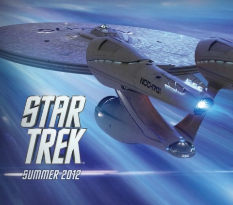
Sequel image follow up
As we reported on Friday, Collider posted an image they say is "something" related to the Star Trek sequel, possibly merchandising. TrekMovie has checked around with a number of sources and has confirmed the image does not come from Paramount, Bad Robot, or CBS. So far it has not been linked to any licensee or merchandiser either.
What is this?
That being said, our resident expert Vreenak isn’t ready to say it is entirely “a fake”. The reason is that the shot of the Enterprise seen in the image has been confirmed to come from ILM. The shot of the Enterprise was created back in 2009 and was available internally at ILM, but not used in any publicity materials. The above image crops that original ILM rendering and adds the warp effect and the ‘Star Trek Summer 2012’ copy, but it is unknown who did the work. It could be fan made, but that fan would have to have access to the original ILM rendering of the Enterprise. It could also possibly be for ILM, who maintain a page on their site listing projects "in production" (w/ thumbnails, see below). The Star Trek sequel is currently not listed, but it is expected to be added to the page some time in 2011.

ILM site touts work in production
So while this new image is not a "teaser" intended for the public, it may be somehow related to ILM or possibly a Trek licensee.
And that is probably enough digging for just one image, but the interest that this image has garnered shows how much fans are anticipating anything related to the Star Trek sequel.
I didn’t think it was genuine, more likely a good effort by a fan.
Surely ILM does much better work than what we see in this picture!
Didn’t Bob Orci say it was fake? Did this really need a new story?
Did it really need a new story? Sure, why not. I for one did’t know that ILM had a website that shows what it has in production. Kinda neat, imho. Thanks for that, Anthony!
All Bob said was he wasnt aware of it if it was a publicity image from paramount….
I think it had to be from somewhere within ILM or Paramount…
It’s a faaaaaaaaaaaaaaaaaaake, Part II….
I still don’t like it and it’s been a few days since I first saw it. For one thing, the dorsal part of the ship seems contiguous with the port engine pylon and is difficult to distinguish, fooling the eye into believing that the whole thing is part of the pylon.
It doesn’t matter to me who did it. It’s not the best shot of the ship, IMHO.
The reason i did a follow up is because a number of sites are calling this the “first teaser” for the sequel…which it isnt
well, it sure teases me….
Need……. new ….. Star Trek…. now!!!!
Wouldn’t it say Star Trek II or have a title on it? Since when does ILM put out posters? Is ILM even working on this?
Here’s to hoping that abomination gets destroyed in the sequel and replaced with something worthy.
Where’s Commander Kruge when we need him? ;)
I still think the new E looks like a nightmare and an abomination to a beautiful design. It looks like it was squeezed out of a toothpaste tube.
I could have told you right off the bat, that wasn’t from CBS-D……
Anthony…………. JUST DECLARE ITS A FAKE. STOP DRAGGING THIS ANY LONGER. lol
What we really need is a countdown in the corner somewhere, I have an app. for that! 598 more days!
Or if you need specifics:
597 days, 12 hours, 44 minutes and 41, 40, 39, 38….seconds until the midnight showing on June 29th, 2012.
And I was thinking that ship couldn’t look any uglier!
And in further news, Generallissimo Francisco Franco is still dead.
And now for something completely different, a dead horse.
Beat it!
Let’s hope that the Brewery also happened to be part of the warp core that got ejected, so we get a new engine room in the next movie……….
Nacelles need some serious size reduction (bit like Pam Anderson’s titties) too.
Oh and note to the che(i)f, no more comic side kick aliens on the menu either……
In http://www.cardassiaprimera.com.ar , have a very cool countdown for Star Tre XII.
@6
Yet again I agree with you.
That ILM site is a bit inaccurate itself – it’s not Cowboys & Aliens, its Cowboys Vs Aliens
Official, unofficial, fake … in any case it’s an ugly bucket.
What #13 said; agreed. And #17. I keep trying to like it but just can’t.
I agree, as I said in the previous article regarding this image, I have been using photoshop for almost 10 years now, I could make this image in my sleep. And Tobias from The Light Works does incredible work, far better than this. If this were official I would say its time to hire some new visual artists.
This ship is gorgeous, my favorite next to the Enterprise refit in the TOS movie. I love the TOS series Enterprise but come on, these days the TOS Enterprise is just uninteresting. Its like saying why would you update the costumes in for the new Tron movie, they should have stuck with the hockey helmets and would just be idiotic and ridiculous.
As long as you keep bashing the new Enterprise ill keep defending it. Those of you who can’t accept the new ship are just going to keep whining and crying because you will NEVER EVER see the TOS Enterprise in these new movies. New age, new ideas, LIVE WITH IT!!!! Nostalgia is great but it should not dictate anyone life. It’s like saying the US Air Force should still be using P-51 Mustangs because you like the way they look better, honestly, grow the F up.
Another observation regarding this image which I am sure most of you have noticed but not commented on and that is the Summer 2012 text only has a black boarder around it. If it was real and professional it would have a black AND gold boarder like the Star Trek text, take a close look. This indeed is the work of a novice. Yawn.
Ah, the summer 2012 text is also flat text and not three dimensional, again the mistake of a novice. A professional I would make all the text match, that is, if I really wanted to make a believable fake.
@25
Few people who dislike the new E are saying that the TOS one would have been acceptable. Designs have to be updated and refreshed.
…But from a balance standpoint the new E is horribly ungainly; remember that there was a reason for the saucer and engineering hull and nacelles to be where they were; you can’t simply push them one way or another without compromising the entire design. The -D had shorter nacelles in part because it would have looked ridiculous and created a distorted schematic. The -E had longer nacelles to balance the more oval saucer.
It’s about design principles.
#25
I don’t think your analogy to the P-51 really holds up… since this Trek universe is a retread of TOS, i.e. back to the “past” of Trek. Thus, one would expect to see a P-51 with a Rolls Royce engine and not a souped-up hotrod jet fighter like the F-15 during WW2. That being said, since this is an alternate universe I suppose a souped-up P-51 could work. ;)
Anyway, fans are entitled to their opinions—whether positive or negative. If someone can’t handle that, then they need to, as you so eloquently put it, “grow the F up.” And remember that a dissenting voice doesn’t always equal hate for something. Or as Samuel Johnson said, “Praise of everything means praise of nothing.”
@25 and 28
I think it just needs “re-balanced”. The design elements are really cool. Retro, yet futuristic. However it looks like everything, but the saucer, is trying to squeeze through a skinny door. LOL
If you’ve ever seen the XBOX live online game representation of the current E (speaking strictly of the “menu” shot of the ship from behind) it looks awesome. The designers of that online game gave it a more balanced look without changing any of Ryan Chruch’s elements. In fact, it looks much more massive and powerful with the engines pushed out (which is more in-line with the original).
But, face it folks, they’re not going for a plausible scientific look with the new design. They just want it to look cool. No matter how much we may secretly wish for it, we’re never (unfortunately) going to get the refit E back LOL.
New Enterprise aside for a moment…. Does anyone else miss the 1979 incarnation?? My God that was good looking ship. LOL
I think it looks like a screen cap from the 2009 film, maybe from the Blu ray. It’s obviously taken from the scene when the Enterprise crew is racing to Earth from the dust ball formerly known as Vulcan. LLARIP
Fake or not, it still has me excited
I miss the ST:TMP Enterprise too… and if I remember correctly, they had built a new model fot ST:P2, but scrapped it (and the new bridge) when they got the movie deal. I had seen some preproduction artwork for the P2 Enterprise, and it was seriously lackluster. We would have been howling, if they had gone through with some of those ideas, one of them being something like and angular version of the -D. I missed the round nacelles of the TOS Ent., but this one makes up for it. But the Engineering section needs beefing up. After all they did it on the 1701-B.
They actually CHANGED something on the engineering hull. How about a complete redesign of that part of the ship? It CAN be done.
The ship is a wonderful looking vessel, and worthy of the name Enterprise… and it IS the new “E”… quit whining… really.
#34, Absolutely Right(TM).
The USS Kelvin had a HUGE engineering section/shuttle bay. Nice and cylindrical, symetrical, etc… Why doe the ‘E’ stray from this design element? It has bigger engines so engineering doesn’t have to be so big? It doesnt make sense.
Ok, theres my beef, I am done.
Am I the only one not too Impressed with the Enterprise E? It was too bumpy and it was small. Ugly looking ship.
The issue with the ship is scale IMO. You could almost fit the tos version into the hanger bay. Supposedly it’s the size (little bigger than) the Enterprise E from TNG!!
I’m a diehard TOS fan, but I can live with the new ship. I just hate the bridge. Doesn’t fit into trek at all. It looked like they TRIED to make it look futuristic and failed horribly. From a design standpoint it was bland and like a hospital. No color. I would think they would learn from the Motion Picture that people overall don’t like the muted tones so well. The original bridge design was the best, but the movie versions were ok too. Shining lights in the camera and using an Iphone store for your bridge doesn’t = “cool”
@20
That is a cool countdown :D
There is nothing wrong with the new E. It remains true to the origonal, and actually improves on the look a bit. If someone has issues with scale, or the “retro” look, then so be it. What jumps the shark for me are the folks who go on about “design” like it’s just a matter of time before we are building spaceships that look really similar to what we see in Star Trek. If you want to ignore physics, or believe that “structural integrity fields” or whatever bulls*** the writers are calling it these days will compensate for structure, fine, but don’t lecture the rest of us about how we don’t understand design when it’s all fake.
Doesn’t anyone remember Tobias Richter saying the image was from ILM in the last thread??
There were a couple of renderings in The Art of the Film that were better balanced. I think they OVER thought the final design. Too much squishing and pulling. But in the end, we’d better just stop bitching and get used to it.
(Remember, it was developed with Borg-influenced technology- from the “alternate future!”
#40
Of course it’s all fake, but that still doesn’t mean one can’t give an opinion about a design. Consider the sometimes outlandish prototype vehicles displayed at auto shows. Many of those designs won’t make it to the assembly line, so they’re as good as “fake” in that regard. Nevertheless, viewers can (and will) give their opinions on the matter.
@30
“New Enterprise aside for a moment…. Does anyone else miss the 1979 incarnation?? My God that was good looking ship. LOL”
I agree. The design for TMP has held up very well and is still the gold standard to which all other E’s are compared. No slam on TOS Enterprise, it was forward thinking but the team had experience and money when they created the “refit.”
#40
“What jumps the shark for me are the folks who go on about “design” like it’s just a matter of time before we are building spaceships that look really similar to what we see in Star Trek.”
That’s quite an assumption you’re making. When I look at a certain Picasso painting, I don’t assume human beings will someday evolve into a creature with ears growing out of their foreheads! It’s all art, all make-believe. You either like it or you don’t.
(Oh, and I do like Picasso!) ;)
I love the nacelles, but I can’t stand the pylons. And the way the saucer joins the secondary hull. It’s too far back, or something. Refit!
@45
“I love the nacelles, but I can’t stand the pylons. And the way the saucer joins the secondary hull. It’s too far back, or something. Refit!”
It does look like the neck is set too far back. That is my only real complaint…
46 Agreed.
Best plot for ST 2012: They go forward in time and stop Spock from making his biggest boo boo ever, thus preventing Nero from having to go back in time and creating their timeline, which means they’ll never have existed. And then they couldn’t go forward in time and stop Spock.
Oh frak… we’re stuck with ’em.
42. Vultan – November 10, 2010
Art for the sake of art, I understand. Specifically, there are people who go to a lot of time and effort to discuss design in construction terms – the prototype car is a bad example, because generally a prototype represents proof of concept. If the car company chooses to build it, it could be built, and it will work. The variations on the E, while entertaining and pleasing to the eye, don’t even rise to the level of proof of concept.. I have no issue with opinion, but people who lecture (because I don’t understand warp drive design, or whatever) take a lot of the enjoyment away from this.
#49
Well, I wasn’t really going for proof of concept; my example of prototype vehicles was more in line with eye-pleasing objects (outlandish cars with see-thru bodies and gigantic tail fins and so on that auto-makers love showing off) than actual prototypes that eventually make it to the assembly line, for example the 2005 Ford Mustang concept that somehow managed to get made! :)
But I understand your point. I don’t care much either how warp drive “works.” However, I think most of us who dislike the design of the new Enterprise are criticizing the look of the ship (i.e. the balance and proportions of the design) more so than how it would function in the real world. At least that’s the way I see it.
A better analogy to this would be the recent GAP logo redesign and the subsequent public outcry for the restoration of the old logo, which thankfully was.