
Following the end of the big Day of Blood crossover event IDW’s ongoing Star Trek series begins a new storyline this week titled “A Savage World of Glass and Bone.” Collin Kelly and Jackson Lanzing continue writing the series, with Marvel and DC artist Marcus To joining for the new arc.
At New York Comic Con earlier this month Collin Kelly spoke about how the new storyline will involve Sisko and his crew on a peacekeeping mission to prevent a third war with the Tzenkethi, a formidable foe that was mentioned but never seen on Star Trek: Deep Space Nine. Summing up Sisko’s challenge of finding peace Kelly said at NYCC “With the Tzenkethi being gigantic space dinosaurs, that might get a little rough.”
We have a 5-page preview of issue 13.
Star Trek #13
Synopsis:
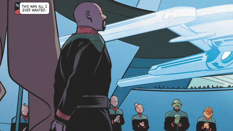
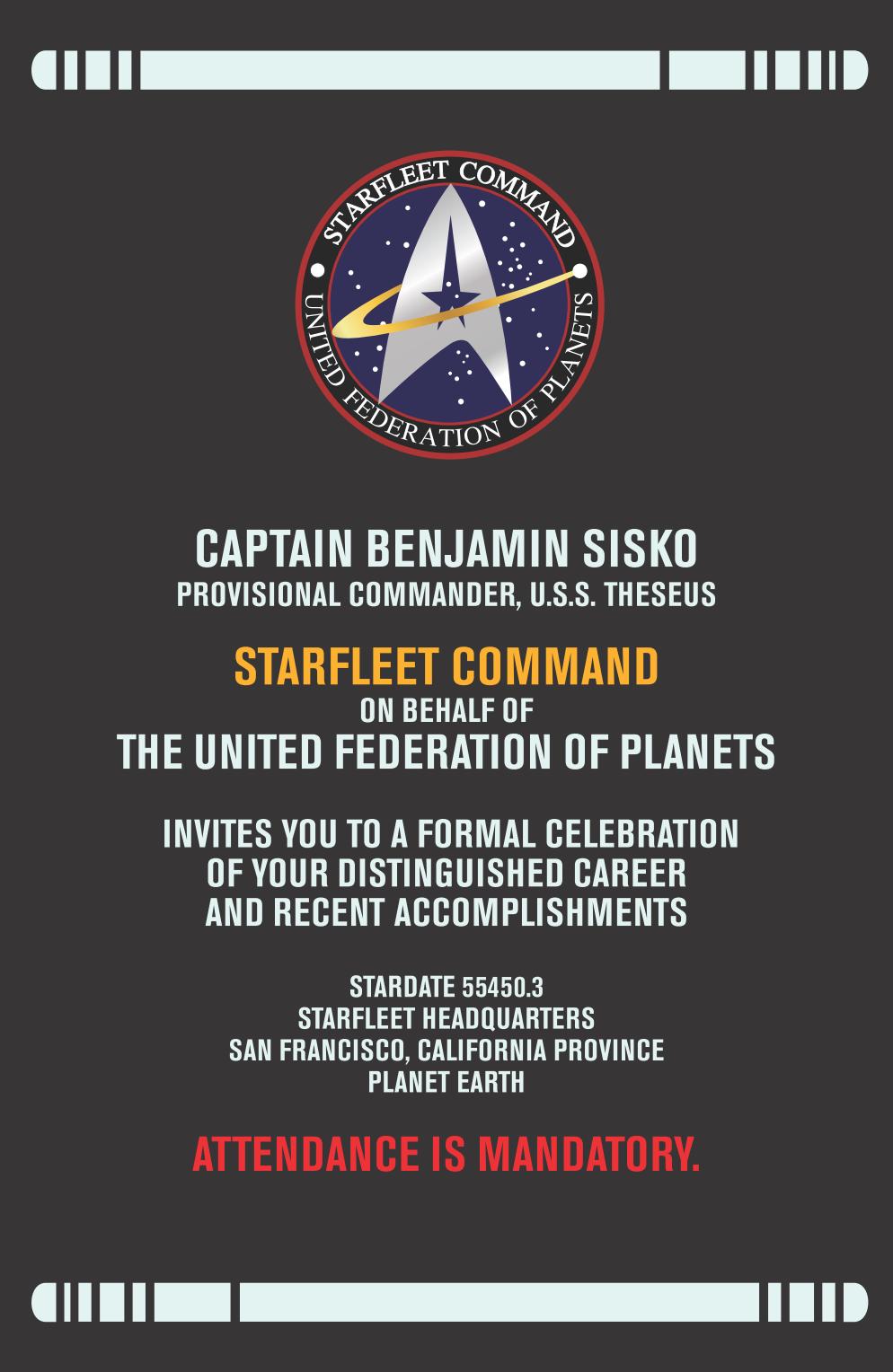
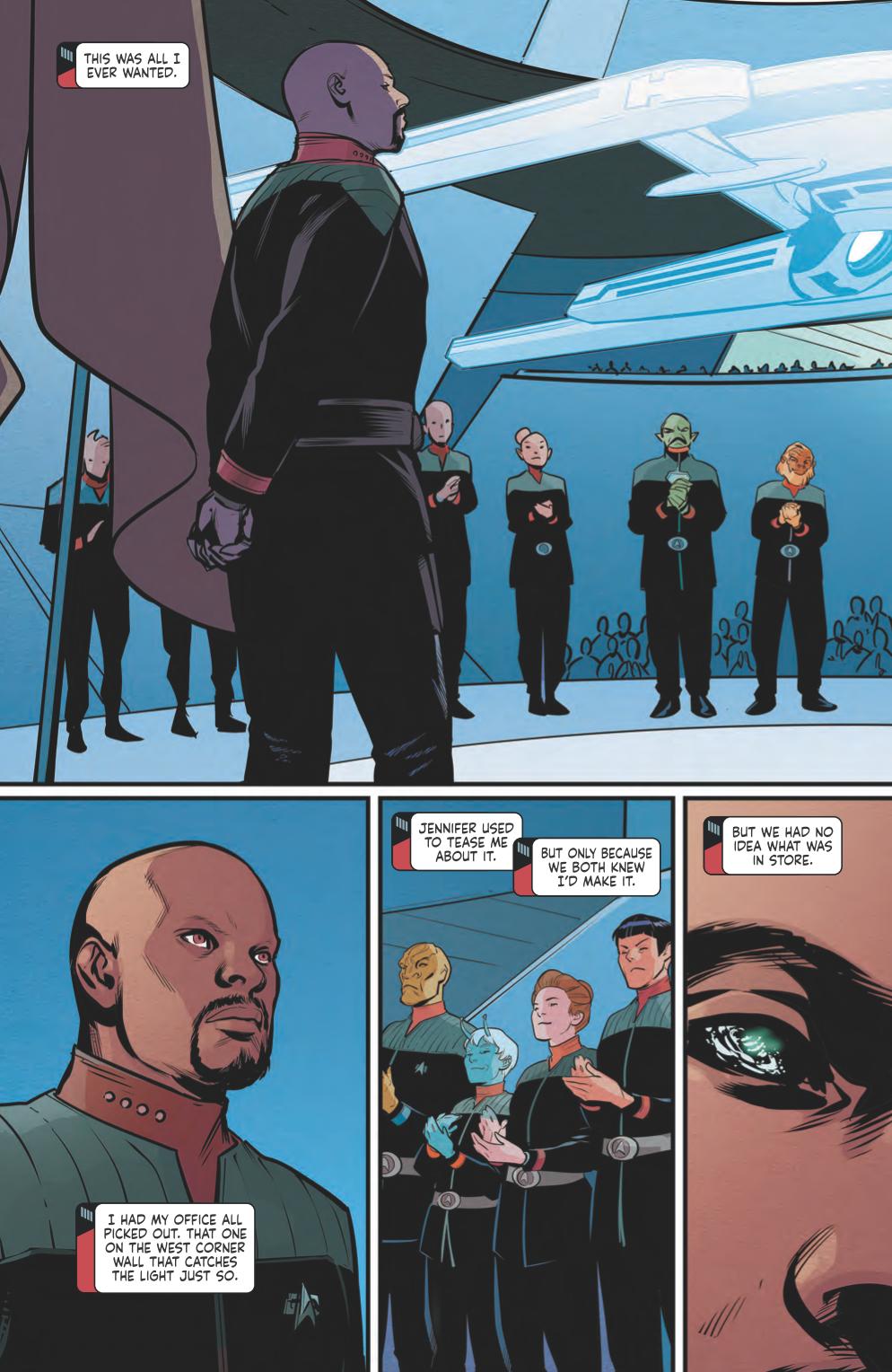
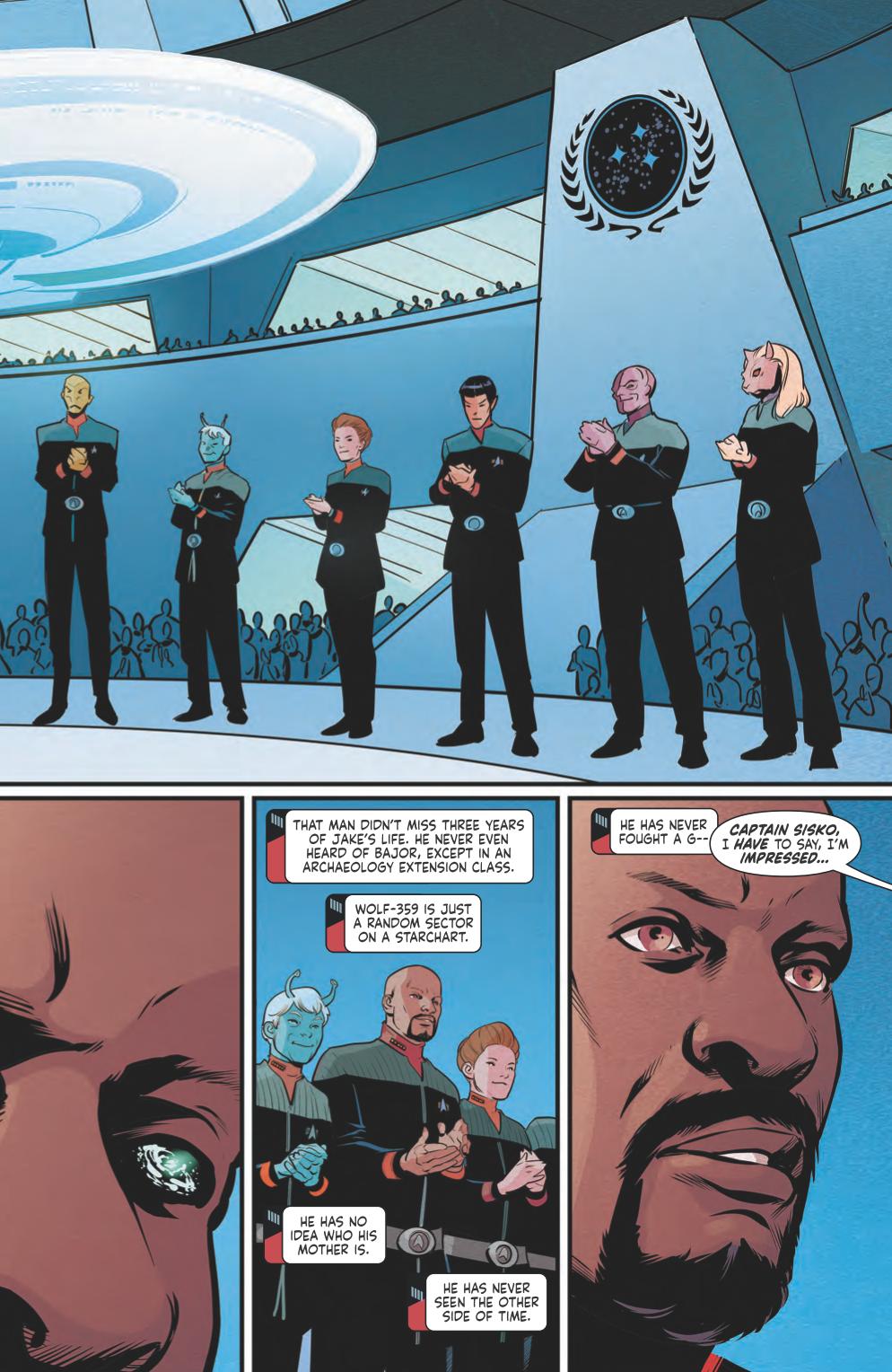
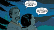
Captain Benjamin Sisko’s quest to defeat the killer of gods is at an end, and the Prophets beckon him home to the Celestial Temple. He’s earned his rest, but when Starfleet requests his help to stop a familiar foe, the Tzenkethi Coalition, from launching the largest fleet in their history, Sisko and the Theseus‘ crew set out once again to save the galaxy. But there’s a reason this species of spiritually rich, reptilian lizard birds has twice defeated Starfleet in battle. They’re xenophobic, ruthless, and innovative… and confronting them on their home turf, a planet thought to be an organism itself, is as good a death sentence as any.
Covers:
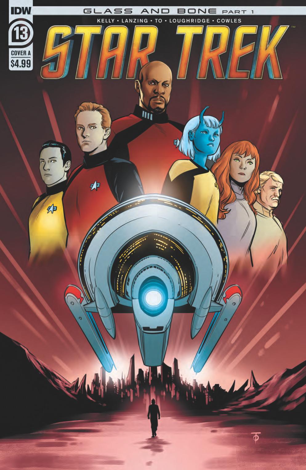
Cover A by Marcus To (also available in B&W variant)
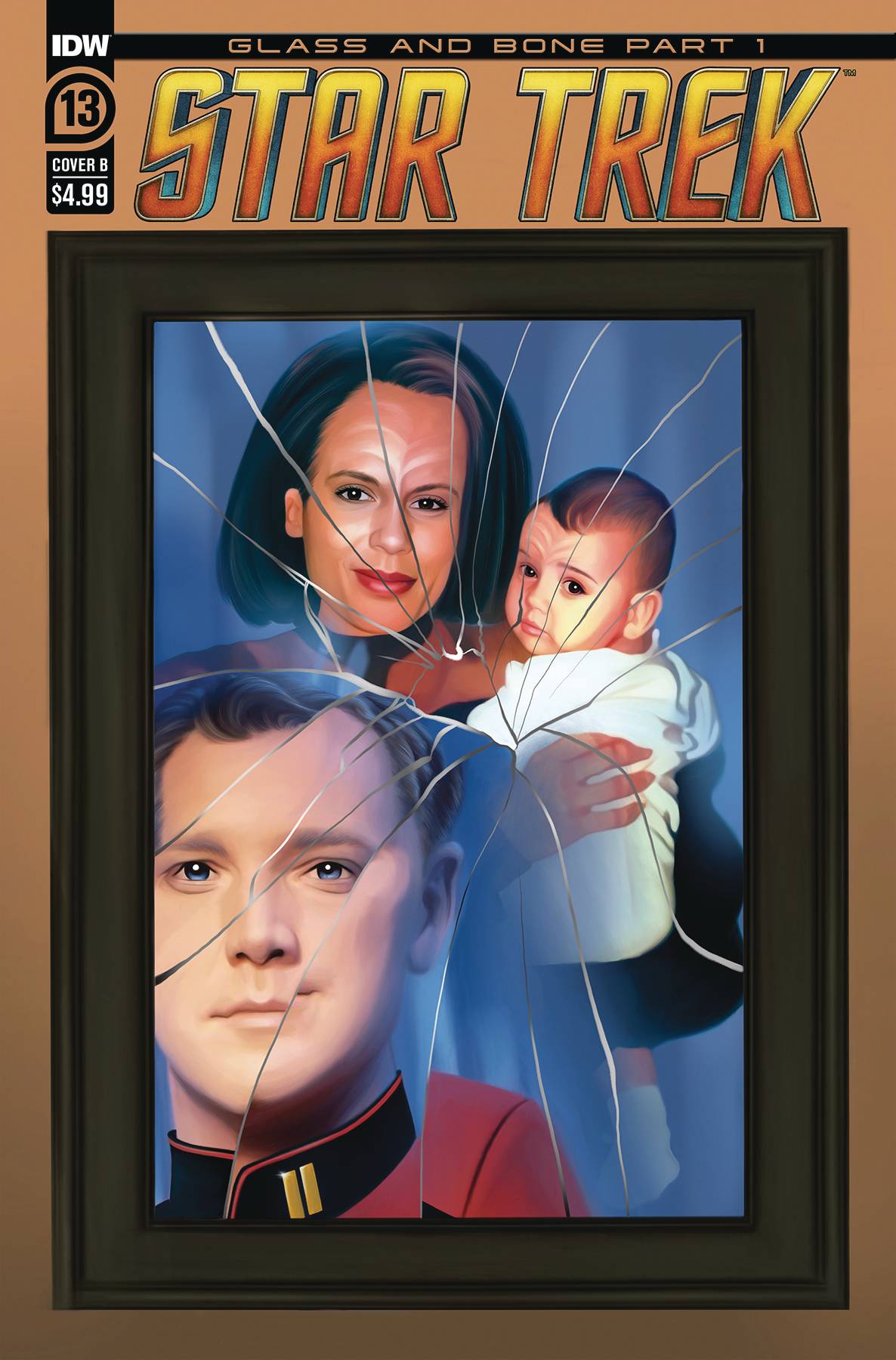
Cover B by Steffi Hochreigl
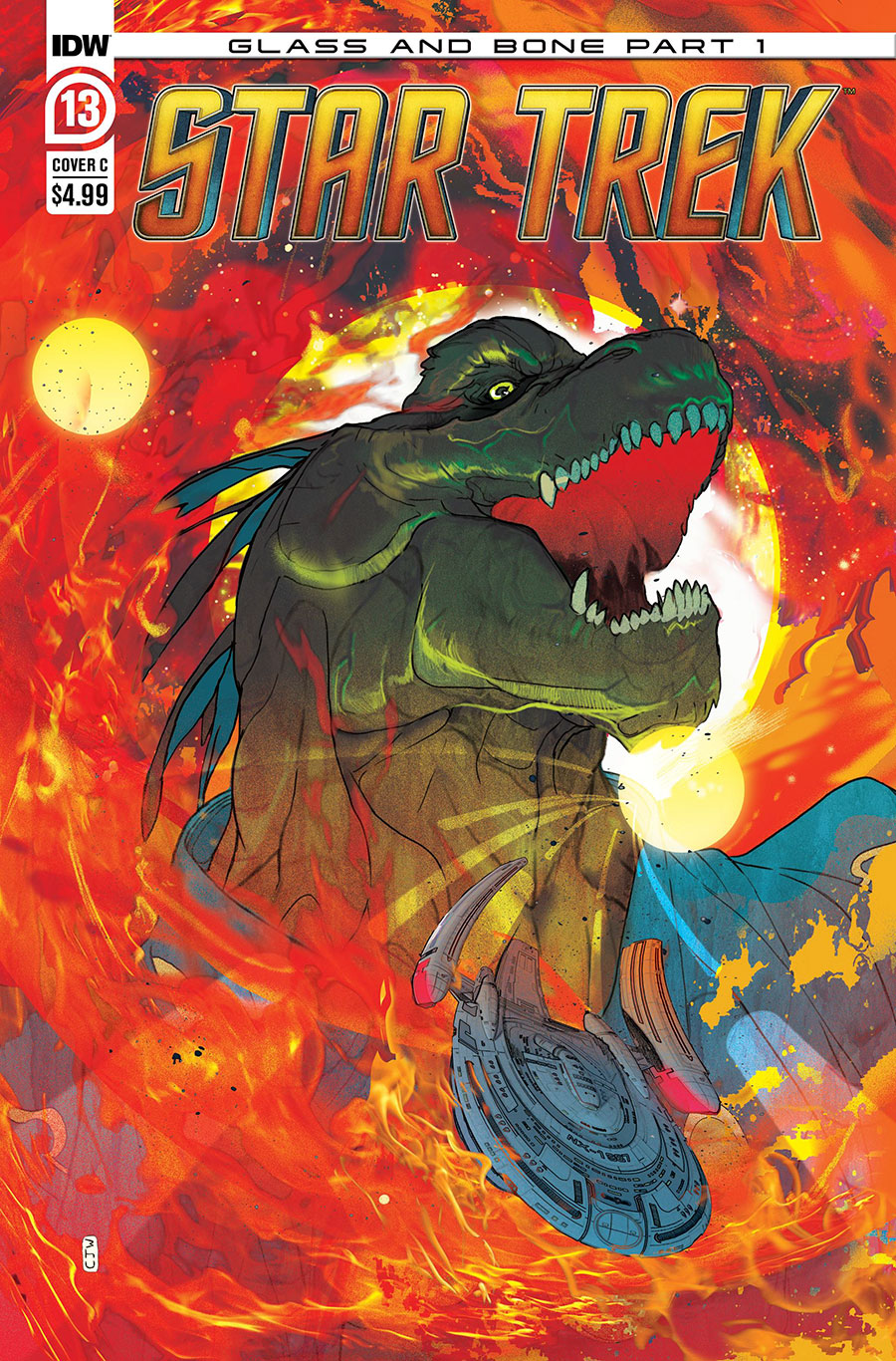
Cover C by Philip Murphy
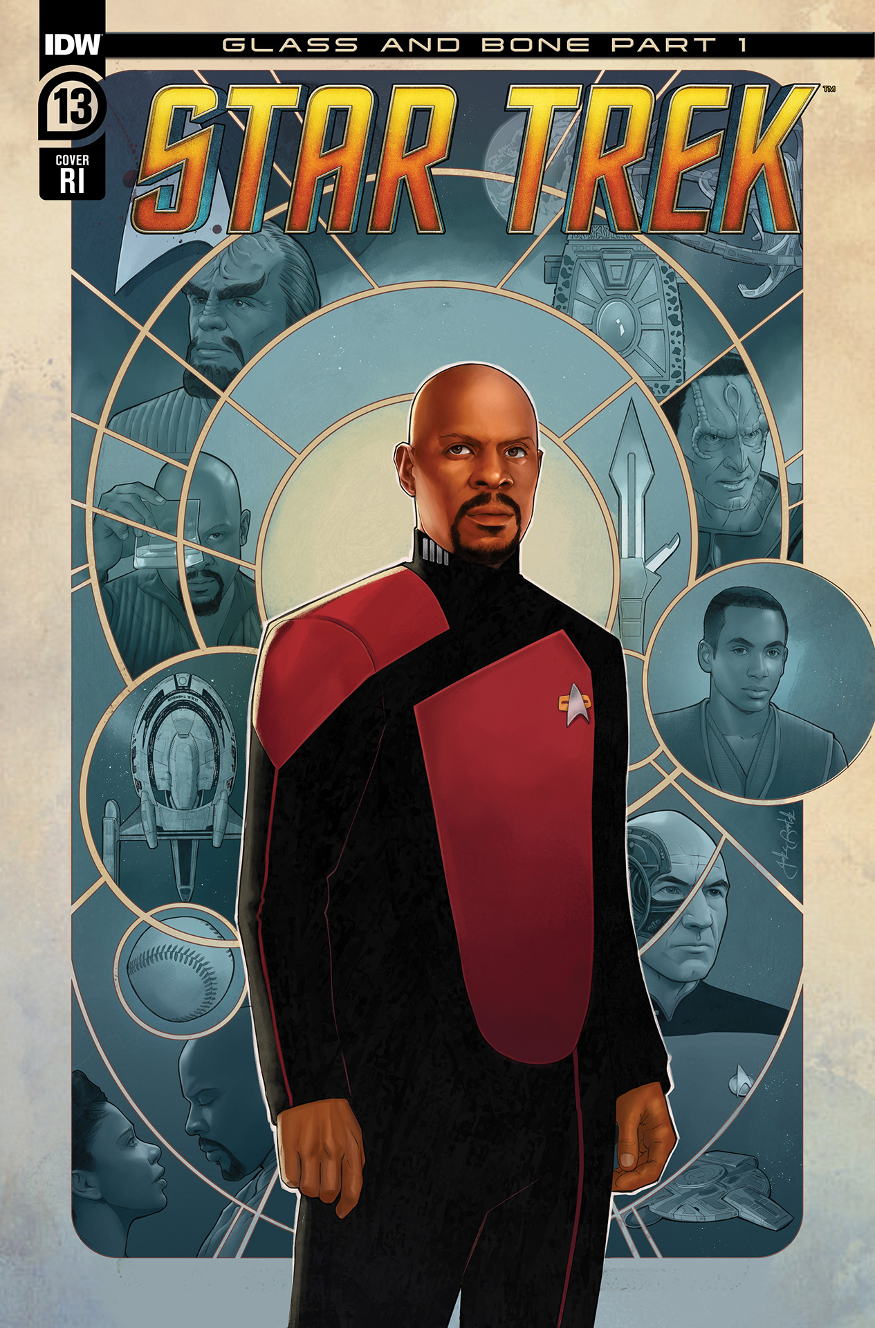
RI cover by Jake Bartok (also available unlettered variant)
Setup/credits:
Five-page preview:
Star Trek #13 arrives on Wednesday
Star Trek #13 arrives on October 25. You can order issue 13 or upcoming issues at TFAW. Or pick up individual digital editions at Amazon/comiXology.
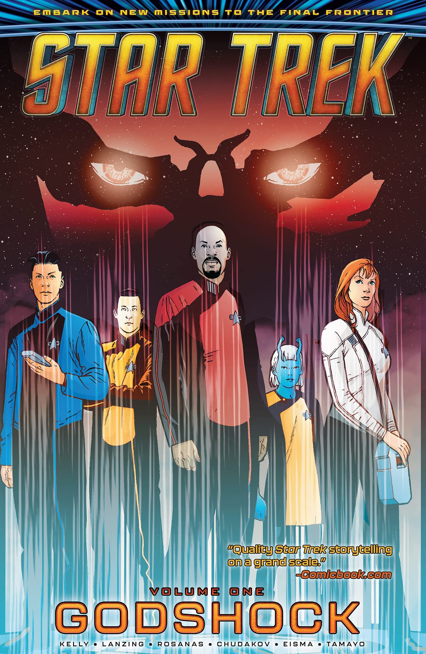
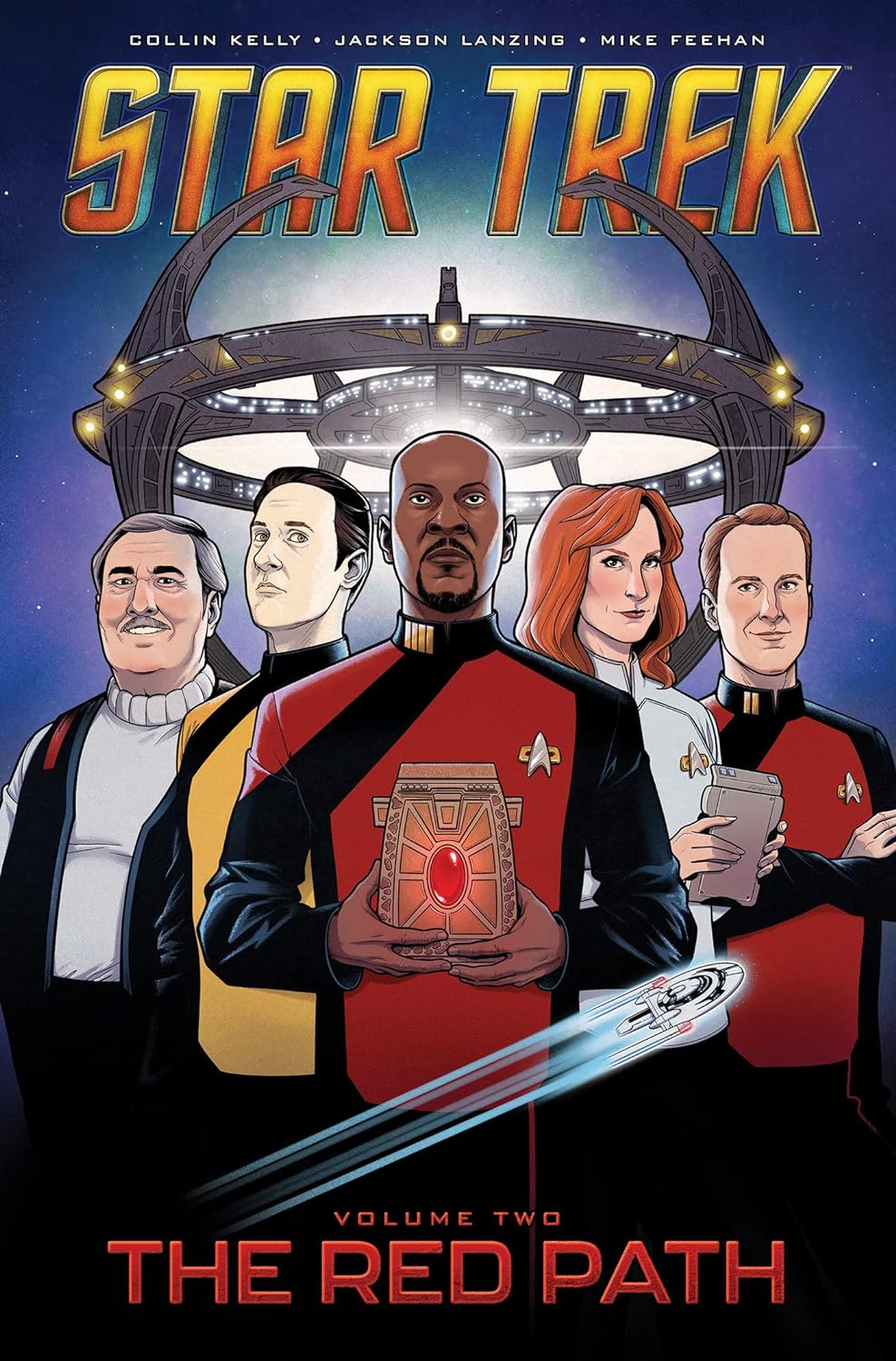
Volume 1 collection out now, Volume 2 coming next month
IDW’s first collection from the Star Trek series was released on July 18. Volume 1 (titled ‘Godshock”) collects the first six issues from the series. You can order Volume 1 in hardcover from Amazon for $20.07 or $7.28 for ebook/Kindle. The second volume (titled “The Red Path”) collects issues 7-10 and will be released on November 21. You can pre-order Volume 2 in hardcover from Amazon for $24.99 or $7.37 for ebook/Kindle.
Keep up with all the Star Trek comics news, previews and reviews in TrekMovie’s comics category.
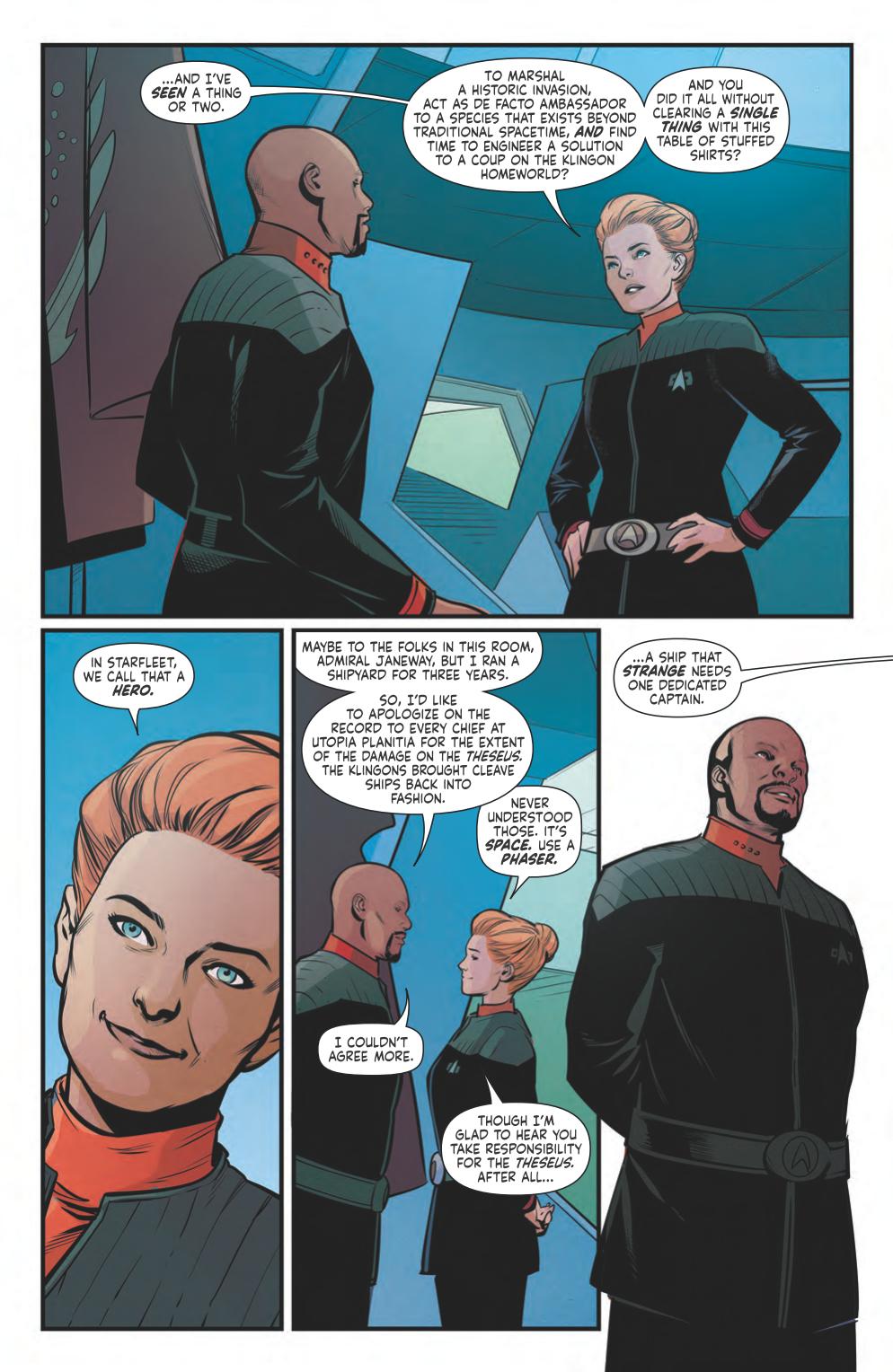
That’s Janeway? She doesn’t even look like Janeway.
Sadly no, she doesn’t. I’ve enjoyed the story in this comic but the art has been inconsistent in quality. Some characters look like who they’re supposed to be but others are only identifiable when their names are mentioned.
Yeah, usually I’m rather lenient on the art in these funny books but that most certainly IS NOT Admiral Kathryn Janeway. Not unless there’s some temporal chroniton-somethin-or-other, timey-timey technobabble bullschwa at play that I am not privy too.
AI ain’t what it used to be
Because…surely a human would notice what they are doing doesn’t look anything like the character they are trying to render….
Given the constraints and schedules comic artists have to work under, “Good enough.” often has to be the refrain if you’re going to meet deadline.
Haven’t you ever heard of Artistic license ? This is why I don’t hang with trek fans.
As a matter of fact, I HAVE heard of artistic license, thank you very much. Artistic license is forgiving wrinkles on the backdrop cloth on Planet M-117 because technology wasn’t there in 1966 to do a more photo-realistic job recreating the alien vista. Artistic license is not unrecognizable characters skating by using the names of beloved fan favorites. You get hired to draw a “Star Trek” funny book, you’d better goddamned well know how to draw “Star Trek” characters.
And on behalf of all Trek fans, we breathe a sigh of relief that you choose to distance yourself.
“Artistic license is forgiving wrinkles on the backdrop cloth on Planet M-117 because technology wasn’t there in 1966”
In fairness, though, that is not an example of artistic license, unless you mean it in the same sense of “Alanis Morisette has an entire song about irony that doesn’t contain any examples of irony.” :)
Otherwise, I agree with you.
And I award you 500 quatloos for bringing up that Alanis song. I love making that argument!
Considering the ‘gaseous anomaly’ aspect of most a34 one-sentence snipe-posts, the word choice ‘breathe a sigh of relief’ is especially appropriate!
Artistic license doesn’t mean what you think it means, and I say that as someone whose employment relies heavily on artistic license.
It means whatever the artist wants it to mean. Your corporation mumbo-jumbo is a lie.
Sorry (not really), but you’re in K.Conway alternative fact-land with that one.
“Funny books”? I feel like it’s suddenly 1950. :)
My father used to call all manner of comic books and graphic novels “funny books.” As I slowly lose him, I find myself embracing his quirky turns-of-phrase. I trust it’s the least offensive thing I’ve said on these old boards.
Janeway here looks more like a Katzenjammer Kid than Kate Mulgrew
Looks more like Nechayev.
I disagree, pretty thoroughly. I’m not sure what you’re expecting from comic book artwork, but if you’re looking for photorealism then you’re missing the point of the medium.
I wasn’t looking for someone to just straight up trace Kate Mulgrew, I thought this was a complete different and new character until Sisko said “Admiral Janeway.” So maybe the hair color should have been closer to her actual hair color and there should have been some other hints that this was Kathryn Janeway before that.
“You tracer!”
I get it, but… let’s go back and analyze the character artwork in Star Trek comics going all the way back to the original Gold Key run in the 60’s and 70’s.
On through the decades of DC, Marvel, IDW, and other publishers… you’ll find plenty to complain about.
Very seldom has the artwork provided a spot-on likeness of our beloved characters as portrayed by the TV and movie actors. Quite often they are unrecognizable.
You either have to get over that, or the comics just aren’t for you. It’s a different medium.
Could the comic artists try a bit harder? Perhaps. But when you understand the ‘behind the scenes’ realities of tight deadlines and relatively low pay, you begin to understand why comic artists go with their individual style and expediency over photorealism.
Not unlike the realities of CGI for TV and movies—sometimes they can get it just right. Often it looks unrealistic, and not for lack of trying on the part of the digital artists. It usually takes a lot of time and money to create something incredibly realistic, more than is available to the artists when they get to work.
If you want the characters in the comics to look exactly like the actors, you probably want to pick up something like the New Visions photonovels series by John Byrne.
Yes I know that comic artists situations suck, they deserve better.
However please see the comment underneath mine. That comment said it better than I can right now.
These comics get stranger all the time. And to pre-empt the inevitable surge of “white knight” fans who want to defend absolutely everything everyone makes regardless of quality (and with no regard for personal opinion, likes, dislikes, independence of thought).
If you’re allowed to love it, we’re allowed to hate it. (And, in fact, I don’t even hate it. I find it puzzling and badly drawn. And yes, I can draw better.)
Sisko + Picard, Shaxs and Janeway cameos/references all in the space of one page, impressive
Those comics has become more and more ridiculous.
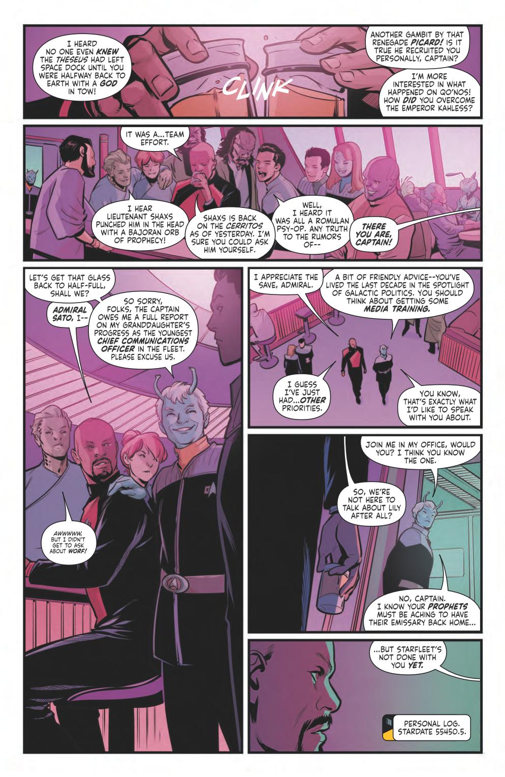
Starfleet isn’t done with you yet,
how cute !! They think they can do something to a bunch of god like aliens who can instantly take people out of space and time LOL