Check Out (Fan Made) High Resolution Views Of Star Trek’s New USS Kelvin December 27, 2008
by Anthony Pascale , Filed under: Fan Productions,Star Trek (2009 film) , trackback
Since TrekMovie revealed the first exclusive image of the USS Kelvin in October, this new ship from the upcoming Star Trek movie has been the subject of much fan discussion. We have seen more of the Kelvin in the trailer and at the Intel promo site, but as with many things with Trek, fans have decided to take it upon themselves to get a closer look.
Do it yourself Kelvin
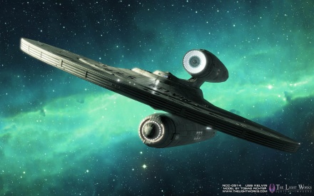
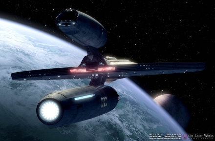
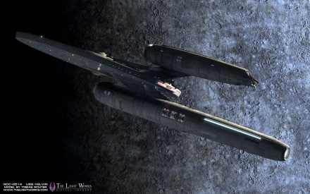
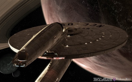
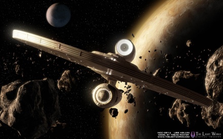
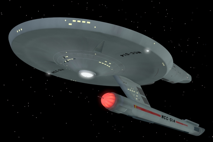
So far the best fan work on the Kelvin (by far) has been done by Tobias Richter who is a Trek fan and veteran CG artist. Richter runs the The Light Works graphics studio in Cologne, Germany, which does visual effects for games, TV and film. He has done some DVD covers for Paramount and some work for Star Trek magazine, but he is not affiliated with the new Star Trek movie and tells TrekMovie.com he just "liked the design of the Kelvin from the new Star Trek trailer a lot." So he created his own detailed CG model of the ship based on the information that is available at the moment (the trailer and the wallpapers), and here is what he came up with…pretty impressive. Check out his HD animations and super high resolution desktop images below.
Video animations (no sound):
Desktop images:

[Desktop Downloads: 1280x1024, 1680x1050, 1920x1200]

[Desktop Downloads: 1280x1024, 1680x1050, 1920x1200]

[Desktop Downloads: 1280x1024, 1680x1050, 1920x1200]

[Desktop Downloads: 1280x1024, 1680x1050, 1920x1200]

[Desktop Downloads: 1280x1024, 1680x1050, 1920x1200]

[Desktop Downloads: 1280x1024, 1680x1050, 1920x1200]
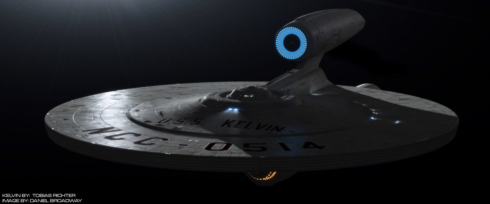
UPDATE: Our friend (and winner of the ‘fake Trek contest’) Daniel Broadway has been playing with his own version of Tobias’ model. Here is where he is so far.
The Kelvin – 60s style
And Richter isn’t the only CG artist who is playing with the Kelvin. Kenneth Thomson Jr. is a another CG artist and Trek fan who is currently working on his own TOS era fan series ‘Starship Saladin’ (which he has previewed at the Phase II forums). The USS Saladin was a single nacelle starship first seen in the 1975 Star Fleet Technical Manual and was used in some Trek games. So it wasn’t a big step for Thomson to rework his Saladin into something like the Kelvin, but in good ol 1960s TOS style.


TOS-style Kelvin (click to see full size)
For more TOS-style Kelvin, see discussions at P2 forums HERE and HERE.
What about the new USS Enterprise?
There has been some fan made work done on the new USS Enterprise, but most of it is a work in progress. Richter tells TrekMovie that although he much prefers the design of the old school Kelvin, he also plans to take a crack at the new USS Enterprise as well. TrekMovie will do an update when Richter or others have finished work on the Enterprise to show.
NOTE: Everything above is totally ‘Fan Made’ and in no way related to official imagery from Paramount Pictures. More official info and images of the USS Kelvin can be found at the Intel promo site boldlygo.intel.com.
Thanks to Thorsten Wulff and Jason ‘Vektor’ Lee for assistance with this article


TrekMovie.com is represented by Gorilla Nation. Please contact Gorilla Nation for ad rates, packages and general advertising information.
Comments
Great work, Tobias!
Amazing quality.
First? Video is link dead, must be a friend
Aw, the video is private. First!
beautiful work
Any public version of the youtube vid? Sweet wallpapers though.
Any chance of a YouTube video that isn’t restricted to friends on the person who made it? Nice work on the pictures though :)
try video again…i have set it to public
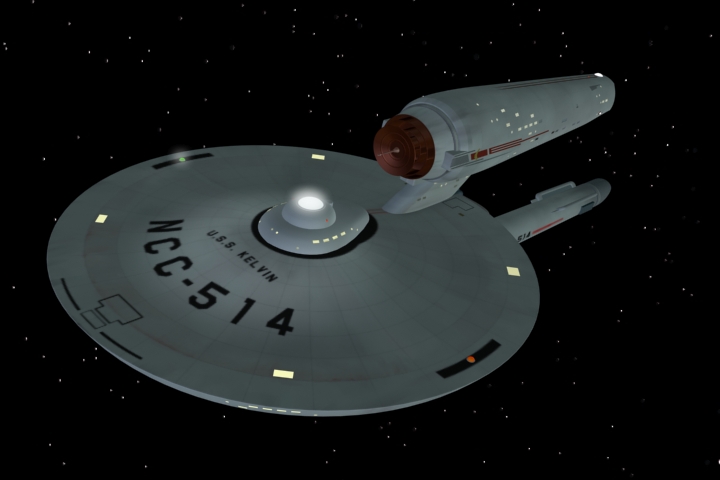
Tobias was kind enough to allow me to convert this Kelvin CG model from Maya to 3ds max. I am about 95% finished with it, and here where it stands so far….
http://img.photobucket.com/albums/v58/PixelMagic/kelvin_max_04.jpg
It would be interesting to poll the fans about which version of the Kelvin they prefer – the Richter model or the Thomas model. I suspect that you will see an interesting correlation to the degree of “canon fanaticism”. The canonistas will mostly prefer the fuzzy androgenous plastic-looking Thomas version because it’s reminiscent of the cheesy cardboard model work from the 60′s (although well done nevertheless). I prefer the tougher, realistic, detailed look of the Richter version. As you can tell from my posts, I’m very tolerant about bending or breaking the canon rules as long as the story, SFX, acting, and directing is good; and the over-all feel and philosophy of the ST universe is preserved.
The talent around here never ceases to amaze me.
Fantastic work!! Love the old school K!
@8…
Nice job, Daniel, who is that guy in the bridge window?
damn… these are so nice! You are all so talented. What programmes do you use for these?
Wow… absolutely amazing. That gave me goosebumps!
Lightworks stuff is always awesome. My favourite is the second picture.Good job Tobias!
Very nice indeed!
You guys put the “fan” in FANTASTIC! These are incredible. So help me out with the single nacelle approach. The nacelle on the bottom is the warp drive structure and the nacelle on the top is living/work space?
That’s more obvious in the TOS-style version but I’m not really sure.
Of course it doesn’t affect my appreciation. These are truly awesome in every sense of the word. Great job!
Anthony, the enlarge on my image doesn’t actually enlarge it.
#11, Tobias did everything on the Kelvin, I merely converted it over to 3ds max format. There is no one in the window. It’s just a roughly modeled bridge similar the Enterprises from the new movie.
Tobias was kind enough to share his fantastic work on the model, and I volunteered to convert it over from Maya to 3ds max, as the majority of the guys over at Scifi-Meshes use 3ds max. However, in showing my work in progress to the guys over at the forum, I made this render of the ship.
17…are you sure?
Cool looking ship
@12…
Tobias worked in Autodesk Maya on these…
@16…
The structure below the saucer is the warp nacelle, above the saucer is the engineering hull with main deflector, shuttle hangar etc…
Seems to be working now, Anthony, sorry.
Amazing. The desing is cool.
Cool! Very Nice.
I like the Kelvin a lot. Its design is a nice hybrid between Enterprise-era design and TOS.
Nice! ’60s version is really cute! lol.
This is amazing.
good work fellas.
impressive.
=h=
I’m telling you, it’s talented fans with the passion like these that need to be hired and put to work on future Trek projects, ensuring constant breakthrough in quality!
@9
For me the TOS style Kelvin is the winner :-). It´s simply beautiful. The movie – version looks strange for me. Mainly the warp nacelle. Looks like vibrator, I can´t help. All the images are wonderful – both from Tobias Richter and from Kennet Thomas Jr. I always liked the images from TheLightWorks.
Well done!
I like this ship! Very cool work there, fallas!
#28—”I’m telling you, it’s talented fans with the passion like these that need to be hired and put to work on future Trek projects…”
Like Roberto Orci, Alex Kurtzman, Damon Lindelof, and Bryan Burk?
People tend to forget that 4 of the 5 members of the self-proclaimed STXI “Supreme Court” are equally passionate Star Trek fans. :)
The work that Tobias, Daniel, and Kenneth have done is fantastic. I love it!
The ship’s appearance seems a little inconsistant with the timeline. Looks very cool, don’t get me wrong, but from a strict timeline stnadpoint, it seems contradictory. It looks like it utilizes technology from the st motion picture, but if the story is set before then, it seems like it would cause a little confusion. Looks cool, but I have to stick to my chronological guns and say that the older looking ship would have made more sense to use in this story. I guess I’ll have to watch the movie and see.
32…actually Burk is a Trek newbie, although very enthusiastic about it now. If you were to list them in their ‘trekness’ I think it would be like this:
Roberto Orci
Damon Lindelof
Alex Kurtzman
JJ Abrams
Bryan Burk
but Bob may have to amend that. And of course there are many more fans who worked on the film both in front (like Urban and Pegg) and behind the camera, and even in ship design room (for example John Eaves)
33, and others
I hate to say it, but even though the 60s version is a cool concept, it may not be a more ‘canon’ version because the Kelvin is supposed to be from a generation before the TOS era, so it is reasonable to assume it would not be an exact match for the NCC-1701 60s USS Enterprise style
These are gorgeous. Are there higher res versions anywhere? (Specifically 2560×1600)
<3 the Kelvin…can’t wait to see it in the movie… and these pics are wonderful! :)
It seems like the Kelvin is more of a hit design-wise than the new-old Enterprise…
Awesome work guys.
VERY well done!
Cool! All cool. I love fan made projects come to life.
#39
Yes, now if they could only learn how to act, direct, edit, light sets, and block scenes, we could simply watch fan films on the net. ; )
But honestly, who doesn’t love the Kelvin? Well, actually I know some people who don’t… but still ;)
That is amazing! As soon as I get back to my computers, I know what my new desktop is going to be!
#34—-I thought Burk was a bit more of an established fan, but I’ll take your word for it. That interview (or was it the “live chat”?) seems so long ago.
Of course, Bob would sit at the top of that list!
Thanks, Anthony. We should never forget all the fanboys working further behind the scenes, as well as among the cast!
Those are gorgeous. I especially like the one over the ringed planet.
Tobias, you rock as always. Good to see the rest of the world has seen what you have provided FEDCON in the past. Thanks for being our friend and I hope to see you in May at FEDCON as usual!
Awesome work, guys! :)
nice work broadway
The Kelvin is a straight six and later ships are V8′s.
8. Daniel Broadway
Nice job on the render. Real nice.
However, as 29. William Kirk agrees, the winner is the TOS styled ship.
Just what happened to the TOS design style? Surely it looks much more like a naval vessel than the new designs. And is’nt that the impression it is supposed to invoke, that the Enterprise is a navy vessel? Plus as far as metal goes. The TOS style and color does a better job portraying the hull being made of steel, or other futuristic metal. It just looks more solid and sturdy to me. Like a battleship or aircraft carrier!
But the genral design of the movie version is nice too. Its still no match for Kirk’s TOS ship design and style though.
really nice job Tobias!
Thank you for these beautiful Pictures
cheers
Wow I remember Tobias doing awesome 3d Amiga demo’s discs back in the day before anyone else was even doing polygons..look where he’s at today!!!
I think that Bob and J.J should hire these guys for the Next Trek Movie. These guys do Incredable work. Well Done.
50. I have one of his old Amiga Star Trek games as well….
To The Next! :-)
#47 “The Kelvin is a straight six and later ships are V8’s.”
The design breaks the 2 engine rule. It is more like a plane with one wing than a straight six.
I think it looks good though – which is all that really matters.
The TOS style Kelvin does not look nearly as good as the actual version of it – the connecting pylons are too long and it looks more like a toy than a ship.
Nice job definitely! Of course, I prefer the original Kelvin over the 60′s version, but it’s a nice comparison/exercise either way.
Really nice and imaginative work
I am pretty impressed with my new desktop wallpaper. Thanks a lot!
53: get over the rule, rules do not make a good movie.
53 “get over the rule, rules do not make a good movie.”
Mike,
Read the post. It looks good – and this is what matters.
53. YARN
Yeeeeah, I agree, with you on this one, but only when comparing images here.
But I still say if the TOS design was rendered to its full possiblility, professionally, like they are doing with JJ’s Kelvin, then the TOS style would be the winner. The TMP version, although very nice, departed from the realistic design of the original Enterprise. Mostly because of Star Wars. I don’t think we all understand the impact that Universe had on Trek.
Remember, with Trek’s technolgies, manufacturing a strong seemless hull would be a logical probability. That’s why I kind of shrugged when I saw the teaser trailer and the “welders” working on the ship. Wouldn’t they be using a differnt method to assemble the ship?
Star Trek’s tech demonstrated it’s control over the atom with the Transporter. Surely early uses of transporter technology would be commenplace in manufaturing or industry, long before it was used on people.
That’s why I was always facinated by the appearance of the Enterprise in Star Trek the Original Series. The ship looked HUGE! And without all the needless detail that appears in todays productions. But a smooth hull is not an easy thing to do while still making it look big onscreen, but when visualized correctly, is strikingly more impressive than “bumpy hull.”
Keep it Simple (KIS). Its a term that applies in any well engineered product. And with the Enterprise, using 23rd century tech to manufacture the ship wiould be logical. Plus the KIS principle still applies. A seemless piece of steel is stronger than two welded together. A largely seemless hull would also be stronger than one made of a million tiny metal pieces. Engineering the Enterprise in the 23rd century should not be shown to be constructed in as primative a manner it is being presented.
That’s all part of the “Wonder Factor” that the original Trek inspired in me.
The design of the TOS ships were perfect with 23rd century tech in mind.
And, I am going to try and not even going to mention the Kingon designs. They were fantastic too. Truly the Klingons had the most nefersous looking spaceships ever put onscreen.
Wow… that’s some good work right there! Thanks for sharing it with all of us.
Just a couple of observations about the TOS-sed Kelvin.
It really should carry NCC-0514 and not NCC-514. The leading zero is already canon for the NX-01 and NX-02 among others (and even the VOY’s NX-01A Dauntless…)
The other observation is that we already know the Kelvin has two sets of warp coils in the nacelle, so it’s really two for the price of one. Perhaps a good way to TOSs it, would be to double up two TOS nacelles side by side, fused like Siamese twin nacelles?
Cool though!
Impressive work. The video is equally good.
34, Exactly.
It’s a cool Pre-Cage, Post-Ent design. I like it a lot.
Nice renderings!
Both are horrible designs
Tobias Richter also used to do the inro video at Fed Con Germany. He knows his stuff.
I like the Kelvin more and more.
Thank’s Tobias
and thank’s Daniel. Great work!
Absolutely awesome work on those renderings guys. I never cease to be amazed by what modern computer technology allows really creative people to create.
And on a more serious note, these renderings show that the Kelvin is a very good looking design in its own right and definitely in keeping with the Trek aesthetic.
65: then you don’t need to be here. Buh bye
Simply amazing. The fanmade stuff just keeps getting better and better!
I guess I’m not saying anything that hasn’t already been said, but…
…DAMN!!
The Kelvin just keeps getting more bad ass with each new image. I admit I had my doubts about a single-nacelled starship, but not anymore!
Love the 60′s style kelvin..I’m sorry…sob…getting misty eyed about it..waaaaaaaaaaaa! nice work all :)
Still not a fan of the Kelvin design (though I like the new E), but there’s no denying this is absolutely INCREDIBLE CG work.
Well done.
Honestly, that’s pretty cool.
People complained about the designs on the other thread?
This is an ugly ship.
I’ve been watching Tobias’ work on this for a while. It really is a marvel, and is absolutely fantastic.
This is somewhat off-topic, but has anyone else noticed that EVERY other starship (with the single exception of the Excelsior) shown in the movies gets destroyed?
Why is this?
Sorry, as soon as I saw my previous message, I realized a vital phrase had been dropped:
has anyone else noticed that EVERY other starship (with the single exception of the Excelsior) aside from the Enterpirse (and the movies have wrecked THAT at least three times) shown in the movies gets destroyed?
#76 – for the same reason redshirts get killed in TOS episodes – you need a way to establish the bad guy as a genuine threat, but you can’t destroy your hero/hero ship. So you introduce Ensign/Starship Expendable, and kill/destroy him/it. Bingo – the audience understands the threat, which makes our heroes’ victory over it even more impressive.
Enterprise blows up in STIII. Enterprise D gets blown up in Generations(And good ridance!). Great work Mr. Richter. I hope the new film footage looks as good. Can you redo TOS remastered again with your vision of The Great Original E.?
These make me all the more excited to see the Kelvin on the big screen come May….
I like all the versions, but the TOS version really rocks. What I find totally amazing is that Kelvin is consistently getting MORE POSITIVE feedback than the “new” Enterprise. Very interesting ….
I, too, was a little skeptical of the Kelvin when the single photo was released, but these (f)animations have won me over. The TOS version is also very convincing – perhaps someone will “TOS-ify” the new movie after it is released to make all the ships look more like the 60s TV series? Not that I would prefer that look on the big screen, I am definitely among those who are looking forward to a “higher resolution” vision of the TOS universe in May. But it would be… interesting.
Speaking of interesting, I saw the ST trailer again tonight – attached to the movie Slumdog Millionaire. Curious, but I “called it” after the first preview (which was for Wolverine). Why promote action/sci-fi films in front of a movie about a chaiwalla that wins Who Wants To Be A Millionaire and his childhood first love? Fascinating marketing.
sweet … well done
Cool Stuff…I dig the retro Kelvin
I thought the Kelvin was the ugliest ship I had ever seen until I just watched the Richter videos, now I see a fantastic, graceful ship!
The Kelvin looks fantastic.
I wonder though, he says he’s also working on the Enterprise…how can people do much with a ship that we only have 2 good angles for?
Jesus, some of you graphic artists and SFX guys have more talent in your little finger than I’ll have in my dreams. I’m Vulcan green with envy. Good work.
I’d be interested to see someone “kitbash” what the Enterprise would look like with the nacelles and engineering hull of the Kelvin (the ’08/’09 Kelvin, not the ’60s Kelvin, that would be tautologous), and the proportions of the ’60s Enterprise.
Never understood the love for the TOS look.
The basic design was great, but it wasn’t until TMP that I liked the Enterprise (and this Trekker was around for the original airings of TOS, thank you).
Keep it simple? Look at any piece of military hardware. There is paneling, markings, etc. Simple may have looked good on fuzzy NTSC 9-19″ TV screens in the 1960′s (color if you were lucky) but it doesn’t hold up today, and certainly not on an IMAX sized screen.
88-I saw it somewhere online but it’d be tough to find it again, lol
Two thumbs up for the Kelvin. Two thumbs down for the new old E..
I’m actually a buddy of this guy on SciFi-Meshes; I’ve been watching his work on this model since he started. Pretty cool stuff, I’m glad to see that he’s been featured here!!
I asked him what the Enterprise might look like if it were built from Kelvin parts, and he did up a couple of renders:
http://i2.photobucket.com/albums/y38/Deloravius/Star%20Trek/2008%20Movie/kelvinprise1.jpg
http://i2.photobucket.com/albums/y38/Deloravius/Star%20Trek/2008%20Movie/kelvinprise2.jpg
http://i2.photobucket.com/albums/y38/Deloravius/Star%20Trek/2008%20Movie/kelvinprise3.jpg
I like the Kelvin-prise!! :D
Wow, ask and ye shall receive — the Kelvinprise inside of 5 posts!
Okay, seeing the Kelvinprise, I can see why it wasn’t enough for the STXI crew to build the new Enterprise this way. While it is attractive from the point of view of a *very* utilitarian spacecraft, it’s not dazzling enough as the “old girl”. Actually, it’s kind of Star-Wars-y looking.
No wonder Ryan Church made the new E look sleeker and more streamlined toward the rear (the “stubby” deflector area notwithstanding).
(I don’t know why my posts are @ #91 and #93, I posted them after the Purolator’s posts @ #95)
#96: Hey, that Kelvinprise really is cool. I dig it.
For everyone who had kind words to say about the TOS version of the U.S.S. KELVIN, I thank you. I need to make a correction to the article, however. :)
My name is spelled Kenneth Thomson Jr. The U.S.S. SALADIN referred to, is the Saladin Class Destroyer, NCC-500, from the Starfleet Technical Manual by Franz Joseph, published by Random house, copyright 1975. Because Kelvin was a single-nacelled ship in the 500 series, it fit right in with that registry. I just modified the same model originally made by my friend Thomas Phong, of the Enterprise, to make Saladin and Kelvin as well.
I was given permission by Karen Dick, daughter of Franz Joseph, to use Saladin in my story. Part of my objective in using Kelvin is to see what it might have looked like had it not been destroyed in this alternate timeline.
Of possible interest to you, I also built the Celestra for Zoic Studios that is seen in the modern Battlestar Galactica series on Scifi Channel.
Sincerely,
Ken Thomson
sorry about that Ken
[SPOILERS]
RE: what the Kelvin would look like in the ‘prime’ timeline.
The Kelvin would look exactly the same in either the prime or the alternative timeline. The timeline doesn’t change until *after* the Kelvin was destroyed. The Kelvin is 100% pure prime timeline sitting between ENT and TOS. So a pure TOS-style Kelvin in the prime timeline is actually more likely to be a successor to the original Kelvin, and to stick with canon should have an ‘NCC-0514-A’ designation, although it is possible it could also be ‘refit’ into a more TOS style.
http://www.startreknewvoyages.com/forum/index.php?topic=6649.0
The Kelvin is one of the very few things in Star Trek 11 that would appear to fit into the cannon of the orginal and main timeline.
It’s cannon name is Avery Class. (After Avery Brooks of DS9, and having the secondary hull above the saucer makes to the top half look like a bird feeding tray, well I think it does!). (I know my ship pictures at the bottom are very basic but, they are very strictly based on the Kelvin schemetics seen on the Intel site. I’m still looking for someone to make them EXACT in 3d).
AVERY CLASS TOS and TMP
(CONJECTURAL CLASS AND NAMES)
(NOTE: SOME NAMES ARE FROM JACKILL’S SHIPS OF THE FLEET VOLUME1, MOVED FROM THE 500′S DOWN, and FASA).
Ships with no text after it have either been placed in scapyards or given to Federation civilian organizations.
NCC 450 AVERY Missing in action.
NCC 451 MARTIN
NCC 452 KENT
NCC 453 LITTORIO
NCC 454 TRENT
NCC 455 TICONDEROGA LOST IN THE LINE OF DUTY.
NCC 456 GUANNADA
NCC 457 ALLEYNE Destroyed in Romulan war
NCC 458 DIEKMAN
NCC 459 STRONG
NCC 460 WILKES
NCC 461 HARLEY
NCC 462 BROOKINGS LOST IN THE LINE OF DUTY.
NCC 463 QUIGLEY
NCC 464 JOYNER
NCC 465 THOMASON Destroyed in Romulan war.
NCC 466 MCWHIRTER Destroyed in Romulan war.
NCC 467 LINCOLN
NCC 468 HAGGERTY
NCC 469 PACKARD Destroyed in Romulan war.
NCC 470 NIXON Destroyed in Romulan war.
NCC 471 CLAXTON
NCC 472 BISMARK
NCC 473 RANCOR
NCC 474 LEYAND Refit
NCC 475 MURREL
NCC 476 DANLEY Missing in action.
NCC 477 EARL Missing in action.
NCC 478 TREHLOW
NCC 479 LEBLANC Refit
NCC 480 WAYLANDER
NCC 481 LEANING TOWER LOST IN THE LINE OF DUTY.
NCC 482 BAVARIA
NCC 483 LEGENTIUM
NCC 484 TURNER
NCC 485 FITZGERALD Missing in action.
NCC 486 COLEBAUGH
NCC 487 ROBBINER
NCC 488 BOUDICCA Destroyed in Romulan war
NCC 489 MOORE
NCC 490 CASTLEORD Refit
NCC 491 NASPYPANY
NCC 492 NEAL
NCC 493 T’LORRA Refit Missing in action.
NCC 494 EARHEART
NCC 495 BETRAS
NCC 496 CANNON Refit Museumed.
NCC 497 SUDRIAN Refit
NCC 498 CAWLEY
NCC 499 AUSTRALIA Refit
NCC 514 KELVIN New TMP Ship. New TMP Ship later retrofitted in the 26th century for warp coil/feild tests.
Yours Sincerly,
Richard Martin (Chroniton)
#34 – “I hate to say it, but even though the 60s version is a cool concept, it may not be a more ‘canon’ version because the Kelvin is supposed to be from a generation before the TOS era, so it is reasonable to assume it would not be an exact match for the NCC-1701 60s USS Enterprise style.”
I was thinking similarly. Even if the Kelvin were brand-new in 2233–and I’m not really assuming that–it’d be an older design than the Enterprise by better than a decade even in the “prime” timeline (in which the Enterprise is built in 2245), and having an earlier technological look would make sense. As such, I really prefer it as it’ll be seen in the movie, rather than a version made to look like TOS-tech (though perhaps that could come as a later refit ;) ).
#99- Anthony’s spot-on that the Kelvin is a vessel common to both timelines, and as such could be viewed as a tech somewhere between ENT and TOS. But i do argue that “canon” says nothing about letter-suffix protocols, and the behind-the-scenes stuff makes it quite clear that Enterprise is intended to have been unique in having such a thing. So a successor Kelvin would have a different registry, not NCC-0514-A.
(For my own amusement, I’m trying to reconcile why some ships might have a leading 0 in the registries, and some might not, though I’m not fully settled on a good solution as yet. Arguably, perhaps NCC-0514 and NCC-514 could denote two different ships, considering that we’ve seen both leading 0 registries and non-leading 0 registries, canonically.)
I understand that Kelvin as we see her in the new film is likely much older than a Saladin Class ship. In fact, the ‘continuity’ I’ll be using in Saladin, is that Saladin was once a ship of this class as well, but was first upgraded to Destroyer Class, and became the new ‘class ship.’ Richard Martin and I took great pains to adjust his conjectural Avery Class to numbers below 500 for that reason, so we started them at 450. Kelvin is one of the few ships that retains the secondary hull it had in its original configuration.
The entire excercise is speculative work. But for the “Starship Saladin” fan films, that will be the theory I’m going with. Starfleet Technical Manual was around since 1975, and was the first book of its kind published. Several dozen books, hundreds of fan projects since, have accepted it as a basis for their continuing stories, role-playing games, new ship manuals, etc. In my estimation, the 0514 and a single nacelle for this ship was an intentional nod to that class. The coincidence is too much to believe otherwise. I simply go with the next logical step and ‘bridge’ the gap. I only had to change one ship, and that was U.S.S. RAHMAN, which originally had NCC-514 as its registry. It is now NCC-564.
Kelvin TOS will fly in the stars with Saladin. :)
Ken
The Kelvin-prise is really cool.
As I said before: Don’t worry about starship designs in this movie. If we don’t like them, we can make new ones ourselves.
And hey, there’s the proof. :-)
Love all these renders, some great work there.
The Kelvin-prise though is just amazing, I like it better than the new/old big E. But I just like steampunk, and I’m guessing this isn’t a steampunk trek film from what I’ve seen.
Thanks for all your kind words. It´s been a joy to model a trek ship again, haven´t done that for quite a while. Originally, I wanted to model the new E, but I did like the design of the Kelvin a lot more, so I went with her. It´s much closer to the first movie E, which will probably always be my favourite. I´d also love to have seen the ships from the new movie to be closer to the original Trek design, but I am pretty happy with the overall look of the film. And as soon as I have enough reference material for the new E, I will model her. For now, I am planning some more sequences with the Kelvin.
44: Hi Marc – see you at FC!
I’ve been a fan of Tobias Richter since the late 1980′s when I purchased a public domain disk (1.44Mb floppy!!) for £2 of one of Tobias’s Enterprise animations. I think it was the one where the Enterprise docks with the space dock.
I remember being blown away by it at the time and tried to have a go myself. Failed pretty miserably I might add!! Takes a lot of talent and patience. I have the patience…..
The software and his talents have come a long way.
My hat is off to these guys for making those absolutely wonderful images.
Wish I still had that disk and an Amiga for that matter, either might be worth a pretty penny now :)
89 Simon: “Simple may have looked good on fuzzy NTSC 9-19″ TV screens in the 1960’s (color if you were lucky) but it doesn’t hold up today, and certainly not on an IMAX sized screen.”
You only have to add some structure and detail to the hull of the 1701, but the basic design holds up perfectly. TOS Remastered demonstrated that, so does Phase II. For an IMAX screen, you just needed to improve the work of TOS Remastered in terms of resolution.
This is pretty amazing work to all involved. And I prefer the movie version of the Kelvin to the TOS-styled one. Not to take away from the great work done in rendering it, however.
And it is strange how the design of the Kelvin hasn’t fractured the fans’ opinion like the new Enterprise has. Might have been wiser for the production crew to have been a bit more conservative in their approach to designing it. I even remember some of the cast, when interviewed, talking about the Kelvin and how cool a design it was. Don’t remember anyone talking about the Enterprise in that fashion. I’m wondering if the production itself is happy with the design of the new/old big E.
#109 – it’s because Kelvin fits together, it’s a well designed, utilitarian ship which also fits with mid-23rd century as we know it. Unlike Enterprise, which is unbalanced, unnecessarily cluttered and kinda baroque. It’s not a starship, it’s a pimped lowrider. One has to be a bit of gansta in order to appreciate it, I’m afraid.
Mark… download an Amiga emulator – Tobias Richter (Agatron) demos can be downloaded easily from the web. I’ve got them all (and the original disks), and they still amaze me.
You can watch his old Star Trek animations via a web browser by going to:-
http://www.randelshofer.ch/animations/anims/nav_tobias_richter.html.
Wow! Just… wow!
altough i dont like the one nacelle look of kelvin, i have to say great work to my brother from cologne ;)
i like this ship ! :D
greets
97 – I’m with ya! It looks great! Kind of sporty yet detailed enough to be in the film. No outrageous flairs or wings or pointy bits. It’s got a touch of a Ralph McQuarrie design and that can only be a good thing (apart from his designs for the Phase II Enterprise which were pretty shocking).
“99. Anthony Pascale – December 28, 2008
sorry about that Ken
[SPOILERS]
RE: what the Kelvin would look like in the ‘prime’ timeline.
The Kelvin would look exactly the same in either the prime or the alternative timeline. The timeline doesn’t change until *after* the Kelvin was destroyed. The Kelvin is 100% pure prime timeline sitting between ENT and TOS. So a pure TOS-style Kelvin in the prime timeline is actually more likely to be a successor to the original Kelvin, and to stick with canon should have an ‘NCC-0514-A’ designation, although it is possible it could also be ‘refit’ into a more TOS style.”
I am going with the theory that Kelvin was not destroyed by Nero in the original timeline, hence, the ship was not destroyed. This is still conjectural based on what is seen in the trailer. If that is the case, then my version would have been a refit of the same ship, actually more powerful with newer TOS tech, but smaller in overall size due to advances in miniaturization. This was the least intrusive way to allow for the Franz Joseph designs, seen in previous films, that use registry numbers in the 500′s and are single-engined destroyers. It’s a logical fit, in my opinion, and let’s both continuities coexist peacefully and strengthen fan canon and film canon both.
Sincerely,
Ken
Shiny.
Still can’t help but think that this ship is upside down :)
#116
That’s what makes it so unique and interesting, imo.
Tobias Richter wow, that’s a name I haven’t heard since I had an Amiga. The 3D renderings, the Star Trek game he made. I also believe he did some TV Movie with Walter Koenig and did the effects for that.
Mark Lynch, are you the Mark Lynch of Infinite Frontiers fame?
Loved both your works growing up. And it was one good reason to own an Amiga!
#116 its space, zero gravity, there is no up or down :)
#110
“it’s because Kelvin fits together, it’s a well designed, utilitarian ship which also fits with mid-23rd century as we know it. Unlike Enterprise, which is unbalanced, unnecessarily cluttered and kinda baroque. It’s not a starship, it’s a pimped lowrider. One has to be a bit of gansta in order to appreciate it, I’m afraid.”
Since they both appear in the same movie I would venture to guess there is a reason in the movie why the E is so radically different….
#120 There is but don’t read unless you have been following spoiler threads…………………………………………………………………………………………………………………………………………………………………………………………………………………………….. Bob Orci said it was a result of the change in timeline. He also hinted that the ship was built on earth in Iowa in honour of George Kirk, who didn’t die at the hands of time travelling Romulans in timeline Prime. The reason the Enterprise looks different to the one we know is because it’s a radically changed history.
Why isnt anyone mentioning that a user on scifi-meshes by the handle of ‘madman1701a’ already built a 3d model of the JJ-prise?
http://www.scifi-meshes.com/forums/3d-gallery/54892-enterprise-investigating.html
Forgive me, another user, ‘Chikan’, also has a WIP thread with his version on scifi-meshes.
http://www.scifi-meshes.com/forums/3d-wips/52819-re-imagined-ncc-1701-trek-xi-aka-ship-everyone-loves-hate.html
#89
I’m sure there will never be fan consensus on this, but I agree wholeheartedly. To me, TMP Enterprise is the superior rendering. While I can appreciate the beauty of Matt Jeffries’ original design, I don’t think it worked as well in execution. There’s a 60′s stigma attached to it that you just can’t wash away. That’s what I like about the new E – it provides hints of the past without looking like the past.
Oh beautiful I also love the TOS style Kelvin too!
Makes me wonder if the folks at Star Trek Phase II might be looking at those for use in a future production…
You never know. >_>
-cs™
#122, 123
If they were going to do another Star Trek animated series, I’d say that would be the guy to go to.
# 126
Thats one way to put it, I suppose.
Take a look at this… this is amazing.
http://www.scifi-meshes.com/forums/3d-wips/38635-enterprise-season-five-nx-toon.html
Since ole Lord Garth is rather computer graphic illiterate (Mute Andorian usually does all that but he is on vacation at Reiza)
I would LOVE to see someone do an animated version of my hand drawn protest drawing of the new E
Broadway, Spockboy, anyone ,….please
Lord Garth’s New E… Enjoy or shred it, I still love you all
http://i188.photobucket.com/albums/z138/bearsturf/IMG.jpg
The most beautiful Enterprise design EVER: the Motion Picture refit design used in the first 6 films. Love it, love it, love it. Enterprise E is a really slick design too.
#89 – “Keep it simple? Look at any piece of military hardware. There is paneling, markings, etc. Simple may have looked good on fuzzy NTSC 9-19″ TV screens in the 1960’s (color if you were lucky) but it doesn’t hold up today, and certainly not on an IMAX sized screen.”
I think Holger has the right of it here. Obviously thee’d need to be a great deal more detail on a movie version of the TOS E. The Remastered ship has some, Kuramura’s Defiant has more. Take those ships, bring the detail level up to that of the TMP ship, and you’d be in business. Plus, the TOS ship has visual elements that even the TMP ship doesn’t, like the orange glow of the front end of the nacelles. Make that spinning effect from TOS look like a rotating, convecting mass of compressing plasma, and the visual interest would be right up there. Add glowing flux chillers (as did Jason “Vektor” Lee in his version), thrusters, weapons mounts, hatches, plating, and other details a la the TMP ship, and the TOS design would rock on the big screen.
#120 – “Since they both appear in the same movie I would venture to guess there is a reason in the movie why the E is so radically different….”
Y’mean, aside from the fact that the two ships might have been built as much as 30-40 years apart in time? ;)
Look at the design differences between the TOS Enterprise, the TMP Enterprise, and the Excelsior. Those are as great as the differences between the Kelvin and the ST09 Enterprise, in a comparable timepan.
#128 – Nice! Again, very simple changes to restore some visual balance, and the Church design would have been just fine. Well, if the mass audience tends to feel the same way, there’ll always be the potential for a “refit” before ST12. ;)
129–I really liked your drawing of a possible E. It must be very challenging to draw something that is white, on white paper. Do you draw the outline of the ship first, and then put in the black of space around it?
Like most fans, I’m a little concerned about the truncated (ie. smallish) secondary hull on the ST09 E. You restored it beautifully in your version.
I’m thinking if fan reaction is strong enough, JJ and staff may decide to have the E suffer some severe “battle damage” to the E in an upcoming movie in the franchise so it can get a new secondary hull. Just a thought.
But I’ve not completely dismissed the ST09 E yet. Maybe it will grow on us all after we’ve all seen ST09 a dozen times….
Thanks
Old fashioned way on a nice thick Bristol Board, layed out with a very thin pencil. Then I go back in add detail and just a touch of color with watercoler pencils and finally a thick black graphite pencil for the space background
@133…
It’s really nice that Donald Corys method worked so well for you ;))
Re: 114 Damn, I was going to say that the Kelvin-prise, aside from looking MEGA-BADASS, did look a lot like a Ralph McQuarrie concept painting, although the less we say about McQuarrie’s actual Phase II designs the better.
Very well done. But perhaps you could also show Madman701A’s version of the new Enterprise which is being built at http://www.trekbbs.com
I think all of us artists should do a “Design your own Enterprise” for the new movie, just for fun to see what our takes on an “updated Enterprise” would be. I am working on some ideas right now.
SO many talented people out there well done to those who did these amazining blows my mind
…Much better than the I’ve seen on 3D Gladiators. Excellent work!
Very nice work by Tobias Richter!
Muy excellante!
these are now my rotating desktop backgrounds
#141
And what bigger compliment could these guys ask for! :)
The problem I still have is that while throughout the series, we have seen the logical design progression of the ships. You can see the upgrade of the Ambassador Class to the Galaxy Class. You can see that the Excelsior is a step up from the Constitution.
They all share a similar design (i.e colour scheme, layout). However, I see almost no correlation between the design of the Kelvin, and the design of the new E. One is grey-brownish and bulky (which looks far better in my opinion), whereas the other is gleaming silver and streamlined to the point of idiocy. Those thin warp pylons on the new E may look all nice and fancy, but one good photon torpedo would break them in half.
I suppose you could say the same for the original Constitution as well, but then again that looked big and imposing. It was bulky and it was fantastic. It looked strong.
The new E just doesn’t. The Kelvin can take its place as one of Trek’s iconic ship classes, and I think that it is a great piece of design.
Love the 60′s look!!!
The 60s Kelvon looks so cute. Nice work!
One of the fun things about being a Trek fan is that we get to make up stuff to “fill in the gaps”.
I like the Kelvin. It fits nicely into the period between ST:ENT and TOS.
One thing I’d like to say that IMO the difference in the look of anything can be as simple as a coat of paint. For example, does anyone remember when they were painting the space shuttle’s fuel tank white? NASA stopped doing that after they realized it would save weigh and cost. Now of course, weight would not be an issue for Starfleet, and neither would cost.
However, what reasons would YOU give for the difference? Why is Kirk’s TOS Enterprise so “smooth” while the Kelvin and the ST:TMP Enterprise so “detailed” i.e. why are the plates so visible?
That Kelvin-prise has incredibly powerful lines to it. Aside from certain NX-01 style quirks, it’s pretty much what one would expect in a pre-TOS ship.Very nice job!!
The design should be used at some point. It’s just too good to waste.
This is awesome! I hope Tobias puts some of his stuff onto that big screen on the next FedCon. I love his stuff.
#146 – “However, what reasons would YOU give for the difference? Why is Kirk’s TOS Enterprise so “smooth” while the Kelvin and the ST:TMP Enterprise so “detailed” i.e. why are the plates so visible?”
In Mr. Scott’s Guide to the Enterprise, Shane Johnson posited that the TOS Enterprise had an extra layer of thermocoat on the hull (i.e., paint ;) ) that was dispensed with after the refit. But TOS-R, in its up-detailing of the ship, made the platework more visible, suggesting it was there all the time, anyway.
Make of it all what you will.
#150- In TOS-R, the detailing visible was more like weathering than platework.
If you want to see platework on a TOS era ship (and I personally don’t), check out Daren’s E in Blood and Fire.
In this one area, TOS-R did a better job, IMO.
As far as JJ’s E goes, we can’t say what the rationale is, other than it’s a different timeline- so actually I find the Kelvin much more interesting.
#110:”One has to be a bit of gansta in order to appreciate it, I’m afraid.”
No. One really doesn’t.
Good CG works, but the Kelvin design itself is uninspired garbage. So is the new-look Enterprise. Mind you, the old ST designer team got a bit sloppy tow the end, as well (what with the way the NX looked like Akira), but this goes much further!
I think the Kelvin is spot on for how I would expect a NCC-500 series ship to appear. Basic Franz design, but cruder/older look than re-using NCC-1700 parts. The guys behind this did a great job.
As for the poor ol’ little ol’ E, here is my best design (I had help):
http://memory-alpha.org/en/wiki/Image:USS_Enterprise_alongside_the_Botany_Bay.jpg
Who designed the Kelvin? Church? Eaves?
Has this been mentioned?
I actually like the Kelvin WAY more than the Enterprise developed for this film. I especially like the image of the Kelvin near the ‘roid field. Nice work there.
Hmm…well, I like the Kelvin…
And I think Tobias did an excellent job with these renderings.
My favorite is the one in front of the green nebula. It’s a great angle!
I think that people like #155 are being a bit premature.
We have not seen the new Enterprise in close detail yet like the Kelvin, I think once we get a “tour” as thorough as this a lot of minds will be changed.
The TOS style just looks too cartoony.
when exactly did nero created an alternate timeline, because, if it is when he attacked the kelvin, shouldnt the kelvin look like the TOS version, otherwise….
The Kelvin is a great ship, and has an even greater crew…
I smell the possibility of a miniseries here, as a prequel to STAR TREK…
The travels of the 514 can be a great way for Bryan Fuller to get back into Trek flavored TV…
shana tova!
Anyone seen this version yet? A TMP style…
http://www.flickr.com/photos/27155204@N06/3149831525
#159 – “when exactly did nero created an alternate timeline, because, if it is when he attacked the kelvin, shouldnt the kelvin look like the TOS version, otherwise….”
If the Kelvin is a ship built 30-40 years prior to TOS, I think it’d stand to reason that the tech wouldn’t be a duplicate of TOS tech. Look how much things advanced between the 2260s and 2290s, or even the 2350s to the 2370s. I wouldn’t assume it should look the same between the 2230s and 2260s.
Make sense?
@162…
well, you’ve got me convinced Alex!
In the end it is about smooth or plated hulls,
and the question if HD needs more structure to please the eye…
http://www.boatnerd.com/news/newpictures03/MACKENZIE-11-1-2003-D.jpg
;))
162.
makes some sense, thanks. though i meant to say…the kelvin should look MORE like the TOS (or OLDER) kelvin as seen above. i didnt realized how old the kelvin is until you pointed it out. my point is id like to see a bit of contrast to differentiate when the timeline is atlered. because if theyre saying that the reason why somethings look different in this movie is because its happening in an alternate timeline. then the part of the movie wher the timeline hasnt been altered yet, things should look familiar to the original timeline.
Can someone make a mod of these models for Sins of a Solar Empire? That would be Schweet…
164 – ‘Course, part of the issue is the 2230s are an era that we’d never seen, even in the original timeline, so we don’t have a baseline to compare.
I suspect that this, too, may be part of how we’ll see the continua diverge, going from the Kelvin, which can fit comfortably in both universes, to the Enterprise, which looks quite different in the new continuum.
(Ironically, one issue at the end of the film will be the question of whether the different continua recoalesce down the way a bit, too.)
There are a few details, including the structure of Kelvin’s secondary hull, that do look reminiscent of the prime Constitution, and I wonder if that, too, was deliberate.
#161 – that just might be by far the coolest version of the Kelvin !!!!
Really SWEET looking!
BEAUTIFUL work Tobias!!! Keep up the the great work! =D
Especially love WP02: In orbit from rear. SWEET!!
USS Kelvin is cool! LL&P!
Tobias created a version of the Saladin, NCC-0500, in his Kelvin-Movie-Style. I just wanted to say thanks to him for sharing the model.
I very much would like to include it in the history of NCC-500 as the way the ship was originally built.
Sincerely,
Ken Thomson
33.
my point exactly.
being years older than the TOS enterprise (23rd century). still doesnt explain why the kelvin looks like it was made in the TMP era. atleast the NX-01 (22nd century) had a similar nacelle design with the TOS enterprise. even the first warp ship by zefram cochrane had a similar nacelle design considering it was in made in the late 21st Century.
89.
a submarine. its simple. no greebles, theres paneling but streamlined. no WINDOWS too. its big and its real. it has more in common with a starship than any military wessel.
those over abundant panelings we see in these ships and in star wars is an example our generation’s version of STEAMPUNK. if we were living in the 1800s, we ‘d imagine flying saucers with rivets all over.
169.
nice one.
another example of fan made ships looking better that the ship in the movie.
im sure the TOS kelvin has a better profile than the movie kelvin.
#119
Sorry, can’t claim that honour. Just plain old Mark Lynch… :)
#111
Thanks for the advice. Have already downloaded the Amiga emulator and did indeed find the original. But again, thanks anyway.
Lot of fun playing around with an Amiga again, brings back a lot of memories.
[...] the USS Kelvin from scratch and has created several CG reels and HD screenies. Check it out: LINK [...]
Impressive–VERY IMPRESSIVE!!!
ALL OF IT–INCLUDING the ’60s version!
KEEP UP THE AWESOME WORK, BOYS!
[...] [...]