
Mike Johnson and Tony Shasteen elevate their Final Frontier narrative with Star Trek: Boldly Go #1. The comic takes place during the final few minutes of Star Trek: Beyond, and as the creative duo demonstrate, a lot happened in that short amount of screen time.

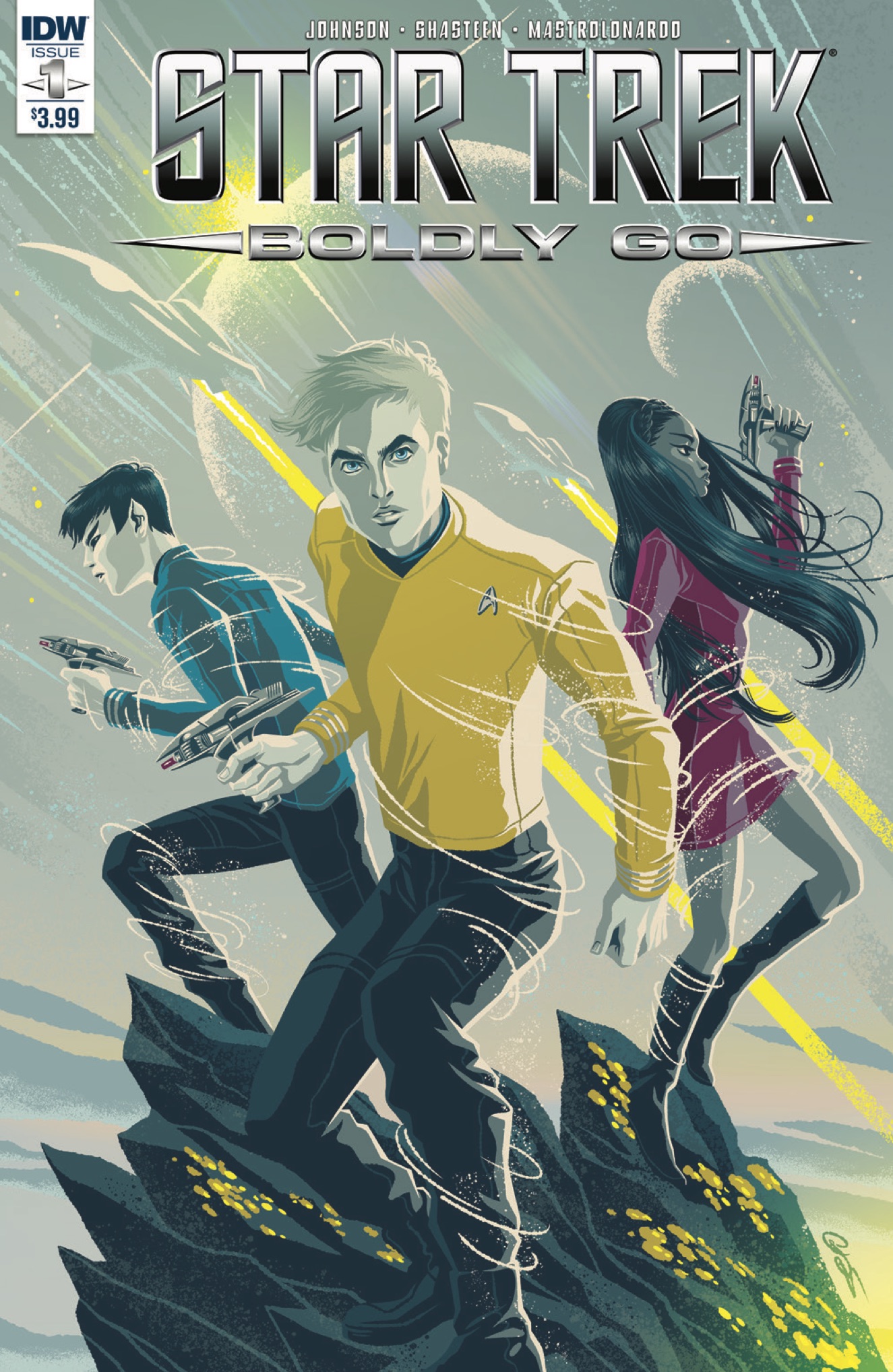
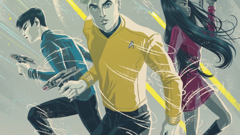
Cover art for Star Trek: Boldly Go #1
Available from IDW
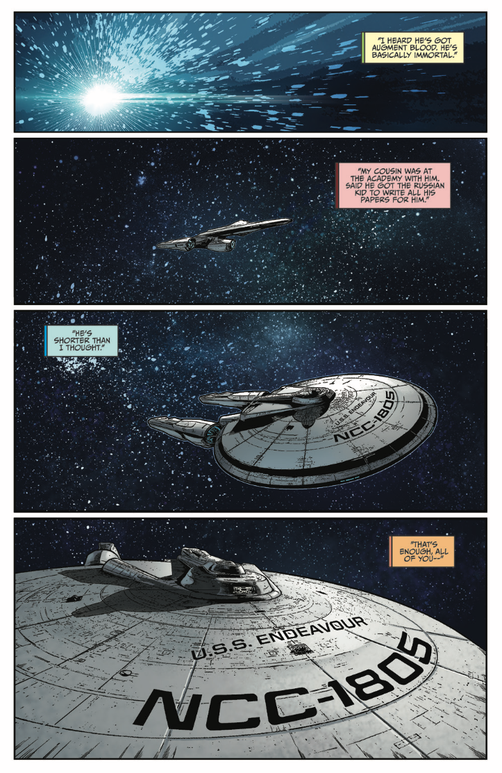
Space, the final frontier. These are the voyages of the starship Endeavor. Opening with a familiar saucer shape and twin nacelles, each panel draws a ship closer into view only to reveal a surprising name on the hull. Upon this revelation, one thing is apparent, this is not the previous five-year mission by Mike Johnson and Tony Shasteen in IDW’s relaunched monthly Star Trek comic.
Fresh in its approach as a Star Trek comic, Johnson and Shasteen are filling in the blanks from the conclusion of Star Trek Beyond’s final minutes, between the moment Kirk and company peer upon the construction of the Enterprise A and its inaugural voyage. Turns out, time moves much faster in films than real life (or the comics) and there is an entire new set of adventures taking place during those final on-screen minutes.
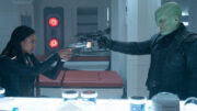
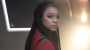
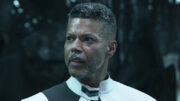
Thrusting the crew in brand-new situations, Johnson has separated the Enterprise crew, leaving sets of characters together, while placing others in new roles – none of which will be divulged in this review, as part of the joy of this new series is in where and who Johnson put together. There are characters no longer serving onboard a starship, while others have seen their responsibilities drastically changed – some for the better, and some not so much.
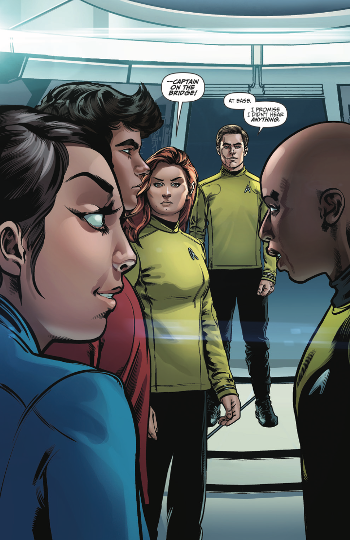
Honing his Star Trek storytelling craft over the past five years, Johnson has hit his stride as a writer and elevated his narrative with Boldly Go #1. This being a Johnson-penned script, there are a few Easter Eggs to be enjoyed, especially the “Oh, Wow” moment on the last page. The issue also offers Shasteen a different visual challenge, although nothing beats the suspense of his opening and closing pages. Generally, most of the characters are always in their Starfleet uniforms, so it is cool to see Shasteen get to draw a couple of them in different attire, including one terrific TOS throwback.
Debuting with seven different variant covers, Star Trek: Boldly Go #1 features the normal newsstand and subscriber covers, as well as a blank edition and several exclusives. Hands down, the best is Shasteen’s Midtown Comics cover, which is a classic homage to an Original Series promotional image.
Number one issues are terrific jumping on points for readers, and Boldly Go #1 is no exception. The creative team has become a well-oiled machine and the first issue places the Enterprise crew in while familiar, completely new environments. As the title suggests, it is now time for the characters, creators and readers to Boldly Go.

Not a big comic book reader but this does look kind of cool. Minimalistic looking artwork.
I really hate the new graphic “trend” that forbids the use of black to out line anything. From icons on your smartphone to comic books this new aversion to the color black is getting old. Can’t say I’m too crazy about the new “feminine” look of Kirk and Spock…and I hope it’s just a cover variant. If the entire book’s artwork is of these new “style” I will have to pass. Do currrent artists no longer know how to draw gritty,realism anymore for these adventures?
Please, less anime influence and more realistic illustrations like this!
Wow, you got a point there. I like minimalistic art but what you show there really pops off the page. Really well suited for a comic.
What comic is that btw if you know?
It, Army at War. Good realism.
You’re right, Hugh, it was Army at War, the title that introduced another great gritty war comic, Sgt. Rock. Love the Trek universe, I’d just like a little more care and effort put into the art so men look like men rather than department sore mannequins lol Especially in a dangerous deep space adventure!
I see were your coming from Jonboc. I actually don’t dislike the artwork these folks have done, there’s plenty of room for interpretation imo. I’m sure they put their best foot forward and I do like minimalistic art. But I would love to see some Trek comics drawn in a similar fashion as that Army at War comic.
@ Hugh Hoyland
@jonboc
I’d also like it if the incidental or background or “guest” characters had appearances more similar to the lead characters. The difference kind of pops out.
—————————————————————————————
On another comics subject, there’s also a comic novel based in the Iraq war, in a similar black and white style, beautifully drawn. I’m racking my brain to think of the name. It’s about a journalist embedded with the unit, observing the soldiers and their “adventures” … name is something like “Safety First” … I hope someone here knows it … I saw it in Best Comics 2008 and would like to buy it ….
@jonboc,
I agree wholeheartedly. I hate the look of the “anime”-type cover. Some artists love hearkening back to ’60s advertising, and it looks as if they’re ads aimed at women for Bloomingdale’s or Macy’s. Ugh.
Could not agree more.
“Fresh in its approach as a Star Trek comic, Johnson and Shasteen”
I really wish this website’s writers would put more effort into using proper grammar. Johnson and Shasteen are not a Star Trek comic, so the above makes no sense at all. I see non-grammatical sentence constructions like this all the time on this site–and it’s only frustrating because this site is such a great resource for Trek fans. I read it every day and enjoy the articles, but the grammatical problems often find me cringing.
Dandru,
While I agree that horrible grammatical mess needed to be brought to the author’s attention, as it is very difficult to discern what is being communicated, I can’t help but note that I found myself also cringing with your attempt to hammer it home forcing the singular possessive form of “it” to correspond to the connected personal names “Johnson and Shasteen”. I wish you had just left it at stating that the sentence had “grammatical problems”, making it impossible to discern meaning, rather than attempt a still cringeworthy demonstration of one wrong aspect.
Your response is nonsensical. Please try again.
Dandru,
Re:Your response is nonsensical.
Actually, that was exactly my point about your intimation that a sentence so rife with errors could possibly mean anything, let alone the “Johnson and Shasteen ARE a Star Trek comic.” that you insinuate. A meaning at which one can only arrive without without additional cringing by somehow ignoring the other grammatical errors. You did arrive at the appropriate “makes no sense at all” conclusion, regardless.
Who cares…? Geeze, Grammar Nazis.
CaptJWAmick,
Re: Geeze, Grammar Nazis.
I’m not. More reformed. I don’t take it quite as seriously as I appear. Because the shoe once fit in my brash college matriculated youth, I enjoy trying to keep Dandru honest about his.
For example, he claims that his written contributions are more deserving of pride than anyone else’s because he can spell well. And he’s never backed off from that prideful boast; even after I pointed out to him that William Shakespeare, a veritable linchpin to many of STAR TREK’s written scripts, couldn’t spell.
The publication should contain a trigger warning for those of us who like science and plot credibility in our SF stories. After all, it begins by mentioning “augment blood” and thereby recalling the trauma induced by the so-horrible-ST:BEY-pretended-it-was-never-made STID.
One more reason never, ever, to pick up a Star Trek comic book. Good advice since 1966.
That was a remarkably stupid comment.
Nah, it’s just ARH’s opinion; stupid or not, ARH has a right to voice it
That’s irrelevant since at no point did I say he didn’t have the right–you’re arguing against something that I didn’t say.
@Dandru
Did someone pee in your Cheerios? Good grief. Chill out, keyboard warrior.
CaptJWAmick,
It is progress that he’s stopped attacking the messenger and now attacks the message.
“The comic takes place during the final few minutes of Star Trek: Beyond, and as the creative duo demonstrate, a lot happened in that short amount of screen time.”
Huh? I’ve read this comic and the action starts months after Beyond and there is no reference whatsoever to the movie… Did I miss something or are you just making up a review without having read the book?
That what the promotional materials said, and is the only time period that makes sense – despite what the inner front cover of the issue says. Not the first time IDW has been unclear about such things or messed up chronologically.
Presumably there is a gap between the final shot of the crew looking out at the Enterprise A while she’s under construction….and the finished ship warping off into space in the final frame. I’m not sure how long construction would take, but in ST ’09, the original Enterprise is under construction in Iowa as Kirk rides up to join Starfleet Academy and is finally launched three years later, just after graduation. This comic book series takes place during that gap…however long it may be.
I can’t see why Starfleet would automatically build a new ship with the same name for the existing crew. Surely everyone from the Enterprise would be swiftly dispersed across the fleet and Kirk, post-court martial, would receive a new command. It would have been interesting to see Kirk on an older ship, not called Enterprise, for Star Trek 4.
It’s not the US Navy. While many maritime traditions remain within Starfleet, the organization as a whole is entirely different. Maybe that’s because of the strain of long term deep space deployments? You need to be able to fully trust the person next to you fully. You function better as a team when you fully know those whom you work with and lead. That is why, in the past, infantry units have largely stayed together in a time of war from Basic training/ boot camp until deployment.
I like the twist at the end of the comic. My only beef is that I would have preferred to see it on the big screen. All in all, great comic. Cant wait for #2!
the best is Shasteen’s Midtown Comics cover, which is a classic homage to an Original Series promotional image.
I loved seeing that! Not sure I’m going to like people in different billets though … :-(
Looks like we’ll get to see Chekov! Hooray!
Hey, that’s the Aegis design from the upcoming (and unfortunately delayed) “Star Trek: Bridge Crew” being used for the Endeavour! I like that design, BETTER than the JJ-prise herself (though the jury is still out on it being better than the Enterprise-A). I never really got into the “Ongoing” stuff, but this “Boldly Go” deal is of some interest. Not to mention taking some chances.
Small Spoilers!!!!!!— Dig the new uniforms from Beyond! Never took to the delta insignia printed uniforms used in the first 2 films. In fact never really cared about the jj-verse at all until Beyond brought some of that old TOS flavor to the series.
Only have 2 complaints for the first issue. McCoy is drawn way off character and I’m really disappointed they brought back the Smock-Uhura relationship when it was scrapped in Beyond. (I do appreciate the Amok Time call back with Uhuras’ dress though!) The tribble blood mention, although having nothing to do with the story, does bring back unwanted memory’s of STID.