

Ever since the Star Trek: Discovery trailer came out last month, fans have been talking about the costumes and yesterdays release of the first picture of Captain Gabriel Lorca (Jason Isaacs) gave us the clearest picture yet of the Starfleet uniforms.

Starfleet officers in uniform from Star Trek: Discovery
These new uniforms appear to be the most intricate of any seen before in the franchise, either on TV or film; providing a particular challenge to cosplayers seeking to craft their own. Showrunner Aaron Harberts recently cited them as one of the reasons the show has been delayed; they flew a costume designer to Switzerland to get the fabric, and some of the detailing had to be custom-made using 3D printers.
Like any uniform, these 23rd century Starfleet issues are designed to be both functional, and to convey information about the officer wearing them. We’ve taken a close look and created a detailed infographic for you. We also take a look piece-by-piece at each component with some zoomed in screenshots below. Let’s start with the infographic…
INFOGRAPHIC: The Star Trek: Discovery Starfleet Uniform
(Click for an even higher-resolution, downloadable version.)
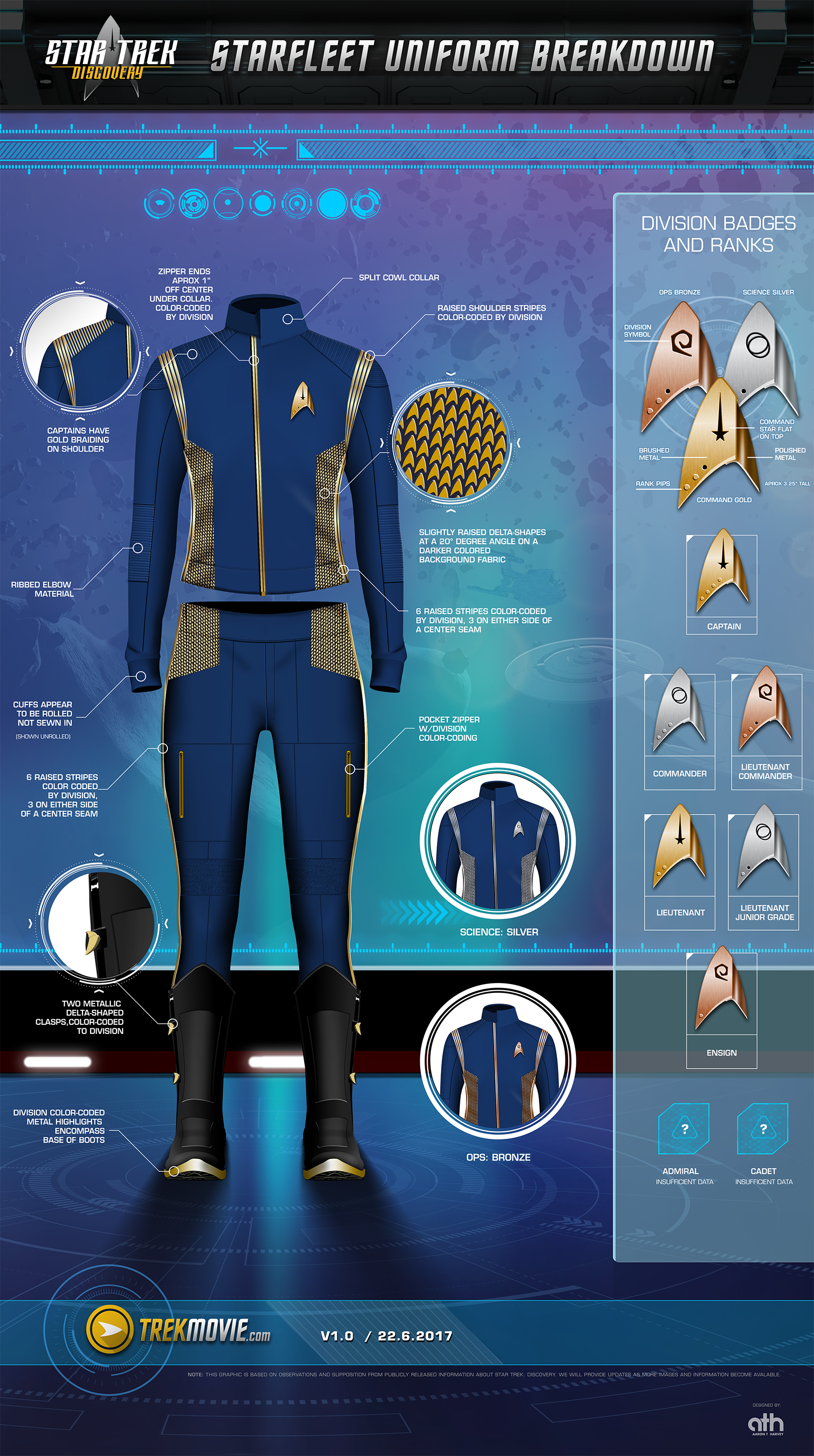
Note that the above graphic is based on observations from what has been released as of now. As more images and information is released we will update the graphic and repost it.
The new Starfleet Uniform – a closer look
The Jackets
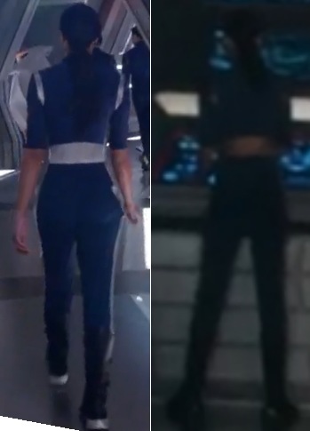
They key component of the new uniform is the jacket. All the uniforms (jacket and trousers) appear to come in the same basic blue. The zipper (which is slightly offset from center), shoulder braids (which seem decorative and don’t indicate rank), and a raised delta shield pattern on the sides all have the accent which indicates department: gold for command, silver for science, and bronze for operations. The captain also gets an additional striped shoulder pattern. One note is that the braid, as seen so far in the handful of examples from the trailer, has four stripes for women and five for men. This seems to be a function of the size of the uniform, not something indicating rank, division, or gender.
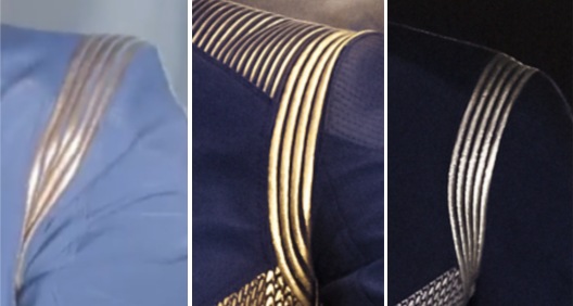
Shoulder braids and delta pattern in bronze, gold and silver indicate division with captains (center) getting special shoulder patch
Trousers and Boots
The delta pattern is continued on the trousers, which also include a zipper and stripes, again indicating division. This division detail continues even down to the boots, as not only do they have a color-coded stripe around the sole, there also appear to be two delta shield clasps as well. These are hard to see in the trailer, but can be made out with closer observation of the trailer.
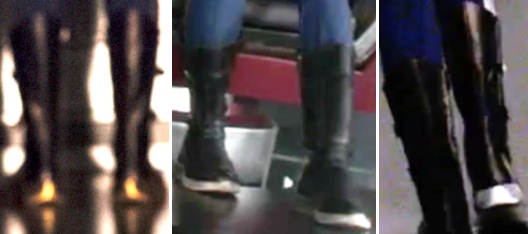
Division color-coding even applies to boot trim
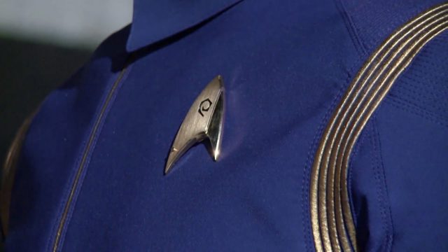
Badges
Star Trek: Discovery also brings us delta shield badges which are new but still familiar as they use the same division symbols seen on the original Star Trek (set 10 years later). The badges are also color-coded to these same divisions, but they are doing double duty. They also function as rank insignia, although you will have to be pretty close to make it out. They are using a ‘pip’ system similar to that from Star Trek: Enterprise (set in the 22nd century) but actually more akin to Star Trek: The Next Generation‘s 24th century-era.
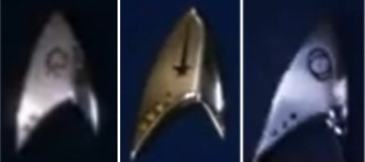
Starfleet insignia badges show both division and rank
One quick note on the ranks: If we assume TNG system of rank pips then the trailer images indicate that Michael Burnham (Sonequa Martin-Green) is a Commander and Saru (Doug Jones) is a Lt. Commander, however earlier reporting had them as Lt. Cmdr. and Lieutenant respectively. So either the Discovery pip system is different or their ranks on the show are different than originally reported, or possibly their ranks change during the show.
Variants and Other Starfleet Outfits
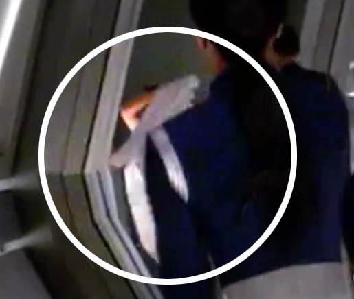
In addition to the main uniform, we have also seen some other bits of Starfleet kit. One of the more interesting ones appears to be some kind of variant. You only get a couple of glimpses of it from behind in the trailer, but it appears to be a short-sleeved version of the standard uniform with a sort of cummerbund wrap which is (of course) color-coded. There are only a couple of examples and both were female crew members so it is possible this variant is only for women. One of the images was from the back of the bridge, so it does still appear to be something worn on duty. Unfortunately we haven not seen the front of it so we can only speculate, but presumably it is a shirt with a badge or possibly the badge is on the cummerbund, like Kirk’s green wrap tunic. It may even be that this short-sleeved shirt is what is worn under the standard jacket.
Star Trek: Discovery Starfleet uniform variant in silver and bronze
An even more obscure detail was spotted for just a few milliseconds in a scene in the corridor of the U.S.S. Shenzhou. As we follow one officer (in the above mentioned variant) down the hall, a brief flash of another crew person putting on some kind of white jacket can be spotted. This white jacket could be casual wear, but a good guess might be that it’s a medical smock.
Blink and you miss it glimpse at a white smock
One thing we get a really good look at is a new spacesuit, worn by Michael Burnham (Sonequa Martin-Green), as she takes a spacewalk in the trailer. And just like the uniforms, this is the most elaborate Starfleet spacesuit seen in Trek.
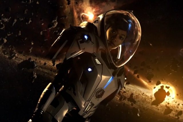
Michael Burnham in Starfleet space suit
The trailer and officially released images also give us a look at some desert wear. These do not appear to be standard Starfleet desert uniforms as there are no indications of rank or division, unlike the desert uniforms seen on Star Trek: Enterprise and similar uniforms on Deep Space Nine. However, they may still be Starfleet-issue and made to blend in with the locals on a visit to an alien world. The utility belt also seems to be similar to those from the original Star Trek’s “The Cage.”

Captain Philippa Georgiou and Michael Burnham in desert clothes
Like in “The Cage”, Discovery has field jackets, but with a bit more of a tactical bent. The braiding along the sides of the pant and shirt are black, the collar is lower and a uniform hight and it zips to the top, and the chest, back and shoulders have extra protection in the form of a vest. Where the division badge would be looks to be a standard Starfleet Command insignia, like on the space suit. There is also another (different) utility belt for holding a sidearm on the leg and (presumably) a communicator in the pouch at the waist.
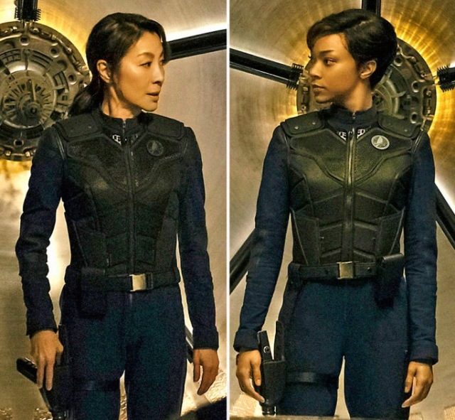
Starfleet tactical uniform
Changes made since first look
It also appears that there have been changes made to the uniforms since the behind-the-scenes teaser trailer was released in January. The badges appear to have been widened. The cut of the jacket seems to have changed as well. Plus, a color-coded zipper is now more prominent. .
The uniforms have already changed since this earlier version was shown in January
“Happy Transporter Accident”
The new standard uniforms for Star Trek: Discovery are unique, and clearly different from the standard duty uniforms worn on the U.S.S. Enterprise either under Captain Kirk or Captain Pike, but that does not mean they are entirely new. Last summer, Discovery co-creator and former showrunner Bryan Fuller described the uniforms thusly:
“I think that when you see it [the uniform] I can tell you specifically what the influences are, and that the styles that [they adopted] a transporter accident in their approach. A happy transporter accident. I think when you see the design, you’ll say “It’s a little bit of this, it’s a little bit of that.”
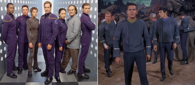
When you look closely you do see various influences, particularly the 22nd century Starfleet jumpsuits seen on Star Trek: Enterprise. While the new uniforms are two pieces, you can still see the influence of the blue and the zippered pockets from Enterprise. And another major influence may be the excursion jackets from the original Star Trek episode “The Cage,” which is set at the same time as Star Trek: Discovery.
As noted before, the insignia design and sizing are pretty much straight out of the original Star Trek, although styled more as badges than sewn on. The rank pips on the badges seem to be replicated from Star Trek: The Next Generation.
The new Discovery badges appear to be a mashup of TOS design with TNG rank system
As for the color-coding system of gold, silver and bronze, this may be another element that pulls from “The Cage” style. With gold again for command, science blue becoming silver, and the operations tan becoming bronze.
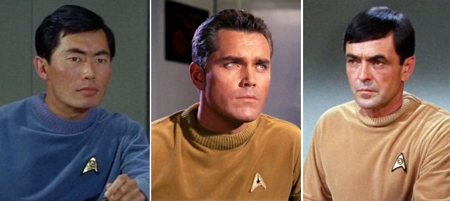
Classic division colors may have influenced the silver, gold and bronze for Discovery
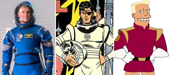
The uniforms may also share more influences from beyond Star Trek, including NASA. The shoulder braids seem particularly reminiscent of a classic sci-fi look from the 1950s, also used extensively in Futurama.
More influences for the new Discovery uniforms?
Keep up with all the Star Trek: Discovery news at TrekMovie.
What do you think of the new uniforms?
So what do you think of Starfleet’s latest outfits? Sound off in our comments section below.
Aaron Harvey is a graphic designer and hosts an excellent podcast dedicated to Star Trek: TAS (and Trek in the 70s) for Trek.fm called Saturday Morning Trek.


What do I think? I think I really, really want one! Love this design :)
I want one too! Can you say Halloween goals! I just love the uniforms. They are just awesome.
Really? They look so tacky.
Very pro this uniform. Clear attention to detail. Looks smart. I don’t care if it doesn’t particularly fit the time line precisely, the cage was made with almost no money. I can’t wait to see them in action!
The Cage had a huge budget. The uniforms looked the way they did because that’s how they thought the future looked to people in the 60s.
Thanks for the detailed analysis of the new uniforms; that’s very interesting!
I like the way the new uniforms look; they’re really quite spiffy. Fond as I am of the TOS uniforms, these uniforms provide a nicely updated look.
The only problem I have with them is that rank isn’t visible unless you’re practically on top of the person. Kirk could look at a crew member beaming aboard for the first time and call them “Lieutenant” from ten feet away, since from that distance, he could see they had one stripe around their sleeve. Captain Lorca will have to practically kiss new crew members in order to see their rank. :-)
Of course, I’m sure any captain would review the personnel files of new crew members before they even beamed aboard; that was just an example. :-)
That’s why PineKirk kept trying to kiss Nuhura… because he couldn’t find her rank.
Yeah I agree, and it looks like the badges did get bigger between time of the teaser trailer and now so I am sure we aren’t the only ones to point that out!
I agree with you Corylea. The rank system appears to be one of those “Hey wouldn’t it be a neat idea if…” moments, which no one thought through the practical implications of. I’m a bit of a Miliary geek so its really annoying. Also the division colours seem a bit “gaudy” for standard day uniform, and they run risk of implying that Ops/Bronze is less important/third place to, the other divisions.
Ha! I knew that little pip was going to be the rank insignia!
What else would it be?
When that first pic was released in the trailer, there was a lot of discussion that it was possibly a reflection, or an indentation, a lot of people didn’t know what it was. I had a discussion elsewhere with some folks where I posited it could be the rank pips, and for whatever reason most of them thought that was preposterous.
No jumpsuits! YAY!!!!
“Cadet”? Try enlisted.
Mary Wiseman is playing Cadet Tilly, she is specifically NOT Enlisted.
Cadet is a rank which Starfleet Academy uses to denote students in training to become Starfleet officers. In the 2250 cadets had a small starburst crest so it stands to reason cadets will have a different badge system, especially given the main uniform is put together.
Enlisted personnel may be promoted to receive a commission, but must pass necessary examinations and/or attend the Academy. So they may have just a blank badge, but we don’t know yet.
Cadet is simply a Starfleet officer who hasn’t graduated the Academy. Saavik was still a cadet, but held the rank of Lieutenant.
This is the kind of geeking out that Trek fans love–and, honestly, this deep dive article has only gotten me more excited for Discovery!
I’m right there with you buddy!
I’m totally geeking out!
“geeking out”? This one doesn’t.
I’ll do the geeking for me and for you then.
Same here, I’ll pony up for the stupid streaming service (but only after all the episodes are up, not because I’m that cheap so much but that I know when I get rolling on this, it’s binge-watch time and I hate being frustrated!)
Meh. They’re ok. Much more stylish than functional. Then again, Trek uniforms have never seemed particularly functional on the whole. I like the excursion jackets, and I really, really dig the boots. They remind me of Leela’s from Futurama. The EVA suit screams Buzz Lightyear. ;)
Enterprise uniforms were completely functional, and the most ‘realistic’ of the bunch. TOS movie (while good looking), and TNG uniforms were the least functional of the bunch. Both looked more like a dress uniform, not a duty uniform.
One of the things I like about the JJ-Verse uniforms is that they have uniforms specific to what they’re doing. Not a one-size-fits-all that doesn’t really fit for anything.
@NX — not sure I understand what you’re saying here — DISC evidently has custom uniforms for various purposes. There’s a duty uniform for ship wear, desert uniforms, away mission uniforms, and probably many more … Not sure what else you want. Also The Kelvin uniforms were way too baggy — at least TOS were fitted and snug. And they BEYOND uniforms seemed way too formal. Aside from the metal decoration, in many ways they seemed more stuffy than the DISC. So not really following your complaint here …
Sounded more like an observation than a complaint to me, but hey, I’m not a telepath!
They work!
The uniforms are growing on me. I really like the gold, silver, bronze parts. Getting more excited for September!
Looks like they’ll be expensive for accurate cosplay, especially with the boots. Don’t mind the look, though.
Maybe you should stop using stupid make up terms like “cosplay”. I assume you’re an adult.
Wouldn’t every word be “made up” at some point? Cosplay is certainly a word now. In fact, it didn’t even get flagged by spell check. Grow up.
No explanation as to why they are using 1701 specific insignia back when every other ship had their own. Oh well, must be another one of those JJverse changes. And, yes, still not buying that this is a prime universe setting.
The different insignia is a combination of costuming errors in Season 2 of TOS (Bill Theiss went and did whatever he wanted) and then a “fanon” explanation to try to deal with it. The intent was that all starships use the delta, other areas of service had their own badge, so only people serving on starships got the delta, folks doing cargo duty had a different patch and so forth. You can see the delta used in The Cage for non-Enterprise personel, and then later in Season 3 as well. You can find Justman’s memo from late 1967 floating around explaining it. So, there’s nothing wrong with using the delta for a starship crew.
Well, Decker commanded a starship in TOS and his uniform had a unique symbol – no Delta…
can you elaborate on that memo’s explanation? Thanks!
P.S. I still really like these uniforms, though…
See Aaron’s full copy and paste of the memo in the comment below our little chain here.
Doomsday Machine is part of TOS season 2, which as I mentioned is when the error crept in.
Justman’s memo comes from late ’67 when they were filming The Omega Glory, and he noticed they gave Capt. Tracy a unique insignia, which shouldn’t have happened. Justman either missed Decker’s insignia difference, or it may have been okay by him since he was a Commodore, no one is sure what happened there.
And then ENT went and created a custom insignia for the Defiant, which is now canon as well.
Yeah sadly they did that based on the incorrect “fanon” idea :-/ and until the HD remaster of TOS in 2006 (after the production of ENT ceased), you couldn’t really make out what insignia they had on, they had standard deltas, most dead guys on the Defiant are slumped away from the camera so you can barely see the insignia, making it super tough to tell.
These two shots are pretty darn clear in HD now:
http://tos.trekcore.com/hd/albums/3x09hd/thetholianwebhd0228.jpg
http://tos.trekcore.com/hd/albums/3x09hd/thetholianwebhd0270.jpg
I just took screenshots of the same thing :-)
@Matt — ha, I never saw that. I always assumed they put the dead guys face down specifically to avoid having to go to the expense of creating a new assignment patch, since it had already been established practice during the second season (never realizing that there was a memo indicating that practice was a mistake).
@Matt Wright – “These two shots are pretty darn clear in HD now:”
Yeah, those nice HD restorations is how this new insignia was discovered in “The Cage”. I’d love to know what the thought was of putting two apparent security guards in sciences blue, with their own custom insignia. Using blue for security continued into “WNMHGB” too, complete with the sciences insignia, evidently swapped for operations. It’s hard to hinge canon permanently on mistakes made in production, or inferred by fans to retcon it …
It’s hard to hinge canon permanently on mistakes made in production, or inferred by fans to retcon it.
Exactly, people need to give the show some slack. TOS wasn’t perfect by any means, there are production mistakes, issues, etc. throughout every show. TOS of course was invented as it went, Season 1 had a lot of world building to do, Starfleet wasn’t even a term for the first few episodes, and so forth.
On that 4th division, I have to admit, I didn’t even know there was one in Cage/WNHGB. Until the HD remasters I’m sure people just thought that was the engineering/operations division symbol since it’s somewhat similar.
Let me acquaint you with a memo from Bob Justman circa Dec 1967:-)
TO: Bill Theiss
FROM: Bob Justman
SUBJECT: STARSHIP EMBLEMS
TO: Bill Theiss
FROM: Bob Justman
SUBJECT: STARSHIP EMBLEMS
DATE: December 18, 1967
Whilst sitting in Dailies today, it was noticed that a Starship Captain (from another Starship) was wearing an emblem unfamiliar to yours truly. I have checked the occurrences out with Mr. Roddenberry, who has reassured me that all Starship personnel wear the Starship emblem that we have established for our Enterprise Crew Members to wear.
Doubtless this situation has arisen due to the fact that a different Starship emblem was used last season on “CHARLIE X”. However, the personnel of that other ship in that show were the equivalent of merchant marine or freighter personnel — and therefore not entitled to bear this proud insignia on their individual and collective breasts.
Please do not do anything to correct this understandable mistake in the present episode. However, should we have Starfleet personnel in any other episodes, please make certain that they were the proper emblem.
Under penalty of death!
Signed this 18th day of December, in the year of our Lord, 1967, by
ROBERT H. JUSTMAN
Chief Inquisitor
CC: Gene Roddenberry
John M. Lucas
D.C. Fontana
Gregg Peters
RHJ:sts
P.S. A carven “I’m sorry!” will be sufficient.
R.H.J.
Under penalty of death — maybe this is the true language of General Order 4…or was it 7…
God I love Justman’s memos. They made “The Making of Star Trek” so much fun.
Thanks for posting that! I’ve seen the “different starships had different insignia” thing stated as fact in several places; it’s nice to have Mr. Justman set the record straight.
“No explanation as to why they are using 1701 specific insignia back when every other ship had their own. Oh well, must be another one of those JJverse changes. And, yes, still not buying that this is a prime universe setting.”
OMG, get OVER it. And how are you not ‘buying’ its not in the prime universe. Do you think CBS is lying about it? They aren’t the U.S. President.
No kidding.
TOS was filmed in the 60’s. Are we to expect every error, every cheap set, every decision made from the 60’s perspective to be adhered to? Come on…
bassmaster22
TOTALLY agree and it really a shame.
While I think they should have gone with sleeve ranks like in TOS rather than TNGs pips system, I think these uniforms are neat and tidy and reflect the quasi-military well that Starfleet is and aspires to be. Awesome article, thanks much!
Horrible and horrendous.
I think they’re hideous. The color is atrocious. Off center zippers are passe. And the entire thing doesn’t fit the timeline at all. Plus why the hell are they still using that stupid delta-shield pattern. UGH.
In Lirk’s time (10 year after Discovery), each ship had its own unique symbol, with Enterprise using the Delta Shield. If this show is a decade earlier, why does Discovery have a Delta shield? It should be different & unique to that ship. The Felta didn’t get adopted by Starfleet until after Kirk’s historic 5 year mission (or longer, until we reach the Motion Picture). If Discovery is in the Prime Timeline, this insignia use goes against known history and was the easy way to go (giving fans something familiar on the uniform). I wonder if they will ever address this during the run of the show, or if they will simply ignore established Prime Timeline history…
Thoughts?
Captain Lirk is my favorite.
TO: Bill Theiss
FROM: Bob Justman
SUBJECT: STARSHIP EMBLEMS
DATE: December 18, 1967
Whilst sitting in Dailies today, it was noticed that a Starship Captain (from another Starship) was wearing an emblem unfamiliar to yours truly. I have checked the occurences out with Mr. Roddenberry, who has reassured me that all Starship personnel wear the Starship emblem that we have established for our Enterprise Crew Members to wear.
Doubtless this situation has arisen due to the fact that a different Starship emblem was used last season on “CHARLIE X”. However, the personnel of that other ship in that show were the equivalent of merchant marine or freighter personnel — and therefore not entitled to bear this proud insignia on their individual and collective breasts.
Please do not do anything to correct this understandable mistake in the present episode. However, should we have Starfleet personnel in any other episodes, please make certain that they were the proper emblem.
Under penalty of death!
Signed this 18th day of December, in the year of our Lord, 1967, by
ROBERT H. JUSTMAN
Chief Inquisitor
CC: Gene Roddenberry John M. Lucas
D.C. Fontana
Gregg Peters
RHJ:sts
P.S. A carven “I’m sorry!” will be sufficient.
R.H.J.
Trek fans not knowing the truth and complaining about it.
Actually, real world explanation aside, you don’t know this. We only ever saw other starship assignment badges over 10 years after DISC is set. So anything else could have been the norm at that time. I recall reading one explanation about the assignment patches that suggested as more Constiution Class ships were launched, assignment patches were developed unique to each one, but eventually after the newness and pride of launching these powerful ships faded, and so many were lost, that the unique badges were retired, and the system was dropped in favor of a return to the delta shield uniformity that predates the Constitution badge departure.
That doesn’t bother me, since the delta is a bit different from the Enterprise one, and there’s at least one instance of a ship emblem being a variation on that logo. You can see it at https://goo.gl/images/PrSq3Q
What does bother me is the change in the division colours and the overly complicated uniforms. Starfleet uniforms have generally been simple and functional, and these are way too dressy and decorative to fit with the design concepts to which Starfleet clearly subscribed during this period. I can forgive the colours because of The Cage, but the style is way too complex and overtly militaristic.
I do think the new uniforms are cool, pretty and unique. If it was just a general Sci-Fi space outfit, looks good. I love the dark blue with the metal highlights. However, as Starfleet? No, sorry. Doesn’t make sense to change to metals instead of blue/gold/red as it’s always been pretty much. The pips on the delta shield just don’t make sense to me. Why are we using the Delta shield anyway? I guess they just want to make it look cool but not strictly adhering to cannon.
Kudos, Mr. Harvey. Great work!
I have to say that I found it especially thrilling that you pointed out the possible correlation between the new metallic colour scheme and the Cage-era colour scheme, since I have commented on that just yesterday.
Now, to be fair, the division colours of the Cage-style uniforms are actually rather elusive, since the set lighting had a such a great effect on them. The colours seem to vary from shot to shot and sometimes it can be hard to tell whether Scotty and, say, Yeoman Colt are actually wearing the same colour, since it appears to oscillate between salmon, khaki, pale ochre and pale copper depending on the shot.
Also, from what I’ve gathered, the “gold” uniforms, as worn by Pike or Spock were actually lime – which is also why they look a lot closer to that colour in the remastered version of the episode.
I LOVE the INFOGRAPHIC, and I LOVE the new uniforms! Glad the 1950s Sc-Fi aesthetics is being noticed more and more. This new uniform is just marvellous and unashamedly ‘Space-Age’.
I know the view is obscured by the holsters, but I’m liking how the phasers look.
Agreed! I’m not offended by the tweaks they’ve made to the look , but it’s great that the phasers seem to be close to the TOS ones (Which admittedly are one of the only things that still look cool by modern standards, in my opinion.)
1st I’m going to drop 25 pounds, then I’m going to buy these threads when I have no doubt Annovos will begin taking orders for them.
The ONLY part I would change is black pants. You gotta have black pants on Trek. ;)
I made a similar version to this graphic when the trailer came out, I like this uniform very much, except for the fact that the rank is nearly invisible.
http://rekkert.deviantart.com/art/Star-Trek-Discovery-Starfleet-Uniforms-681371238
Having seen this outfit a lot while doing that image, I’m fairly certain that the jumpsuit variant is in fact what everyone is wearing beneath the jacket. We’ll find out before September I’m sure.
I agree about the rank. Perhaps after seeing them on-screen they might update the uniform to include larger pips across the shoulder or the rank braids on the sleeve.
But the jumpsuit variant has a collar that looks like it’s identical in construction to the main uniform – that would super weird (and uncomfortable!)
The Division colors are so, so subtle. Without a full sense of the show’s look, I’m not sure I like the sparing and uniform use of color. I wasn’t a huge fan when DS9 went to the grey-shouldered First Contact unis. This, ahem, uniformity is so much more militaristic, and I’ve never loved that aspect pushed too hard.
The TOS movies must have really upset you then.
I like everything but the boots. I don’t know but they look like something college girls would wear to me. I kind of wish they stuck with the boots they were on Enterprise or even the KT films. But other than that its not bad. Still not my favorite uniforms (that will always be the First Contact era uniforms) but I do like them. I’m just glad they didn’t go back to the ugly uniforms of The Cage. Ugh.
Just a little love for Zap Brannigan? If Picard could wear a romper….
I can’t wait for the Mirror Universe Episodes and a Potential Mirror Universe Spin off.
I just don’t like the matching pants and jacket color. I would rather the pants be black or dark gray. Other than that, the uniforms are great.
@VZX — you must have hated the ENT uniforms.
I wonder why some have 4 and others have 5 shoulder stripes
So far it seems to be based on gender, broad shouldered men have an extra stripe to fill it out.
So then it’s not that much gender than
more the encoded size of the uniform
xxs=1, xs=2, s=3, m=4,l=5 …
;)
Right, however thus far from the trailer, all women seen have 4, all men seen have 5. So it ended up in practice based on gender, whether that’s the intention or not.
If its gender, I don’t like that. The stripes could, in an unintentional way. denote a higher rank for men. If they felt 4 didn’t look right on wider uniforms, they should have went with a slightly wider stripe rather then add a stripe.
But time will tell.
Agreed, TUP.
“These new uniforms appear to be the most intricate of any seen before in the franchise”
Nah, the most intriace are still the Monster Maroons.
Not from a construction standpoint, the Monster Maroons were much easier to build where the seams lie and availability of materials…the last time I checked they didn’t have tiny 3-D printed deltas overlaid on a different colored fabric panel inset, or any inset panel for that matter :-)
@Aaron — I assume by “Monster Maroons” you mean TWOK uniforms? If so you should read about them. There’s a reason they stopped using the white turtlenecks in TNG, and it had nothing to do with the evolution of the look. That turtleneck was likely more complicated than 3D printing of mini deltas on the side panels, requiring a custom machine they no longer made.
Awesome! Well Done!
Nope, not feeling this at all. I think it’s a real stretch on trying to explain the copper color for engineering division.
I get it that in the first two pilots you didn’t see any red uniforms, but this is where you can take some creative liberties; but they’ve gone really beyond that at this point
Huh, how is the copper-color a stretch for engineering/support?
because copper is copper color, and red is red….also science/medical is silver now?
At least JJverse got it right; brilliantly right
You lost me at “JJverse got it right”. Like really, you lost complaining privileges with that one lol
@Hugh — Ignoring your JJ comment, but hunkering you in the original comment; there was NO RED during THE CAGE era. It was beige. Copper is as good as any neutral metal to represent a beige color. So … Checkmate. You lose.
Anyone notice the smashed NX-O1 in the asteroid field in the blown up Infographic? It’s to the left of the Captains Delta Shield. Look closely!
Where was the red cross badge used? I don’t recall seeing it. You would think that by the 22nd, 23rd or 24th century they would understand that not all cultures use the cross in their medical simbology, e.g., red crescent, red star of David,…
Nurse Chapel wore it in TOS.
They also left off the “Security” badge from the original CAGE pilot, which would have been used during this period.
The cross in the red cross isn’t a religious icon, so it shouldn’t be a problem. Rather, it was intended to be a universal symbol that would be easily recognisable at a distance as representing medical personnel. That’s why it’s red on white, as both colours are highly visible. The red crescent was introduced because it was feared in the 19th century that some Muslim soldiers might interpret the red cross as a religious symbol, but it would be nice to think that we’d moved beyond that sort of thing by the 23rd century.
Very professional-looking infographic. Wow.
Notice the NX-O1 when you enlarge the Infographic? Look on the right side of the Infographic where the Captains Delta Shield is. Then look to the left. The USS Discovery is closing in on what appears to be a badly damaged NX ship stranded in the asteroid field. You can tell it’s an NX ship by its nacelles and configuration.
I wondered if anyone would see that!
In the recently released picture Captain Lorca has silver stripes though. If that infographic is right, shouldn’t they be gold?
He doesn’t though – if you notice that image is WAY blown out and the white balance is off (unless he is an alien with a bluish pallor) the material rarely appears that bight cerulean blue. This also does hint at an issue with using reflective metallic highlights – colors can get tricky!
Here’s a properly white balanced image in comparison with the released image:
Looks better corrected. Thank you. The darker shade is definitely better.
It’s a nice, rich blue, much better. Thanks Aaron!
I really hate these uniforms. They’re way too ornate to be Starfleet. Star Trek has always spend with the exception of the WoK style, Starfleet uniforms have always been simple, as though we’ve grown out of the need to decorate ourselves. These are far too overtly militaristic and decorative to really feel like they belong in Star Trek when compared to every other series, including Enterprise.
If you really mean “with the exception of “WoK” style, you’re talking about a style that basically lasted, what, 70 years? So…it would seem that design was the longest served design in Star Fleet history.
I agree, the weird shoulder stripes..I think someone from Starfleet uniform R&D went into the 1940s and said they liked the old Flash Gordon/Buck Rogers uniform look from the serials and just recreated those.
Too much unnecessary details, the deltas all over, the stripe on the boots in the infographic, the ribbing, the stripe on the sides of the torso..just too much.
CBS, TPTB, the showrunners, anyone that understood how uniforms have looked in Trek for 50 plus years should have tried harder.
They look nice, but I wouldn’t go so far as to say they’re the “most intricate” of any & all Trek uniforms to date. Unless you’re ignoring Star Trek Beyond.
Beyond doesn’t count because it’s in the Kelvin Universe. I can’t say I love everything about these uniforms. I like the metal color coding scheme, but I’m not crazy about the excessive use of the delta shield pattern, nor the liberal use of braiding. It’s far too much bling for a BDU. I could see the dress uniforms with all this extra trim and decoration, but otherwise it’s too much IMO.
Curious, It does look verrrry dressy.
@Marja — no denying that. However, I’d say TWOK uniforms look even more formal and dressy, despite the lack of shiny things. I’m eager to see these in practical application.
I’m just confused with the use of the Delta shield. In original Star Trek, only the Enterprise has the Delta and it was explained that the Delta shield was adopted by the whole of Starfleet to honour the Enterprise after its 5 year mission (being the only ship to make it home), however if this series is set before Original Trek, then all the different uniforms in original trek now have a continuity error. (or there was a coincidence that the Enterprise crew just happened to use the symbol which Starfleet dropped and then take it back up again). I think this might already be discussed in the chain. Personally, I think they could have left the Delta shield “on the shelf” and used something else.
Nah, they couldn’t really drop the delta shield – that’s literally the most identifiable symbol of the franchise — and let’s be real: CBS is looking to build a strong franchise brand, and a little retcon to preserve that goal is a small price to pay.
The question I have is whether we’ll see the original 4th division symbol created for the Cage:
http://memory-alpha.wikia.com/wiki/File:Starfleet_security_badge,_2250s-60s.jpg
There are some fans that would rather have a series that never makes it off the ground ore gets cancelled quickly then one that takes creative license and attempts to create something that is successful
Really? did you read any other comments before posting?
We’ve addressed this a few times in the comments. The idea of the delta being Enterprise only is “fannon”.
https://trekmovie.com/2017/06/22/a-close-up-look-at-star-trek-discovery-uniforms-infographic/#comment-5346294
“Tactical” – still uses 21st century plastic buckle.
Looks like they should be playing a tuba in that outfit. All that’s missing are hats. So many problems on so many levels…
Not a fan.
I hope we get some detailed information about the back soon as well! The two pictures available are not too clear. I make my own uniforms, so that’s a detail I need to get started.
The rest I already got by watching the trailer frame-by-frame.
There really doesn’t seem to be much on the back. Everything stops at the center seam except for the striping from the armpit down the top and onto the pants….3 on one side 3 on the other and four course the bands around the shoulder. The rest is plain. There might be some stitching we can’t see (and some we can) but there doesn’t seem to be any design elements unless it’s the women’s variant top….well we’ve seen 2 women wear it, there maybe be a mens version we just haven’t seen.
Here’s an image I compiled:
I really, really love how the gold, silver and bronze division colors more closely match the “Cage”-era division colors of gold (command), blue (science/medical) and tan (ops). I know: silver isn’t blue, but blue isn’t an option.
Also, I’m so glad they decided to stick with the rank/pip system that’s been in place since TNG, rather than reverting to the Kirk-era system. It’s still a continuity problem, of course, introduced when Enterprise decided to use the TNG rank/pip system 2 centuries earlier. That means the Kirk-era stripes from the series/medallions from the movies are radical rank departures that Starfleet takes for about a century. Whatever … some yahoo in the quartermaster’s office got antsy in the mid-23rd century, I guess.
It’s good. A tad overcomplicated at places, but good.
I don’t understand the idea of color-coded boots, though. What purpose does it serve? To allow a hidden enemy crouching under a table to tell an engineer from a science officer?
And these are supposed to evolve into the uniforms of Kirk’s era? I see a complete lack of effor to make them appear like anything that came before. Nothing but typical gimmicky science fiction design. Might as well have flames shooting out of the back of the engine pods. Should have looked to Abrams movies, at least they got that right over there.
Are you for real? You don’t see any evolutionary nods to Enterprise, Kelvin? They do look like that which came before in the sense it could evolve.
You must still be really upset with how drastically the uniforms changed between TOS, TMP and WoK…
I know this would be a crazy departure from continuity, but the way high tech “wearables” are going, there’s really no excuse for uniforms in the 23rd C to be just plain fabric and metal with no intelligence built in to do the stuff you’d want them to do: deflect energy weapons, provide breathable atmosphere and pressure (including automatically activating in emergencies), heads-up displays built into visors/goggles, monitor vital signs, etc. Uniforms in the 23rd C should basically be like walking around wearing a very sophisticated and unobtrusive computer that encompasses your entire body.
How do you know they’re not?
These look like they were reused from Galaxy Quest. Wouldn’t it make more sense to do something similar to the uniforms from Captain Pike era? That’s about the same time as this series is going on , correct?
They don’t really look like Galaxy Quest. GQ was very much playing up on the TNG uniforms, so in as much as that Trek DNA is there, they look like Discovery, but not really. They are much closer to say Babylon 5 or the BSG reboot.
The Troy, 7 0f 9 and T’pol catsuits always looked out of place to me, especially that white, with the cameltoe outfit that T’Pol wore on the desert planet.
BSG Uniforms were great. They had TWOK film era look to them, which works so well to express the mood of he character by unbuttoning the flap. The DSC uniforms have a bit of that as well.
Have you not seen the uniforms from Pike’s era? People have to think like a 25 year old whose never watch much Star Trek before. To you it may look normal. To a lot of people who never watched it, it looks like something from the 60s. I know you are saying not to use the exact look, maybe update it a bit like the KT films did but even those looked too retro. I have a feeling why they got a nicer change up in Beyond.
The delta shield was the symbol for the Enterprise in TOS and each ship had their own. It was adopted for all Starfleet after the 5 year mission. Why does Discovery have the Delta shield?
Are you serious? Read other comments before blindly posting… this has been bitched about and answered many times already.
This is the stupidest complaint that keeps getting repeated.
Here Rob: https://trekmovie.com/2017/06/22/a-close-up-look-at-star-trek-discovery-uniforms-infographic/#comment-5346377
Horrifying.
This drama is set during the same time period as the Talos IV Incident. While I would understand upgrading Discovery and Shinzou, they could have at least used Fifties era fatigue uniforms with some upgrades.
Enterprise could’ve been testing a new line of uniforms – much like they already used those black collar uniforms while other ships still had The Cage ones. Or, like DS9 started using those new jumpsuits before Enterprise-D did.
I am so massively tired of everyone doing some form of the overly on the nose micro printed pattern. Superman’s S didn’t need it in Superman Returns, the uniforms didn’t freaking need them in the first two nuTrek movies, and they don’t need them here.
@will — I actually kind of agree with this as a practical matter. And it’s certainly not as subtle here as it was in the first two BR movies, which makes me dislike it any more. From a marketing, branding, franchise perspective it makes a lot of sense, and let’s face it, that’s what this is. But as a life-long Trek fan, I find it kind of annoying. But they would have gotten a lot more love from me if they’d been a mono-chromatic texture and not such a garish metallic print.