
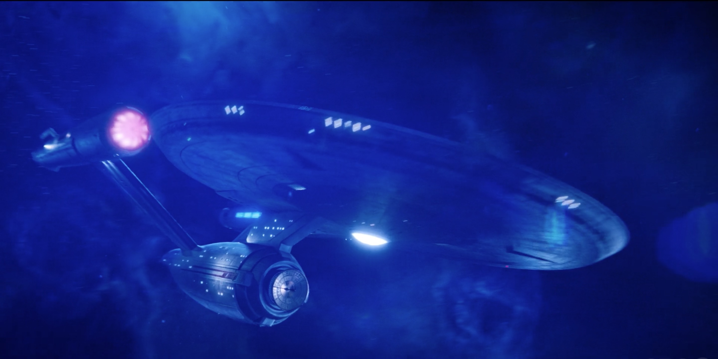
The reveal of the USS Enterprise as led by Captain Pike was a big twist in the season finale of Star Trek: Discovery. The inclusion of the ship has led to a lot of fan debate. While we can’t settle any of those debates today, certainly not before we see what they’re planing to do with the Enterprise in season two, we can do what Trekkies do best, which is to analyze the new “Disco” design of the most famous ship in the Star Trek franchise.
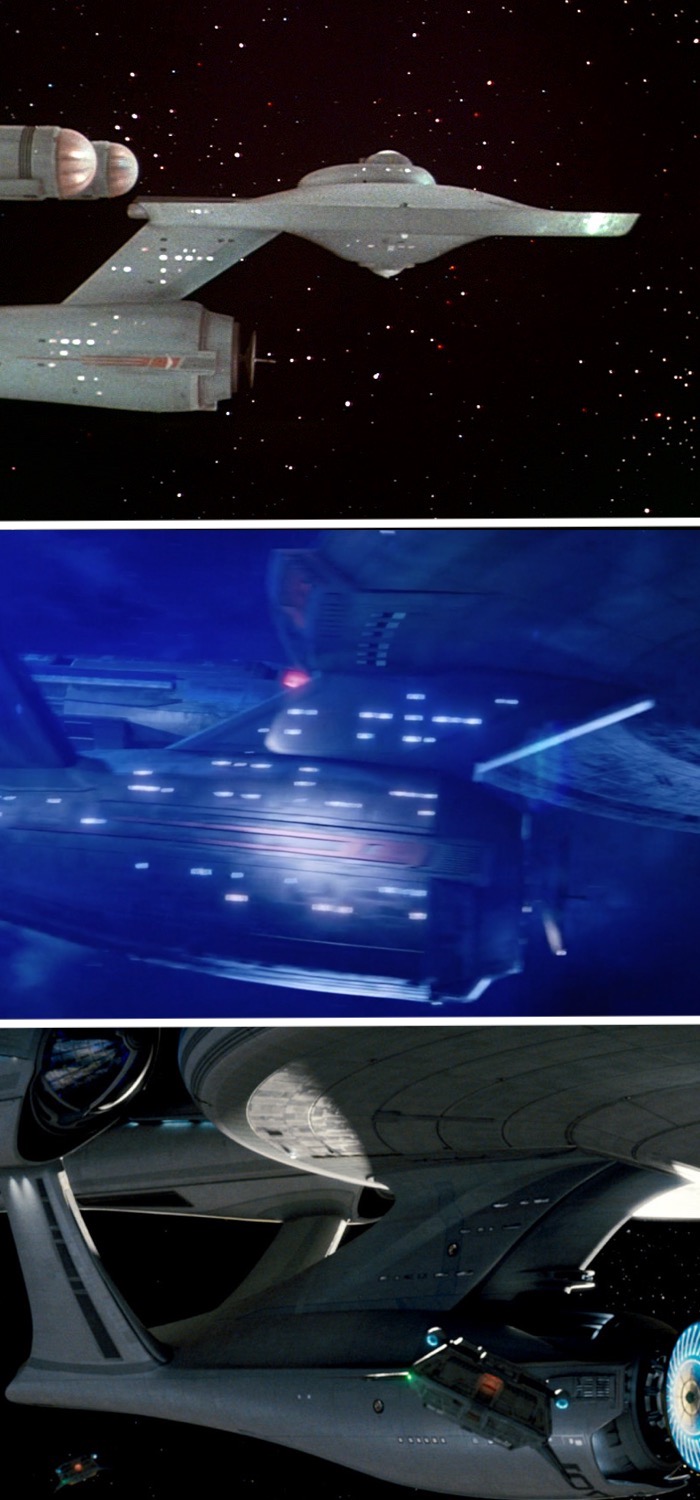
The new tweaks to the classic design are certainly interesting, and contain a variety of influences, primarily of course the final version of the classic Enterprise model that was used for The Original Series. There are also details from the pilot version as seen in “Where No Man Has Gone Before,” and the later refit version first seen in The Motion Picture. Also in the mix of influences are the NX-class from Star Trek: Enterprise, and yes, a dash of the Kelvin-universe USS Enterprise as well.
The original Enterprise(s)
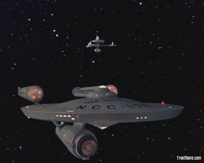
For those who may be unaware, the filming model for The Original Series’ USS Enterprise looked somewhat different in the first pilot “The Cage.” It was updated again for the second pilot, “Where No Man Has Gone Before,” and was then more dramatically re-worked a third time when the show was picked up for series.
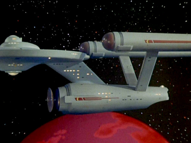
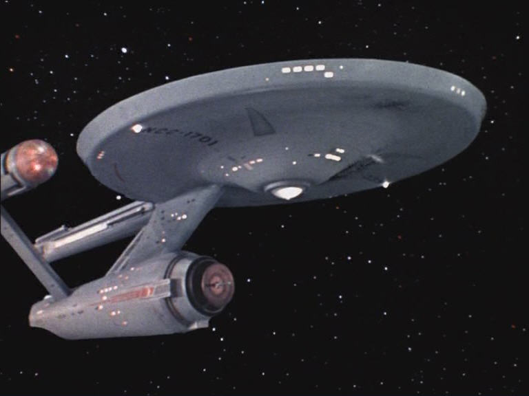
The classic series version of the Enterprise
The season finale of Discovery takes place in 2257, which sets it in between the two pilots, with the “The Cage” set in 2254 and the second pilot “Where No Man Has Gone Before” set in 2265. The two pilot versions of the Enterprise are fairly similar. One of the easiest differences to spot between the pilot and series versions is the look of the nacelle caps (Bussard Collectors in TNG-era parlance). In the pilots they were a simple reddish-brown and had a spike protruding, matching the spike in the deflector dish. Speaking of the deflector dish, it was quite a bit larger than it would be in the final series version. There were some other differences too; the back of the warp nacelles initially had minimal detail in “The Cage,” and later in “Where No Man Has Gone Before” had a simple grille that looked like vents, rather than the funky and futuristic-looking balls they would have in the series. The bridge modules were also different; in both pilots they were taller. Various hull markings were changed between each pilot and the series as well.
The second pilot version of the Enterprise
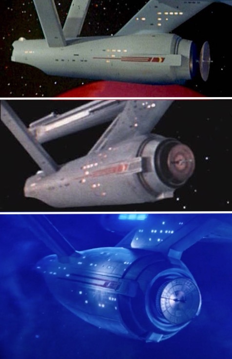
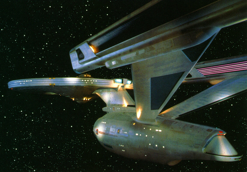
Comparing originals to Discovery’s Enterprise
Nacelle caps
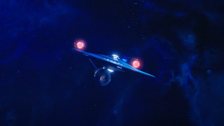
Let’s start with two of the most obvious attributes of the pilot versions. The nacelle caps are not spiked. Realistically I didn’t expect them to keep this feature of the pilot model, it was done for simplicity’s sake in 1964 and certainly isn’t the iconic look we all know. What’s more, in Discovery they need as many light sources as they can get, since they render the space scenes pretty dark. The nacelles’ spinning lights are less colorful than the TOS version, but they are overall similar to it.
Get a load of those nacelle caps
Deflector Dish
Moving down to the deflector dish, the Discovery team chose to go with the smaller, more detailed, version seen throughout the series. It would have been nice if they’d used the larger version, but again, the iconic design is the series filming model, which they’ve stayed pretty true to in this area of the ship.
Deflector dishes a plenty
Saucer Section
While we’re observing the bow of the ship, the saucer is pretty similar to the classic Enterprise. It does have a steeper taper on the edge, making it somewhat unique to this interpretation, but is otherwise pretty close, including the same long triangular markings on the underside.
A classic TOS shot that shows off the bow of the ship
A good look at the saucer and the deflector dish.
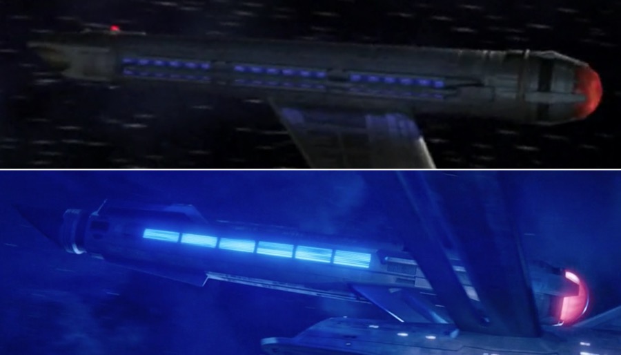
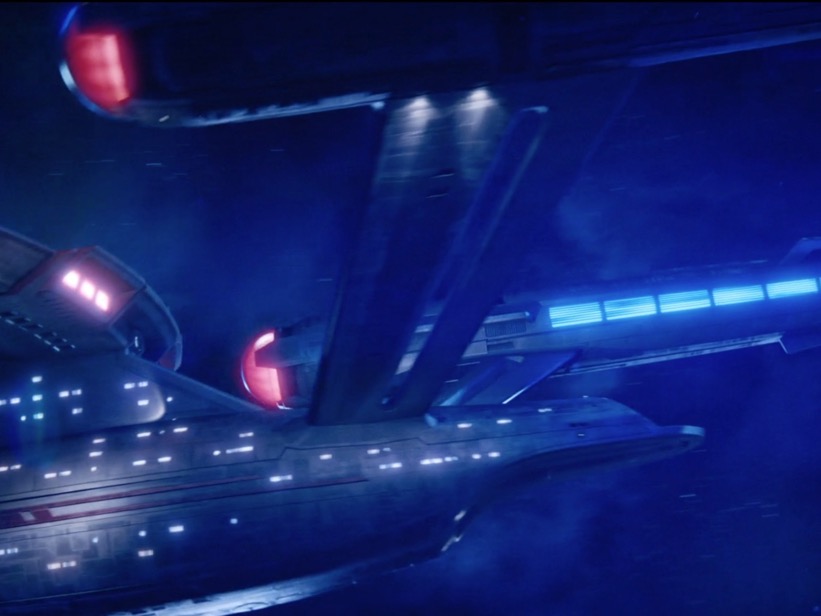
Engines
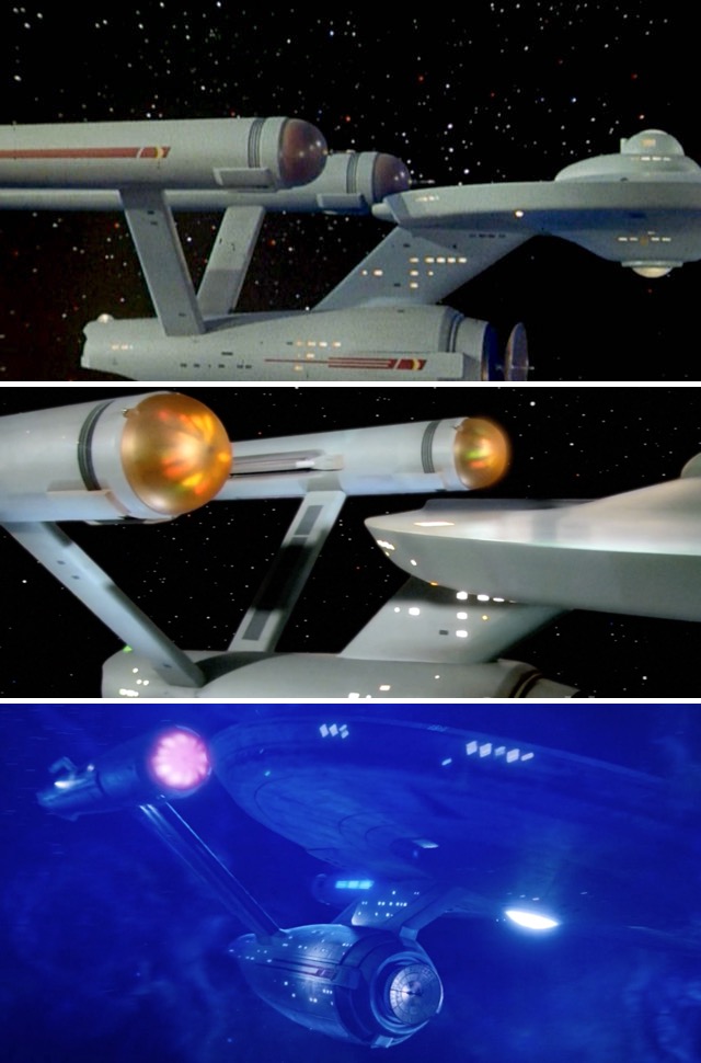
Swinging around to the stern of the ship, let’s look at the engines. In “Where No Man Has Gone Before” there was simple vent grating at the back of the warp nacelles. This one was a nice surprise — in the back of the nacelles of the Discovery version we find a glowing grid of vent holes.

Vents R’ Us
This last detail is more obscure: only in “Where No Man Has Gone Before” do the impulse engines have multiple nozzles in the back. While not exactly the same, you can see the Discovery impulse engines have three segments on each side.

Let’s get Impulse-ive
Details that connect to the past and future
NX Nacelles
One nice bit of design that ties this version of the USS Enterprise to what came before are the nacelles. These seem to be heavily influenced by the design seen in the NX-class of Star Trek: Enterprise. The glowing blue on the inside flank of the nacelle, the more obvious “clamps” around the nacelle caps, and even the thicker pylons that hold up the nacelles, all echo the NX-01.
NX-alicous
Refit and ready to “Disco”
Of course the other influence that is readily apparent is the (future) refit of the Constitution-class. The lines of the bottom and aft of the engineering section on up to the shuttle bay are very similar to the refit. Likewise the nacelle pylons come out of the hull in much the same manner as they do in the refit. The refit also introduced a number of extra spot lights to better show the hull texture and the Starfleet identification markings in the darkness of space. These same kind of floodlights are present in the Discovery version.
The refit USS Enterprise from Star Trek: The Motion Picture
A similar view of the Discovery Enterprise
Thick necked
One change that affects the lines of the ship is the new neck. While somewhat reminiscent of the refit, it appears to be a little bit shorter and about 50% wider, making it look a bit stubby and less graceful than either the original or refit Enterprise. We’ve seen this kind of stubby and wide design before, but it comes from an alternate universe. Thankfully this general design idea is all that’s taken from the Kelvin-universe.
Necks of USS Enterprise
Uniquely “Disco”
Let’s get this one out of the way: Yes this Enterprise has a window on the bridge, like all Starfleet starships in Discovery. The top of the saucer is similar to the original series version, but the bridge module is even flatter and wider than the classic series version. It seems like this was done to make a wider bridge which would accommodate that window.
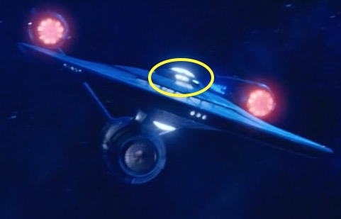
The window is lit up, right where you’d expect it, under the bridge dome.
So far we’ve seen how the Discovery USS Enterprise melds influences from the rest of the franchise, but there are two totally unique oddities with this new design. For reasons I can’t fathom, there is a slit with rounded corners in the nacelle pylons. This seems to be pure “Discoization,” and people online are already calling this detail “the potato peeler.” No other ship we’ve seen in Discovery has this kind of cutout in the pylon. Even more unusual is the extended platform for the shuttlebay; we’ve never seen a shuttle craft actually need an extra landing strip before, and it gives the design an awkward “lower lip.”

The pylon “slit” and the shuttlebay “lip”
What do you think of the USS Enterprise redesign for Star Trek: Discovery? Share your thoughts in the comments section below.
Star Trek: Discovery is available exclusively in the USA on CBS All Access. It airs in Canada on the Space Channel and is available on Netflix everywhere else.
Keep up with all the Star Trek: Discovery news at TrekMovie.


I think they did an amazing job on the Enterprise, and I look forward to seeing the interior. Anyone who complains about these minor cosmetic changes is taking things WAAAAAY too seriously.
i totally agree. it’s still The Enterprise. you can instantly see that. a few minor changes make for the series unique interpretation. If it was exactly as in the 60’s version i bet there would be far more complaints about ‘lack of imagination’ etc. I love it and can’t wait for the Eaglemoss Star Trek Starships model version of it !
You’re absolutely right. Besides. This is 2257…we shouldn’t expect it to get refit to how it looked in TOS until 2265.
Why would a refit make the ship look older and crappier? Nobody has ever taken their car in and paid for it to look worse.
The continuity here does not work, period. I don’t mind that provided the producers aren’t insisting that it DOES work, but they are, so the series just feels like a really weird, purposeless, low-grade lie to me. And there’s no need for it to be, which makes all the weirder and more annoying.
Han Solo apparently did! Obviously I get your point though, of course they would not refit their ship to make it look crappier. The bottom line is nobody, including yourself really believe that the 60’s models and sets could seriously pass for a real starship in this day and age. If they’re still making Star Trek in 2067 they won’t be using 2017 fx either.
Exactly! I get people hate change for sake of change but in this case they really are doing it because the old ship would look ridiculous next to the very advanced and stylish looking Discovery. Look at the old 1701 and then look at all the ships that has been introduced in Discovery including the Shenzhou (which IS suppose to be ‘old’ btw) and tell me the sixties model would even pass in the same universe as those?
It wouldn’t. It would just look ridiculous to anyone who hasn’t been watching these shows for decades. It had to feel like it belonged in the same universe, thats just the reality.
No the ship would not look ridiculous & as for the Discovery looking “Advanced & Stylish” ? – it is flat & chunky, it looks like a few planks of wood Glued together- The original Enterprise had more grace & its been proven with fan made art that the original model with external lighting, glowing nacelles & the same Discovery era CGI lighting the old model matches the Discovery perfectly.
Might clash with the Shenzhou style ships though- but the design is 15-20 years old at that point so why would you expect it to match newer designs.
Where can these renderings be found?
There’s always some idiot that chimes in with “If you don’t like it, don’t watch.” Thanks, moron. That skips over the actual discussion and point anyone is trying to make.
@Horft — that’s because the point is moot. The sooner Trek fans hung up on the look of a TV show from the 1960s drop off the franchise, the better for the future of the franchise.
Brandon, look here:
https://vimeo.com/254676203/97fd22677b
I’m quite happy with it @Trekboi, I know they’ve made a few tweaks but it still feels like the Enterprise to me. I get what your saying as well though and I can totally understand your viewpoint as inconsistencies in canon can take you out of the story and I’ll admit that I’m not the biggest fan of the Klingon redesign. I guess the way I rationalise it is that this is what the Klingons should have looked like in TOS due to the eugenics mutation and that by TMP they’re back to something closer to there true look. As much as I love Trials and Tribulations I sometimes wish that they’d picked an episode without Klingons for the Defiant to travel back to.
I guess I should’ve said advanced and stylistic which is what I really meant. I’m not really talking about its aesthetics and mostly about how its design fits a totally different look from what TOS was clearly trying to do. I have seen plenty of art and videos of the old 1701 next to the Discovery and nothing about the two feel like they remotely belong in the same era. The Enterprise is not suppose to be that much older and as said the Shenzhou is also older and yet it looks NOTHING like the 1701 either.
To me its like trying to compare a Mustang from the 60s to a Mustang today. You can tell they were made by the same company but they are different looking cars with some similarities. But no one is trying to pretend they were both made in the same era.
The Discovery looks totally wrong. That’s the problem. Again, Rogue One is the perfect example of how to stay absolutely true to the original era (A New Hope) and yet apply such skill and production values that while looking authentic it also looks cutting edge. No one complained about Rogue One looking too retro. Yet you can run it with A New Hope as a double feature and the mesh between the two is visually seamless.
@zoe — it’s apples and oranges. Happy for you that you’re stuck in the past, but I prefer the future … you know like Gene Roddenberry?
Rogue One doesn’t exist in ‘our’ time, it was based on a galaxy a long time ago far, far away. The difference with TOS is that its suppose to be presenting OUR future several centuries from now and yet their computers are bulkier than ours 300 years in the future. Their ship interior looks like a campy sixties set compared to today. People are wearing bee hive and go go boots. It just doesn’t gel with an advance looking future. Maybe at the time, sure, but certainly not today and thats the issue.
I will agree they did do a great job with RO setting it to ANH but their mandate was different because RO was purposely meant to capture the nostalgia of ANH in every way possible (which is entirely the movie even exists). What is weird about Discovery is they weren’t setting it in the period to create nostalgia the way SW is doing. They went about creating a new story set in a familiar era. But I will argue it was never really about nostalgia until the Enterprise showed up, it was mostly a way to market to old fans but it wasn’t to show them all the things they loved about TOS like RO did with ANH.
The long time ago, far far away galaxy is not that far away and wasn’t that long ago for us. You can see a galaxy-class federation starship in the skies of Coruscant in Ep. I and an Astromech flying away during the Kelvin attack. It’s a long time ago in a galaxy far, far away for the narrator of the story and it’s not supposed to be neither an earthling (or terran) nor a milkywayan (lol).
They most certainly could. In the remastered version of TOS the ship looks great. There is nothing unacceptable about the design of the ship by today’s standards. Look at Star Wars Rogue One. They kept the look so true to A New Hope that you can run A New Hope immediately after Rogue One (the one flows right into the other) and the look totally fits. The people in charge of effects made Rogue One look both cutting edge and utterly true to the New Hope era. They kept the old designs but applied top production values and a huge budget to execution. Discovery could have done this regarding not just the Enterprise, but the look of the entire show.
Well, that’s apples and oranges. Rogue One ends approximately 10 minutes before Episode IV begins. It is, for all intents and purposes, the same era, so they couldn’t really do anything new in terms of designs. What is new is the all-CGI ships and architecture, allowing the filmmakers to stage battle scenes with much greater depth of field (in a virtual camera), more moving elements, simulated weather conditions, dust clouds, better compositing, smoke and explosion effects, etc. But the look and feel of the _universe_ isn’t dramatically different.
Compare to the prequel trilogy, where we span approximately 23 years from 32 BBY (The Phantom Menace), to 22 BBY (Attack of the Clones) to approximately 19 BBY (Revenge of the Sith; birth of Luke and Leia), where we see designs evolve from the handcrafted N-1 starfighters to the pointy Delta-7 Jedi starfighters, to the multi-finned Eta-2 interceptors, which are ancestors to the TIE fighter.
It’s very like the evolution from WWI biplanes to the P-51 Mustang to 1960s interceptors, over a span of roughly 40 years. It’s easy to see the design lineage today.
With other science fiction it’s not so easy. Take 1936’s THINGS TO COME (based on the novel by HG Wells), which posited a post-WWIII ‘1980’ that we would find ridiculous today, from a production design standpoint.
That’s why I think we need to take the visual legacy of Trek seriously, but wear it lightly.
The formula for ‘The Enterprise’ is so simple a child can draw it – a circle and three tubes and some sticks to connect them. Between TOS, TMP, the B, C, D, E and J, this formula is the same, but reinterpreted to depict decades of design and technological evolution. And as we’ve accumulated visual canon over the decades, what is “accurate” is up to the producers to decide. A 2250s Enterprise with NX-01 style nacelles and angled pylons, and a bridge window? If it makes sense in context, why not? I think it’s just another marvel of imagination.
Practically speaking, 50 years on from the original, it’s perfectly acceptable to say, ‘it’s got to be recognizable as the Enterprise, but also has to make sense within our contemporary production design.’ This ship, even briefly glimpsed as it is, fits with what we’ve seen so far. Future Trek shows will reinterpret it differently too, based on our changing understanding of technology and design.
One could also say it solves the problem Bernd Schneider writes about, which is that the TMP refit is unbelievable, as the design is so different, and nothing really lines up with the original – unless you think Starfleet would tear the ship down to a few beams and rebuild it from scratch rather than just build a different one!
Do you discount The Original Series for changing the look of the Enterprise from “The Cage?” Do you discount every episode after “The Corbomite Maneuver” for changing the uniform colors? Do you discount all of the movies for not being set in the 26th century, which “The Squire of Gothos” had set for TOS, or the 22nd century, as claimed by “Space Seed?” Do you discount “Day of the Dove” because the Klingons’ look changed from “Errand of Mercy” so that they were all swarthy and had pointed eyebrows? Do you discount The Motion Picture because the Klingons became identical lobster-heads? Do you discount Star Trek III because the Klingons now sported entirely different head appliances? Do you discount Star Trek VI for the very same reason? Do you discount The Next Generation for forgetting that an entire planet of androids exists, and for giving the Romulans head bumps? Do you discount Deep Space Nine for forgetting that several entire planets of shape-shifters exist? Do you discount Voyager for forgetting that no one knew about the Borg before “Q Who?” Do you discount Enterprise for bringing time travel and holodeck technology into the franchise too early in the timeline?
No, of course you don’t. Star Trek has ALWAYS contradicted itself. It’s par for the course. But fans love to bitch about nothing.
Agree 100%.
This list could go on forever. Remember when the NCC-1701-D got a new, smaller but more detailed model during TNG’s run? The ship looked different, but folks kept watching and accepted :)
The Enterprise D bridge changed quite a bit between TNG Season 1 and 2. There was even a Starlog Magazine article about it (which I no longer have, unfortunately).
Nobody complained as far as I can recall.
Heck, so did Worf’s head!
Because it was a progression forward not going back & changing things- can you not see the distinction?
FLB,
I thought it was a disimprovement to the bridge, myself. But I was so unenthused about nearly everything TNG 2nd season (outside of Q WHO and MEASURE) that I quit watching the show for a time, and it was only finding out about the 3rd season ‘open door’ submission policy that got me watching again.
Actually no, Even though they were small inconsistencies between models not a redesign Fans noticed, complained & when they made Generations they went back & refurbished the Original 6 Foot model to use for all the Enterprise shots (exccept a couple CGI Warp-outs)
Trekboi,
That was because ILM was doing the VFX for GEN (after building the model and doing most of the shots for FARPOINT before giving way to the regular in-house team), not because of complaints by fans.
However, the 4 ft model was glaringly different to my eye from its first appearance, and I found its appearance problematic throughout, because even with the increased detail, it still seemed small, especially in close flybys, owing to what I call the model-size-to-taking-lens relationship.
When you see the TOS 11′ fly into camera, it absolutely overwhelms the frame, flying over and under the lens with apparent immensity. When you see the TNG shots with the 4′ – it is more like RELIANT in TWOK, when the size of the otherwise well-made model doesn’t seem to withstand such a close pass. There are shots of the 6′ that have blown scale issues, but that is owing to rushed lighting (you have to light the 6′ TNG ship very carefully to bring out the subtle stuff, otherwise it comes off shiny and flat.)
Dana, you deserve a medal. I toast my Romulan Ale to you.
Ah,as the Bard Shakespear might have paraphrased about his plays: “The SPIN’S THE THING.”
But the plays script writer must be fluent in the word continuity & it’s cousin corollary.Otherwise weekly ratings(the bane of many a good show)lets the plot thicken with too much prior knowledge of future good plot lines.
Stick with the storyboard and maybe not the scripts.
Just sayin’😎🙊🙉🙈📖📚📙📓📘📕📗
Well said Dana. All true and I’m sure there are many more contradictions. Unfortunately social media gives everyone a voice.
Unfortunately social media gives everyone a voice.
Including you.
>Unfortunately social media gives everyone a voice.
No, fortunately it DOES give everyone a voice. People can agree or disagree. IDIC = Infinite Diversity in Infinite Combinations.
Well said!!!!!
Nailed it. Absolutely.
Wise words!
Wow Dana, you just wasted a lot of words totally, willfully missing the point repeatedly- All those changes were on a progression of the show- Discovery is based in a time period when everything is established so there is no room to change anything like they did with the Klingons.
It makes no sense & is jarring, brakes any suspension of disbelief & makes it unwatchable for anyone who has seen any of the other Star Treks & remembers the Klingons as they were.
I thought they would make them one of the houses who are genetically different but they just changed the whole race to match.
In all those examples they were improving or updating the show as irt progressed, Discovery just re-wrote everything which now contradicts everything else.
If it really upsets you that much, then don’t watch.
I stopped after episode 5.
Zoe, if you stopped watching after episode 5… why do you bother to still read about a show you don’t like and you don’t watch? You are either lying or you’re a troll.
Has it occurred to you that even those who don’t much care for the show are still fans of the franchise overall and want what is, in their opinion, best for it?
I always find the “just don’t watch it/walk away” arguments silly for that reason. We are here because we are all Trek fans, not just Star Trek Discovery fans.
Then they should stop whining and complaining. Or yes, if they don’t like what they see, don’t watch. Stop torturing yourself by watching something you don’t like.
“Stop torturing yourself by watching something you don’t like”
Who said I didn’t like it. My view is mixed. Something I have already told you today.
You do like straw men and telling lies about the people you’re talking to, don’t you?
English isn’t your first language,is it? I was referring to the haters in general that say that. Not you. I was responding to you post.
Zoe, you have stopped watching the series. Why still comment on it? Please leave it to people who have watched the entire 1st Season.
Yeah they placed the show in the past (relatively speaking) then refused to adhere to the proper look in any way. If this is what they wanted they should have placed the show after Voyager in the timeline.
The proper look in 2256 and 2257 was never established in canon. Until now.
@zoe — you mean the proper look to blend with a series produced in the mid-1960s, because style, and technology have moved on since then?
Style and technology are relative. Berman era Trek is already out of date to some degree. Discovery’s is already out of date because it still tries to fit into canon to SOME degree. For instance, it has communicators bigger than the TOS ones, despite being set two hundred and fifty years after the invention of the smartphone. Yet, I don’t see any of the “Discovery can do no wrong” crowd criticising that as being silly.
El Chup,
Re: smartphone?
I am unaware of any smartphone that is able to successfully communicate with any person moving at a significant percentage of the speed of light at which those ships travel. Even modern day satphones, which communicate via moving satellites in orbit, are bulkier than the compact smartphone whose small size fascinates you so.
But Curious Cadet you yourself has argued the show doesn’t feel like it fits the era and have complained they have advanced the technology too much like having the ability to do site to site beaming and Klingons already having cloaking technology amid other things. I’m not bothered by those but clearly you and others are so yeah the argument is valid even if you can get over the look of it the technology is more advance than it should be.
That is a lie. I have seen all past Treks and find Discovery very watchable.
Also, Discovery is not set in a period that was established. It’s set in between THE CAGE and TOS…not during…
Just because you and I pictured it to look differently at that time doesn’t mean anything…our assumptions are not canon, only what is shown on screen.
Marc, what is shown on screen is that the Enterprise from The Cage and The Enterprise from the rest of TOS is the same design with very minor changes. Your argument is that between the two the ship was completely refitted and then rolled back to iot’s previous version in time for Where No Man Has Gone Before. Does that make sense to you?
God I hope the next show is in a post-Voyager era. None of these arguments would exist if Discovery was there today. Not one. But since its not, people just have to accept that the show has to appeal to a younger and newer demographic. Not EVERYONE watches or has seen TOS. Many people probably never have because it looks so old to them. And to a lot of people the old Enterprise looks too outdated. They had to redesign it somewhat which looks mostly like the movie version and last time I checked most people liked that version and while its also old it still feels modern enough to fit with Discovery and this universe.
Guys its a visual reboot, either you accept that or you don’t. They have starfleet officers not in groovy color tops and go-go boots but in military style uniforms talking to hairless Klingons on super size bridges through holographic communication. None of that fits in with TOS. And you’re upset the Enterprise had its pylons changed?
If this bothers you THAT much you are simply watching the wrong show at this point. The producers probably have a mandate from CBS to make the show actually look different and actually modern from the old show. There is only so much they can do when compared to TOS.
Tiger2,
Re: None of these arguments would exist if Discovery was…(in a post-Voyager era.)
You’re still hawking that bilge-water? All of the series, and some odd motion pictures did scripts where they traveled back in time introducing back all these arguments that you claim absolutely would not exist merely by their settings start by being forward of the first series.
One or two episodes is not the same as an entire series. I have made this argument why going back in time to see the Enterprise in 1960s form WORKED in DS9 for example because they did everything to keep that universe in tact like the actual show. And that was a good idea btw. But it was clearly a one time nostalgia thing.
But with Discovery they have basically set the entire series in this time period and they have to make it look more advance (which I 100% agree with) BUT that would naturally conflict with all the outdated stuff from TOS which clearly upsets a lot of fans. I know the producers said they plan to ‘reconcile’ the two but lets be honest outside of throwing in a reference here and there to TOS this is just a very different universe visually and it would feel lame if everything reverted to TOS by the end. It would feel like they are literally going backwards so I hope that’s not the case.
But yeah they should’ve put the show in another time period. Maybe it didn’t have to be post-Voyager but as many said post-TUC would even feel a bit better and some of the technology could feel like its catching up to TNGs time although in this show a lot of it is more advance than that time as well. Having it here just feels too distracting for some people. But I have also said THIS is the show so you accept it or you don’t at this point and I do.
Tiger2,
But it is a fantasy, this belief that sentient civilizations, and their technologies and fashions would solely progress ever forward without looking back. Human civilizations and their histories are rife over the centuries with retrogrades, fallbacks, Renaissances, “everything old is new again” designs and fashions, etc. They rise and FALL.
And one would imagine with replicators common place, fashion and design fads would churn at a pace that’d make us dizzy with their pace two hundred years from now.
I’m not sure what any of that has to do with stuff that is clearly out of canon? During the Cage era they wore essentially the same uniforms we saw on TOS, just cheaper looking. On Discovery they have completely different uniforms. What does that have to do with your point about ‘fads’ and ‘looking back’? Some of this stuff does not simply jive with the era its supposedly in. If we’re told a technology was not created until a later date but its shown earlier then it simply does not mesh with that canon.
I get some of your point but its clearly a lot more than that. Discovery does not look or feel like anything from TOS outside of the phasers. And yet in a decade later we have to somehow pretend the ships will look less advanced and everything smaller. Suddenly big tactitle color buttons will be the ‘in’ thing I guess and holocomunication will just be a relic…in ten years. Women will go from very military grade uniforms to now wearing mini-skirts and go-go boots.
Yeah some of it you can suspend your disbelief on for sure but if people are trying to somehow bridge this show with TOS, its a really tall order and unrealistic to a major degree.
But oddly enough if you put this show after TUC, while a lot of it will still not quite work, a lot of it would, especially how the ship interiors are designed.
Tiger2,
Re: During the Cage era they wore essentially the same uniforms
What are you smoking?
The Cage era female personnel uniforms were radically different from the first series’ era:
http://www.ex-astris-scientia.org/gallery/stmagazine/uniforms-2254-2.jpg
And I don’t recall anyone on the first series ship ever wearing a combat uniform or a landing party jacket?
And the first series certainly never used Pike’s transporter personnel uniforms:
http://www.ex-astris-scientia.org/gallery/stmagazine/uniforms-2254-3.jpg
And I don’t ever recall Kirk’s nurses ever wearing those medical personnel uniforms. I do recall M’Benga and McCoy wearing something along those lines occasionally but the under shirt was different and there weren’t any insignias over the left chest.
And all THE CAGE’s uniforms were devoid of pips.
LOL can we split hairs any more than this? Its essentially the same uniform as TOS, yes with some changes. My god, are you suggesting that looks like anything in Discovery? You got my point man, the Discovery uniforms are NOTHING like the Cage ones, especially since you seem to be making the point the Cage uniforms were so different from TOS which is not the case. Its the same style its just a variance of that style. Its nice the girls weren’t running around in mini-skirts though so that is definitely a big difference.
Disinvited, sometimes I feel you just want to pick silly fights with me over the tiniest things. You are now talking about the UNDER shirts? OMG, its time to move on.
Tiger2,
Re: Discovery uniforms are NOTHING like the Cage ones
And pantsuits are NOTHING like miniskirts and there never was a military functional explanation for that radical change in uniform styles. It seems to have just been a fad which I have already pointed out likely spin rapidly in and out of fashion by that era.
Re: sometimes I feel
Sometimes I feel you purposely misrepresent speakers of points that refute you as if somehow you can change the truth of their facts by claiming that somehow they become lies because of whatever characteristic you find laughable about the person who said it. Truth doesn’t work that way. What’s true is true, even if the devil himself doth spake it.
One conclusion upon which our different approaches do converge, once you demonstrate, as you have, that you know nothing about costuming, fashion styles and their differences, it’s time to move on, as you clearly know nothing about that upon which you seek to pontificate.
Spot on Trekboi.
As a fan who was around when the original series aired, I have had the pleasure of seeing Star Trek evolve. Discovery is a part of this. Times ARE far different and how the show can be presented has grown. What is being done just makes the franchise all the richer while keeping an updated look that was never possible in the 60’s.
This is a brilliant post. All the snark about “Discovery Can Do No Wrong” crowd is ridiculous. I could call those people the “I Can’t Accept Change” Brigade, but that serves no purpose.
Discovery isn’t perfect, but it’s damn good. AND it’s Trek. *shrugs*
I get your point but:
“Nobody has ever taken their car in and paid for it to look worse.”
Idk. There’s whole subredfits about literally this.
It’s a visual reboot.
The series is a total mess.
Crappier? That hurts my feelings…I loved the TOS design. It doesn’t matter what it looks like, it could have intentionally been given a retro look.
If you can’t accept that as canon, that’s too bad…I feel sorry for you, because it is canon.
@Marc Henson — it’s a kind of canon, but not THE canon.
Not sure what you mean, but the policy of canon has been clearly defined, and what is shown on screen, is canon, set in the prime universe unless otherwise indicated.
Edit: And just to clarify, I’m not saying that everyone’s complaints about the look of the show is not understandable, everybody’s entitled to their own opinion, (I for one am not a fan of the new Klingon look) but when you start preaching that the show is set in another timeline or universe, that’s when you start speaking untruths. I may be a canon thumper but somebody has to be.
It is best described as canon on script, visual reboot on screen. Totally canonical it is not as canon is not just what is on a script…and if the show is said to be part of the original universe then canon requires it be consistent as best as possible.
Personally I think they’d have won a lot more fans on side if they’d just stick to the older designs for already existing things and just added more surface detail. They could have simply enhanced the Klingons a bit. Same with The Enterprise. The TOS design was fine. Just give in the Discovery colouring, metallic look with a bit more surface detail and job done. There really is no reason to start doing things like changing the pylons and impulse engines. Once they start doing that they cause problems for themselves as it means they have been lying to the fans for 18 months with the insistence the show is canon.
I think the Discovery makers would have made it a damn sight easier for themselves had they simply said it was a loose reboot that casually fit on with prime universe canon, sort of how Superman Returns was a loose sequel to the first two Christopher Reeve Superman movies. Instead they promised those of us who like canon that this would be canon, and I think that’s what irks me a little.
@Marc — canon is the story … not necessarily the way things look, unless that’s part of the story. Canon is whether Han shot first, not what his gun looked like. One change deserves concern, the other doesn’t.
“Older and Crappier” is extremely subjective. Whose to say that the tastes of people living in the 2260s don’t begin to favor a simpler, sleek metal design over the flashy lit up design? Whose to say the changes aren’t made in the name of stealth? (Those lights have to consume a lot of power) Maybe they develop new hull playing that masks a certain percentage of the power emissions. And what if in the course of this next mission the Enterprise gets so badly damaged that a complete refit is absolutely necessary? Honestly there are just so many possible reasons for the change, all that would fit perfectly with canon.
And you pretty much just made the producers’ point for them. “Nobody has ever taken their car in and paid for it to look worse.” Does anybody really think that in 2018 a studio is going to pay millions of production dollars to make a ship that looks “Older and crappier” than other modern science fiction shows? Seems to me you made their point for them.
Good call.. In fact, you could look at the progression of the uniquely shaped colorful aircraft of WWII to flat shaped gray aircraft of today..
“I don’t mind that provided the producers aren’t insisting that it DOES work, but they are”
My sentiments exactly. They would have a lot more leeway had they not insisted it worked. What they should have done was speak about how the show may not match up exactly into TOS but that they tried to maintain the spirit of Trek in certain instances.
Which is why I am still confounded as to why they made Discovery a prequel. It would work just fine after Nemesis. Probably much better.
CBS AFTERTREK already mentioned a company taking preorders….but forget it’s name.
Me too, I’m obviously expecting a much more modern take on the interiors but I hope they still find a way to honour the spirit of TOS.
All hands brace for fanhate!
I tried. My guess for the interier is bright yellows and pale blues….
Dana, I completely agree. This Enterprise is the PERFECT blend of TOS to fit in the Disco universe. They also nailed the phasers & communicators. But I can’t stop staring at this new version of the 1701. Wow.
So, I imagine the biggest complaint among the hardcore TOS is the Klingons. Let me just say, I agree that these Klingons don’t match at all, and they haven’t even tried to address it. That being said, these are my favorite Klingons. I love the depth & variety of the houses. I feel like we finally can see them as complete characters. I am almost 45 years old & grew up on TOS. Still my favorite. If I can accept these changes, then other people need to let go of their nitpicking. If you want old Trek, it’s all out there on bluray & streaming. I love this new Trek. It’s on par with TOS & TNG, but for different reasons. Let’s be honest, it took TNG until the 3rd season to be worthy Trek. Disco nailed it within the 1st 4 episodes.
Dig it. Keep em coming. :)
Of *course* they have addressed it! Between generations, Star Trek has had ongoing issues with the changing look of the Klingon race, & Discovery is the first series to provide a reasonable explanation for it. This even explains why Worf said the topic was a shameful taboo.
These old Klingon Houses are deeply variegated in appearance, & they take such matters very seriously. Even so, their spies (one of whom has just taken power) have managed to put a Klingon in a human body; how could that possibly *not* relate to their changing appearance?
Then there’s foreshadowing of the genetic dysfunction as put forward in DS9 continuity.
And the fact that (much like the Kzin in Niven’s Known Space novels) the majority of the most alien & aggressive Klingons keep getting killed off, applying a brutal selection weighted toward the homogeneity these Discovery Klingons fear so much.
Now there are not one, not two, but *three* reasons why their look may eventually change; & keep in mind, this appears to be closer to the reboot universe than TOS one, so any historical differences are effectively ret-conned from the outset.
You obviously never watched Enterprise. They explained the Klingon look of TOS vs everything else. So if Discovery uses the fact they can change a Klingon to make them look human as the reason why TOS Klingons look the way they look they Are ignoring canon and the show (no matter how much they insist it is) is not in the prime universe at all.
Yeah, not true. We were NEVER told that the Klingons in TOS were the same as the augment Klingons. Indeed there’s nothing that proves that is the case. Moreover, there are TNG era Klingon characters with ridges who did not have ridges when they first appeared in TOS. So, no, this proves nothing.
I thought Enterprise had already explored the cause for physical appearance differentiation throughout the series…
Discovery has provided no such explanation. The writers have hinted at it off screen, but not on screen and so far every single Klingon on the show has been the new version.
Give a smattering of older style Klingons in the background, or even just some what hair, and you’d go a long way to making it all fit together and for the fans who liked the older versions. But this apparently is too hard to contemplate, both for the showrunners and the “Discovery can do no wrong” crowd, the latter of whom take it upon themselves to ridicule anyone who would like to see it all fit together.
I don’t think that they have to explain the klingons.
They simply have evolved over time.
They already did explain the Klingons. They took great pains to explain the change in appearance across a two-episode arc of “Enterprise” dedicated to this issue. The final season of the most recent Star Trek series before Discovery explained that the Klingons used to be ridged, but during the Enterprise era (the show Enterprise) they stole from the Federation the technology used to make the supermen (like Kahn), but this technology only made them look like humans (removed their ridges). It did not make them super strong. So, from this point through Kirk’s era Klingons had smooth foreheads. DISCOVERY is placed smack dab in the middle of this time period during which Klingons had smooth foreheads — but they ignore it.
Think about it. The very most recent Trek series went to the trouble to make a motion picture length drama about why Klingons starting with Archer’s time developed smooth foreheads that they maintained through Kirk’s era. Yet Discovery pees all of this carefully crafted canon. It’s crap like this that makes it impossible for me to respect or enjoy Discovery.
Changes to The USS Enterprise are trivial by comparison.
@zoe — that “carefully crafted canon” as you call it it was the worst possible thing a producer could have done for the franchise, IMO. It’s lazy writing, from talent-less Berman-era hacks, turning fan fiction into canon. So sorry your dependence on visual canon upsets your enjoyment of an otherwise entertaining chapter in the Star Trek franchise.
You’re saying that Manny Coto was a “talentless hack”? That “hack” made the single best season of Trek since DS9 ended.
Oh, and canon issues is a minor problem with Discovery. Discovery’s biggest problem is the very thing your are telling Zoe she should ignore, underwhelming and inconsistent writing that has given us some good moments but also some utterly atrocious garbage (such as mirror Georgiou’s prime universe storyline).
Zoe, don’t waste your time. Enterprise and canon are dirty words to the “Discovery can do no wrong” brigade.
Chup… yes. There are a number of posters who seem to be of the opinion that DIsco is perfect and anyone who questions or criticizes it are just haters with no substance whatsoever behind their thoughts. It’s unreal but not unexpected on internet threads.
Thank you! They spew vitriol at anyone who criticizes “their” show- even if the criticisms are valid and reasonable.
But Zoe is WRONG, it was explained the ridge Klingons were still around after the virus on Enterprise, so Discovery isn’t wrong on that front. The difference is we haven’t seen them from TOS but BOTH exists according to Enterprise. And those can still pop up in future seasons.
Just to make the point farther:
http://memory-alpha.wikia.com/wiki/Klingon_augment_virus
In fact I also remembered reading that page they showed the Klingons with ridges in STID and remember that also followed Enterprise canon so yeah, they still had them, period.
Right!
But you seem to ignore the FACT they also explained on Enterprise that the ridge-less Klingons was only one segment of the population the was effected by the virus. Other Klingons would still have the ridges we simply didn’t see those on TOS so it actually fits just fine in Discovery.
Now if you don’t like the look of these thats fine but their ridges DO fit into canon.
so I guess we’ll have to wait for another reboot reimagined series to explain why they’re bald.
@nytehawk — nope, they were always bald, it just didn’t appear that way in the television episode you were watching.
The entire Klingon race did not develop smooth foreheads just because a few Klingons screwed around with a super human cocktail.
@NCX-1701 — Yup. That’s exactly right. The Klingons we saw in TOS had ridges, they just couldn’t afford to show them to us in 1966.
So true. I wish that those who are critical of Discovery should realize that Roddenberry didn’t have the budget in 1966 that later incarnations had shown. I hope that this issue is addressed in Season 2.
“A few Klingons”, you mean the MILLIONS of Klingons who were infected by the Augment Virus, before being cured with the side-effects being that they would look Human?
Thank you, finally a voice of reason.
Looks more like they have de-evolved. I guess the Augment virus magically disappeared or was cured since Enterprise. Another miracle of screwing up the timeline by the rocket scientist’s at CBS.
With respect, there was more depth and variety of houses in Berman Trek than there is in Discovery. In Discovery we have only really learned about T’Kuvma’s little sect.
I don’t know if anyone else has thought this through, but I think Ash Tyler explains the difference between TOS Klingons and all the other Klingons we have seen. they created a class of Klingon that is more acceptable in the TOS universe To the TOS occupants. Therefore the “real” Klingons dealt with their own problems, and sent the genetically altered versions into Federation space. What do you think?
I’m glad somebody said it!
They really nailed it, it looked fantastic.
I second this! I am no fan of the JJ-prise, but this one I like! :)
The JJ Prise evolved in a more scary Universe. Nemo’s ship puttee fear into the Federation because of its size and destructive power, accounting for more resources being devoted to the possibility that it was a seeker ship in our area with a possible armada waiting just somewhere outside of the Federation space. The JJ Prise had to be a much more powerful ship for just such an eventuality. Sort of like if the Borg had peeked in on an incursion instead of Nemo-same reaction the Prime Universe Feds took in prep in Picard’s era-
I agree Dana. I love the new design as well.
I too thought they did a good job reinventing the TOS Enterprise, although aesthetically I don’t care for the NX-ish nacelles. The NX similarities do make the 1701 look older, however, and maybe that was their intent.
The article here actually makes me appreciate the design more—someone designed this ship knowing fans were going to tear it apart no matter what they did, and I honestly think they were pretty attentive to keeping a lot of details.
Minor? Are you blind?
Never liked the JJverse version of the Enterprise (or the movies, tbh). The Discovery guys did an amazing job without overdoing it – i love it!
JJs is the worst Enterprise I think. Enterprise E is my favourite. It’s posh, but also strangely gritty as well. I’d love to serve aboard her above any of the others myself.
It’s fun to pretend. Also that is the WORST design.
Enterprise E is probably my favorite as well. I never loved the KT version but its OK.
Point of fact, they DID overdo it. The potato peelers alone speak to that.
That is not a point in of fact. It is your opinion only.
It is a fact they changed the ship noticeably & not just changed the struts but made them weaker with pointless slits.
Love this all. Bringing back childhood memories of line drawings in notebooks, trying to get the Enterprise just right.
Oh, my gods, how I would try to get the Enterprise *just right*
Yes, you nailed it, that’s exactly what the DSC version is: a picture drawn by a kid who doesn’t have the original readily available for reference, thus having to draw it “from memory”.
A kid can be excused for not remembering everything right. What excuse do THEY have, with all dimensions and proportions carefully measured; with all those reference images of every single detail of the Enterprise readily available, single mouse click away? There is no excuse for a sloppy job like this.
Though admittedly, it is still parsecs ahead of the swollen, tumour-like Abramsverse abomination.
The pylons and neck really are the only minor things I disagree with. Other than that I like it. A shorter neck makes it less graceful as mentioned.
@Nelson — I don’t agree about the neck. It’s always seemed too long and awkward to me, particuarly the asymmetrical front-to-rear design. TMP finally fixed it by effectively shortening it with the photon torpedo launcher. Whether they extend the engineering deck up into the neck, or shorten it overall, it’s an improvement for me.
I agree,I have no problem with the neck,and love the ship.
I think it looks great! Fits very nicely in the discovery universe and is a very nice homage to the original. Well done.
I’d hazard a guess that the “potato peeler” element of the nacelle pylons is a earlier version of the flush vents/thermal regulator assembly that we see in the TMP refit.
I love it. They took a bit of everything, while being true to the original (more than the JJverse ENT).
And I also love the extended platform in front of the shuttle bay. Voyager has it too, like a bunch of other ships. Hopefully landing lights are integrated in the platform..
I like it but I feel like it’s too squashed. The front profile looks odd to me, the Enterprise should be tall and graceful. Otherwise I love all the new details. It evokes the refit, which is my favorite sci-fi design ever.
Fyi though, the bridge window originates from 1964 on the pilot version of the Enterprise, not the Kelvin movies. https://goo.gl/images/EZ8YPK
Excellent work digging out that window/screen photo on The Cage model! I really was not aware of this detail. This really changes my perception of KU and Disco designs.
If you look at the bridge which was actually used in “The Cage” and “WNMHGB” you’ll also see a black rectangle which is almost exactly where the bridge viewport is supposed to be. It was removed after the two pilots.
That’s not a window. It’s a light beacon. Yes coincidentally it’s in about the same spot a window would be. Also that’s from “Where No Man Has Gone Before”, they that added detail for the 2nd pilot. For “The Cage” there was no internal lighting to the model at all.
The two links I have in the article under The original Enterprise(s) section will give you a ton of information about all the changes between The Cage, WNHGB, and then the series configurations.
Semantics really, it looks exactly the bridge windows we see on the Kelvin and DSC ships. Obviously the bridge is situated above the light/window, but it’s aesthetically the same thing.
@Reign1701A — I agree. From the moment I saw “The Cage” Pilot with its black “window” on the front of the bridge module, I’ve always wondered if they hadn’t thought of having a viewport window where the view screen was. Especially because the Cage model wasn’t lit, it could easily be a window. Despite adding that giant light (which is way too large for scale), all of the shots in WNMHGB do not have it, though the model is lit, yet that black “window” is not. Regardless, for those who are adhere to visual canon, the precedent is theoretically there.
The Enterprise is a gorgeous ship in all her various incarnations, including the latest one. I find her much prettier than the Discovery and a thousand times prettier than, say, the Millennium Falcon.
Agreed, but the hunk of junk Falcon isn’t supposed to be pretty.
True.
She may not look like much but she’s got it where it counts.
Seems like a descendant of the NX-01 refit. Lots of elements are similar, like the back of the saucer, secondary hull, pylons and nacelles, and the way the neck and pylons are lower. As a retcon following that continuity, I think it works quite well.
Yeah those nacelles are a neat way of showing the design evolution from the NX-01 to the Enterprise.
Looks sweet !! I love the old bird, but this was done in and with respect. I would love to see the bridge layout to be just like the original but with updated more modern accompaniments.
yes keep the layouts and colours the same but update the visuals and tech
This is how it should have been in 2009. If Gene had the technology today this is how the E would have looked like. A great visual update!
It was pure fan service, but this fan feels thoroughly–uh–serviced. Seriously, it’s a beautiful design and a great TOS/DSC/refit/ENT blend as the article describes. I look forward to seeing (and having, I hope) a model of it.
I don’t see it as fan service. Fan service implies that there is no reason other than the fans to do something, while this ship is meant to be a ship we’ve already seen. Fan service would have been keeping the 1701 looking exactly like the original, in my opinion.
@mwz — it also means introducing characters and items fans have a high admiration for, which may have little impact on a general audience watching the series for the first time. There’s likely no reason to introduce the original 1960s series Enterprise into the story, other than fan service. And it’s really hard to imagine what story they would tell that would involve the two crews meeting, much beyond seeing Pike in hologram form communicating with Saru. We know from canon that Sarek and Spock can’t meet. So that leaves Number One, which again begs what kind of story would they tell with limited crew interaction. So it’s all purely fan service, unless they give us an incontrovertible reason the ship couldn’t be anything other than the Enterprise, and the meeting between the two ships is critical to the entire season plot arc. Otherwise, it’s no different than Dr. McCoy inspecting the Enterprise in TNG’s pilot — which was nothing but pure fan service, so right now, it appears to be nothing but fan service, the way the Defiant was used in the MU when they didn’t have to mention it at all, much less show it.
Yep. See: Two episodes featuring Harry Mudd and one+ on Sarek.
I’ve been very critical about the things I’ve disliked about STD, and there have been many of them. In a few instances, like the phaser and communicator and tricorder designs, they have absolutely nailed an update with more details and improved quality while retaining the lines and spirit of the original. This Enterprise hits that target.
In fact, in a lot of ways this design incorporates the improvements made for the TMP refit (which is the best looking ship in Trek history and one of the very best in all of sci-fi) and looks better than the original. She’s beautiful, to be honest.
The one thing I really hate is the dull grey-silver hull material and the generally dark way the filming is done. It’s a good model, let us see it! Brighten up the hull material to a more pearly white like she should be and film with a decent light level and this model should really shine.
But the Discovery universe is dark.
>;>}
Somebody forgot to pay the electric bill.
Space is dark. Very dark.
trellium,
Understood about the dark part. Why is DSC space BLUE carrying a blue tinge? And why does it seem murky instead of sharp? Space is SPACE, no atmosphere to attenuate the clarity.
@kmart – Artistic license? I’m really not sure why they like to show space as blue. Interstellar dust? Who knows.
I do like how the ships aren’t completely illuminated from all angles and need to depend on their running lights more to be seen. That is a bit more realistic. I just wish the space effects were more crisp. The ships seem blurry to me.
I would love to see a contrast – that the ship would be seen in bright harsh sunlight in-system, then transition to the self-lit look in deep space, but sans all this gloom/murk. I honestly think pulling this off is a sticking point for VFX that aren’t being done at GRAVITY-level credibility, at least with turnaround times being what they are …. and yet ORVILLE just about pulls it off for a decent percentage of the time.
TMP Enterprise is really beautiful. I am surprised that design has avoided looking outdated through the years, or maybe I am biased as that was the ship I grew up with. She did lose her luster a bit in the other films because the effects people couldn’t deal with the pearlescent paint.
I love this version of the Enterprise. It really looks more in line with and plausible for the refit version we see in TMP. As far as the neck being shorter than the refit version, don’t forget that the neck of the ship in TMP is sitting on the newly installed torpedo tubes, so it will look longer than it did just sitting against the secondary hull. Also, The shuttle bay “lip” makes sense as a loading dock and isn’t really that distracting.
She is still a beauty when viewing her from the rear. :)
This new design looks great. One observation: Is that “potato peeler” element only visible on the starboard nacelle strut?
No, both.
I am happy as can be with this version of the Enterprise. Miss the pointy nacelles and big deflector dish of Pike’s original version, but this is just fine. It’s the Captain and crew I hope are done justice next year, including an overly emotional Mr. Spock and Dr. Boyce with his bag of martinis.
John Glover as ‘Bones’ Boyce!
@AJinMoscow — other than Pike, there’s no reason to expect any of “The Cage” crew to appear in this Enterprise. Canon even gives Spock a window where he might be on some kind of extended leave which coincides with this period. Boyce could have already been replaced with Piper (or someone in between the two). Sulu might already be on board — now that might have some interesting story developments with Stamets). Number One could be gone already, and Pike could be off the ship as well. It all depends on how integral this appearance of the Enterprise is to the plot. The danger here, is the more they tell us about the Enterprise from this period, the more limited any future series based on Pike’s enterprise may be by canon.
This universe’s Enterprise is not bad. As much as I appreciate the original Enterprise, the neck has always too long and too thin; subsequent designs have tended to shorten and thicken it, which makes the ship look sturdier and tougher, so that is consistent with the Discovery design theme. The detailing is good. I don’t mind the potato peeler. I hate the window in the bridge, like I hate the window in any bridge. I expect the bridge will the same JJ look as the other bridges.
But overall, not bad.
.
.
.
(Ray Liotta as Pike – cliche I know but all the more reason…)
What did I miss? What is that a cliche?
Don’t worry, it isn’t. C.D. apparently doesn’t know what the term “cliche” means.
I am not the first to recommend it. Ray Liotta was often suggested as Pike for the 2009 movie, including on this very site as a matter of fact. But I was kidding anyway.
How is that a cliche choice? You’re probably the first person to recommend it.
Plus, Liotta is way too old–he’s 63. Pike would be around 38 at this point.
I’ve thought this before, and have heard others say the same. Ray Liotta is the spitting image of Jeffrey Hunter. I thought he would have made a better-looking Pike than Greenwood. I’m not sure he could act the part as well, though.
Maybe 20 years ago. Now he’d be absurd as Pike.
@DF — …because?
@DF — why exactly is Pike around 38 at this point? Canon is pretty contradictory here, and has been convoluted by the Abrams movies. Liotta doesn’t read that old, so I wouldn’t say the character has to be the same age as the actor. But in any event, I think canon is unclear on Pike’s age.
I have no issues with this redesign of the Enterprise or it replacing the classic—I kind of like it. My issue is with the incessant boasting of the producers and writers that this show is in the Prime Timeline. It’s just not—and that would be fine that it is not. The film franchise rebooted and for all intents & purposes was successful. They should do the same with Discovery.
Continuity DOES matter—when you create a show—you want it to be successful right? You want it to get people fixated and keep it running with record breaking ratings? Then you maintain a continuity—even if you add twist & turns. It’s okay if they want to focus on newer viewers and disregard hardcore fans—but don’t disrespect the hardcore fans by invalidating their concerns—after all they are the ones that got us here—kept Trek alive for over 50 years. The studios only kept pumping it out because they knew there was an established fanbase—or else Trek would have fade into obscurity 48 yrs ago.
Solution: at some point in season 2 establish that Discovery is in an alternate reality/timeline. Or just have the studio establish this series as a reimagined show—it worked for BSG. I love both the original and SyFY versions. The same can happen for Trek. At least the Kelvin timeline movies established a reason for the differences between it and the original. With Discovery, the studio force changes on its fanbase—and you don’t want to bite the hand that has fed you. The Klingons? Bald? Really? That’s in the Prime Timeline? At least the older shows offered why their look changed—and that continuity helped the franchise endure.
The technology and visual aesthetics in the show are more advanced than TNG/DS9/VOY and even the Kelvin Timeline movies. Holograms, spore drives, Windows instead of view screens? Just call it a reimagined show.
I 2nd the motion…
I don’t really mind the updated tech. The problem is that the tech change between 1964 and 2018 is bigger than the tech change between TOS and Voyager. The Enterprise is a good compromise. It looks good in 2018 while still looking pretty close to 1964. Because the Enterprise is refitted every 5 years, it wouldn’t actually be good in story to have the Discovery Enterprise look exactly like any of the other Enterprises.
The only problem I have with Discovery from a canon perspective is a major war that’s just kind of forgotten about. The tech had to change in order to not look silly.
Fitting this war into the timeline is an interesting challenge. There’s certainly room in that period for this to happen, and the ensuing cold war makes sense by the time we get to TOS. It is a strange war as well in that it’s not really a war with the Klingon Empire, but against 24-ish separate Klingon Houses. It only takes adding a line or two to a couple of TOS episodes to make it work, perhaps they’ll George Lucas it in a future release. ;-)
@Beaux — You’re entire argument seems to be based on visual continuity between TOS and DISC. If that’s true, you should probably get out now. I’m one of those fans that kept Trek alive for most of its history, and I don’t have a problem with any of these visual continuity changes. When they start changing canon, otherwise, then there’s a problem.
Well congratulations on being one of millions that have kept Trek alive—and good for you if you like this series. Discovery is a reboot/reimagined series plain and simple—I like it—but, forcing all of us that have way more interest in story and design than you—it’s a bit much to label it “Prime”—it can be and is “Canon,” but not Prime. In DS9 and ENT, they revisited the TOS “Prime” Timeline/Universe and didn’t change any visual aesthetics and the current technology of the 1990’s & 2000’s was way more advanced than it was in the 1960’s. I have accepted STDISCO’s looks—but the studio keep saying it’s Prime? It’s not.
Again, it can be consider “canon”—but not Prime. The Klingons endured a a mess of changes but in DISCO the hairless Klingons is a bit much. I don’t mind the look—but changes like that?—makes it a reimagined series. It would make it very awkward for going forward and doing anything new with Worf’s character, especially if they ever revisit TNG. Even the designs of the Federation starships are too racy and sleek for anything prior to 2372. They could have made DISCO after ST Nemesis—Burnham could have still had a connection with Spock and Sarek—DISCO’s Sarek could have been Sarek’s son with wife Perrin.
DISCO’s Hologram communication seems weird to make common in 2250’s—but then goes away until the Dominion Wars in DS9—it looks cool but out of sync with any Prime plot devices. I mean the 2nd Pilot had paper computer readout for God’s sake, yet a few years prior they were using holograms beyond the viewscreen teleconferencing?
Like I said, I like Discovery and its look, but it lacks the feel of the Prime Trek that had been established for 40yrs—at least JJ Abrams made continuity changes to the TOS but gave reason, DISCO does not. Again you can speak only for yourself on what you accept—doesn’t mean you are more of an authority on Trek anymore than the next person—same goes for me. But those that feel as I do, and there are plenty—the ones that have bent and accepted every drastic and subtle change to Trek over its vast history—DISCO being crammed into the Prime timeline, is too much. Looking at Trek as a whole (from the pilot through all the series and movies)—if it were one big movie? DISCO would be like George Lucas introducing midichlorians in the Star Wars prequels to ‘enhance’ how the Force works.
Discovery is a good show—but it’s like eating a mediocre version of your favorite meal (example: a Philly Cheese from Philly) that isn’t easy to come by—you eat it and enjoy it because you have been craving it for a long time, but you can’t say it’s the best recipe you have ever had. I like DISCO but it doesn’t taste like Prime Trek to me.
You can say you like it—and accept it, but that’s just you. I could care less what you like and accept—I just want to voice my opinion whether anyone likes it or not. I could care less if you agree with anything I say. Having a Trekkie handle name doesn’t make you more of a fan than me or anyone else. I know Trek and design & story continuity —consistency is key. Again, the show can’t be considered Prime—Discovery is a reboot/reimagined series. Canon? maybe, but not Prime. I can watch and enjoy it—but producers and writers insisting it’s in the Prime Timeline?—is just ignorant.
@Beaux — really, how much less “could” you care? Seems to me a lot less since you’re here trying to convince me and others of our folly. I couldn’t care less, btw — just thought I’d point that out.
Seriously?! lol. Dude you’re pathetic. hahahahahaha!
@Beaux — stated like a true troll.
If the producers say that it’s Prime, then that’s what it is.
Well of course it is—and I realize there have always been continuity inconsistencies—but the entire Klingons race being refitted (no hair) come on. It’s not canon or prime—it’s a reimagined series—plain and simple.
Why does it matter what Klingons look like…the Empire is comparable in size to the Federation…there would be many different races and subspecies of Klingons…they likely bred with subjugated races… this isn’t the first time we’ve seen different looking Klingons.
Sure, some explanations were given…but only after about thirty years or so. It doesn’t even matter.
And to be clear, I’m not a fan of the design, but I accept it as prime timeline canon, and to quote Charlton Heston from PLANET OF THE APES, you should too, “you’d sleep better.”
Beaux, you are really on to something here. Something that I believe cannot be simply dismissed with the equivalent of, “It’s 2018, get over it or take a hike!” It all depends on whether or not you believe someone with the stature of Alex Kurtzman when they state that Discovery, “adheres to canon”. I’ve personally weighed all the evidence available to date, and I don’t accept that. Other people, of course, are going to either agree, disagree, or not care one way or the other. I think Beaux’s argument goes beyond “visual continuity” issues. Discovery’s creators taking a second trip into prequel territory is already fraught with the potential for a lot of unforced continuity errors. The attempt at the series’ inception to graft it’s main character Burnham to the history of Trek’s arguably most beloved and recognizable character is only one example of what I see as an aggressive move to lend Discovery a measure of credibility out of the gate. Multimillions of dollars spent on merchandise is but the most tangible evidence of a longtime fan base that has, despite lots of official stumbles at times, believed in the minutia and history of Star Trek. Will Trek’s current keepers of the flame be able to grow the fanbase at a rate that mitigates the alienation of a significant part of it? That’s one of the central questions for me.
“Solution: at some point in season 2 establish that Discovery is in an alternate reality/timeline. Or just have the studio establish this series as a reimagined show—it worked for BSG.”
No. This is exactly the opposite of what should happen. They got it right by placing it in the prime timeline.
I’m, um… ambivalent about this. I understand what they were trying to do and why, and I realize it took them a lot of well-intentioned work, but I just can’t bring myself to appreciate it. It’s like a love letter that somehow manages to insult and hurt instead of bringing joy. Something that was not needed or necessary, something we could do without perfectly well. A distinctly “These Are The Voyages” moment.
I LOVE this iteration of the Big E!!! Eagle moss, make the replica!!!! Take my money!!!!!
Looks perfect!
I feel like the neck and shuttle bay lip are more like TNG Enterprise. I feel like they were trying to make an updated version that you could see easy see as coming from the NX Enterprise and going towards the TMP/TNG Enterprise. My wife, who isn’t a huge Star Trek fan instantly recognized it as “The Enterprise” even though she had no idea who Pike is or what the registration number is (so the early tease from distress call were lost on her). I think that’s exactly what they wanted. An Enterprise that no matter what version of ST you may have seen a few episodes of you knew this was “The Enterprise”.
I for one love it.
That’s awesome when non-fans so easily recognize the Enterprise. She is probably the most well known “character” from Star Trek.
Wow I never saw it that way but you could be right. Great catch and would make sense.
While I like the design, I think it doesn’t belong at this point in history.
This would have been a good Phase II Enterprise, but I was bummed that they did this to an early-Pike Enterprise.
To those who insist that modern-day production technology requires updating the look of everything, I ask why we still have theatrical and stage productions of period pieces that don’t insist on ‘updating’ how everything looks just because our technical abilities have evolved since the days of, say, Shakespeare?
I doubt that the 23rd century is going to look like the 1960s. Star Trek really isn’t a period piece in the same way a Shakespeare stage production would be. Star Trek is an imagining of what the future will look like and those imaginings are constantly evolving as our current technology evolves. Each show is a product of its time and are visually influenced by the decades they are created in.
yes always has been a projection of the future from when the show was made
But if you go backwards in the storytelling, you can’t also just ignore the troublesome aspects of the story that you’ve gone back to. Not unless you simply do a full reboot, which is what this show ought to have been if it wasn’t going to be a next-next generation series.
The visual aesthetics and budgetary production limitations have very little to do with trying to stay true to the story. Even 1960s TOS couldn’t keep its story straight on occasion.
I’m pretty sure it wasn’t until half way through Season 1 that they nailed down the Enterprise was a Federation starship. I’m sure at one point that Kirk mentioned “Space Command”.
And ‘Space Central,’ too, which sounds like a faux news show.
@BB — what exactly troubling aspects of the story have they ignored?
Exactly. They seemed to copy the tricorders and communicators to a T, but everything else has this weird twist.
The Borg ship traveling back in time to pre-Enterprise days obviously affected the future. :-) Which means this is not Prime, but Prime-ish. I realize that’s not what the producers are really doing here, but it’s a ‘fun’ thought.
While we do have modern-day productions of old plays, we also have plenty of modernized versions. They see that the important part of the plays is not really affected by altering the costumes.
Er, I haven’t ever seen a staged version of Shakespeare where they’re wearing Elizabethan clothing.
Aside from a few brief moments of the stage production of Macbeth, in “The Conscience of the King” – Arcturian, don’t you know. :)
The glowing blue lights on the insides of the warp nacelles technically aren’t supposed to reference NX-01. There is an old book about the TOS 12ft model and her construction. It shows original memos from Roddenberry and production crews. In one of the memos, Roddenberry talks about adding lights to the insides of the “pods” (nacelles) but because of budget reasons they cut it. The blue lights he wanted weren’t done until the TMP model.
The TMP engines aren’t lit except for the inboard sides and ONLY while at warp. The steady-state nacelle lighting is a piece of TNG visual dumbness that just got repeated ad nauseam for the last three decades.
I have a lot of problems with Discovery, but the Fed ships, and in particular this interpretation of the Enterprise isn’t one of them. I love every bit of it, including the potato peelers.
Actually, I lied. One part does bug me — the apparent lack of scalloping under the primary hull. Like the Kelvin version, it’s just flat across. It makes the saucer feel too heavy to me.
I hated the JJ Enterprise. It’s proportions were all wrong… it always seemed bigger on the inside than the outside. It was a failure in both design and execution. On top of that, I hated Into Darkness so much that it finally broke me. Star Trek did not deserve that much control over my feelings. So, shrug. I don’t hold this series to the same standards that I would have held “Enterprise” to. I have accepted that the powers that be don’t want a faithful recreation of what came before. That’s fine.
THIS Enterprise is such an improvement over what the JJ films did, that I can’t help but love it. I hope that everyone who is gnashing their teeth over this can eventually find peace.
Wow, you perfectly articulated EXACTLY how I feel about Discovery.
Just want I wanted to see. The designers have done a cracking job of bringing the Enterprise into the 21st Century without compromising the original design. A sleek, elegant ship and far better than the Kelvin-verse version.
I would like to see the FX shots cleaned up and the ship lighting improved in the next season to really bring it all together.
Congratulations to all concerned for bringing Trek back to the small screen – it exceeded this old Trekkie’s wildest expectations.
If you’ve seen the Trek Yards review of the new ship, I had commented this: The one thing I kept asking myself watching this and other debates… why is everyone forgetting the 1701-A? I see a lot of influence of the A here, the secondary hull shape and struts. Everyone is upset that the 60’s look of the Enterprise has been established by canon… and it has… by misdirected cumulative nostalgia. Scotty should never have walked onto that primary coloured candy button set, it should have been written to have him walk onto the bridge of the A. Or, had the budget allowed, an updated, re-imagined version. They should have taken the opportunity then to establish things. Instead, Deep Space Nine hit, once again, let’s do some cool effects and put them into Candyland again. (Don’t get me wrong, one of the coolest episodes ever!), and Enterprise clearly had no choice. The boys here mentioned Star Wars honoured canon with Rouge One, because they could. What everyone seems to forget…. Star Wars was a movie… with a movie budget. 11 Million or so. Star Trek was a TV show on a shoestring budget, like $150k an episode. I’m sorry, but simple math, that budget doesn’t allow for as high-quality models and sets. You all built the models, use all the structural integrety fields you want, those nacelles were a pain in the ass and would fall of with a touch… there simply wasn’t enough thought put into actual engineering. The nacelle struts would never jut out straight as an arrow, and go into the secondary hull in the same shape.. the A, swept back and clearly reinforced attachment onto the secondary hull… evidence of actual engineering though. But you know what? They did have enough money to put into that when they made The Motion Picture and by god that was a beauty! And now they had money for fancy sleek consoles and such! THAT is what they should have done starting with the Next Generation… the nostalgia was great, but it set forth this argument and put a silly 60’s shoestring budget, embarrassingly retro set as canon for a show set 300 years in the future. I for one LOVE this Enterprise, its perfectly nostalgic while futurist looking… I cannot wait to see how they’ve chosen to update the insides!
Agree- Gene & team updated the look of everything when planning the Phase II show and The Motion Picture because they had the budget. The old sets/ships wouldn’t fly on a movie theater screen, let alone our 4K TV big screens of 2018.
The Discovery team has been very respectful and faithful to the original TOS Enterprise design. This looks like the NCC-1701, except with more detail and minor tweaks. I don’t see the issue.
This is the Prime Universe. Having a more detailed Enterprise doesn’t change that.
@WildcatDC — technically, the existence of the Kelvin Universe has not been established in canon. Therefore, with the exception of the Mirror Universe, there is only one universe all of Star Trek has taken place in, only different timelines.
Great point, Gene dumped the look of TOS as soon as he had a bigger budget.
Yes not only did he dump the look but completely moved away from it entirely in TNG. He clearly didn’t see that look or era as the end all and be all of Star Trek and thankfully it isn’t today.
TOS was a budget TV show in an era where make up and effects aren’t like today, he simply had to make do with what he had.
Definitely agree, the later shows made the wrong call when they canonized the TOS sets. It would be easier for fans to have accepted a retcon of the TOS look back then than now, now that other shows have referenced that look.
As I recall, it was a budget decision for “Relics.” They only had to recreate one section of the bridge, use a short clip from “This Side of Paradise” (the empty bridge) and borrow a fan’s full-size mockup of “the chair” and the helm.
I actually disagree. No one at the time EVER thought they would do another show or film based on that era. The point was to do it for nostalgia purposes, not for any real story points. It makes it special to see Scotty sitting on his old bridge in TNG because it told people TOS did exist as we saw it on that show. It wouldn’t hit home as much if he saw a bridge that looked cooler but different from the one he sat in all the time.
DS9 was clearly the same idea since it was celebrating TOS 30th anniversary, it was a nice way to represent the show AS we saw it. It would take away from it if it looked too different.
I think the mistake was was trying to base another show in the 23rd century or at least this part of the century. Prequels in general are usually a bad direction to go in and while I like Discovery nothing done in it has proven to me they had to set it in this era. Nothing. In fact the very opposite.
I think Discovery is the worst show ever. I have been a fan of the franchise for 38 years but it’s been going down hill for a long time. There are so many good stories in the material that we don’t need these new idiots making up really stupid crap like huge mystical space water bears or any other moronic nonsense.
The science in Star Trek has always been lame. A huge mystic space water bears is not anymore unrealistic than the warp drive or transporter or holodeck or any one of a hundred things in the show that were scientifically impossible. None of them would ever work in the real world. New stupid crap meet old stupid crap. But the old stupid crap was good because it was your stupid crap.
Really??? It’s a tv show. Let it go
What is the space water bear? You’re not talking about the gorgamander are you because that’s a whale man.
It’s a fictional television series.
Don’t watch it, pure and simple.
Worst. Show. Ever.
Gotcha. Even worse the that show with the GEICO cavemen?
This design is fantastic, cannot wait for the models
I think it looks great. Like to see Jeff Hunter’s son, Chris play
Captain Pike!
I’m loving the new design. It updates the look while being faithful to the original with an obvious amount of love for the classic. Bravo!
“we’ve never seen a shuttle need an extra landing strip before”
Really what about Voyager?
Note I said a shuttle, as in we’ve never seen a shuttle need extra runway, they land in shuttlebays that are right at outer edge of a ship no problem. So there’s no in-universe reason to add the extended “lip” detail, it seems gratuitous.
I imagine having a staging area outside of the artificial gravity and atmosphere of the shuttle bay might come in handy from time to time.
Exactly, mwz. I can picture worker bees picking up and dropping off cargo outside the shuttle bay doors.
The shuttle in STV could have used a longer landing strip. Just sayin’ ;)
I really like the new design. I think we can consider it one of the many unseen refits the ship received over it’s many years of faithful service.
One big unanswered question… How *big* is Discovery’s Enterprise? The TOS and TMP versions of the Enterprise are around 300 meters long. The Kelvin versions are more like twice that length. It seems like the ships in Discovery tend toward Kelvin timeline size so it will be interesting to see this Enterprise in perspective with the Discovery.
The Discovery does not look anywhere near 600m long to my eyes. Is it? I’d peg it at about 250m, maybe a little longer considering the long tapering nacelles.
The STD Enterprise looks only a bit longer than the Discovery.
I’ve been breaking down in my mind the size of this Enterprise since the moment she and Discovery appeared on screen together. It’s been established for an extremely long time that the Constitution class in the 2260’s was 289 meters long, and as commented in a post below, Kirk’s Enterprise had a crew of 430. That said, the Crossfield class is listed with a compliment of 136, but amazingly a length of 750.50 meters. That number came from Star Trek: Discovery The Official Starships Collection, published by Eaglemoss.
Now this creates a problem to me, as there is no way the Disco is near 80 meters longer than the Sovereign class that won’t be launched for a good 110+ years. In that one 2 second shot we see of them face to face, the Discovery appears to be about the same length as the Enterprise despite the angle of the view. That said, taking the designs into account, Discovery is practically flat in comparison to the long neck and thick body of the Enterprise, only the lengths are comparable. That difference in internal area is enough to explain the difference in crew compliment. As an experimental science vessel with only two of the type known (why no mention ever of the U.S.S. Crossfield with an NX registry?), it is unlikely that this class is designed to be out on 5 year deep space exploration missions like that Constitution class.
Now I cannot speak to the highly unusual number that Eaglemoss published, but as a random aside, if you reinterpret the 750.50 meters to 750.50 feet, that mathematically comes to 228.75 meters, which is strangely and interestingly believable. Yes, I know Eaglemoss is a British magazine, so I doubt that is a realistic error. I just thought the math to be strikingly coincidental based on the visual we got, and for my own sanity’s sake, I’m personally running with it.
The only other explanation is the horrifying one. That we are encountering a Kelvin-verse styled up-scaling of everything, where no one will ever know the ship’s true size. After all, the Kelvin-verse Enterprise has been cited with many lengths over the years, ranging from 294 to 1524 meters, and many different things in between. I find that to be unacceptable.
Given that we’ve seen pull-out shots right from the Discovery’s bridge window, it shouldn’t be too hard to get some min/max on the size. From memory, my gut impression is that it’s in the same range as the Enterprise if you include all the way out to the tips of the nacelles. The bulk of the ship, though, seems much less massive.
I agree that 750 feet is much more palatable than 750 meters.
Can a size be determined from the shuttle bay?
Random thought… The potato peeler shouldn’t be in a section of “unique”. Look back at the Abrams 1701. Same potato peeler.
There’s no open section on the pylons in the Kelvin Enterprise. That’s detailing, not an open area.
I’m all about this design. I guess I would say that my favorite iteration is the Movie Refit. I’ve never been all in with TOS version of the ship, even thought TOS is the best series and Kirk and Spock is the best dynamic duo in all of fiction. My biggest problems were with the neck and pylons. But this is Beautiful.
The gratuitous changes such as the potato peeler and protruding lip are done in the same spirit as the Klingon “enhancements” – to piss off the diehards and generate social media chatter. As Lorca says in his bestseller “The Art of the Squeal,” bad publicity is better than no publicity.
If they made the JJ-prise look like this, I would have liked those movies a lot more, I can tell ya
It’s way closer than the awful JJ Prize, so I’m happy.
Note that the shuttle bay “landing platform” is actually somewhat reminiscent of Voyager. Even though in that case it was much more pronounced, like an actual landing pad.
I like the design. It takes cues from lots of ships from lots of eras (the “lip”) at the rear of the shuttle bay is kind of reminiscent of Voyage) but the proportions of the separate components appear to work well together from the angles we’ve seen.
I don’t expect a 100% faithful reproduction of the TOS design but this is sufficiently recognizable while still being allowed to have a few flourishes.
I love it.
The enterprise is too small. Pike’s enterprise had 200 something crewmen. Kirk’s had 430 crewmen. Discovery 100 something. Either discovery is the greatest science vessel ever built, essentially bigger and more powerful than a constitution class, heavy cruiser star ship or, Discovery should be smaller than Enterprise. Even if discovery has arena size labs. Just my thought
Considering that the Discovery is capable of having over 300 simultaneous science missions on-board, that 100 number doesn’t sound right. Perhaps there are that many on-board during the show, but that doesn’t mean that number is the ship’s actual capacity.
Not my Constitution Class NCC-1701.
This one seems like a bad mixtape. It looks unfinished. It looks mid-refit. It doesn’t fit the canonical time period. And don’t fool yourselves, TOS *is* a period piece. Otherwise why call it TOS? Star Trek isn’t the Batman franchise. It isn’t James Bond. There is a rich history that ties together despite the contradictions. Once you start changing things for change’s sake, is when it all falls apart.
Don’t say you have a reverence for the material and then go and change it.
Absolutely. Lighting differences would have worked as well as a redesign. Like changing the Klingons for no good reason, this was a mistake for no good reason.
You can have reverence for something while not being beholden to it. Once you decide to not change things because “that’s the way it always was and should be” is when Trek dies. Some of us would like Star Trek to keep being in the conversation for the next 50 years, and the visual trappings are most certainly not the most important thing about the series.
I think it’s pretty darn gorgeous to be honest, but that might pose a problem! I must say I have been drooling over these images far more than I ever did with the USS Discovery! I love the show and I LOVE the spore drive effect but the flat/squat nature of the vessel still hasn’t clicked with me yet!
Looks fantastic
You Discovery sycophants are like Mikey in the Life cereal commercial. You’ll eat anything.
Or maybe people actually like the design? That’s a possibility, right? People not liking and/or disliking the same things that you do?
Umm… Mikey was a picky eater that hated everything. Just FYI.
Trolls gonna troll.
Simple question: Why all the Blue now?
danpaine,
I’m gonna guess they were going for a ‘moonlight’ look (sarcasm dripping, NOT a fan of the look at all, way too stylized.)
Fire Engine Red would look funny.
The whole concept of a ‘visual reboot’ is crap, and I would have far and away preferred to see an unmodified Enterprise of the vintage seen in TOS, just like I would have much preferred uniforms and klingons that actually looked like TOS. Disconnected reimaginings are for islands. Continuity is for empires.