
Artphoric, who have the exclusive rights to reproductions of famed artist Bob Peak’s work, have announced a new series of limited edition seriographs under their new IconcLE brand. Bob Peak is known for creating the art for a number of iconic movie posters from the 1960s through the 1980s, including posters for the first five Star Trek feature films. And the first IconcLE release will be a reproduction of Bob Peak’s art for the Star Trek: The Motion Picture poster.
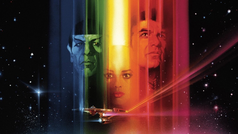
To add some rarity to the new prints, Artphoric have recreated the art from one of Peak’s final submissions that is a slight variation on the final Star Trek: The Motion Picture poster released by Paramount. On close observation, you will note that Kirk and Spock are on opposite sides on this print than they were on the official movie poster.
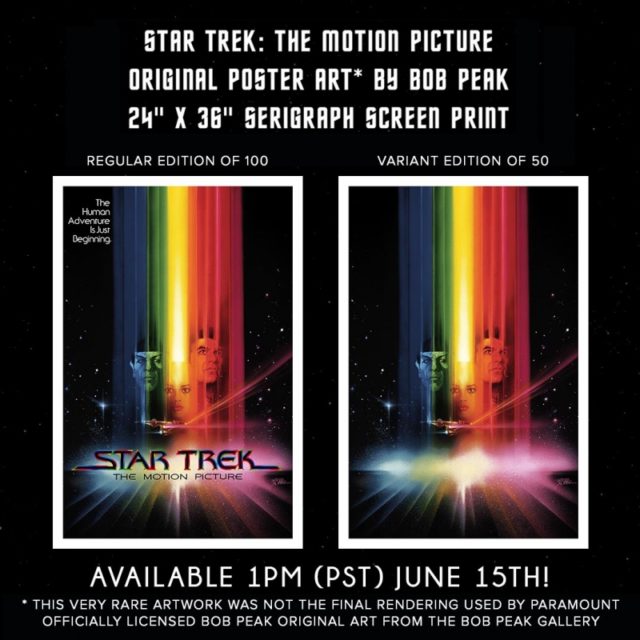
Only 150 prints will be made in total, with 100 regular editions and 50 variants without titles. The process of creating the serigraphs separates it into 25 different layers (20 layers for version without titles), which are then high color-count screenprinted on heavyweight Cranes Lettra Flo white linen.
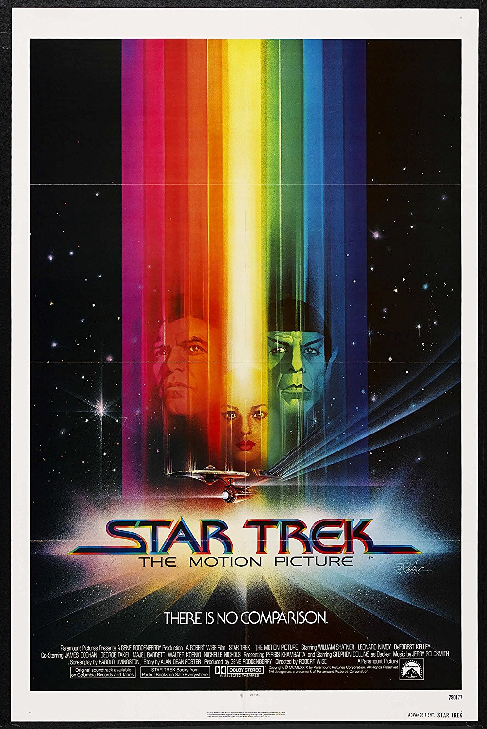
Final Paramount poster for Star Trek: The Motion Picture (note Kirk and Spock are on different sides than version being sold by IconcLE)
Artphoric has the artwork for all five of Bob Peak’s Star Trek feature film posters, including a number of variants. Hopefully over time they will release more Trek art prints in this new IconicLE line.
The 24″ x 36″ Star Trek: The Motion Picture seriographs are priced at $120 for the regular version and $140 for the variant. They go on sale on Friday June 15th at 1p (PST) at iconicleprints.com.
Awesome. Love Bob Peaks work.
My head-canon Kirk. Tougher-looking and more rugged than either Shatner or Pine.
I guess this is good for collectors, but the original movie poster is available on eBay for as little as $25.
I had this movie poster. When Star Trek II came out I asked my local theater if I could buy the poster after the movie moved on. They said sure & they had TMP stored as well. I think I paid 5 bucks for each. As each movie came out I bought the poster from the theater. I had them all up to Star Trek VI. I gave them all to my nephew who is a huge Star Trek fan, wish I still had them.
You did the right thing, Ensign Ricky. I’m sure the little tyke is enjoying them.
Anthony Thompson,
Re: the right stuff
Definitely A right thing, but, for me, it would have been a struggle between honoring my niece or nephew’s love of Trek with the posters, and auctioning the complete set off with the goal to fund his or hers college education so they could have a shot at the actual dream.
Beautiful :)
Peak was one of the best. His movie posters for TNG and APOCALYPSE NOW are simply two of the greatest examples of that genre, from any era.
Yup, I put him and Drew Struzan (hope I spelled that right) at the top of the movie poster artists. Struzan’s Blade Runner poster is another classic which I would not mind having a good print of.
Yargh! I saw the poster and the first thing I thought was: “Director’s Edition HS release?”
Foiled again… It’s a great poster though!
Buzz Kill…
Loved the one sheet when I was a kid. Although I was wondering why they featured the new player rather than McCoy. Still looked sharp, though.
Clearly a case of the “not-gays”. Kirk, Spock, and a rainbow (with or without McCoy) would be too much.
Oh brother.
They also put Lt. Ilia on the cover of “Us” magazine– does that even exist anymore? — and billed TMP as the “sexy new Star Trek.” I think they wanted a younger vibe in the poster. Not that Shatner and Nimoy were very old, 48, then.
So, why the mirror image? Not really a reproduction if the image is reversed on it.
From Iconic LE’s Facebook:
Trivia time! The version of The Motion Picture theatrical artwork that most people are familiar with features Captain Kirk on the left of Ilia and Spock on the right. What most people don’t know is that the original painting by Bob Peak switches the orientation of those characters. William Shatner preferred to be featured on the left side of the rainbow beam and so the studio edited Peak’s artwork to accommodate this. Our screenprint release features the artwork in its original form which helps it stand out from other reproductions!
The studio didn’t edit it, Peak did a new painting. The details are different between the two. The heads are closer to even on the final, while the alternate version here has Kirk much higher in the frame. The actual stars (not the actors) on both sides are close to being the same, but not quite. The actor expressions are also a little different.
This is a nice piece, but to call it “final” is inaccurate.
@Captain Caveman — interesting stuff. I’ll bet Nimoy had something to do with the head height as well. This is the kind of stuff that makes an artists soul crack, and why Hollywood can be such a difficult place to labor in the creative mines. I wonder why they flipped the color spectrum. Part of me wants to believe it’s a reference to their original uniform colors (although Kirk never wore gold again), but it likely has to do with red being a stronger color for Kirk, and Spock’s journey to find enlightenment …
Interesting… I wonder if Nimoy complained that Shatner’s head was bigger than his in the unreleased version?!
A note about this version From Thomas Peak Yes, This is so true. My Father Bob Peak told me all about how William Shatner wanted to be on the left side. The one being offered is the original finished key art version with Leonard Nimoy on the left and William Shatner on the right.
I think Shatner got it right. He looks better on the left. The original art version looks like a mirror-image photo. Besides, the color spectrum is Roy G. Biv, not Vib G. Yor ;)
Shatner is an ego maniac. Love his work though.
Shatner stole everyone’s lines on TOS and wanted his head to be pre-eminent on the STMP poster! It fits.
Bob Peak was an amazing artist his Star Trek TOS movie posters are still fantastic looking!
I still have this somewhere– it hung in my room from about the time the film came out…!
I actually prefer the version that came to the theater in 1979. I still have an original with the fold creases. Bob Peak was Amazing!!!
I’m a bit confused, this version, aside from the sides & positioning of the heads also has a lot more realistic detail in the stars & the Enterprise.
Is this a seperate painting that he did first & presented then he did another painting, rushed with the changes asked for but less detail?
So are there too paintings & did the first one have more detail or did the artist go back & finish this first painting off after later once the other one was approved for the poster?
With not much specific details to the Trek movie poster in question , you can glean more insight into the Paramount poster production process of that era from these two sources discussing Spiros Angelikas, who hired Bob Peak:
http://www.richardamselmovie.com/single-post/2017/05/05/Spiros-Angelikas-The-most-interesting-man-in-the-advertising-world
http://www.trek.fm/hyperchannel/78
It starts about 6 minutes into the Trek fm podcast.
Actually, after re-reading the article & info “Reproductions” & “Recreated” as in not the original, a copy by someone else?
Can someone explain this?
25 layers of screenprinting means this thing is going to look FANTASTIC.
I think the IconicLE website is down as I cannot get there to place an order. Such a pity. Anyone know what’s going on?
They’ve been partially down most of the day. I don’t know if it’s due to people trying to get orders in, but I was eventually able to get my order in after trying multiple times.
Love Bob Peak, Love the poster, hate the price….