Eaglemoss has already committed to adding the USS Voyager-J and other 32nd-century Starfleet ships from Star Trek: Discovery to their line of Star Trek starships. While waiting for those we thought we would take a look at another future ship they have taken on: the recently released XL version of the USS Enterprise-J, the big brother to the previously released smaller version of the future ship.
Eaglemoss XL Enterprise-J
Truly one of the most unusual interpretations of the starship Enterprise ever designed, the Enterprise-J was glimpsed only briefly and more or less as an illustration in the background as Jonathan Archer is spirited onboard the vessel during a pivotal moment involving the Temporal War in the Star Trek: Enterprise episode “Azati Prime.” Designed by artist Doug Drexler, the ship was intended to be a far-future iteration of the famed Enterprise and thus had to appear almost unimaginably advanced, particularly in comparison to Archer’s NX-01. Mission accomplished!
There’s a line in TOS where someone offends Scotty by suggesting advanced technology warp engines would eventually be “the size of walnuts.” The Enterprise-J doesn’t exactly pull that off but you might think that Drexler was trying to get at that idea in his design.
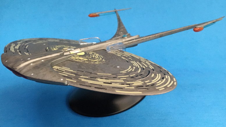
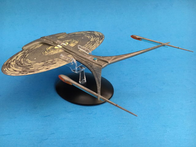
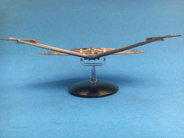
The J looks like a big, flat pancake with a hammerhead-shaped superstructure on top of it that sweeps back into extremely delicate, spindly warp engine pylons and nacelles that look like they’d be completely incapable of driving the mass of a ship like this using the warp technology we (claim to) understand. The oval-shaped primary hull is supposedly the size of a city.
Since we originally only had a single view of this vessel (it has subsequently shown up in 3D form in Star Trek Online) it would seem to be a challenging subject for Eaglemoss to reproduce, but with help from Drexler, the Enterprise-J comes to life in a sizeable XL Edition that is one of the company’s more impressive offerings.
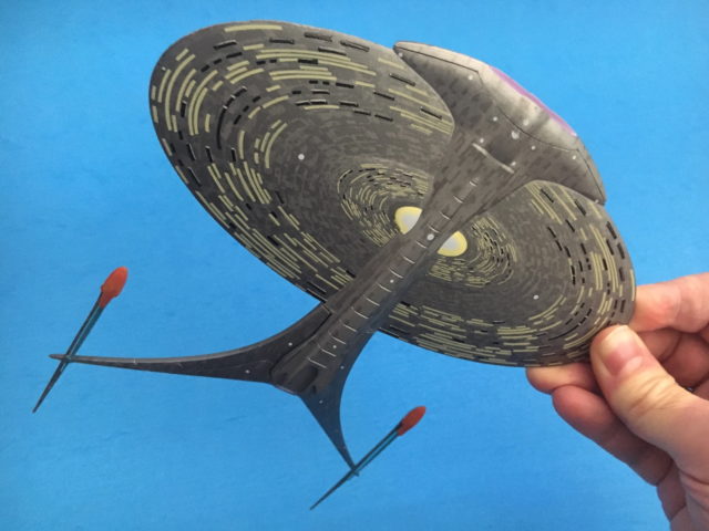
The gigantic primary hull disc itself is metal, giving the ship considerable heft, while the pylon section and warp engines are plastic. The J has all the basic engineering details you expect to see on a starship—a forward deflector (built into the nose of the primary hull like the gaping maw of a flat fish), an impulse deflection crystal, warp nacelle bussard collectors, blue warp grills (which are spear-like, tubular structures almost separate from the rest of the nacelle), Aztec panel details and windows—although these are stretched out, illuminated curves on the primary hull seen as paint details on the model.
Since Star Trek Discovery has now moved 900 years into the future and several hundred years past the era of the J, the Enterprise-J has lost a little bit of its imagination-beggaring mojo (hey, it’s nacelles are still actually ATTACHED to the ship), but it’s still fascinating to have this vessel as something you can actually hold in your hand and credit must be given to Eaglemoss for managing to reproduce the ship so that its fiddly details don’t immediately snap off when the model is handled. In fact, this is a surprisingly sturdy reproduction that seems less prone to breakage than some of the company’s other models.
Available now
If you’re looking for one of the most unique Trek ships to display, the Enterprise J could be your huckleberry. You can pick up the XL Edition USS Enterprise-J for $74.95. (the smaller regular edition can be had for $24.99).
More photos of the XL Enterprise-J
Keep up with all the Star Trek merchandise news and reviews at TrekMovie.com.




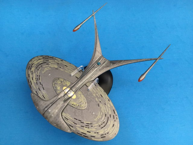

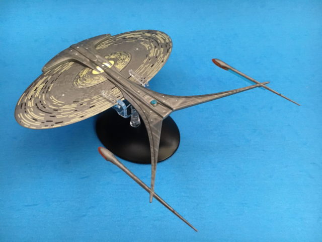
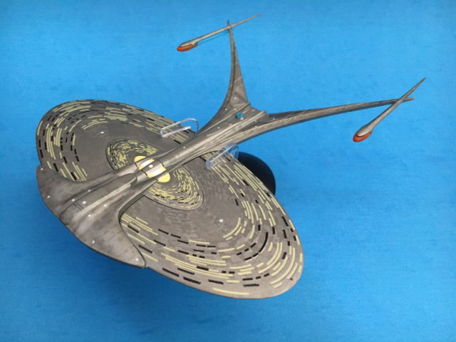

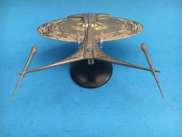




Just when you thought Star Trek starship design reached its lowest point with the NX-01 incrementalist, design-by-committee crapfest, welcome to the U.S.S. Floss Pick.
“To boldly prevent cavities where no brush has gone before.”
LOL! Even though I don’t get it,lol.
What’s it like to be so proud of being wrong? :)
What’s it like to post something no one can understand? :)
If this thing was 2 miles wide by the 26th century, I would love to know how big is their biggest ship 600 years later in the 32nd century lol.
Never loved this ship, but it has grown on me over the years. I’m hoping the same will eventually happen for me and Discovery. ;)
I feel the same way about Discovery!
I do like some of the changes they made for the refit. It does look a bit less ugly and awkward, but still not exactly the ship of my dreams or anything. But it looks like we are stuck with it.
“It does look a bit less ugly and awkward”
Does it? To me it looks now like somebody stuck too many Christmas lights onto a pizza cutter…. still a pizza cutter! I mean, ’tis the season, but this is a Scrooge fest :D
…..a little. ;)
What a lovely little ship.
Worf voice: Little?
Psssshhhh. Attached nacelles. How quaint.
I’ll wait for the USS Cerritos.
This is lovely, and I imagine difficult to manufacture. Kudos!
That said, 2021 marks the fifth anniversary of Star Trek: Beyond, and still no Alternate Reality 1701-A? Not even a Revell or Snap-Tite model?
Anyone know someone at either Eaglemoss or ViacomCBS’ licensing division who can tell us what the hold-up is?
Will we get an Eaglemoss ‘Star Trek Discovery Cloud of Tiny Debris From Battling Control,’ or ‘Short Treks School Bus Shuttle’ long before an actual, onscreen canon Enterprise?
I have a friend who works for EM,I’ll ask him.
Thanks, appreciated! 🖖🏻
Not Drexler’s finest hour, but it still bests the Pizza Cutter (not that that’s particularly difficult!)
FWIW, the “disappearing” pylons and ultra tapered nacelles do provide a nice intermediate step in the design lineage between the already getting smaller nacelles of the 24th century Galaxy and Intrepid classes and the 32nd century “detached” nacelles.
Drexler never even had a mediocre hour designing starships, let alone a finest hour.
He’s a makeup artist…his first, best destiny.
LOVE this ship and luckily got both versions EM made. Like the XL line a lot.
I never thought this was a practical nor beautiful design, sorry.
Agreed. It’s moronic.
It looks like a double sided dental floss pick.
No idea why this deserved the XL treatment. It was only seen a few seconds.
Suprise: The Ship is inside bigger than outside. That’s why it is so flat.
The windows make even less sense than the ones on the D.
These are not windows, this is aluminium which coincidently happens to be transparent. ;-)
And on the ceiling too, unless the decks are arranged unconventionally.
Maybe they have open-sky gardens ;-)
One word: Homely.
This is one of the ugliest vessels ever designed in Trek. It doesn’t deserve the name it bears.
Well said! It looks like a double sided dental floss pick.
I’d like to see this with the saucer separated.
Thanks I hate it