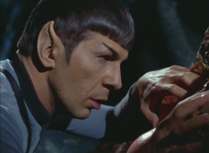
 As a kid, Devil in the Dark was always one of my favorite episodes because it’s just about the closest thing Star Trek has ever done to a bona fide monster movie. It’s also one of the cheesier episodes in terms of paper mache rocks and tunnels, melodramatic performances and a monster that looks like an unholy union between a shag carpet and a giant pan pizza. It’s essentially a bottle show and most of it takes place down on the planet, but there are a few unique opportunities for updated visual effects.
Strange New Worlds—at High Noon
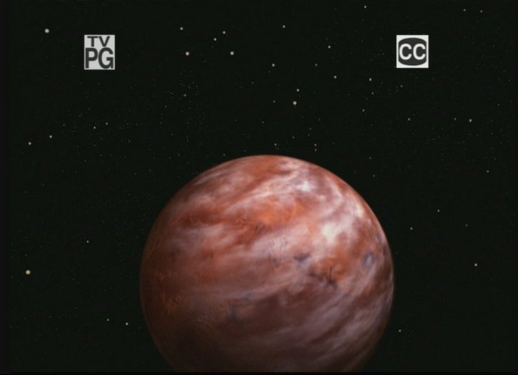
The planet Janus VI is the first thing we see as the episode fades in, a red-orange-white ball with more detail and more discernable surface features than the amorphous original. It’s worth mentioning because, like just about every other planet we ever saw in the series, we just happen to be on the fully sunlit side of it in every shot. They could have made these scenes much more visually interesting and improved the lighting on the ship at the same time just by changing the angle of the sun and letting us see the night side of the planet and some stronger shadows here and there. It’s like the difference between a photo taken in normal, realistic lighting and one taken by a camera with a built-in flash where the lack of shadows and highlights makes everything seem two-dimensional. I thought the same thing about the duplicate Earth in Miri, even though that planet was almost perfect in every other respect.
Next we see a wide shot of the underground mining complex, which has undergone a dramatic change for the better. The original matte painting was nice but also rather obviously a painting. The new version is not only more realistic, but they have added a delightfully dynamic element down in the lower left corner. If you watch closely, you can see a tiny, orange-suited miner just entering an illuminated passageway, which transitions seamlessly into the live-action footage of that same miner on patrol inside the tunnel. It adds a very nice bit of context and helps establish the sense of where all of this taking place. I also have to compliment them on the pan and zoom accompanying this shot which was very reminiscent of the style of cinematography in those days. The same updated matte painting appears several times in subsequent scenes through the mining administrator’s office window, sometimes with smoke or steam rising from the pipe gantries and little lights twinkling here and there. Often, there is someone standing or passing in front of the window, which means the special effects team had to rotoscope the old matte painting out of the shot before replacing it with the new one. This is a very easy process to screw up but they seem to have done an excellent job on it.
Error Correction or Artistic License?
One of the selling points for Trek Remastered was that they wouldn’t be changing things just for the sake of changing them. The visual effects were going to be “updated” to a higher level of quality consistent with HD and certain “errors” would be corrected, like the missing beam from Scotty’s phaser when he was cutting his way into engineering in ‘The Naked Time’. Otherwise they were going to be very respectful of the style and content of the original versions. So far they seem to be adhering to that philosophy almost excessively, but there is one scene in Devil in the Dark that is already generating some controversy over whether or not it needed to be corrected or was just fine the way it was. It comes in the second half of the episode when the Horta appears by burning its way through the cavern wall. The original effect was a fairly straightforward optical transition from solid rock to open tunnel which was masked by an animated glow. They used something similar almost every time an unfortunate Redshirt got zapped by a phaser beam or lightning bolt. If there was anything wrong with it, it was the overly obvious outline of the piece of styrofoam rock before it began to melt.
In the new version, the section of cavern wall has been digitally replaced in a way that very effectively hides where the tunnel opening will appear. The glow effect is much more animated, rippling and expanding into its full circular shape while smoke billows from the rock face. After the glow fades and the Horta is revealed, smoke continues to roll out of the opening and off the Horta itself as it shambles out, and this is where the truth of my comment about rotoscoping being easy to screw up is revealed. In the original version, there was no rock left to speak of at the lower edge of the tunnel opening, but here part of the digital replacement remains and must be masked out as the Horta passes over it. The edge between the Horta’s shaggy fringe and the digital rock is noticeably fuzzy and indistinct. “Screwed up” is probably too strong a term but it’s not one of the best examples of the process I’ve ever seen
The question is, was there anything here that needed to be corrected? After giving it some careful thought, I think the styrofoam plug in the tunnel opening before the transition was sufficiently obvious and fake looking to warrant the digital replacement, but I think they could have constructed it better so as to avoid the fuzzy masking at the end.
Same Ship, Different Day
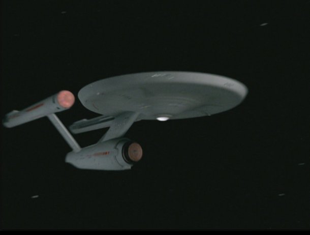
Technically, all of the space exterior shots of the Enterprise arriving and orbiting Janus VI are new, but they are essentially the same shots that were used in Miri aside from the planet itself. It would be interesting to know if they are reusing elements of the new CG work as “stock footage” as was done with the originals. If so, they’ve been careful enough so far to match the corresponding details like the fill light on the ship and the color of the planet below. In general, though, as I look at these shots I’m more convinced than ever that the model is over lit and under textured. There’s hardly any tonal or specular variation over the hull surface, particularly in the side-on orbital view, it’s all just a flat, featureless gray. I’ve seen the still images of the CG model that clearly show weathering, gridlines and other subtle surface details but they are apparently too subtle to survive the bright lights and the transition to full-motion video, at SD resolution anyway. I presume they are trying to evoke the somewhat overexposed look of the originals, but this is one of those cases where I feel they are adhering too closely to authenticity and missing an opportunity to truly improve these shots.
A pleasant exception to this rule comes at the very end of the episode with an unusual twist on a typical Enterprise fly-by. Instead of cutting abruptly between separate approaching and departing angles, the camera pans to follow the ship as it glides gracefully past. This is something they technologically could not do in a 1960s television production because they had no reliable way to synchronize camera movements for separate elements like the ship and the stars. This is why, with a couple of rare exceptions, the camera always remained fixed during the exterior space shots. I believe it’s also the reason why most of the attempts at replacing those visual effects by amateur artists like myself tend to look out-of-place, because they just can’t resist using dynamic cameras, often to the point of unrealistic moves that are only possible in CG. Here, the pan is relatively understated and effective. I also have to mention that the spinning nacelle domes in this shot are significantly better looking than any of the others we’ve seen so far and the lighting is more subdued and realistic
One last observation: The transition from the live action bridge scene to that final shot of the Enterprise fly-by is worth noting because it’s a cross-fade from one to the other. This presents a significant technical problem because there are a number of frames where the two shots are intermixed and there’s no easy way to separate them. It appears the CBS special effects team has solved the problem by simply beginning the transition early. Kirk is still in the middle of saying, “Ahead warp factor two,” when the scene changes. Sometimes the simplest solutions really are the best ones.

The new closing flyby of the CGI Enterprise
Click to see more screenshots and video from ‘Devil in the Dark’ Remastered
Jason Lee is a lighting designer and computer graphics specialist. Better known by his online moniker, “Vektor,” he is working on his own CG update of the special effects from numerous original Star Trek episodes.


Watched this episode with my two young daughters. They’ve never watched a full Trek episode before. They were scared of the monster until they realized, “The monster is a mama!” After that, the Horta was “cute” and they wanted one. That’s why I love this show — all the themes of diversity and understanding still shine through so clearly and simply. CBS did a nice job on the updates. I’m thinking I need to build a new Enterprise model now. Seeing that panning flyby at the end fo the show really got my juices flowing.
I’d say that just about says it all fairly concisely. Exquisite.
Perfect episode, and it still feels just as great. Star Trek really holds up well and the new shots truly enhance the experience. Loved the exterior shots of the minning complex.
I don’t think they have to go too crazy with updating the effects since in my opinion the stories are truly compelling.
You watch this episode and you don’t think of the Horta as some cheap foam creature, you see a being that is suffering because of the circumstances presented in the story, and if that works then the matte paintings and the model of the Enterprise shouldn’t even be an issue.
I’m dissapointed.They should have done something to give the Horta a little more personality like put on a pair of lederhosen.