
The appearance of a redesigned USS Enterprise in the season one finale of Star Trek: Discovery lasted only a few seconds, but it has spawned much discussion and analysis since. A single image of concept art in an upcoming calendar made news, and even sparked a controversy. With just those brief looks so far, it is no surprise that some fans have taken it upon themselves to bring this new version of the USS Enterprise to life.
A few days ago on Facebook, 3D modeler Chris Kuhn posted his own version Discovery’s take on the USS Enterprise.
Chris Kuhn’s render of his new 3D model
In addition to a very nice render of the ship, Kuhn also released the 3D modeling files into the wild. These files have allowed other members of the sci-fi rendering community to create their own versions of the iconic ship in various new scenes. Even with his model only being available for about 3 days, there’s already a number of nice shots that have been posted to the 3D Sci-Fi Renders group on Facebook and we have selected a few to share.
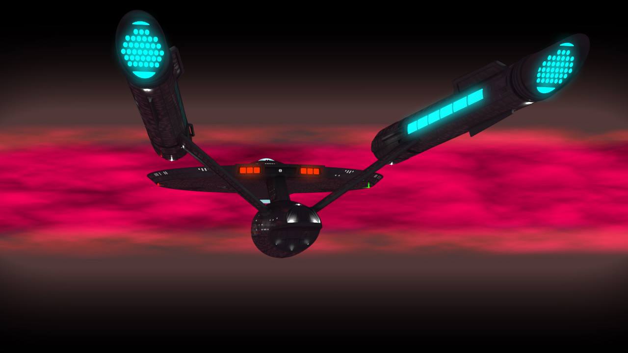
One of the first folks to jump in and play with it is Marc Bell, who was a VFX supervisor for Star Trek Continues, who has shared a number of shots:

Marc Bell
Marc Bell
Artist Glenn Gagnon places the new Enterprise at the edge of the galactic barrier, as seen in the second TOS pilot episode “Where No Man Has Gone Before.”
Glenn Gagnon
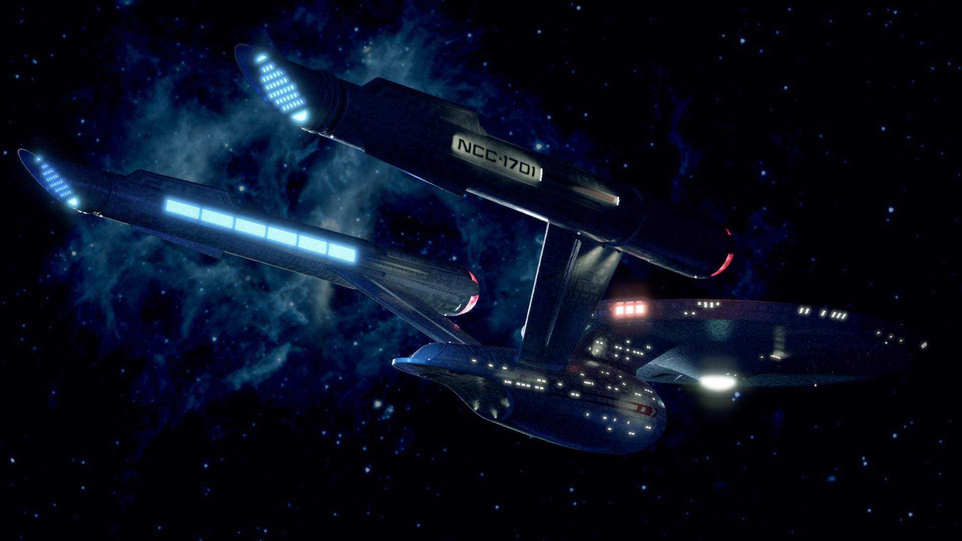
Chris Hicks has used Kuhn’s models of the USS Discovery and the USS Enterprise to recreate the scene from the season one finale where the two ships meet.
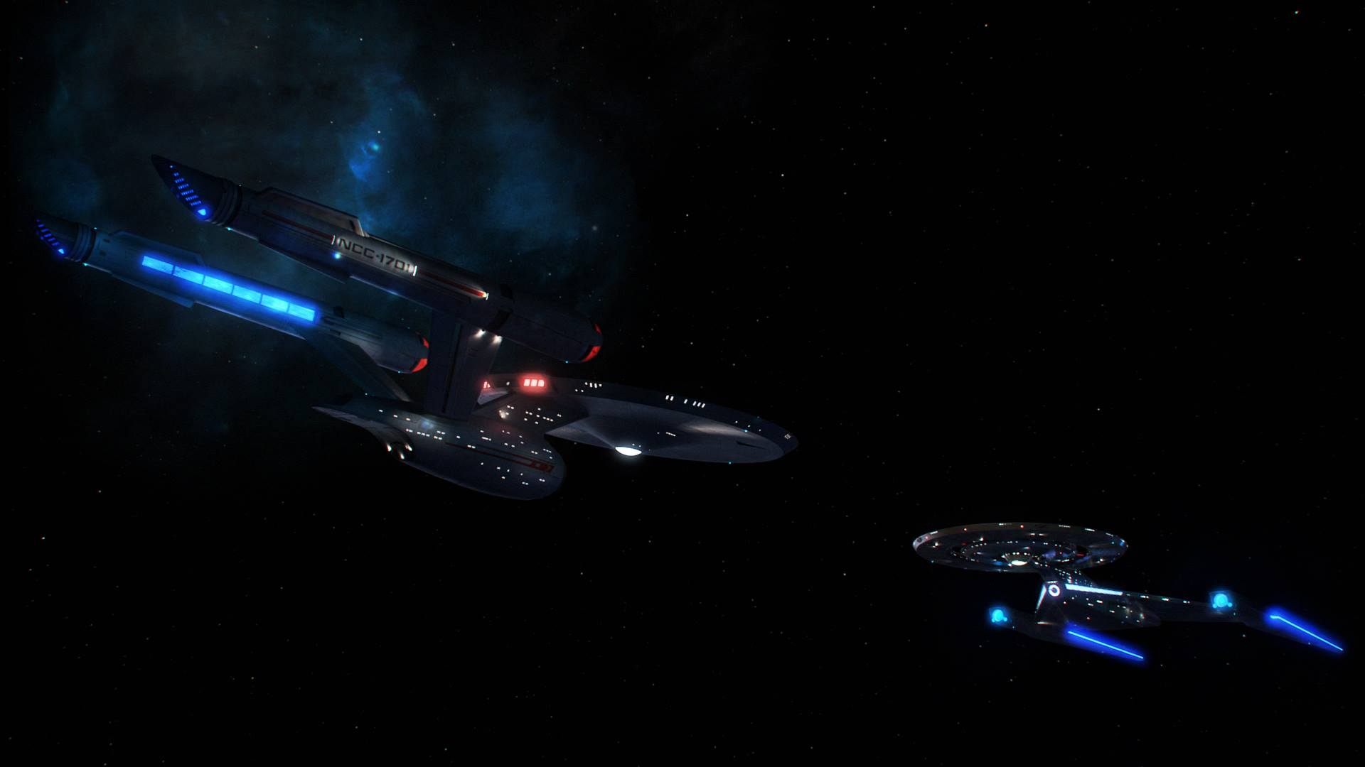
Chris Hicks
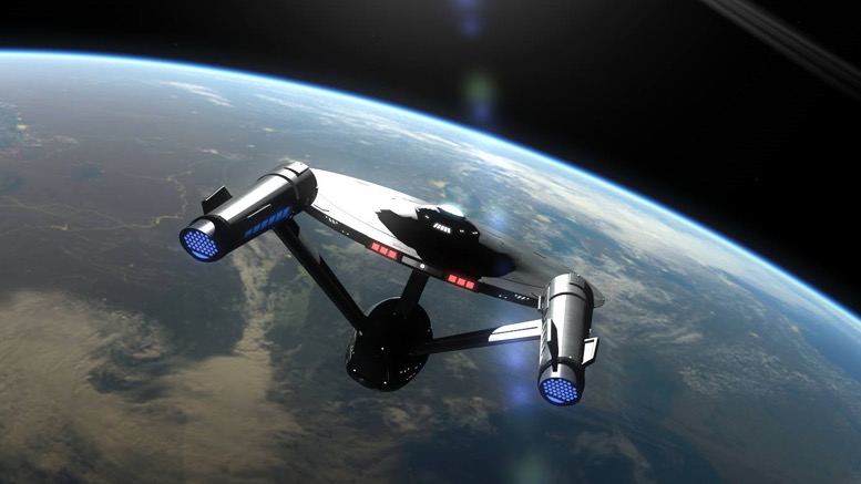
Artists Conner Bentley and Cameron Bishop both have nice shots of the Enterprise around planets.
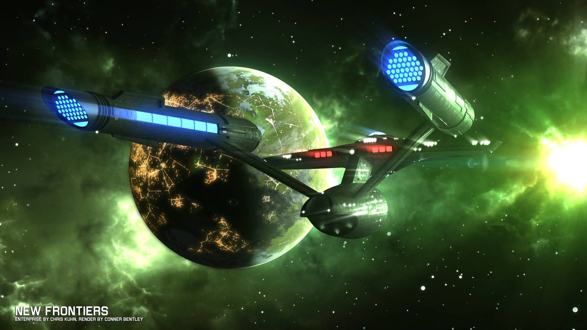
Conner Bently

Cameron Bishop – The Enterprise clears Spacedock in Earth orbit
And on imgur today, Daniel Broadway released a series of photos of his render of Kuhn’s Enterprise model, giving a good look at the ship from a number of angles.
It seems the 3D modeling community is just getting started, and until we get another glimpse of the real thing from the second season of Star Trek: Discovery, their work is a great way to keep fans going.
Star Trek: Discovery is available exclusively in the USA on CBS All Access. It airs in Canada on Space and streams on CraveTV. It is available on Netflix everywhere else.
Keep up with all the Star Trek: Discovery news at TrekMovie.


very cool indeed. Such a great re-design. I 100% prefer it to the 1966 TOS one.
The original 60s one will be better than this DSC version
Apprehensive how the interior will be messed with
It will likely be generic and resemble the other Disco ships. In fact, I’d put money on it being a Shenzhou (sp?) redress.
Likely dark, like everything we’ve seen so far…
I never understand when people complain about a dark bridge. Have you SEEN the bridge of the Saratoga at the beginning of Star Trek IV? My God, you’d need flashlights to find your way around it. A dark bridge is nothing new to Trek and the Disco bridge isn’t “dark” by most standards. You’ve gotta remember that Lorca who had sensitivity to light probably lowered it.
Yup
I dont think many people complain about the lighting on the bridge. Its not an issue for me.
I DO complain about the lighting of the ship exteriors though. The over-abundance of blue haze and darkness doesn’t serve the show well at all. Its like they’re hiding the ships…maybe their CGI isnt very good up close. I dont know.
I’ll take that bet, especially given that fan expectations are riding high. My guess is that, much like the exterior, it will be some combination of the TOS and Disco aesthetic, guaranteed not to make the critics or canonistas happy.
You know nothing this show does will make canonistas happy, which is fine, they’re not wrong. But I agree with Chup and Dan, it will probably be a darkly lit, generic sci-fi set redress of the Shenzhou bridge. It doesn’t have to be, and they could surprise us, but that’s my bet. Heck that set might even double as the other Starfleet ship the engineer is from.
If it is a redress of the Shenzhou bridge, my bet is that it will be a substantial one. This is the Enterprise we’re talking about, after all. We’ll see.
It won’t be a Shenzou redress. That set was on a raised platform to accommodate the underslung bridge of the Walker class with the large windows.
True, it just won’t make sense.
True it wouldn’t be a “redress” in the strictest sense of the word. But they will reuse the Shenzhou bridge set for the Connie in some way I’m sure.
Dark is fine when it is DAY OF THE DOVE, when you’ve got some decent highlights, or when you kill ALL the lights except the alert slot and the helm blinker, a la BALANCE OF TERROR after the nuke detonates (one of my fave visuals in TREK history – am surprised it didn’t violate broadcast standards to go that dark.)
But DSC’s usual murk and glare plus dark equals not-good for me, so I’m thinking the more they depart on the bridge, the more I’m not going to like it.
Whereas – I – understanding that a tv show with a budget in 2018 isn’t going to look anything like a tv show with zero budget from 52 years ago ffs. And nor do I want it to.
I love it Looks like a step down from the Movies Enterprise
Cameron Bishops render is particularly great. Might have to have a play in Blender again myself.
Fan Art is so cool! I’ve always fanned out on fan art.
I wish Discovery had jjust gone with the original enterprise, surprised us and stopped playing the douche. Great efforts from fans at recreating Discovery’s reboot enterprise. I had to laugh, as in keeping with the series all the shots are lit badly. Moody, dark, angry, edgey. What a clever production team they are!
For me, it’s not that I really care that they altered it, but as we’ve seen online in countless youtube videos, this could have been done believably by simply updating detail/texture, and lighting… everyone says the effects look great, but they look completely unrealistic. In other words, I don’t mind dark because it is outerspace.. but when has outer space ever been so consistently colorful in every place they go? Ugh… they should just go ahead and call this show what it is…. a reboot.
Just our of curiosity, what YouTube videos would those be?
I think Scott Gammans did some really nice TOS ENT CG work that wasn’t updated or refined design-wise at all, but the textures still somehow held up (in a photographic-looking way) at ranges where the filming miniature did not (found it quite amazing. Not talking DOOMSDAY MACHINE tests, but something else I think he did that involved really nice come-to-camera flybys — the way he captured the hard light look and falloff was awesome. Apologies if I’m thinking of someone else …
You’re thinking of the right guy. I like Scott’s work (we once shared a brief correspondence about CGI software, given my status as a dabbler), and I agree that his surface textures and lighting were very convincing, if a little too Aztec-y for the TOS era.
Personally, I still think that Dennis Bailey’s work on “The Trissarian Intersection” came the closest to capturing the TOS “vibe,” even though the ship being portrayed wasn’t actually the Enterprise.
The Gammansprise would still likely need a bit more surface detail, but I otherwise think that artists like him make a good case for retaining the overall classic shape and making it work with today’s SFX.
Google Search TOS Enterprise 1.5
Ummm. They did. And duh… obviously it is a reboot or a reimagining or visual update… just like Producers had stated.
It’s like you didn’t read a word I typed. Also, they’ve said nothing about a reboot. They’ve consistently been saying this is faithful to canon… except that it’s not. And the visual differences aren’t the biggest violation of that. I’ll say it again so you understand… I don’t care that they updated the Enterprise. I care that they keep telling us this is respectful to canon when it’s not.
They have said it is a visual reboot.
They have said and this is a quote “visual reboot”. Now that thats settled. Please stop crying and just be happy you got Trek back at all. Keep up this whining and we can kiss our favorite series good bye. I want Trek. ALL TREK! Be a real fan and stop complaining!
You are right. Waht I miss are HD remaster of DS9 and VOY. Only that satisfy my nostalgia…
Stop sounding so sycophantic and show some discretion. That’d be an indication of some serious devotion to a program, rather than blithely signing off on anything with the TREK moniker.
A “Real Fan” doesn’t take 2nd best, 75% Fake Trek.
They don’t just take what they are given when it is not faithful to the Original Universe (TOS/TNG/VOY/ENT) & instead some Try-Hard Game of Star Wars wanna be.
Yep. I think the Berman era ship SFX was often better than what DSC has offered up. The whole blue-ish look has given the show an almost cartoony feel and at no point have I ever looked at a ship shot and thought “wow, that looks like some real money has been spent”. It’s a shame because some of the other SFX has been top notch (like Burnham’s space walk, etc).
You have got to be kidding me!? Those effects have not held up at all and most of them look amateurish at best. I honestly think you should re-watch just VFX reels. You might change your mind.
Exactly Ryan, I was watching past Trek on Netflix and sure they look like models, they look tangible but you watch ship explosions or something else and it looks cheap.
So the fifty seconds of the ship flying work fine, but then the two seconds of pyro is where the fail comes in? That means it is still working roughly on a SPACE 1999 level, which is way ahead of VOYAGER and ENT, in terms of crediblity.
The compositing on the TNG-era modelwork is inconsistent, but the motion control shooting and lighting of the models is often exceptionally well-done, though the smaller models are not very successful. The fact they could make the -D design work despite its godawful front-heaviness is a miracle of finessing.
VFX on Trek went WAY down with the switchover to whole cloth CG on VOYAGER and ENT (DS9 declined a bit towards the end for the same reason — I have a tendency to watch WAY OF THE WARRIOR or ONE LITTLE SHIP when I want to see the good stuff, as the big battle scenes later, while still tons better than VOYAGER’s cartoonishness, just don’t have the same visual credibility.)
As a gatekeeper since 1968, I can only say this.
“Get a Life”.
What looked awesome 50 years ago doesn’t mean it looks good today.
Star Trek is not a damn religion. Some of my fellow fans were upset that ST:TMP changed the Klingons. TNG changed Romulans. Other changes have caused serious over-thought amongst fans.
You know what some of us appreciated? That budget and FX technology finally allowed for stuff to look better.
I’m still waiting for the “budget and fx technology” to make TREK look better than a lot of the work done on the features between 1978 and 1996 (the best of that is probably still the good stuff in TMP, along with select views in GEN and FC), but in a lot of ways the largely all-digital approach utilized from INS onward has gone backwards to a more painterly and sometimes cartoonish look. I WILL say the critter that was tearing folks apart on DSC looked very good to my eye, but I haven’t liked any of their exterior ship shots at all.
I’m not levying this against TREK exclusively; I’ve written about visual effects since 1990, and I think the height for most photo-real space effects was established around 1997, when vendors were using conventional model work and augmenting with digital, sweetening the shots to a high level of credibility and beauty with CGI rather than doing whole-cloth CGI. There have certainly been outstanding exceptions in the last two decades, but for me they definitely remain exceptions and not the norm. (so far as ‘invisible’ VFX go, I will also grant that digital compositing and the ability to finesse images today had greatly improved above the old norm, but that’s not what we’re discussing here.)
I don’t entirely disagree. That said, you have to admit that much of ILM’s work seen in TWOK comes off as pretty cartoony when compared to Trumbull’s, and that was all (except for the Genesis demo) pre-digital. Meanwhile, for believability I’ll take the digital space shots in the rebooted GALACTICA over the Dykstra originals any day.
I’m not the guy to defend ILM, especially their ‘design’ work that stains SFS so badly, but I think a decent chunk of their TWOK work was very good, though agreed, it doesn’t hold a candle to the best or even the middle-of-the-road stuff, in TMP. I think there are two reasons for the inconsistency — one, that ILM guaranteed their price per shot, which makes me think they cut corners to keep that guarantee, and two, that they didn’t have as much time as they would have had with a more ideal schedule.
A third aspect might be that ILMers had their noses out of joint with being forced to use Paramount designs for VFX instead of working up their own (though in this case, I think that was good, because as indicated above, ILM design looks way too STAR WARS/big-and-blocky-is-better, what with the moronic blimphanger spacedock and a BirdofPrey that is cousin to a ship in 1985’s EXPLORERS, which is basically the BoP with wings torn off.) ILM was able to depart on the Genesis cave, and that was seriously unsuccessful, though they did successfully pitch the Genesis tape, which is a genuine landmark, though actually executed by a division outside of ILM proper, which later became Pixar.
NuGalactica holds on its shots and let you look at them, but I still think there is a resolution problem with the space stuff, though it is much easier on the eye than the live-action, where it seems that everything that isn’t badly underexposed winds up seriously overexposed (hard to believe this is something they strove for, even now!) I have a genuine fondness for the look of the Dykstra stuff — Muren had gotten pretty sophisticated with his programming at that point, and they had some very nice sweeteners like shadows of cylon ships passing over GALACTICA along with the raiders themselves. Haven’t seen it in HD yet, and probably won’t (the live-action on the original is still really painful-awful to me), but if there’s a reel, I’ll take a look again. The biggest sin was seeing the same shots over & over, and being able to anticipate when they’d just flip the neg and show the cylon getting blown up banking right rather than left.
Another issue with TWOK was ILM’s shooting the Enterprise miniature against bluescreen, which necessitated dulling-down the beautiful original rainbow paint job and substituting a grey Aztec pattern instead. It got the job done, but wasn’t nearly as compelling visually.
We’ll definitely have to agree to disagree about the GALACTICA effects. I know that the doc-style “shaky-cam” wasn’t to everyone’s taste (and even made some people physically ill), but even allowing for that, in terms of scope, execution, and gritty realism, I consider the work done by Foundation Imaging to be superior to the original in just about every way possible.
I’ve rewatched NuGalac at least twice since the original airing, so for me I’d say it is a triumph of storytelling over style (which is really saying something, since I also found a lot of the storytelling choices to be places I didn’t want them to go, yet still didn’t tune out or stop watching.) Suffice to say, if a TREK series went to this visual extreme, it would have been a dealbreaker for me.
Sure do love all the percussion music on that Galac, though, Bear’s work sounds like Gerald Fried (early Trek composer who did an all percussion score for PATHS OF GLORY) got pumped full of adrenaline or something.
Trek has been around for over half a century and for the majority of that time was amazingingly consistent over hundreds and hundreds of hours. An amazing feat really. While you may not care about that, so fans who have been following the franchise nearly as long as, if not longer, than you do care.
The budget and SFX argument is a weak argument and always has been. It is perfectly possible to update the look and feel of the show while still having designs that maintain the basic aesthetic and have you believe there is some credibility for it being Prime Universe. But the visual changes are well above and beyond that. They are changing things for the sake of it, and that’s well beyond the TMP Klingon change. For instance, the DSC Klingons. What about them is new? Nothing. Convincing rubber heads and rubber gloves were around in the 80s. So the budget arguments doesn’t fly. They’ve just been changed because someone wanted to put their own stamp on the show. That’s just one of many examples.
Necessary changes are adding in modern lighting, surface detail on ships, sets and uniforms, updating methods of shooting and creating brand new stuff where canon will allow. Unnecessary changes are redesigning something that can still hold up today. I mean take this Enterprise. Are you honestly telling me that changing the shape of nacelle pylons was necessary because of modern SFX but retaining, for example, the sixties deflector dish was okay? That right there shows you how much the modern SFX argument is BS in terms of just how far they have gone in redesigning things.
Fans were promised canon and were basically sold a lie. While it may not bother you, it does bother some other fans and I can assure you that just because it does it doesn’t mean they need to “get a life”. You are not the final judge and jury on what they should have affection for and want to see.
I think some of you have bumped your head. Gumdrops for buttons look better than an actual touch screen?
Well, yeah. Touchscreens are very boring-looking. And where’s the extrapolation into the future toward something different? Maybe a console you sink your hand into, a kind of VIDEODROME approach? If that’s going too far, then step back to something that at least looks pretty — like your colored gumdrops, which at least provide some contrast and snap on a black console top.
So if the TOS set was so futuristic (and sacrosanct), why did GR want a redesign for Phase II/TNG?
Because he could? (I don’t know that the matter of whether he ‘should’ entered into it at all.) Capabilities and intentions aren’t just the cornerstones of the intelligence business, they drive a lot of other things too. Certainly being given an open-ended budget on Phase II made it ‘sky’s the limit’ for a time. But outside of suggesting oval screens (a horrendously inefficient and downright stupid idea), I don’t think GR had a lot of input on the bridge redesign, that was mainly Lee Cole’s baby, and I find it an awkward translation of Mike Minor’s concept art.
Preach!!
Star Trek is a religion for many people who want to believe in a better future for humanity instead of this Dark Pro-War Anti Exploration Trump era Drivel Discovery wants to condition us to believe are the most we can aspire to.
So a better future means endless outrage and sniping over how bright the bridge is?
#NotMyEnterprise ;)
Awfully busy and cluttered with the lights, plus awkward round the nacelles, esp in profile.
Still, I do wonder what it would look like when lit with one hot strong light source, like a vessel in-system. Would that bring out the virtues carried over from the original, or point up the deficiencies even more?
Oh, I don’t know. . . the side profile isn’t greatly different from Jeffries’ Phase II Enterprise in terms of mass and proportion, and while I’m not a huge fan of the bluish-grey cast the placement of windows and detailing seem reasonable. And I really like the WNMHGB-inspired grill on the rear nacelles. Overall, it’s not bad–and infinitely preferable to the total botch job of the J.J. films.
I don’t like the MJ p2 either. That may sound like heresy (not a fan of his too-slick shuttlecraft he came up with for that never-to-be either), but I really loved the round nacelles with the too-cool spinning caps, and really think the glory of the TMP ship is that the details and quality of its finish and lighting is a lot of what elevates it, in spite of the flat nacelles. I also preferred the bulb on the nacelle back more than the holes, but that isn’t a dealbreaker (until they lit them up with DSC, that is.)
Something about the rear of the engineering deck, around the hangar bay, seems to evoke EXCELSIOR for me in a bad way, tying in with that great condemnation of it in CFQ when they said it reminded them of a tube of toothpaste that had been squeezed too tightly.
Agreed on the AbramsBotchJob though — wholeheartedly agree.
My friends in 1984 referred to the Excelsior as “the pregnant guppy.” The ship seems to have gained some respectability in the decades since, though I agree that design-wise it’s a mixed bag.
You know what’s really funny about the nitpicking?
Nebulas don’t look like pretty clouds of you’re close.
Unless you’re right next to a star, there is no lighting.
Last but not least, warp drive would make the stars appear to converge on the center of the screen.
Frank, It’s not nitpicking when it is legit criticism with both a realistic and aesthetic basis. Example: how much of STAR TREK takes place within a star system, which for purposes of your argument, is ‘right next to a star’ — quite a lot. So very contrasty lighting WOULD be a component of any legit portrayal of ships in space. For what I recall as a semi-decent extrapolation of FTL flight, you can watch the opening credits of THE LAST STARFIGHTER, which even include the spectral shift as the camera seems to pick up speed.
The JJ Enterprise looks better than this one.
Gods no, it doesn’t. Sorry.
The Kevlinverse Enterprise still looks wrong to me. Just too top-heavy and weirdly proportioned. The DSC Enterprise is much more faithful to TOS/movie era.
Sorry Heyberto but the JJ-Prise sucks! The DSC “Connie” is a major improvement.
I dont hate the JJ Enterprise other then it being enormous (whats with the Bad Robot guys’ obsession with size anyway…lol)
Even the people over at reddit like it. Why is everyone here so grouchy?
Looks great! Absolutely nothing wrong with the Discovery Enterprise.
Agreed! Love it!
This is just shocking. The audacity of it all. If you look closely, on deck 7 forward, there are clearly less windows than on TOS Enterprise. I feel like my childhood has been robbed and that this is just some ploy to make us conform to their way of thinking. I don’t know who is to blame here, Trump, the NRA, Putin…….
:)
Maybe they just pulled the curtains …
I had not thought of that!
Trump. It’s definitely Trump.
Why isn’t there a card-playing rapper names 2noTrump?
tRUMP needs another spanking.
LOL
Was this a Romulan plot? A ploy?
THAT WAS TWO QUESTIONS!
Blame the people that wasted there vote on Jill Stein.
I counted 3 less rivets on this Enterprise than the original. Yes, counting the rivets on the deck plating was a painstaking process but I love Star Trek and those 3 less rivets make me hate this show and everyone on it.
@TUP Oh man. Oh God, oh man. Oh God, oh man, oh God, oh MAN, OH GOD, OH MAN, OH GAHHD!
THERE. ARE. FEWER. WINDOWS!!
That scene with the Discovery and Enterprise together, has someone made a render re-creating the scene using the proper ship of the era/timeline? The ORIGINAL Enterprise?
Why would someone render something that would look out of place in this context? It looks perfect just the way it is.
The recreation with the appropriate Enterprise for the era looked infinitely better, frankly.
I’m curious as well, how the original TOS Enterprise would’ve looked with the Discovery environmental lighting. Would’ve there been a difference or not?
My friend did it and it looked better
It’s not that the DSC design is bad, it is quite good, but to me as a fan of TOS,I feel this shows aesthetics are an insult to the show that started it.
Guess it doesn’t help that I am not a fan of DSC.
The only way to make that scene better is actually to leave the Enterprise alone and replace Discovery with something that doesnt look so awful and out of place.
Horrific lighting issues aside, that is more than half the battle for me.
Maybe they will have a scene where they reveal Starfleet contracted out the building of the Discovery to some third party low bidder and regrets it.
Only thing I’d change is the potato peeler nacelles. Not sure why they decided to go with that. Otherwise, I love it.
Do you mean the nacelle grilles at the back? The Cage version had that. It’s actually a nice little touch of authenticity.
The spheres came later.
No, he’s talking about the slits on the side of the support pylons. Not my favorite aspect of the design either, truth be told. But the 2nd pilot-style grilles (NOT “The Cage;” that was yet another iteration) are indeed very cool.
Yup, sorry, meant the pylons. And yes, I dig the pilot-style grills at the end of the nacelles.
Having the tips on the bussard collectors would have been a nice touch too, but you can’t win ’em all.
Ah, gotcha. Yeah, the slits caught my attention too, but they don’t bother me so much. Bussard spires would rock!
This design is absolute nonsense, and it breaks my heart every time I see it.
Why? If you love the TOS original (as I certainly do), this does nothing whatsoever to change it.
So neat. I love that Trek fans are not only interested in one of the best science-fiction franchises ever to see the light of day, showing their good taste in entertainment, but so talented, as well.
I would say that Star Trek is my favorite science-fiction franchise, although I also like its competitor, Star Wars; and I also appreciate other SF worlds such as the two Galactica series (original and reboot) (excluding Galactica 1980), the Dune novels, various Clarke creations, Asimov in all his original glory (examples: The Foundation novels; the world of his positronic androids, etc.), and various others. I liked Ringworld (Niven), and the so-called “hard-science fiction” works that kept me in the library stacks until it was time to borrow the materials to take home with me. Just so many fond memories.
But in terms of creativity, Star Trek and Star Wars fans seem to have a preponderance of it, judging from the official and unofficial works related to those universes. Fan films, artistic renders, novels — I could spend days viewing and perusing them.
And Star Trek has inspired real-world inventions and careers in science and related fields — and some fields not directly related. Even a high-ranking American military leader sees greatness in the leadership traits of a Star Trek character.
It’s a great time to be a science-fiction admirer. I look forward to more creations that are based on DSC and Star Trek as a whole. If only I were nearly as talented, I would contribute some visuals as well.
I’ve been a Star Trek fan since 1966…but…I’m getting REALLY interested in a remake of one of its rival shows from the 60s; Netflix’s remake of Lost in Space. I really appreciate their Science & Exploration theme, with a Mothership (the Resolute) shipping on board many Jupiters and the Robison family’s Jupiter is just one of a couple dozen or so Jupiters. No space wars, no evil Empires, just a a crew of scientist/explorers thrown into a survival situation after some kind of mishap on board the Resolute, with many of the Jupiters crash-landing on a very interesting planet, with a severely damaged Resolute in orbit and out of communication with the stranded Jupiters…just my cup of tea these days.
Lost In Space has been a bit of a surprise – it’s fun and has some actual science in it. The Expanse is a bit grim-dark, but really scores on the science front. Never thought I’d be liking Lost in Space more than DSC!
I like it, but it has plot holes. If the Resolute can’t communicate with the Jupiters on the planet, why don’t they just use the comm system of one of the Jupiters still docked to the Resolute? (There were still quite a few when last seen.)
Also, someone should have caught that line about the planet being “trillions of light years from Earth”. The universe itself is only 30-ish billion light years across.
But it is a fun show, very family friendly, but not dumbed down like most family fare. No in-your-face nudity, sex, and violence like so many for-pay network shows these days.
Agreed “Lost in Space” is a remarkable reimagining of the source material. I enjoyed it and wish it had more episodes.
The holes I found in it weren’t just the “trillions of light years” part but some logistic ones. I found it hard to believe natural selection could have produced such complexity of life on a planet that (SPOILER ALERT) is so unstable owing to its location in a binary system where one solar mass is a black hole.
Also, the needless drama when they emptied the fuel tanks on Jupiter 18 would have been circumvented solely by parking the mobile fuel carrier and vehicles on the edge of the partially buried Jupiter furthest from the cliff. The mass of the transferred fuel would have still rested on the Jupiter along with the added weight of the rovers. A child could have solved that issue.
I also enjoyed Lost in Space, probably a bit more than Discovery. Very cinematic reimagining. The opening credits reminded me a bit of ENT, it even had the space shuttle Enterprise on screen briefly!
Yeah, a bit melodramatic, but I love it anyway. I really enjoy the Scientist/Explorer/Settler theme and hope it gains more emphasis, with more drama derived from solving survival problems; having to “science the $#@T out of it”, from that famous line in the movie “Mars”.
One “plot hole” (at least I think it is), is that the implication that the Earth is dying, hence the need to move off-World and seek new Worlds to settle, is not a convincing reason to me: an advanced technological society that has the ability to travel interstellar space, also has the ability to geo-engineer the HomeWorld and green it up, use its water resource to maximum advantage, perhaps harvest comet water to supplement, etc…a more positive reason would simply be to explore new inhabited Worlds, perhaps partnering up with them and settle new Worlds not already inhabited, and geo-engineer the heck out of it…a theme of construction and Life thriving; Star Seeds (for a change-of-pace in the Space Opera Genre).
What comes to mind is the HMS Bounty sailing in to Tahiti, being greeted by warm, friendly Tahitians,exchange of gifts (and knowledge of different cultures), a group of them sailing off together to settle uninhabited Pitcairn Island, (minus the mutiny of course). It doesn’t have to be “rapacious Vikings” hitting the beach, weapons in hand, raiding and pillaging. That theme, although well-executed many times in military sci-fi, has been played enough; its long-past-time to hear the alternative way it could unfold, IMO.
Worth a viewing, then! I may have to re-subscribe to Netflix.
OK those images are nice (i especially like the Daniel Broadway pics) but i gotta ask: OK, where the hell do they launch the Photon Torps from now? The same place 50 years ago?
~Pensive’s Wetness
I like to imagine they launch from the base of the neck, just like in the TMP refit. But maybe in the TOS (and this) version, the launch tubes are normally behind a nearly-seamless hatch. And I guess maybe there’s only one actual tube to explain why it doesn’t protrude out the sides.
Part of the TMP upgrade was to make it double-barreled.
Proportions look good, and I’d imagine the detailing is such that had they had the ability way back when this could have been something they would have done. Nice work to the fan renderings…
I imported the mesh into 3ds Max. I have no appetite at the moment for making the effort to texture map the thing, but did view it from enough angles to confirm that it read well from a majority of them. The weirdest alteration to my mind is the relocation of the bridge to the superstructure that used to be deck 2 (and which, according to St. Joseph, contained the briefing room and ship’s telescope). All told, not bad. I might be more enthused about the redesign, had it made its debut in something better than that cold turd of a season finale.
OMG. She’s beautiful. I am going to make one of these my wallpaper.
Cool! I myself am working on my own Blender model of the “Disco”-fied Enterprise.
I’m not a fan of the huge strip of windows right above the registry. The rest of the ship is fine, but those windows take a beautiful design and make it look atrocious
I can’t wait for the Eaglemoss model of this.
At least the nacelle struts aren’t sticking out of the hangar bay, like they did on the JJ-Prise. I hadn’t realized before that the bridge dome has disappeared.
I don’t mind the way the ship looks. I hate the show it’s on (so far), but the ship itself is alright, and accomplished what they were seemingly trying to accomplish (a visual update appropriate for 2018 television).
I just wish they weren’t still trying to hoodwink me into thinking this is the prime timeline. It’s not. And that’s fine! It doesn’t have to be! Just don’t try to convince me it is; because then I have to wonder why you’re putting so much effort into this transparent falsehood you’re peddling.
That’s AN Enterprise.
It’s not THE Enterprise.
Just because you think it is not the prime timeline does not make it so. The creators of the show have said it is the prime timeline. Who the heck are you to say it is not just because you don’t like it. Trek has changed stuff constantly throughout the years to match the limits of special effects technology at the time. This is no different.
EDIT: Also just saw your website and realized you are just a waste of space on the internet…literally. https://wherenobloghasgonebefore.blogspot.com/2018/02/20000-words-about-star-trek-discovery.html
A person is not a “waste of space” just because his opinions do not reflect your own, even if that blog post was rather silly.
As for you parroting the showrunners, this is Prime Universe in plot only (and even then there are inconsistencies). It it quite clearly a visual reboot and that makes it a partial reboot overall. In order to be truly Prime Timeline it needs to visually match as much as possible because designs are part of the canon as much as “the history of the future”. The rational behind the updates is modern tech. I get that. But the visual reboot goes beyond improvements needed for today’s SFX and budget and just flat out fully re-imagines things in many cases, and the updated production values argument goes out of the window then. What people like you, who will seemingly happily support any decision the showrunners make, don’t understand is that there are many long term fans who are invested in the visual canon as much as the story canon and previous Treks have gone out of their way to try and make it all fit together. When new showrunners come a long and tell those fans “it’s all the same universe” and then present something that clearly isn’t matching up those fans are going to feel cheated. Now you can insult those fans until the cows come home, but I bet if you were honest you’d be prepared to accept that a lot of the current frustrations could have been avoided if the showrunners had been honest from the start and admitted it was a partial reboot.
Trek is rife with inconsistencies, again, nothing new. And as for the person being a waste of space, I call it like I see it. That article was enough for me. So the klingons and romulans being changed was ok. The Enterprise D being changed in the 5th season was ok. You all ‘fans’ need to get your stories straight.
I don’t take serious anyone who puts “fans” in quotation marks. Who are you to decide who gets to be a fan? Or who decides that all fans must think alike, otherwise they are not fans?
And, yes, there is no place for personal attacks, regardless of differing opinions.
“I don’t take serious”…er I think you mean “I can’t take anyone seriously..”. As for the “fans” comment, if you have to invent your own story connections in your idea of what canon should be and try to justify people who run their own show not destroying your childhood, then yes I don’t think they are fans, but more obsessive. The producers have said multiple times that it is the prime timeline. Just because it doesn’t fit with some random person’s thoughts on how trek should be, does not make it not prime. Making up your own theories and nonsense to explain why it is not Prime to me is just idiotic and grasping at straws. A true fan would just enjoy it for what it is. An hour of television to enjoy.
“If you have to invent your own story” … er, I think you mean, “if some fans have to invent their own stories” because I’m assuming a smart individual like you would know your audience (another facet of strong writing, btw) … as for defining “fans,” no, you have a very narrow definition of fandom. Some fans like certain versions of shows more than others. Does hating TOS or TNG mean one is not a Trek “fan”? Why not? Since they are a “fan” of something but they are cherrypicking what’s of value to them in the franchise instead of just “enjoy[ing] it”? Once you, and I do mean you, start defining what fans are, you’re heading down an ugly slippery slope. Everything you just said can be thrown back at you by people who are no less a Trek fan than you claim to be (but maybe you aren’t a true Trek fan after all, but just have another agenda here?).
And, “a true fan would just enjoy it for what it is”? Wow. What a shockingly ignorant understanding of fandom. Fans love what they love, but (most), regardless of how much they enjoy something, are not mindless idiots incapable of independent thought and critical reflection. A true fan, in my opinion, is someone way too passionate to be as passive as you want them to be.
And, yes, calling someone “a waste of space” is still uncalled for–a point which wasn’t convincingly made anyway.
The blog post in question consists of nothing but the phrase “This is not Star Trek” written so many times I’m not even going to bother to count, though it easily looks like the guy copied and pasted it several hundred times–as if Jack Torrence from THE SHINING were a maddened Trekkie,
If that’s not *literally* a waste of space, I don’t know what is.
Your criticism of the original post might be legitimate, but the poster literally called the *person* directly–*not* the blog post they wrote–a “waste of space.”
You’re making an argument from authority, which is prone to fallacy. One must accept that the producers are the authority and fans are passive recipients. Where your argument becomes specious is that if fans lose interest, the show gets canceled, making the fans the ultimate arbiter. Another authority that may come into play is producers of future iterations of the franchise, who may keep Discovery’s contributions, or discard them (as was done with TAS).
It’s sloppy logic, and you would all do well to define what Star Trek is in itself, and then argue what falls into that definition, and not just lean on your favorite authority figure (be it Gene Roddenberry or Bryan Fuller) to validate your opinion.
You disagree vehemently with what I say, yet you take the time to visit my blog and research my opinions further…?
Glad I got inside your head for a minute there.
Yes, Trek has changed things. It’s changed it forward, for the most part, which works (more or less) and keeps things in continuity. That process doesn’t work backwards. Therefore, this show’s approach to keeping a single continuity doesn’t work.
Plus, frankly, it’s not all that good in general, regardless of continuity issues. A great most, and a beautiful look; both squandered by sloppy, unimaginative, un-Trek-like writing.
But yeah, sure, the Enterprise looks okay.
I don’t care what you say. That one article showed how childish and ignorant you are.
Given your stance, you could have just as easily have gotten that from my initial comment. Instead, you decided to go on a wee stalking expedition. Not the direction I’d have if I disagreed with somebody, but you do you, pal.
I clicked on your name and clicked one article, 2 clicks do not constitute stalking, get over yourself.
Yes, hence the “wee” in that sentence.
My point is, why bother doing even that? You find an opinion you disagree with, so you immediately try to find out MORE about the person who holds it?
It’s a little weird, is what I’m saying.
A waste of space? Come on. Really not necessary.
I call an article of 20,000 words of nothing but “This is not Star Trek.” a waste of space, yes.
@flodburg, you called the person (as in “you”) a “waste of space,” not the original rant. Own it.
I call it like I see it. The article was a waste of space, so therefore he must also be a waste of space.
I don’t hate the show. I find it a mixed bag. That said, the last few episodes were dire. Like you, I don’t mind the look of the new ship, but it’s the idea that it is all Prime Timeline that is frustrating me. If I knew from the off it was a partial reboot I could have maybe enjoyed the reveal a bit more. But after four or so episodes of terrible writing, to then get the biggest canon middle finger in possibly all of Trek history it just felt like someone was making fun of the older fans.
I’m probably senior to 90+% of the people who post here, and I didn’t feel insulted or made fun of. That said, I certainly share your disappointment and frustration with those last few episodes of Discovery.
Hardcore TOS fans would rather see less changes, but most seem to find it acceptable. Personally I dislike the 60’s vibe it still has, I’d rather see more updated shapes and detailing, but again it’s not so bad I actively dislike it. On the whole, I think they struck a very nice balance.
As an alternate universe Enterprise, it couldn’t look better. (ducks and runs for cover).
Guess I am in minority, but I think they enterprise shouldn’t even be on the show. At least not this early, and definitely not for more than one episode. I have no choice but to wait and see what it’s doing on show. Creators are a strange bunch in a way, you make a show called discovery only to bring in episodes about the most storied ship in start fleet? Good luck
Absolutely agree, Ari. It’s hardly “Boldly Going,” using existing characters and ships. Lazy and lacking in imagination, imo.
Not a single mention of the guy whose scratch built kit IS the new Enterprise on Discovery?
This design is Bill Krouse’s USS HOOD – and it’s been acknowledged that the Discovery folks “borrowed” it.
I’d love to see a series of side-by-side shots of the Discovery version of the Enterprise alongside all the other iterations of the ship: the pilot versions, the main TOS model, the TMP upgrade, and the version (or versions?) from the Kelvin-universe films. (I know there are crazy scaling issues with the latter, but I’m mostly interested in changes to the shape of the ship.)
Can anybody point me towards a page that has those comparisons, using this model instead of the very few shots from “Will You Take My Hand?”
Its so nice to actually see the ship rather then see a blue fog shaped vaguely like a ship.
And yet they all still kinda look like video game graphics to me. The way the effects were done in the TOS movies made the models feel like real starships. This new design, while fine, will never be as iconic as the originals. But if it was lit and shot like a model, I bet it would stack up better than it does in murki CGI.
Amazing shots of the new E. My compliments.
Perhaps SOMEDAY my JJ Trek wounds will heal and I will give this a shot.
Right now TREK feels like an Ex wife. And I get along with her! : )
Kind of how I’m feeling right now too. I had high hopes for a renewed relationship, but the lady didn’t keep her extravagant promises for the most part, so now I’m feeling cheated, and just a little bit hurt.
Love it.
From what I understand of creative people they need to put their touch on it. They aren’t interested in doing what was done before.
It’s also show business. They want the Enterprise to appeal to the new viewers. If DSC trotted out the TOS Enterprise from the ’60’s? The response from a lot of viewers would most like have been “How quaint.” I choked up when I saw the Enterprise appear on the finale of Discovery.
I like the changes for the most part.
She’s a beauty. I was comparing the side profile views of Disco’s Enterprise and the refit from TMP and noticed that the wider part of the divided nacelle pylons (the wider part before the potato peeler gap), is almost the same size as the pylon on the TMP refit. I guess the slimmer nacelles on the TMP refit don’t require as much support.
Anyway. After comparing the two, the Disco version seems to fit better in the ship’s evolution than the 60s original.
I think the did a beautiful job on this ship (both the folks who designed the ship and the fans providing their renderings). I really wish this had been the 2009 movie version rather than the hot-rod monstrosity we got.
The original Enterprise is a timeless triumph of design, is displayed prominently @ Smithsonian and is analyzed by art historians. But this squashed version should be appealing to those who fantasize about imaginary space battles. Ha, but I get it; there’s a practical reason to smush the Enterprise for the Discovery web series. That is, the Disco ship is so flat as to look two-dimensional from some angles, and would look even more bizarre next to a properly-proportioned Enterprise. For more on this subject, check out EC Henry’s “Why the Enterprise is an Amazing Design” on YouTube.
Having spent $1300.00 some years ago on a Masters Replicas model of the original 1701 (no bloody A, B, etc. . .), I don’t require a YouTube video to provide me with reasons to think it’s a classic. And yet I like the redesign just fine, your snark notwithstanding.
$1300, really? The last convention I went to, must have been early 1992, I held an incredible metal ST 5 phaser recreation in my hand, but couldn’t bring myself to spend $120 for it. Even though I don’t currently own any Trek memorabilia outside of books and films (in a very stupid and generous mood, I gave away a Virgil Mirano — Trumbull’s stills guy — 16×20 refit image in 1986, the likes of which I’ve never again seen), I wish I had gone for that, even though it really just seems like Geiger’s alien bred with a 1911 Colt .45 auto.
I am unsure whether all the hubbub over the TOS in DSC is genuine or just not having something else to talk about over the hiatus. Personally while I don’t like the TOS changes, I find that the DISCOVERY herself the real disaster. Hard to see how a ship that looks bad from so many angles got through any design process (and that’s saying a lot given how true the same is for E-D, though that at least does have the three-quarter forward view that hides its seeming misshapen form.)
It does kind of make me wonder if the real reason space scenes look so messed up on the show is due to that being the only way to make the hero ship look less awful, to hide it in murk and glare. Has anybody done renderings of DSC with a single hard keylight, a kind of Earth-orbit look, with the camera following the ship through an arc past camera? Might ‘shed some light’ on the deficiencies of this.
This wouldn’t be the first time TREK put the cart before the horse. On TMP, the original buttons on the consoles melted due to wattage of bulbs beneath. But instead of doing something smart like replacing the plastic with lexan or something that would ensure a successful long haul, they kept the buttons and reduced the illumination by 75%, making things even more dim than necessary. Add to that how bridge lighting again suffered in order to let the rear projected console films around the bridge ‘read’ well (instead of installing video, as they did for TWOK and as Disney did for THE BLACK HOLE, which was shot concurrently with TMP) and the film becomes seriously overdependent on the cinematographer to miracle-worker his way through nearly every bridge setup, and have to rely on feeble split-diopter crutches to carry focus in a way that is often more distracting than successful, given the chosen soft-light approach to shooting.
(Wow, I was just going to mention the TFF phaser, didn’t think all that was going to vent out.)
kmart,
Yeah, that split diopter on TMP was a real beast. To this day, the scene of the V’ger “probe” on the Enterprise bridge just makes me cringe.
For sure, the $1300.00 I spent on that made-in-China hunk of plastic and wires was outrageous. But when I saw it, I just had to have it. SF author Robert J. Sawyer owns one as well, so I’m in good company. Hey, it’s the original Enterprise, in all its 1966-69 glory, and until the Smithsonian finally refurbished the studio model a couple of years ago the Masters Replicas version was probably the closest you could come to seeing in real time the platonic ideal of the TOS ship, outside of taking the deep dive and building the Polar Lights kit yourself (a task I’d almost certainly botch).
To the charge of being a hopeless dork spendthrift, in my defense I’ll note that the only other piece of Trek memorabilia I own is one of the original pages of artwork from IDW’s outstanding adaptation of Harlan Ellison’s original “City” teleplay (it’s the scene in “limbo” where Kirk and Spock argue over Keeler’s fate), which I may possibly treasure even more than the ship model.
Except for Trooper, that is my favorite part of the Ellison script, so I’d say you picked a couple of winners!
The thing that killed the v’ger bridge probe for me right away was how it looked like they suddenly started shooting 8mm instead of 35mm, owing I guess to how the original 35mm material was rephotographed. In the theater opening day, I felt embarrassed for the filmmakers that it looked so shabby (not the only time that day, to be fair), and I still think that the ‘degree’ of that generational loss owing to rephotography could have been mitigated by rapidly dissolving from the original footage to the treated image again and again, so you’d see the normal amount of resolution in a cutaway closeup of Kirk, then ramp rapidly to the crappy look when you saw the thing moving across frame, and back again.
But even assuming they had a similar brainstorm to this idea, that would have taken more time that production didn’t have (the sequence took so long that Dykstra apparently admitted they couldn’t finish it in time, which is why Wise and his cutter cut the early part with the security guards and the phaser attack on the probe — not enough time to do those shots.)
Not sure if it is still around anywhere, but a few years back, Scott Slocumb (not sure about spelling), a VFX guy who worked on Abel’s team and Trumbull’s team, posted some test images of Abel’s (actually Con Pederson’s) probe. It looked seriously cool, though there’s no telling whether they’d have been able to get it to work over the existing ‘tube of light shot on set.’
With its stark black background the artwork I bought is a really dramatic character study of Kirk and Spock all on its own, and it’s obviously a pivotal moment in the story. But to be honest, one of the reasons I purchased that particular page is that it was done as a simple ink sketch, as opposed to the full color washes that were used everywhere else, and thus was a cheaper buy. (Given my choice of anything I’d probably have selected the page with the triptych of the landing party observing scenes from Earth’s past in the time portal, but that one was already hanging on Harlan Ellison’s wall.)
Trooper’s emotional encounter with Kirk is of course my favorite part of the original “City” teleplay as well. Ironically, one of my very few disappointments with IDW’s adaptation is that the artist doesn’t really convey Trooper’s gratified astonishment when Kirk shows his willingness to trust him by fronting him the two dollars–but it gets so much else right that I can only concur with Harlan’s overall satisfaction with the project. He got his version of the story told, finally, by some pretty talented people and in a medium he really prefers to television anyway. Fifty years on, Trek’s greatest tragic tale got a happy ending!
There were a black&white still of Kirk melding with Spock near end of SPECTRE OF THE GUN that turned up in an early STARLOG (maybe issue 1?) that very much reminds me of the Kirk & Spock against black of that CITY adap … then again, for all my interest in art direction, sometimes ‘limbo’ sets really work (I love THE EMPATH, critics be damned, and the OUTER LIMITS ep NIGHTMARE done by the same director.)
Despite the complaints from many, I find this version of NCC-1701 far better looking than the one in the Kelvin-verse. The one aspect I still don’t get is the transparent hull on the front of the bridge. The field of vision would be so limited they have to use projected visuals/video to see all they want. If so, then what’s the point of a window that I can only assume compromises hull integrity to some degree?
A very minor quibble, all in all. I’m guessing the design choice lies solely in aesthetics.
Kevin Lee,
Re: transparent hull…compromises hull integrity
Have a little transparent aluminum faith, baby!
@Kevin Lee — ANY window in a starship is going to result in issues of structural integrity from today’s standpoint. Considering the Enterprise is riddled with windows, and Ent. D has some of the most ridiculously massive openings ever seen in a starship, this is not likely an issue 300+ years from now. So that’s really not something we should worry about.
Personally, I think making the viewscreen a giant HUD over an actual window was one of the best choices Abrams made. And it actually has roots in the original “Cage” designs. There’s clearly a window where the viewscreen would be on the inside, depicted on the original model, and in some shots lit up like all the other windows. At some point they dispensed with the idea, likely due to the cost involved in depicting that in the 1960s, because it would always have to have something on it.
The choice actually makes a huge amount of sense, not only for why the bridge is at the top, most venerable place on the ship, rather than buried deep within it, but also it solves so many problems that have arisen over the years where the viewscreen was down, and they were “blind”, or needed to see an object with their eyes. Admittedly it limits their field of view as a practical window, but certainly is better than nothing in those aforementioned situations. Otherwise, it’s meant to be used with as a HUD, so it doesn’t matter what it is, so why not a window assuming the structural issues have been overcome in 23rd century? Retroactively, it also explains why the crew was always shielding their eyes, rather than the auto-dimming technology kicking in on the display.
To quote Scotty from “That Which Survives”: “Mr. Spock, the ship feels wrong! I canna put my finger on it, but the feel is WRONG.”
I’m sorry, I have really, really tried, but I think this update is butt-ugly. To my eye it’s an ungainly mashup of design elements from the 1960s Enterprise, the 1979 refit, and the 2009 alternate universe monstrosity. What’s even worse is that it seems to be a mashup of all the worst elements from those three iterations. But that’s OK; I really liked season 1, and I’m excited to see what happens in season 2. I won’t let something like this detract from my enjoyment of the show. (For what it’s worth, I think the Discovery is even more beastly looking.)
I’ll just squint or go to the potty or grab a beer from the fridge whenever the Fauxterprise is onscreen… no biggie. 8-)
A part of me can’t help but wonder if the prequel series fans really wanted to see all along was one that featured the original Enterprise with Pike in command. It’s a bit of a mystery why no one had ever thought of doing it before.
“Captain Christopher Pike, in command of the U.S.S. Enterprise as war erupts between the Federation and the Klingon Empire, is tasked with ending a conflict that potentially threatens the lives of billions. With Starfleet’s best scientists at his disposal to implement new technologies for strategic advantage and a crew which has engaged in conflicts which could not be resolved by diplomacy, Captain Pike will need to guide two opposing mindsets toward a common goal to preserve the ideals and future of the Federation.”
Funny you say that. My want for the series before we knew anything was a Captsin April series on the enterprise.
And a Captain April would have been a complete blank slate. We would have known the ship but absolutely nothing else about April, his crew or the era he commanded in.
Yup. My pitch would have been a shiny brand new Enterprise, state of the art for its time, out on the final frontier.
And unlike Pike, you have a Captain that has no fate (or anything) in canon so you’re not confined at all. The only thing you know for sure is, the ship makes it.
LOL its funny I literally asked this question a week ago on Reddit and it doesn’t seem like a very popular idea at all. It honestly surprised me. With all the prequels you would think this would be an obvious step to go in, especially since TPTB seems to want to build around TOS.
But I guess the Reddit crowd is just much younger and grew up or became more interested in the TNG era. I personally wouldn’t want another TOS or Captain Pike show but I can certainly see them trying to do one. But I think it just speak to the generational divide with Trek as well.
But I agree with you, I’m shocked no one has just decided to make one and why I posed the question in the first place.
I think the one constant in all of this is that the only thing fans are more protective of than the franchise itself is the Enterprise.
Oops should actually give the link so people won’t accuse me of lying:
https://www.reddit.com/r/startrek/comments/8djf0e/do_you_ever_think_they_will_ever_just_make/
Again, I was pretty surprised over the responses myself.
Kids these days. Geez.
LOL, but yeah this constant idea that the general fan base cares about the TOS era the most is a huge misnomer. I think for older fans they do but if you started watching Trek from the 90s and on, no, not so much. Although my guess is most will watch anything Trek wise as long as its good and would probably give a rebooted TOS a shot at least like the Kelvin films.
I agree to a degree. I dont think the TOS fans outnumber the TNG+ fans. Just the passage of time and the amount of TNG+ material should impact that.
But if you’re a studio exec and you need to market Star Trek, you can say “Captain Kirk” or “Mr Spock” or “Enterprise” and EVERYONE knows what you’re talking, TOS fans, TNG fans or general public.
Thats why Discovery was marketed as “ten years before Kirk & Spock”. And why JJ went back to those characters and used Nimoy.
You appeal to the broadest audience when you do that.
Bringing back Patrick Stewart as Picard in a movie that includes new characters would have a similar effect though.
Thats the one issue I agree on with the updated visuals of Discovery – you market it as pre-TOS but there isnt much familiar about it.
The decision to cliffhang with the Enterprise (which to a degree was a detriment to the rest of the finale) is all about juicing the premiere next season.
Beautiful work.
I am a TOS season 2 and 3 NCC-1701 FAN, and I have to say that this iteration of the Enterprise is the only one that has ever equaled, if not surpassed the original design. I’m glad that it seems to be gaining traction. The announcement that they had to alter it over contractual issues seems to have quelled some of the outrage that usually accompanies this sort of thing. I say well done, and well done indeed!
You don’t like TOS season 1? Seriously?
For me, this ‘next-gen’-looking re-design of the classic TOS ‘Enterprise’ works fine for me as an ‘alternate universe’ version…and therefore fits into this show perfectly.
But these fans have done some nice renderings of it, so kudos to their efforts.
I know people want a beauty shot up close with tons of detail and better lighting, but this is not Star Trek the motion picture.
Oh, we’re doing more than just stills: https://www.youtube.com/watch?v=PTlnMCsYHms
Such a beautiful re-imagining of a classic beloved design. I LOVE it!!!