The second season of Star Trek: Discovery has introduced a number of changes, with new characters, storylines, themes, tone, and visual style. Also getting an update are some of the sets of the USS Discovery, something we first heard about from the design team back in March 2018. Today we’re taking a look at some of them.
Making changes to sets between seasons is a long-held tradition with Star Trek. In many cases, sets are re-worked for practical reasons, such as helping to make filming easier or reducing wear and tear on swing sets (sets that provide multiple uses). Along the way, designers get to embellish some of the details as well.
We got our first look at some of the updates for Discovery in the Short Treks released in the fall. More new elements have been seen in the first two episodes of the second season. In addition, a select group of entertainment news outlets were given a set tour during production, with Space.ca and SFX magazine providing some details about the set changes.
Enter bridge right
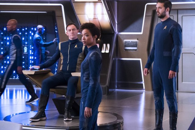
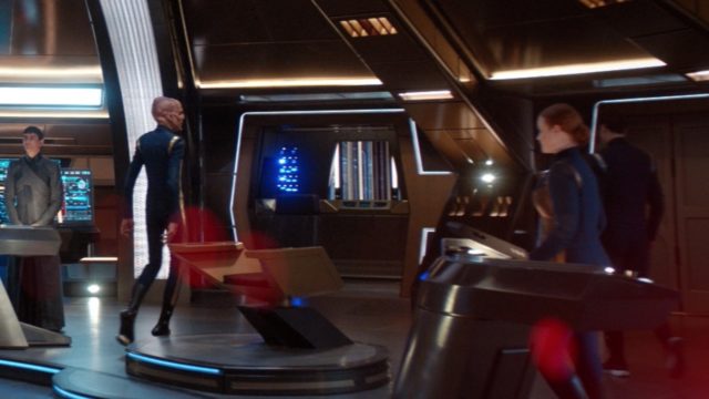
In season one, the only real way to show someone entering the bridge into a scene was via the ready room. So for season two, they changed the dark blue area behind the captain’s chair that had a bunch of blinking lights symbolizing the main computer core, called “HAL” by the production staff (which is, of course, a 2001: A Space Odyssey reference). It’s been pared back a bit and an opening was created for another way characters can enter and exit a scene. Art director Jody Clement says:
“It allows for crew members to enter onto the set other than through the Ready Room, that area was considered a bit dark in the background and didn’t really have any life in it. So we added digital production on some pipes—a bunch of ones and zeros that give it life.”
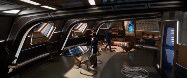
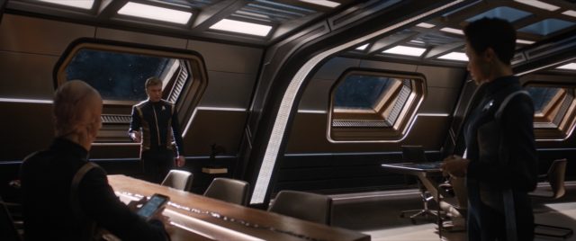
Ready Room replaced
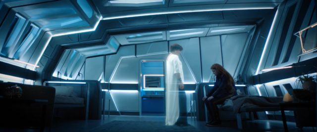
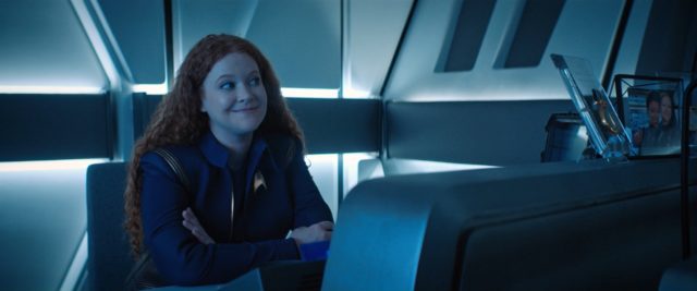
In the first episode of season two, “Brother,” Captain Pike says he needs a new ready room if he’s going to stay on the USS Discovery, since the existing room was configured by Captain Lorca without any seating and wasn’t very conducive to meetings (or discourse). A new office/meeting room set was constructed for Pike, which is possibly a redesign of Captain Georgiou’s ready room from the USS Shenzhou in season one. The production team has repurposed Lorca’s old ready room into a new science lab set, which we have yet to see as of episode two. Pike’s new ready room is no longer entered from the bridge directly and requires a turbolift to get to.
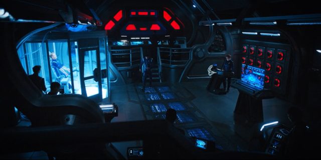
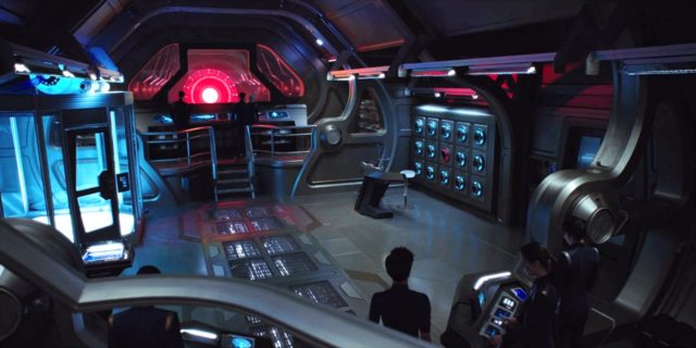
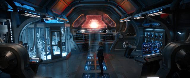
Engineering depth
While they’re still not saying if we’ll ever see main engineering–all we’ve seen so far is the lab where Stamets setup his spore drive research, also known as Engineering test bay alpha, which is actually just off main engineering– they did make a few changes to the engineering lab set. Clements notes:
“You can see a series of pipes [through that hall] and then we have a backdrop just beyond those pipes to give the illusion that the chamber goes a lot further.”
Clements also told SFX that the new backdrop is 30 feet high and is meant to show off the Discovery’s dilithium chamber.
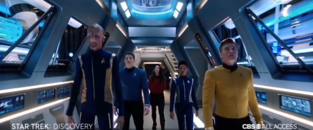
Longer corridor for more “walk and talk”
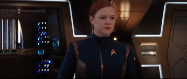
As we saw in “Brother,” the corridors of the Discovery set got some nice upgrades. Clement expands on this:
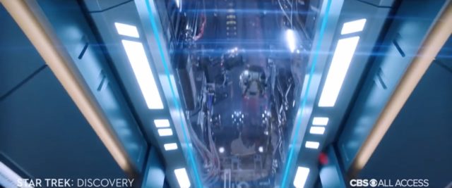
“Directors were finding it difficult to stage scenes. This year, in order to prevent them from having to stop and start over, we can do a continuous loop because we opened it up. The airlock has gone away and we’ve made the ceilings a little higher with some greenspace [green screen area] above.”
More set, less wear
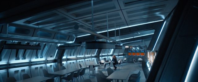
To save on cost, the mess hall and crew quarters were really the same basic set in season one, and it took a toll according to Clements: “It was a challenge on many levels, and we also ran into a lot of wear-and-tear on the set when we were changing it over.” So now there are new standalone mess hall and crew quarters sets.
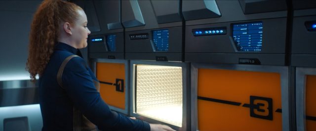
While rebuilding the mess hall, they also upgraded the functionality: during season one only one food synthesizer (slot 3) was set up and working, and now all five work, so there can be some variety in the shots of people getting food.
Sickbay gateway
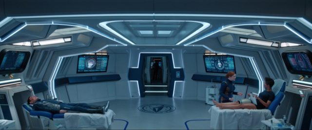
While less dramatic, sickbay got a revamped entrance and a few more tweaks to the detailing on the set. As Clements teases: “We have the same sickbay as last year, but we made a few changes.”
More new sets coming
We have probably seen most of the changes for the USS Discovery, besides the aforementioned new science lab. This new lab may have been glimpsed in one of the trailers for season two.
And there are a number of sets outside of the USS Discovery still to be seen in the second season. We know that L’Rell now has her Chancellor’s chambers on Qo’noS, something L’Rell actress Mary Chieffo has mentioned in interviews, and could be glimpsed in some of the trailers, including blueprints in the start of production teaser video from April 2018. These new sets are derived from the Klingon sarcophagus ship in season one, which was later redressed to become the throne room set from the ISS Charon in the Mirror Universe for the second half of the season.
There have also been strong hints that Section 31 will have its own ship in season two. The start of production teaser video showed the former USS Shenzhou bridge set being re-worked, along with a glimpse of blueprints labeled “Section 31 – Bridge/Lab.” We can see the final product in a few of the promotional photos released just before the season began.
Star Trek: Discovery is available in the USA on CBS All Access. It airs in Canada on Space and streams on CraveTV. It is available on Netflix everywhere else.
Keep up with all the Star Trek: Discovery news at TrekMovie.







Thanks ! :)
This is Awesome!
Great analysis and comparison! The streaming nature of the series is really helping making this kind of discussion and analysis possible. Even into the 2000’s with ENT, you’d have to DVR it and take screen caps, which was a pain in the butt!
As for the sets themselves, I like them, but I feel like the large bridge, while nice for cinematography and for creating drama, allowing the Captain to pace around with fluid camerawork, means that the helmsmen are so far from the captain that they’re constantly shouting!
Good for drama, I suppose, but I miss the more calm reports from the likes of Data, Ro, Paris, Dax, or Kira.
@Afterburn — to be fair, Data was extremely far away from Picard, for the same reasons. Paris was as well, from Janeway (I never cared much for the VOY bridge design). The reports could be just as calm as they were in those series, but it’s the direction that’s likely in effect in what we’re seeing.
You’re wrong, Janeway and Picard were mere steps away. Google bridge schematics, you’ll see. Looks further on camera because of wide angle lenses maybe. There’s a good overhead shot too on Memory Alpha that shows Picard is MAYBE two and a half steps away from the conn.
Nobody was as far away as Detmer is to Pike. Not by a long shot.
Clearly the bridges of the D and VOY were closer together. Just count the steps from the Captain chair to the consoles.
Also, the D conn was designed to be movable for the cameras, and in certain episodes you can tell by the red/grey separation of the carpet that they’ve been moved forward a few feet. But even with that, Picard is still just three steps away.
I really like the Disco bridge, and comparing measurements from Voyager, TNG, Disco and other bridges, the distance isn’t really any longer.
I do agree that the helm should be closer to the Captain for an optimum conversation, but this really wasn’t seen in Trek since the TOS movies.
As you can see on the website link, I’ve done 3D reproductions for several of these bridges, and it really isn’t realistic that Data and Tom were able to talk to their Captains softly, from their stations they should’ve needed to shout all the same, it was just through the magic of television and dubbed audio that it wasn’t needed. :)
” comparing measurements from Voyager, TNG, Disco and other bridges, the distance isn’t really any longer.”
I’d like to see proof of that! Eyeballing it without a tape measure, Pike’s chair would be at the back wall at least on the bridge of the D!
I’d like to stress though that these are nitpicks for discussion, not legitimate criticisms. Overall, the bridge is gorgeous, if a bit drab (like most bridges, though).
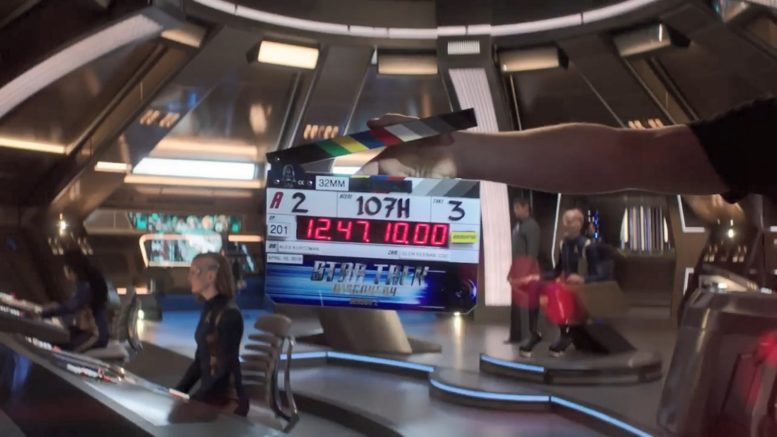
Just look at the image at the top of this very article, the one with the scene clap board, the bridge chair is not that far from the Helm and Conn
From what I see there it’s about twice as far as Picard was from Data.
The window back into the dilithium chamber reminds me of Engineering in TOS. And Pike’s Ready Room must be on the level right below the Bridge. Those windows look like they’re right on the edge of the center ball.
@JonBuck, I am convinced that the new ready room is behind and slightly above the bridge. Read my entry below and look at the establishing shot of Discovery at the top of “New Eden.” You see windows that were previously not lighted in that area that would match the ready room windows better then the ones below the bridge.
100% better than the Apple bridge of the JJPrise.
The “apple” bridge was awesome.
It sucked.
Never hated it like others, but was never in love with it either. Generally thought it was fine and it was nice to see the Enterprise get a completely updated look.
Didn’t like the apple bridge myself. It was too white and the set felt like it lacked any depth. They improved it slightly for Beyond …and then destroyed it :(
Discovery has a cool bridge.
FrostUK
That’s the thing: White is extremely tiring on the eyes and causes additional stress in already stressful environments. It’s why hospitals banished white from operating gowns and the like. The ‘Apple bridge’ colour scheme and blinding lights never made sense, while the original show’s colour scheme did, as does Discovery’s.
Sure as hell did suck. It was like going down the cosmetic aisle in Target squared, not a place you could actually get any work done unless you were wearing sunglasses. Art direction on the 09 redefines sub-floor level stupid when it comes to sf movies.
It was garbage
Great article. Love the details :)
I have to admit while I still have problems with the look of the ship overall, the interiors are beautiful. Everything is so ornate, shiny and spacious. The Expanse this is not! I love the new sets as well. Sadly I think because Discovery looks so advanced and high tech its a part of the reason some fans have issues gelling it with TOS era which looked and felt more lived in and rugged (but I think that’s mostly just 60s TV production design, I’m pretty sure the ship was considered just as advance and cool looking for its day). But the same time its one of the actual highlights of the show, just how cool and advance it looks. Discovery doesn’t look quite as comfortable as the D or Voyager but its something hipsters would proudly move into lol.
Like we discussed in the other thread, I have trouble seeing how they can credibly place NuTNG 150 years apart from this. Some of the new sets like Pike’s Ready Room look like straight from TNG, and only details like the food synthesizers are more primitive than the TNG replicators, but even that seems more of a conscious stylistic choice and not necessarily due to differing technologies (the slots could be all the same no matter the underlying technology). My guess is that while NuTNG will include some magical new technology, the interior design will NOT be 150 years apart but both will rather reflect 2010s sensibilities (same as TNG reflected the 80s with beige tones and carpets). Of course, that is like asserting that 1850s and 2000s interior design bear any semblance, so will require some disbelief, but once again, such is the price to pay for doing prequels instead of always going forward!
Yeah I have no idea how separate they can make the new show look differently from Discovery. Most have agreed the Discovery bridge feels basically as updated and modern as the Enterprise E did which was literally the most advanced ship we have seen in that era; even sharing a similar lay out. The rest of the ship doesn’t look any less advance. People went on and on about the replicators in the TNG era but its clear Discovery basically has replicators as well not only for food as you mentioned but even clothing as Michael essentially replicated a new uniform in the fourth episode. And those mirror universe uniforms they were suddenly wearing wasn’t hanging in some away team closet somewhere. Clearly they replicated them too.
I agree as well the design won’t be a big difference from Discovery. Different on some level but not a 150 years different. If anyone wants proof that Discovery can easily fit into the 24th century this drives it home. It has much more in common with that century then it does the 23rd for sure.
Yeah a Picards ‘Laptop’ looks like something from the year 2000, not 2370. Suspension of disbelief is required and I’d bet the Picard Show will be updated for the 2020 audience too.
@DataMat — let’s hope so!! I have to say, I was sort of disappointed with the design of the tablet device that resembles the one from TOS. I can’t imagine what else it’s supposed to do, but as an iPad of sorts, it really just needs to be a sheet of glass — at least I hope that’s what we’ll have 300 years from now.
Yes, I have no doubt it will be updated with holographic displays and futuristic tech that is well more than 25 years more advanced than TNG. Such that one segment of Trekkies will STILL complain. Because they can’t enjoy anything.
As has been discussed in another thread, they locked themselves in a corner with some of the “maximum-advanced” technology (from present point of view) they already introduced in Discovery, such as holographic display technology, in that it may be sufficiently advanced to make it believable as 200 years from now, but leaves little room to place NuTNG’s technology 150 years from Discovery (let alone completely breaking the 1960s vision of TOS)! How much further than self-assembling space suits can you go for example, something they did not have even in the last TNG movie? Logically they would have to ditch spacesuits altogether now and introduce some sort of personal force field (like the Borg have).
Lol you’re ridiculous. So now it’s Discovery’s fault! Nonsense. But keep living in that little angry fantasy world if it helps you sleep at night.
So far they’ve done EVERYTHING right.
That last part sounds like lemming talk. And the stuff before it is even worse, AB.
Of course it should. It’s 30 years since he became the Captain of the 1701D. That’s not updating for the 2020 audience. That’s updating because as time goes by things change. Now if they did a show about a young Picard and they decided to give him even more advanced tech than he had on the 1701E…
I was in what one might call the “second generation” of fandom, i.e. those who discovered their love for the show in the very early Seventies, and I can assure you that we all thought the original 1701 was muy cool and advanced-looking inside and out, almost right up until TMP hit theaters in ‘79. Franz Joseph’s Enterprise blueprints and Starfleet Technical Manual didn’t become bestsellers with multiple printings because we thought the designs looked outdated or cheap.
I watched then as a kid and thought everything looked cheap and dated. It sure wasn’t 2001(which also looked dated, but more plausible).
I always marvelled at the sickbay readputs, however.
2001 looked dated? You can stop right there.
2001 certainly didn’t look futuristic. It looked like what future tech look like if it existed in 1969.
AB, I don’t want to engage at length with the uninformed, but the flatscreens and iPad looking things alone show you that they had a lot of stuff very right, much more than just about anything else ever.
It not only looked cheap and outdated, it looked corny, and not far off from kids fare like Captain Video, Space Patrol, or Rocky Jones: Space Ranger.
They look great but my biggest quibble is that the spaces should be tighter. As with any military or research vessel, every square inch is maximized. The bridge is massive with a signifiant amount of space between the various workstations (there are maybe a 10 people on that bridge at any given time), corridor heights are high and wide, crew quarters are large enough to accommodate at least 4 people. These spaces were designed for shooting purposes, not to reflect any actual sense of practical space or realism. It’s a military vessel, not a cruise ship.
Thats the only real problem I have as well Denny C, the bridge is ridiculously massive. It looks like the Captain has to shout to everyone. I don’t expect it to to be the size of TOS or TNG but it looks too spacious.
And I wonder why do they have such big crew quarters and yet only single beds lol. It makes no sense, they have the space, give them a real bed. In TOS they were given single beds to match the size of the quarters. But in TNG they got at least double beds because their quarters were much bigger.
I don’t have an issue with DIS size in general but you’re right part of the reason there is so much space is for shooting purposes and not functionality, especially for a science vessel.
I keep thinking about Scotty when he’s shown his quarters on the Enterprise D and asks if he had been assigned an admiral’s quarters.
Ironically enough, JJ Abrams had a bridge created that was not significantly larger than the various bridges that preceded it.
Agreed.
This is something at least Enterprise tried to rectify in designing its prequel ship, by crossing the future with a submarine feel. There ought to be some sort of credible design evolution from more cramped and barebones starships to the smooth, comfortable and vast spaces of the 24th century. Discovery with its visual reboot has broken this design lineage.
In “Enterprise” they did a nice job establishing that it was a significantly smaller ship from the width of the corridors to Archer’s quarters with low ceilings and a relatively narrow footprint.
The show is made for widescreen television. Having the sets bunched up would look silly.
So you are saying there can’t be any more submarine movies because of widescreen television? Reality should not be bent to fit the aspect ratio.
Nope. Not at all.
Discovery is not reality.
Let me rephrase: CONTINUITY should not be bent to fit the aspect ratio. And besides, cramped submarine Enterprise was already filmed in widescreen (if not 2.35:1), so the point is moot.
This has nothing to do with continuity. There is absolutely nothing wrong with redesigning the bridge to enhance the cinematography.
So let me rephrase: this is a visual entertainment medium. Designing sets to take advantage of the screen presentation is EXACTLY what they should do.
Anything else would be a disservice to the art form.
Then why are they gumming up the image with all these flares and distortions? The one thing TNG got right was that stuff is going to be crystal clear, not all flarey and hard to look at. These early 21st century shows that go for the foggy flarey look are going to be as dated as all those 80s movies shot in smoke, and even more negligent with respect to good cinematography.
The disservice is manifest in the lack of respect for what looks good and works.
That’s why TNG looks so boring. The show looks like a stage play. There’s a reason the HD TNG box sets failed in retail.
Oh, so THAT’s the reason? Geez, Holmes, you’re just making us all feel inadequate owing to your genuinely absolutely UNBELIEVABLE insights.
If you desire to worship me, I won’t stop you.
You can certainly argue that the flares and distortions are bad, if you don’t like them. But that is very clearly a specific style they are going for.
There’s a difference between creating art that people don’t like and work that doesn’t try.
And what is “realistic and spaceworthy” anyway when we’re talking fantasy technology 300 years into the future?
That’s just nonsense.
What was the last blockbuster submarine movie?
CRIMSON TIDE, a movie I’ve seen at least 20 times, despite the fact I want to kill the ‘Weps’ character every time. Now answer this: what was your point, and how does it apply here to discussion of TV SF and cinematic aesthetics?
A movie from 1995.
Answer the question, don’t recite from imdb.
The aspect ratio we see in Discovery Season 2 has been utilized in every Star Trek movie to date from Star Trek: TMP through Star Trek Beyond. Massive bridge sets and high corridor ceilings are not a requirement for a wider aspect ratio.
Maybe not a requirement, but a solid choice. I have my issues with the set, but I think they are doing all the right things, in a broad sense.
And yes, they redesigned and enlarged the bridge for TMP, again for TWOC, again for TUC, and the redesign for the Enterprise E did exaclty what DSC is doing– they made it wider, to better take advantage of the widescreen aspect ratio.
In fact, in Generations they added two science stations, new steps and additional lighting on the left and right of the “horseshoe” for the same reason.
Boy these complaints get more ridiculous every day!
The bridge in TMP through TVH is the same, just four ft bigger than the TOS series set, I think, so I don’t know where you get the idea that TWOK changed things (they didn’t have money to, for one thing — Meyer blew sixty grand just adding lights to the bridge on his first walkthrough.) I don’t know if the TFF/TUC bridge was bigger or not, but it might be wider.
And so far as TMP taking advantage of widescreen, they actually did the reverse, by putting Spock behind Kirk instead of at screen left.
These crazy-high ceiling in the Abrams and now in DSC don’t do anything to work with the aspect ratio, unless they shot in IMAX, which is more square-ish than cinemascope, and shows more overhead.
If you’re going to talk about this stuff, then get informed first.
“The bridge in TMP through TVH is the same”
lol no it isn’t. Talk about informed. You’re just living in a fantasy world.
Afterburn,
TMP-TVH is absolutely is the same set.
The new refit bridge was built for TMP. They did some tweaks in TWOK to the TMP set, which then was used in TSFS as well. For the end of TVH it simply got a new coat of paint and the display graphics upgraded.
http://forgottentrek.com/designing-the-motion-picture-bridge/
https://memory-alpha.fandom.com/wiki/Star_Trek_II%3A_The_Wrath_of_Khan#Sets
https://memory-alpha.fandom.com/wiki/USS_Enterprise_(NCC-1701-A)#Background_information
Thank you, Matt.
The sheer bulk of righteous wrongheadedness around here lately is kinda troubling. It’s like they’ve never read or researched anything, or doublechecked anything. Maybe that is generalizing some, but that is the way it plays from here.
Hey, when you’ve interviewed Joe Jennnings, the art director on phase 2 who was also the production designer on WRATH OF KHAN, maybe then YOU can say with authority whether the set is a different one. But that will have happened in an alternate reality, because in this one, I’m the guy who did that, with Ross Plessett.
Just look at the Enterprise D. It’s suppose to be this huge ship, yet inside it looks and feels no bigger than Voyager.
a34,
Wrong wrong wrong. Submarines, to quote essayist Thomas Doherty, are made for widescreen, whereas the DSC sets are just spacious instead of looking spaceworthy.
Good thing DSC is not a submarine. Federations starships are not made to be spaceworthy, they’re made to look good on screen.
Then they need to be remade, big-time, because DSC looks a mess to me.
Good luck with that.
Well your job is clear. Redesign it for them, i’m sure they’ll take your suggestions!
Good points, Denny. Well put.
I love when people compliment faulty logic. So laughable.
LOL, sounds more like a religion.
I love the new ready room, it has a TNG Movie vibe with the bronze colors and immediately sets the right tone instead of the starker and darker sci-fi sets elsewhere on the ship. The table and decor are really nice touches, it reminds me of TNG sets which mixed sleek modernism with natural materials. Wouldn’t mind if the bridge picked up some of the design details from the other sets, especially the brighter surfacing.
Supposedly they are practicing for the Picard series already? Just for TNG style THIS is the wrong century.
There has been no word that the Picard show will even use the same production designer. This has nothing to do with the Picard show.
I really appreciate the new designs especially the ready room
I could not make out what was happening above the corridor and when the Enterprise crew came over? It’s the green screen space obviously but was that turbo lifts seen moving around?
Yes I think that’s the “roller coaster” tracks for the turbolifts above it.
It was a fun scene to watch but it made absolutely no sense. There was a lot of dead space between those turbolift tracks.
Thanks for this analysis and especially the photo comparisons, Matt!
I don’t understand that ‘people can now enter the bridge though somewhere other than the ready room’ bit…

There were always two doors at the back of the bridge, one was the turbolift, directly behind the Captain’s chair, and right next to it (opposite HAL) was the ready room door.
We see Michael getting to the bridge through that turbolift and head directly to the ready room in ‘Context is for Kings’, the very first time we saw the bridge.
Besides there are two other doors at the front of the bridge (one on each side), which we saw Tilly and Stamets use repeatedly to get to the bridge, so there really wasn’t any need for the change. Don’t get me wrong, I like that change! The corridor there looks cool, but there must have been another reason for it.
I don’t understand that ‘people can now enter the bridge though somewhere other than the ready room’ bit…
You’re thinking in-universe, while that statement was made by a member of the production design team about the sets. I don’t believe the extra doors at the front of the bridge are functional. The turbolift is center behind the captain’s chair, you’re right it’s another way to enter the bridge that we know works. However, the production seems to have a preference to shoot looking at an angle towards the captain’s chair — looking stage left (the ready room door), or looking stage right where HAL was in season one. So I think they’re referring to the preference to have actors enter from the side. The article isn’t super clear.
I’m hoping they put half as much effort into the writing and developing the characters. As they have on the visual effects and the look of the show. I love the cast, but the writing has a long way to go. I hope season 2 has a sort of general direction in mind and a continuity, season one was a mishmash of different ideas and writers pulling in many different directions like it was the plot of 3 different shows.
Its still very early but season 2 definitely has a strong direction its going, thats obvious. The issue will be how tied in will the other story lines be we haven’t seen yet like the Klingons and Section 31. They haven’t really said much about either in terms of their relation to the main story. Will it tie in or just be its own thing? I think it will tie in and not be what happened in season 1 where the Klingon war and the Mirror Universe were basically separate story lines.
I guess we will get some idea next episode.
I could imagine that both the Klingons and Section 31 will seek to weaponize the red signals for their own advantage (weaponize-able or not). Something like the Romulan involvement in The Chase.
The possibility excites me for a storyline that does not zig and zag and i can follow. I was really let down when they tied up the Klingon war in one 40 minute episode the conclusion seemed rushed and forced and not organic. Like CBS said you have one episode to tie this up and move on.
“I was really let down when they tied up the Klingon war in one 40 minute episode the conclusion seemed rushed and forced and not organic.”
I literally rewatched that episode the day before the new season started. I only saw it when it originally aired. It sucked just as much in my last viewing as my first. I really think that finale is what soured the season for me overall. Up to that point, I wasn’t loving the show but generally OK with it with some issues for sure. But I realized on my second viewing it was the finale that made me feel the entire Klingon war just felt like a complete waste of time and that the writers really had no ideas of how to end it.
I’m hoping season 2 will turn the tide.
They were already losing me when they stuck around in the MU longer than I felt they should. But once the Lorca reveal happened I could no longer take the show seriously at all. Every tense moment was literally laughed at. But not that moronic “we are Star Fleet” garbage at the end. That made me throw up a little bit.
I’m so glad that they’ve dialed back on the blue tones. As much as I loved the visuals of S1, I could not wrap my head around the insane amount of blue in some shots.
I love the warm palette of Pike’s ready room, and I appreciate that the corridors now have more color and visual interest.
Blue? It’s the good old orange and teal ;-)
https://petapixel.com/2017/02/23/orange-teal-look-popular-hollywood/
Pike’s new ready room makes 24th century flagships look cramped. Captain Picard is jealous :)
LOL true. It looks like something a CEO of a large company would have. How big is the Discovery suppose to actually be??? Does anyone have the schematics? I know its not as big as the D obviously but clearly much bigger than the original Enterprise. And I know it has a much smaller crew complement as well so maybe everything is bigger but because they have a much smaller crew and less quarters to make other areas of the ship larger.
They do have a lot of space for Zero G space whale hunting around the turbolift tracks!
The ready room is apparently just above the parade grounds and adjacent to the arboretum, but not so far from the track and soccer fields as to be inaccessible.
Re: How big is the Discovery supposed to actually be??
From the official CBS docs given to Eaglemoss for their ships line,
The Discovery is a whopping 750m long, however a lot of that is the crazy long nacelles. If you ignore the nacelles it’s still big, but at least a little less crazy, at around 400m long.
The Shenznhou is 423 meters, but again that includes the rather long nacelles.
The new scaled up Enterprise in DSC is 442m long.
For comparison,
The TOS Enterprise is 289m and 305m when refit in the movies.
The Galaxy-class is 642m.
OK, thank you for the detailed answer!
And it does prove Discovery is a much bigger ship than the original Enterprise. Although until now I didn’t realize they made the Enterprise bigger too lol. But then I guess they had no choice but to make the it bigger because I was under the impression the Constitution ships were the biggest in the fleet at this time. But I guess its nothing compared to the size of the Kelvin Enterprise which I read somewhere IS suppose to be around the size of the Enterprise D.
I’ll say it again, I’m not really bothered that the ships are bigger, I just don’t understand WHY they feel they have to make them bigger either? It only makes the naysayers argument stronger who thinks Discovery doesn’t takes place in the PU when so many elements are changed.
And it certainly goes against what Dax said once when she pointed out Starfleet use to ‘pack them in’ referring to starfleet crew sizes on smaller ships. Apparently not as stuffed as she remembered. ;)
The scale is a bit out of whack for Discovery. Each ship in the past has used the bridge as the jumping off point for scale and then worked its way out to great effect.
Pipes!!?? Pipes on a starship??!!?? This is an OUTRAGE!!
JJ Abrams called from 2009, and he wants his brewery back ;-)
The Original 1701 had pipes
Here’s a very clear image of some pipes in TOS for ya ;-)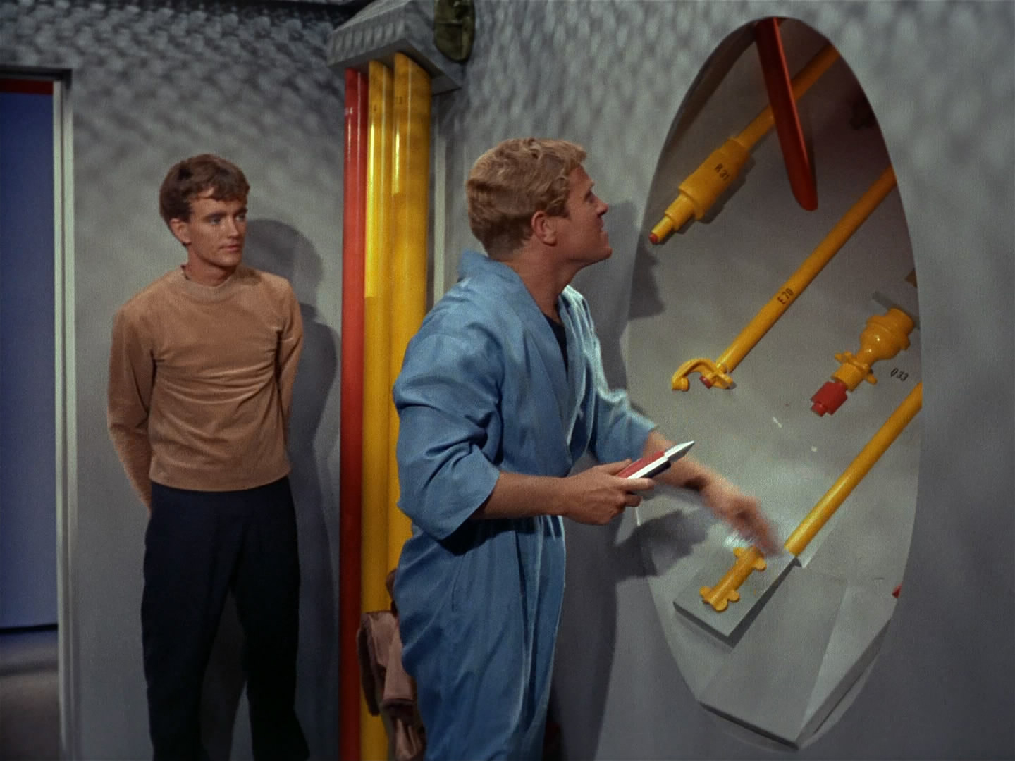
Yeah, thank god they’re visually retconning TOS. THANK GOD. This is just terrible, and not believable as a starship 300 years in the future.
@ Afterburn – I just prefer to look on the original TOS show and all it’s characters and aliens as being set in a ‘fantasy alternate universe’ to our own universe’s ‘future’ – so the likes of colourfully-lit corridors and pipes work in that context perfectly fine whenever I watch it nowadays, as do any other details which might seem ‘dated’-looking in our own history nowadays. :)
And while I like the look of some of DISCOVERY’s sets and production design, the whole show has effectively given us a COMPLETE ‘visual retcon’ of the overall TOS show source material in truth, in the same way that J.J. did with his ‘Kelvin Timeline’ movies – but rather than look on DISCOVERY as just being the ‘re-imagined’/’retconned’ version of the TOS show’s settings and characters which it is, I personally prefer to imagine it as merely being set in a different ‘fantasy alternative universe’ which is seperate from the TOS show and our own future, to explain away ALL it’s visual anomalies and inconsistencies.
And this works for separating TOS and DISCOVERY from other shows and movies in the STAR TREK ‘multi-verse’ too, as it suits me. While this may seem convoluted to some here, I just prefer to look on the entire TREK franchise in a similar way as the recent ‘SPIDER-MAN:INTO THE SPIDER-VERSE’ movie implies, as a way of watching the various shows and movies in a way which satisfies me the most.
Yeah sure, if you like kids shows from 1955, it looks wonderful. But as a serious dramatic series, the visuals are not to be taken seriously, and should seriously be ignored in 2019.
I think setting is important, but the feel of the setting is more important than the sum of its parts. TOS looks ridiculous, perhaps, but it feels like the future still, if an outdated one.
I personally love both, and even though Disco goes to actual locations, and TOS had a green sheet 20ft behind them, in both shows, I feel that the world is suitably alien, and my suspension of disbelief does the rest.
Sure, it was acceptable in 1966, but only just “acceptable.” They were never really believable, but they were limited to what they could reasonably produce on the money that studios were willing to spend at the time. The first truly believable sci-fi was a few years away: 2001 A Space Odyssey.
And as you say, it is woefully outdated, and the idea that audiences today would ever take it seriously is laughable, hence why the prequel retconning the visuals is absolutely needed. “Just going forward” doesn’t address it.
The Discovery sets don’t even look acceptable now. The show looks like it’s set in the 29th Century!
How can it look ridiculous and yet feel like the future? It looks like a cheap 60’s scifi show to me.
You’ve got a lot of things wrong there. TOS was light years ahead of a ’50s kiddie show which you keep trying to compare it to. TOS was not aimed at children and got an adult TV show production budget and adult writing team (including stories from distinguished sci-fi authors) to go with it.
You’ve got a very glib, and quite frankly, ignorant view of the historical context of TOS.
“The Cage” was one of the most expensive TV pilots produced in the era.
TOS proper got a pretty decent budget up until season 3.
The sets were in fact considered quite expensive and impressive for the era, hardly just “acceptable.”
Here’s a reprint of a set visit the LA Times did in 1966. They come away impressed.
https://www.latimes.com/entertainment/herocomplex/la-et-hc-original-star-trek-on-set-20150908-story.html
So while you may not like the ’60s style, which is totally fine, you continue to bash the sets and make claims that just aren’t true. A TV show, like all art, is a product of its time, and coming in and removing all historical context from it is a disservice.
TOS was an incredibly complicated and expensive show to produce. It was, and remains, one of the most groundbreaking shows in the history of the medium. You are correct that 2001 rewrote the visual vocabulary of what a sci-fi film could look like, but it took almost a decade, when George Lucas made Star Wars, for the rest of the business to start catching up to what Stanley Kubrick had achieved. And it took TV shows far longer than that.
The TOS sets are unquestionably dated. When I started watching the show as a young kid back in 1979, it was already looking very creaky. That doesn’t take away from the incredible design work and many of the other breakthroughs the show had.
To mock what is quite literally the foundation of the entire franchise (and something Discovery borrows HEAVILY from) as nothing more than a kid show is, as Matt said, ignorant.
It was a kiddie show. Google “star trek space dog”
You’re quite the charmer.
Nope, google some of those shows. Very similar, and I agree, very much a product of their time.
I think they need to retcon the look of the Vulcans too. Pointy ears and green blood is just too Buck Rodgers and is a silly childish cliche. And those communicators they use on STD. They need to move beyond the 90’s flip phones. All that stuff needs to be completely redone.
I get this is sarcasm, but you prove nothing. So what? STE retconned a lot, as did STV, STT, and STD the first.
The STE did not retcon anything. They made their show look like it belonged in their era. Something producers of STD failed to do. Voyager retconned nothing either. It had nothing to retcon. Have no idea what STT and STD the first is.
It also appears that you are refusing to acknowledge your own hypocrisy. Which is what my post succeeded in pointing out. But I expected no less.
Hey, I actually like the pipes. And this comes from someone who did NOT like the Brewery engineering in ST09 and ST:ID. The folks at DSC executed it FAR, FAR better than JJ ever did.
Speaking of green screen and set extensions above the hallways. In the season premiere it looked like a lot of empty space above the hallway, which was elaborated on with the turbo lift ride. What the heck was that roller coaster theme park ride doing inside the ship? Way too much wasted and empty space.
It mentioned the new enterprise design in the title. Yet there is no real mention of it here
“New Eden,” new ready room. Anyone think they know where it is on the ship? Anyone wanna post screen shots and begin the blessed speculation?
My first guess:
There are a set of windows usually difficult to see, in a section behind and slightly above the bridge. The new ready room has three windows. The shapes “might” correspond to those on the interior model. Might be more windows which could mean another adjacent room, but so far that’s best guess.
The episode makes it difficult to determine where Pike and Burnham are when they first enter the bridge. But since the turbo lift has a front and a rear door, corridor behind the bridge might be accessed there and there could be a few steps that lead to what could be a half deck. Or the could be a full floor up. I think that ready room’s windows indicate that it’s that weird area I mentioned above, or in the “ball of the center section below the bridge. The only problem with that is when we finally see out of the window we will see the inner circle of the saucer. Which I guess could also be cool.
Is it just me, or does the new corridor set remind anyone of the corridor sets on SeaQuest?
Naah, I actually liked most of seaQuest’s sets.
Are you sure that new science room image is made from Lorca’s ready room? Because other then the door placement, it appears to be identical to Sickbay. Same overhead lighting, same wall panels, same location of what I assume are force-field projectors. It’s just missing biobeds.
The ceiling layout is identical. I guess they could have just copied the sickbay set design.
I am not sure the lab we see above with Spock and Cornwall is the lab that the reports refer to as the redesigned ready room. Its too big and just doesn’t make much sense. Clearly that lab is designed to be associated with med-bay (maybe a special space of psychiatry, given it’s Cornwall). My guess is that the lab we see Burnham in in the “Point of Light” teaser is a different room. Love this stuff, haha!
No I’m not sure. Hence why I said “This new lab may have been glimpsed in one of the trailers for season two.” in the article. You’re right, it looks like they redressed the existing sickbay set to be a medical lab of some sort.
Looking over things again, I’m fairly certain the redressed old ready room is actually this lab, which we see briefly in the trailer from New York Comic-Con (and the “Point of Light” teaser), it’s smaller and has the right kind of simple paneling on the wall to be Lorca’s ready room, they just rotated how they use the set.
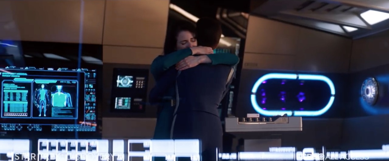
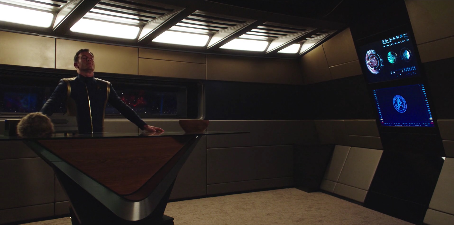
YES! Thanks for the screen caps, @MattWright!
The reuse makes sense, however I have a couple of questions for the producers (that may be answered by watching “Point of Light”). Is the lab “Michael’s lab” and is it off the bridge still in universe? Or will they physically move the set so it doesn’t look connected to the bridge? If it is connected I would wonder about what that means for the science officer (and possible second officer) to have such a prominent private workspace next to the bridge. Power dynamics would be interesting!
Also, when it comes to the lab that Spock and Cornwell are in, I don’t think it is a redress, but instead an additional space built.
Lastly there are few different color schemes we have seen on Discovery
1. Bridge, ready room(s), transporter room (a little), Lorca’s lab: Bronze and teal
2. Transporter room and corridors, blue and lots of blue tinged steel
3. Med-bay and the new Spock/Cornwell lab: white in a very antiseptic, medical-clean sort of way.
4. Private quarters and mess halls: white, window cutouts in walls, mid-century modern furniture as a nod to TOS.
5. The only one I hope the don’t show again: conference room in CYP and TWWTWW. Colors? mostly black. Clearly made for a starbase set, which was fine, but they reused it and implied it was on Discovery (and not the Admiral’s ship) and it just doesn’t feel like it fits quite as well.
Fun to take a deep dive and dissect every part!
Nice summary of the color schemes. I’ve certainly noticed it, but haven’t explicitly thought about it the way you did :-)
Also, when it comes to the lab that Spock and Cornwell are in, I don’t think it is a redress, but instead an additional space built.
Perhaps, but if they only need to use it in an episode or two, it’s way more economical to redress. Tuskin’s original comment points out how it looks nearly identical. I’m thinking they moved the doorway to make it look like a medical lab off of sickbay, and added some consoles in the middle.
Also the articles about the sets don’t mention anything about building a new medical lab set. They barely mention sickbay at all, only saying it got a few little tweaks. So it makes me think it’s a redress, since they didn’t call it out as new.
Pretty sure the image you have labeled as “Science Lab formerly Lorca’s office” is just a slight redress of the sickbay. Lights on the ceiling turned off in the sickbay picture are on in the science lab picture.
In the trailer Burnam is studying the Red Angel in a room that looks just like Lorca’s office but with some lit up circular contraptions added to the wall. I’d guess they don’t play it off as a separate lab, instead Burnham is given that space off the bridge to work on the red burst issue.
You’re right, if you look at the comment thread just above yours, there’s a whole discussion about it. I changed the image after re-looking at the trailers.
Discovery definitely has some nice upgrades but it’s too bad there’s not much of a story and way too much emphasis on visual effects. That was the whole idea of star trek in the first place, to wow the imagination to the point where we ignored the low budget tech and seemingly impossible star trek laws of physics.
Oops, looks like they forget to install some more lights so the scientists, engineers, ops etc. can see what the frack they’re doing. But I guess the sexy mood lighting is more appropriate for the spooky ghosts and bathetic neuroticism that are sure to ensue.
Ship still looks too futuristic, still too much teal in the lighting. Same old.
Can someone explain how are workerbee’s flying around INSIDE Disco?