
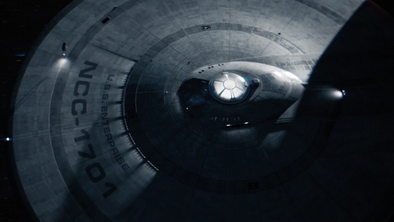
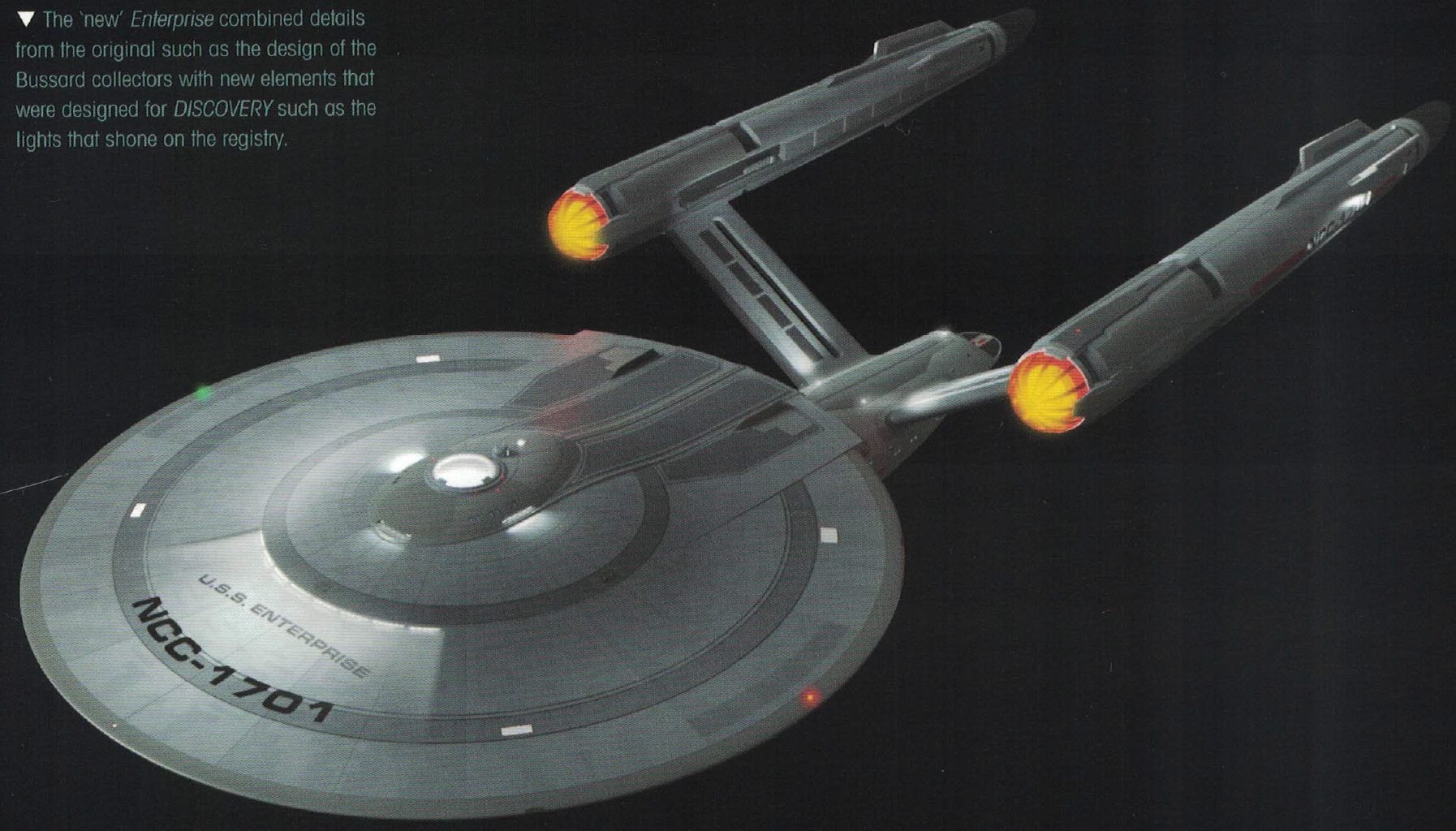
“I can see it now. Whatever it is, it’s big. Two cylindrical projections on top, one below. Purpose undetermined.” – Captain Christopher, “Tomorrow is Yesterday” (TOS)
The U.S.S. Enterprise is instantly recognizable to fans of Star Trek, and that basic shape has become iconic in pop culture for being identified with the franchise; so iconic, in fact, that the original shooting model of the Enterprise has a home in the Smithsonian’s Air & Space Museum. A number of designs for the original USS Enterprise have appeared on television and film, with the latest showing up on Star Trek: Discovery’s first season finale, and the premiere episode of the second season.
The redesigned Enterprise generated a lot of buzz, and there was even a bit of controversy, which was later clarified by CBS, explaining that design changes made to the ship were made by the creative design and VFX teams to take advantage of the latest technology. We now have insights into the development of the concept art for the redesign, thanks to the collectors’ magazine included in the brand new Eaglemoss USS Enterprise model, which tells the firsthand story of how the designers took on the daunting task of redesigning the USS Enterprise for Star Trek: Discovery.

Collectors’ magazine included with new Eaglemoss Star Trek: Discovery USS Enterprise model
The word is given
By the end of Discovery’s first season, the show’s art department had been reduced to a small team of Production Designer Todd Cherniawsky, Concept Artist/Illustrator John Eaves, VFX Art Director William Budge, and VFX Artist Scott Schneider. The Trek veteran of the group, Eaves, had already designed the NCC-1701-B in Star Trek: Generations, and the NCC-1701-E for Star Trek: First Contact.
Eaves told Eaglemoss, “Before our Production Designer Todd Cherniawsky left, he gave us the Enterprise.” Eaves and the rest of the team had known that the Enterprise would be seen in Discovery’s season two, but the decision had been made to move her appearance forward to the season one finale.
The design process
The production team’s process was straightforward: Eaves would produce initial sketches, Schneider would turn them into 3D models, Eaves would work with Schneider to paint extra details onto the model, then Budge would work on the final level of texturing and detail. All three actually worked remotely, with Eaves and Budge only having communicated over the internet at the time of publication.
According to Schneider,
When we started developing it, we had no script. We just had an outline, aside from a few minor notes on the way. There was very little feedback so it was pretty much left to the three of us. This was our golden hour.
“There was an initial suggestion that the Enterprise would look very different from Matt Jefferies’ original version, and would have a design that was more in keeping with the other ships in the Discovery era, but this idea was soon abandoned,” recalls Eaves. The brief was simple: come up with Discovery‘s version of the original.
(Eaglemoss/CBS)
Making the 2256 Enterprise fit with the 2266 Enterprise
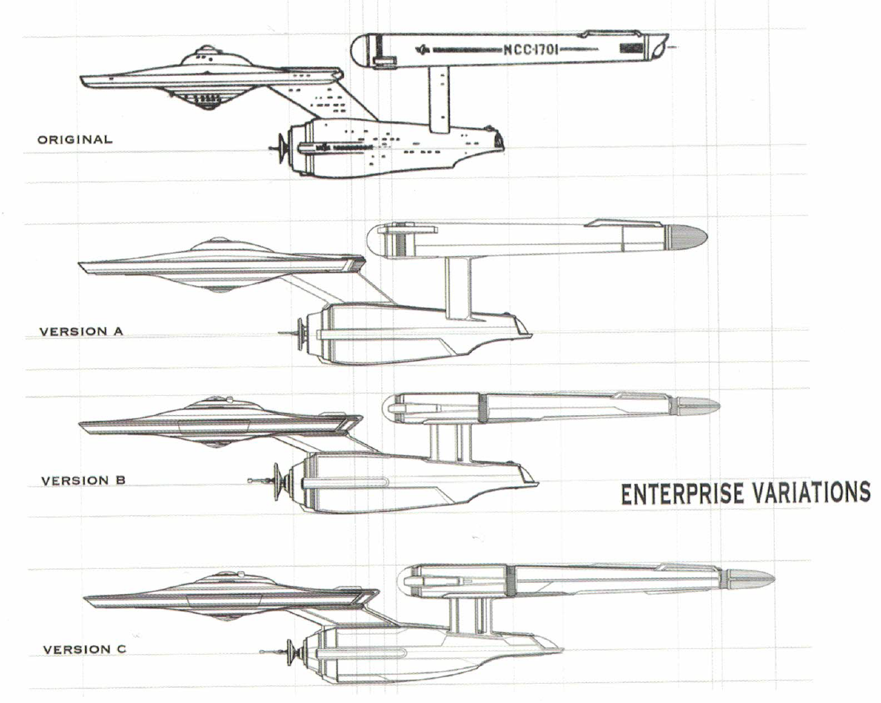
Eaves began the process by producing a series of ten sketches to illustrate how the classic ship could be altered. Eaves wanted to streamline the Enterprise to give it the sleek, Discovery look, yet keep the form as close to the original. As the team was aware that the Enterprise they were designing for Discovery—set in 2256—would be the same commanded by Captain James T. Kirk in The Original Series. They theorized ways their version could be refitted over the years to become the 2266 Enterprise. Their theory was that various components of the ship, such as the warp nacelles and impulse engines, would be swapped out over time, so the team set out to design primitive versions of them.
(Eaglemoss/CBS)
Schneider explains,
We were constantly trying to tie into both the past and future architecture of Starfleet ships. It was actually a fun part of the whole process. We tried to tie stuff into the NX-01 and stuff that would come in the future, like the Enterprise-B. So on the bottom of the impulse engines it has these little vent details that you’d see on the bottom of the B. We were trying to tie into the Discovery-era so we had a double-pronged antenna on the front [of the deflector dish] and a wedge on top of the lights [illuminating the ship’s registry].
During the team’s design process, Cherniawsky had moved on to another project and was replaced by Tamara Deverell. Like Cherniawsky, Deverell was keenly interested in making sure that the team respected the original. Schneider notes:
There are little things that we did along the way where we were adding details in to try and keep it as close to the original as possible. In the beginning, we had the ball on the back of the nacelles, like they did on the original version built for “The Cage.” Later on, we got into a meeting with Deverell and we discussed it and I said ‘Really, time-wise we should be doing this.’ So we put the grilles in there instead.
Hidden details
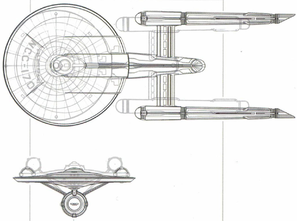
The team also added a number of details that are unlikely to be seen in the show, such as fleshing out what the markings on the bottom of the secondary hull meant. They added a warp core ejection hatch, and tailored the numbers on the secondary hull to honor the pioneers of Star Trek like Gene Roddenberry, Matt Jefferies, Andy Probert, and Doug Drexler. Hull codes were produced that included their birthdays, resulting in ‘GR0821’, ‘MJ0703’, ‘AP0946’, and ‘DD0353’.
They also added RCS thrusters, tractor beam emitters, and aft photon torpedo launchers and phaser banks (some of these features were first shown on the Enterprise’s sister ship, the USS Defiant in ENT “In Mirror, Darkly”). As phaser emitters and torpedo launchers were never shown on the underside of the saucer during The Original Series, two photon launchers were added just above the ventral sensor dome, as well as forward, starboard, and port phaser banks.
(Eaglemoss/CBS)
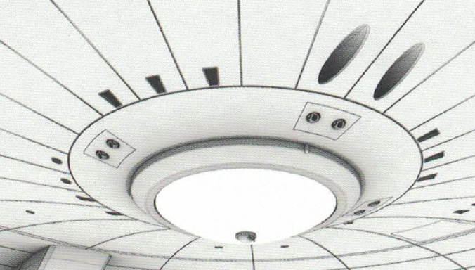
The team also tackled the issue of Jefferies’ Enterprise having a turboshaft directly behind the bridge on the centerline, while the bridge set placed the turbolift doors off to an angle. This discrepancy had led many fans to speculate that the bridge was positioned at an angle, rather than facing directly forward.
“A cool thing that Schneider did that you’ll never see,” says Eaves, “was to make the turbolift work. He came up with the idea that you get in the turbolift and it rotates in the tube, and then drops.”
Schneider adds, “You have an elevator shaft on the centerline and two standby elevators off to the side. So one would slide back and over and go down the tube and another one would come in. This is why you could get an elevator so quickly because there’s always at least two standing by and that explained why there is a center shaft.”
Resolving the Enterprise’s color and textures
After Schneider would render Eaves’ designs, Eaves would assist with coloring the hull. On some examples, Eaves experimented with an Aztec design that had been introduced with the refit Enterprise, and was being used on all Discovery-era Starfleet ships. He also produced versions with a simple metallic texture that reflected Jefferies’ vision of the ship’s hull being made from an advanced material that could be molded to cover vast parts of the hull, instead of relying on the smaller hull plating that produced the Aztec effect. In these designs, Eaves added elements to the saucer that matched the look of the Enterprise from “The Cage.”
(Eaglemoss/CBS)
The final version
The design process took the team six months (from April to October 2017); the group then handed their model over to the VFX team for them to create a higher-resolution model that would be used on-screen. Schneider recalls that he “sent the VFX team a mesh model, and they basically rebuilt it. They made some design changes.” Working in coordination with the show’s producers, the VFX team altered some of the proportions of the design. The most notable change made by the VFX team was to sweep the nacelle struts back, akin to the Star Trek: The Motion Picture refit.

(CBS)
Eaglemoss Discovery USS Enterprise available now
This article covers only certain aspects of the process of designing Discovery’s Enterprise. For the whole story, pick up the 8.5-inch model from the Eaglemoss store, where it’s currently on sale for $49.45. A full review of this product will be posted on TrekMovie.com soon.
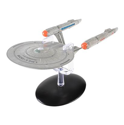
The Eaglemoss Star Trek: Discovery USS Enterprise
Keep up with all the Star Trek: Discovery news at TrekMovie.


It’s a beautiful ship. In any generation.
She really is lovely, so graceful looking.
HOT TAKE : The Enterprise as seen in Discovery is *better* looking than the one from Star trek (1966)
It’s a *perfect* design to update the original and make it look closer to the TMP refit- which is the best looking Enterprise of all time.
With everything else updated – having the 1966 Enterprise pop up in Discovery would look so silly.
100% correct. They did a great job on this!
I 100% agree with you. The original ship was obviously nice for its time, but it really does look very out of date to anyone who didn’t grow up with it. And the interior looks even worse.
This Enterprise looks cooler being more update and modern. Discovery exists in a reimagined prime timeline end of the day. That’s what it is regardless what they call it so it makes sense to have other areas of it reimagined to a degree like the Constitution class ships. I never had an issue with that. What bothered me was when they basically avoided most of the universe in its design and look to the point it could be any generic sci fi show. But something like this works well IMO.
I’m with you.
And I saw some of TOS in first run as a grade schooler.
I really think they did a great job, and the care to weave and interpolate different periods of canon is very appreciated.
The TOS design and colouration was all of a piece of that era.
I remember a sci-fi puppet show that I loved with similar gray and bold colouring. It was what worked with the new (not great quality) colour TVs but still looked good in black and white (which most households still had).
I’m always surprised by the strong resistance to attempts to enrich the design with new technology.
Rich and subtle colour in HD is a different medium, and even the remastered TOS doesn’t look the same as it did when originally broadcast.
But it seems clear that there is a large contingent of fans that first saw various Trek as middle schoolers and have locked deeply into certain visuals.
I can accept that it causes issues for them, but I have to disagree when they want to hold the franchise back.
I’ve rolled through all the visual changes, and I wish they could too.
Some people will always just be stuck in nostalgia I guess. That was one of my biggest fears when we were told the show was going to be set 10 years before TOS because it raised all of these expectations of how it should all look. Many people really did expect it to look the same as the actual sixties era. I can’t remember (not here) how many times people said they considered Star Trek a ‘period piece’ which was the entire issue of going backwards in the first place if you can’t accept changes with updated designs and effects. And Discovery went farther than even I expected in terms of those changes (Klingons) but yes I guess now most people have come around or accept this is just what it is while they are trying to bring in TOS aesthetics a little more at least.
I’ve always said what they did with this Enterprise was a good compromise of acknowledging the past but forging ahead with something new. Discovery probably should’ve went this way from the beginning although we still don’t really know what the interior of the ship looks like outside of Spock’s quarters but I suspect if we see it it will also be high grade mix of familiar but new.
Either way, it does seem like more people like this design than don’t which is a positive.
When they said it was 10 years before Kirk, I figured there would be changes. Said changes would mainly just be visual upgrades but it would still retain the feel of the era it was supposed to be set in. As you said, Enterprise did this well. It was obviously before Kirk but still looked modern enough that it could still be futuristic. What we got on Discovery was NOTHING like it. It was it’s own world one that even looked like it surpassed the TNG movie era over 100 years later. Now, sadly, the show is stuck with those piss poor creative choices. They are trying to backtrack where they can, but overall the damage to the show is done. Visually, at least.
I completely disagree with everything you wrote.
Care to elaborate? Perhaps counter something I said with your take and have a good discussion over it? No?
I definitely agree. Perhaps not 100%, but close. The creative choices are lacking. They also keep telling people it’s the “Prime” universe (which is NOT the original that a lot of us grew up with, by the way), however it doesn’t really fit unless, in the so-called “Prime” universe, everyone is aware of Section 31 in a similar way to how we all are aware of the CIA & other agencies in the intelligence community. DS9, in the original timeline, established that no one was aware of the existence of Section 31 except those in it (like Sloan).
As for Discovery overall, I like the look of most everything (but NOT the Klingons…that said, I didn’t care for the TNG style variation of the TMP/Search For Spock Klingons), however, the writing leaves MUCH to be desired. I’m 10 episodes into season 1 and there’ve been a grand total of 3 that felt like Trek and were very entertaining. The rest either were rather boring or, in two cases, flat out SUCKED.
I’m hoping for an improvement in season 2. From what I’ve seen of Anson Mount’s performance as Pike, I think he makes a great & very welcome addition to Discovery. Even if he weren’t playing Pike & it was a brand new character, it’d be a welcome change. I find most of the regular characters unlikeable. Anson has a tremendous charisma that is sorely lacking with pretty much everyone else so far.
The Enterprise as introduced on the show is absolutely beautifully designed. Love it. And I’m an old school TOS fan who loves that original design by Matt Jefferies (love the TMP refit as well). I grew up in the 70s watching TOS in syndication.
Also, it fits the lineage (NX01 -> 1701 -> 1701 Refit) better than the old design. After the hot rod abomination(s) from the reboots, this is finally a beatuiful Enterprise again. Thank you to all involved!
The trick is it’s not the fecking refit. This is the predecessor that the ‘original’ was the refit to.
To be clear I think it looks neat and probably close-ish to what Matt Jeffries and Co. would have done had they had the budget and time. But the original, no bloody A, B, C, or D is the graceful lady of the stars.
I’d agree, if it weren’t for the awful metallic texturing that makes the ship appear heavy rather than sleek and graceful. Have to stick with the 1966 version, sorry.
Don’t apologize for that. Just because this doesn’t look as bad as Abramsverse doesn’t get it a passing grade relative to Probert and Jeffries. I’ve interviewed Schneider once and Eaves at least a couple times, and they’re really good guys with a lot of talent, but this take is like messing with a Ford Futura in a non BATMAN way that just hurts the gorgeousness … sort of like how the BLUE THUNDER helicopter is weighed down aesthetically and practically with a bunch of ugly pods.
It’s only good by comparison. “Sure, I’m locked in the basement, but Dad hasn’t beaten me all week, so I can’t complain.”
Really like how you’re dealing with the guy on the thread up top today, Tal. You’re showing a lot more class and control than I would, and still delivering zingers while remaining on point.
Thank you, but I’m not as nice as I should be. The Internet is so uncivil and I don’t like adding to the animus. It’s just so frustrating sometimes, though. There are insurmountable challenges to text-only communication, though I suppose emoticons have helped somewhat…? These boards don’t incorporate them, however.
I remember Dan O’Bannon’s complaint about all the extraneous crap that he thought ruined the BLUE THUNDER design. (And indeed, AIRWOLF was much cooler.) Of course, O’Bannon very publicly complained about everything, his own mother included.
Make no mistake: textures aside I was still about 1,000 times happier with the DSC version of the ship than the Abrams abomination, a real Frankenstein’s monster of a design.
I very much liked the look of Blue Thunder. It worked and looked the part. Airwolf was a lot more sleek and it did what it needed to.
O’Bannon, who was the original screenwriter of BLUE THUNDER, said at the time that his intention was that the helicopter “look like a wasp — fast, black, and deadly,” and faulted the producers for weighing the design down with what he considered to be a lot of useless crap. Just his opinion, but as the author of the concept it is relevant.
Not only that, but in the movie Murphy derides the design as being pretty ungainly too, so even in the ThunderVerse it is perceived as a kludge.
I was going to include the line, “This thing is nose heavier than the Ayatollah.” But opted not to.
Sigh. “Abomination” is such a fan boy/comic book guy word and overused by such. You guys need a thesaurus.
Depends on which kind of thesaurus — I like the one pictured in the glorious award-winning tome SCIENCE MADE STUPID, which shows a dinosaur with a book growing out of its spine.
If my stomach lurches when I see something, can’t I call it an abomination? That’s my excuse for not wanting to see Craig in Bond movies as well.
the 66 version would be a refit of Discovery’s perhaps it was then they decided to paint her white. As much as I love TOS and have my issues with Discovery, the 66 Enterprise would look out of place in ST Discovery. At least she was recognizable as a Constitution class, and the Enterprise is the ship everyone in Starfleet wants to serve on.
If you were to view the show as an advancement of the tech as portrayed in Enterprise by the NX01 then you are fine.
Totally agree. This version really does look like a modernized version, but with the spirt of the original very much intact. It was very tastefully done. I loved it!
It does look better than the original. My favorite Enterprise is the TNG Enterprise E.
Same for me! Enterprise E is just a really cool looking ship and hope we see it again in the Picard show if they don’t make another one.
Mine is the Enterprise refit for TMP. That one was really nice. Never warmed up to the E-D. Enterprise E was an improvement but still… Not even close to the original TOS version.
I didn’t appreciate the Ent-D until it was destroyed for no good reason in “Generations”. After that, I became fiercely loyal to it.
As much as I like the Phase 2 refit, I think I like the TMP refit slightly better. That is a good looking ship, and I prefer any version of it without the “A” behind her registry ;-)
I don’t know what the phase 2 refit was. The only refit I know of was the one made for TMP.
To each his/her own, but the Ent-E is too perfect. It’s just “another pretty face” with not enough character.
I’m lucky enough to own the Master Relicas 3 foot filming model replica. You really can’t fully appreciate the original design until you have it in front of you in three dimensions and in a size large enough to get in close and appreciate the details. When viewed that way, the original Matt Jeffries design looks just fine and suitably sleek and futuristic. It may not precisely fit with the aesthetic of Discovery but it does not look “silly”.
Thank you. Finally a voice of reason.
I’m a fellow MR owner myself. SF writer Robert Sawyer also has one, so we’re in good company. :-)
Nice to know! I don’t want to think of the money my brother and I have spent on our Master Replicas … er … replicas :) (and not just the Trek ones)
I’ve got the MR model as well. She’s very impressive at that scale.
User name checks :)
Yeah, the running lights and working nacelles are beautiful and like I said before she really holds up to close scrutiny. I only wish the nacelle effects were a little quieter.
The Polar Lights model is built to the exact same scale, and you can see in YouTube videos that an experienced modeler can obtain a result that’s very comparable to the MR model (and may even be slightly superior overall). I’m not a modeler, and so was very glad to snap up the MR Enterprise when it was available. Since I actually own very little in the way of Trek memorabilia aside from some books, I was able to overcome my guilt over spending so much money and go for it. :-)
There’s a YouTube channel called TrekWorks that’s run by a modeler; he’s done quite a few beautiful Trek builds as well as other sci-fi stuff (UFO, 2001, Space 1999, etc.). He also has a great looking Polar Lights TOS Enterprise that he built to match the one used in the second pilot.
I have no talent when it comes to model building and whenever I DIY something my eyes will go to every imperfection because I’ll know exactly where they are. For that reason, I buy rather than build whenever possible. The MR Enterprise was within my budget and my brother and I managed to scoop one up right about the time MR went under.
I’ve seen some beautiful builds of the Polar Lights TMP refit (including one on the TrekWorks channel) but have never found one that falls within what we’re willing to spend. Maybe some day.
I have 2 each of the Polar Lights Models. The Classic Connie, and the refit. One set is named Enterprise, the other is a fan group I used to a part of…Angelfire NCC-1795 the last Connie off the line. I did not light the models due to $$$ and the wrong calculations on the ohms. To paraphrase the Borg…”Resistance is Futile” if your “Magic Circle” calculations are off. LOL
The last time I watched Star Trek TMP, I noticed the subtle but significant differences between the Klingon Battle Cruisers seen in TOS vs the ones used in TMP. Much of the differences were in the exterior detailing of the bridge plus the hull of the ship. Most of the changes seemed to be easily chocked up to the existence of superior model making capabilities and special effects for a high budget 1977 movie vs a more limited budget 1965 tv show. In many ways, that is how I view the Enterprise today vs the one seen in the original 1964 pilot and TOS – although I am still not a fan of the swept nacelle pylons haha.
Nobody liked the kidney bean shape in the conning/bridge area, so that was an obvious change, but most of the rest of the detailing happened very late, after the model was turned over to one of the replacement VFX teams. You’re seeing 3″ to 4″ of model credibly filling the screen in those early shots after the swingaround shot, which is amazing, given you’re looking down at it, which is something of a giveaway with most model shots (even in dock, when you’re looking down at the refit, it has a bit of a model feel, despite the superb work — I remember a guy in school saying that shot knocked him out of the whole sequence because it looked like a frisbee.)
It had to be updated. A sharp eye watching the original, you can spot plywood and 2x’s. It’s very unlikely Douglas Fir will find its way into spaceships.
Have you even SEEN the original in the Smithsonian??
Thank you Dr. Image. I was just about to say the same thing. The original model that is at the Smithsonian is a sight to behold. Sleek and actually quite detailed. There’s enough texture there and definition to rival any subsequent designs.
I really wish that the TOS Remastered team had been able to scan in the restored model, like was done when the show was first on the air in the 60s and used a mix of the studio model and CGI to complete the remastering.
The Discovery reskin is adequate. It’s exactly what I would have liked to have seen all the way back in 2009 for those movies. However, I wish they could have kept the exact same shape and dimensions and just added some more details to the exterior for Discovery or gone with more of a hybrid of the original and refit with no extraneous changes that fall outside those two designs.
. Not a fan for the discovery enterprise, but I do like it better than what was designed for the JJ verse.
I would of loved to have seen the original design with just more detail added.
Am I gonna get shot for saying I prefer this over the TMP design haha, I’m a TNG era kid, loved all those ships, Enteprise D/E Defiant, Voyager.
It looks good, though I’m pretty miffed the effects house on their own decided to tweak the design that was handed to them (the change made swooping the nacelles back). Not that I don’t like how that looks, but it caused internal continuity errors with some of the on screen displays, which used the design as was handed to the effects house.
I hope someone was spanked for this rogue act.
I have an Enterpirse model painted by Robert Rodriguez called The U.S.S. Chingon. Will post picture shortly.
Anyhow, one of the greatest bits of design, these ships, ever.
Hey Bob! Let us know where you post it!
I like how they show how the lifts take you to various parts of Discovery. Not just up and down or sideways.
I think that’s totally bonkers but that’s okay if you like it.
I thought it was totally bonkers myself.
Please include me as another in the “I think it’s totally bonkers” camp as well.
I’m all for labeling the DISCOVERY-era shows all as part of the Bonkersverse going forward. I don’t know from social media, but if we can get Stephen Colbert to mention it (won’t happen, he seems to like all incarnations, blast him!), it’ll catch on.
Is it unusual for the VFX team to override the wishes of the production designers? I would have though the designers would send over a “final” design to the VFX team and they would more or less just reproduce it. Seems weird but I guess that’s the process.
Going by the comments made by Eaves in the booklets for all the Starfleet ships in Eaglemoss’ Discovery line, the VFX team appears to be able to make changes to what the design team submits to them at will. There are a few other examples of this happening, but none as major as changing the orientation of the nacelle struts.
For Paramount projects in the Berman era, the modelmakers have usually had to conform very precisely to designer intent, which I think led to some issues over the -D’s detailing (the hidden ‘ugly’ on the hull.)
On FC, there was a very late decision to change the model (because production couldn’t afford to build the deflector dish full-size with compound curves), so ILM had to modify the design after shooting had already started on the miniature, plus Berman was asking for iteration after iteration of many a shot, so it wasn’t as smooth as GEN in terms of collaboration.
ILM executed the very good Par-supplied designs for TWOK, but then Nimoy started letting them design stuff on III, which to me was a terrible call and is probably when the StarWarsification of Trek started in earnest.
Usually VFX teams only get their creative way when there is a time crunch, at which point everything goes out the window so airdates and movie theater premieres don’t get missed. Also on lower-budget entries … ILM did some interesting work on FIRE IN THE SKY where they basically got to design a lot of the experimentation scene themselves, and in THAT case, did a pretty good job.
Are you kidding? The Excelsior, Grissom, Bird-of-Prey, Spacedock and merchant vessels are classic designs that not only looked great – they gave TNG what variety they had until they built the 1701-C USS Phoenix. So what the devil are you talking about?
The BoP is pretty good (and if you tear the wings off, it looks even better reused in EXPLORERS, which employs a very similar design), but the rest of the ships are pretty amazingly poor compared to refit and RELIANT, and the spacedock … GEEZ! That is a giant obscenity, a blimp hangar in space that reflects NOTHING of the beauty of a spacebuilt structure or the functionality, just a big grey thing.
Spacedock is one of the most popular space station designs ever and a personal favorite of mine. Excelsior is the backbone of the 24th Century Starfleet. If it was ugly they would have used something else.
Do some research about the origin and purpose of EXC and get back to me about that. As for popularity … that’s not what I’m talking about here, and taste is subjective.
I’ve been around since first run TOS. I know the whats & whys of the Excelsior class and designed it and who built it at ILM. Truth is they also thought that after the Enterprise was blown up they were going to use it from then on as a replacement and was also designed as such.
So apparently you haven’t read up on the various counter stories about designing it to look intentionally bad.
You mean the unsubstantiated stories and not the ones directly from the ILM staff who built and designed her?
You can be the judge on what is substantiated and not, and also on which accounts should be considered credible, whether they originate with ILM or Paramount. Just keep in mind that for Trek feature stuff from TUC through FC, I’m the guy that interviewed the ILM folks for the largely definitive CINEFEX stories. And we talked about lots of past films in that process — in fact, down through the years I’ve made a point of talking to folks who worked on TMP’s effects, over thirty at this point, and I don’t make stuff up. In fact, I have spent an unhealthy amount of time trying to correct a lot of ‘print the legend’ nonsense, such as the klingon blood color being for ratings rather than plot reasons, for no other reason than trying to keep some sense of journalistic accuracy in film article writing.
I have to disagree with you on ILM’s approach on design. Star Trek III introduced the Excelsior, Space dock, the Klingon Bird of Prey and a number of design elements which were new but consistent with what had come before in the first two films.
wildly at odds with the spaceframe designs of ep 9 and drydock and the space office complex of tmp is what you mean, it is a whole other ILM verse here, look at inside of drydock, it is the death star II reactor on all planes.
It’s a starship hub. You need to take a closer look at ROTJ.
I’m talking about the planes of the interior not the core. Looks almost like the same model with different detailing.
yeah they NEED to clamp down on this nonsense. I wouldn’t be surprised if that silly turbolift rollercoaster came from the VFX team as well.
There’s also an issue with the launch of the Mission Pods in “Brother” that seem to go on an extended ride on that rollercoaster before launching out of the tubes which made NO sense whatsoever.
There’s literally no chance that that is the case. A VFX crew doesn’t just make up an entire scene that gets tossed onscreen.
If you reread this article they stated
“Working in coordination with the show’s producers, the VFX team altered some of the proportions of the design. The most notable change made by the VFX team was to sweep the nacelle struts back, akin to the Star Trek: The Motion Picture refit.”
“Working in coordination with the show’s producers.” They didn’t just redesign it on their own.
Just to clarify, the VFX team doesn’t “override” anything per-say. They work with the producers during post-production. Any changes were signed off on by the producers. Best guess is that a producer wanted to tweak and/or put their own stamp on the design late in the process.
This.
I absolutely love it that, ship after ship, they keep the red/green port/starboard lights. They only really make sense at sea (and then really only about a hundred years ago), but it’s tradition.
There’s still something that doesn’t ring true about the story of the design of this ship. Initially John Eaves said the changes were made for legal reasons, for which he was silenced. The thing is, that explanation makes more sense then “…taking advantage of the latest technology.” Also, why be concerned with mapping out how the ship could be modified to look like it did in TOS while at the same time acknowledging needing it to fit into Discovery’s aesthetic? Add in that the Enterprise looked 95% as it did in The Cage and The Menagerie (the flash back scenes) compared to season 1 of TOS and this narrative completely makes no sense at all.
He was silenced specifically for saying that CBS didn’t own the rights to the TOS design. They do own them.
It seems like he just misunderstood the reasoning behind the design changes, and the ‘25% different’ request.
He didn’t say that specifically. He talked about ownership and licensing and admitted to not having access to all the reasons why. He DID mention the “25% different request” specifically. I suspect that is why he was silenced. The point appears to be not with the ownership rights of CBS, but the rights specifically granted by CBS to the “controlling entity of the current Trek TV universe” or whatever you want to call it. Let’s just call it the Kurtzman Trek Universe. There appears to be some kind of separation between that and the rest of the Trek universe/canon. Look at how CBS is licensing products. The Kurtzman Universe is separate. Some examples: IDW Trek Comics: Their Discovery line is separate and distinct. The novels: Separate, different look. Modiphius’ license for the Star Trek Adventures RPG – they have everything EXCEPT the Trek 09 movies and Discovery. Eaglemoss: The Discovery ships are a separate line from their Starship Collection.
CBS owns STAR TREK. Quit with the nonsense conspiracy theory.
I didn’t claim that they didn’t. How is theorizing about a licensing arrangement a conspiracy theory? There’s evidence to support it, and if true its a business arrangement that has interesting implications.
None of that is true, I can assure you. Please do not use this site to spread unfounded conspiracies.
Thread closed.
I like the modern take of the Enterprise on Star Trek: Discovery. It looks like it belongs in the 21st Century but it respects the original design philosophy of the Enterprise.
The one addition done by the VFX is the one I dislike the most: The swept back nacelle struts.
Wish they had kept it close to the original design. As it is now, the aft section looks like a mishmash of TMP Enterprise and the NX-01 Enterprise.
Hope when we see her again, it’s a little closer to “TOS” after repairs.
Edward Samuela it looks okay. I’m happy that they modernized it for modern audiences of today’s world but it doesn’t deviate from the original design. TOS Enterprise looks too old fashioned for today’s standards but it’s beautiful anyway.
I respectfully disagree.
What is one of the most memorable moments from this season? The prologue in which “Discovery” incorporated elements of “The Cage” into the series. Did it matter that the footage looked dated, or the old Enterprise model had (for today’s standards) bad visual effects? No. People went nuts and loved that the show acknowledged its past, warts and all.
The “TOS” NCC-1701 Enterprise is what it is, and to try to update it is, in my opinion, folly. People will accept the Jefferies’s design because that’s what “Star Trek” was, and trying to create something different feels like either a bunch of producers not trusting their audience or an attempt to sell new toys and models.
Agreed and excellent point.
You have a excellent point Edward Samuela. Star Trek: Discovery Enterprise doesn’t look so bad. It is more modern looking. I understand you like the TOS Enterprise better. We can agree to disagree.
I agree. We didn’t see an update in DS9 or Enterprise. The audience gets it.
DS9 & ENT were done as homages to the original and not as much time has passed, not to mention TVs were still standard definition.
Enterprise was shot and presented in high def.
Enterprise was SD for the vast majority of its stations. Even the Blu-rays come from sub-par masters. The VFX ranged from 480p to 720p maximum.
Your arguement isn’t one: TOS Remastered is at 1080 and the digital version of the classic E looks fine.
To you. Truth is Roddenberry had it redesigned for cinema screens with the additional detail for TMP – because the 60s design was for the TVs at the time.
Actually, the p2 and TMP ships were designed to be smoothskinned during GR’s involvement, which is borne out by photos and artwork. The additional nurneying took place very late in the process, well after shooting on TMP began … it was intended to be done for enhanced scale only with the paint job, not with model parts and scoring (and to a large degree that is still true.)
While I haven’t yet read “Return to Tomorrow” — I know, I know, I must — my recollection from the Trumbull interviews I’ve seen is that while the Magicam miniature had been long-finished by the time he signed onto TMP, the “ocean liner at night” aesthetic was all his.
If you dig up STARLOG 27, the best tech issue they ever did, it has a long Magicam interview in which they mention how the model got nurnied up after leaving their shop. Some of that was by Abel’s folks (which is also when the wiring got messed with, leading to a disaster while Trumbull was shooting it, when the ship ground out and wiped the memory of the motion control camera through the metal rails), and is one of the reasons they had that one airbrush guru back so many times to repaint the thing.
*L* No ancient, moldering STARLOG collection to draw on, sorry. Thanks for the info, though.
There’s a website with just all the old STARLOGS on it.
It just looks too outdated compared to all the ships we seen in Discovery including Discovery herself. Those ships looks way too detailed compared to the original 1701. It would just stick out like a sore thumb, especially when you have ships like the Shenzhou that is suppose to around the same age but clearly looks much more modern.
And the prologue of The Cage worked in If Memory Serves because it was a homage to it. It was seen as it was meant to be seen, a piece of nostalgia. But the episode itself didn’t try to recreate it in any way like DS9 did with The Trouble with Tribbles, right? If Memory Serves gave us a piece of the past with the prologue but then did EXACTLY what they did for the Enterprise and updated everything from the original episode, even the look of the Talosians themselves EVEN though what they showed in the prologue were a very different looking species. They acknowledge the past but they aren’t trying to completely recreate it either. So in that regard they are being entirely consistent with the changes of the Enterprise.
Look, if they used the original design verbatim (well, except maybe the dish) and really detailed the hell out of it and lit it properly, and revealed it with a shot that started in on a window and then pulled back to a full reveal, and did it RIGHT, nobody would be saying outdated, they would be saying what a shot and what a great design. They couldn’t, they didn’t, and that gives them license to do … whatever this is.
I totally agree. I like how the Discovery updated the Enterprise.
*Sigh* The design was modified, somewhat, to tie-in more with the Discovery aesthetic; I’m not at all sure that “updated” is even the correct word to use in this context. Certainly, including details that tie it back to the NX-01 would not in any way qualify as an update from the perspective of TOS.
Absolutely agree.
It wasn’t “modernized for modern audiences”. It was altered to fit into a previously established aesthetic.
I agree. The swept back struts should have represented an evolution in design by the time we see the refit so they seem a bit out of place here.
AMEN I think if they had kept the pylons at right angles it would’ve seemed like much less of a face lift. I honestly have a problem with just that one decision, otherwise I think they did a fantastic job.
A lot of effort went into the Enterprise design to be one and done. Just saying…
It will probably be back in the next couple episodes. I believe it’s been confirmed that Number One will be back, and there are rumours they built a bridge set.
I was referring to one season of Discovery and done. Me thinks the Enterprise may have a future.
I think you are right. We are just awaiting the right venue for an announcement.
The PD specifically stated that they did not build a bridge set, much to my disappointment.
Yeah, but a guy who had his picture taken with Kurtzman on Instagram said he was on a Enterprise Bridge Build, he wasn’t allowed to show it.
The PD could have been lying to keep the surprise, or maybe she didn’t personally work on it.
Plus Rebecca Romijn said she was on a set she couldn’t talk about that made her cry in relation to her love of watching TOS with her mother.
Looks like they lied!
Wouldn’t be surprised if a repaired Enterprise swoops in during the final or next to final episode for a little redemption. It’s too beautiful of a design not to see her in action alongside the USS Discovery.
We also need to see more of the ‘new’ Klingon D7.
I would have preferred to see the original design and proportions updated with the Discovery-aesthetic’s details and textures. This is supposed to be the same vessel we saw in the original series. I don’t think it was necessary to change the proportions. I don’t think the Discovery version looks bad, just not required.
This. This right here. I have a headcanon that makes the DIS design work, but I have to bend an offscreen narrative into a pretzel to make it happen.
Ignore ‘The Cage’ and pretend TOS is a refit of the DSC design.
I like Discovery a lot and the Enterprise does look fantastic, but I would have preferred the non-swept nacelle pylons. The producers have a chance to correct that issue by changing the pylons back and saying it was done during the Disco S2 refit. I imagine we will see Pike, Spock and Number One back on Enterprise plus great exterior shots during the season finale next month.
The original and it’s refit from the films were the best version s if the constitution class Enterprise.
I lived the refit from the films and I think the original is timeless and should not have been touched, given the era the show is set in.
However, the version on DSC is more faithful than the Kelly Timeline version.
To me TOs is still a better show than DSC and that version of the Enterprise is more iconic.
Old fashioned my ass. The Enterprise is timeless.
Classic. Iconic. I don’t mind a refit design when the story calls for it, but the known narrative between The Cage and Where No Man Has Gone Before did not call for it, and if they’re going to INCLUDE a refit that is later mostly undone, they should have actually included some storytelling on the issue.
Exactly.
I can understand people thinking the TOS Enterprise looks dated because of the lack of detail (even though that doesn’t quite follow logic), but there’s nothing inherently dated about the shape/configuration/proportions. While I like this redesign, I wouldn’t say it’s necessarily better. I like the older proportions better. I like the height of it. The ‘sleeker’ scrunched down look is unnecessary. However, I can accept it as a pre-refit retcon that follows through the NX-class design lineage. I think my biggest problem with the current proportions is that the secondary hull looks too bulky and the saucer is too shallow. Also not a fan of the light strip but I get it. I think Version A, without rotating the end caps to the side, and with the final detailing would have looked just about perfect.
I agree, I like the ship taller, it makes it more proud-looking to my eye, more majestic. And like do we really need an NX homage? It’s 2256 for cryin out loud, why are we referencing a hundred year old starship? We don’t see Nimitz class aircraft carriers referencing the USS Monitor…
Alternate universe.
If they wouldn’t have had the swept back nacelle struts and the weird extended out hangar thing the design would be so much better. The back part of the nacelles also bother me, that black band around the engines makes it look like they can be disconnected. It’s a cool design but those things just ruin it. I actually don’t mind updating the design of the Enterprise but it needs to have as much of the same basic profile, shapes, and dimensions as the original as possible. The lighting, colors, and details all look great though. If they literally just changed the things I mentioned the design would be perfect.
👍
Love the swept back pylons. She really is a beauty.
Swept back always looks better. But I woulda preferred straight pylons.
“There are little things that we did along the way where we were adding details in to try and keep it as close to the original as possible.” ——– if they were so concerned about keeping the Enterprise as close to the original – why not just use the original, possibly with greater detailing?
Nothing beats the original. A timeless classic. Not sure why they’d even attempt to redesign her.
Right. TOS Remastered used a hi-res digitsl model, and it holds up fine in close-up. Also, Jefferies INTENDED the ship to be a smooth-skinned object. None of the of the “looks dated” arguements above hold water. What’s “dated” about a ship of the future? lol
I disagree. I think the TOS Remastered ship looks worse than TOS Original. Close up it screams it’s a fake. A CGI Enterprise was needed for Discovery, and to have the old design duplicate it would never look right if it wasn’t a model on film. This version is appropriate for Discovery and it is a good update.
The only reason the CBS Enterprise model looks fake is because it’s made from cheap CGI circa 2006. EdenFX did it waaayyy better in Enterprise.
“What’s “dated” about a ship of the future?”
The Christmas lights and weird neck.
THANK YOU Mark! I LOVE the original design, I absolutely love it. But it’s more of a classic car reference. You can take a classic car design from the 60s, put her next to her modern counterpart and while the classic is still as beautiful as ever she can still look obviously dated.
Whether it’s the color, lack of hull detail or a few other issues, the original Enterprise while still gorgeous and iconic is very dated. Admitting that doesn’t mean it’s a bad ship or bad design. Even the motion picture team understood this when adding all the little details to the refit. Why is that so hard to see/accept?
I think people have a tendency to equate detail with “newer.”
Gaaron, An argument that dates back with some validity to 2001 and Silent Running and Star Wars when comparing them with a lot of 50s stuff, but honestly, the Joe Jennings argument that Enterprise is the Chris-Craft of spaceships is an equally valid one, though I often say Ford Futura. The lines are what makes it, not the nurnies. But if you do the FALCON smooth, you’ve got a miss, not a hit.
Here was their process: First, eat a diet of trash, seasoned with greed and a dash of contempt; second, drop their trousers; third, proceed to extrude a hot mess they esteem as better than whatever came before it.
There was a right way to do this–leave established designs alone, adding more detail–but they wandered off in another direction.
Not everything old is better.
That’s not an argument. “Not everything” just means “some.” Some is not the entire set. Logically (in the formal, propisitional sense) that means some things old are better, some things are not. You haven’t said anything, apart from inference.
If you look at our present throwaway material culture, and you’re old enough to remember industrial age design and manufacturing, you would have to confess that new is sometimes just cheap. Planned obsolescence and disposability keeps you buying the same thing every other year, rather than lasting decades. It’s not a recipe for quality.
So please, let us not build altars to all that is new and shiny.
My apologies, I can see you’re a true intellectual who means to aid me in gaining knowledge, as I have very little. I am not a smart man, no sir. Please, explain to me again how one spaceship is objectively better than the other. And if you can do so by using another analogy comparing the hard work of artists to poop, I’d enjoy that. It’s one of the few things I understand. Thank you, sir.
I detect sarcasm, with a soupçon of anti-intellectualism. In anyone else, I would suspect feelings of inadequacy. But that would be an attack ad hominem, which no one here would stoop to.
I think I made my feelings of inadequacy very clear.
No one here is trying to make you feel inadequate–at least I’m not. But you gave me a one-liner and I gave you a reasoned, long-form response. Rather than come back with sarcasm, you can probe deeper or offer a rebuttal, or simply say I hear your opinion but I’m moving on. Elevate the discourse a little. (Scatological references aside.)
I can get serious for this answer.
You stated a strong opinion for a design I rather like, one that I think looks better than the original. I’m an artist in a limited sense, and I know how much time and effort goes into pieces. They had a hard job, and while many fans may dislike the choice, Disco’s take on the 23rd century doesn’t lend itself to the 1960’s design.
I was raised in the, “Brevity is the soul of wit,” school of arguing, in that I can say what I feel in the fewest amount of words. I don’t try to start arguments, especially when it comes to areas of subjectivity such as art.
But then you came at me with slippery slope and weak analogy logical fallacies, and inferred a lot about me from my lack of words. When I’m challenged, I do not rise to meet my challenger, I get snarky. Like I said, I don’t argue when it comes to subjectivity.
You say that no one is trying to make me feel inadequate. You are, based on your second and third posts. You say I’m attacking intellectualism ad hominem. No, I’m attacking you and your poor arguments in a deliberately obtuse way. I’m a teacher, sir, I know poor arguments when I see them.
I have worked as a graphic designer and I am a philosopher by degree. I stand by my argument. However I believe we have been talking at cross purposes. You were arguing from aesthetics and respect for the current designers, I was arguing first from respect for past designs, then from the standpoint of durability, since usually the attacks on the TOS aesthetic, after simply deeming it out-of-date, is to call it “cheap” (which I am here dubbing the Argument Ad Plywood). Everything that followed was immature rubbish and I apologize for my part in it.
As do I.
I liked what the DSC designers came up with well enough, though I’d have preferred something closer to the original myself. It’s really not that binary of a choice, actually. It just wasn’t ever likely that we’d get a more faithful version of the ship given what had been presented so far.
References to trash, greed, and excrement in this context are, perhaps, unfortunate. As artists, and people, these designers should be accorded a measure of respect even if you ultimately disagree with their decisions. Being tasked with keeping the essence of a beloved design while making it fit into the aesthetic of a very different era could not have been easy. That said, I’ve long-despised the Argument Ad Plywood myself. De gustibus Trek non disputandum est.
De gustibus is one of my favorite Latinisms, it’s so useful. Yes, trash and excrement were poor rhetorical flourishes on my part, but I do stand by the greed and contempt bits, the former directed at CBS executives trying desperately to bring in the summer blockbuster-going 18-24 y.o. male demographic, the latter being art director Tamara Deverell, who literally made the argumentum ad plywood when discussing the new visual canon. I heard her lip sneeringly curl in my soul while reading her comments about flimsy TOS sets.
Attempts at cozening the youth demographic are nothing new to Trek — just ask Walter Keonig or Jeri Ryan if you have any doubts about that — and while DSC has depended far too much on “shocking” plot twists for my taste, at its best I still find it to be reasonably thoughtful entertainment. As to sets, the Argumentum Ad Cardboard is even more egregious than Plywood, which at least has a measure of truth to it. The flimsiest-looking sets I ever saw in an SF series were undoubtedly those for BABYLON 5, which looked like they’d literally collapse if one of the cast leaned on them.
And this is why you’re not a part of production design.
Imo, considering the way they’ve gone off the rails with how technologically advanced everything looks in this ‘pre-TOS’ period, and how butt-ugly the Klingon vessels are designed, they showed the Enterprise a great deal of respect in its design for DSC.
Trying to make a prequel to TOS is fraught with challenges, especially when it comes to technology. More than half a century has passed since TOS was on the small screen and it is hard not to incorporate common 21st century devices such as small ipads and tablets, transparent OLED displays, and AI devices into a show that is supposed to depict the 23rd century. No matter what the producers and cast will not be able to please everyone but IMO they are doing a pretty good job – especially considering they were handed a story template, characters and newly imagined aliens and ships that most TOS fans hated by a producer who bailed/was fired before the show’s premiere.
They shouldn’t have gone to the past at all. It probably would have worked out so much better for CBS if they had gone forward instead. But that’s an old arguement, I know. Their second mistake IMO was not approaching the TOS era as a fictional historical period piece. The Star Trek universe doesn’t have to align with our present. Heck, we passed that point in the 90’s when the Eugenics Wars didn’t happen. :) They still could have made many updates and still stayed in line with what came before IMO.
An old argument perhaps, Gaaron, but one I still appreciate. I totally agree with you.
God I wish they’d kept the straight pylons.
I love the new design, but yes, I whole-heartedly agree.
YEP
While not a huge fan of the STD aesthetic, I am forced to admit that the Enterprise as shown in Discovery does indeed look like it belongs in their universe.
I’m not the biggest fan of Discovery, but I absolutely love this design. Few tweaks I’d make, but it really is a beautiful ship and I love how neatly it fits in between the Enterprise era and what we see in TMP. Feels like the perfect transition between the two.
Just wish they hadn’t swept the struts back.
Okay, time to let loose my inner geek. .Org. 1701, A, E, B, D, C, NX-01, in that order. None of the later versions read as well from as many angles as the original IMO. The E, for example, looks great in side profile, but squashed flat from the front or back.
The DSC version would fall after A or E depending on my mood. The J.J. abomination doesn’t even make the list.
Nothing from the Abramsverse makes my list either, but I think I’d go orig/refit, followed by E, C, B and nx01/d at the bottom. Still can’t evaluate how low the Dsc E would place because I haven’t seen it in daylight (as in a nice hard key light from a sun.)
I’m gonna say B, E, NX, TOS Ent, Disco E, JJ E, C, and then D cuz it weirdddd. I love the Ent-C for some reason, although having the model in hand and seeing it from all the angles, I realize it isn’t super aesthetic.
Whats the point of spending months of decision making, honing a design, tweaking this and that, keeping in mind where it fits in the timeline, and coming up with a final version, if, when you hand it to the VFX team (which wasn’t part of this process), they’re just gonna change things as they feel like it anyway? If I was one of the design team I’d have been pissed that months of work and canon consideration etc went out the window.
Such is the nature of working on ANY creative team project.
I understand how collaboration works, and it’d be different if the VFX team was part of the whole process, but my understanding is the VFX team is hired to take what the art team creates and put it on screen, not to just use it as a starting point for their own creative art work. To use an exaggerated analogy, its like the Louvre taking the Mona Lisa and deciding she looks better with a mustache! :)
Edited to fix a typo.
“The VFX team” doesn’t just make changes, it makes changes based on feedback from the producers
Live free or die. LLAP 🖖
Wait… so they started their redesign with the extremely inaccurate Franz Joseph’s rendition, instead of using the actual HD photos of actual Enterprise? Seriously? HOW MORE INEPT CAN THOSE PEOPLE GET? Ouch!
Now there’s no wonder that the resulting ship looks like it looks. Franz Joseph’s saucer was too thin and the proportions of secondary hull are all wrong (note the misshapen curve of the hull under the hangar bay, and the bulbous “belly” which didn’t exist on the proper Enterprise). But Franz Joseph was making his drawings based on what he saw on the screen, with no ability to pause or make screenshots or download HD stills from the internet… what excuse does this Cherniawsky guy have? :P
Drawing-and-quartering is clearly too good for the man.
Is it weird it took me watching an Eaglemoss model YouTube review to finally appreciate the care that went into the Disco Enterprise update? I actually love it now, whereas initially I reallyyy didn’t care for it. Shoulda kept the right angle nacelle pylons, otherwise they did a fantastic job.
As an original watcher of the show when it first aired, my love of it has always firstmost been the Enterprise. When I heard of Discovery and that it takes place 10 years before the original, I thought “Enterprise will be around!” and wondered if we would see it. Then Discovery came on and I was overjoyed at the ship designs. And that made me excited to wonder if they would bring in Enterprise and give her a modern update to match these beautiful designs and update in technology I was seeing. And there she was. I’m gonna fess up, I shed a tear. She is beautiful! Thanks to the Discovery team for bringing her forward and doing such a great job! I wish everyone would quit whining about the change and just enjoy the show!